Zoning the bedroom: a few simple ideas (26 photos)
Content
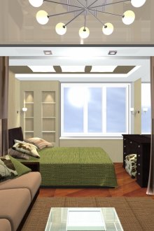
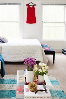
Not always in our apartments, especially in the "Khrushchev" and panel five-story buildings, it is possible to allocate a room for, for example, a living room, and most often we sleep in the same room where we receive visitors. Then zoning the room to the bedroom and another room comes to the rescue.
Zoning objectives
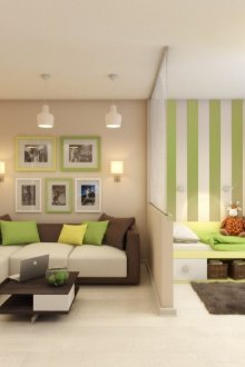
The main idea is comfort. If you plan to separate the office, then you need a place where you can safely finish your work; if you want to divide the bedroom into the "adult" and "children's" parts, then you would like a little personal space. In any case, for adults and small residents of an apartment or studio, zoning gives physical or psychological comfort.
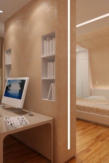
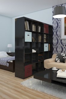
A secondary goal is to achieve ergonomic space. Below we will talk about zoning furniture: this is the best example if we are talking about ergonomics. The narrow rack installed between the zones allows you not to waste precious space on screens and partitions - a much more convenient option than if it was standing against a wall.
Zoning Options
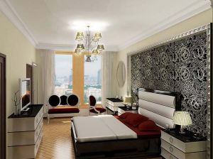
- Bedroom and living room / lounge;
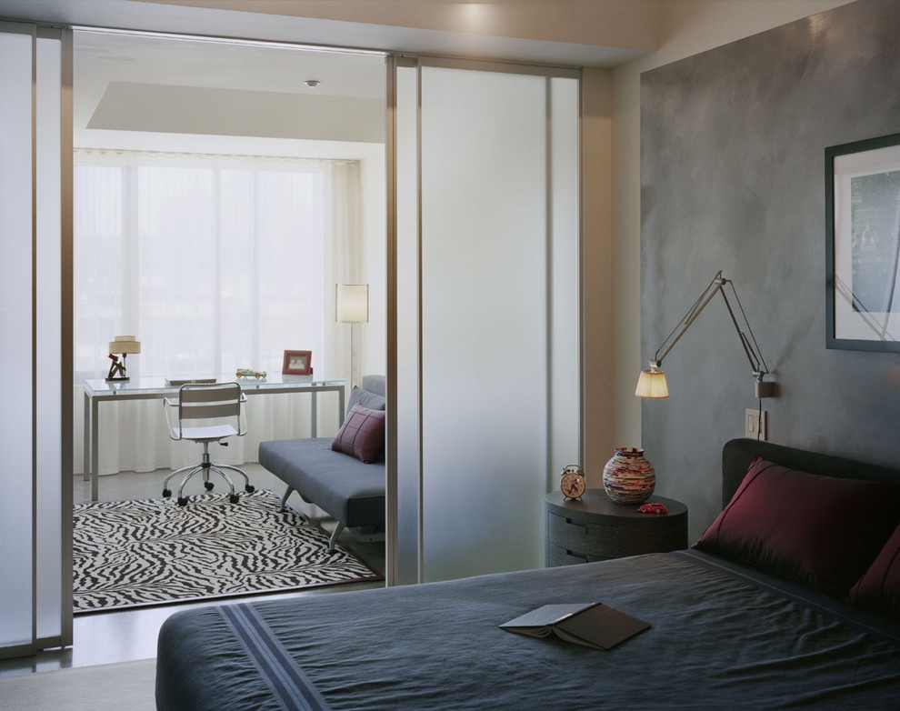
- Bedroom and study;
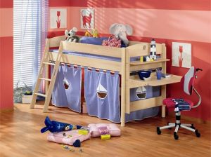
- Bedroom and nursery;
- Living room and study;
- Living room and dining room.
Zoning Methods
Most often they combine two or three methods of dividing space into zones: not only to emphasize the functional separation of zones, but also because of design considerations.
Furniture zoning
The best way to beat an item of large sizes is to build the entire composition around it. Usually this idea applies to long and narrow pieces of furniture. If we place them along the walls, they "steal" a lot of useful space, and nothing can be put in front of them.
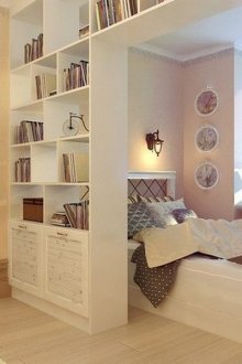
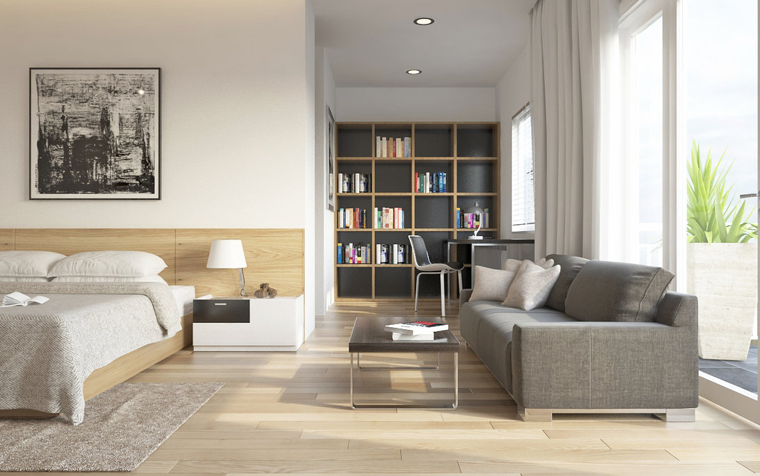
- Bookshelf / bookcase. A classic example of furniture zoning; It is good because light penetrates between the shelves if the window is in the adjacent area.
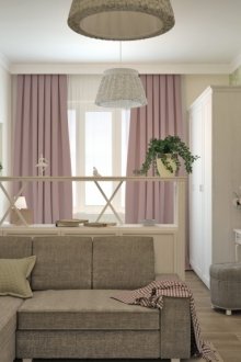
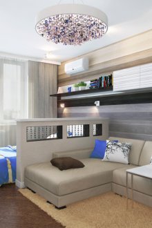
- A sofa with a high back will softly emphasize that there is already another zone behind it - the sleeping one - and at the same time it will not create a feeling of crowding, like solid partitions.
- Screens visually make the space a little smaller, but they have two advantages: firstly, they can be folded and removed as unnecessary, and secondly, they themselves often represent a work of art.
- A narrow bar counter will also be a great idea: it will not serve as an obstacle to the light and perfectly divide the office and living room or living room and dining room.
Zoning with floors, ceilings and walls
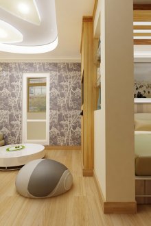
The technique is to build zoning on color and textured contrasts between the zones - this applies, first of all, to decoration materials (wallpaper, panels), as well as decor items in the interior.
- Floor. Part of the room, which is a living room or office, can be finished with laminate or parquet, but in the sleeping area it is better to place a carpet of a natural shade.
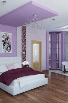
- Canvas. Using drywall above the bed and bedside tables you can create a multi-level ceiling with LED strips and ceiling wallpaper in pastel shades.
- Walls.In the part where there are coffee and desk desks, bookshelves and racks for video and audio equipment, you can make a brick-like cladding with basement panels or gypsum blanks (in the loft style), plaster the walls. For the sleeping area, leave natural wallpaper from jute and bamboo, expensive non-woven and vinyl, fabric or plain paper. The color scheme should also differ (at least minimally): in the space where the bed is, calm shades will prevail; other parts of the room can be brighter.
Zoning with additional architectural elements
If the size of the apartment or studio (from 18-20 sq. M.) Allows you to "steal" a little space, you can divide it with the help of drywall constructions. Unfortunately, this is almost not applicable to the "Khrushchevs".
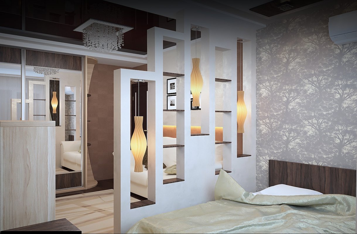
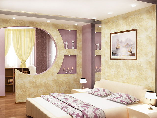
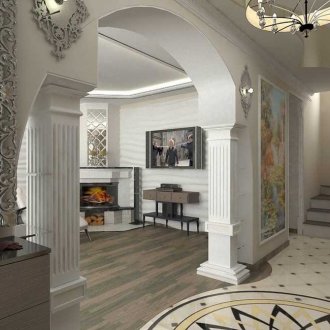
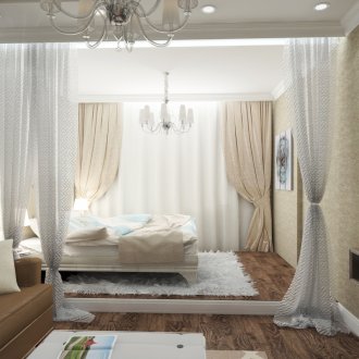
Arches can have either a traditional arch shape, or be made half-arch or created according to any other pattern. The smoothness of the line depends on the overall design in which the interior is designed. They will be even and straight for modern, hi-tech, minimalism, rounded for classicism, shabby chic, provence. Sometimes draped with curtains.
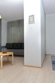
Columns are a rare option for apartments. Of course, such columns are not bearing, but only visually delimit the space. You can attach small narrow shelves to them, hang on them a series of photographs, children's drawings and small flower pots. Why is this option good - it almost does not limit the penetration of light into that part of the room where there is no window. Columns can be trimmed or papered.
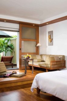
Podiums are usually arranged where the bed will be. If a podium is mounted in the room, then there is no rearrangement: for example, the pair “computer desk and office chair” has nothing to do on it - this is just a dangerous idea (especially for those who like to ride such a chair).
Zoning with fixed partitions
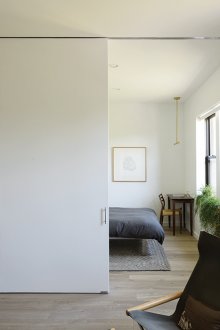
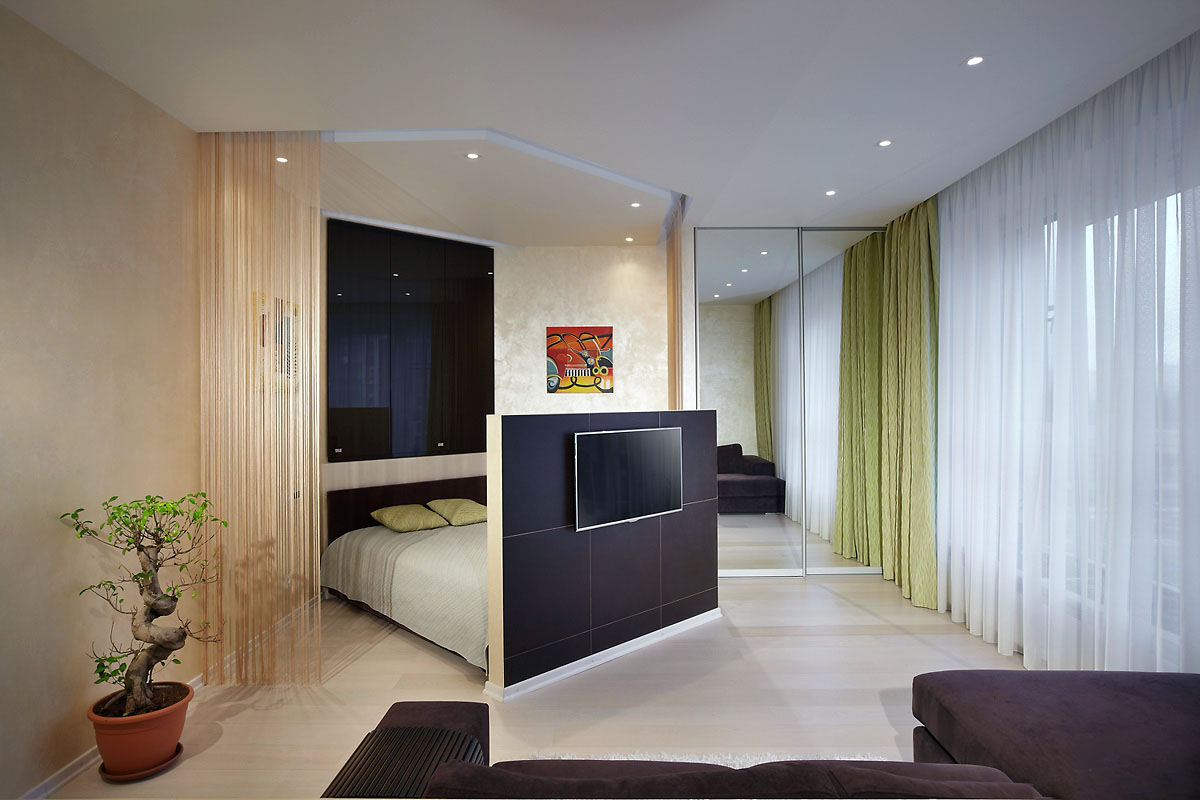
Typically installed sliding partitions made of polycarbonate or glass. They almost do not affect the level of illumination, but the space of the studio or room is visually made small, and quite seriously.
Zoning with screens and curtains
Screens are ideal for the interior, if its design is sustained in Asian styles. Of course, being pieces of furniture for an apartment or a house, they have nothing to do with those that can be seen in medical rooms; interior screens are most often a work of art. A translucent screen made of profiled or cellular polycarbonate is more functional than decorative, but those that look like medieval Chinese are traditionally made of thick paper or silk and painted with drawings. They can be a good accent in design.
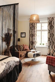
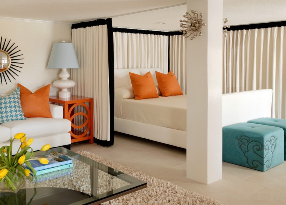
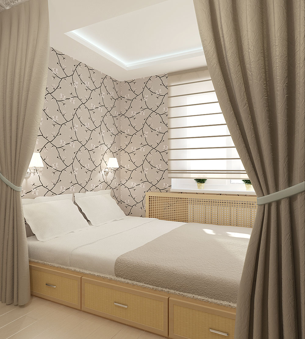
Curtains for zoning use translucent - from organza or veil, and never - heavy curtain or black-out.
Zoning lighting
Finally, a technique that is almost never used alone: when there is only natural light in a room or studio, all division into spaces will remain “behind the scenes”. However, lighting as a small finishing part of the zoning is simply a chic option for interior design.
- The workplace is illuminated by a table lamp or floor lamp.
- A coffee or coffee table is equipped with the same appliance, but with a softer light.
- In the area where you read or do needlework, it’s ideal to hang a sconce.
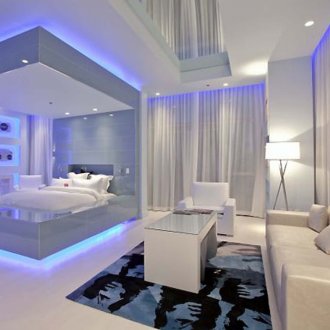
- On the bedside tables you should arrange nightlights, and if a multi-level ceiling is arranged above the bed, paste over it with LED tape. The last trick can be used to illuminate the podium, if the bed is located on it.
- LEDs are also suitable for corners where children's beds are located.
In interiors, where there is a division into zones, there is almost never a "top" light, familiar to the "Khrushchev".Bright illumination of one part will probably interfere with a calm intimate atmosphere in another.
Zoning Rules
If the window is located only in one of the zones (and even more so if it is small), it is better to abandon high opaque partitions, otherwise you will have to use artificial lighting even in the afternoon.
Ergonomic and yet ergonomic design. Zoning is done more out of necessity than on a whim (especially if we are talking about a small studio from 14 to 16-17 square meters, in which there is only one living space), which means that there is not much space. If it is possible to install a folding sofa or pull-out bed, you need to use it, the same applies to folding tables. For children's rooms, it is better to buy bunk beds: a berth at the top and a working bed at the bottom. A bedside table can serve as a coffee or coffee table during the day - you just need to pick up the model on wheels. If possible, all pieces of furniture should be as narrow as possible, while they can occupy a lot of vertical space.
Living and dining areas are decorated in more intense colors than sleeping: we are talking about furniture, wallpaper, textiles.
If you use the techniques described above, consider the space that the pieces of furniture will occupy when unfolded.
Zoning is always a contrast, and you can beat it the way it’s convenient for you.
