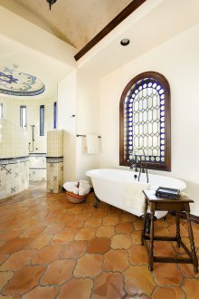
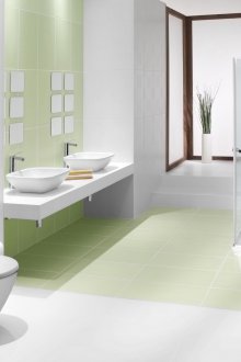
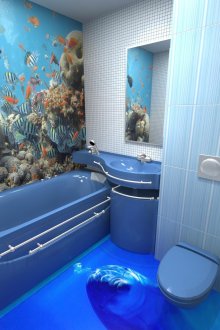
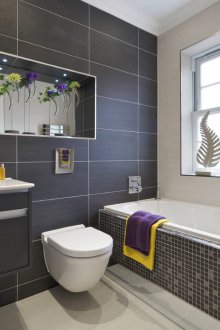
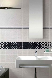
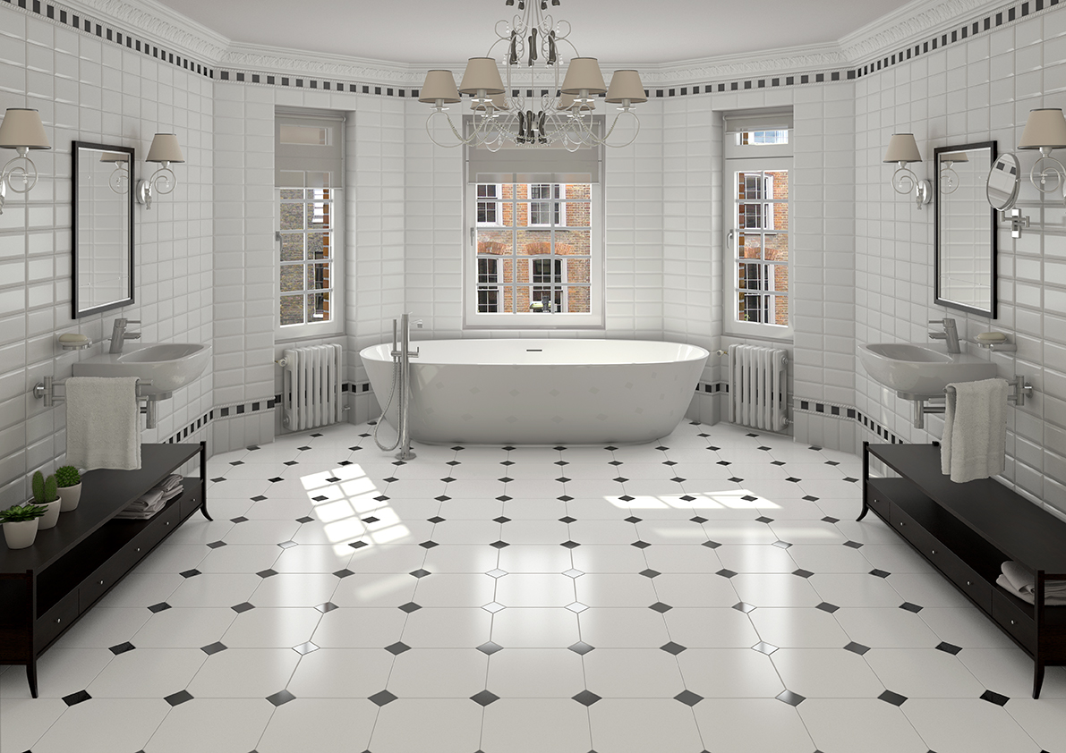
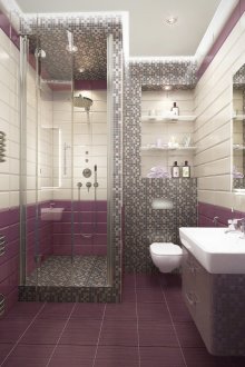
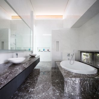
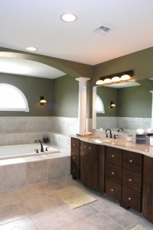
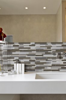
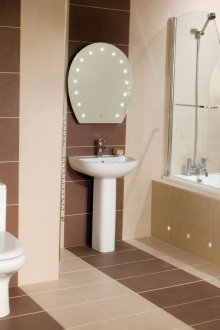
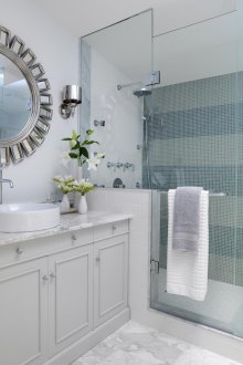
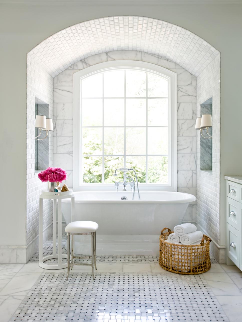
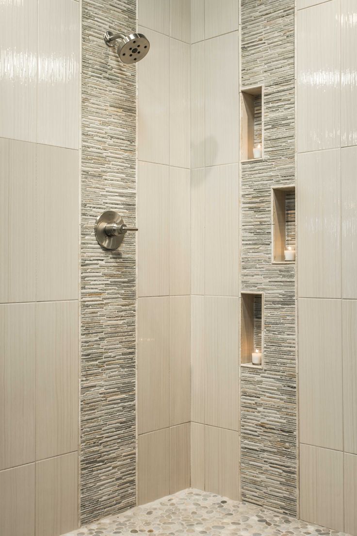
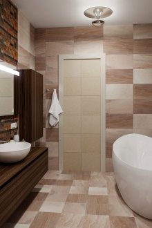
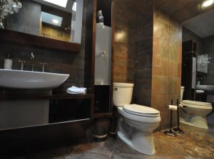
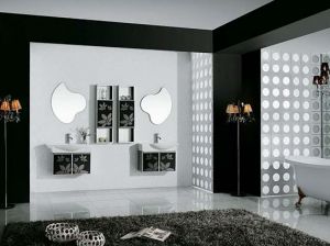
Layout of tiles in the bathroom (52 photos): good examples
Content
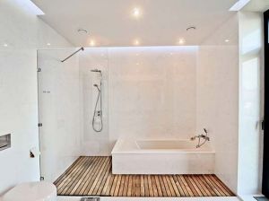
In the bathroom, decorative tiles are often used as the most practical, economical, inexpensive material with a huge selection of colors, textures and shapes. It can be used both on the floor and for wall decoration. Using this finishing material, you can create any design, depending on the style that you want to implement.
To date, there is a layout of tiles in the bathroom in a large number of different options. Experienced craftsmen know many ways. But most often 3-4 of them are used. In the article we will figure out what are the ways of laying tiles in the bathroom, what are their advantages and weaknesses, what design they allow to implement.
Pros of using tiles in the bathroom
Why most bathroom owners prefer to decorate these rooms with ceramic tiles:
- The material is very practical. Horizontal and vertical tiles are moisture resistant, long lasting, easy to clean.
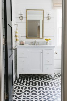
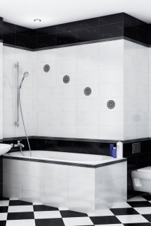
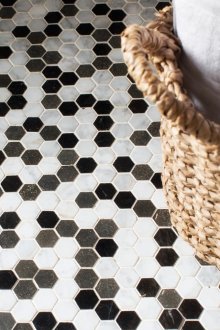
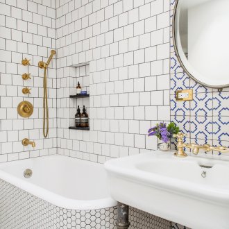
- A large selection of colors, sizes, textures allows you to experiment with design, finding the right combination of shades, implement any decor ideas, even in a small bathroom. For example, a design with black and white tiles in the form of a chessboard is very popular.
- Many tile layout options make it possible to combine different colors, thereby achieving the individuality of the room, making it an original, author's work. An individual layout scheme can be found for each interior in the bathroom.
Options
What layouts of tiled and ceramic material in the bathroom on the floor and walls are the most popular today:
Standard without offset
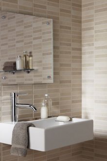
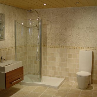
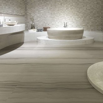
This is the most popular layout plan. In Soviet times, all bathrooms in new buildings were trimmed like this, so for many such a layout causes instinctive visual rejection. Her example in that performance to this day can be observed in the apartments of the elderly. However, if it is carried out using large tiles, then the standard layout without displacement looks pretty stylish and original.
Diamond laying
Or diagonal. Also a very common layout. Features:
- Creates a very interesting visual effect, looks stylish. With its help, the most original and stylish designs are obtained. Gives the room depth, design - sharpness.
- A rather time-consuming option, therefore, only an experienced master finisher can implement this layout. It requires careful calculations and accurate cutting of the material. In terms of labor, it is comparable to laying mosaics.
Wall panel
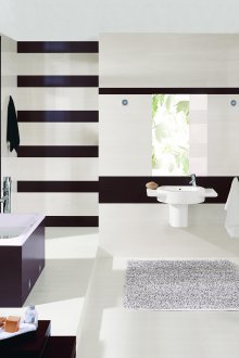
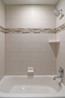
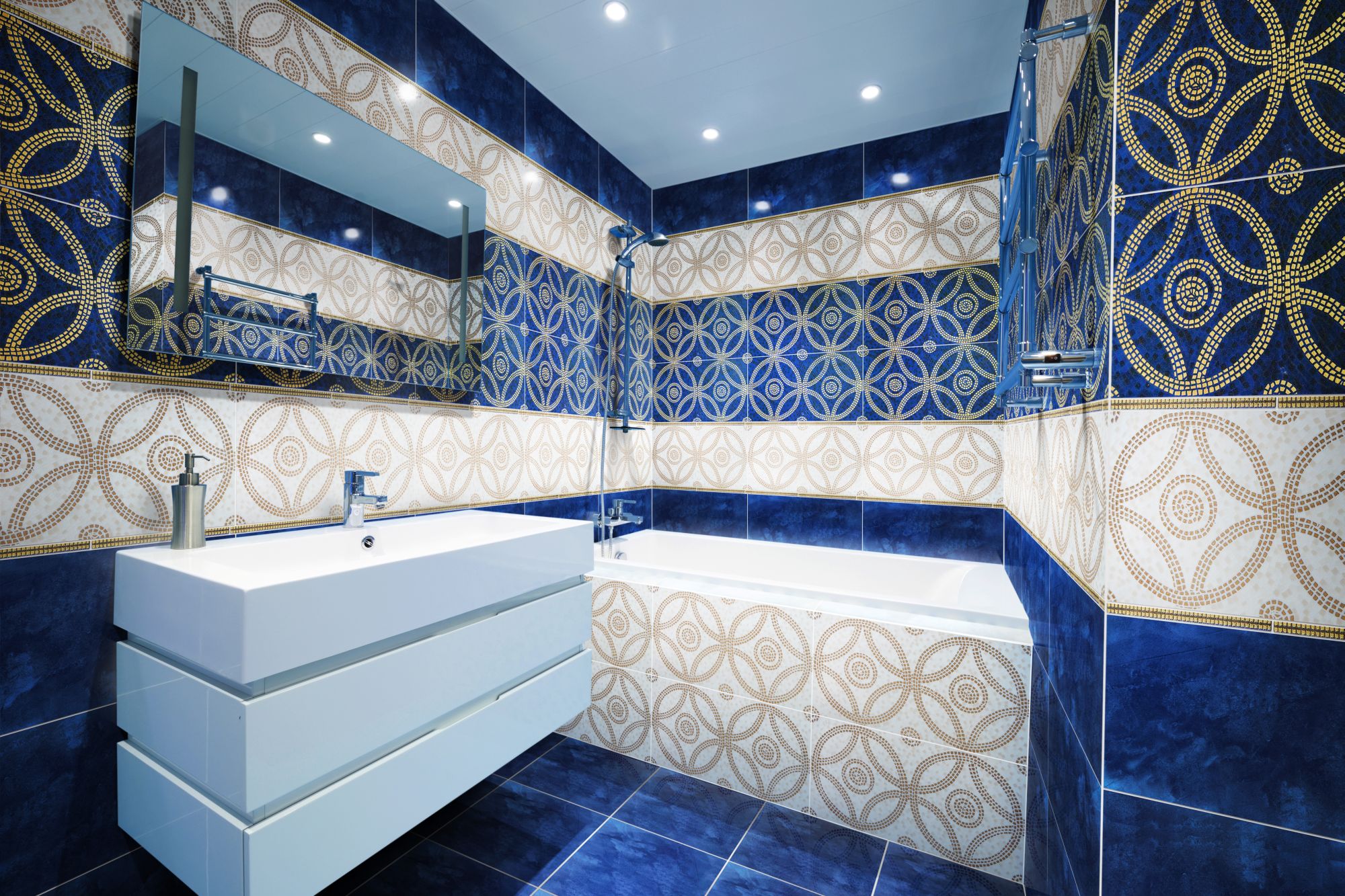
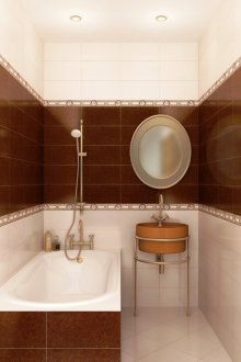
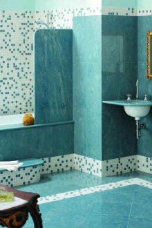
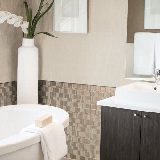
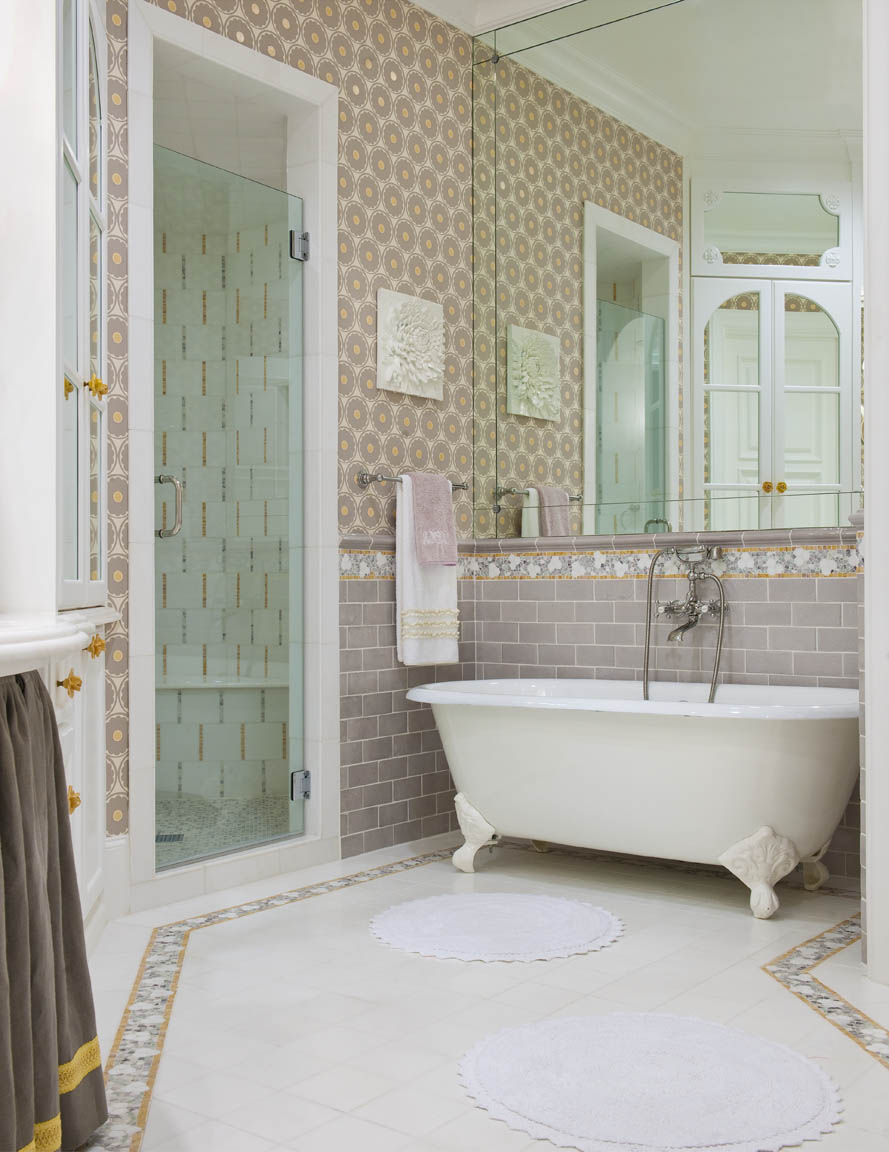
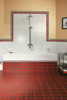
This scheme is a classic of the genre, when the lower third of the wall is laid out with dark tiles, and the upper two-thirds are lighter. The place of joining of different colors of the tile is usually still made out in a contrasting border to match, it can also be made from mosaics. Often this way of designing bathrooms can be seen, as an example, in various public institutions. Such methods can be applied to your own bathroom, but this gives the bathroom a little severity and formality.
Features and rules:
- Such a layout design makes the room lower, expanding it at the same time. You should carefully study the floor plan.
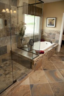
- At the same time, the floor can either coincide with the walls, or be completely contrasted with them. Each design is interesting in its own way.
- In some variations, you can see a combination of a light bottom and a dark top. However, this layout of tiles in the bathroom lowers the ceiling, so it is suitable for narrow and tall rooms. And in most of our standard apartments, small and not too high bathrooms are still more common.
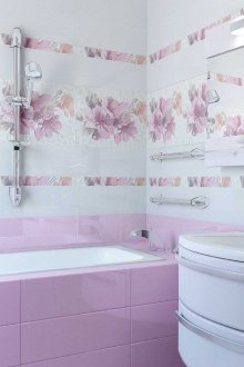
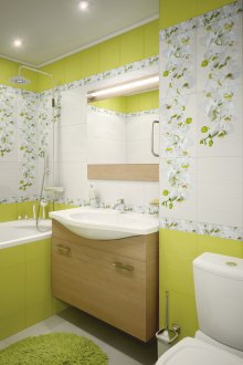
- The border on the walls of the bathroom can be made as a narrow strip, as well as a sufficiently wide independent area, tiled in several rows. In addition, these strips, especially if they are narrow, there may well be several pieces. Just do not forget that each of them will make the room a little lower.
With a border
In this version of the layout, the tile that is laid on the floor continues on the wall. But not completely on the entire wall, but 2-3 rows above the floor. Above, it is desirable to make tiles of a different shade, most often lighter. Such a layout plan will make the design of the room lower and wider.
Fragments with accent
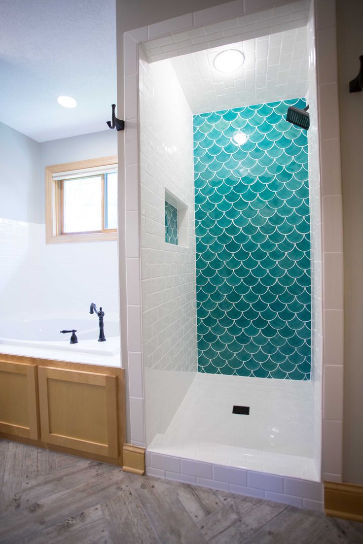
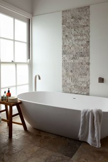
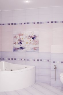
A very popular layout plan today. But such options for laying tiles in the bathroom are suitable only for decent sizes. In a small room, contrasting accents can create a visual imbalance, which looks inharmonious.
Advice:
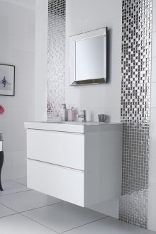
- If you decide to choose such a project for laying out the bathroom tiles, then you should know that you do not need to focus on more than 2-3 areas of the bathroom. An ideal layout example when emphasis is placed on the washbasin, heated towel rail and shower. Or in another similar variant.
- If you do not want to increase the height of the ceiling, then the accent area should not start directly from the floor, but it is better to do this at a certain distance. It is also not necessary in this case to bring the accent to the ceiling.
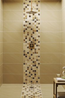
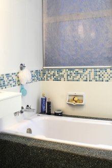
- You can emphasize using mosaics.
- On the floor, such a layout plan does not apply. Accents made on the floor look ridiculous and inappropriate.
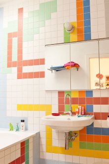
Equal Colors
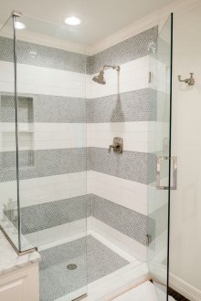
In this case, they take several colors - contrasting or similar, usually 2-3 shades and they decorate the walls of the bathroom. In this case, the colors should not be mixed. One color is laid out on one wall, the other on the second, etc. Be sure to choose a harmonious combination of colors. Features:
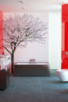
- Thus, it is possible to visually clearly divide the functional areas in the bathroom. For example, highlight the area near the washbasin in red and finish the area near the shower with black tiles. The layout in this case can be both horizontal and vertical.
- In this case, the floors are finished with tiles of the same colors, but at the same time they can be mixed. For example, it will be great to use a chess layout for the floor.
- This design does not look in a small bathroom, because it visually makes the room narrow and small.
Kaleidoscope
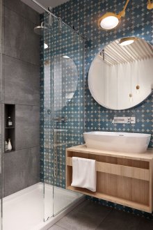
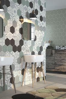
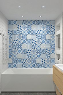
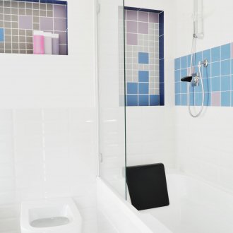
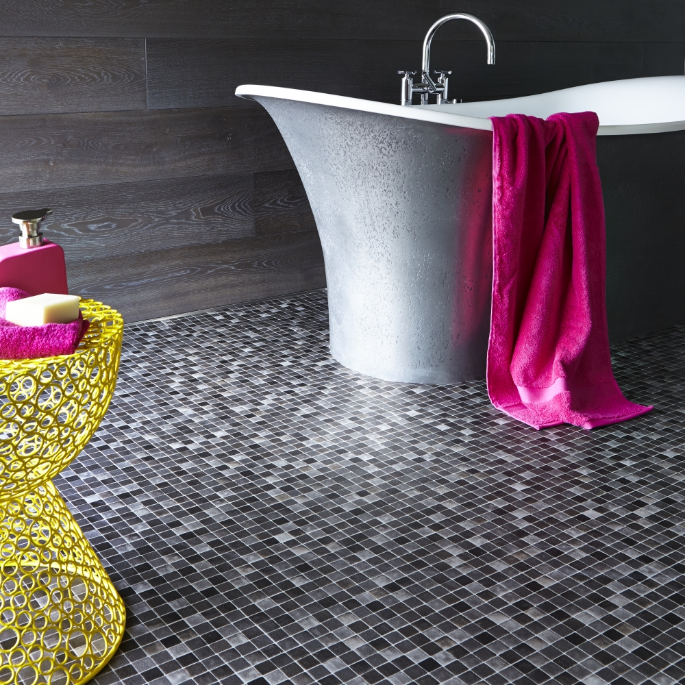
In some embodiments, such a pattern is also called a “patchwork” or “patchwork quilt.” Here, the design combines tiles of several colors, while they can alternate both randomly and adhere to some specific order. Such design methods are chosen by people of creative professions with a creative mindset. A similar layout of tile can be carried out on the bathroom floor.
Spray layout
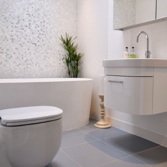
This layout project uses one primary, basic color of the material, and as a bright interspersing with individual tiles, a different color is introduced. Plots of contrasting color should usually consist of single individual tiles scattered randomly, which is why they are called “splashes”. They can still be made using mosaics. It will look right and good only in spacious rooms: bathrooms and bathrooms. In a small room, such a design will not be appreciated, as it will look careless.
These are only the most common tile layouts in the bathroom.In addition to the above, there are many others that are also beautiful, but are used less often. See their example on our website.
Advice:
- In the modern design of bathrooms in residential premises, almost no border is used, since a project with a border visually narrows the room and gives it a kind of cold formality, depriving an individual style. In addition, the curb significantly complicates the work plan and makes it more expensive.
- The smaller the bathroom, the easier it is to use the layout option. And vice versa - if you can brag about the presence of a bathroom of significant size, the larger layout options on the floor and walls become available.
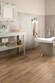
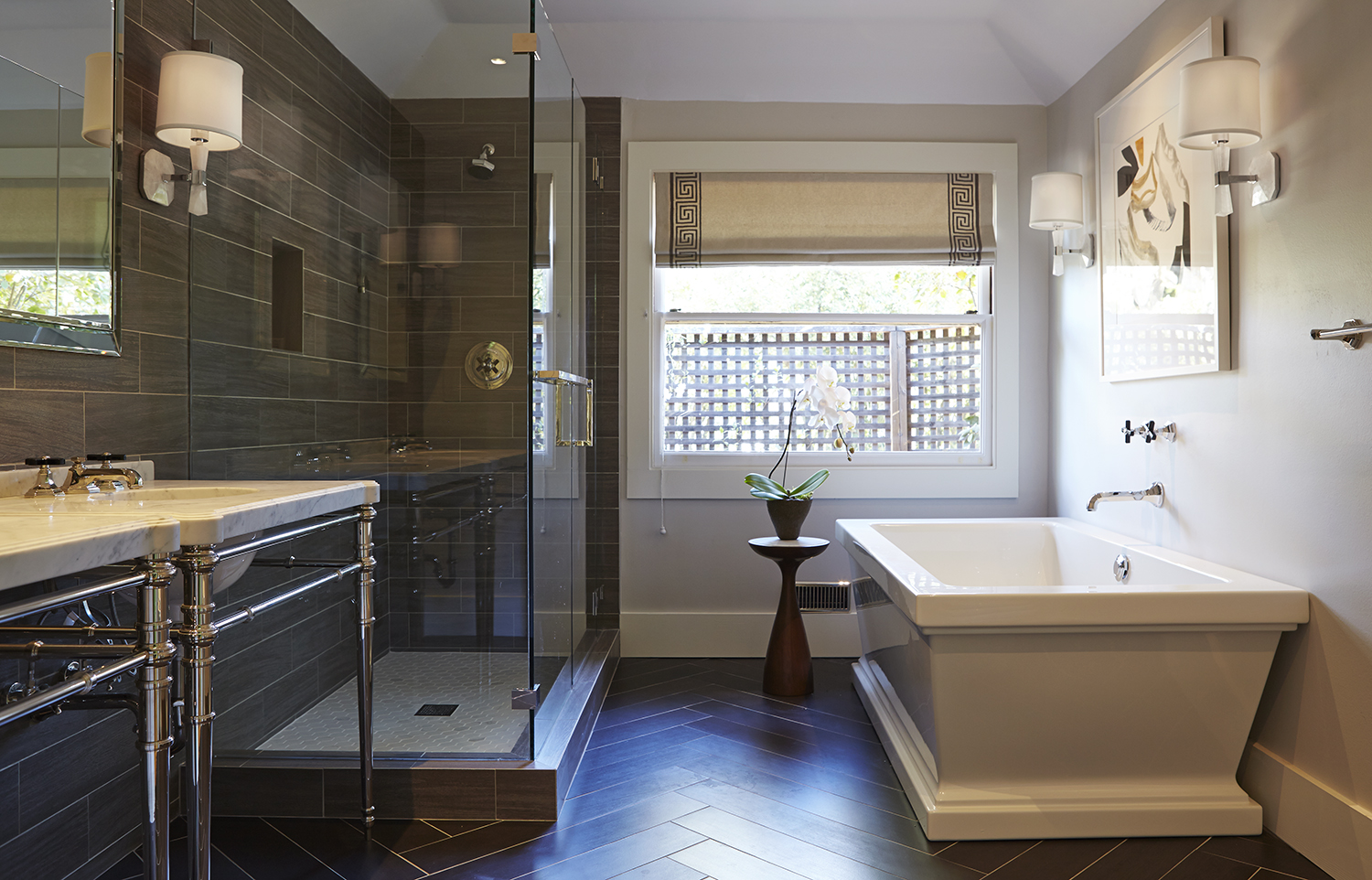
- On the floor it will be correct to use the dark colors of the tiles in a matte finish. The glossy version, although beautiful at first, is slippery and will be erased from the times, and ugly bald spots will appear in its place. Glossy tiles are best done wall decoration.
