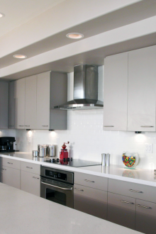
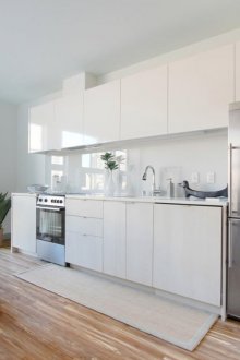
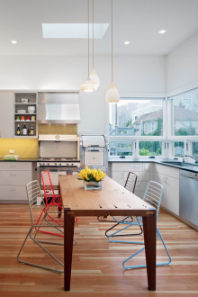
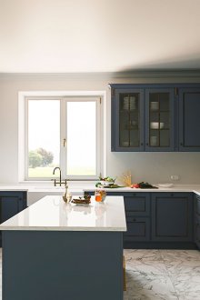
The combination of colors in the interior of the kitchen (50 photos): we choose the right palette
When making repairs in the kitchen, it is necessary to think over such an important question in advance as its color scheme. Indeed, the harmony of the kitchen space depends on how beautiful the colors are combined: whether it will be comfortable in it, whether it will cause appetite and aesthetic pleasure. In addition, according to the ancient Chinese teaching of Feng Shui, the kitchen is the center and meaning of every home, and its color scheme plays an important role in the safe functioning of the whole family. In the article, we will consider how to choose the right combination of colors in the interior of the kitchen.
How color affects us
Consider how a different color selection can affect the human body:
- Designers are strongly advised to choose dark colors only for large kitchens. A small kitchen with dark colored walls and furniture can become even smaller and lower. And vice versa - a light design - lilac, orange, yellow - expands the space, so it is ideal for small kitchens.
- Too bright shades - bright yellow or bright orange, green, for example, also do not fit into the small space of a standard city kitchen. In such a room, vivid combinations will cause irritation - the mood may spoil out of the blue. But in a large space it is quite acceptable to use such a combination of colors in the interior of the kitchen - in this case they will not have a negative effect.
- Use cool tones carefully, such as blue and lilac. Still, the kitchen is a living room, the area where the elements are fire, so warm natural shades, as closest to nature - brown, yellow, orange, or a combination of two or three of them, will be an ideal choice. Cold shades can cause a feeling of facelessness and lifelessness of space. Only a talented craftsman can execute the design of the kitchen in cool colors so correctly that it will look harmonious and stylish. But on your own it is better not to risk it and go a proven, guaranteed successful way in warm colors.
Monochrome kitchen
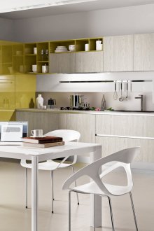
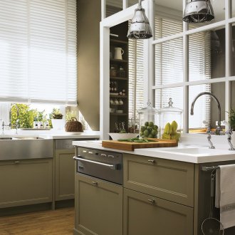
In recent years, monochrome cuisine is gaining more and more fans. Indeed, such a design facilitates the task of selecting colors and shades, accessories and kitchen appliances. In addition, such a design looks, for example, pistachio or green, always stylish and noble.
Consider the features of the kitchen in a monochrome version:
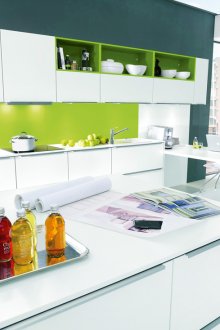
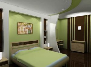
- In order for a monochrome kitchen to have a truly expensive look, it is important to choose the right colors and their combinations. If you use the color ineptly, there is a high risk of getting a boring, faceless kitchen as a result. For example, a combination of pistachio-colored walls and a green or lime green furniture design is a great option.
- The primary task is the choice of the main color. And then additional shades in the same gamut are already selected for it. This technique provides a harmonious unity of the kitchen, all its surfaces - vertical and horizontal. For example, brown is suitable for pistachio, and blue is combined with gray.
- Designers strongly advise that if you choose colors yourself, do not use more than three shades, as there is a risk with insufficient experience to miss the right choice, and as a result get an inharmonious, incongruous interior. For example, if the base color is green, then the right solution for choosing shades is light brown, lime or emerald.
- Zonate the space of a monochrome kitchen, highlighting, for example, the dining area, work area, bar, etc. For example, you can use brown for the working area, and yellow or orange for the dining area.
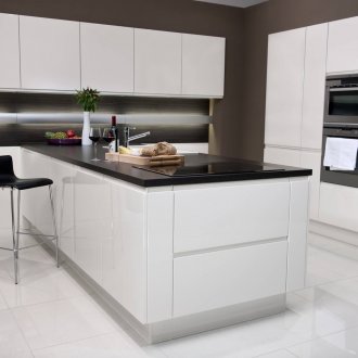
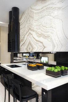
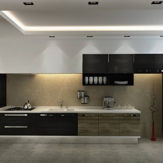
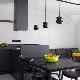
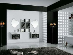
- Often a monochrome kitchen is performed in black and white. Such a stylish technique when choosing furniture and wallpaper for walls should also be used wisely, since with the inept use of these active base colors, a colorful space can be obtained that has little in common with a beautiful picture in the catalog. It’s better to look at catalogs, corresponding sites where a good design is shown - and then start setting up your black and white kitchen.
Advice
Some important points that will help you choose the right colors for your kitchen:
- If you want to make the kitchen spectacular and bright, choose a design based on the reception of contrasts. In this case, several directly opposite colors are used. Such a selection of colors gives the room liveliness and activity. The bright kitchen will energize in the morning and will cheer you up after a hard working day. An example is the bright yellow kitchen, with an additional blue color. Lilac and brown colors will also be an excellent choice.
- If you are afraid to miss the choice of color combinations, then choose a win-win technique: the use of adjacent colors from the spectral circle. The colors that are located next to each other in a circle are used. It can be, for example, orange with yellow, blue with purple or red with orange. Such a kitchen is guaranteed to look harmonious. The main task here will be zoning of space - use wallpaper, color of furniture and floor for this.
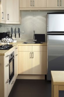
- For rooms of a sufficiently large area, you can choose bright colors. But for small spaces, a neutral gamut of shades is better - light and pastel, better warm tones. The brown shade and delicate pistachio colors here will especially look good.
- It is desirable that the design of the floor, ceiling and wallpaper for walls harmonize with each other. Their design can be decorated in a single color scheme, and in contrast - it all depends on the planned design.
Color selection
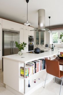
White:
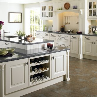
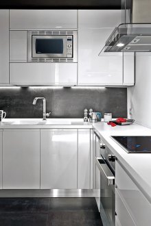
- Great for classic design, and useful when designing in hi-tech style.
- Promotes relaxation, calms, creates an excellent space for relaxation and stress relief.
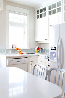
- Very pure color. White space will need to be constantly kept clean, getting rid of debris and stains. Therefore, such a kitchen always looks especially elegant.
- It will be necessary to think over some bright or contrasting accents, otherwise the white interior may look somewhat faceless. For example, add a lilac or other rich shade to the finish. It can be expressed in the color of the tiles or wallpaper.
The black:
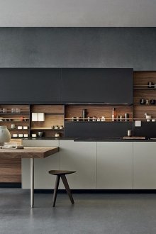
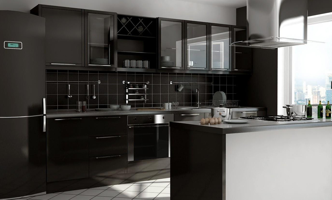
- This choice of kitchen decoration is suitable only for a large space. In a small kitchen, black is not used, as the room will become very tiny and dark.
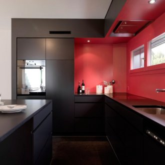
- Be sure, as in the case of using white, for black kitchen you need to pick up bright accents that will enliven the interior and give it dynamism. Light green or a little green, red will not be redundant here.
- Looks good black in a glossy finish. Thus, black furniture, household appliances and other surfaces look harmonious, expensive and very stylish. In addition, the shiny surface of tiles and furniture saves the room from excessive gloom.
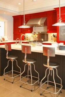
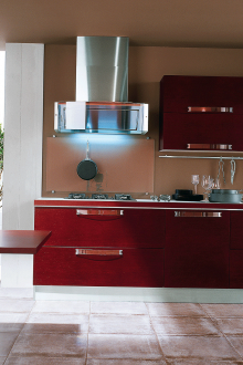
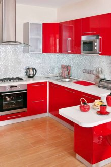
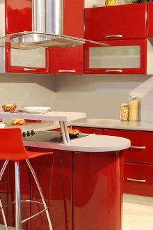
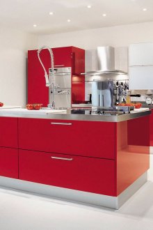
Red:
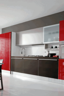
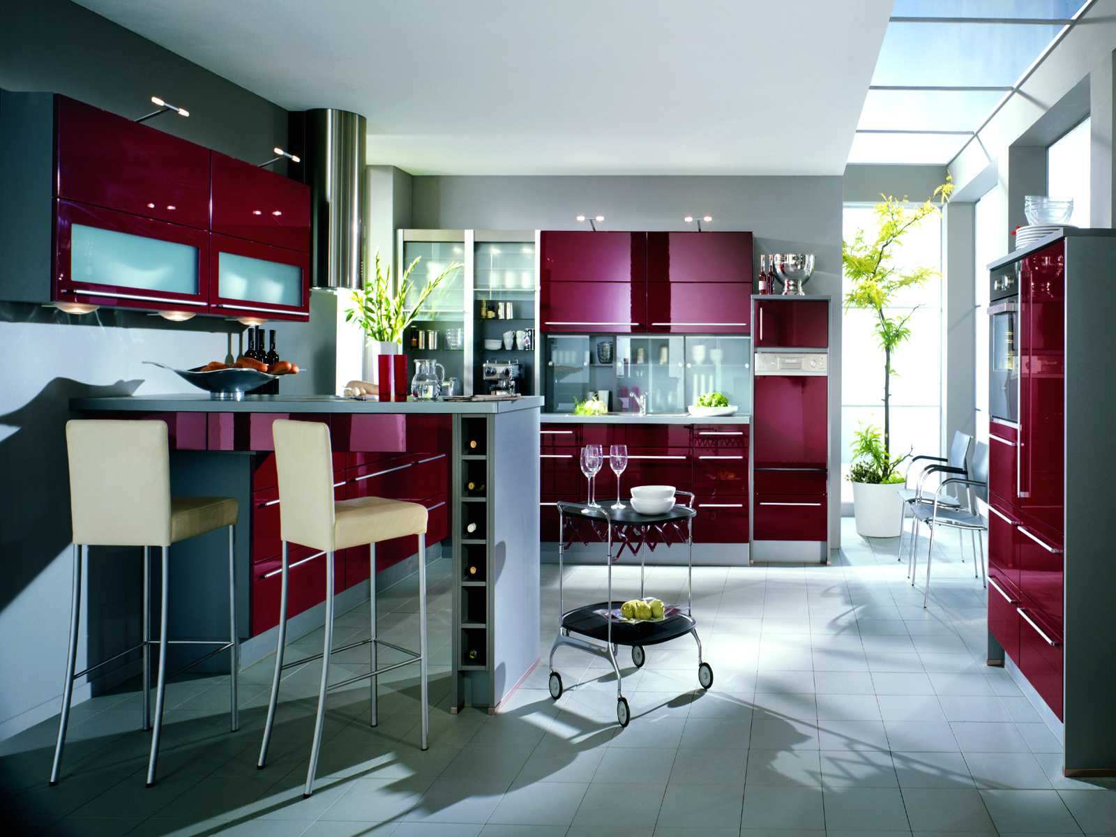
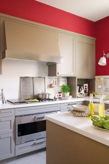
- The red palette is a great uplifter, so it is suitable for people with a tendency to lethargy, depression and laziness. Red color awakens vitality and pushes to action. Looks great in combination with gray.
- However, this color is tiring, so for a long time only a calm and quite melancholic person by nature can withstand red wallpaper or the color of the tile.
- It is important that red is a warm shade that will make the space cozy. Cold tones of wallpaper and furniture do not have this ability.
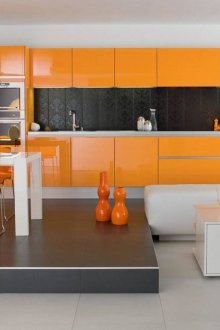
Orange:
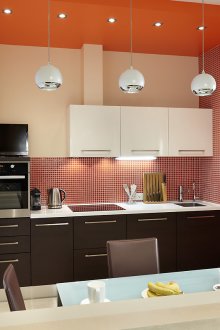
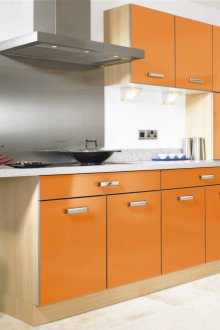
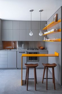
- The color is ideal for decorating a country-style or rustic setting.Gray and orange are one of the most fashionable combinations.
- Orange is a warm and cozy color that fills the kitchen with cosiness and makes the space visually comfortable and fun. Wallpaper of this color will decorate the room, filling it with warmth.
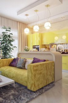
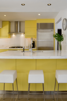
Yellow:
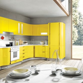
- Various natural materials are perfectly combined with this color: wood, natural textiles. Yellow color is suitable for cheerful, elegant, bright interiors filled with light and air.
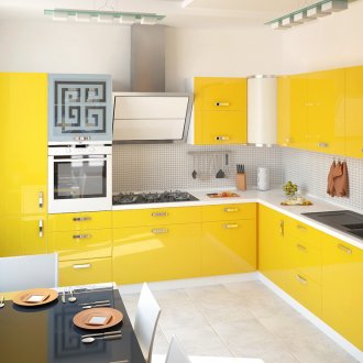
- The yellow shade of the floor, wallpaper or furniture harmonizes the room, gives it comfort and warmth.
- Sand-colored tiles on the floor and on the apron - the perfect choice for a yellow design.
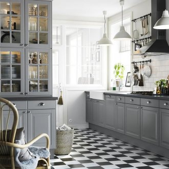
Beige and gray:
- Perfect for people with traditional views on the interior.
- Use vibrant details that dilute these overly calm and dull colors.
Brown:
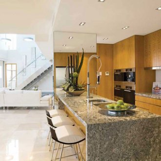
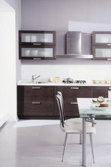
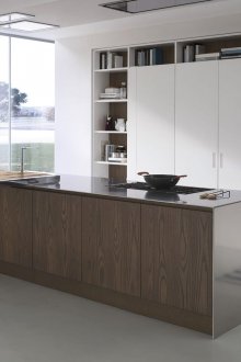
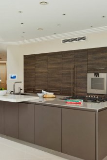
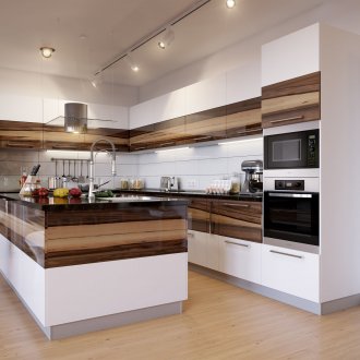
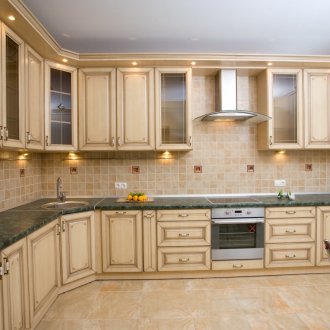
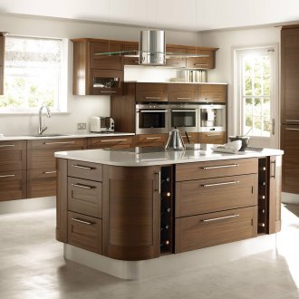
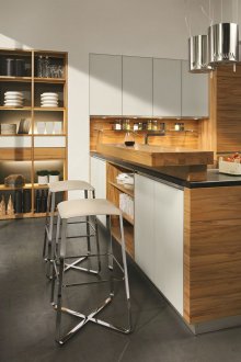
- Probably the most popular palette for the design of the kitchen space. Brown can be selected in different shades - from light to almost black.
- Suitable for a classic interior, gives the impression of quality, reliability and solidity.
- Brown cuisine is the most respectable of all possible. Most classic interiors do not recognize any other colors than brown in all kinds of variations for the design of kitchens.
Blue:
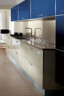
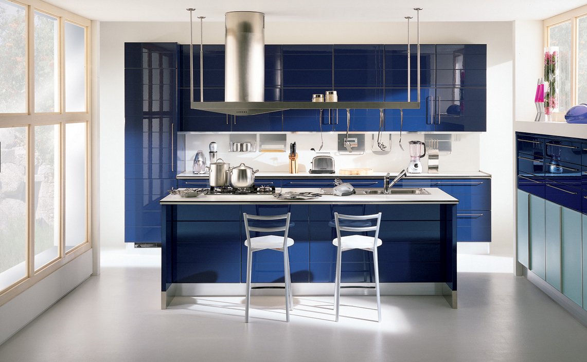
- In the case of using this color, which is not the most popular for the kitchen, consider additional lighting of the room, its individual zones. Since in low light the blue kitchen will become too cold and gloomy-dull.
- Do not make the entire kitchen space blue. Wallpaper for walls and flooring is best chosen in a traditional style, using brown, beige and sand shades.
Purple:
- Color in the design of the kitchen is rarely used, since it is quite active, it is difficult for inexperienced people to choose the right details for it.
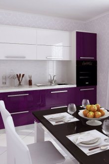
- With a professional approach, purple is able to make a real work of art from the kitchen. Glossy violet surfaces look especially beautiful. A contrasting wallpaper will complement the stylish interior.
