Colors in the interior of the corridor - the whole palette and its capabilities (60 photos)
Content
It's no secret that the corridor is not only a connecting transition between rooms, but also a full-fledged space, like the bedroom or living room in your apartment. That is why you should not neglect the quality design of the corridor, which requires the implementation of the same rules as in the case of other rooms. One of the important aspects that many prefer not to pay attention to is the choice of color in the interior of the corridor. Proper use of the color palette allows you to control the space and depth of the room, which is very important, especially if your corridor is not different enough square meters.
So let's look at all the possible color solutions, one way or another used in the design of the corridor. It is very important not only to choose a beautiful and aesthetic option that combines with the overall interior of the apartment, but also to set a certain atmosphere, because it is the entrance hall and the corridor that are the places where your apartment starts, and they should set the tone for all subsequent design.
General design of the corridor
When creating a good and harmonious interior, it is very important to pay special attention to the color scheme used. After all, the mood that a person will receive when entering your apartment depends on the choice of color. First of all, the choice of color depends on several parameters:
- The style of the room. Not every style allows the free use of colors. An ideal example of this would be a classic style in which bright and acidic colors are simply out of place.
- Selected decoration materials. Here, the direct dependence is also traced, as in the previous case. If you decorate your corridor with natural wood, it will simply be illogical to use purple. However, in the case of using panels, the color scheme will be much wider.
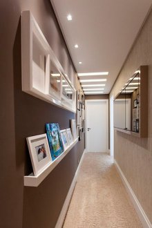
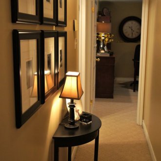
- The size of the room. Not in all corridors it will be prudent to use dark shades. They visually narrow the room, which in the case of small-sized corridors will be quite a negative factor.
Guided by these three rules, you can choose the perfect color combination for your corridor, which will create the necessary mood in the room with which your house begins.
The choice of color deserves special attention if you have a studio apartment. In such rooms there is only an entrance hall, which most often smoothly passes into the room itself.
Stage design of the corridor
A harmonious choice of color in the corridor should contain not only a selection of shades for wall coverings, but also a combination of the color of the walls with the palette of the ceiling and floor. If a pleasant combination is achieved that does not irritate the eye, then a relaxed atmosphere is possible that matches your character.
In addition, it is necessary to take into account the general combination of the colors used. It should be not only harmonious, but also disposed of for further movement around the apartment. If you use repulsive shades, then you just do not want to be in the corridor.
Color scheme for the ceiling in the corridor
When choosing a color for the design of the ceiling, several important properties must be taken into account. For example, cold and bright colors visually expand the space.
One of the most popular solutions, besides the classic white color, is the use of blue and bed tones. A ceiling of this color seems larger than it really is. High ceilings, on the contrary, require the use of dark shades, which visually reduces the space and makes it compact.
Floor in the hallway
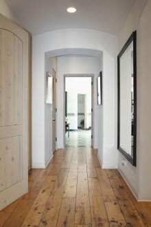
The floor in the hallway is recommended to be decorated in bright colors, which also visually increases the space and is convenient for cleaning. However, the choice of color should not come from stereotypical recommendations, it is important to pay attention to the little things that leave your interior.
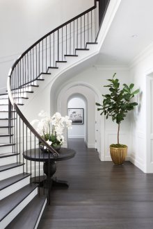
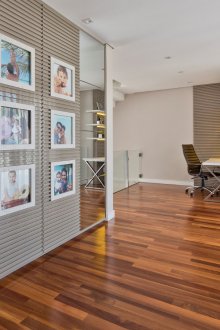
When using dark options for flooring, there are a number of advantages. The perfect harmony between the dark floor and the rest of the bright room fills the corridor with cosiness and makes it a great start for moving to other rooms.
Color scheme for walls
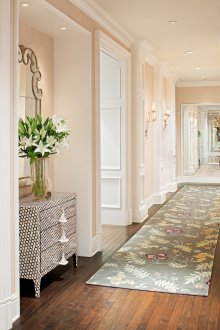
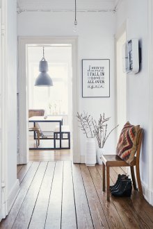
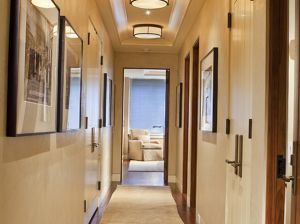
To create complete harmony, the color shade of the walls is recommended to be selected based on the shades of the ceiling and floor. The best option would be to use a shade that is slightly darker than the ceiling and slightly lighter than the floor.
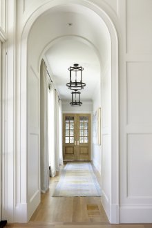
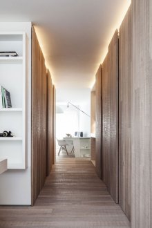
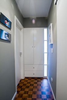
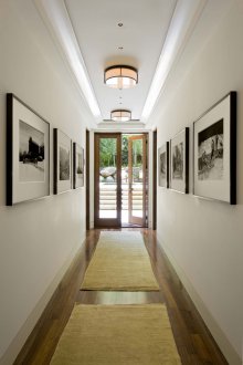
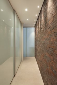
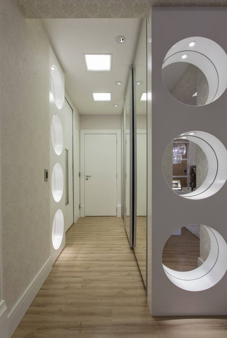
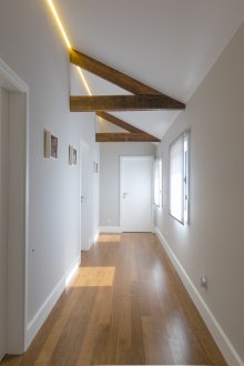
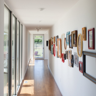
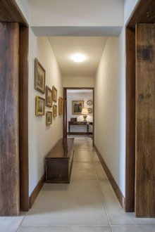
Color options also depend on the size of your corridor. If the room is narrow, then it is worth using light colors close to white, which will help to visually increase the space and expand the distance between the walls. If, on the contrary, the corridor is disproportionately wide, then boldly use dark color combinations.
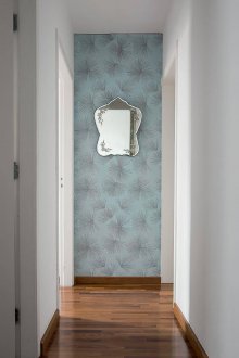
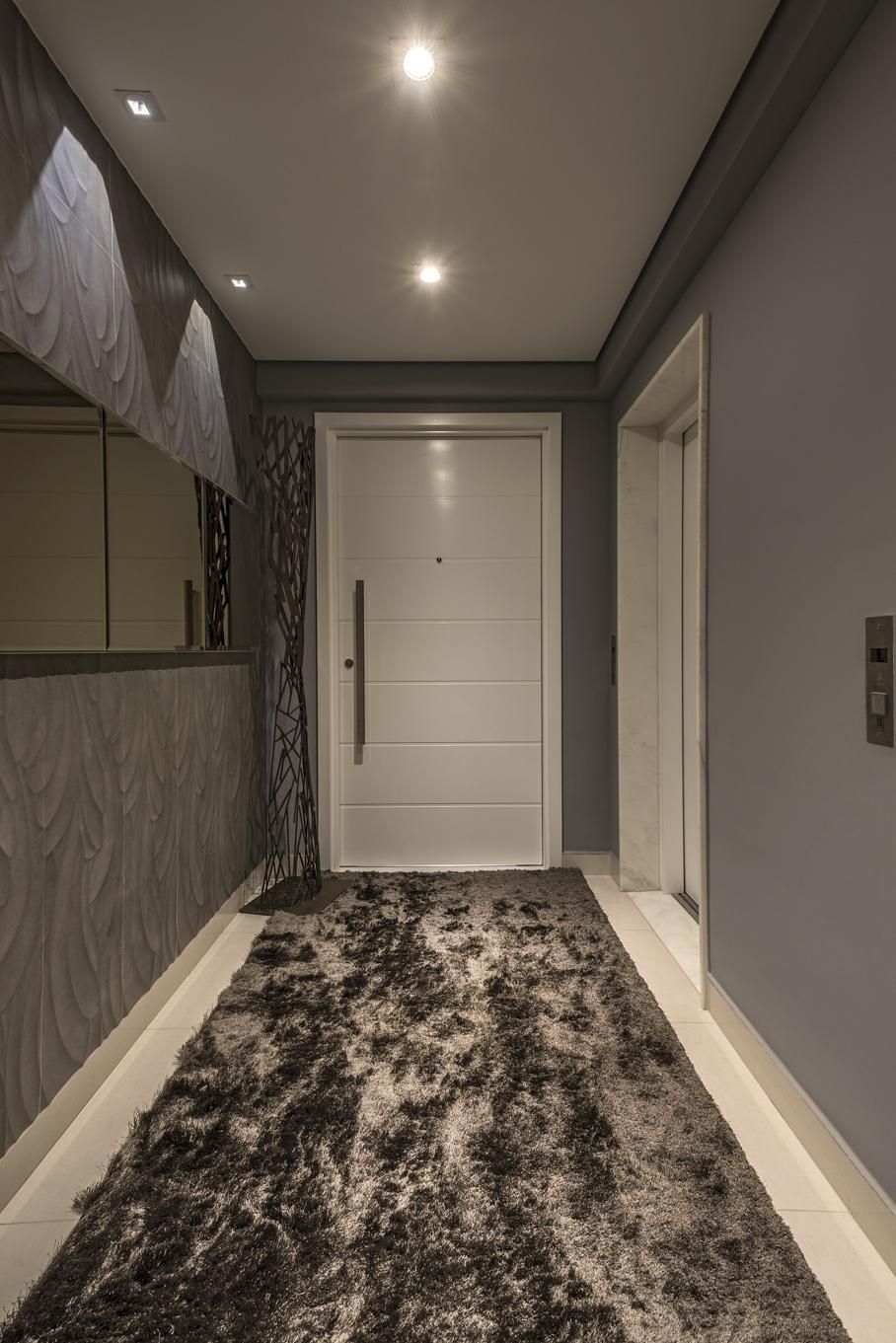
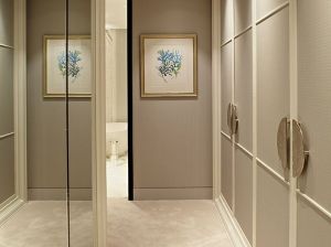
Do not be afraid to use mirrors, this will help not only visually increase the space, but also positively affect the use of light colors.
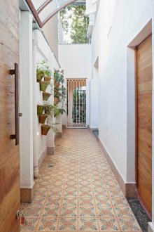
Separately, you need to talk about the doors. They are in any corridors and, one way or another, the door is an integral part of the wall. When choosing a specific color scheme for decorating walls, the door must be designed accordingly. If you have a wide entrance, you can choose dark doors in relation to the shade of the walls. If the corridor is small, then it is better not to break the harmony of space and pick up the doors close to the tone of the wall decoration.
Selection of shades for each style
If you are an adherent of a certain style, then you need to take into account the fact that each individual style uses its own color schemes. Each style is not only the use of certain materials of decoration, decor and universal nuances, but also its own color scheme.
Provence Colors
Provence itself is a kind of rustic style. It originates from provincial houses in the south of France. However, today, it is very often used not only for the decoration of the corridor, but also for the entire apartment.
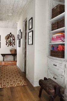
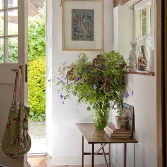
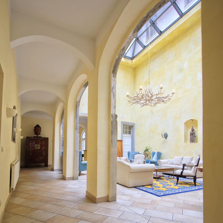
Color in this style is crucial. Often, pastel colors, white, cream, beige, and other delicate and laid-back colors are used as the main color.
Loft Colors
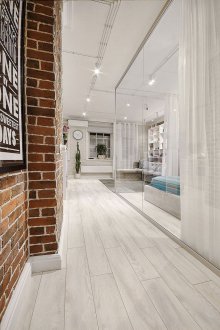
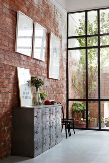
For the first time, the loft style appeared in the United States at a time when, due to high real estate prices, people converted factory premises to residential areas. Today, this style is quite popular, especially among those who love simplicity and spaciousness.
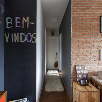
Most often in such rooms, I use neutral colors - white, gray and brown. However, lovers of originality may well replace one of these three colors with a brighter solution. For example, white is often replaced with violet, thereby giving the room a new perspective.
Art Nouveau Colors
Art Nouveau style originated in the 19th century and represented certain historical delights, today it has a fairly wide range of different branches. However, even all modern interpretations of this style perfectly combine the grace that was originally inherent in it.
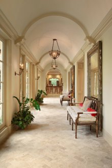
Color solutions of this style can not boast of a wide variety. Among the most basic shades, various dark variations of natural colors are distinguished. An example of this can be various sandy shades, stylized wood or stone. Often, the picture is diluted with gold elements and a little less - silver or bronze.
Vintage colors
One of the youngest styles is vintage. It originated relatively recently, and its main focus is the stylization of rooms under 50-80 years of the last century.
The main advantage of this style is that it does not have that strict attachment to a specific set of color schemes. In those years, on the contrary, there was an abundance of bright and colorful solutions. Accordingly, today, with such stylization, the use of the brightest shades is allowed.
Color properties
Each color in the interior has certain properties that affect not only the perception of the room, but also on the person himself. Depending on your desires and needs, you need to use the colors that suit you the most.
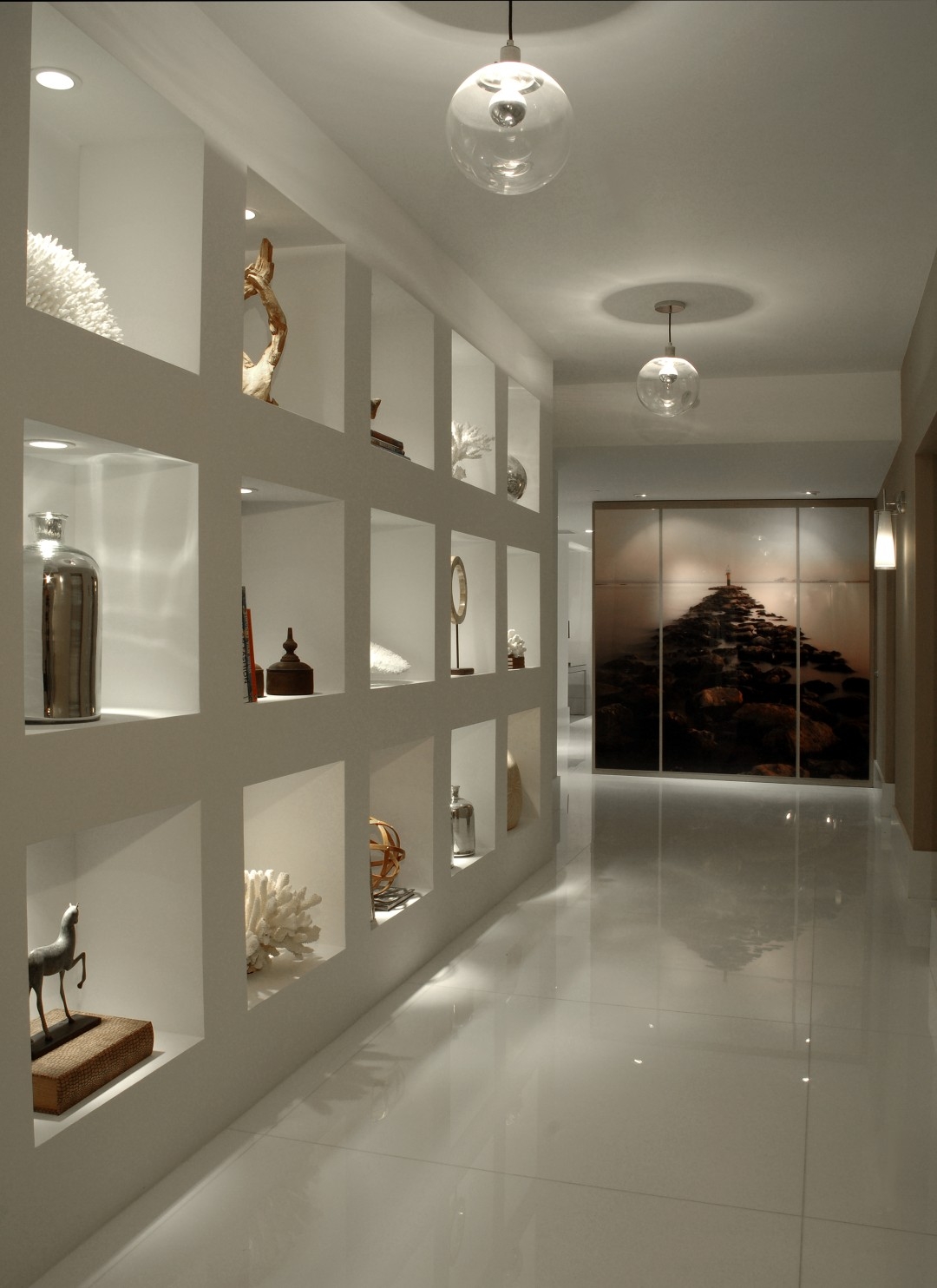
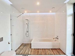
Let's start with the most common color - white. Its main quality is that it blends perfectly with other colors in any design and interior. For this reason, it is most often used as the primary or complementary color. Since white color is the lightest, due to the properties of light colors to visually increase the space, its use in small-sized corridors will be a priority.
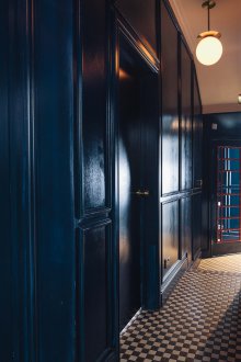
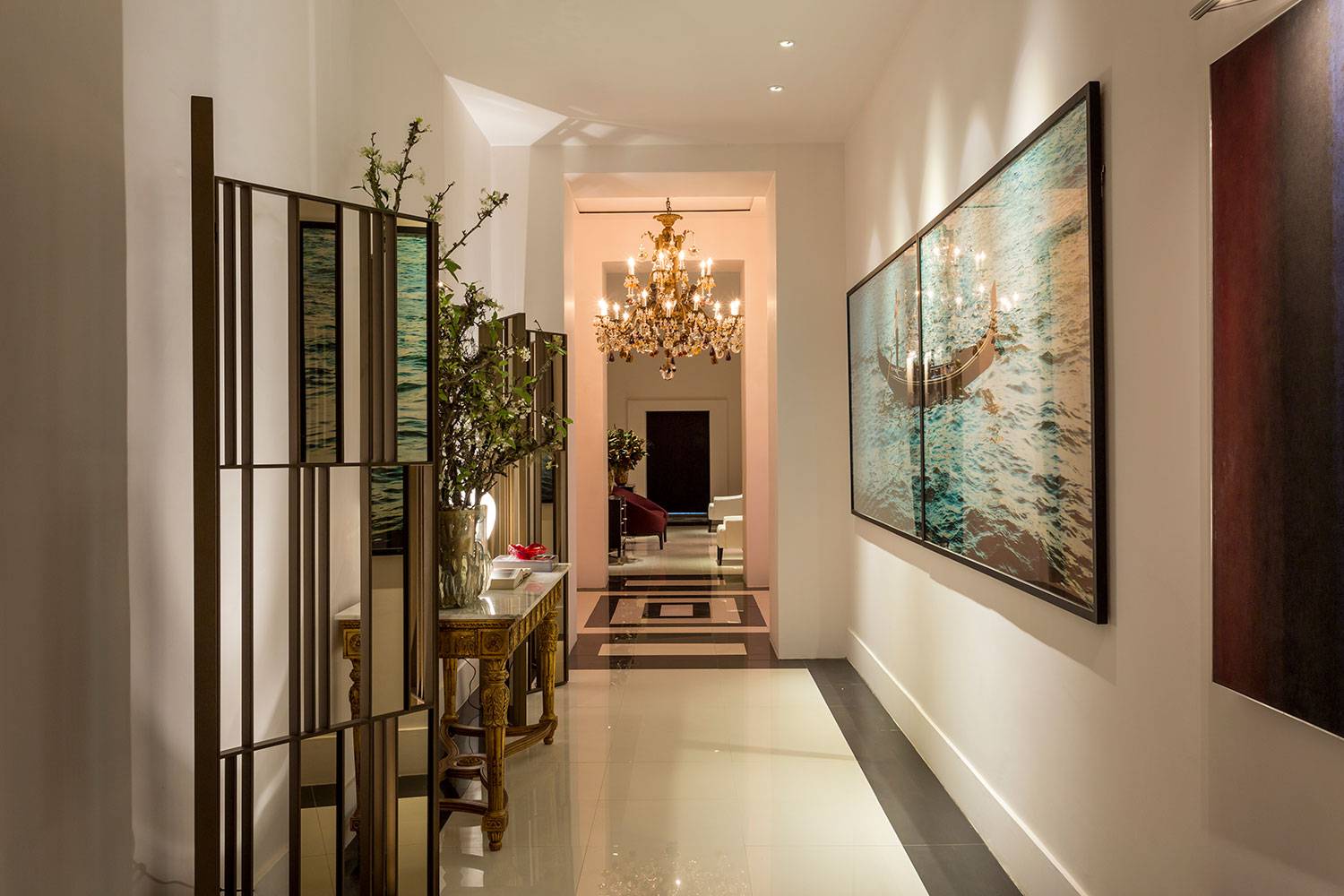
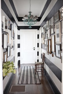
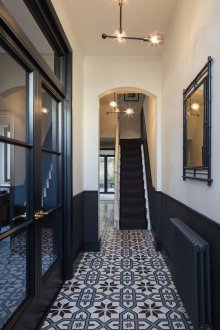
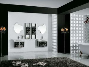
Black is the exact opposite of white. Its use is permitted only in the case of large spaces. Moreover, from the point of view of psychology, it is not recommended to be used as the main color. As a last resort, in equal parts with white color. However, it is black that impresses with its simplicity and sophistication at the same time. For this reason, it is often used to embody rich and luxurious design solutions.
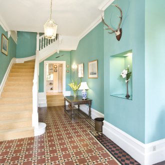
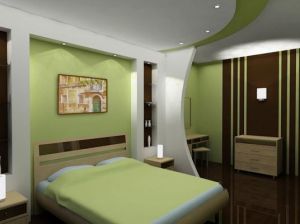
Equally popular is the green color, which is associated with nature and freshness. In addition, it is green that favorably affects a person. Due to this property, quite often the corridor is decorated in green colors. The color of the corridor should favor further movement around the apartment, and the green color copes with this task better than others.
One of the most unusual color schemes is the use of purple. It combines both severity and unusualness. You can make the floor purple in the corridor, because the color itself is quite dark.
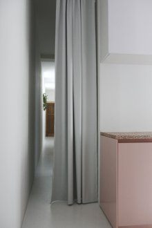
Pink color, especially its delicate shades, easily harmonize with all light and neutral colors. Soft pink color can give a special atmosphere and saturation, for example, to black and white or gray interior. Moreover, it can be used as the main color, because thanks to such a contrasting game, it will not stand out much.
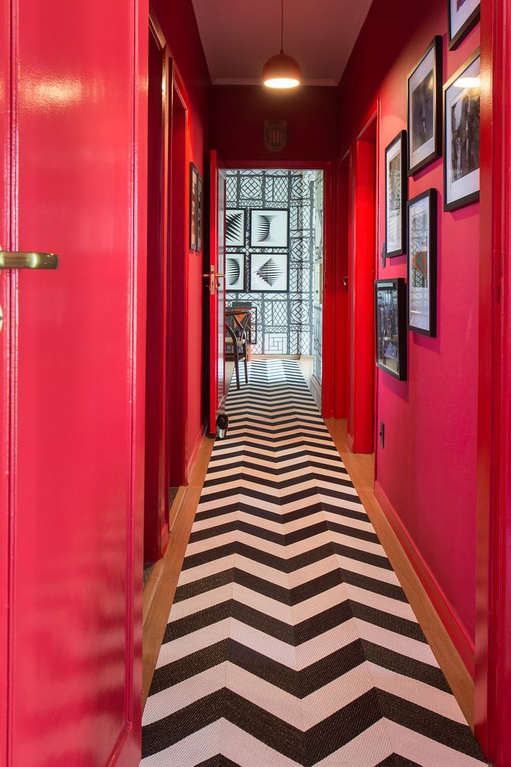
One of the most striking and defiant colors is, of course, red. Most often, this shade is associated with danger, so you need to use it in the interior with extreme caution. It is better to decorate the corridor with combinations of red with white or black.
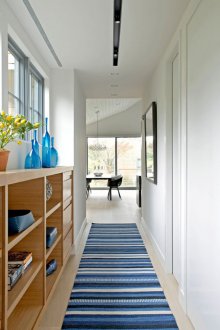
Sometimes used in the decoration of the corridor and blue colors. However, unlike other light colors, blue is associated with cold. In its other parameters, it is no worse than other colors. For this reason, it is recommended to use it only in small quantities.
