White hallway: only for the elite (23 photos)
Content
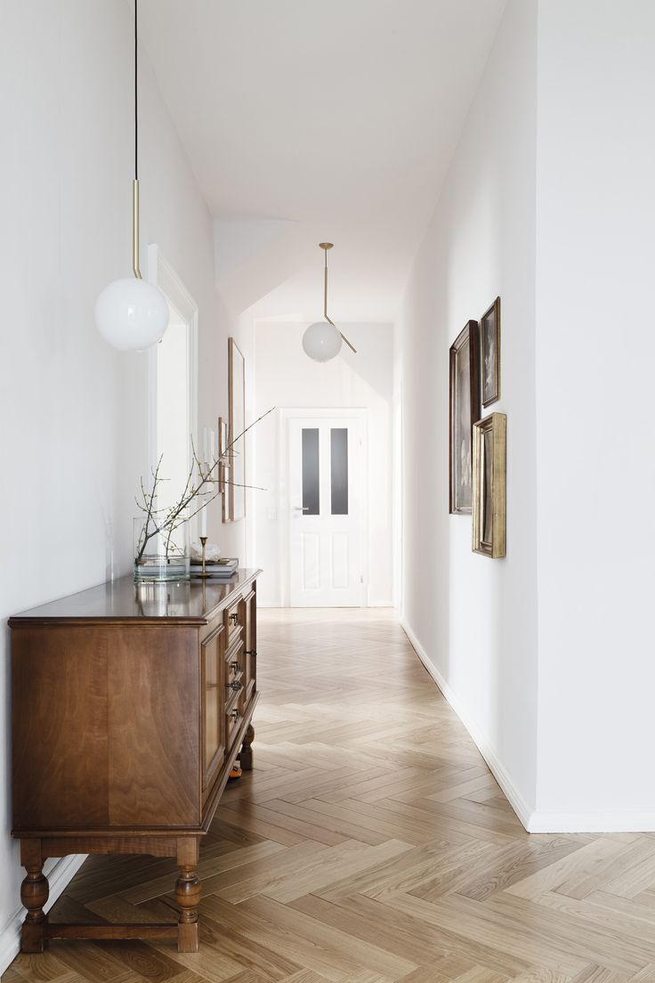
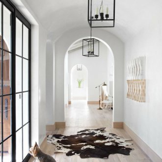
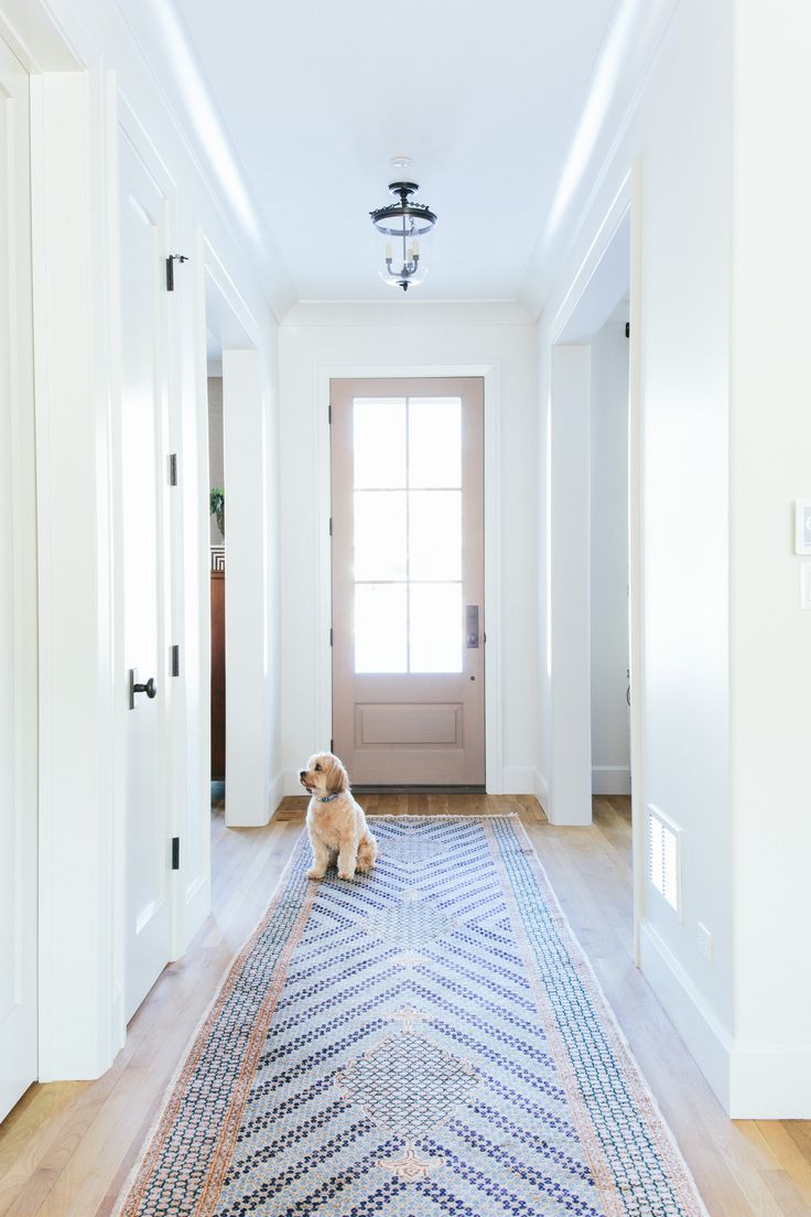
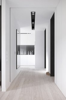
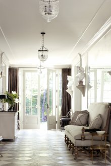
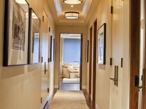
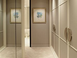
The vast majority of hallways in ordinary houses have small dimensions. To expand the space at least visually capable of white interior. Even the smallest entrance halls make white colors stylish and chic. For lovers of custom solutions, there are still options in red or black and white.
General requirements
Monochrome interiors, in order to look organic, are made out according to certain rules.
Zoning Methods
A solid monotonous interior in white tones will easily turn even a small room into a hospital corridor. Solid red will overwhelm. The selection of individual segments eliminates this discord, makes the interior of the hallway attractive and functional.
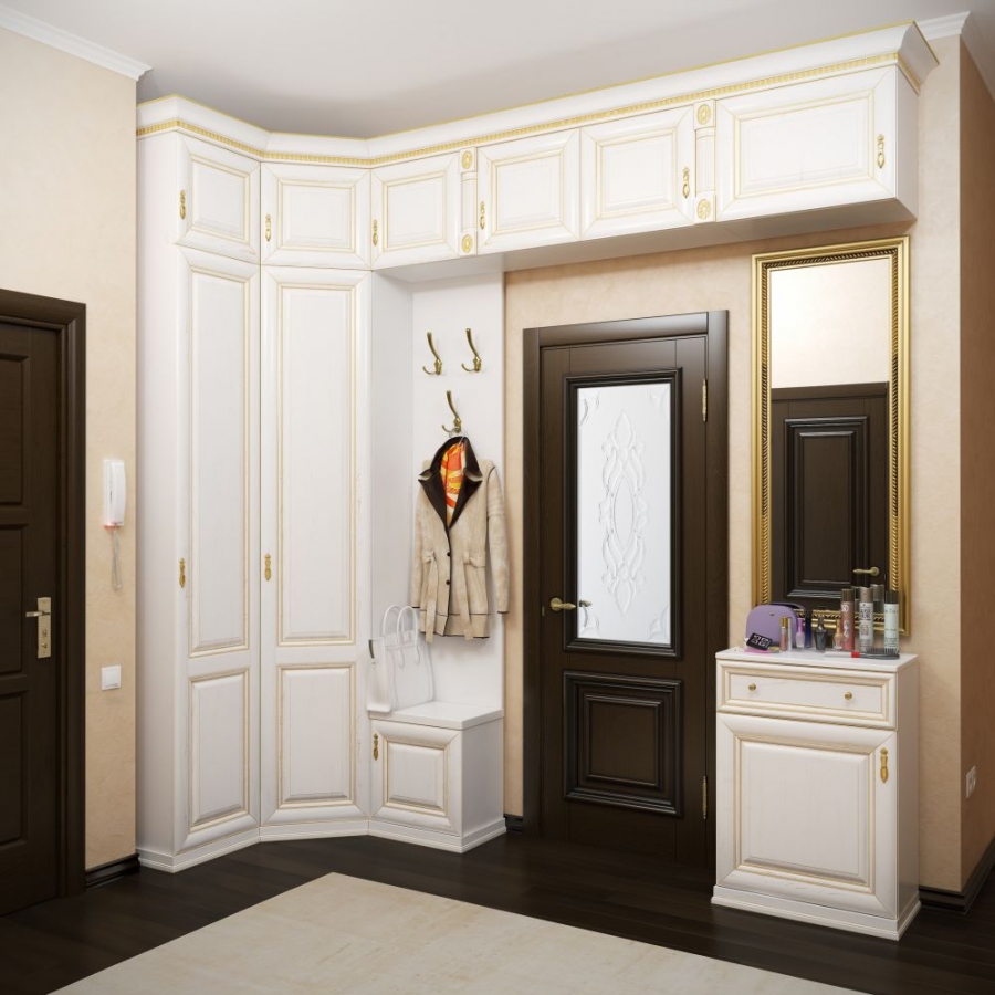
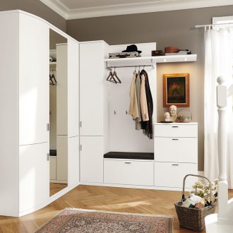
When arranging furniture, first of all, they determine the location of the most visible object, that is, a wardrobe. It is placed in such a way that access to adjacent rooms does not overlap and there are no obstacles when opening the doors. Compact corner models are bought in a square or narrow hallway.
As a rule, an ottoman and a shoe rack are placed on the opposite side.
Headset
Furniture is recommended to be as closed as possible so that clothes, shoes and accessories do not violate harmony and no one clings to them.
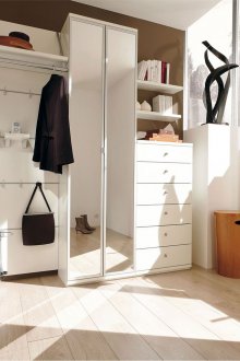
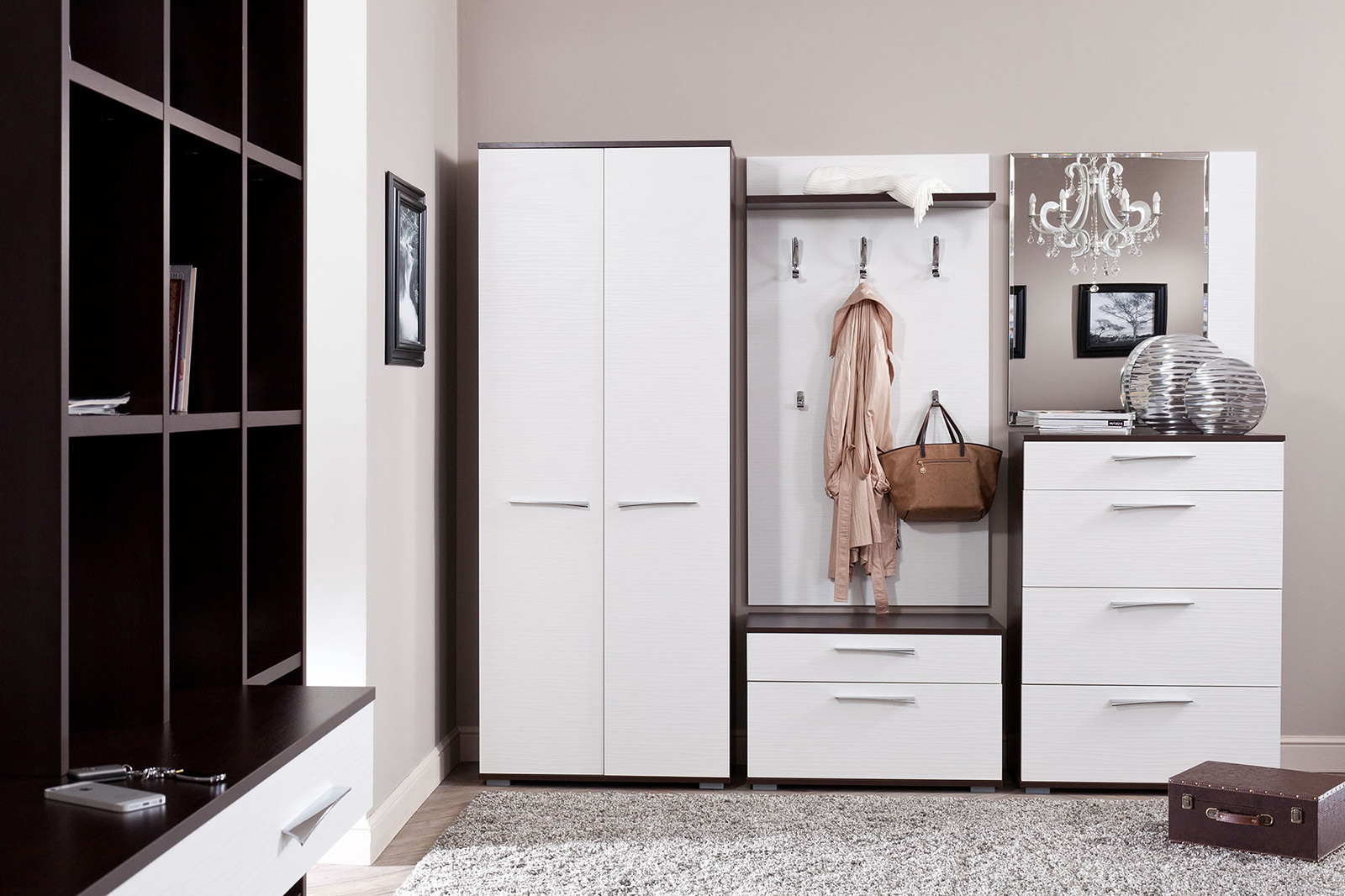
First of all, this is a sliding wardrobe: it takes up a minimum of space, containing a lot of things. As an option, a combination of the open part with hooks for seasonal outerwear and the closed one is used, where things that are not used during this period are stacked.
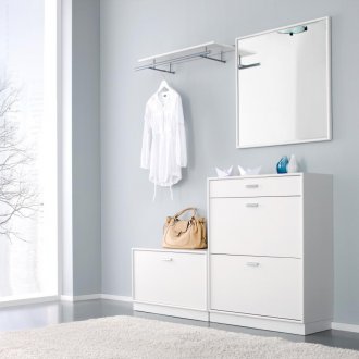
The dresser in the hallway with all its many drawers is indispensable; a special shoe rack, shelf or console table, a soft ottoman will come in handy.
Finishing materials
The hallway is a place of increased attendance, but, for example, white furniture for the hallway adds a touch of color, so the materials here are practical, easy to clean, but high-quality, on which scratches or stains, if any, are not often noticeable. They should be combined in color and texture: discrepancies in a small space will appear immediately and will negate all the beauty.
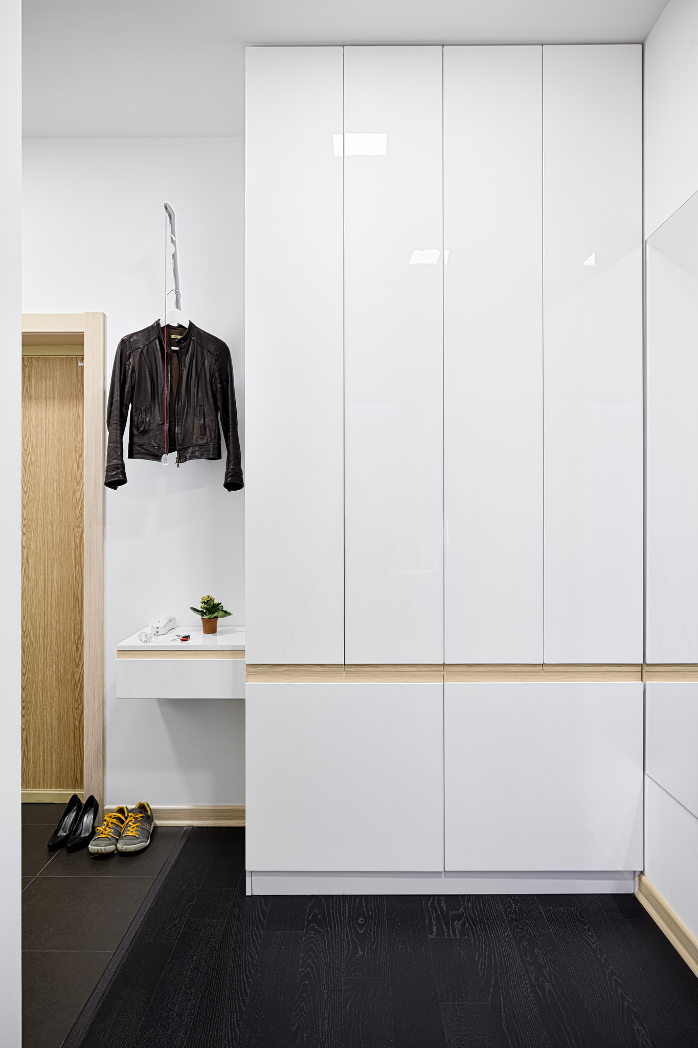
The glossy hallway is very elegant: solemnity and solemnity itself, but the overabundance of brilliance is tiring, especially if it is complemented by a mirror. It is enough to arrange either the facades of furniture or the walls, and not all at once.
Floor
Linoleum or tile in the hallway are considered the most suitable. A covering imitating a tree or a stone in a hall is appreciated for its practicality. Tiled floors look impressive, but white tiles, other bright options make inevitable increased care. If there is no readiness for this, it is better to choose a less easily soiled version of the tile. Laminate is not very suitable, because it is badly affected by intensive cleaning, which is inevitable in the hallway.
Walls
The usual solution for most apartments is wallpapering. Not ordinary paper types are suitable, but those that can often be wiped or washed. The decorative textured plaster of gray-light shades looks very advantageous. In addition, it does not require special care.
Oak has earned a good reputation. Panels made of bleached wood - the best solution. Their solidity will be softened by mirrors.
Ceiling
It is made in two versions: classic white or the main color with a hallway.Another difference: dull or gloss.
White hallway
A festive option, although practical people white hallways are not particularly in demand because of the increased marquee.
Walls, floor, ceiling
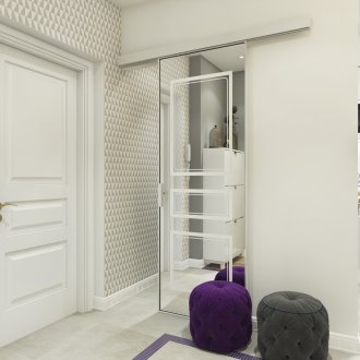
The stylized walls look like white brick in the interior of the hallway, a relief canvas with the same white pattern or with ornaments of a different color, for example, gray-smoky, looks organically. You can choose color wallpapers, and leave only furniture and accessories white.
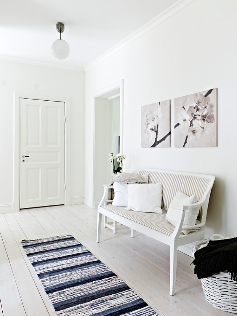
The room with the white floor is very beautiful, especially glossy, but the slippery gloss for the hallway is not very suitable. Practical matte surfaces are safer. Covering from bleached oak, light northern wenge, tiled styling of natural stone solve all problems. If you don’t feel like tinkering with the tiles, linoleum is suitable: white, gray-blue or in the color of the decor.
To significantly increase the space, a white hallway in a modern style receives a shining ceiling. A large mirror on the cabinet or wall will support this white gloss effect.
Furniture
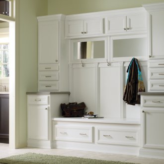
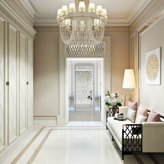
The white version may look bulky, especially the white overall sliding wardrobes in the hallway or chest of drawers. Making them more elegant is able to finish the appropriate color. The corner models are almost invisible, but they are made in the same decor as the main wardrobe.
Smaller things: a shoe rack, a fragile console table, a small ottoman can be both pure white and combined. It all depends on the tastes of the owners.
Color
To prevent the premises from causing undesirable associations, the design of the white hallways provides for diluting the white background with color accents. In the decor of rooms of different styles, they are different:
- gold, blue - classic;
- black - minimalism;
- red - avant-garde, modern;
- brown or green - eco;
- gray-white, metal - high-tech.
Experts believe that in any case, the entrance hall in white should be decorated in no more than three colors: white for the walls, light wood on the floor (preferably oak or wenge), just a little dark so that the room does not “float”.
Hallway Provence
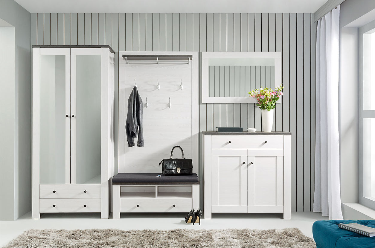
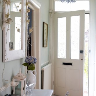
Hall in the Provence style suggests white wallpaper in the hall: clean or with a barely noticeable pattern in the main colors of the style. There should not be more than three. Furniture made of wood, simple shapes, reminds rural. For her, bleached oak is often taken. If funds allow, furniture from light wenge is bought.
The decor is white or in a very light gray and pastel color scheme: white cabinets plus colored inserts or fragments. The console table is also acceptable, but in a more solid than usual design, so as not to violate the style.
Red hallway
The red hallway is a popular, albeit non-standard solution. Red embodies energy, movement, appeal. This in itself is wonderful, but an overabundance of a bright shade causes concern, even suppresses, therefore the main thing in the design of the hallway is the exact dosage of red, combining it with more calm colors. Modular hallways are especially valuable here, the bright segments of which are arranged throughout the room, rather than in a solid array. There are a few more rules:
- For a large entrance, red walls and a ceiling are permissible. In a more modest corridor, there are fewer bright surfaces.
- If the walls and ceiling are red, then the furniture is needed in neutral colors.
- The furniture is decorated in bright colors with the walls and ceiling in light shades.
For each style, its own shade and materials are selected. In hi-tech, this is rich red with gloss, modern hangers and metal fittings. The classics are harmonious in the color of wenge, with furniture made of precious wood (for example, oak).
If completely red walls are unacceptable, but such a color is desirable in the interior, classic hallways may have separate noticeable elements. That is, light walls and ceilings are fragmentary decorated with bright stickers. They are complemented by the same juicy ottoman or shoe rack.
One of the most popular duets is red and white.Against the backdrop of the bright walls, a snow-white stand-console or elegant white banquette look in a new way.
Black and white hallway
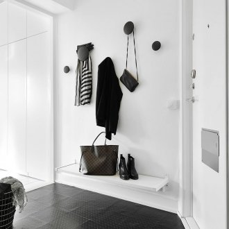
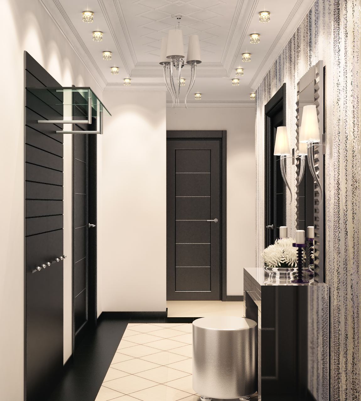
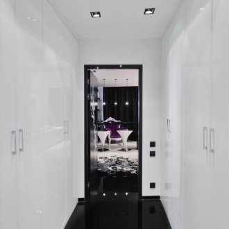
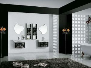
Black-and-white anteroom suggests two design options, depending on the size of the rooms. Small will increase the predominance of white, large will add style to the black dominant. It is necessary that any one color prevails, an equal ratio makes the interior too colorful. Although the corner models from the isometric black and white segments look chic. The color ratio of 50X50 is acceptable in accessories:
- a hanger in the hallway with a white base made of wood and black hooks or vice versa;
- shoe rack with alternating shelves in color;
- console table with different countertops and legs;
- ottoman with halves, top and bottom of different colors or in another pattern.
Hallways are almost always small, so white is taken as the basis, it is difficult to achieve harmony with black. The only black option that visually expands the space is gloss. It makes the floor or ceiling larger, as if lifting the latter.
If whiteness is selected for the ceiling, it is underlined by a black border, overlap or pattern. Using the same method, they draw up a white wardrobe in the hallway and other furniture.
It is better to make the floor dark and the areas directly adjacent to the front door: this is the most easily soiled place.
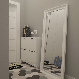
The floor in the hallway may not be completely black, but in the form of a mosaic or two-tone pattern. If funds are available, a combination of bleached oak and black wenge in the array is selected.
Modular designs
Modular halls are a real salvation for owners of small or non-standard premises. Any item can be installed exactly where it will be in place. Corner options are more compact, and perpendicularly located mirror facades create interesting effects.
However, the modular design has one major drawback. It should be installed on the floor, perfectly aligned, otherwise the modules will not fit together tightly, they will “lean” on each other, which is unacceptable for furniture.
White, red, black-and-white or a hall in another non-standard design will add variety to boring everyday life. Upon entering such a house, even the darkest mood will disappear, giving way to optimism and confidence.
