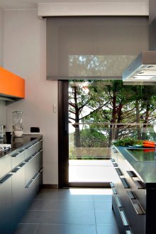
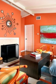
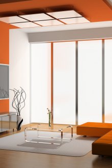
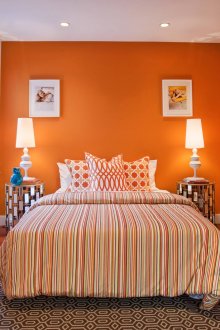
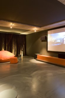
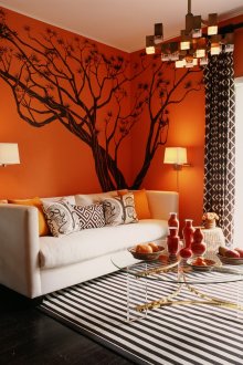
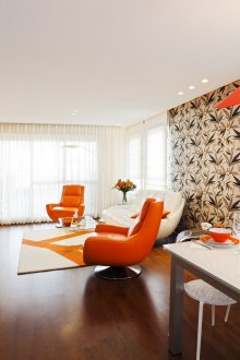
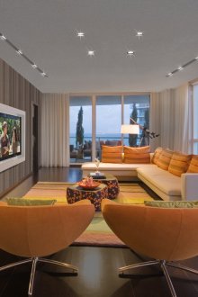
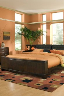
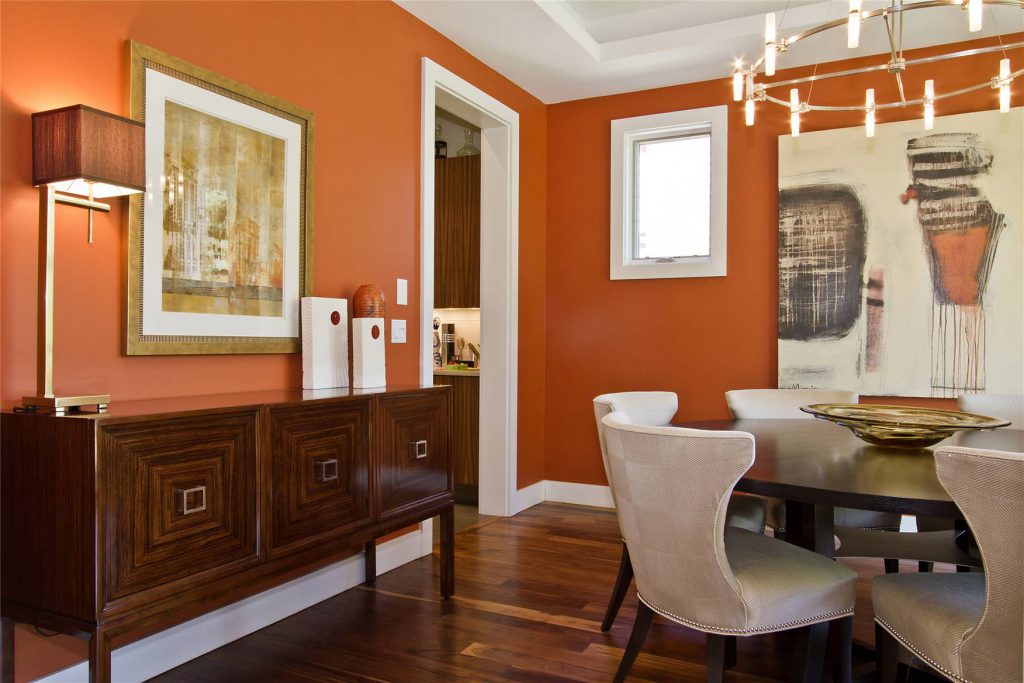
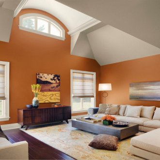
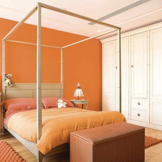
Orange color in the interior (43 photos): a variety of shades and combinations
Content
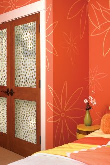
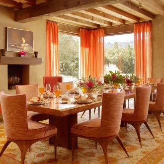
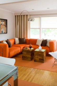
Such a bright and warm color as orange is not often used in interiors. And in vain. Even several elements of any shade of orange will add warmth and coziness to any interior. The palette of orange has collected all the warm shades: from soft sand tones to bright fiery ones. Giving preference to this particular color, you should remember about its features.
- Any shade of orange will always stay warm. Because of this, it is quite difficult to combine with cold flowers and it is desirable to combine it with warm colors.
- Any object of this color will involuntarily attract the eye. The same applies to any element of the interior: walls, furniture, carpets, and more. This is suitable for creating an emphasis, but not to hide the flaws of the room.
- Saturated variations of this color displace all other colors from their surroundings. This is due to the fact that orange immediately attracts attention to itself.
- Orange makes any subject more voluminous.
- Many shades of orange are used in ethnic interiors: Japanese, Mexican, Moroccan, minimalism.
- Such bright walls where reddish wallpapers are used and small rooms are not compatible. Psychologically, this is a powerful color and will not cause comfort. It will be enough to add a few elements from this palette.
- This color is ideal for uplifting. This is an active color that gives impetus to new creative ideas, vitality, infusing new energy. Apathetic people are recommended red-yellow wallpaper in the workplace.
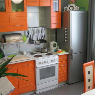
- Kitchens decorated in these colors increase appetite. And in the lounges, orange should not be used, because it will not allow you to fully relax. In very hot rooms, it should also not be used.
- Orange is a combination of two colors: red and yellow. From the first, he took activation and stimulation, but is not as aggressive as red. From the second - warmth, a feeling of happiness and well-being at home.
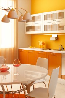
Given all these features, you can choose the perfect combination for any room and at the same time it will look harmonious and bright. It is recommended to add this color to the northern cold rooms. This color is ideal for the workspace, nursery, bath and kitchen. Orange color in the interior is necessary so where there is not enough positive and energy.
Freshness of white and warm yellow-red
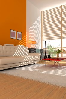
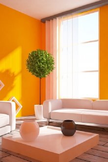
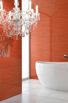
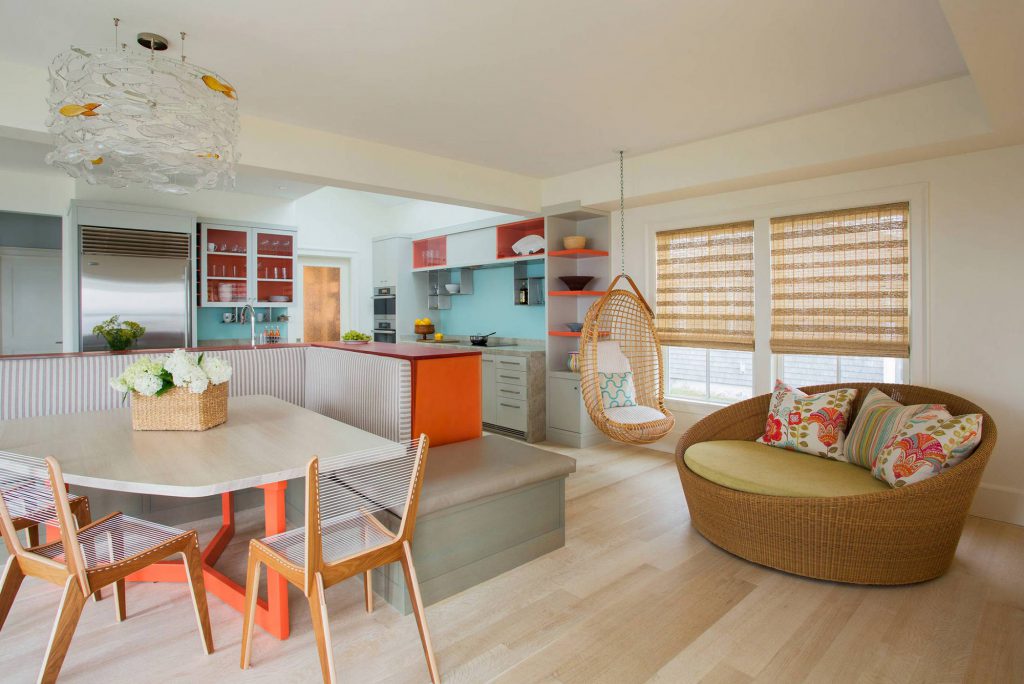
Pure white color will express as much as possible any shade of orange, creating a cheerful sunny environment. This combination will create a festive mood every morning, such wallpapers will be appropriate in the kitchen and in the living room. It looks fresh and original when designed in a minimalist style. This option is great for the bathroom, where white will express the purity of the walls, and bright orange to fill with energy for the whole day.
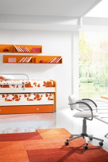
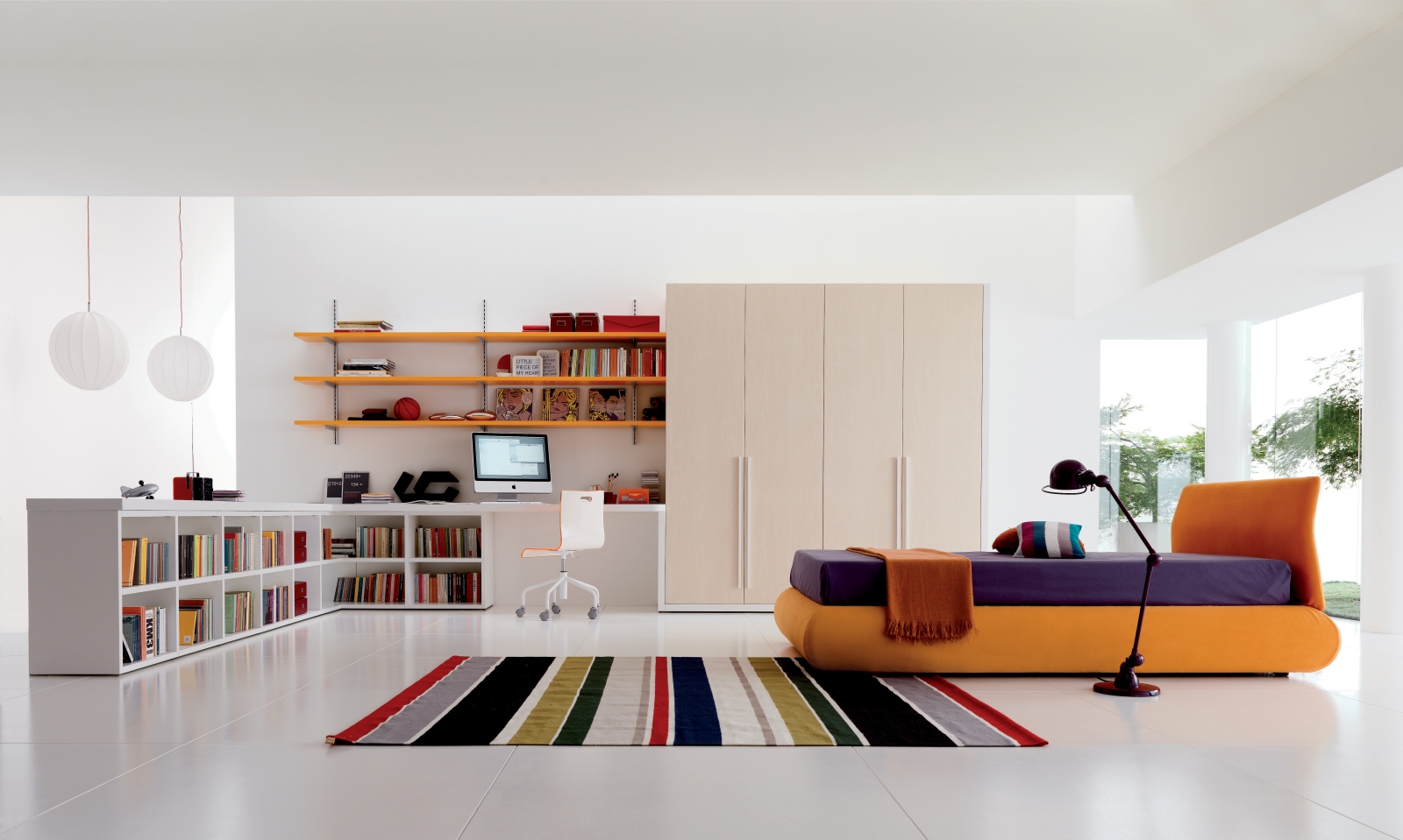
Shades of such a bright color are often used in children's rooms, because orange is very suitable for active kids. White will allow you to slightly reduce the activity of the baby and help concentrate. Thanks to the addition of white, you can reduce the excessive energy of the room, which is good for bedrooms and living rooms. Shine of orange will help to wake up, and the coldness of white will allow you to relax and fall asleep.
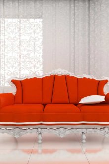
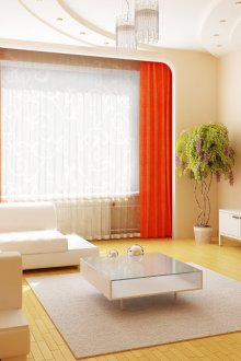
Bright and slightly crushing red-orange, not all guests may like it.However, white will soften the atmosphere at times, and the room will become more comfortable for everyone. It is advisable to use the orange color in the interior of the living room for emphasis, rather than the dominant color.
In all seriousness of black
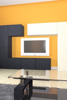
The red-black combination is classic, but very difficult for the interior. The same applies to the orange-black tandem. They look good when accented, but only very active and self-confident people take risks to style the whole room with these colors. Thus, you can design a kitchen under the hi-tech style, but for bedrooms and children's rooms is contraindicated.
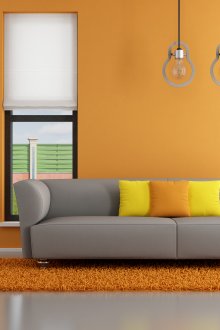
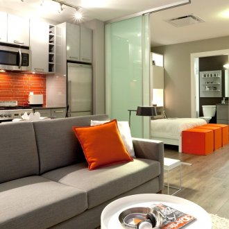
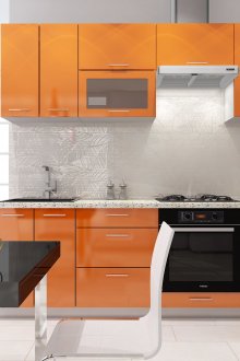
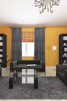
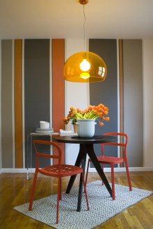
It is much more harmonious and more pleasant to combine a bright orange color with a calm and seasoned gray. Any saturation of gray will somewhat extinguish the activity of the fiery, and this repayment will be very harmonious and natural. In such an environment, both active and calm individuals will feel comfortable. These colors are also suitable for the kitchen, if you want to moderate your appetite.
A search for brown and the brightness of red flashes
Brown of any saturation looks incredibly consistent with all shades of red and yellow. It is this combination: brown and carrot, that creates warmth and soft energy. It is enough to recall an orange with chocolate to immediately feel all the comfort of this combination. Brown can be very saturated, almost black, or very soft on the contrary. Such walls will look expensive and sophisticated, but not as oppressive as with black. Light brown will be more comfortable than sterile white. You can still add shades of gray to such a duet, muffling excessive bursts of bright tones.
For the workplace, a brown background with a bright orange pattern is great. In the living room you can make one of the walls red-orange, and the rest put on a brown tone. This will create a feeling of comfort and good mood.
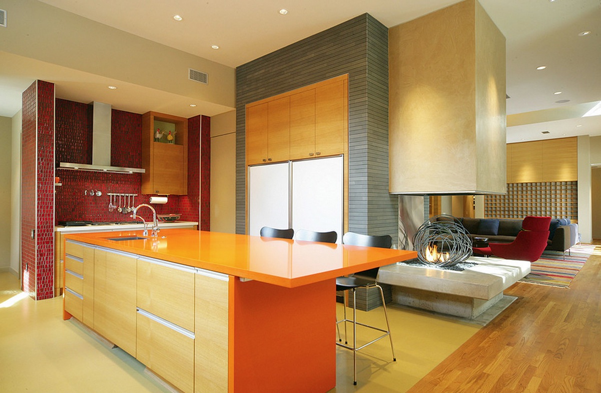
Thanks to such a harmonious combination of these colors, orange goes well with natural wood. Adding wood panels to the interior of the apartment, there is a feeling of high cost and naturalness. A tree can be very light tones or dark brown, this coherence can not be broken. Also, the tree is often used to decorate the kitchen, where brown returns to nature.
Synergy of orange with green
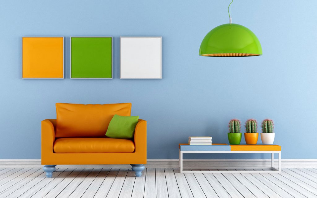
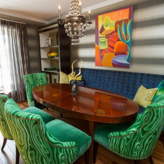
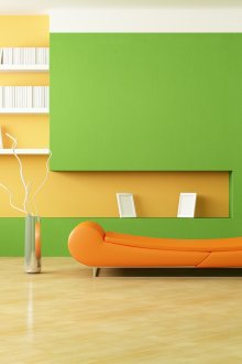
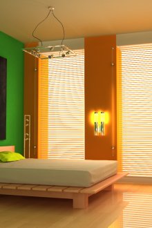
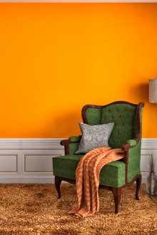
Green-orange combinations lead to thoughts of southern fruit trees - tangerine groves, orange orchards. It is these associations that lead to the use of these lights for the kitchen. And for lovers of exotic relaxation and for the bathroom. Such a color palette, despite its brightness, is unobtrusive, in contrast to red. Green wallcoverings work well with the orange kitchen floor.
After playing with shades of green and orange, you can find a good combination for the nursery, which should be filled with comfort and tranquility. The children's eyes should not be tired of the catchy pattern of the walls, here we prefer more unobtrusive prints and drawings. If a children's room also performs the function of a children's bedroom, and not just a playroom, then green should prevail in such a room. Orange can only be individual elements. This has a good effect on the development of the still unstable psyche of children, especially if symptoms of hyperactivity are observed. Lighter tones of orange paired with green will improve the situation with the children's nervous system.
Green-orange kitchens have an appetite, but with a penchant for proper food. Specialists in the ancient Chinese art of Feng Shui claim that the presence of a large number of green walls in the kitchen arouses the desire to eat salads and plant foods, while orange optimizes the appetite. And this dual action is useful from the point of view of nutritionists.
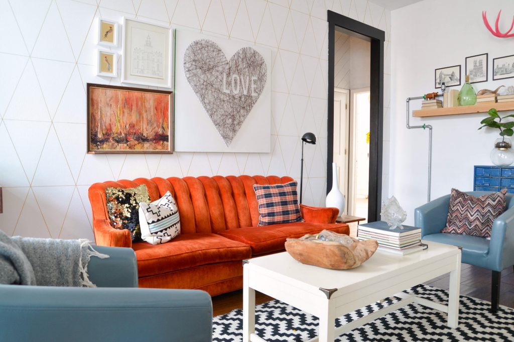
Aesthetics of orange with blue
This combination has never been too popular.But it’s very undeserved! Choosing just such a gamut of colors for an apartment, you will never find yourself in the mainstream. This combination is ideal for children's homes. The obvious gradation of color temperatures does not introduce an imbalance at all, but, on the contrary, pacifies and awakens creative abilities. No wonder it is impossible to take your eyes off the picture of the evening sea horizon against the backdrop of the setting sun, and this is such a color scheme! Of course, it is more correct to choose more muted shades for children's contemplation.
In other rooms it is quite possible to use juicy shades of orange with blue. For the kitchen, you can use the image of a waterfall at the sunrise of a new day. Looking at the wall covering in the bathroom with such a combination, we observe an amazing effect - the colors, complementing each other, become more saturated. Use either special water-repellent wallpaper in the bathroom, or for fans to steam in clubs of fragrant steam, it is more rational to give your choice to the tile on the wall surface. And this will give additional opportunities to create, surrendering to the flight of his design imagination. With often high humidity in the bathroom, the combination of shades of sky blue and calm orange will seem much brighter than it is, you need to consider this when choosing materials for repair.
Are you ready for clever tricks? Then intensify the shade of blue towards purple or turquoise and you will see how the result changes! Brightness will no longer amaze the eye, however, the saturation and positivity of the atmosphere will remain, and in the case of turquoise, orange will even win.
The orange color is the warmest in the spectrum, it is located second, after red and before yellow, bearing the properties of each of them. It is very bright and interesting, do not be afraid to bring it into your interiors, but be careful: like fire, it can burn, or it can warm in bad weather or during a period of vital turmoil.
