
Rules for combining white in the interior
The white background in the interior of any room looks good due to the effect on the room. It adjusts the size, or rather, visually increases the space. In general, this is one of the main reasons why white has become so popular lately, when not everyone can afford spacious housing. But what does it mean for people? This color cannot be attributed to either warm or cold colors, it is neutral. Due to this, it suits absolutely everyone, with a favorite type of temperament, taste and attitude.
Pure white interior
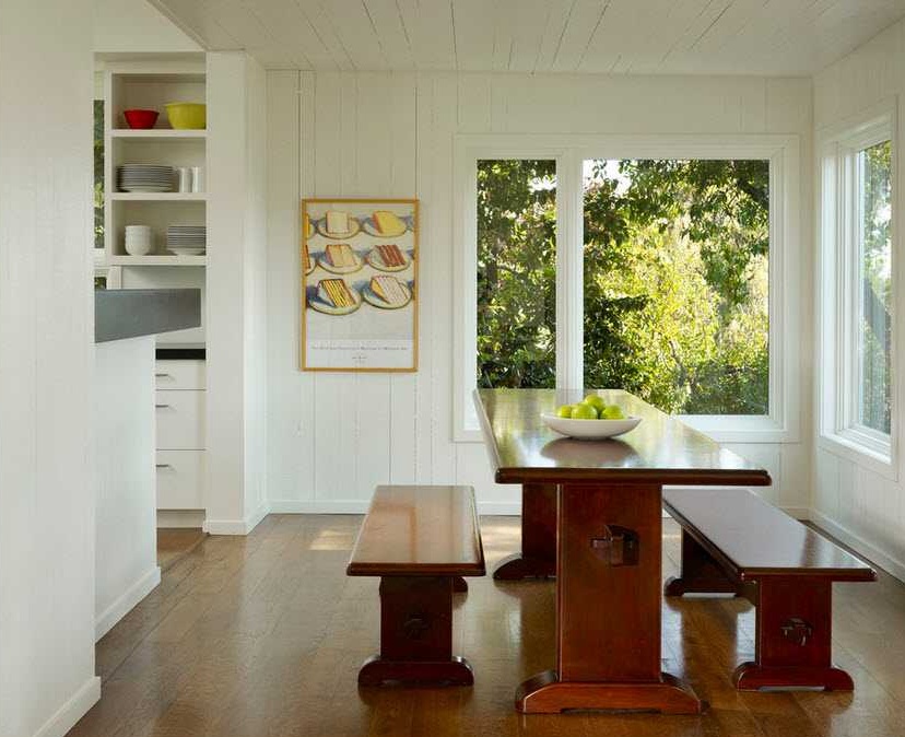
If we talk about a purely white interior, it looks very static, that is, motionless, so that such a room does not look dull, like the Snow Queen’s castle, we add some liveliness, that is, dynamism. To do this is simply through the use of objects of maximum complex and original forms. For example, unusual figurines or ikebana from branches in a vase.

A variety of elements, curls, carvings will also help to achieve a dynamic effect. How? Everything is very simple, all of these elements will create a play of shadows and lights, and it will look lively and comfortable.
And if curls and carvings are not to your liking, then you can diversify the interior by adding an interesting texture. For example, walls covered with rough material, fluffy pillows on sofas and chairs and so on. All the same game of shadows works here, which will save the room from boring monotony.
Lighting in a white interior
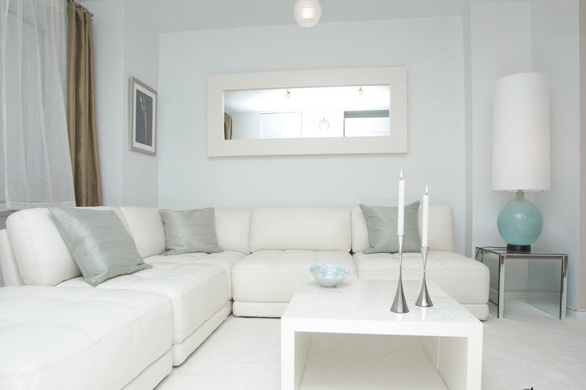
For any room, it is important to choose the right lighting, but for white it is especially important. When arranging the elements that will create our game of shadows, make sure that the light from the window and from the lamps falls correctly, otherwise unpleasant shadows may appear, creating a gloomy sensation. Here you need to experiment all the time, turn on the light, vary objects, changing their location, and observe how and where the shadow falls. With daylight a little more difficult, you have to adapt to different times of the day. Another little tip: be careful with the color of the lighting. If, for example, you want to use yellow light, you need to know that this will overly warm the atmosphere and the whole effect of a snow-white room will disappear. A blue light, on the contrary, will make the interior too cold. In general, try, experiment, white is a universal and multifaceted color.
But not everyone decides to use pure white color for their interior, this requires courage. Therefore, many prefer shades of white, for example, ivory, coffee with milk, baked milk, cream, the color of snow, cream, mother of pearl, natural linen and cotton.
Milk and Cream
One of the shades of white that are often used in interior decoration are milk and cream tones. They blend beautifully with soft bed tones, as well as materials of natural origin, such as linen, cotton, wood and wild stone.

And now about the combination of white and other colors
What I want to note is the atmosphere that this color creates. In a bright room you feel a certain luxury, chic. By the way, in the 20s, when the white interior was just beginning to gain popularity, it was widely used by very rich people to show their well-being. In addition, this color creates wonderful alliances with all other colors, helping them to open.
Black and white
The classic tandem, long rooted in our lives, is a combination of white and black, or rather, a white top and a dark bottom.Regarding the interior, this helps to enlarge a small room, but also to adjust too spacious. In addition, it looks very elegant. Here one can feel overt strictness and laconicism.
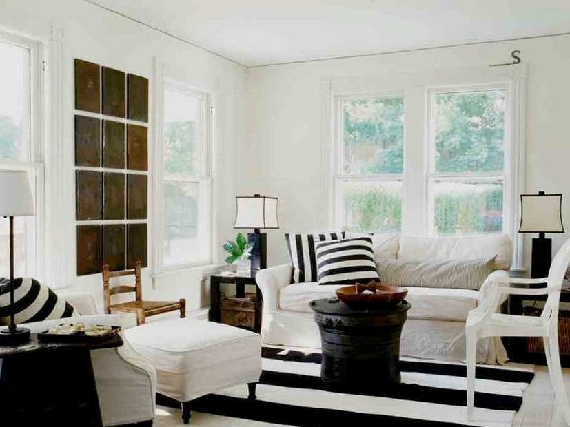
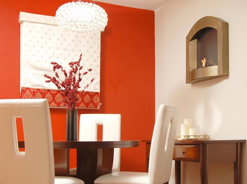
In this design example (in the photo below), a bright detail is added - part of the wall in dark orange. It brings in a bit of a sunny mood. In general, when choosing neutral interiors, it is recommended to add elements of warm tones rather than cold ones. This makes the atmosphere more lively and inviting. Although, it all depends on the preference of each person and the role that he gives the room.
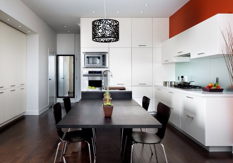
White and orange
For those who need a bright mood, an orange accent in a white room is the best fit. He envelops in his warm influence and creates a feeling of freedom, joy and even wealth.

The closer the orange tone to the red, the “warmer” it becomes in the room, and the mood is more fun.
White and purple
If you add a touch of purple to the white interior, the room will immediately acquire a new status. That is, the cold power and mysticism of violet will join the nobility and luxury of the white background. Here the atmosphere of something unreal, mysterious will reign. In such a room, people with creative potential who need sobriety of mind and breadth of imagination will feel good.


The saturated violet color added to the white bedroom will favorably affect the dream, it will be pleasant and calm to fall asleep.

Often, several bright colors are added to the white interior at once.
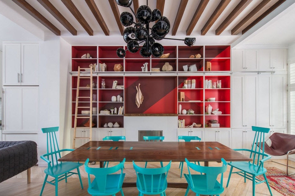
This photo shows the design, where the accents are: red, burgundy (as a shading element) and bright turquoise and all this on a white background. What is it? Red excites us and encourages us to act, turquoise personifies the calm of the sea. Why use two such opposing influences? The fact is that it is not in vain that they are represented precisely in an environment of white color, it very successfully unites them and even neutralizes them to some extent, making up a certain line between activity and peace. On the example of the dining room, this can be seen in a good, but moderate appetite.
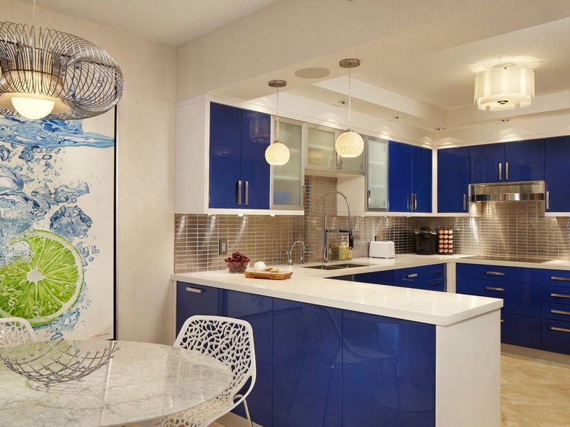
And in the kitchen, this can affect the mood to experiment in cooking.


In the white living room, the turquoise chairs around the transparent table will create a small oasis. What is this talking about? The fact that with the help of color variations and the correct use of contrast, you can make zoning, but not just dividing the room into parts, but creating a completely different atmosphere in it.

Adding green color to the white interior, we get a more relaxing environment. After all, the white color is a bit harsh, and if we are talking about a bedroom, then here it is simply necessary to bring something that has to rest. But not a very good choice would be bright shades of green, such as lime and lime. Their acidity will not let you sleep peacefully. Therefore, it is better to take the main green color or a tone lower, that is, a darker shade.


With regard to the kitchen, they also act that is, they choose more calm tones of green, since in general any juicy color in the kitchen does not affect the appetite too well.

But for other rooms in white, you can take any shades of green, this in any case will make a relaxing effect.
White and blue.
This is the most icy combination of colors, in such an interior it will be comfortable only for those who basically like this cold atmosphere. But here, of course, there are advantages: the brain will always be clear.
You can add red warmth to the white-blue interior, this will allow you to relax a bit and feel more relaxed.

What can be said about white? He is unique! This is the only color that is good both on its own and with any other color. It is the color of purity and innocence, as well as the beginning of something new.


