Orange and its combinations
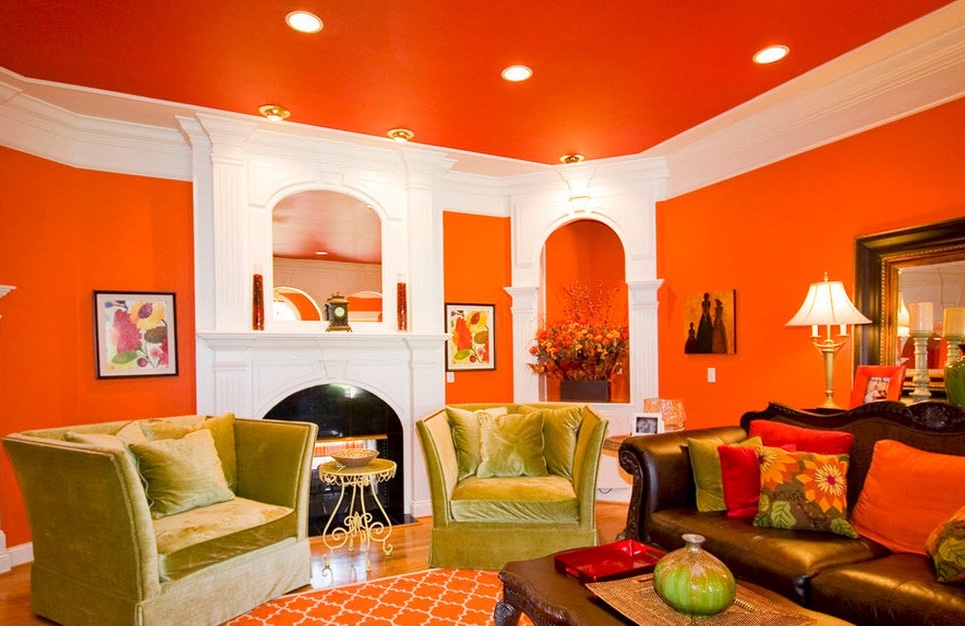
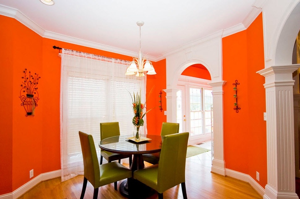
Orange is the warmest color in the palette, and the point is not that it is not warmer, it simply will always remain so regardless of the presentation and combination with other colors. It is possible, of course, to make it a little less or hotter by playing with its shades, but if other colors, depending on the design, can be either warm or cold, then orange (like blue, by the way) never changes its temperature position. Therefore, such an interior is perfect for cold climates, in any damp or cool weather, the orange interior will be warm and sunny. But it is worth considering that if the window of the room faces the sunny side, and even more so if the climate is hot, here you need to be careful with the orange color, otherwise there is a risk of making the interior too hot. Although lovers of the tropics are not scared.
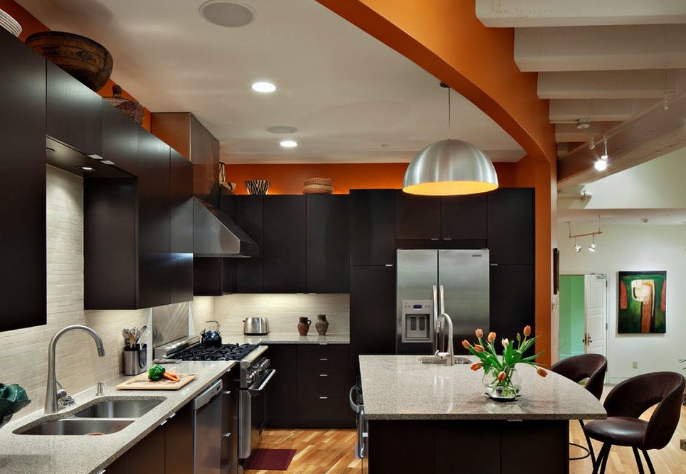
Of course, this sunny color will fill any interior with a charge of energy and good mood, which is perfect for the kitchen, it will be a great start to the day.
Of course, orange motifs are also good for other rooms, especially if you skillfully combine them with other colors and shades.
In combination with white
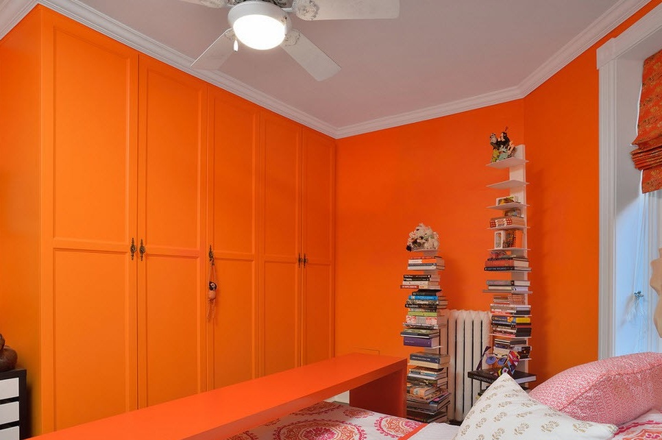
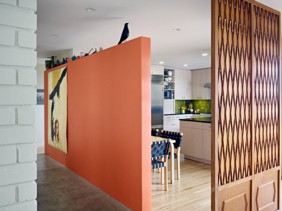
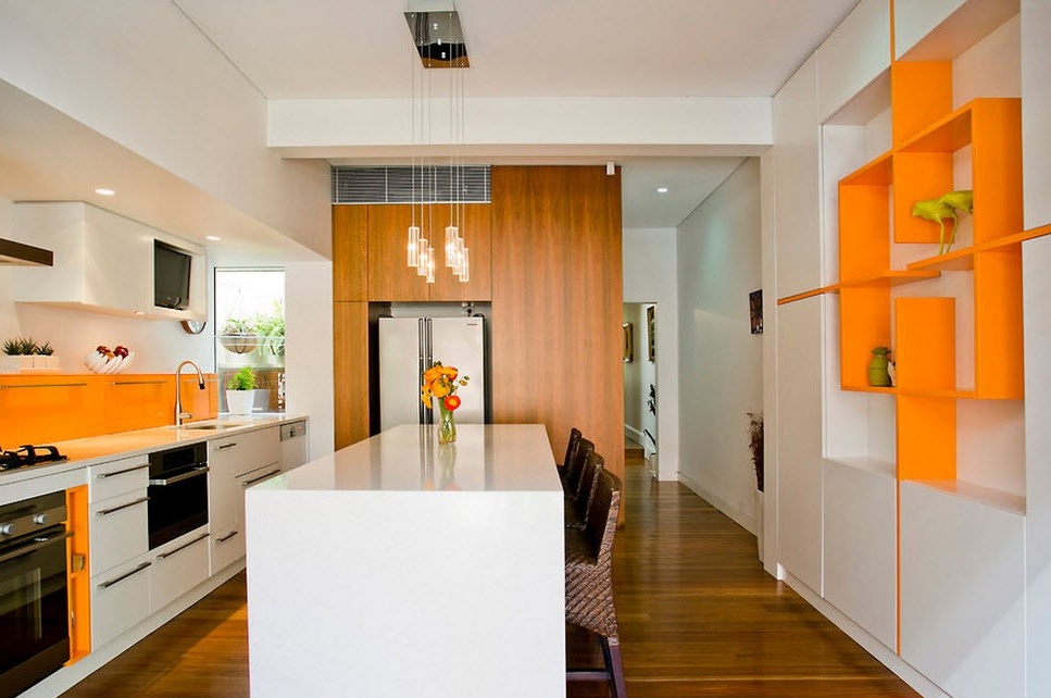
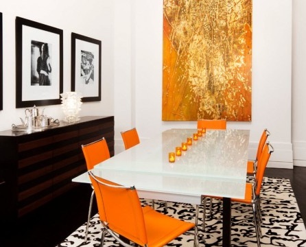
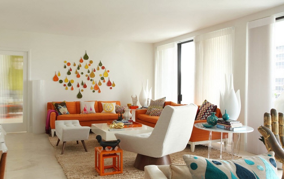
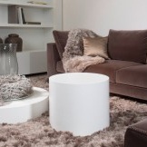
The sunniest mood will be in the orange and white interior. Exactly white color emphasizes the expressiveness and brightness of orange. Here will always reign a lush and festive atmosphere, charged with inexhaustible energy. Perfect for minimalist style kitchens.
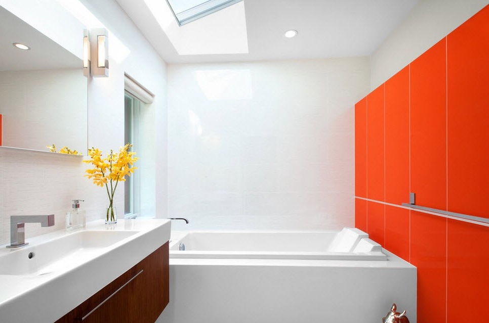
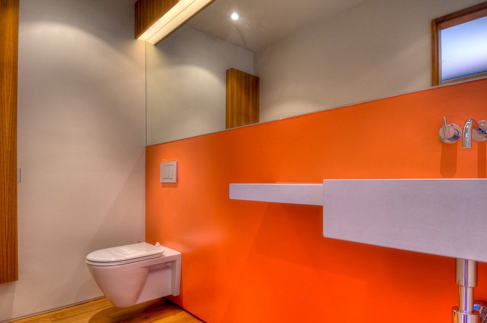
It’s also good to use these two colors in the bathroom: the cleanliness and sterility of the white will be as if recharged with the energy of orange and invigorate in the morning.
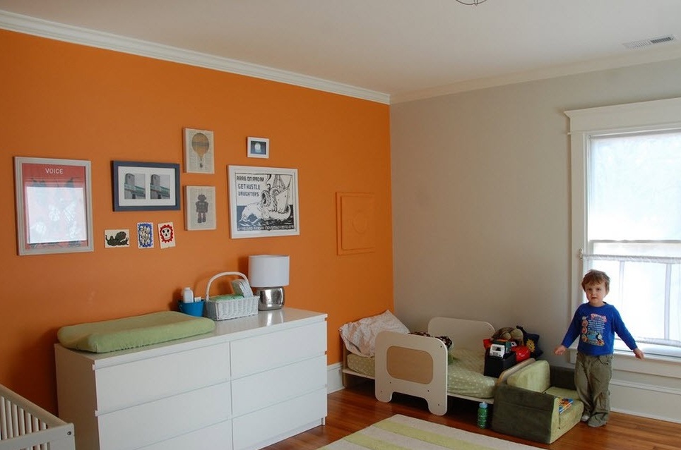
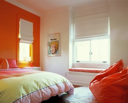
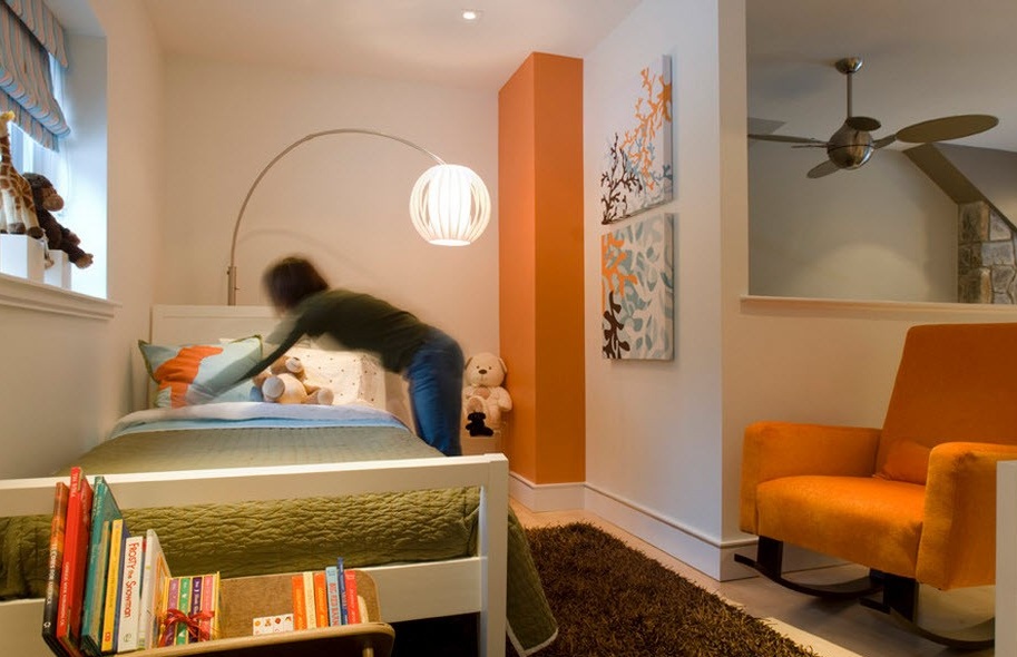
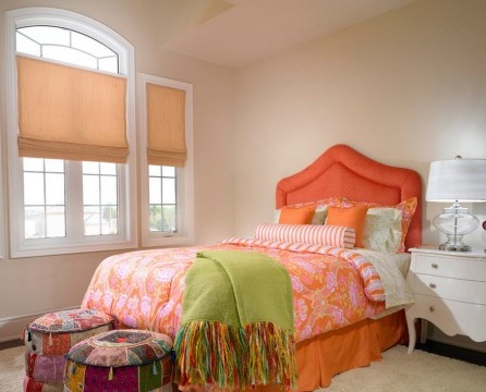
For the children's room, the use of this union will have a beneficial effect on the development of the child. In the room, the baby will be comfortable, fun, but not too much, since white will still neutralize the intensity of the orange a little, which is very good for children, otherwise it will lead to hyperactivity and inability to concentrate.
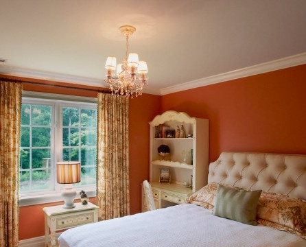
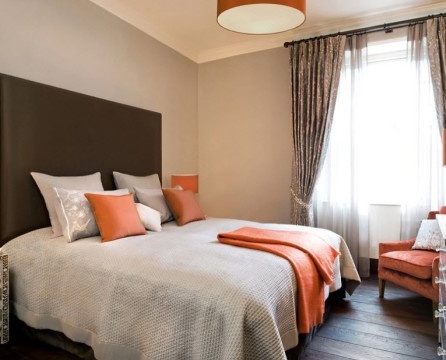
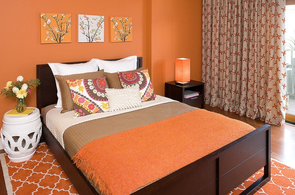
Regarding the bedroom, it can be said that the orange color will envelop you with pleasant and soft coziness and a sense of comfort, invigorate in the morning, but so that you can easily fall asleep at night, it is better to add white.
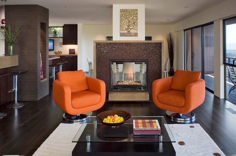
In general, everything is built on the temperature balance. The orange interior itself is very warm, but by adding white, you can make it more moderate. And, accordingly, the more orange, the warmer the situation and, conversely, the more white - the calmer it is. The latter, by the way, is more suitable for living rooms, since for the reception of people with different temperature preferences, it is better to choose a neutral setting and add a little warmth in it in the form of orange accents.
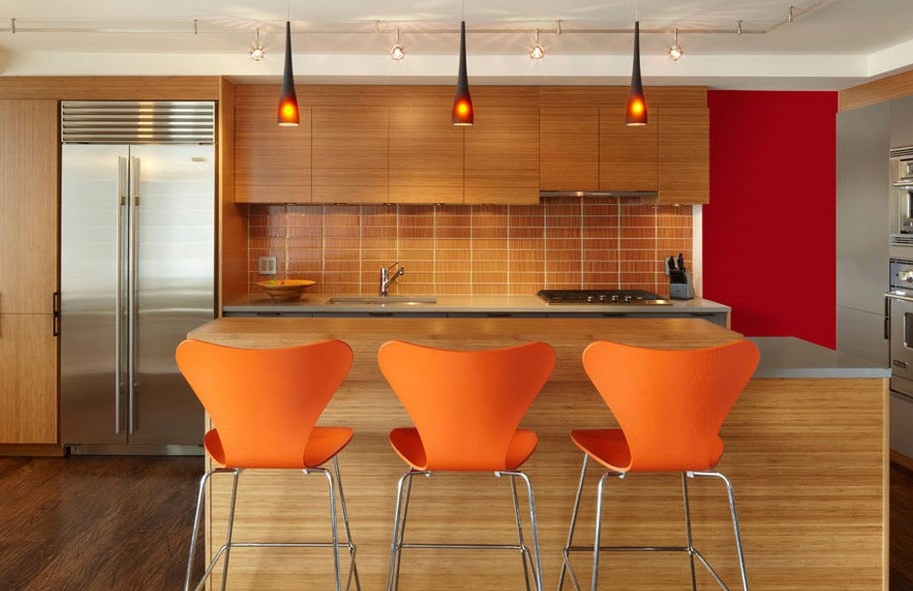
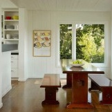
Tree From time immemorial it has been a symbol of comfort and harmony, but, besides this, it also has the ability to balance the activity of the orange color gamut. And it turns out a very harmonious atmosphere, filled with natural naturalness.
A tree can be in a close tonality with orange, or much darker than it, or both can be, most importantly, it will always be comfortable here. That is, it is such a harmonious union that any shades of wood will fit perfectly. In addition, there is no need to add other colors, they only spoil the magnificent image, except that a little white in the form of an accent.
At the sight of green-orange interiors, an image of an orange tree is immediately drawn in the head. It is this natural association that makes this duo often used for decorating rooms that are as if filled with this sour-sweet taste, covered in lush greenery. By the way, such a combination may remind someone of the mandarin, which will be sweeter - it's a matter of taste. But what is so good about this combination of colors is that it is more comfortable and unobtrusive, in contrast, for example, from the union with red.
But varying the shades, you can make the interior not so juicy and bright, which would be too tedious, for example, for a children's room. For children, this is also a good combination, since everything connected with nature has a positive effect on them, but it is preferable to choose more calm shades, especially for hyperactive children.
In the kitchen, green-orange motifs will have a good appetite. Feng Shui experts believe that if there is a lot of green in the kitchen, then you will want to eat more salads, which is useful. You can think of yourself that the presence of orange encourages the use of oranges and tangerines, it is also very useful, most importantly, not to allergies.
Orange and Brown (Chocolate)
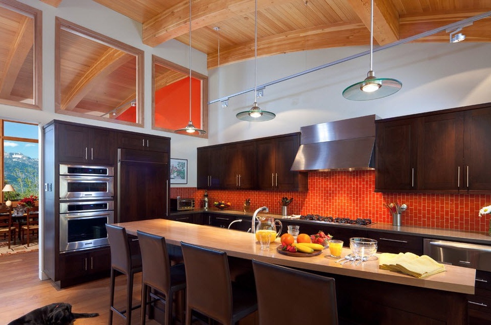
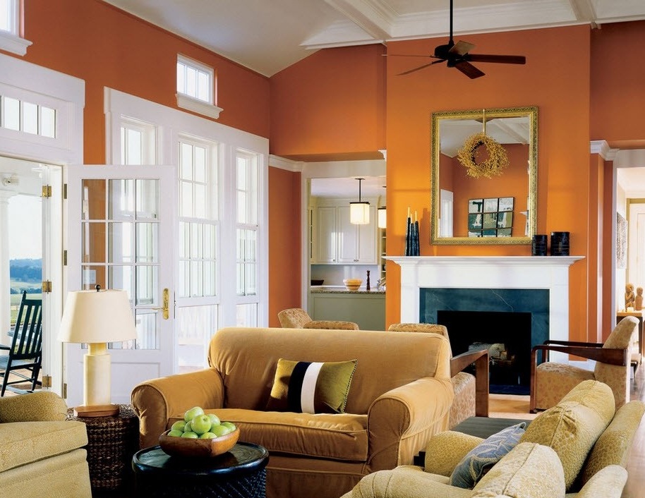
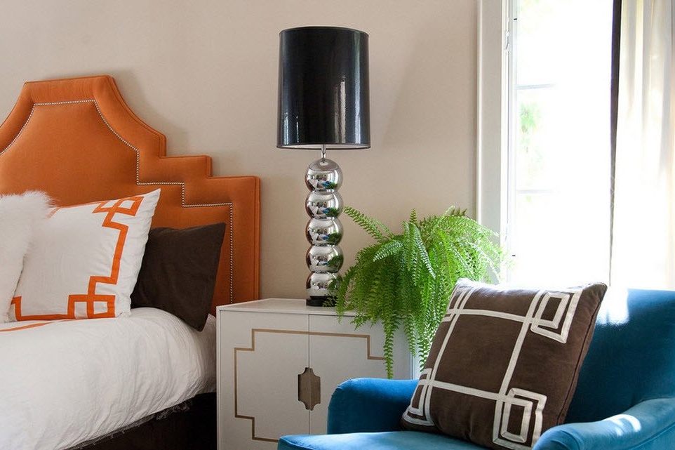
This is a very harmonious and balanced combination. It is suitable for people who want to make their interior warm, cozy, but also energetic. There will be no disharmony in such an interior, no matter what shades of orange are taken, they all blend perfectly with chocolate.
To saturated orange, they often take a chocolate color, which reaches a glossy black. It looks somewhat strict, but solid. In this option, it is worth adding light surfaces, you can have a grayish tint. And the use of black not only in this case, but, in general, with a brown-orange gamma is not desirable, this will lead to a compatibility conflict.
Despite the positivity of the orange color, few dare to make it dominant in the interior - still it is very warm, even in conjunction with neutral colors, such as brown. But do not forget that there are softer shades that even in the form of a background will not make the room too bright. And brown will further soften the energy of the orange.
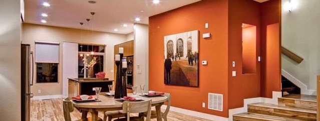
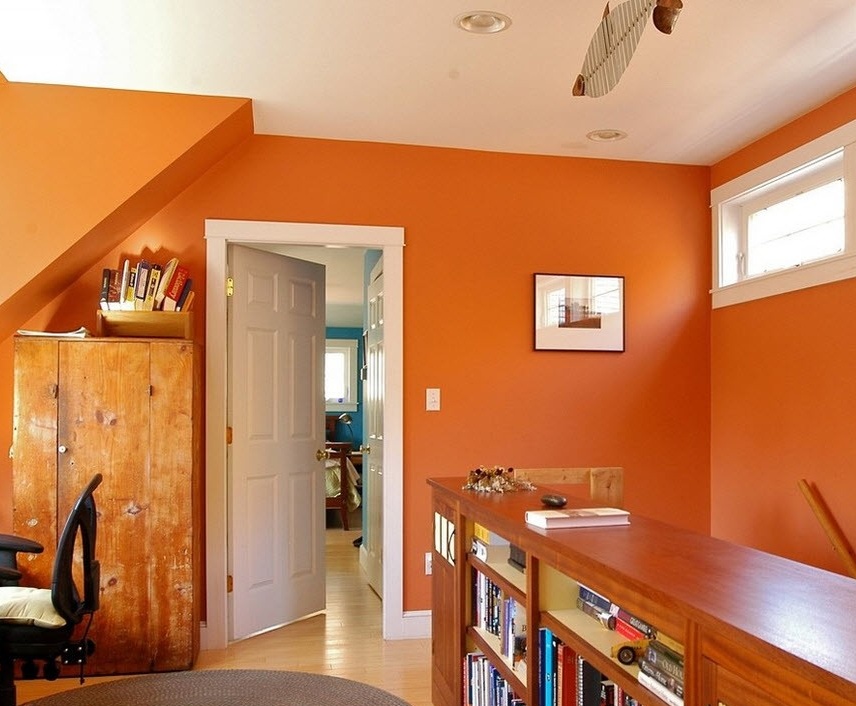
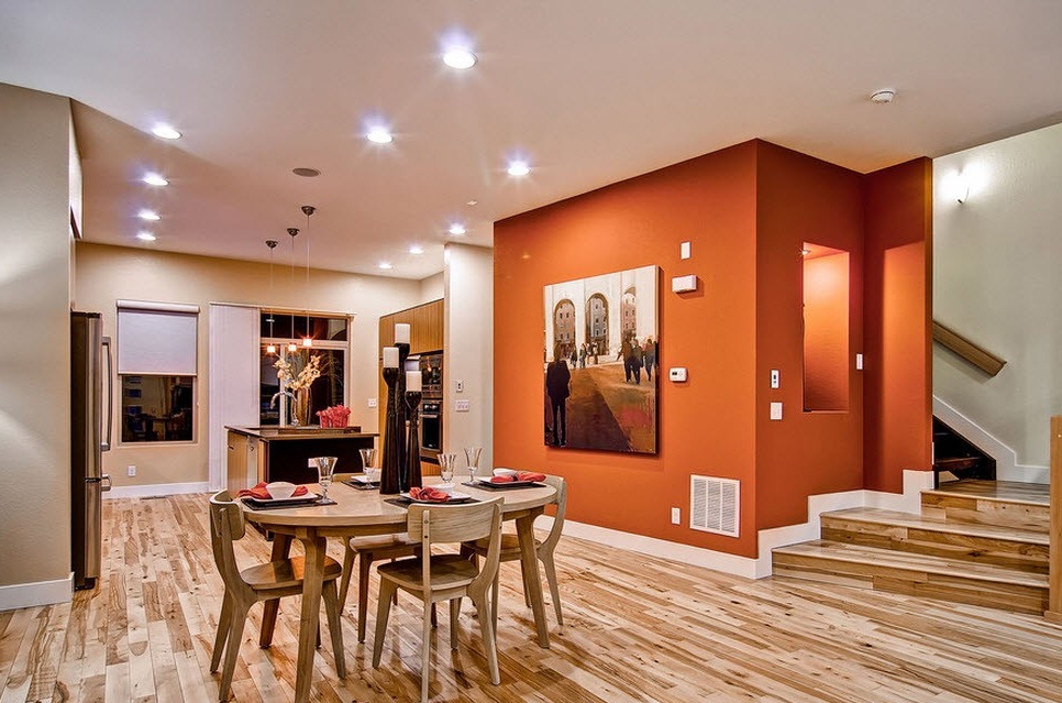
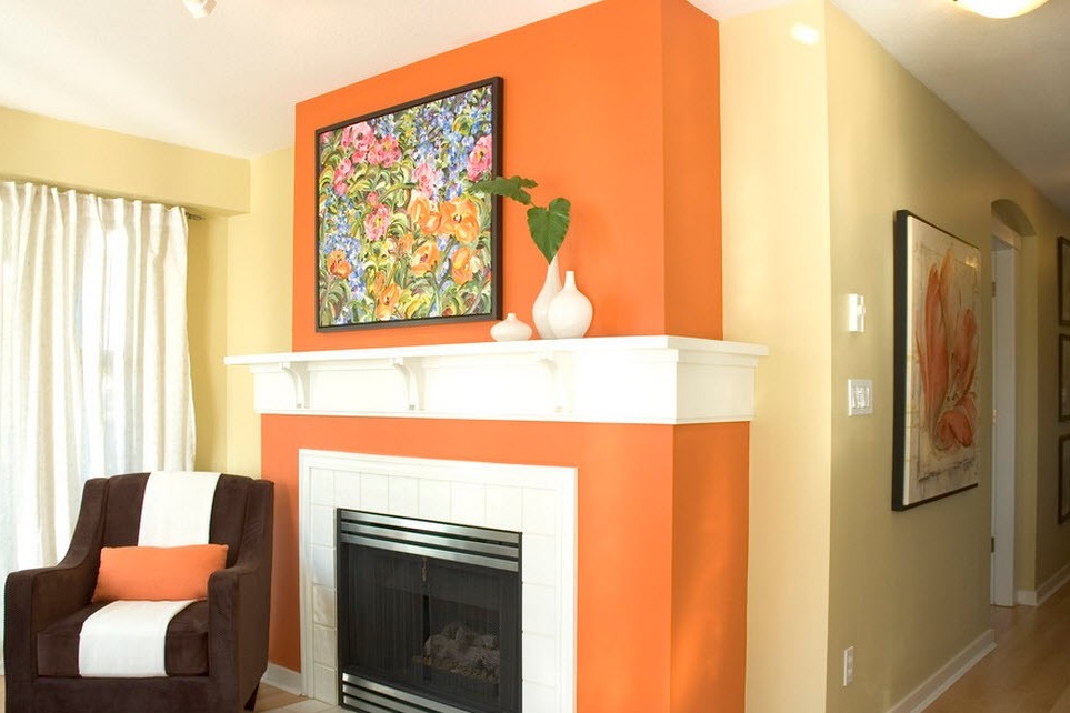
But there are other options, for example, to make orange only one wall, and others in brown shades. The room will be both warm and calm at the same time.
Another option would be to use orange accents in a brown interior. Brown will very successfully emphasize, but will not enhance the influence of orange.
Soft union with pastel palette
The pastel palette itself is characterized by calmness and tranquility, and when combined with some bright colors, a cozy interior with hints of cheerful mood and some temperature preference is obtained. In an orange duo and pastel palette, the room will become moderately warm; cheerful and cheerful, but also within reason.
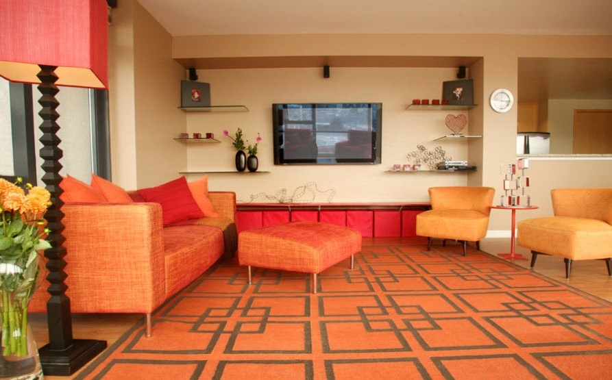
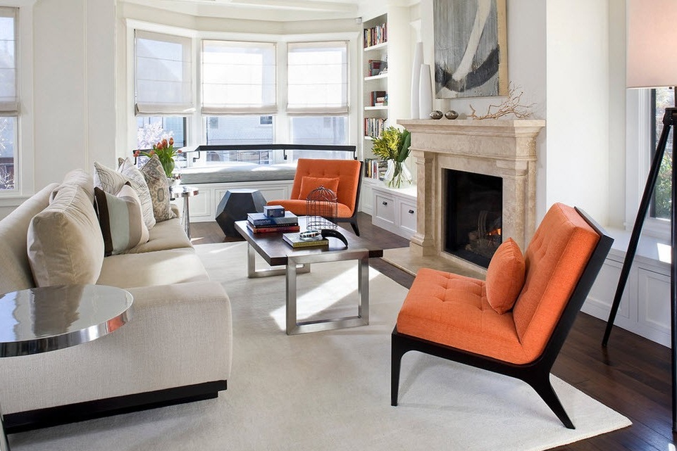
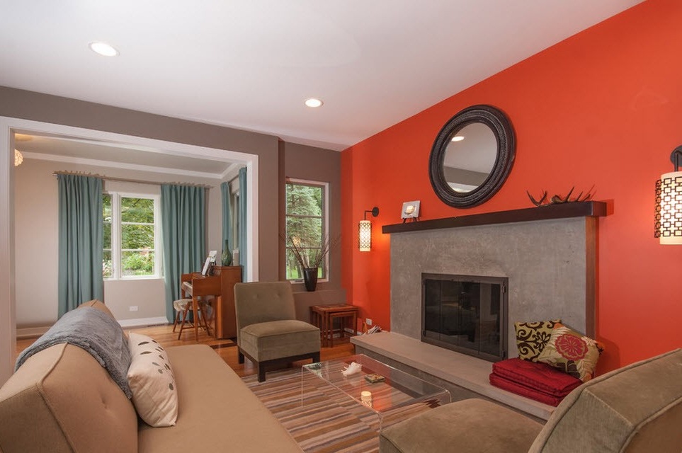
For lovers of an active lifestyle, this option of placing accents is suitable: orange walls and beige furniture (beige belongs to the pastel palette). So what does this give us? It is impossible to sit still in the orange interior, I want to do something all the time: to walk, jump, and vacuum. This color charges with a huge stream of energy.But so that sometimes you can relax, sit down or lie down on a beige sofa and you will immediately feel better. A conversation with friends in the living room with this design will be active, fun, but not overloaded and not tiring.
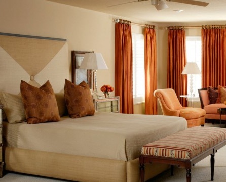
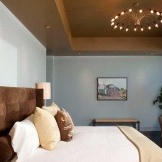
But for the bedroom it is undesirable to choose such an interior design. It is better to make the walls in a calm design, otherwise there will be problems with sleep. A good mood and a boost of energy can be obtained by making orange curtains. Especially in the mornings, when the sun passes through them, the room will be filled with bewitching light.
Orange and blue - a rarity in the interior
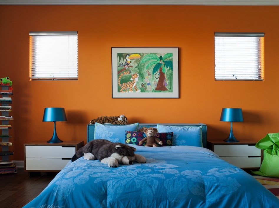
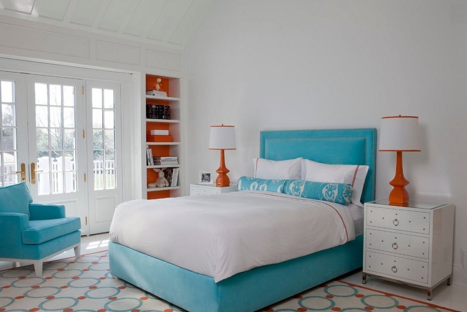
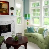
Recently, such a combination of colors is rare. But I want to draw attention to the fact that this union is perfect for children's rooms, where a clear temperature conflict does not create an imbalance, but, on the contrary, brings both colors into harmony. That is, the room is not cold and not hot, but fresh and comfortable. True, provided that blue or cyan are presented in soft form.
And in other rooms you can take a rich shade of blue, orange will benefit from this. In this combination, he himself will gain saturation. For designers, this has already become the rule: against the background or in combination with dark blue or dark blue, any shade of orange (even the palest) will become brighter and juicier. By the way, this principle works only in such a formulation of roles, and if you replace dark blue with dark green or purple, then the result will already be different.
And if for the “neighborhood” take brightblue or even turquoise, then the intensity of the orange will decrease. The room will not be so bright, but the warmth and positive will remain.
When working with orange-blue and blue interiors there is another subtlety. The color of the furniture does not have to match the color of the walls, they just merge. Of course, you need to maintain the tonality, but it is better if various tint transitions or a contrast effect are used. That is, if the walls are orange, then make the furniture in orange, but lighter or darker, and in blue. So you can achieve compatibility and a clear definition of the boundaries of objects.
Orange and black
In ancient times, knights used this combination as a symbol of valor and honor. But now everything is different. Nowadays, this alliance is personified with Halloween (celebrating the transition from the bright part of the year to the dark). Just as this combination is used in nature by poisonous reptiles and insects, people use it, warning the danger: marking, road signs and so on. And in relation to the interior, the orange-black combination is too aggressive, but it can be used by daring and confident people. As well as creative and moving personalities, which it will stimulate.
Optimal use of the union of these colors on hi-tech kitchen. But for children’s rooms this duet is strictly contraindicated, it acts on them overexciting.
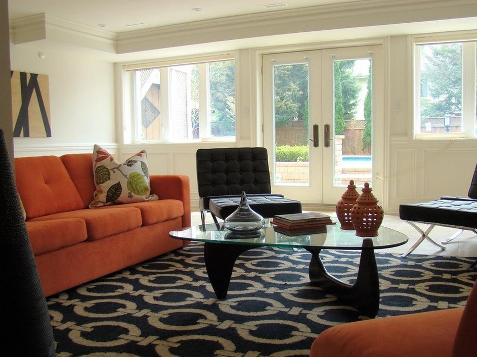 So, any interior can be ennobled and made sunny-joyful with the help of orange color, but you can play with the temperature sensations using a combination with other colors.

