
Black color and its combinations in the interior
Black color is neutral; it personifies classics, elegance and respectability. With regard to almost any color, especially neutral, there are opinions for and against, but if desired, any disadvantages can be made pluses, and disadvantages can be turned into advantages. So, what are the disadvantages of black? To be objective, not so much. Of course, if the room is small, then black will make it gloomy and further reduce its size (visually, naturally). But do not give up black because of this, just take it in a small amount and dilute it with other colors. That is, most often the drawbacks of this color are considered gloominess and visual reduction of space and all the ensuing consequences. But! He has many more advantages, and with the correct presentation and proper use of the disadvantages there is no trace. If you take black as a background, then its depth will highlight important interior details, giving them expressiveness. In addition, the black background itself will play a role only in the background, as a basis that performs a collective function. And in this design, the room will not visually decrease, but, on the contrary, it will expand according to the principle of “stars in an infinite universe.”


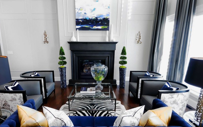
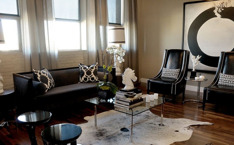
Black and white classic
If black color is an embodiment of classic, then black and white combination is even more so. If you can’t choose the color of your clothes for any celebration, then just wear something black and white, and you will not lose. For interiors, this rule is also suitable. But what is important to consider here? Using these two polar colors, you need to remember that they seem to split the space into parts. And if the black and white details are small, then the room will turn into a mosaic. Therefore, it is better if these parts are larger. From these considerations, one should not get carried away by the strictness of the lines - this again will lead to the effect of crushing. But too smooth lines will not work - this will make the interior blurry. It is better to stop somewhere in the middle: a little strict and a little smooth lines. And for fans of chess cells and black and white stripes, it is worth remembering that this tires our eyes and promotes isolation. To avoid this, do it on a white background, it will distract attention and relax tension.


Another subtlety: it is not advisable to place small white elements on a purely black wall and vice versa. This will be very distracting and annoying.
In general, in this combination there are a lot of subtleties, knowing which, you can build a cozy and not tiring interior. To summarize: the interior in black and white does not like the abundance of details and elements, only strict or only smooth lines. And what comes of it? Right - minimalism style! Everything here is concise and comfortable. If you don’t like minimalism, it doesn’t matter, take a different style, but do not overload the space, otherwise the black-and-white combination will lose its qualities. Namely, those that allow the brain to relax from the information flows of life.


In its purest combination of black and yellow causes anxiety and a sense of danger. Therefore, white color is added to this tandem, and then the atmosphere becomes with a twist, with clear shapes that defy gray everyday life.


In addition to adding white color, they use a pattern that in itself always softens the atmosphere.


Combination of black with orange It was once used by knights to emphasize honor and valor. But in our time there are no knights left, but there is an association with Halloween and poisonous insects and reptiles. But nevertheless, the value of courage has remained in our days, since the celebration of Halloween is a victory over the fear of dark forces. What does this have to do with the interior? And the most direct. Knowing these nuances, you should not use both colors in equal amounts. And black is better to take not too saturated tones, in addition, you can dilute this union with white, gray or brown tones. But in no case do not design a nursery with this combination, it will affect them overexcitation.


A similar duet of flowers for the interior is used quite rarely. What it is connected with is not entirely clear, they just do not look very good together. Although many consider such a tandem refined and elegant. If you still want to use this combination, then professionals recommend diluting it with white or other light shades. It is also better to make soloing green and black in the form of accents or underlining lines and shapes.


For a sense of liveliness, you should take several shades of green, close in tone. And black can be expressed in a combination of glossy and matte surfaces.
Black and brown combination
This duet looks very expensive. Work with it involves the creation of rich and respectable interiors: expensive materials and serious design work.
If the construction is based on contrasts, then the advantage is given to the shape of objects, so that the border in combination can be clearly traced. The lines should be clear. It will be appropriate to use stripes and patterns, for example, in the form of a cell.

Since both of these colors are dark, do not forget about the alternation of objects: dark furniture on a light background or the presence of dark and light furniture. It will also be good to add white color so that the room is not too gloomy.
Lighting in such a room should be good, both natural and artificial. You can even hang white curtains on the windows, but blinds or tulle will look more harmonious. White lamps emphasize the sophistication of the environment, and fluorescent lamps less distort the colors used.
Similar interiors love conciseness: minimum paintings, shelves and other decorations.
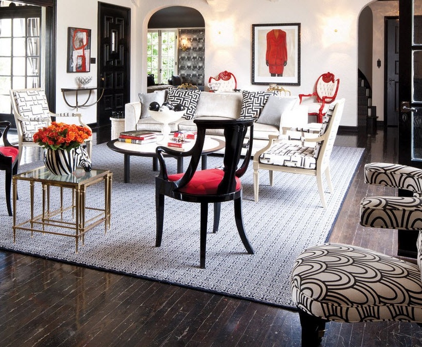
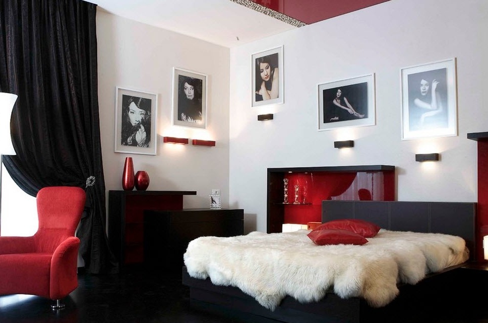
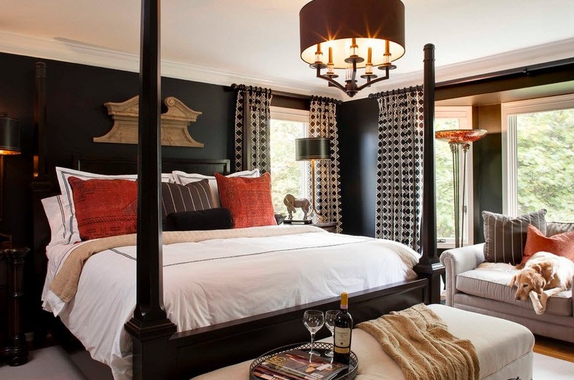
The most passionate duet: black and red
The combination of black and red can be presented in different ways: either it is anxiety and danger, or passion. Although these two contexts are different, and it is difficult to mix them up, they can be combined into one image of ardent Gothic.

In its pure form, this union creates only one style - neo-Gothic. But if you add other colors, for example, white, then completely different notes appear. White color removes dark from blackred combination and there remains only a spectacular contrast, which can make the room something fascinating and magical.
The union of black, red and white will make any room, even the most simple or modestly furnished, stylish, presentable and festive. Here you can feel the notes of the call, attracting all the attention.
If we add gray rather than white to this tandem, then the atmosphere changes completely. Instead of a magical aura, balance and harmony appear. And there is no trace of negativity either.

Speaking of black and red combination, it is necessary to dwell in more detail on the color balance so that the interior is built correctly and does not act negatively. After all, black and red colors themselves are complex and even a little dangerous, and with their duet you need to be even more careful.
So, only one color must be dominant - according to the experience of specialists, about 60 or 70% of the entire surface. If the colors are used in the same proportions, then there is a risk of getting an interior with a "restless" aura. Which color will get the main role, and which secondary you decide. Here the main criterion is your character and temperament. Most often, the leading color is white or something from a pastel palette. Against this background, the black and red combination looks calmer.

To dominate the room in red, you need to have a strong and strong-willed character. Such interiors are suitable for temperamental people, bold and daring.
Well, black solos are preferred by original and extravagant people.
Black and pastel palette
Almost all the colors of the pastel palette successfully fit black. This is due to the fact that there is no oversaturation of the room with paints. Why? The fact is that the black background is like an amplifier of those colors that are next to it, it saturates them. And if these are bright colors, any (blue, red, purple, orange, etc.), then they become even brighter and work is already underway to combine them. And pastel colors are those that are in the outer part of the circular color chart, that is, all pale, light, almost colorless tones: light beige, sand, light yellow, pale pink, light blue or blue, pale green and so on . So these same almost colorless tones against a black background gain their significance, become expressive, but do not overload the room with brightness.
Proportions can be taken depending on the desire to make the interior darker or lighter. More black means a darker atmosphere and vice versa.


Quite a rare combination due to its rigor. It seems uncomfortable and dirty to many. To avoid this, you need to separate these colors from each other. They may be nearby, but not on one subject. Then you get a solid room for independent people. Most often, this combination is used both in the interior and in the clothes of men, a little reserved, thoughtful and calm.


Regarding black and blue duets, we can say that this combination is very deep, calm and mysterious. But in its pure form is also rarely found in interiors. More often, light or other shades are added here so that the room does not resemble the depth of the seabed.
Basically, designers advise using a combination of black and blue and black and blue as additions that emphasize elements and accessories. Both adults and children like these duets, but in large numbers they can create a feeling of gloom. Therefore, rooms in this design should be well clarified. It is possible with the help of many lamps, a large window with light and airy tulle. It is good if there are not many shelves and other decor. Upholstered furniture and a neutral color floor are perfect.
This is a very extraordinary and mystical interior. It expresses in itself both Gothic and pathos. Not everyone likes this combination, so you should think carefully before you make out the living room in this way. There can be no talk of a children's room - too majestic and unrealistic atmosphere will overwhelm the children. But for the bedroom, kitchen and bathroom is quite possible. Especially for the bedroom, if you like the atmosphere of mystery, full of energy and subtle matters. Complete the picture with candelabra, elegant crystal and you will believe in magic.
Of course, it’s not necessary to exaggerate everything like that, you can simply use this combination as an emphasis on respectability or even luxury. In this case, it is worth adding white color, which will soften the mystical side of the combination and enhance the wealth effect. And it is better if there is more white. Then this design can be used in other rooms (but still except for the nursery).


Despite the fact that black color can have a gloomy feeling, with proper work with it and its combinations, you can achieve excellent results, emphasize the dignity of the interior and make it sophisticated.


