Yellow interior: combinations
Yellow interior filled with a sunny mood and a positive charge. This design is well suited to people who are used to keeping everything in themselves. In this case, yellow will help them unleash their inner potential and liberate themselves. The yellow interior will always be warm, for example, in a room where one wall is yellow, the other, for example, beige, is warmer near the yellow wall, next to it a person’s heart will beat faster, breathing will become faster, and blood will begin to circulate more actively.
Designers advise using yellow and its combinations with other colors in rooms that lack heat and light, that is, in small and dark rooms. But if the room faces the sunny side, then the yellow interior will be very hot. Although someone may like it.
Interestingly, this color is used to treat diabetes, diseases of the liver, kidneys and rheumatism. But it is strictly forbidden to use it for people with neurology and tachycardia.
Yellow and white
Note. The combination of yellow and white is the most common and beneficial.
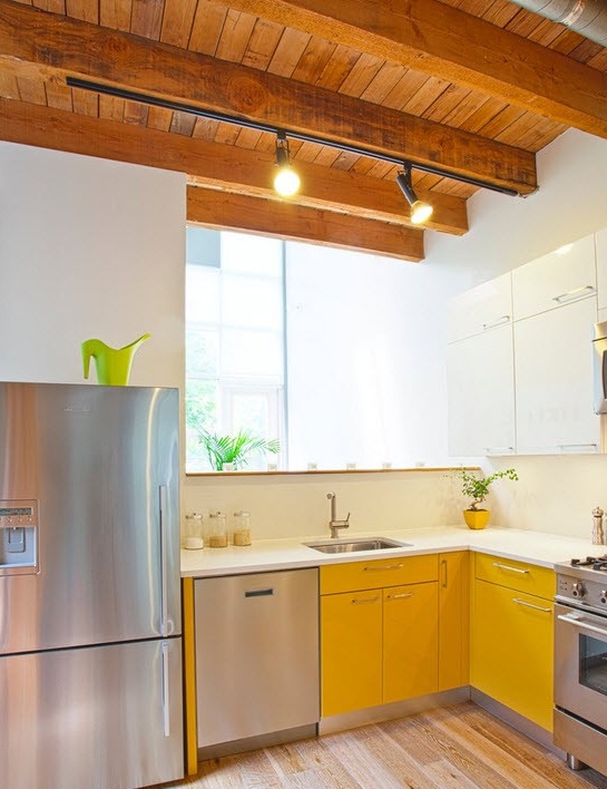
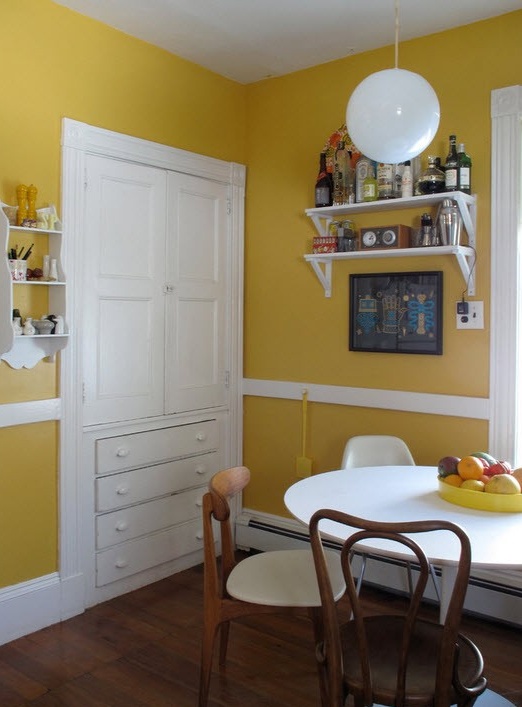
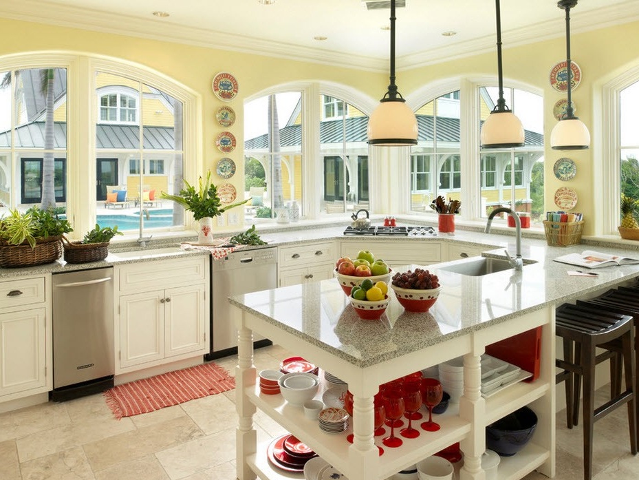
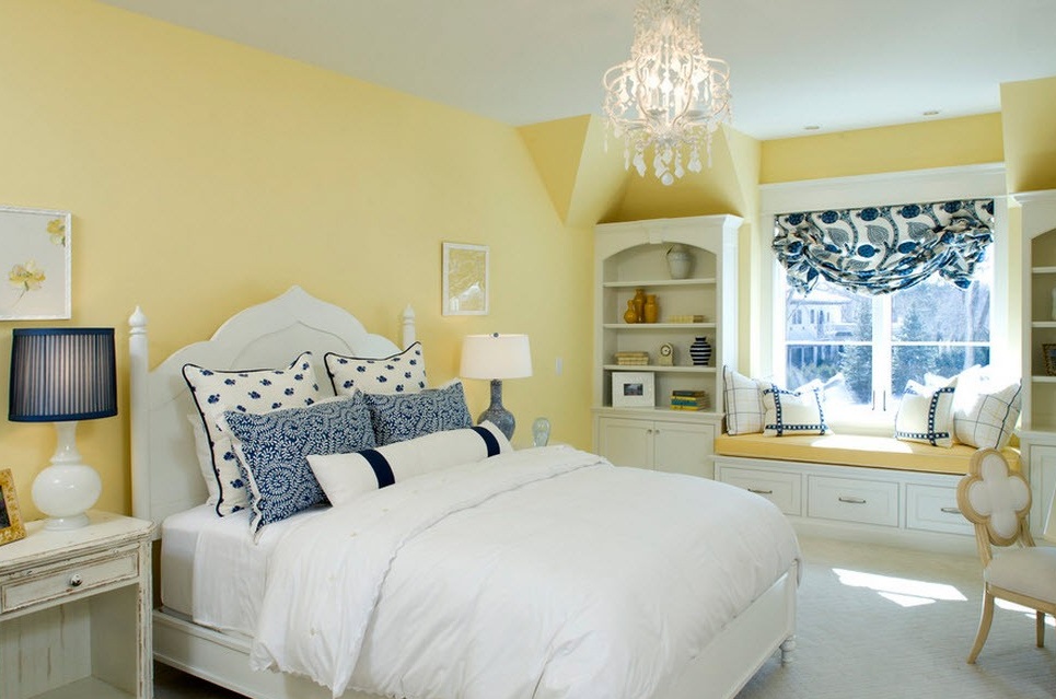
Often you can find a combination of yellow with white. And, although the interior is called yellow, this color is not soloing, it is an accent. But this option only enhances the effect of a cheerful and fresh mood. It is recommended to use this combination for small rooms.
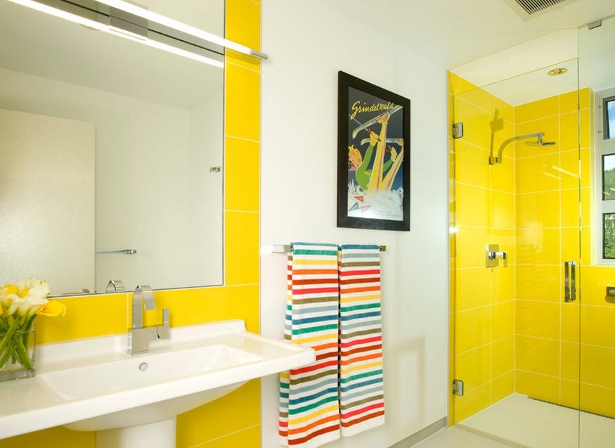
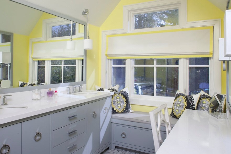
In the bathroom, for example, you can use more yellow, while diluted with the same white. Taking a bath or shower will be fun and interesting.
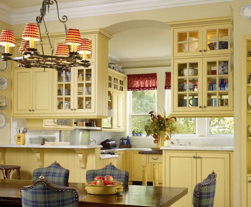
This combination is especially suitable for rooms that need additional lightening and visual expansion of the space. This union of colors will also bring lightness and freshness to the atmosphere. The yellow and white interior is well suited for small living rooms, classrooms and possibly for the kitchen and dining room.
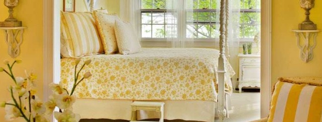
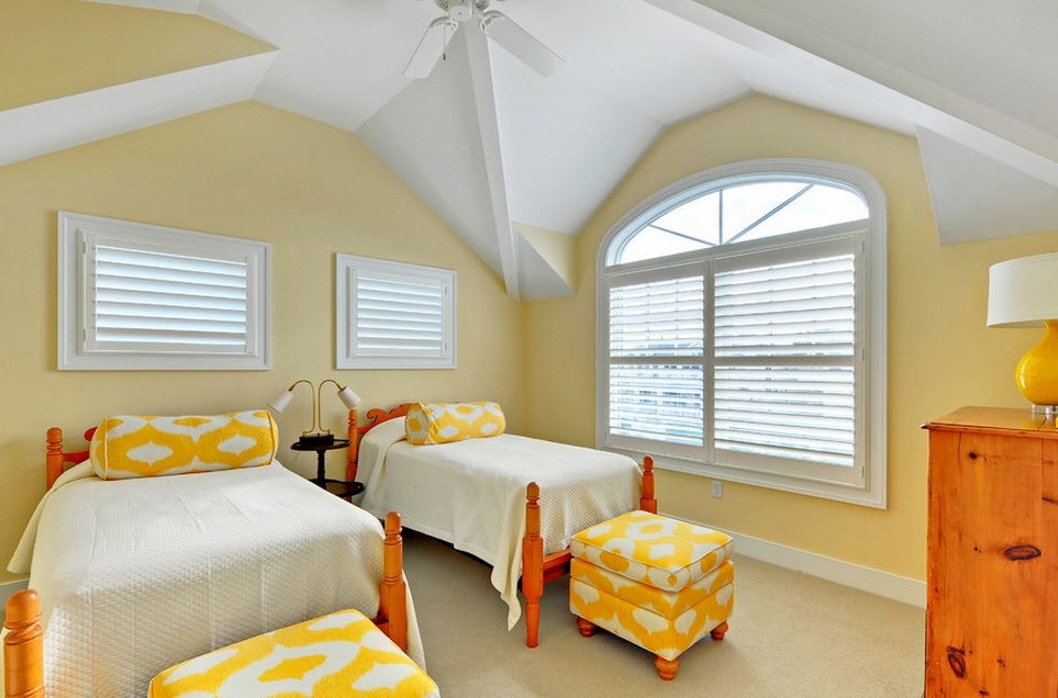
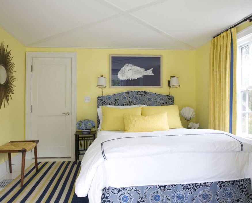
Some lovers of sleeping next to the sun, choose a combination of white and yellow for their bedrooms. The main thing here is not to overdo it with bright colors, the main background should be slightly muffled, otherwise it will be difficult to fall asleep.
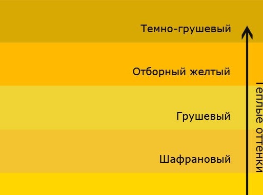
Note. For beige, soft shades of yellow, such as brownish yellow, or it is also called dark pear, selected yellow, pear, saffron and golden yellow in its soft manifestation, are more harmonious.
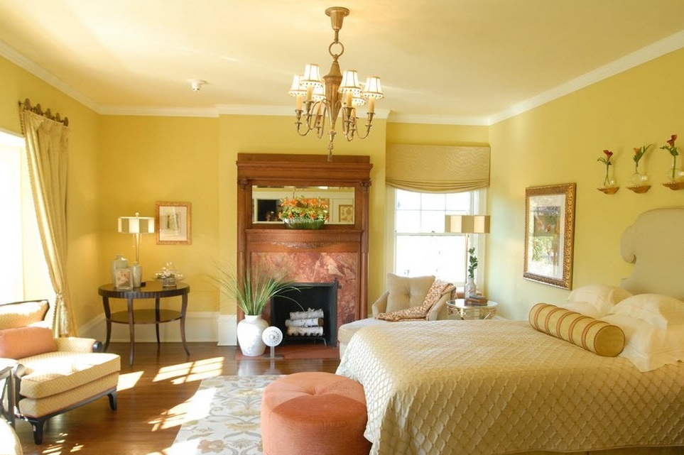
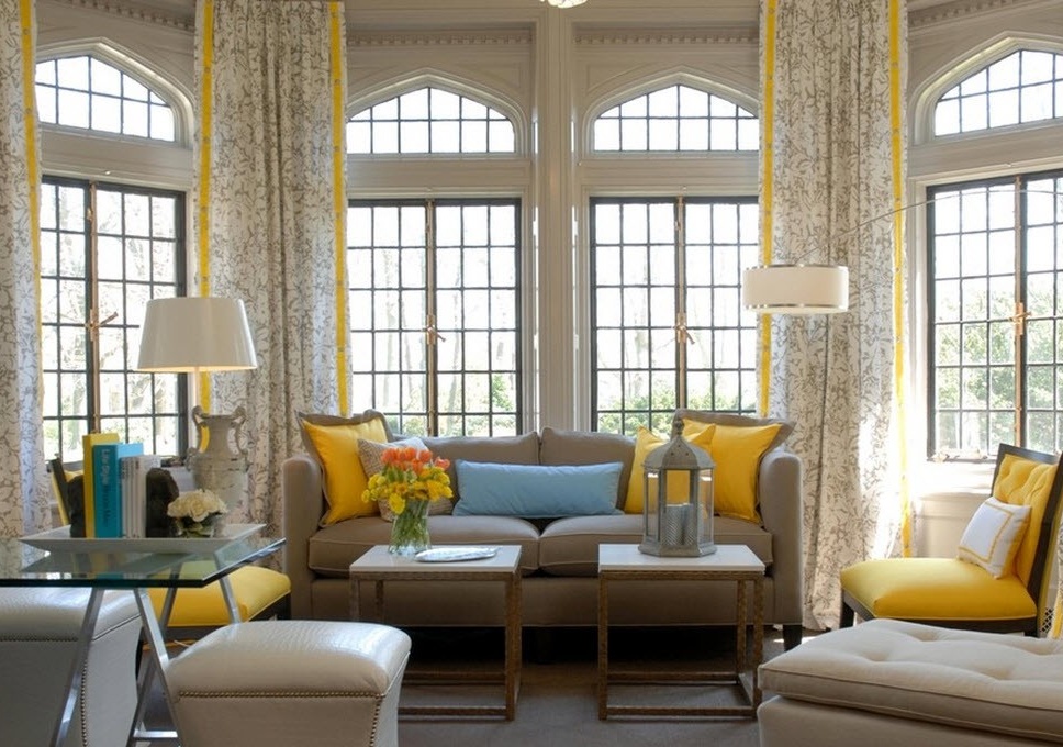
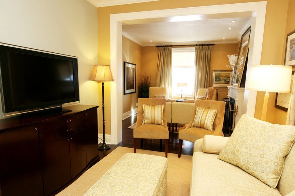
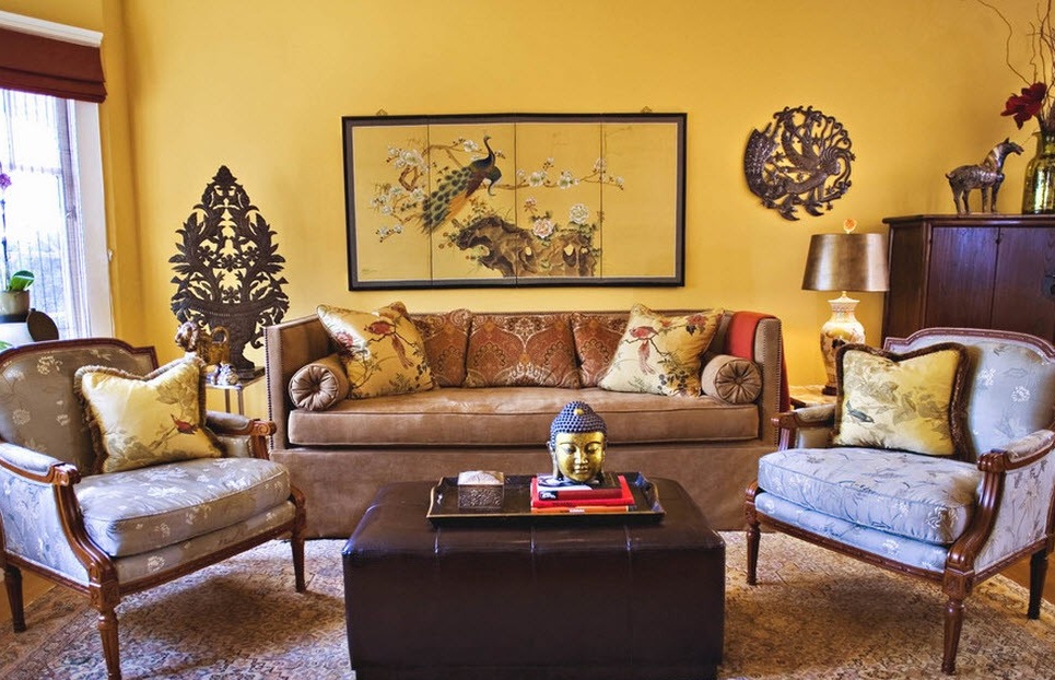
The use of yellow as an accent is again considered very successful, but not for a white background, but for beige. This option is good for a spacious room, it is immediately filled with comfort. Designers advise using beige for walls, ceilings, floors, and most furniture. A yellow color as additional elements. You can even make some pieces of furniture pure yellow.
Beige belongs to the neutral range, so it calms the “heat” a bit, which creates a yellow color. And for greater harmony, in conjunction with beige, not very saturated shades of yellow are used, it is better if it is something like brownish-yellow.
Yellow with black and white
Note. This union is considered the most extravagant among all combinations of yellow.
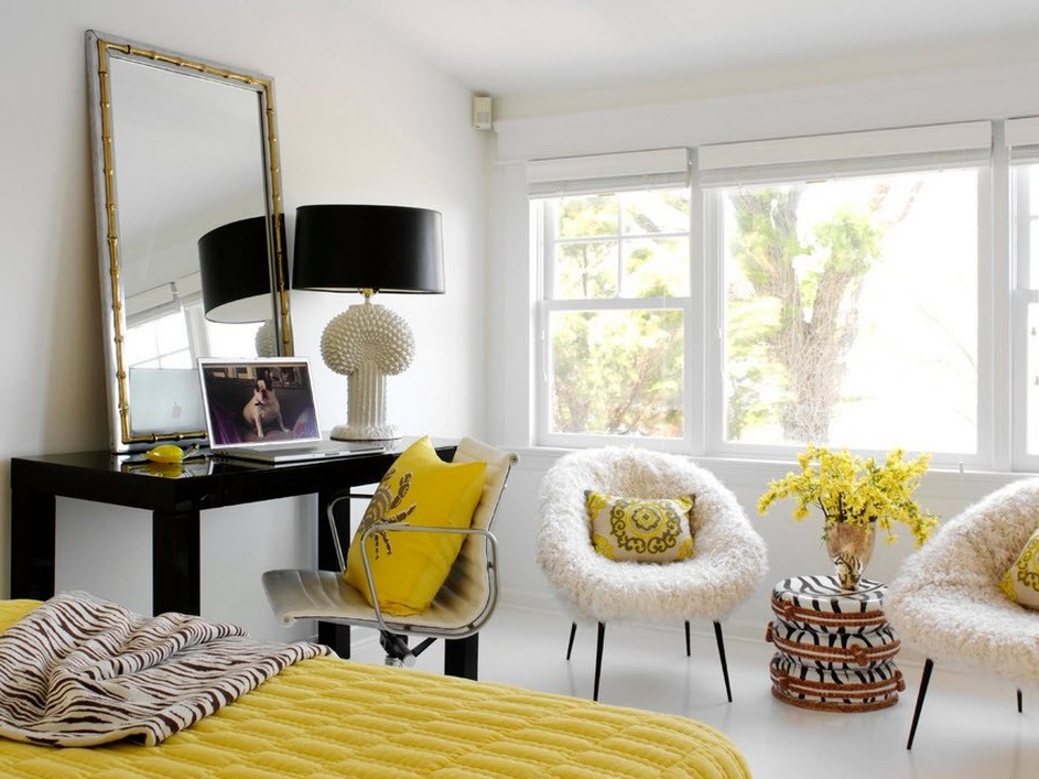
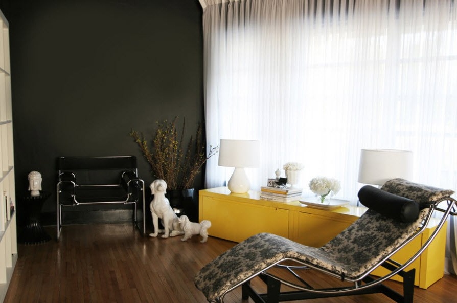
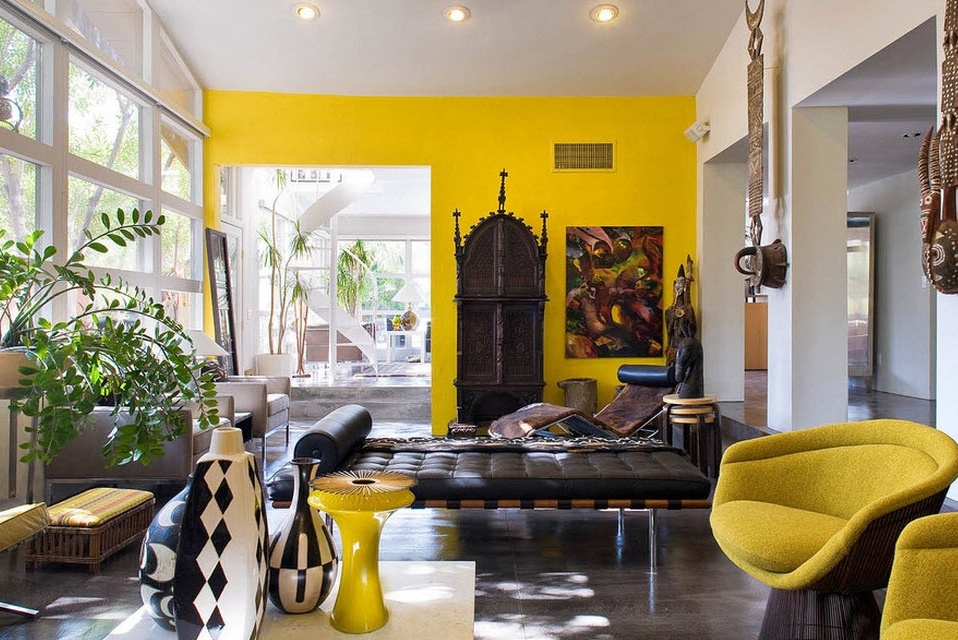
For many, the combination of yellow with black and white seems strange and risky. But, in fact, it turns out a magnificent interior. The purity of white, the depth of black and the sunshine of yellow will create a friendly and even affectionate atmosphere.
Using the following photo as an example, it can be seen that the classical austerity of the black-and-white interior is diluted with one yellow object, and this introduces a slight touch, as if a ray of sun penetrated the room through the window.
Note. Yellow and green personify both summer and autumn, so it is important to correctly place accents and choose the right shades to create this or that atmosphere.
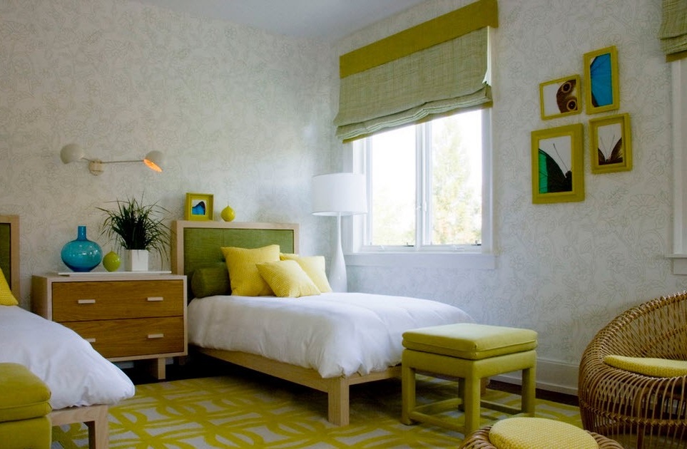
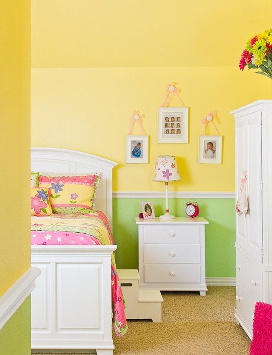
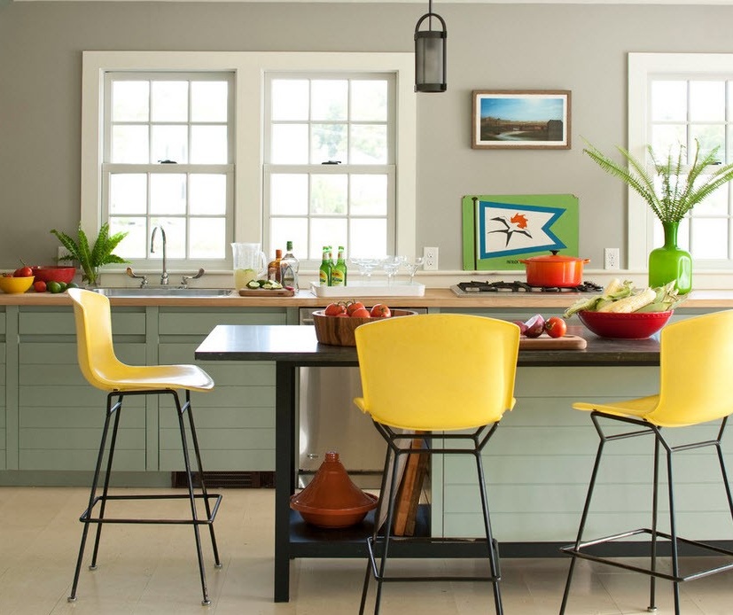
For a cheerful summer palette of yellow shades, designers advise picking up more muted tones of green, otherwise the room will be too colorful. This will emphasize the game of contrasts and will not hurt your eyes. Recently, such a combination has often been used to design children's rooms and kitchens. Regarding the children's room, both options will look advantageous: both muffled and bright. The choice of shades will already depend on the purpose of the interior, if you want to activate your child, use saturated colors. And for reassurance - soft.
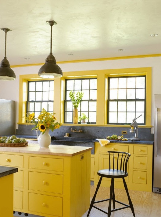
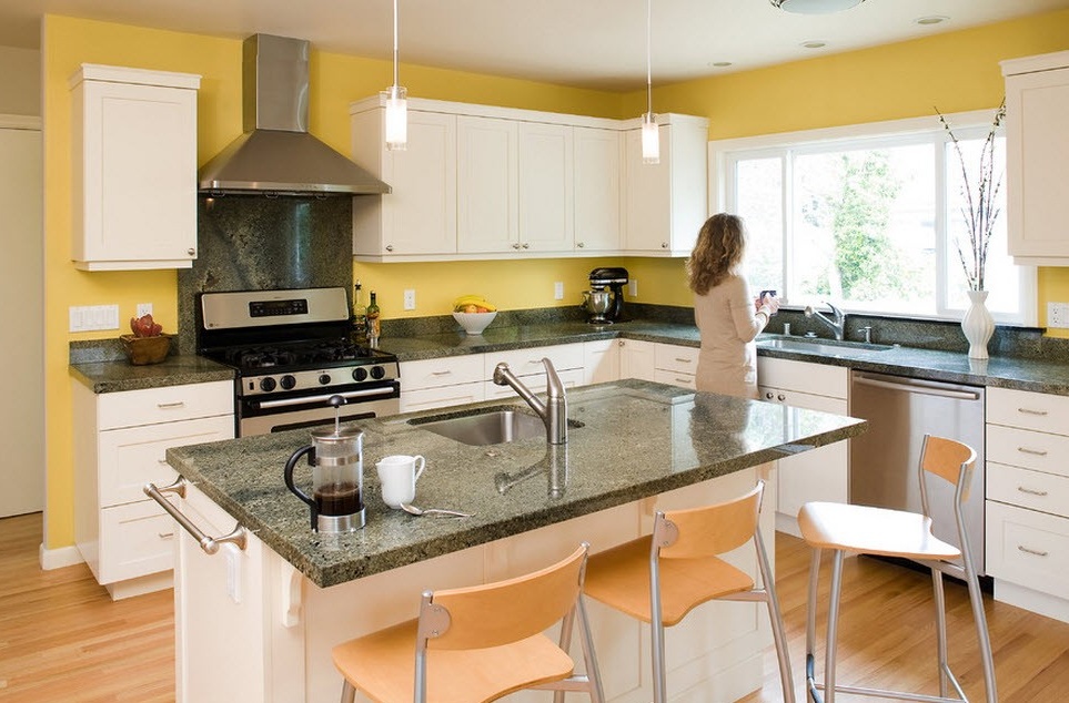
Bright shades on the background of any neutral color are well suited for the kitchen: both the mood is good and the room does not dazzle.
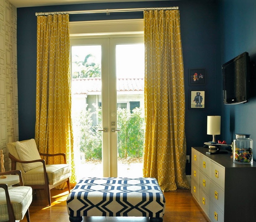
Note. So that the yellow color does not get lost on the background blue or blue, the latter should be selected in muted colors.
Interior in yellow and blue it reminds me of the autumn sky, the approach of coolness is already felt, but the sun warms a little more. Therefore, this design will suit lovers of the autumn mood and light, cool interiors.
These two colors are an imbalance in temperature, yellow is a very warm color, and blue is the coldest. Therefore, for their harmonious “neighborhood” it is recommended to choose soft or even pale shades. And if diluted with white neutrality, then the temperature conflict does not seem so obvious.
Note. For tan interiors, larger and brighter rooms would be a better place, since brown itself is very dark and the presence of yellow does not smooth out much.
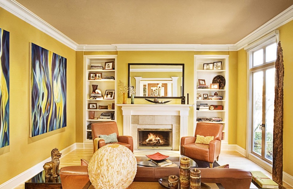
According to professionals, this combination of colors is very successful, the softness of the chocolate shades is perfectly emphasized by the yellow background, but not bright, but, for example, saffron. They have a certain similarity in tonality, and it looks very harmonious.
For bright yellow, choose the color of the tree, next to black and white. Abundant lighting, preferably natural, is important here.
To softer and muffled shades of yellow, such as pear and saffron, a mustard shade is well suited. The atmosphere becomes light and airy.
Note. AND red, and yellow colors excite the nervous system, therefore, if there is a desire to make the room as invigorating as possible, then this combination is ideal.
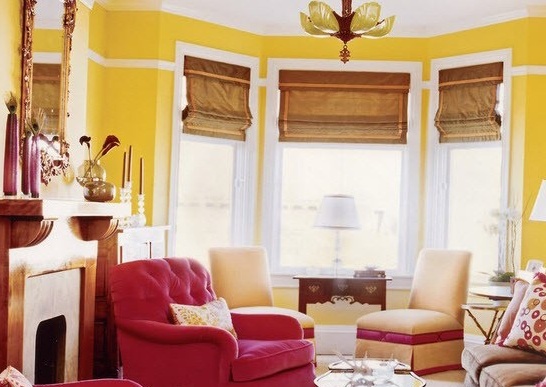
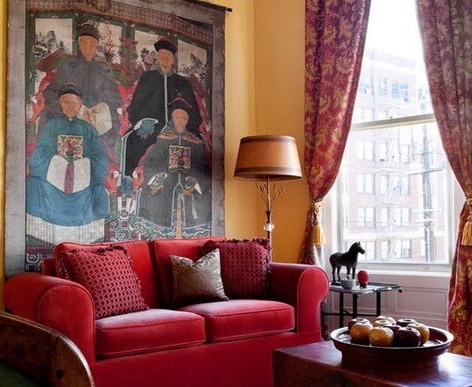
If you take a combination of bright red and bright yellow, then the room will turn out to be very hot. To mitigate using a more muted shade of one of these colors. Or you can use the accent technique, when one color is the background, it will set the mood, and the second be done as an accent. Very well in this case, a combination of a bright yellow background and a raspberry shade for furniture is suitable. Raspberry still has a softer tone than the main red color and, therefore, the atmosphere will be sunny, warm and even a little tasty.
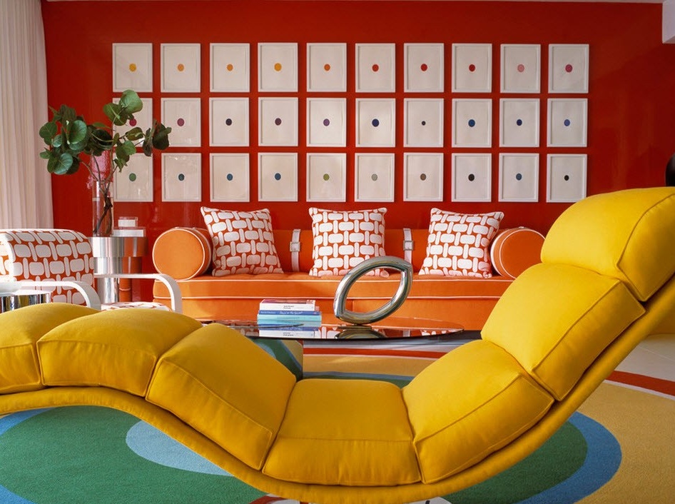
But the use of saturated red, yellow with the addition of orange will make the room look like a beach at the height of the day.
So what is yellow interiors? These are unusually sunny and joyful rooms. Whatever color it is combined with, it will leave its positive mark everywhere.

