Green Interior Combination Options
The most pleasant color for our eyes is green. There are few people who will not like him. Basically, this color evokes only positive emotions, associated with summer grass, bright foliage, forest and a charming emerald gem. In such an interior, good rest and peace are ensured. Green has been shown to relieve stress and smooth out conflicts. And it fits absolutely any room.
Along with all the advantages, many designers find it difficult to work with this color. The problem is the complexity of the compatibility and the choice of shade. The tonality of green is wide; it is represented in absolutely all color palettes.
But, with confidence we can say that all the difficulties and inconveniences when choosing this color are overlapped by its magnificent appearance and positive impact on the person.
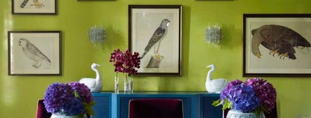
In addition, the presence of a large number of tones can be used for good. Indeed, various shades of green combine perfectly with each other and create chic combinations filled with comfort, joy, youthful fun and simply positive emotions. Very often, designers add shades to the main color, for example, pistachio, lime and light green colors.
Green and tree
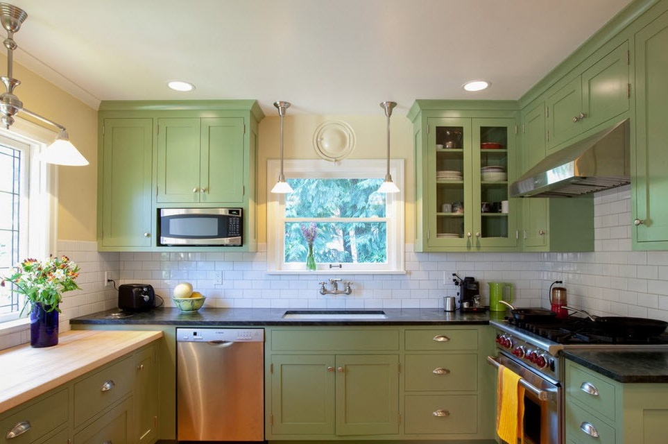
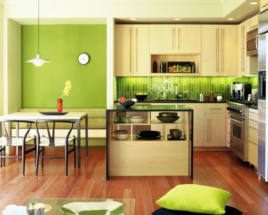
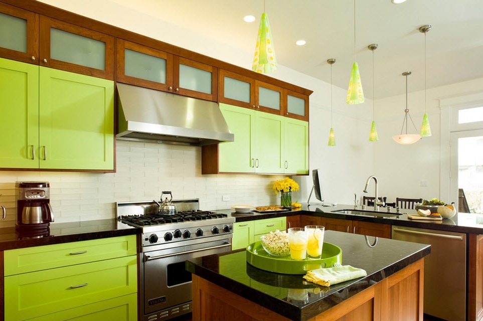
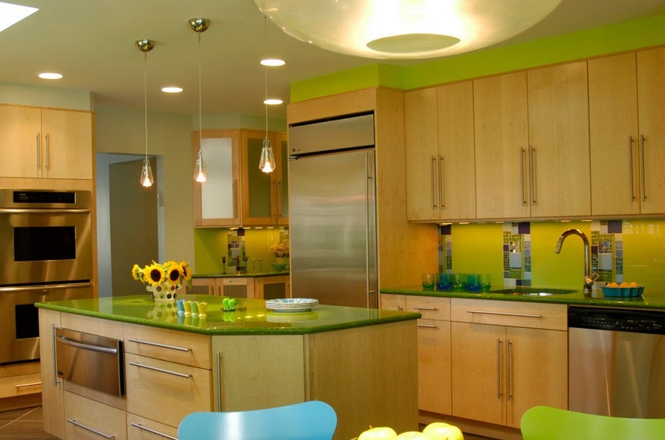
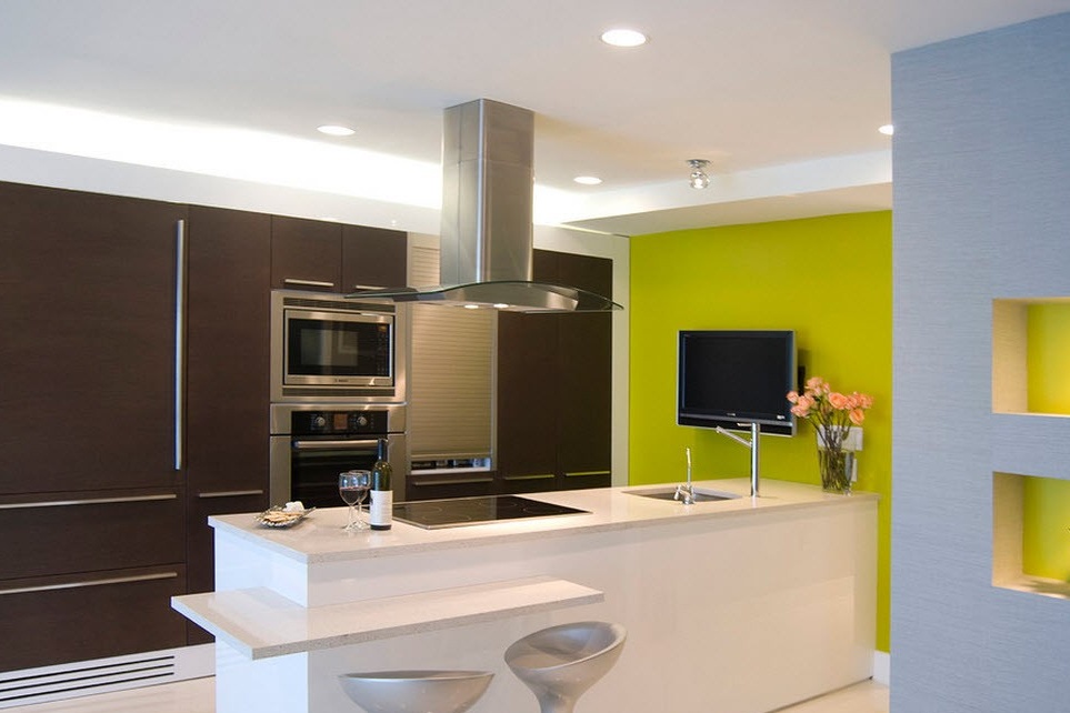
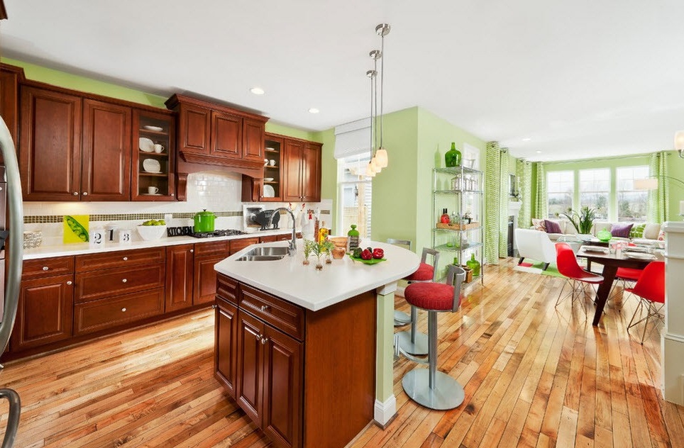
Since the green color is associated with the forest, and, in general, with nature, it will be ideal to combine it with tree. This interior will be the embodiment of comfort and pleasure. The example of the following photo shows that the whole furniture made of wood and left in a natural color, and some of its facades are painted in green. This interior design looks natural and friendly.
Green and pastel palette
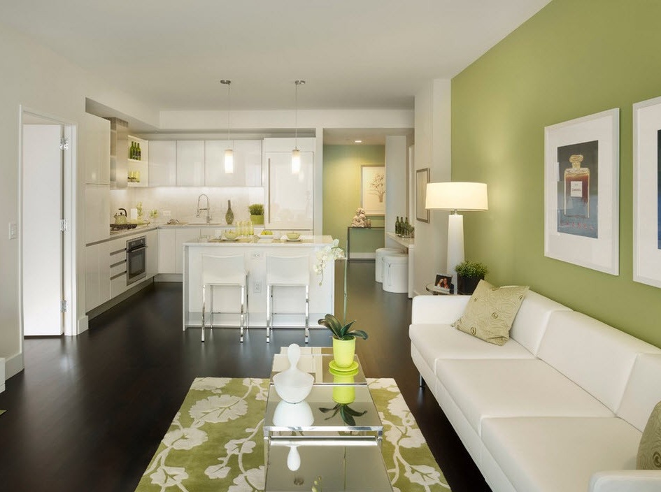
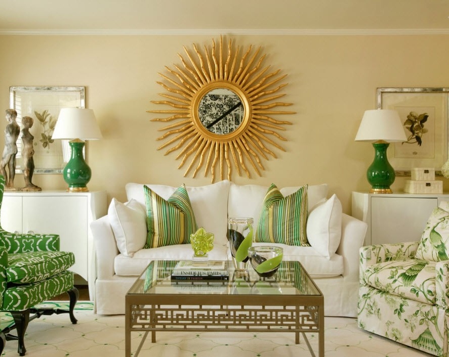
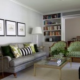
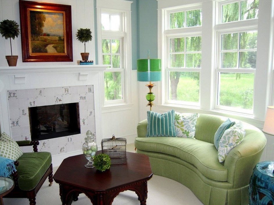
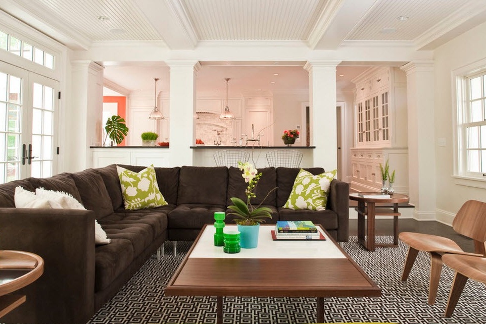
In the following image, the green color acts as an accent in combination with white and the color “coffee with milk” as the background.
Please note that in this design a wooden element was also added (frame for the picture), but there is no longer that mysterious and enchanting atmosphere of the thicket. The color "coffee with milk" envelops with its warmth, white invigorates a little, and green color plays the role of a disposing element, it distracts from everyday worries. A kind of lawn at home. This room is designed for relaxation, here you want to lie on the couch and chat easily, sipping refreshing drinks.
Green and white
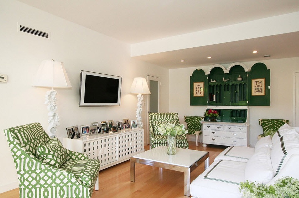
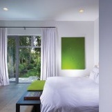
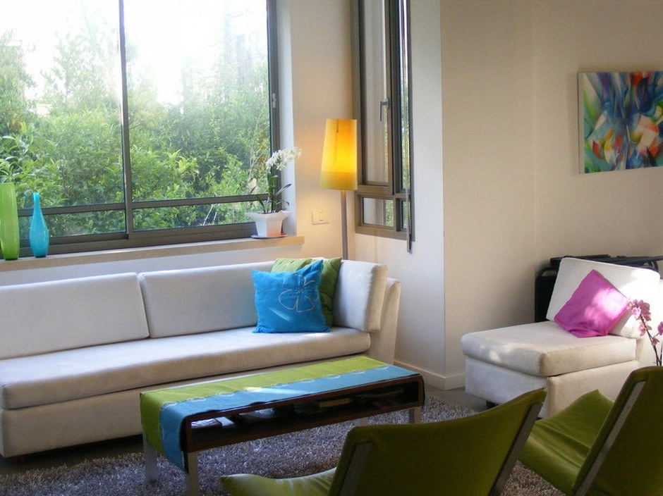
If you wonder what color is most suitable for green, then you can safely answer that white. And not only because white is the only universal and combined with all colors. It is about his wonderful ability to soften his partner. Therefore, the most tender will be green and white interiors.
The combination of these colors especially emphasizes vintage style.
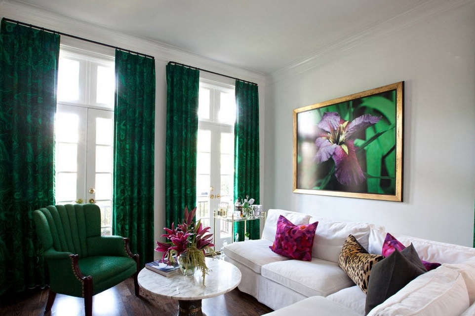
If you choose a saturated green color for the interior, then to give harmony and smooth out the intensity, neutrality of white will suit you well, which will ease the decor of the room.
Green and black
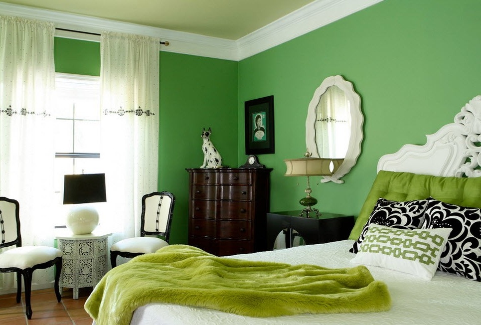
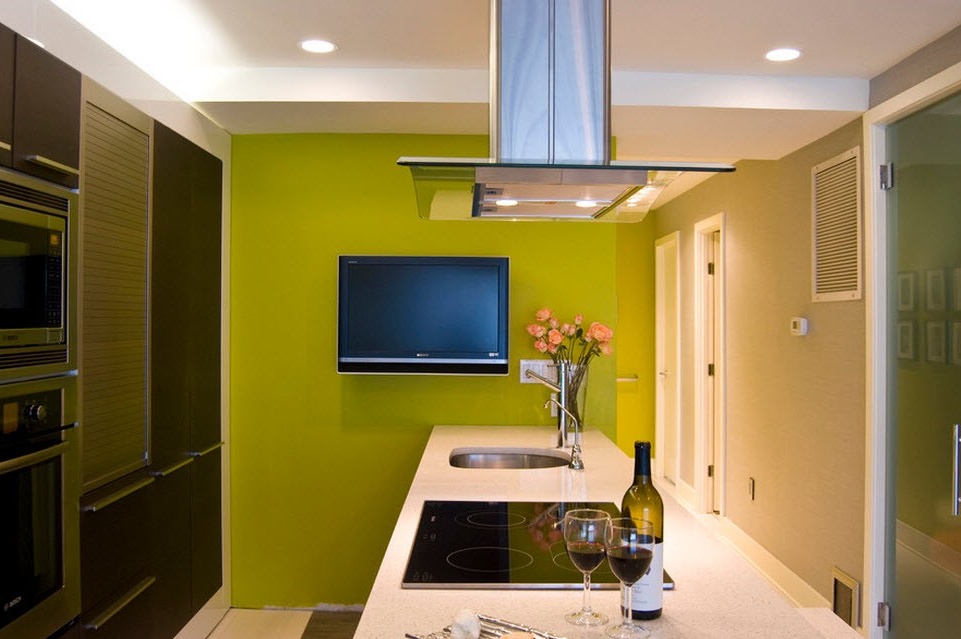
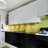
Many designers do not recommend combining green with black, unless they can “side by side” in the form of stripes or other prints. But, in every color selection there are many subtleties, knowing and considering which, even the most contradictory combinations can be made cozy and beautiful. For example, for the union of green and black, it is better to choose a complement in the form of white, its neutrality and clear antagonism to black will dilute the gloom that it represents.
Green combined with related colors (blue, cyan, turquoise, yellow)
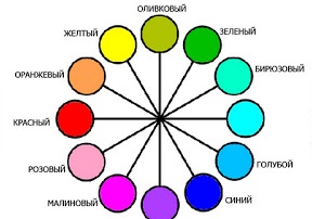
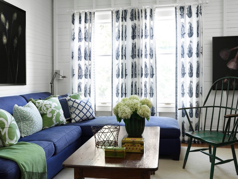
Green, blue, cyan, turquoise and yellow are related color groups, as they are located next to each other in the color arc, one next to the other.
This suggests that they are perfectly combined with each other in various variations and types. This can be used for decoration and children's rooms, and bedrooms, and kitchens, and living rooms. For each room they have their own meaning. In the nursery, these color combinations will create a fun atmosphere, cheerful mood and a boost of energy. With the help of various combinations you can create a fabulous atmosphere, fill the room with a forest aura or floral motifs. Do not forget that the green color is good for the eyes, looking at it, we relax, we can be distracted and relax. This is a very favorable environment for children.
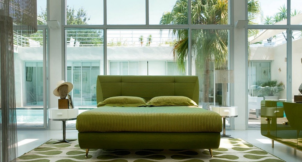
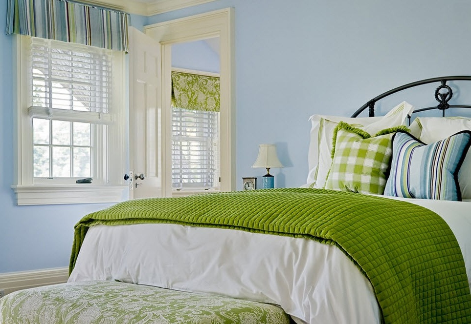
In a relationship bedrooms you can do everything the same as in the children's room, or you can create a soft and relaxing intimate area where it will be a pleasure to fall asleep. After a hard day in the interior with green, blue or yellow notes, the rest will be pleasant and full.
Very often, these colors are associated with fruits and vegetables, and create a good mood. And where, if not in the kitchen, does this play the most important role? For the dish to turn out delicious, you need to have a good mood, our grandmothers also said that. And while eating, a pleasant environment favorably affects appetite, digestion and, as a result, the general physical and emotional state. An interesting fact was noted by Feng Shui experts. In their opinion, the fruit and vegetable situation in the kitchen subconsciously places us to eat more fruits and salads.
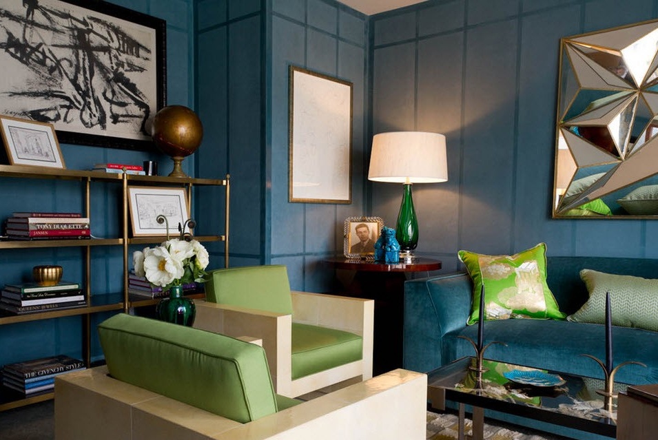
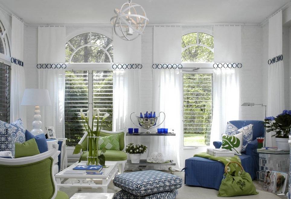
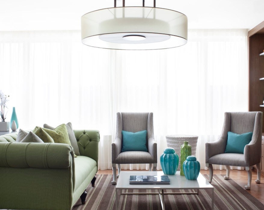
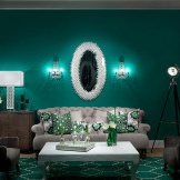
For living rooms, the combination of green and blue (cyan), for greater expressiveness add turquoise, which emphasizes the completeness of the situation, its sophistication.
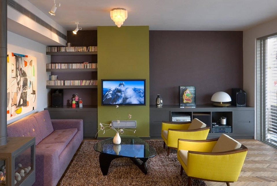
Yellow also sometimes present, but more often in small quantities and in the form of accents.
Since both green and blue belong to the cold gamut, they soften them more often with neutral colors, for example, beige or white.
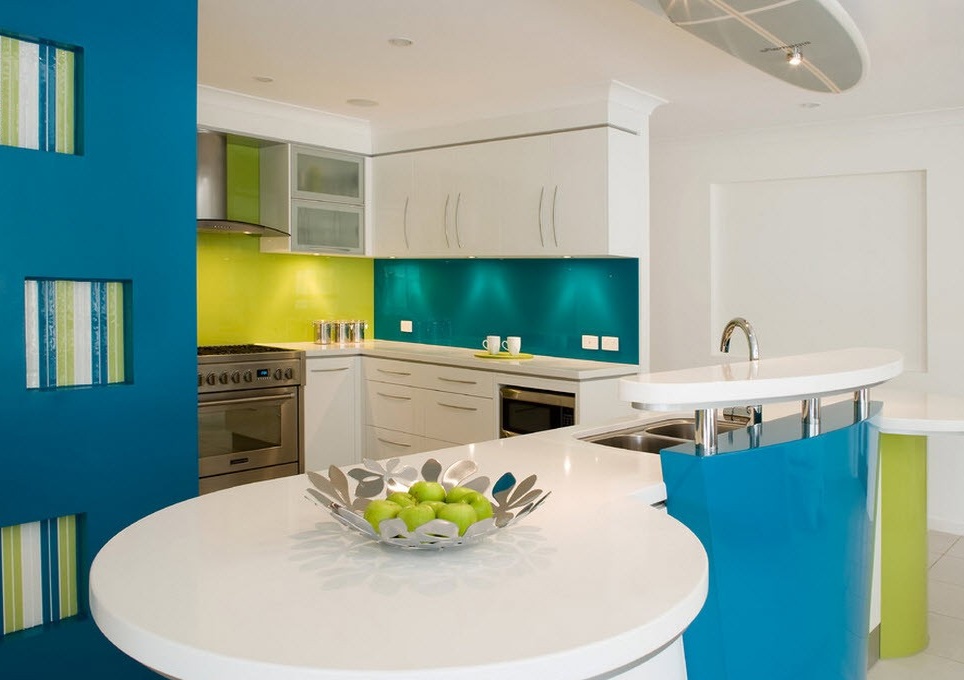
What is characteristic of these combinations? Pistachio is more suitable for saturated blue. For light blue or sky blue tones, it is more harmonious to choose fruit shades of green. If we add yellow accents, then blue and green should be in their soft manifestations, it is good if there will be a smooth transition using turquoise color.
These two colors create a perfect pair; they have a certain completeness in their combination. That is, most often, designers do not dilute such an interior with any other colors. It is believed that this is not necessary, they perfectly complement each other. It is in this design that the whole complexity of working with green simply disappears.Brown acts as a context that makes the room as receptive and balanced as possible. But still there is one rule that must be observed: of all shades of green, only one is suitable - apple-green. And with respect to brown, there are no restrictions, you can take any tones. But all this applies to interiors where there are no other complementary colors. But if there is a desire to dilute the situation, then the rules change. Soft tones of both green and brown are more suitable for accents of a turquoise hue.
The more saturated shades are taken to yellow, a contrast will be clearly drawn here, which will fill the room with a certain mystery.
But with a white background, you can use several different tones and halftones.
Green with red
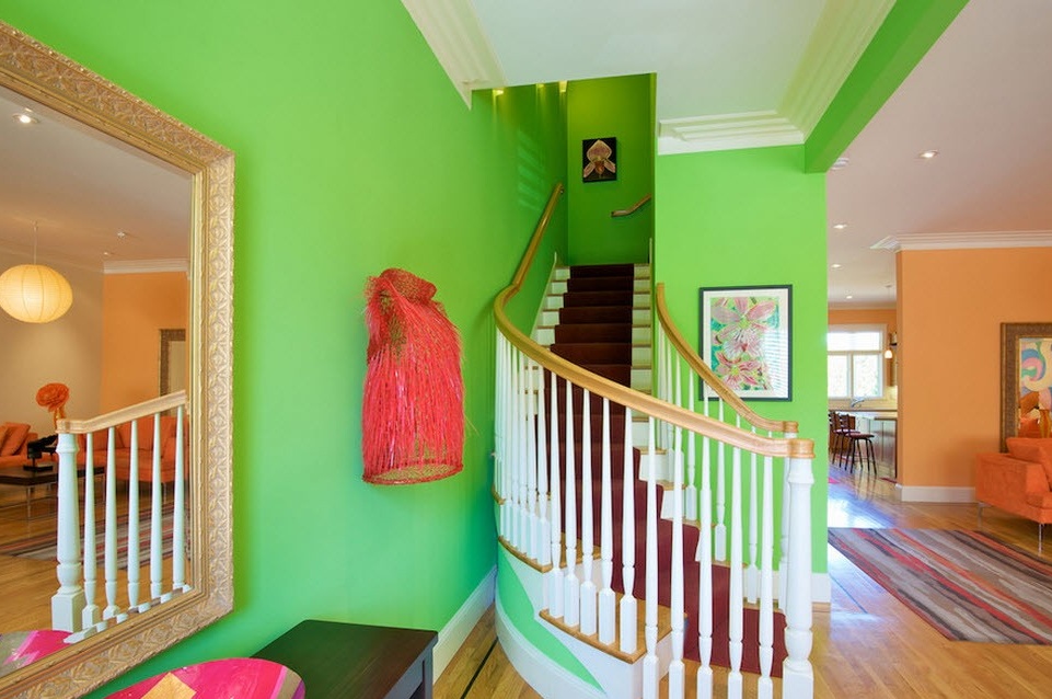
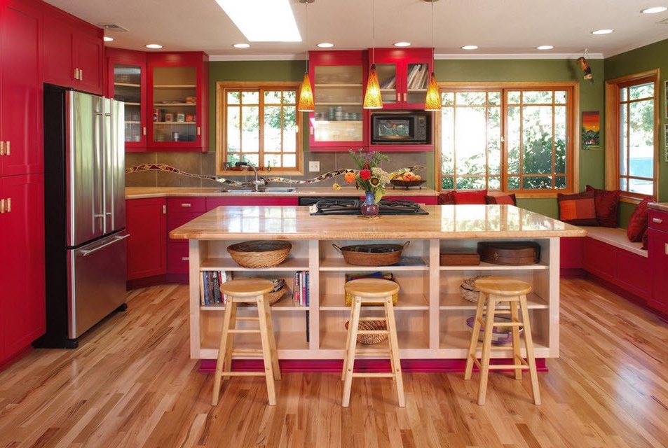
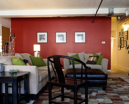
Red color is contrasting to green. With this combination, it is easy to turn the kitchen into an orchard, if you take berry shades. Although green is not the main one here, as it is a little lost against the background of bright raspberry, it is he who completes the overall picture of the “sweet” interior.
Red is also considered a complement to green, it emphasizes its expressiveness and the room becomes cute and attractive.
Given that both of these colors are bright, you can calm down such an interior by diluting it with other calmer tones, for example, white, beige, black or yellow.
Green color is magnificent in all its manifestations; it blends perfectly with almost all others, ennobling them and breathing life, joy and positive into the interiors.

