In sight: loft design of a two-level studio apartment
Who could have imagined that a straightforward design with an “industrial” past would be one of the most popular today? The desire for rationalism, the stylistic potential, the possibility of arranging a house according to the mood with the subsequent prospect of correction ranked the loft as a competitive destination. Using a concrete example of organizing a two-level studio apartment, we will take a closer look at the options for solving everyday life, privacy, and methods of conditional zoning. The project was created on the basis of an eclectic mix, functionality, in places ascetic and may seem boring. However, everything is in order.
The absence of internal walls in the duplex perimeter is in favor of the area. Enough designations by means of color, segmented placement of furniture to outline the boundaries of each zone and achieve overall consistency. Unlike standard projects, in an open studio it is permissible to take refuge only behind the doors of the bathroom and toilet. And if you are satisfied with an open demonstration of everyday life, get ready to fold up the sofa daily or carefully make the bed after sleep.
In sight of the living room
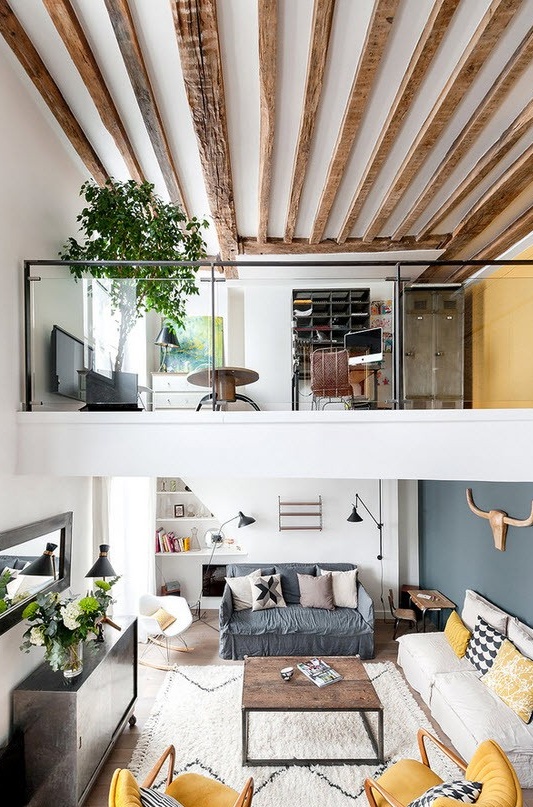
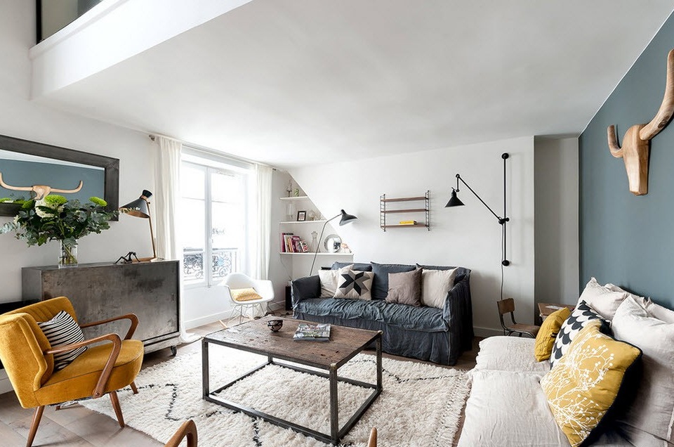
The interior group is represented by a simple complete set with the inclusion of the necessary items. In a compromise combination of the rough surface of the table, enclosed in an aluminum frame and located on a fluffy carpet; metal tubes of lamps, wooden armrests with their texture heterogeneity represent an interesting composition.
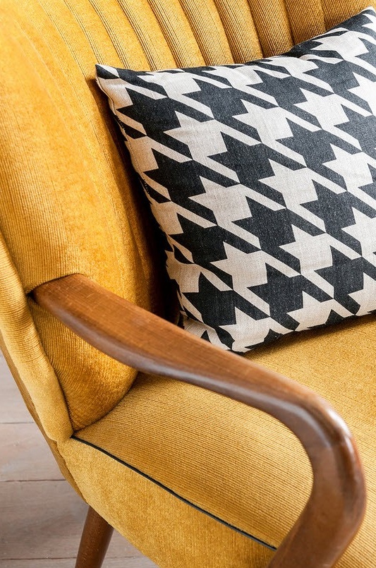
This arrangement is in line with style trends, so unexpected combinations are always welcome. And if the recreation area is modestly designed, it is appropriate to balance impressions by introducing an avant-garde subject or, as in this case, a dazzlingly bright duo from armchairs. With the support of identical pillows, it was possible to "breathe" life into the perimeter.
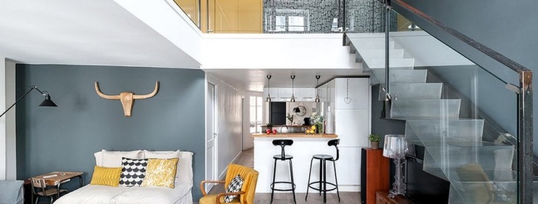
Attributes correspond to the scale of space, and the perception from a small living room is leveled by amorphous lines of expressive objects and their texture. The design focuses on major touches. This is a large imitation of deer horns above a folding sofa. It is duplicated in a mirror with a voluminous black frame opposite, which visually creates symmetry. A cone-shaped lamp on a wall stand with history and a lone silhouette projection with tonal consistency emphasize color monosyllabicity.
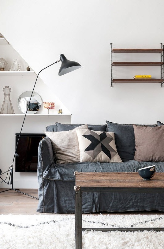
The dark monochrome walls and staircases are offset by the presence of a white wall, from the bowels of which you can see white shelves with a few transparent accessories. A high adjustable black lamp stands out against a light background and serves as a convenient backlight for fans of evening reading. Textiles, thick carpets throughout the apartment, an abundance of pillows actually deprive the voluminous space of multisound. And yet, if the echo bothers, acoustic panels will come to the rescue. Cork floors in the carpet company will contribute to monotonous vibration.
In the lens of attention - children’s and kitchen
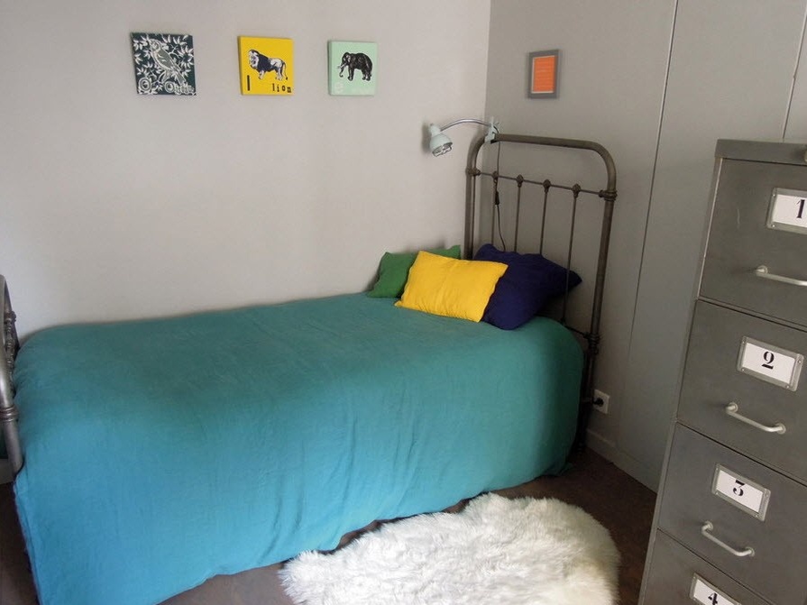
It is permissible to isolate oneself with the help of a niche, alcove, mobile partitions, blinds. In the case of sliding panels, the decorative task is simultaneously solved - colorful screens are perceived as a painting canvas. In this project, a curly static panel behind the sofa has a through passage. The fenced off corner with a Spartan bed and animalistic pictures on the wall is out of sight. Judging by the small size of the table, soft toys, a child lives here.
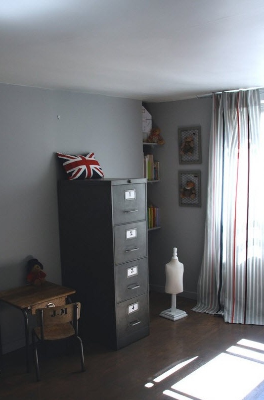
If it were not for the white fluffy rug at the berth, the colorful pillows and pretty striped curtains, the space against the background of the retro design of steel structures and an office chest of drawers would look depressing. The shelves built into the niche organically continued the wall and contained the necessary functionality.Bright roots of books with color saturation added positive to a dark room and softened the restraint of the atmosphere.
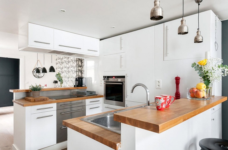
The living room "flows" into the bright kitchen, fenced off by a high counter with a pair of bar stools. In addition to the milky-white dominant, the connection with the design of the living room walls is preserved. The bluish blue of one of the walls repeats the primary color of the first level. The functional segment is practically no different from modern designs in minimalist traditions. Coarse hemispheres mounted in parallel in synchronous sequence are responsible for lighting. The surfaces of the modular kitchen are almost empty. In fact, the interior is absolutely not against an open display case with gadgets, jars of spices, fruit dishes, beautiful bottles and other little things that harmoniously rhyme with the perimeter.
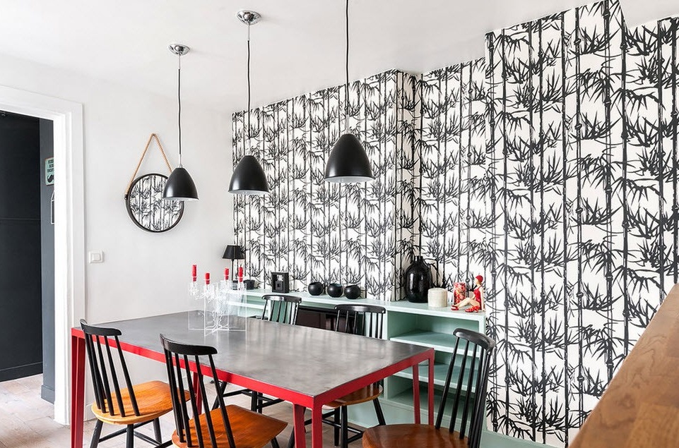
In the dining room segment, it’s much more fun, and all because the black and white duo is accompanied by red, and the design looks stylish in dynamic contrast. The prevalence of dark accessories against the backdrop of a picturesque wall was brightened by the introduction of a delicate turquoise color. The coincidence of forms and textures, successful combinations, the nuances in the decoration of furniture convince of the colorful decor.
We translate focus up
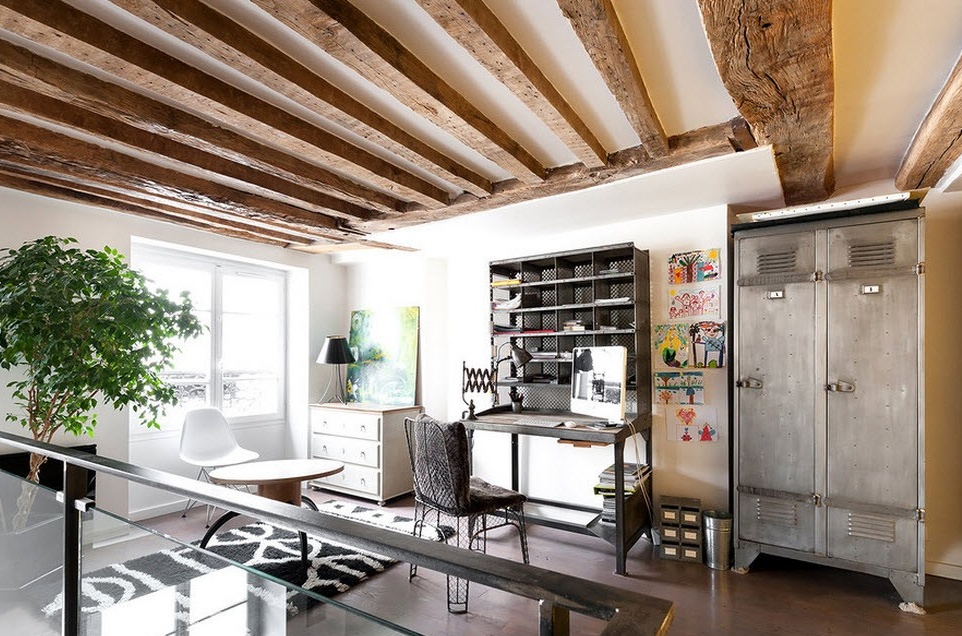
Climbing the stairs, you directly get into the office under the lined ceiling. Massive beams, clerical manner of organizing the workplace leave the “aftertaste” of industrial. Confirmation of this is metal safes, an identical set of shelves and a table. The mesh case of the chair matches the set and disharmonies with a nice wooden table and a stand in a modern design. Since this is a loft, such equipment is the usual solution. Cheerful drawings, a beautiful tree and a picture in green tones became decorative chips and partially integrate design. Nearby, built-in wardrobes solve the issue of storage.
Still, more creativity is needed to feel the softness of the home atmosphere. Little things always form a different impression and emphasize individuality. A set of brilliant dials, a large watch with a large dial, banks filled to the top with wine corks, exotic ikebans, frames will perfectly brighten up the interior laconicism. With such a background, a collage of black and white photographs ideally rhymes.
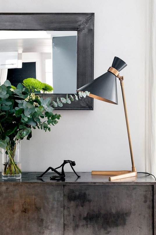
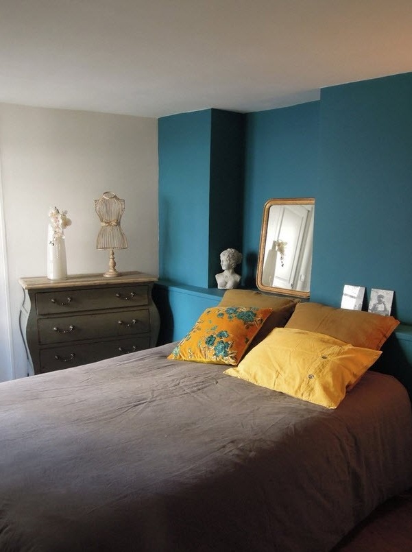
Upstairs is the bedroom. Typical design is determined solely by functionality and does not accept unnecessary decor. An elegant stand, a figured lamp, a couple of little things, a mirror in a beautiful frame make up a compositional plot.
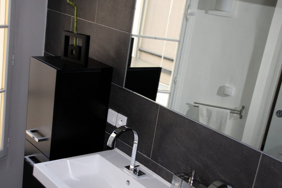
The black and white bathroom is close in spirit to one of the minimalist styles. Black plastic furniture matched the tone of the tiles. A large mirror, chrome plumbing look beautiful against a white sink.
Life and mood are changeable. Taking the idea as a guide to action, do not forget to indicate your mood and preserve individuality.

