A modern mix of design ideas in the interior of a Swedish house
We bring to your attention a design project of a house with original architecture. Private home ownership is located in Sweden and it is not surprising that the foundations of the Scandinavian style left an imprint on its design. Adding a bit of modernity and even pop art to the Northern European style, designers and homeowners got a non-trivial approach to using a complex building in creating a cozy and functional home.
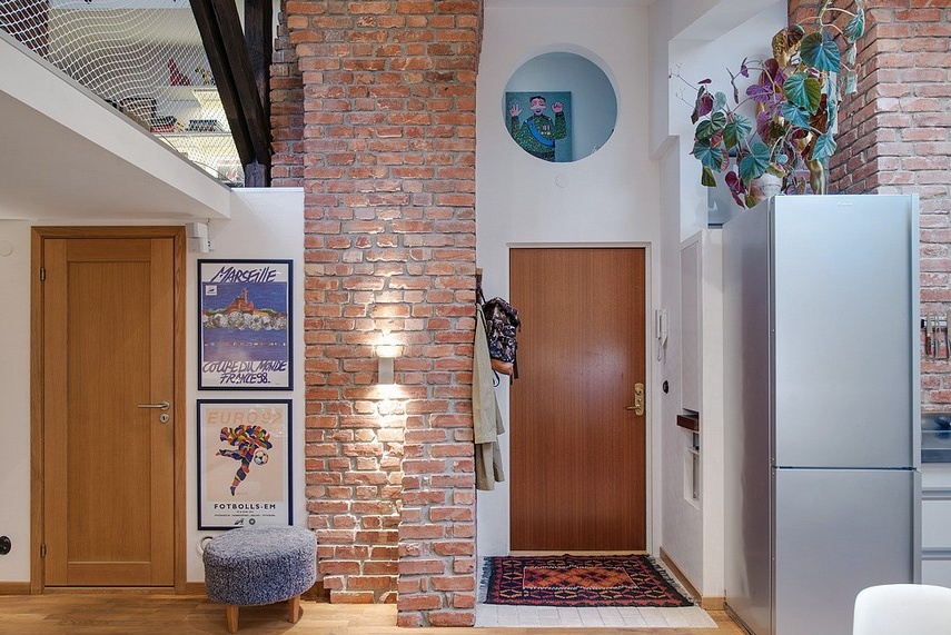
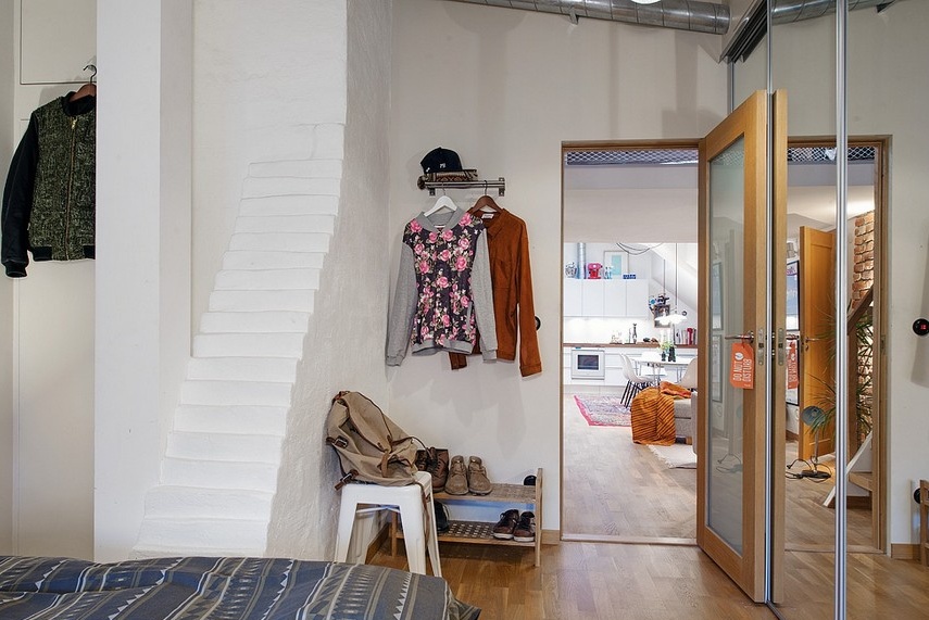
We begin our small tour of the interior of the Swedish house with an entrance hall. From the very first steps it becomes clear that the apartments have a very complex architecture. A lot of different protrusions and bevels, niches and nooks create, on the one hand, a room that is difficult to finish and equip, and on the other, an opportunity for the design team, together with the owners of the house, to create a completely unique project.
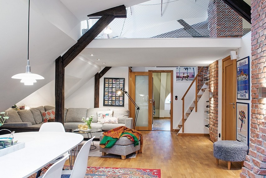
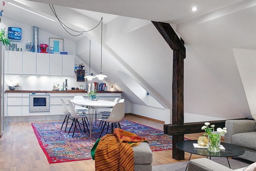
In the first spacious room of a private house is a living room, combined with a dining room and kitchen with an open plan. In all functional areas, one approach to surface finishing was used - against the snow-white background, the dark elements of the building's architecture - beams and ceilings - stand out in contrast. The use of unclad brickwork as accent surfaces helped to bring into the image of the room not only variety, but also notes of industrialism.
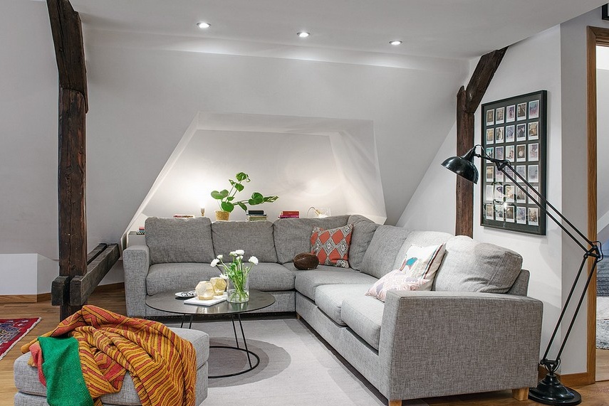
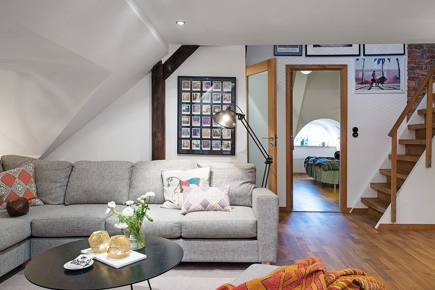
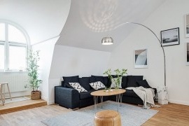
The lounge sitting area is located in a cozy corner. The spacious sofa of angular modification has become an ideal piece of furniture for placing the maximum possible number of households and their guests on a small piece of space on the ground floor. And a cozy light, and an elegant coffee table, and a comfortable pouf stand, and a floor lamp in the form of an office lamp - everything in this segment of the home is selected from the point of view of a harmonious combination of practicality with external attractiveness.
White trim, dark beams and gray shades, as intermediaries between these contrasting combinations. The use of gray and its shades as a buffer always brings some restraint to the interior of the room, “smooths corners” and pacifies.
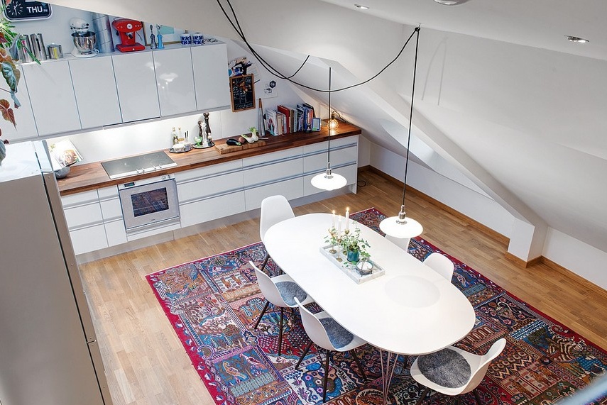
Next to the living room is the dining room, which smoothly passes into the kitchen area. A dining group from renowned designers is already becoming a classic for modern European and American homes. A spacious dining table with a snow-white oval table top and comfortable plastic chairs on wooden legs made up an incredibly harmonious and practical union. The dining area is highlighted not only by individual lighting in the form of pendant lights, but also by a colorful carpet, which can freely symbolize the Scandinavian style in a modern home.
The room has a complex trapezoidal shape, which, of course, affects not only the choice of furniture layout, but also the finish to create a harmonious atmosphere, without attracting attention to the complex architecture of the building. The snow-white background in this case is the best possible option, not only because of its ability to visually expand the space, but also the properties to hide (or not focus) on the complex architectural features of the room.
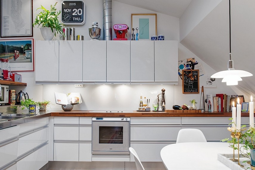
The kitchen and dining hones have enough usable space to accommodate a sufficient number of storage systems, work surfaces and household appliances. But even in this zone the shape of the room cannot be called “correct” - all kinds of bevels and protrusions make their own adjustments to the formation of the furniture set. The angular layout of kitchen cabinets with the top tier on one side only became the best option for arranging a practical, ergonomic and outwardly attractive functional segment of the home.
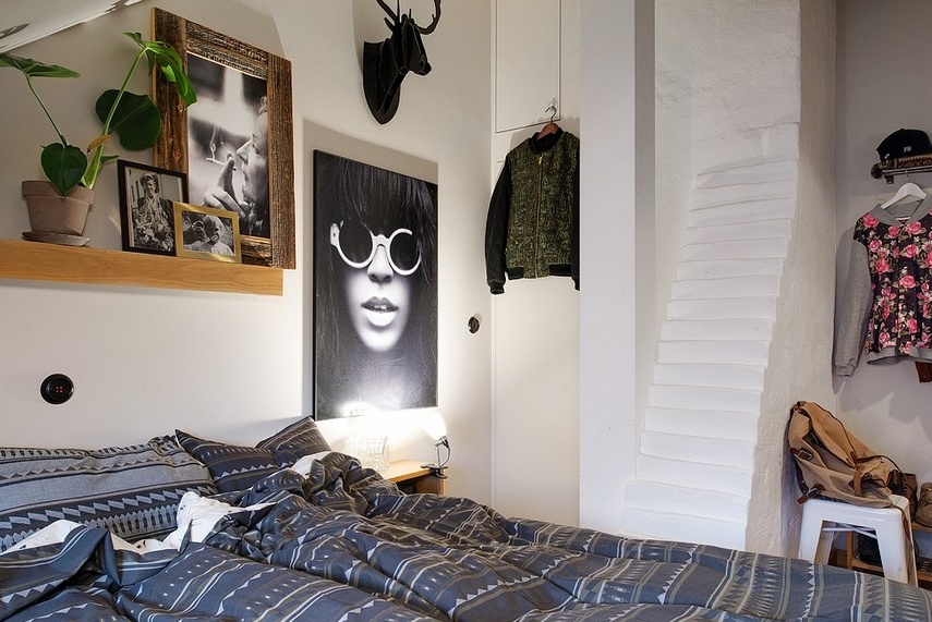
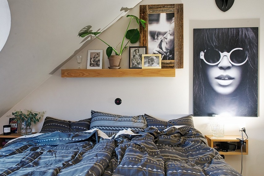
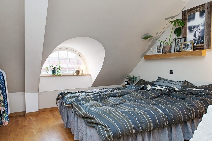
Here, on the ground floor there is a bedroom with a beautiful arched window and an unusual shape of the room itself. Only white wall decoration was able to adequately present all the nuances of the original building. The bedroom space is small, but it was enough to equip not only a sleeping place, but also an impressive storage system in the form of a sliding wardrobe with mirrored doors that visually deprive the room of borders, increasing a modest space.
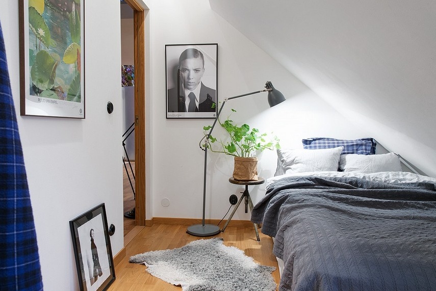
On a white background finish, wall decor looks particularly expressive. The Swedish house has a special place for decoration - original artwork, photos and posters in the pop art style do not just decorate the rooms, but bring a completely different aesthetics to the interior.
But not only wall decor has become a hallmark of the interior of the whole house. Living plants are found literally in all rooms of the Swedish house, and this shows not only a love of nature, but also following the traditions of the Scandinavian style of space design.
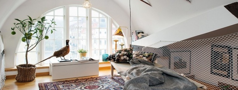
The original design of the arched window makes the design of the whole room unique. Swedish apartments belong to the type of design projects when complex architectural features become the highlight of the building, which is called a “cherry on a cake”.
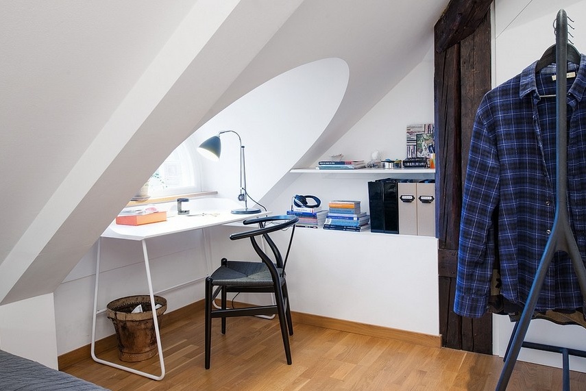
The second bedroom, designed for one person, occupies a room with an even smaller area. A very large bevel of the ceiling leaves a special imprint on the way the furniture is arranged in this room for sleeping and relaxing. But at the same time, the space looks very cozy - not only a berth, but also all the necessary accessories for a comfortable placement found their place in this room.
Near the original arched window, it was possible to place a workplace. A simple desk, a comfortable chair with a back and a pair of open shelves - what else is needed to organize a mini-office?
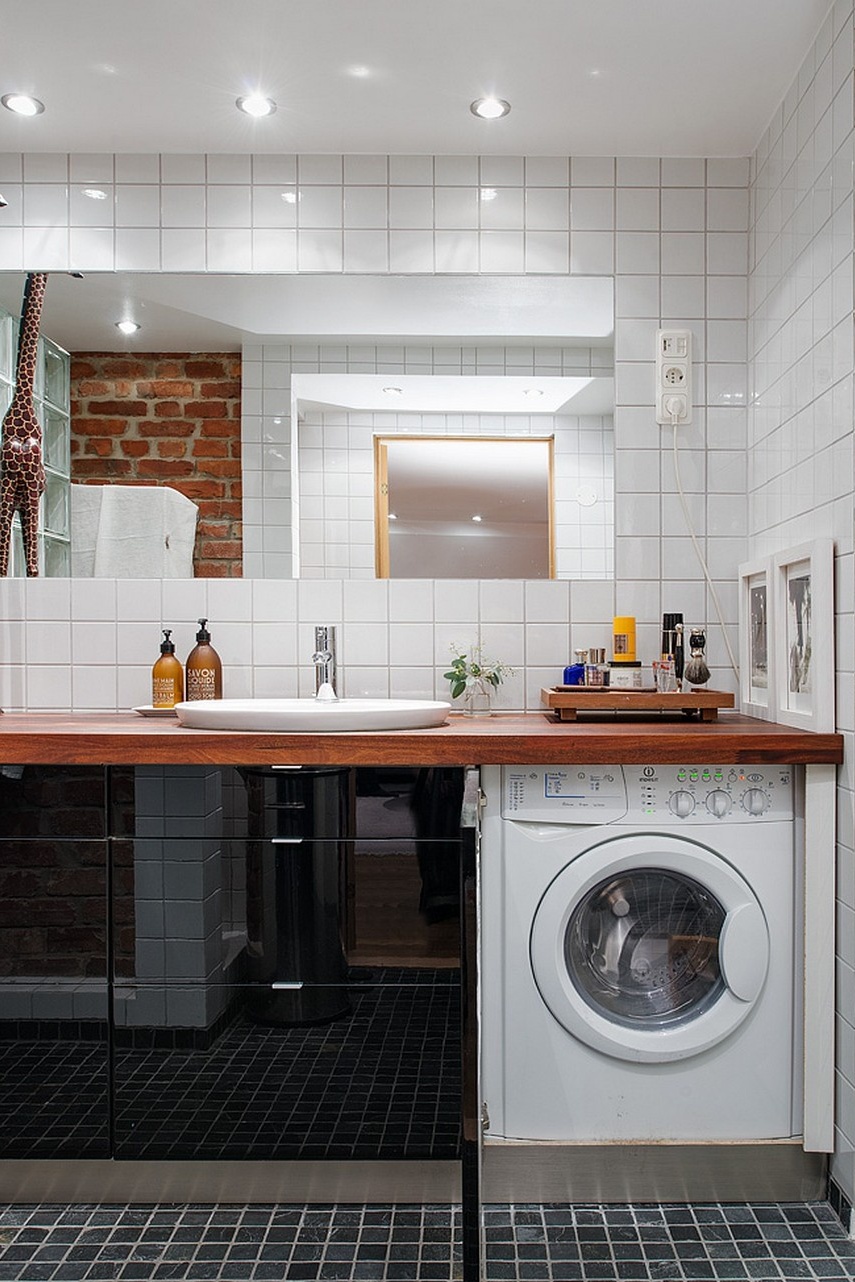
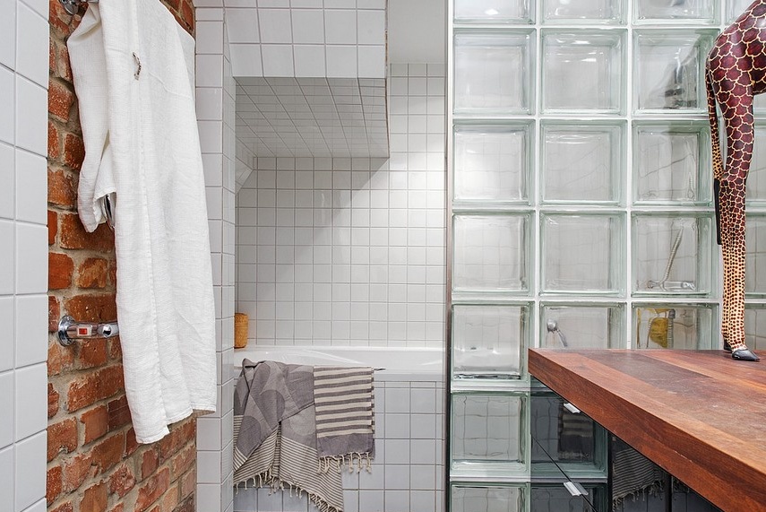
Not far from the bedrooms there is a bathroom room, decorated with a considerable share of originality. If the use of black and white color combinations, the use of ceramic finishes and a brick wall in one room as an accent, we can quite expect to see, then to observe a large giraffe in the bathroom as a decorative element is at least unexpected.
With the help of a partition from glass blocks, the utilitarian room is divided into a zone of morning water procedures with a sink and a washing machine and a segment of evening baths with a built-in bathtub lined with square tiles.
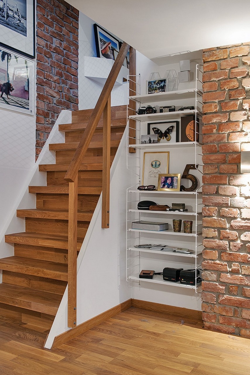
From the first floor of the Swedish apartments we go up the wooden stairs to the upper tier, where a room is arranged, which is a cross between a library, a place for relaxing and reading, and a light zone for family gatherings.
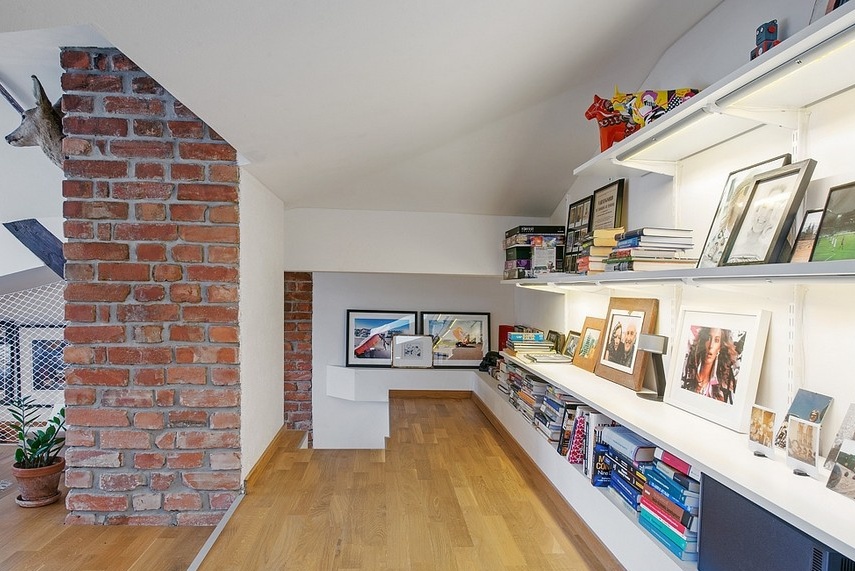
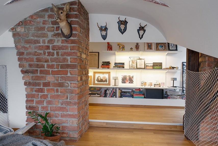
Very often, the simplest solutions for home improvement are the most effective, practical and beautiful. For example, open shelves for storing books, stationery and other trifles. What could be easier? Meanwhile, the whole wall, decorated with the help of such snow-white storage systems, looks fresh, easy and modern.
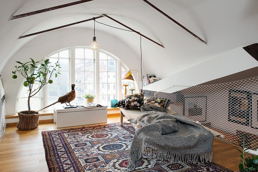
The upper tier is the realm of unusual residential architecture. Here, both vaulted ceilings with curves, and asymmetric columns and floor beams are located in an original way.
The space for relaxation and reading fenced on both sides with a grid is a relaxation room, similar to an oriental boudoir, but in a modern reading. In such a cozy and bright room, the owners are surely pleased to be, because each piece of furniture or decor brings its own touch of warmth and home relaxation to the atmosphere.

