Contrast modern design on the example of Kiev apartment
We bring to your attention a small excursion on the interior decoration of one modern apartment located in Kiev. The contrasting interior of this home is filled with dynamism, energy and a positive charge. The Kiev apartment is a great example of how you can place all the segments necessary for a comfortable life on a relatively small living space and make it bright, original and original.
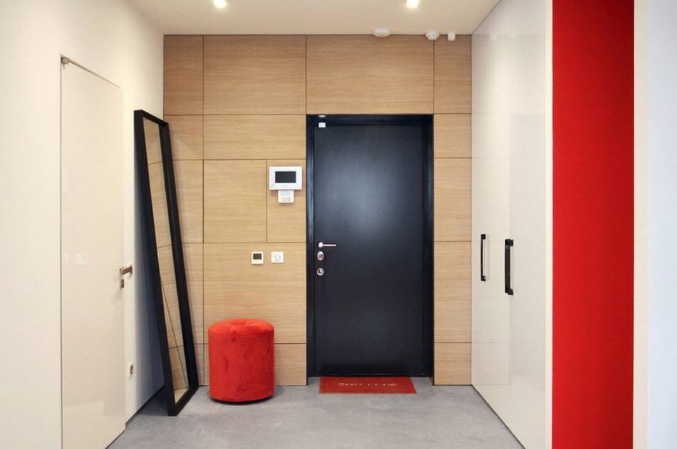
So, we are in the hallway of the Kiev apartment, the interior of which at first glance can be called just white-red-black, it is so contrasting, bright and original. The modern design of residential premises is increasingly striving for unobtrusive minimalism, when storage systems are masked by integrating into niches, furniture is deprived of decor, lighting systems rarely use chandeliers, more often built-in lamps and LED strips or lamps, and smooth, monophonic surfaces are used in decoration, sometimes glossy.
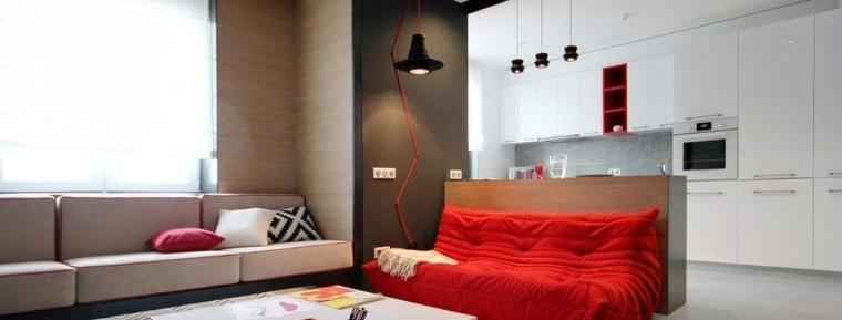
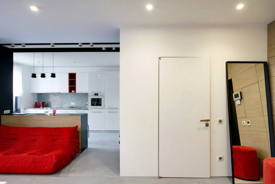
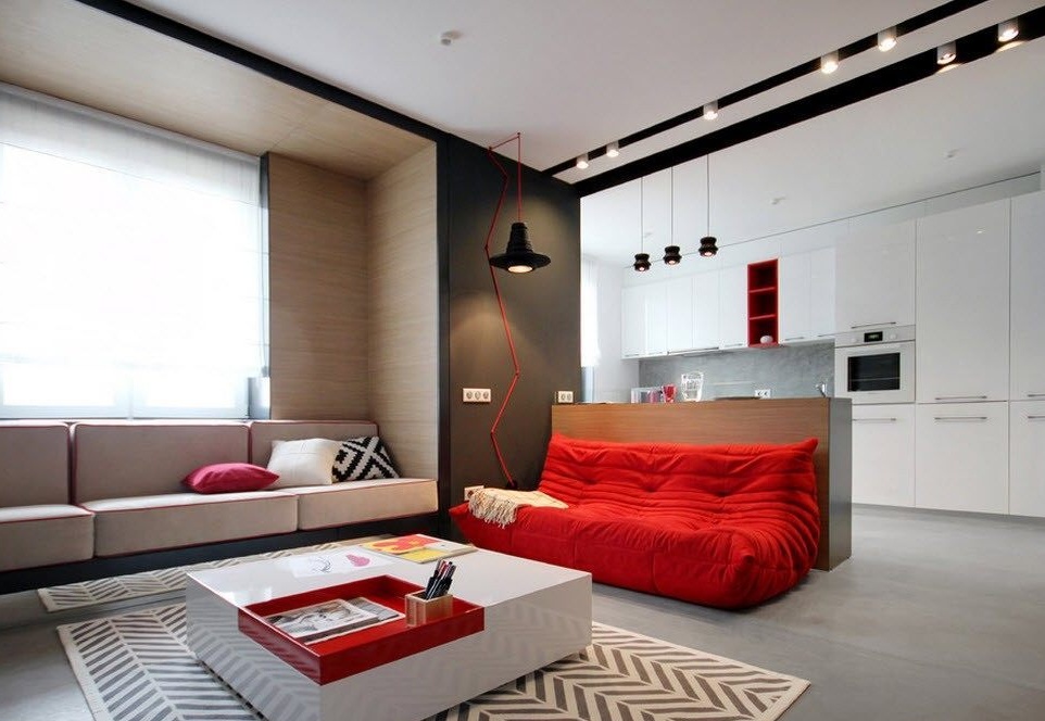
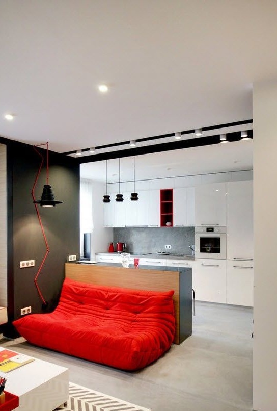
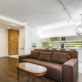
Without any obstacles, we can get from the hallway into the living room area, which is combined with the kitchen segment, with the conditional division of the bar counter. The snow-white finish of the walls and ceiling visually expands the space, moreover, against such a background, black and red elements look most advantageous, bright and distinct.
The alternation of white, black and red tones in the design of the apartment does not bother the eye and helps focus on certain interior items, decoration features or decor elements.
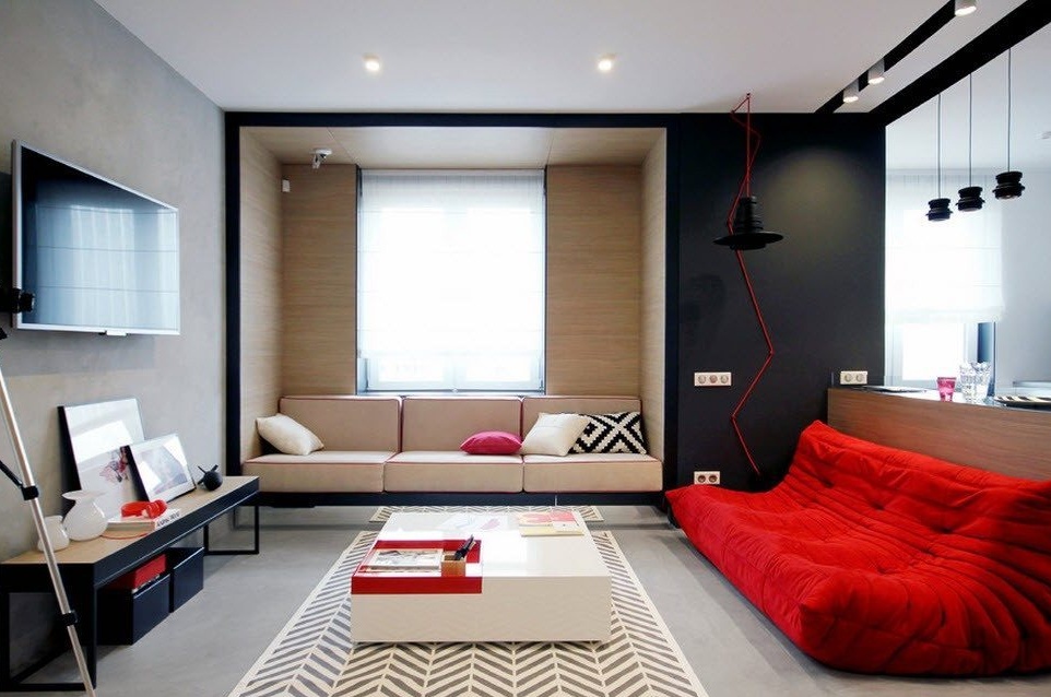
The living room, combined with the kitchen, is designed as a studio room, where the division into zones is very arbitrary, but the room has a high level of functional load. Almost all the cabinet furniture of the apartment is built-in, there are several design features that formed niches and ledges, which complicated the geometry of the room, while maintaining spaciousness.
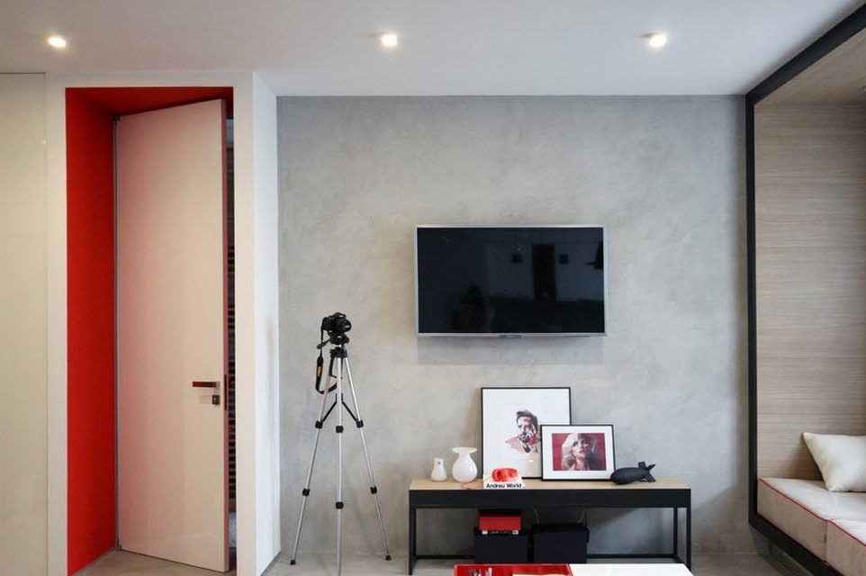
The living room is endowed with everything necessary for a comfortable rest and relaxation, a relaxing pastime after a hard day — a soft zone in a niche near the window, an original frameless sofa in a bright saturated shade, a transforming coffee table and a TV zone.
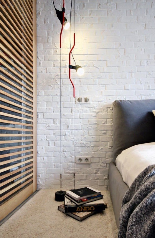
The lighting system in the Kiev apartment is laid at several levels - lamps are built into the ceiling around the entire perimeter, in addition, pendant lamps of the original design in bright colors are placed near the working surfaces and reading places.
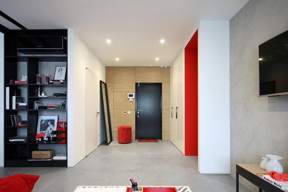
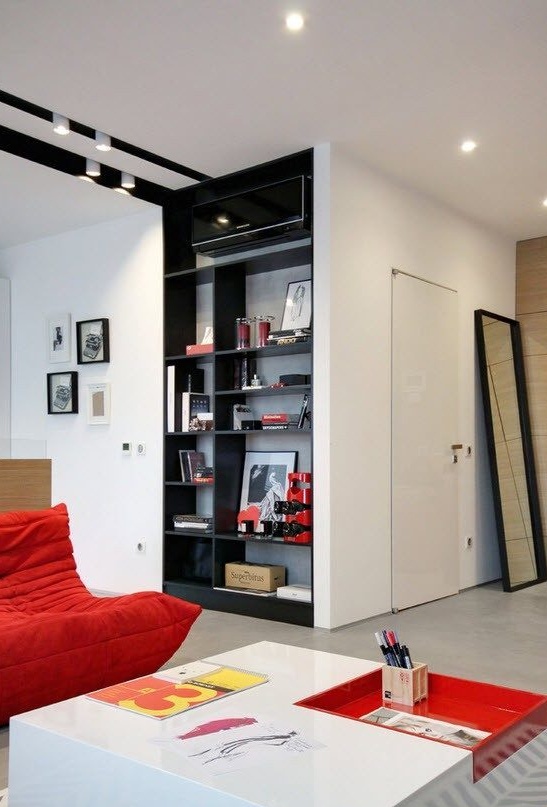
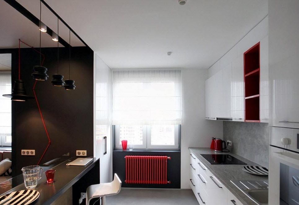
On a fairly wide passage between the zones, bypassing the built-in open rack, which has become a refuge for the split system, we find ourselves in the kitchen space.
A fairly spacious (for a city apartment) kitchen space contained all the necessary work surfaces, appliances and extensive storage systems. The bar serves as a dining group, which in combination is a supporting surface for a soft sofa in the living room. The original design move was the emphasis on radiators - on a black background, the red element looks very advantageous.
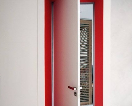
Then we head to the TV-zone of the living room and, opening the interior doors located in a bright red niche, we get into the bedroom.
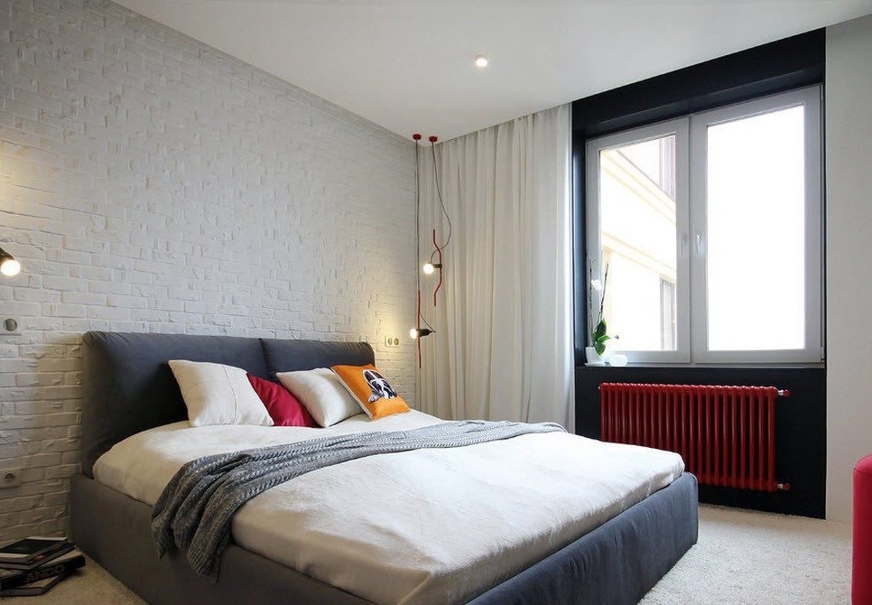
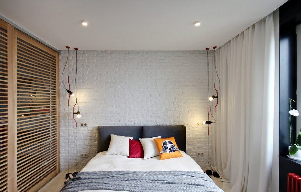
The bedroom is a separate room, in the decoration of which we again see the familiar methods of color contrast - the snow-white finish of almost all surfaces, the contrasting dark design of the space around the window and against this background a bright red heating radiator. Often the wall at the head of the bed is made as an accent, but in our case this happened only from the point of view of texture - the brickwork was painted white.
In the bedroom, as well as in the living room and hallway, storage systems are presented in the form of built-in wardrobes, the contents of which are reliably hidden from prying eyes behind mirrored sliding doors with a rack frame.
Some industrial interior is diluted with soft upholstery of the bed frame, creating the effect of a cozy, home environment.
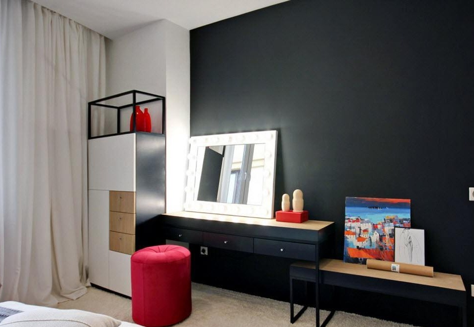
Against the background of the total black wall of the bedroom, the mirror of the dressing table with backlight stands out especially. The game of contrasts in this Ukrainian apartment does not leave the visitor for a minute, presenting in all new manifestations, whether it is the decoration methods or the decor used in the room.
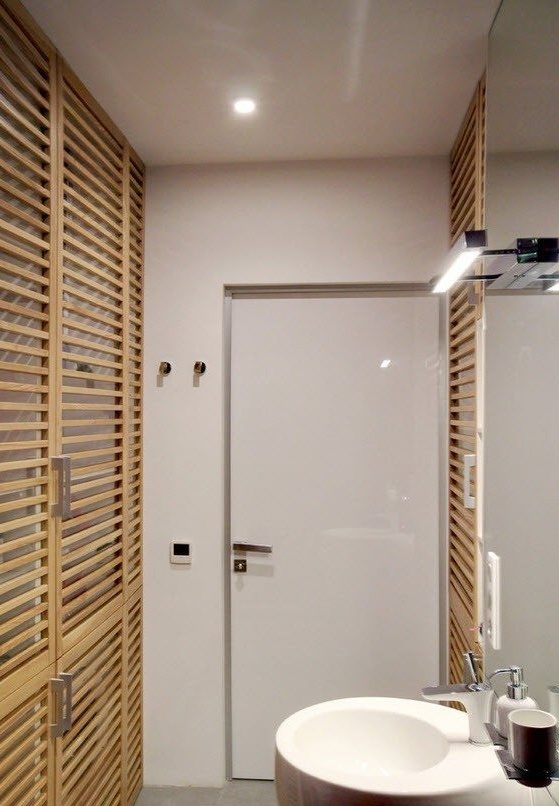
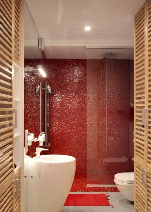
Near the bedroom there is a small bathroom, the space of which was visually expanded due to the abundant use of mirrors, glossy and glass surfaces. Here we see the familiar way to design storage systems behind the rack doors.
Finishing the space of the shower with bright mosaic tiles has become the highlight of the bathroom, its emphasis. Against this background, the dazzling whiteness of plumbing looks the most advantageous, contrasting.

