Blue kitchen: the best photo selection of design ideas, noble shades and color combinations
Blue is one of the designers favorite color options for interior decoration. The diversity of its edema gives vent to experiments and rich imagination. Having competently worked with such a gamut, you can achieve an amazing result. Today we will tell you all about the nuances of using blue in the interior of the kitchen.
Design features of the blue kitchen
The main features of color imply a few key rules, thanks to which a dull gray space will turn into a stylish elegant interior:
if you are used to working in the kitchen or solving important matters, decorating it in blue tones will favorably affect the quality of intellectual work;
blue color helps reduce appetite and pressure;
the interior in such a range looks noble and strict, but too much blue can darken the room, so it is important to know the measure;
if we talk about the temperament of a person, then such tones are more suitable for restrained, serious individuals who lead a measured lifestyle or are engaged in business;
optical features of color allow you to visually distance objects, and some surfaces are perceived more heavily;
shades of blue are used in a wide range of style decisions;
An abundance of color is suitable for rooms where the windows face the sunny side. This creates a feeling of coolness, and for hot rooms it is very important.


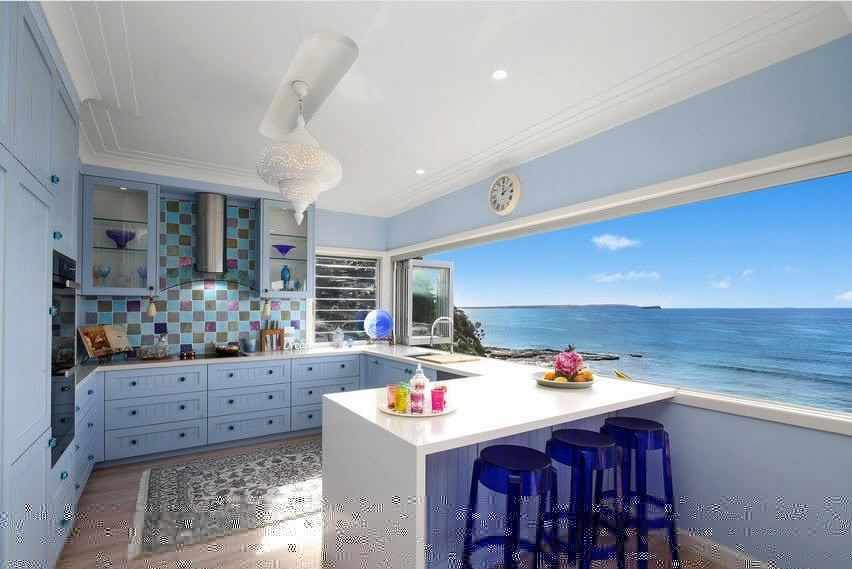
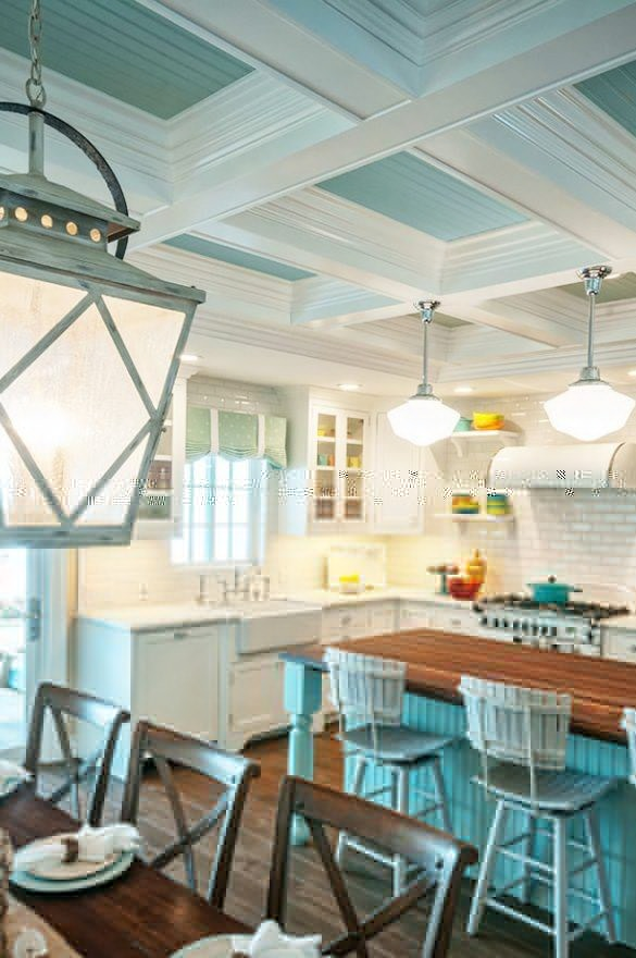
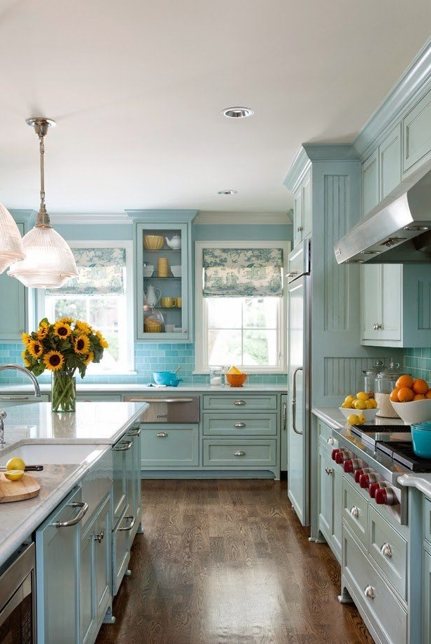
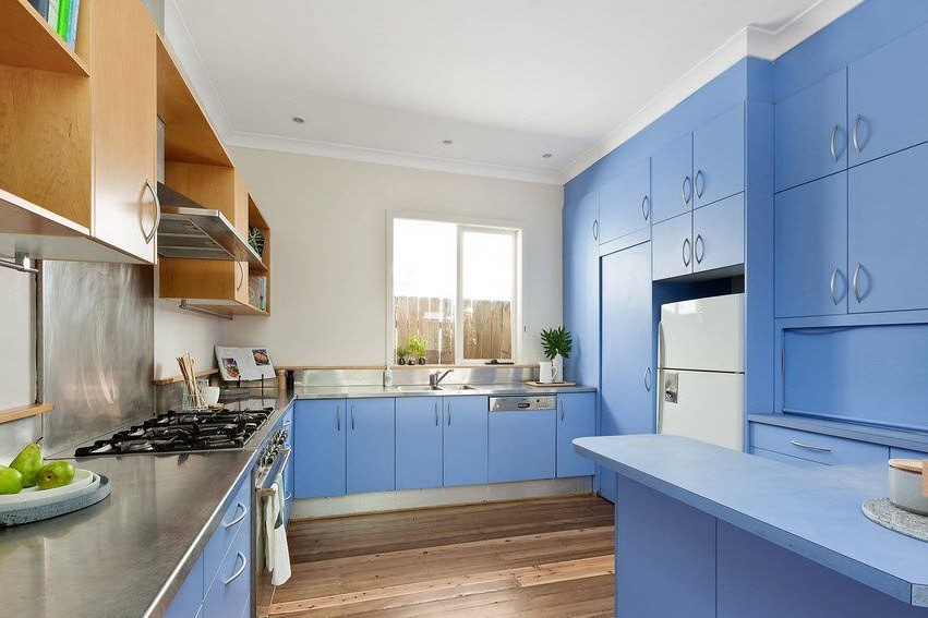
Kitchen in blue: a variety of shades
A wide range of shades allows designers to skillfully vary colors that complement each other perfectly, thus creating a single holistic and harmonious space. The most popular are the following:
blue;
azure;

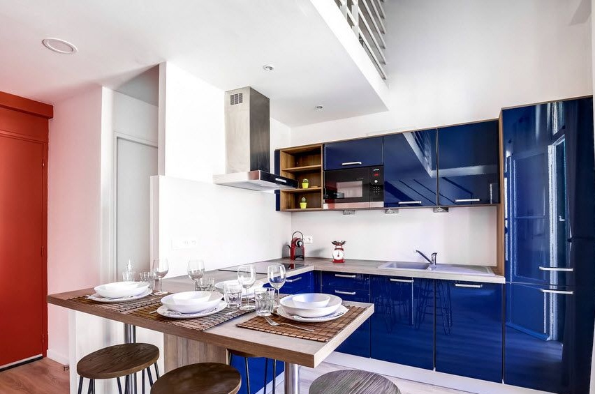
indigo;
sea wave;


turquoise;
grayish;

jeans.

Each shade has its own special character, which creates a certain mood and atmosphere around.
Perfect style for blue and the possibility of alternatives
Most of us associate blue color with a certain stylistic orientation and at the same time do not represent this shade in other options. So, for example, blue is unthinkable in a country interior, but in the Provence or Scandinavian style it is quite appropriate.


The noble cold range is ideal for minimalism, but blue is especially popular in the Mediterranean interior. It is on it that the whole design concept rests. It actively uses a blue apron, white facades, blue walls and other solutions.


This color can also become a successful accent in such areas as art deco, empire, contemporary, fusion.
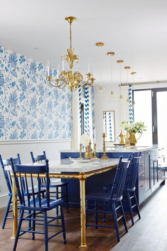

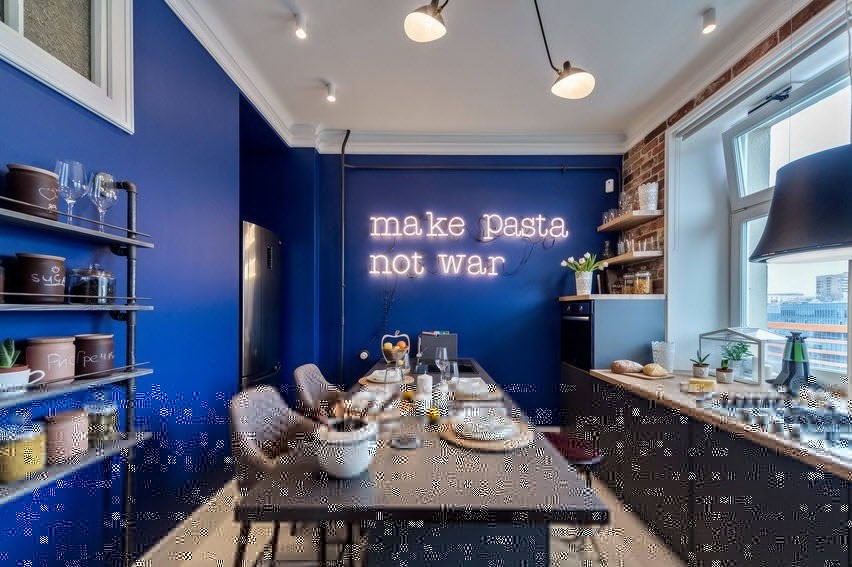
Blue kitchen: the best combination of colors
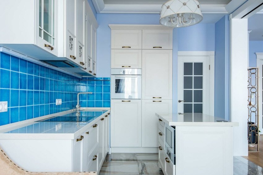
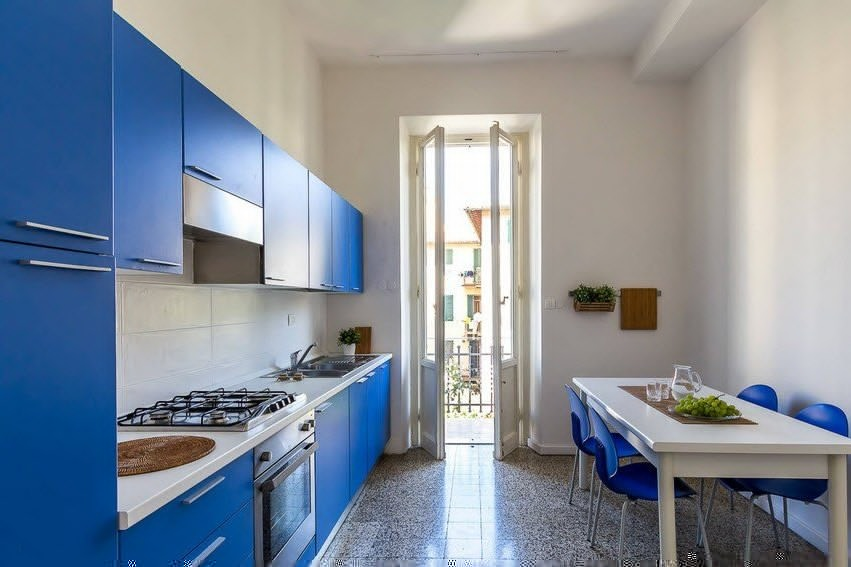
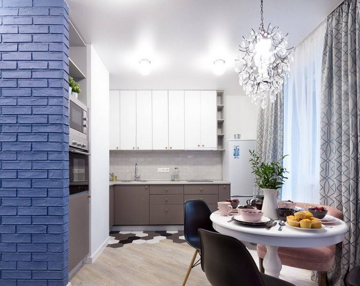
White and blue kitchen
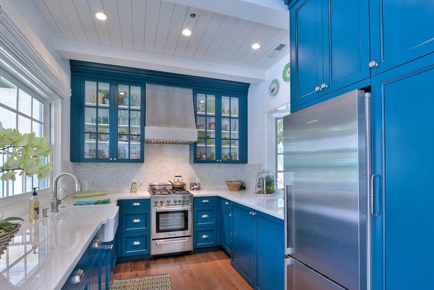
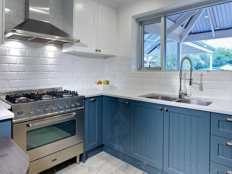
As a rule, white color is a universal option for diluting a blue tone. Blue accents on a white background - a win-win combination. This combination is often used in the marine theme of kitchen design.

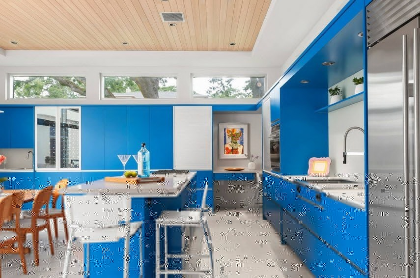
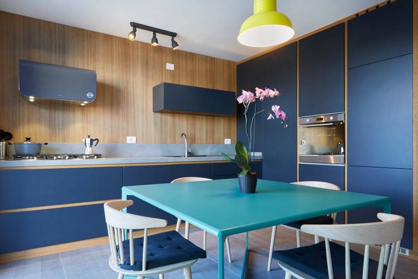
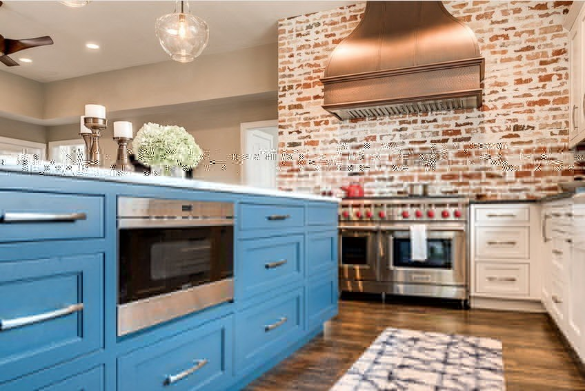
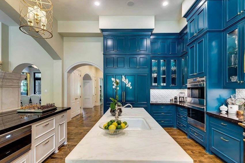
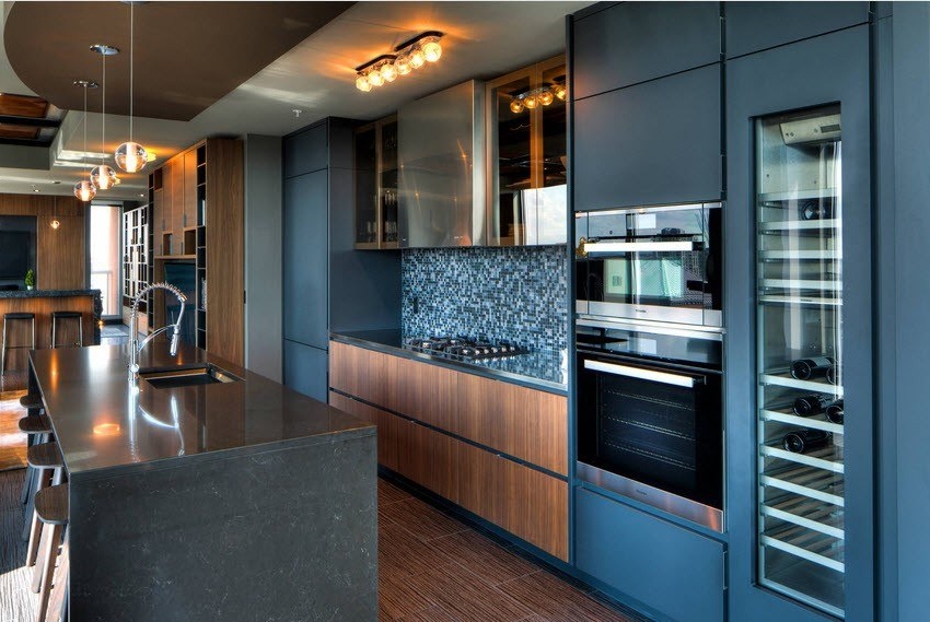
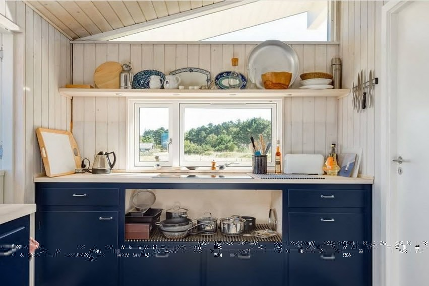
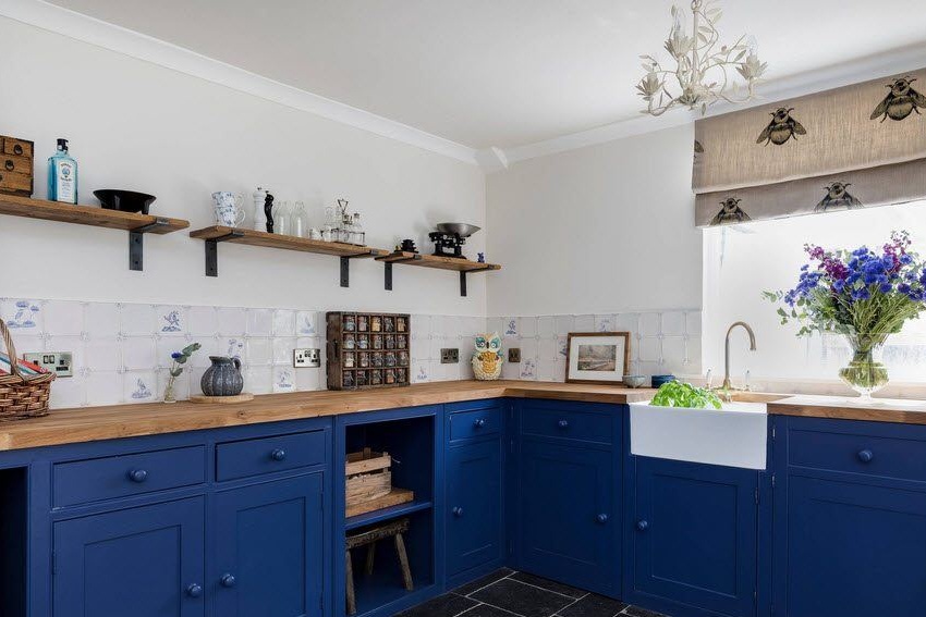
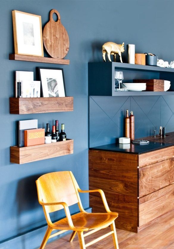
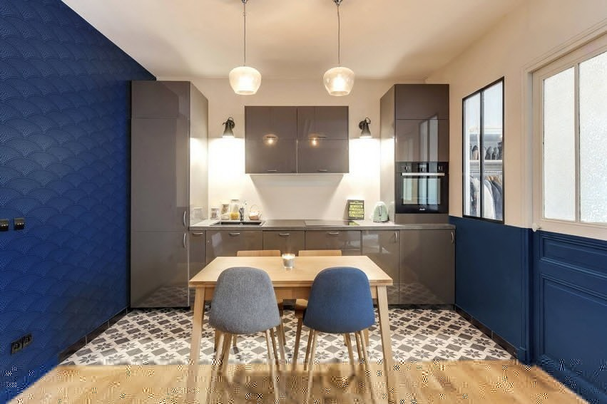
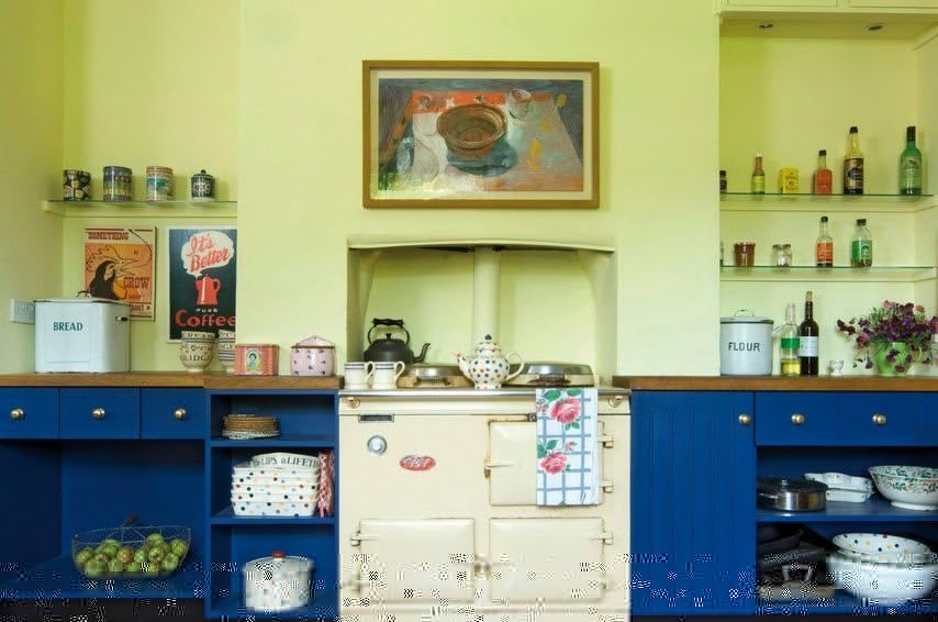
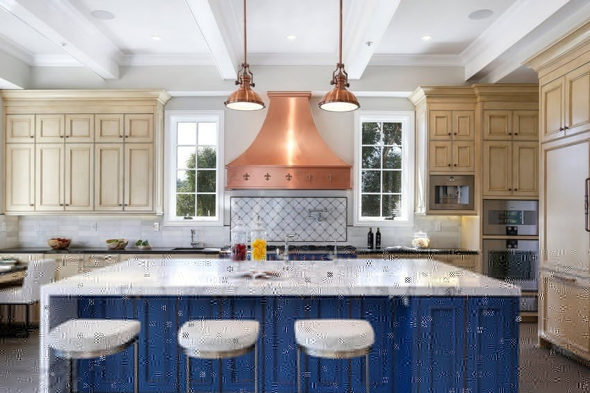
Brown-blue kitchen (combination with wood color)
Cold blue tones in combination with wood surfaces is one of the most favorite design techniques. Such a decision will make the kitchen more comfortable and warm. The blue background of the walls perfectly complements a wooden set or a colorful wooden table. In such interiors, both light and dark wood species look equally good. 

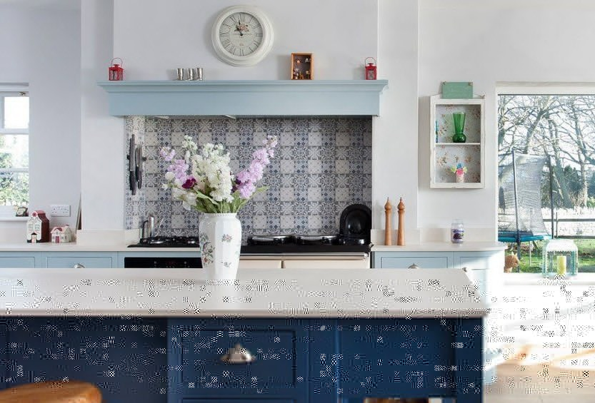
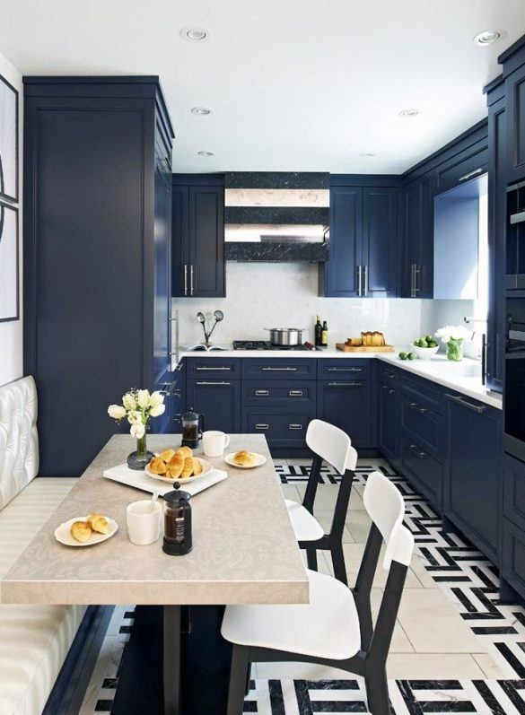
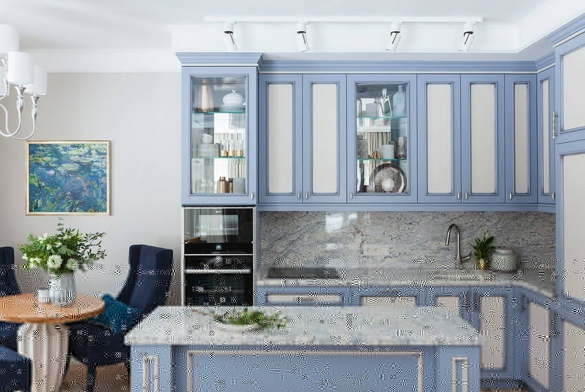
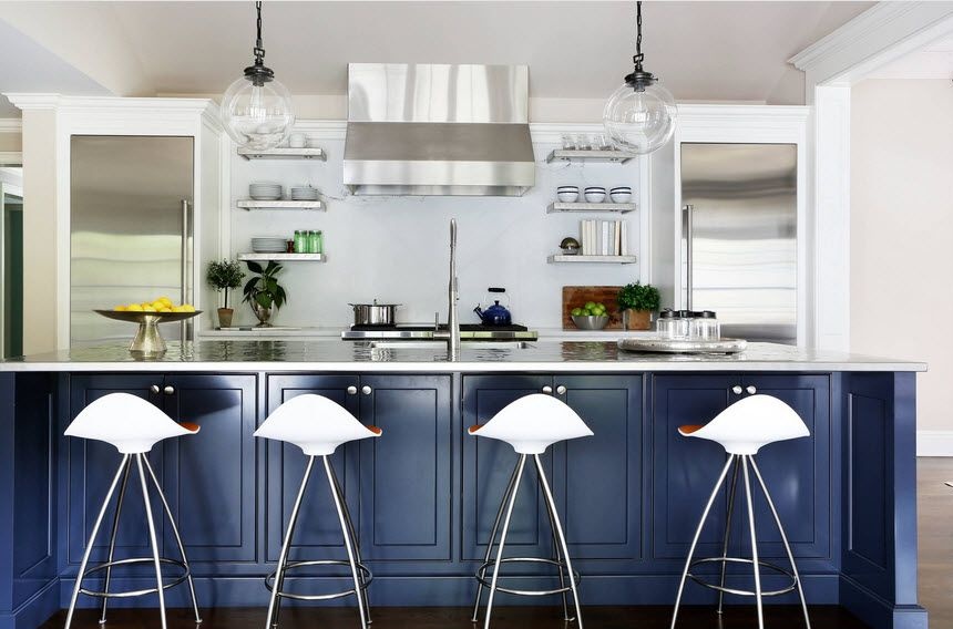
Gray blue kitchen
The gray-blue harmony of shades is undoubtedly one of the components of a modern, stylish and impeccable design. This option looks not only restrained, concise, but also very impressive, original. It is always a universal and win-win design option for the kitchen.

Yellow and blue kitchen
Of course, both colors are contrasting, so this combination is a kind of experiment.But if everything is done correctly, the result can be quite impressive, individual and extraordinary.
More calmly and habitually, yellow will look like an accent. So, for example, you can decorate the kitchen in blue and white colors, and dilute it with yellow decor - textiles, vases, pillows, accessories.


Blue and orange kitchen
To create the most harmonious design in blue-orange tones, impeccable taste is needed. You can dilute the blue background with orange details in the form of a painted table, headset, curtains, etc. In this case, the bright seats of the chairs look very impressive.

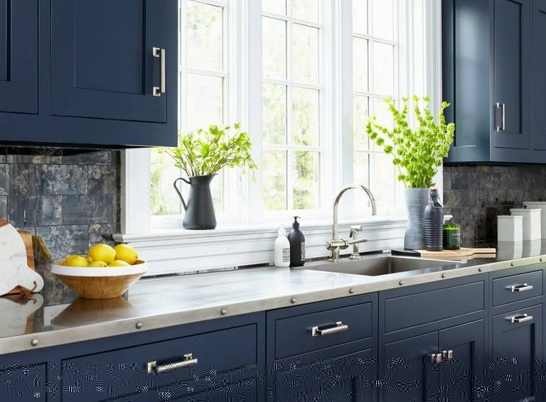
Black and blue kitchen
For an organic implementation of black, blue tones should be an order of magnitude lighter. However, black is not always appropriate, therefore, a dark blue color can become an excellent alternative, which by no means worse performs its task and makes the room brighter and more comfortable.


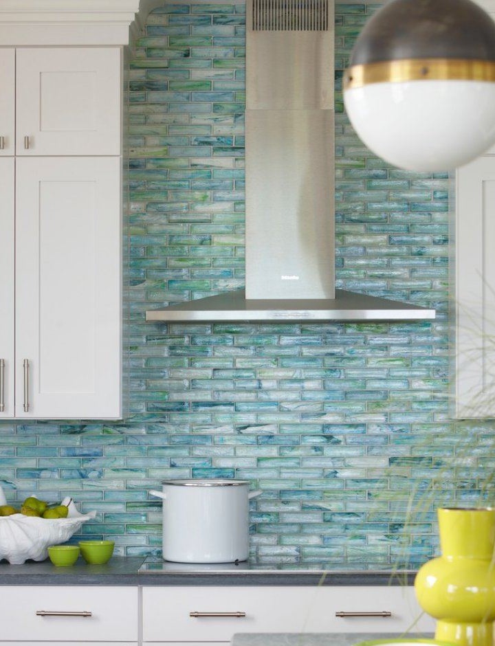
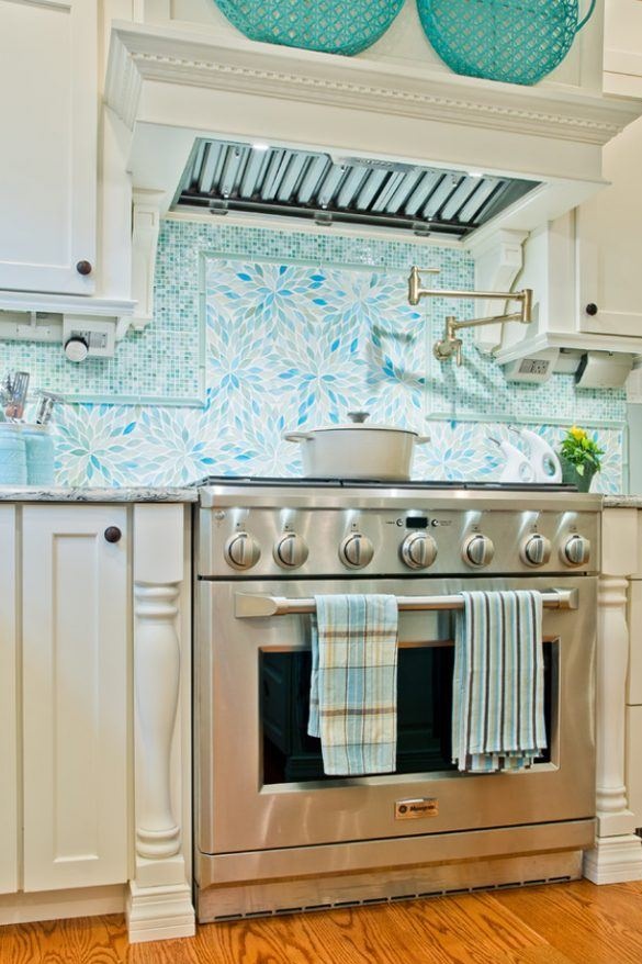
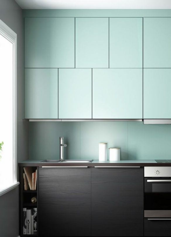
Blue green kitchen
If previously such a combination of colors was considered a sign of bad taste, today it is a very interesting duet, which is often used in practice. In the interior of the kitchen, this option looks very stylish and non-trivial. And instead of pure green, olive, turquoise can be used. It is not necessary to adhere to a single gamut - on the contrary, a variety of solutions will give an elegant, relaxed atmosphere.

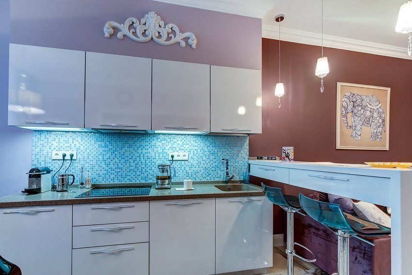
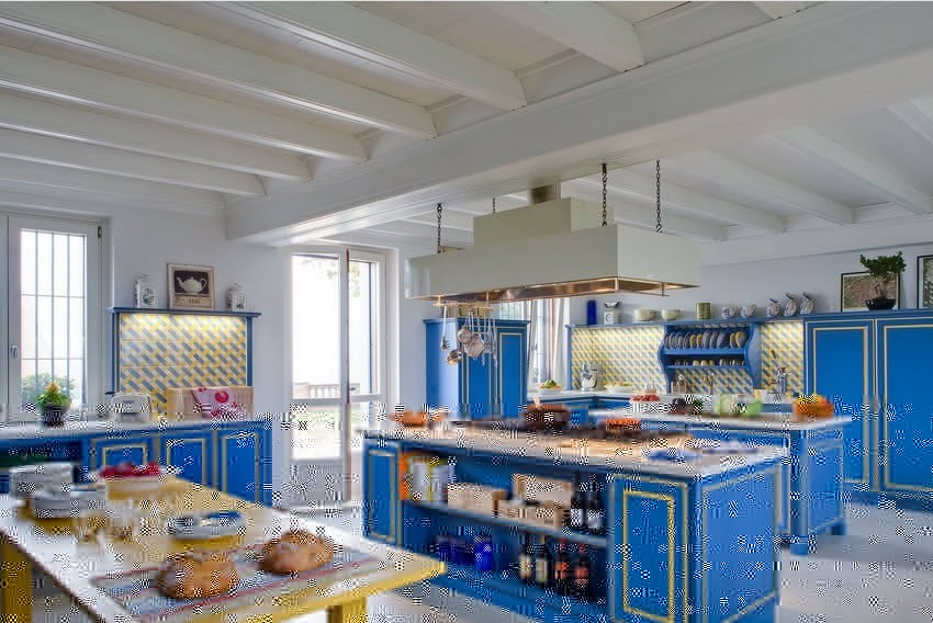
Note: blue goes well with metal elements. Their shine, together with a cool blue tone, ennobles the interior, gives it a special touch.

Blue kitchen in the interior: advantages and disadvantages of color
The positive aspects of using blue tones are obvious:
soothing and relaxing atmosphere;
the perfect combination of laconic rigor with luxury;
the play of colors allows you to narrow or lengthen the room;
blue gamma is widely used in several stylistic directions.

Along with the positive aspects, it is still worth considering some nuances that can affect the decision of the hosts:
it is obvious that the blue color refers to the cold palette, so in winter such a kitchen will not look very comfortable;
if there is little natural light in the kitchen, such a range is not the best solution. In this case, blue will only aggravate the problem, as it will further cool the room and make the furniture heavier;
too spacious a room decorated in blue shades will seem even larger, creating a feeling of emptiness. But in the case of the right combination with other warm colors, a stay in the kitchen will become as comfortable and cozy as possible.
Blue kitchen can really become for you a special and most beloved room in the house. Do not be afraid of experiments, choose bold shades, focus on the photos presented in this article, and get the desired result from the right decisions.