Renovation in a kitchen with an area of 12 sq. M - creative practicality
If your kitchen has an area of approximately 12 sq. M, then, first of all, congratulations to you. Few city apartments can boast such wealth, mainly the prerogative of private homes. In any case, the arrangement of the area in which you do not need to save every centimeter is an opportunity to translate into your interior all your ideas about how a practical, functional, convenient and beautiful kitchen should look. But it’s not worth relaxing too much - if you let the repair in the kitchen take its course, considering that a sufficiently large area is the key to success, you can get a not quite satisfactory result. Too heavily loaded with furniture and household appliances, the kitchen will look heavy and even messy, and a room in which there is little furniture will give the impression of a cold and empty place. As always, it is necessary to adhere to the “golden mean”. Let's try to find her together.
A kitchen with a sufficiently large area has a lot of advantages - there are no restrictions on the choice of a color palette, you can place a maximum of furniture and household appliances of normal and reinforced volumes, the whole range of stylistic directions is in front of the owners, you can place a dining area in the center of the kitchen and access to it will be open from all parties. In a spacious kitchen, you can apply originality not only when choosing the design of the facades of kitchen cabinets, but also finishes, use embossed surfaces, ledges and niches.
Choosing a layout for the kitchen
Not only the distribution of the useful space of the kitchen, but also its appearance, the image you created, depends on how your furniture, household appliances and work surfaces are built-in. A sufficient number of square meters does not impose restrictions when choosing the type of layout of the kitchen. It will depend mainly on the number of storage systems and appliances that you need to build in your kitchen space. Also, the shape of the room and the number of window and door openings, the location of the room relative to other rooms of the home or apartment will influence the choice of layout of kitchen furniture. You can center the room, both the kitchen island and the dining group, or save space for more spacious storage systems and limit yourself to the peninsula.
P - shaped layout for medium and large kitchens
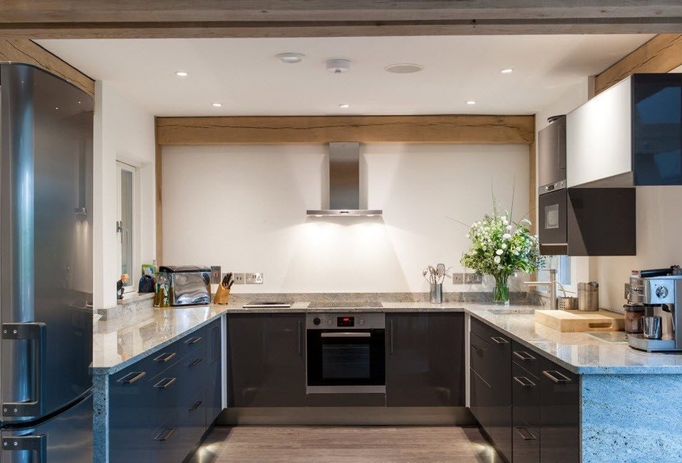
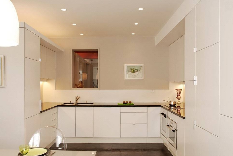
The location of the kitchen in the form of the letter "P" is possible only in medium and large rooms. In this arrangement, it is very convenient to place the vertices of the working triangle - a sink, a gas stove (or hob) and a refrigerator. All the main functional segments of the preparation and storage of food can be placed on different sides of the kitchen ensemble, while you follow not only the rules of ergonomics, but also ensure personal safety.
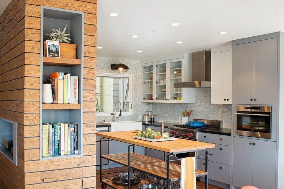
The use of a portable island can become an original and very practical way of arranging a kitchen with a U-shaped layout of a kitchen set. This is a standalone furniture block on casters that can be locked for stability. As a rule, the tabletop of such an island is used as an additional work surface, for example, as a cutting plane, and storage systems are located in the lower part. The portable kitchen island is conveniently used as a table for snacks and drinks for parties. You collect everything you need in the kitchen and take your station for drinks and snacks to the living room or other room where the reception is held.
Parallel or two-row layout of a kitchen set
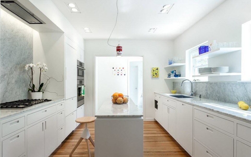
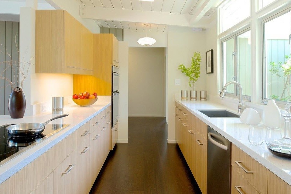
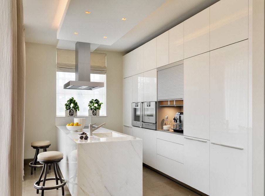
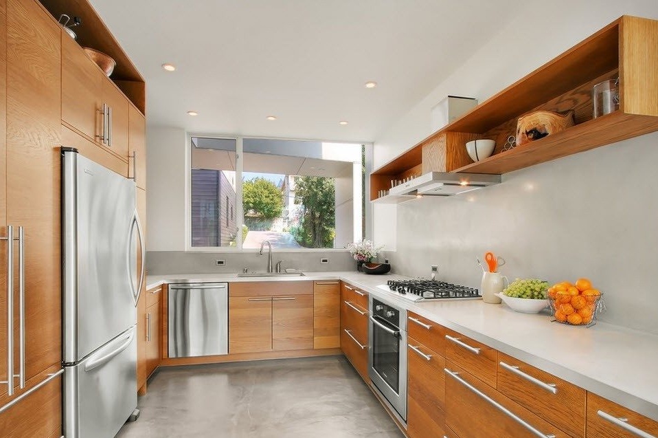
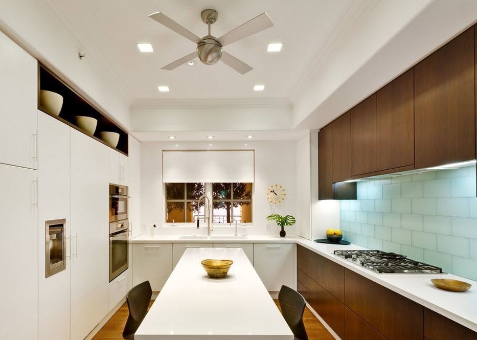
If the room is a walk-through or one of the walls is almost completely given over to a panoramic window, in this case a parallel layout of the kitchen ensemble will be preferable. It allows you to achieve the integration of a fairly large number of storage systems and the entire necessary list of household appliances. In narrow and long rooms of medium size, as a rule, there is no possibility of placing even the smallest dining table in the center. In the kitchen with an area of 12 square meters, you can install a narrow island or a bar, which will serve as a place for short meals.
Corner layout with an island or peninsula
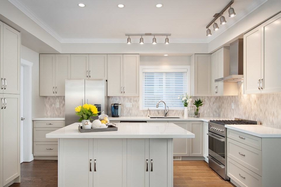
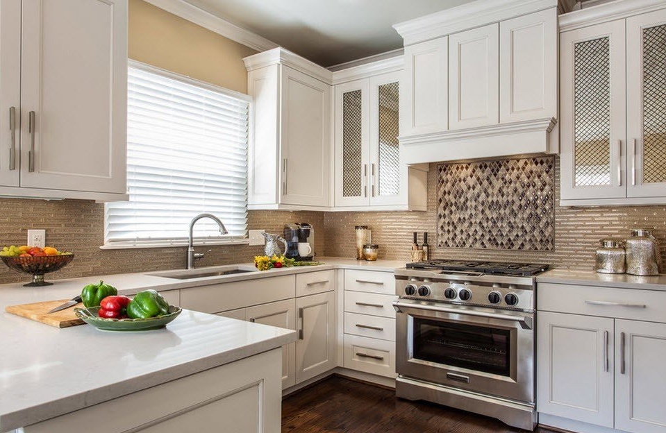
As you know, the angular layout of the kitchen ensemble is a universal option for placing work surfaces, storage systems and household appliances in rooms of any size. Only in a spacious kitchen you can not restrain the choice of the size of the kitchen island or peninsula, so as not only to increase the number of storage systems and work surfaces, but also to organize a place for breakfast or other meals.
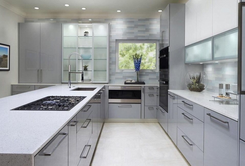
With the corner layout of the kitchen, integrating a sink or hob into the island or the peninsula, you ensure that the triangle rule is followed, in which case the distance between the fire, water and cold will be sufficient, but not so long that the hostess has time to get tired, "winding" meters between the main base stations of the kitchen.
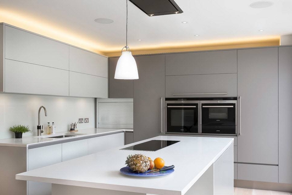
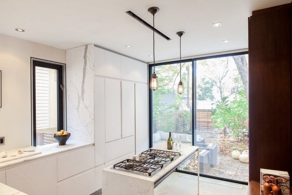
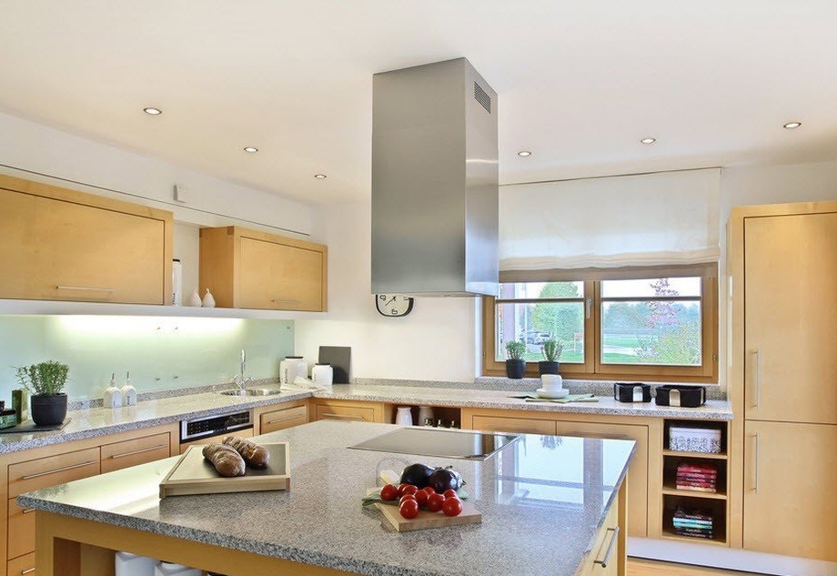
If you integrate a stove or hob into the space of an island or a peninsula, then you need to place a hood above it, attaching it to the ceiling. On the one hand, this is a certain difficulty, but on the other hand, a place is freed up near one of the walls where your cooker hood could be located, whether the stove was placed in the kitchen.
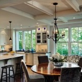
The corner layout provides the ability to save a large amount of usable space that you can use to set the dining area. Many of our compatriots are not yet close to the very concept of a kitchen island and all its advantages, and a dining table located in the kitchen is a "classic of the genre" for the Russian homeowner. Moreover, in a room with sufficient quadrature, it can be installed in such a way that the approach from all sides is open to all households.
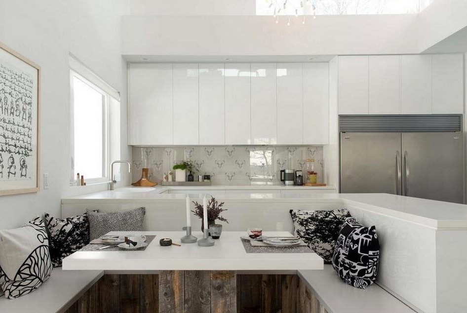
The original version of the corner layout with the peninsula is the continuation of this element to create a soft corner frame. A sufficiently spacious U-shaped soft corner can serve as a full-fledged dining area for a family of 4-5 people.
Single layout with island or dining group
Layout in one row is used in medium and large rooms infrequently and always together with an island or peninsula. The fact is that the location of storage systems and household appliances only along one wall is often not enough for a medium-sized family. The installation of the island allows you to transfer part of the work surfaces (for example, cutting) and household appliances (for example, hob or oven) into its space.
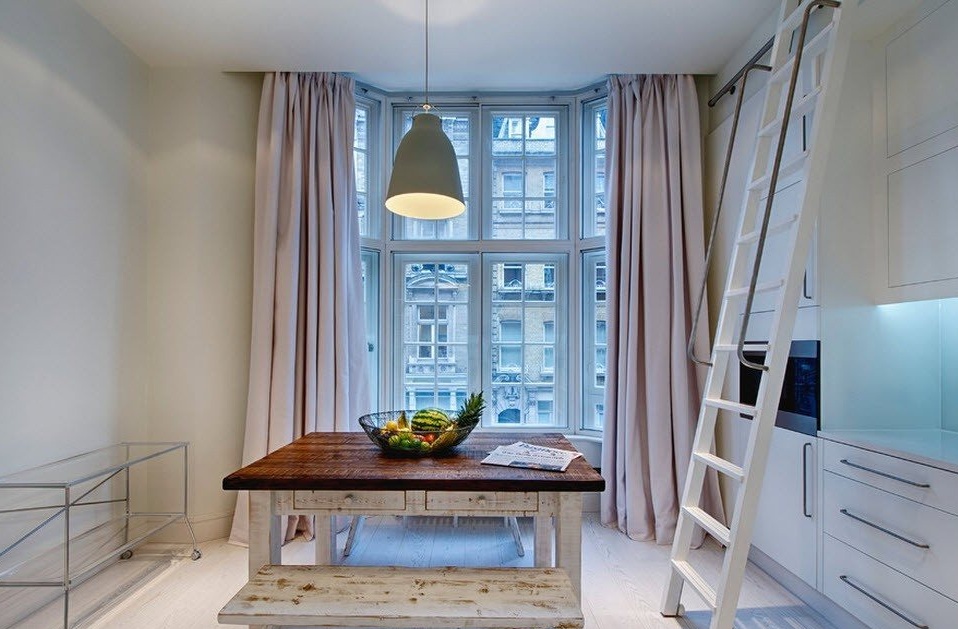
In kitchens with high ceilings, the location of the furniture ensemble from ceiling to floor may require a ladder to allow access to the highest storage systems. It is most convenient to fix such a ladder on a special tripod located along the kitchen set in the upper part. Typically, the manufacturer of the headset takes care of its installation (if you order the manufacture of furniture according to the size and parameters of your kitchen room).
Kaleidoscope of color solutions for decorating the room and facades of the kitchen
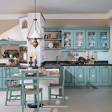
Indoors, medium and large kitchens you can not limit yourself to choosing only a bright palette, which, as you know, visually expands the space.You can decide on bright, contrasting combinations, enjoy the use of your favorite color in the decoration or execution of kitchen furniture, apply colorful decor or unusual design solutions that would simply look inappropriate in a small kitchenette.
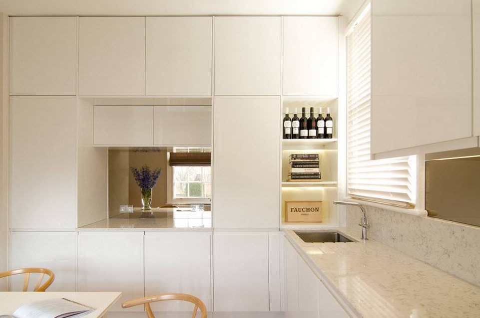
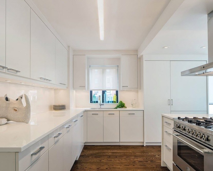
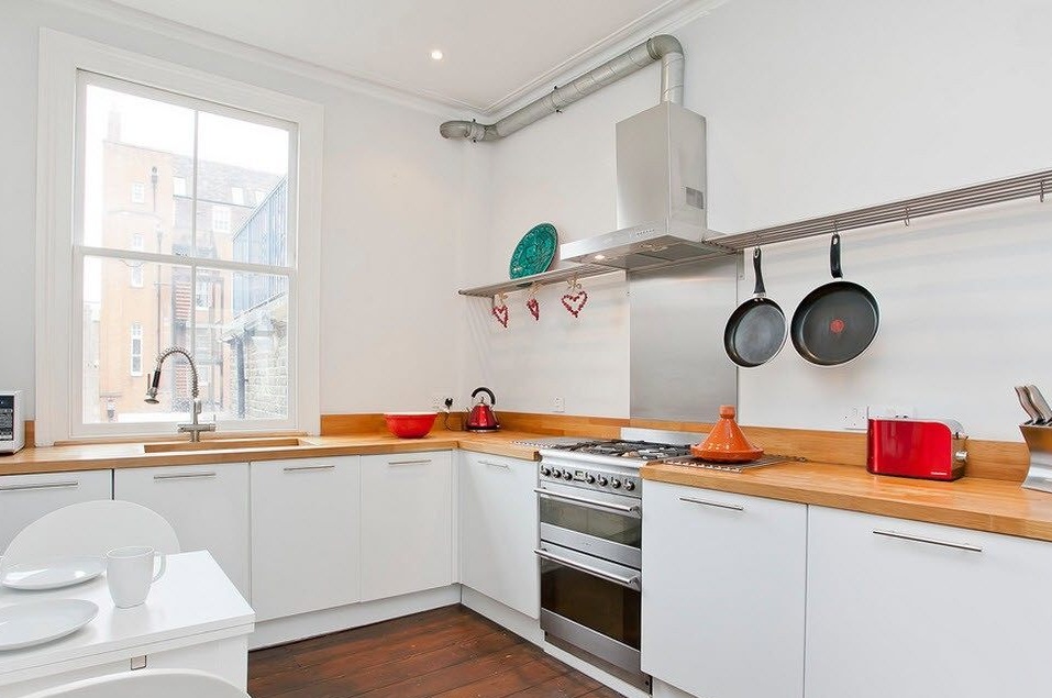
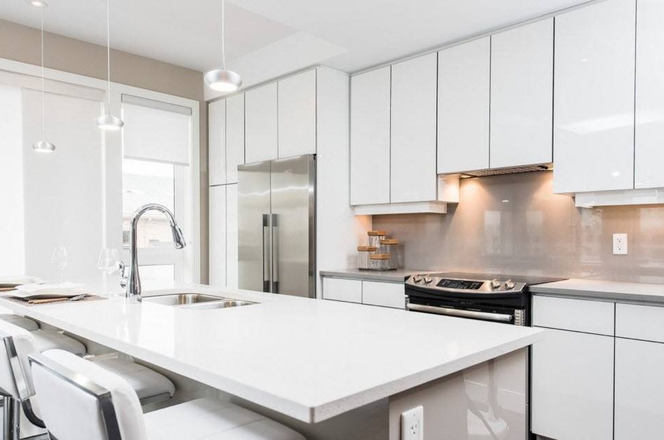
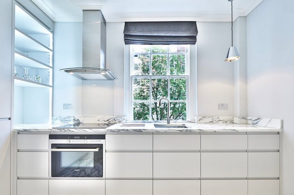
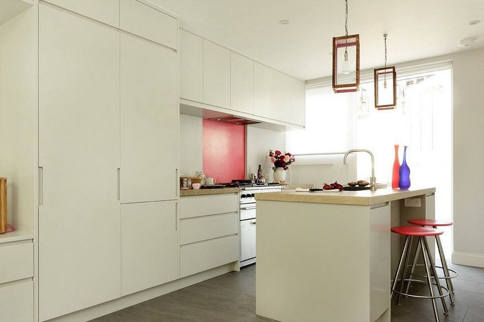
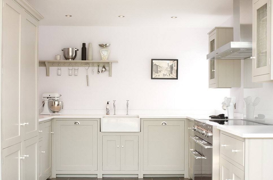
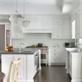
Whatever the size of the kitchen, there will always be white fans in the decoration and execution of the kitchen. This is a color that will never go out of style, with which it is incredibly simple to combine other tones and shades, decor, accessories and textiles. But be careful with the total use of white shades in the design of the kitchen - apply contrasts, dilute the snow-white idyll with other tones to avoid the image of the operating room.
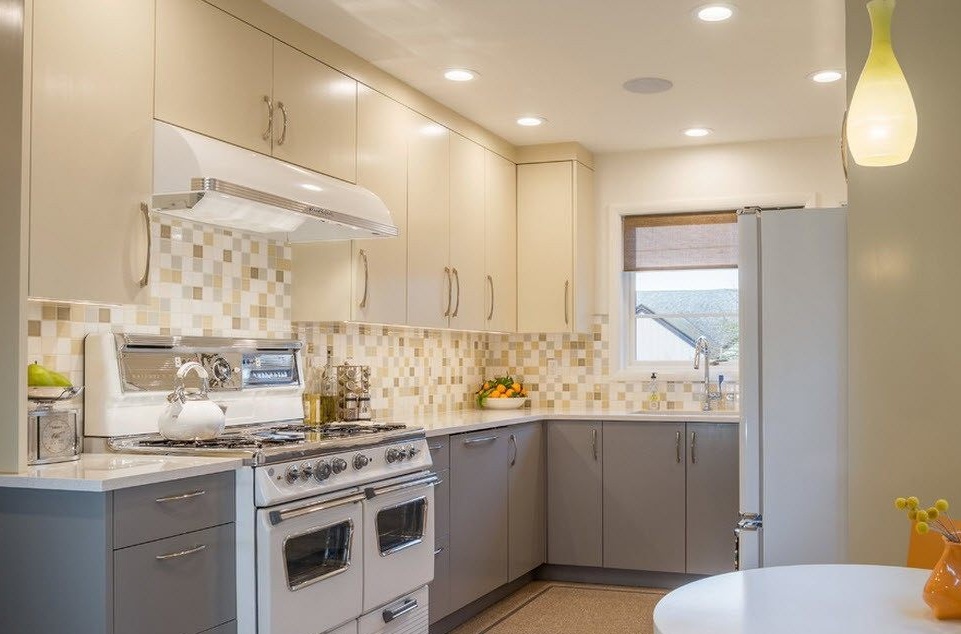
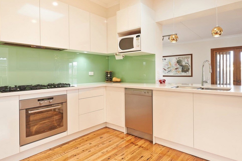
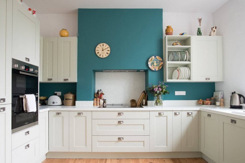
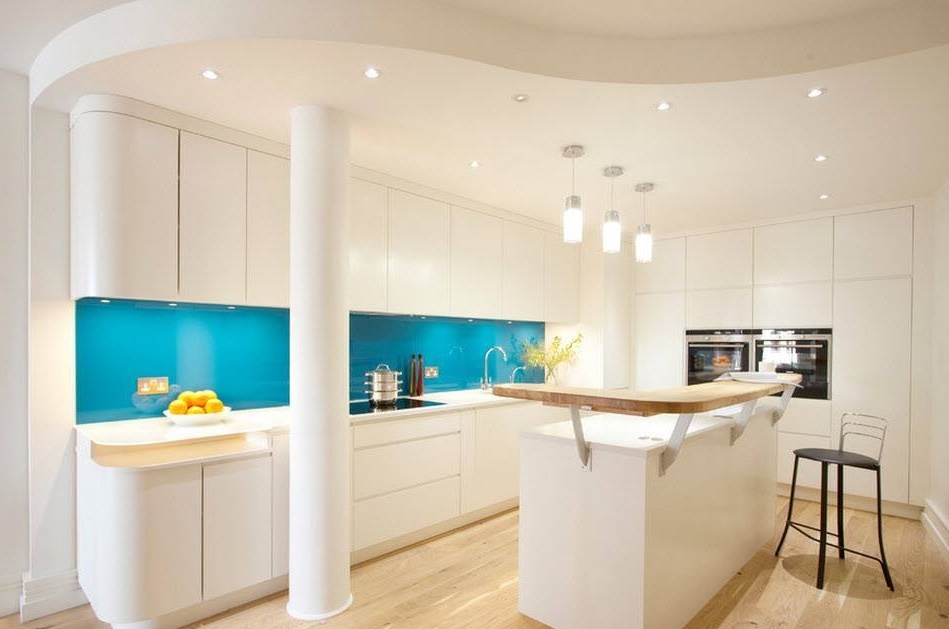
It’s easiest to diversify the white palette of a kitchen room when decorating an apron - the bright tone of ceramic tiles, mosaics or wall panels will not only transform the room, but also create an accent so necessary for our look.
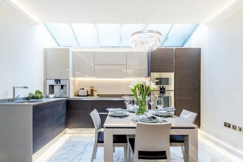
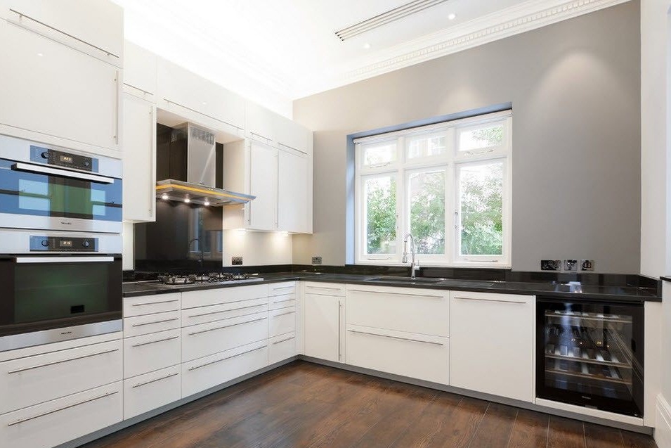
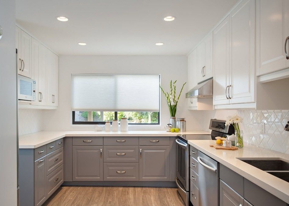
With the help of a white headset, you can quite simply design a kitchen with contrast - it is enough to use countertops and household appliances in black. For color finishes, you can focus on the choice of pastel colors, for example, the intermediate tone between white and black - gray, is perfect.
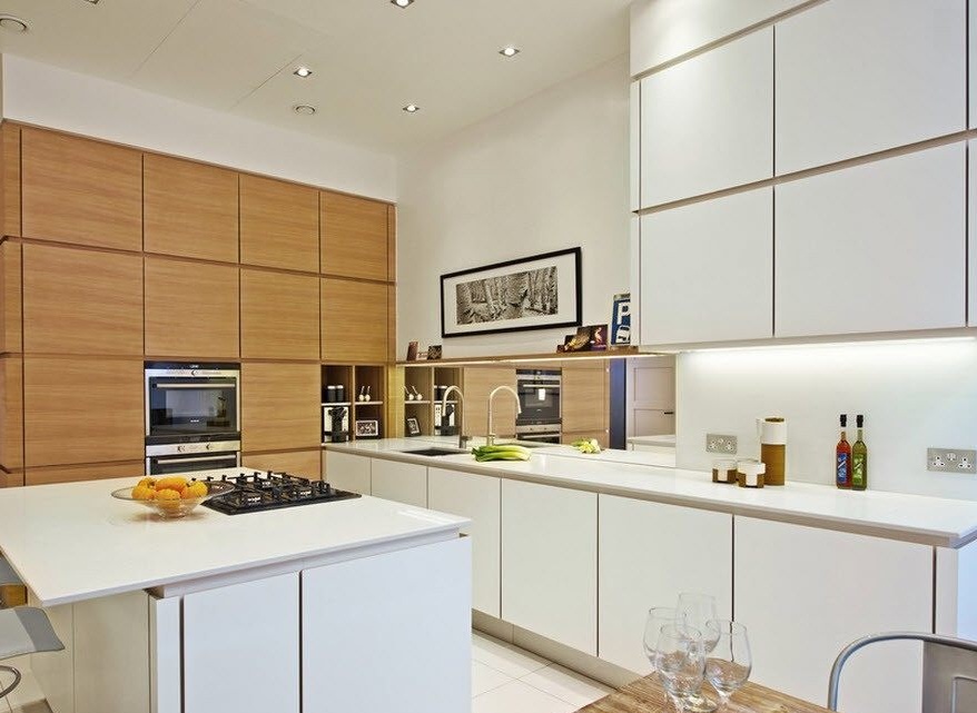
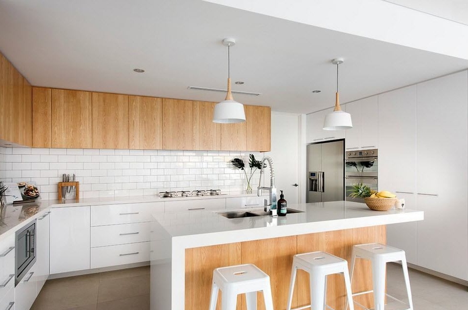
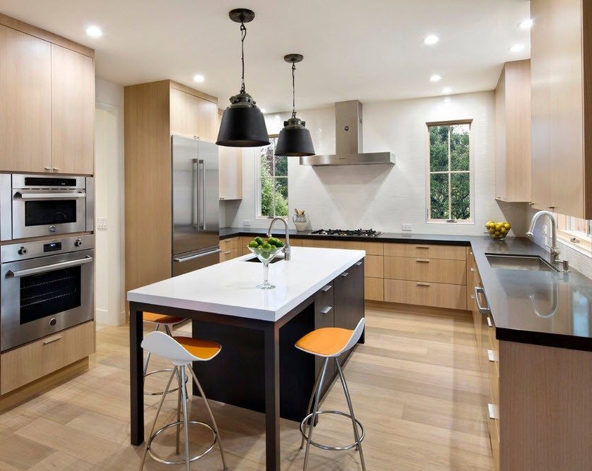
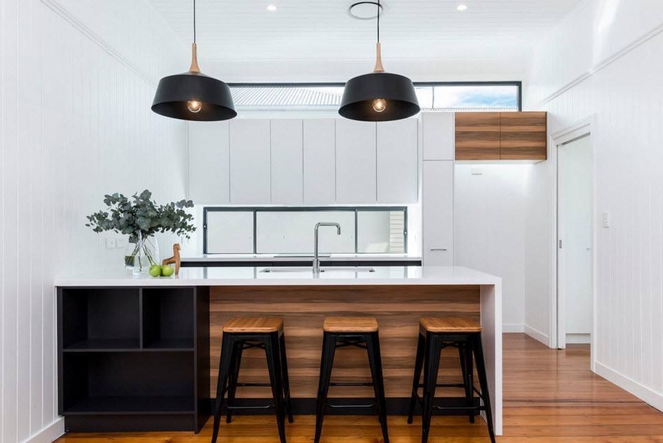
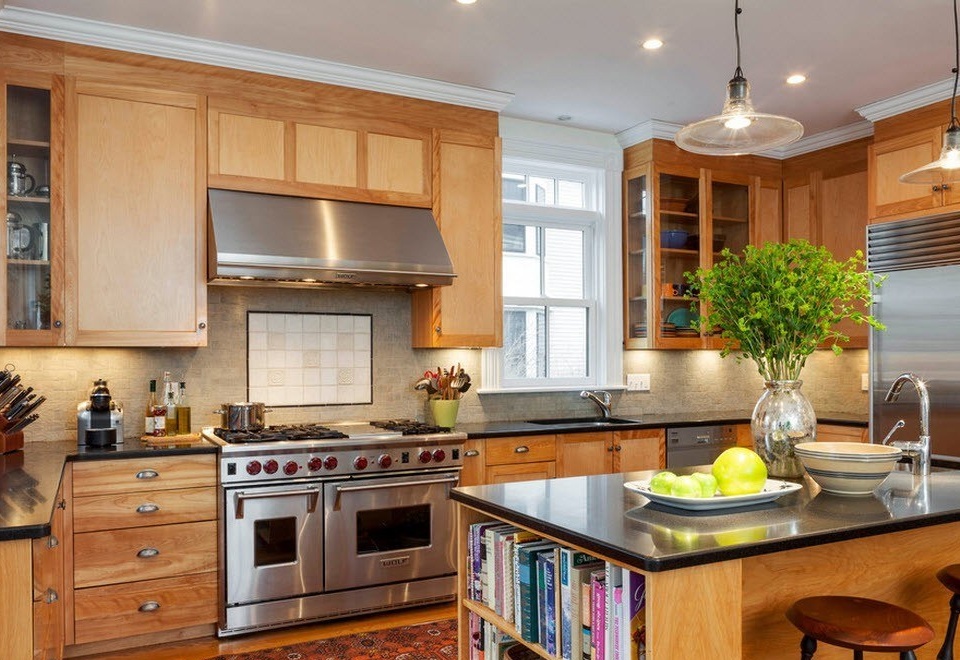
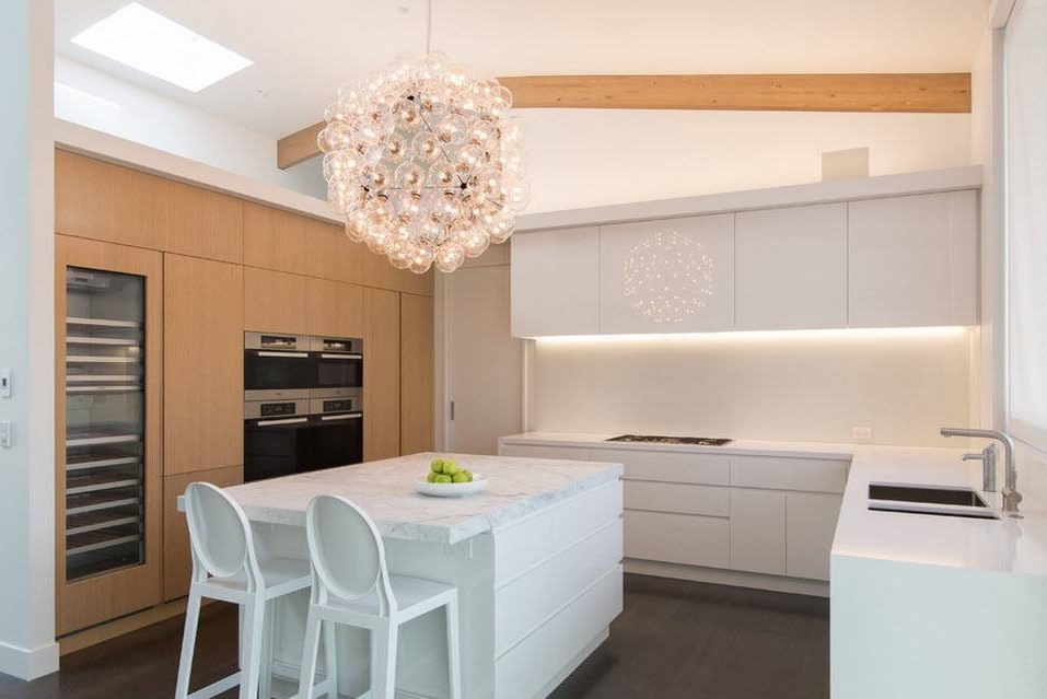
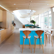
Another example of a rather contrasting combination is the use of light wood for the facades of kitchen cabinets, black color countertops and shades of pendant lights, and a white tone for decorating the walls, ceiling and countertops of the kitchen island.
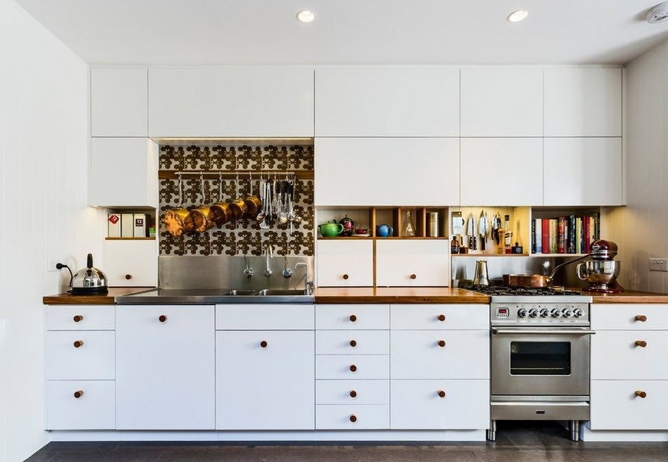
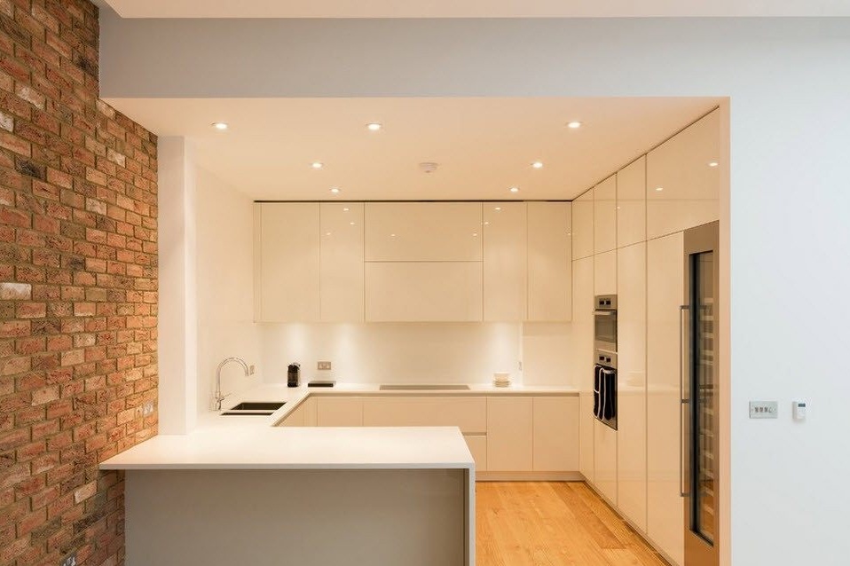
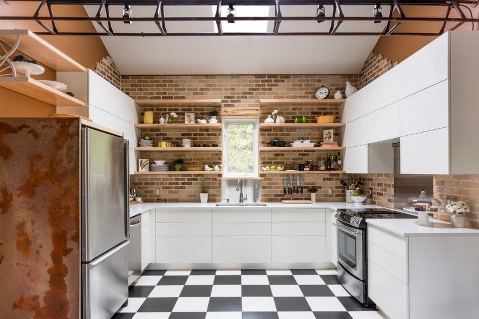
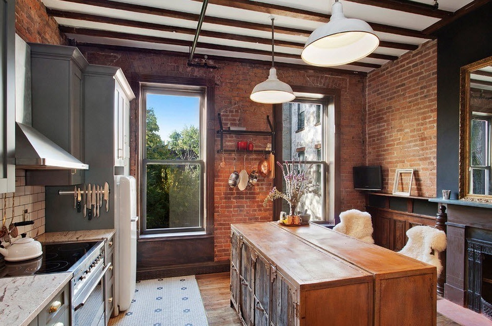
In a kitchen with enough space, you can afford a lot in terms of surface finishes. For example, imitation of brick or masonry, false ceilings in two levels or colorful flooring. But if you decide on a fairly active drawing of the walls or just the kitchen apron, it is better that the facades of the cabinets are monophonic and the same in both tiers.
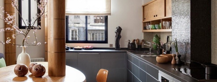
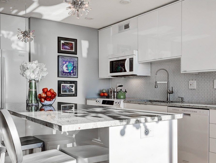
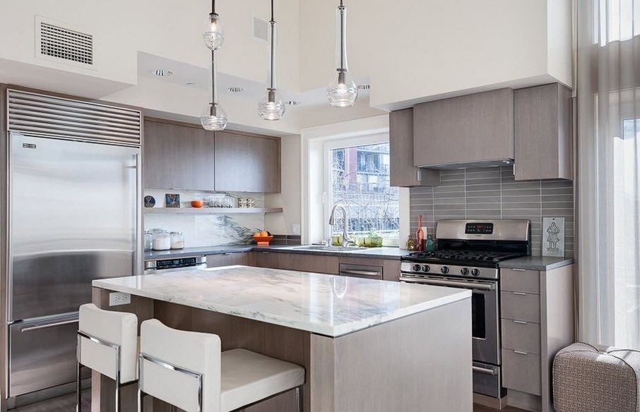
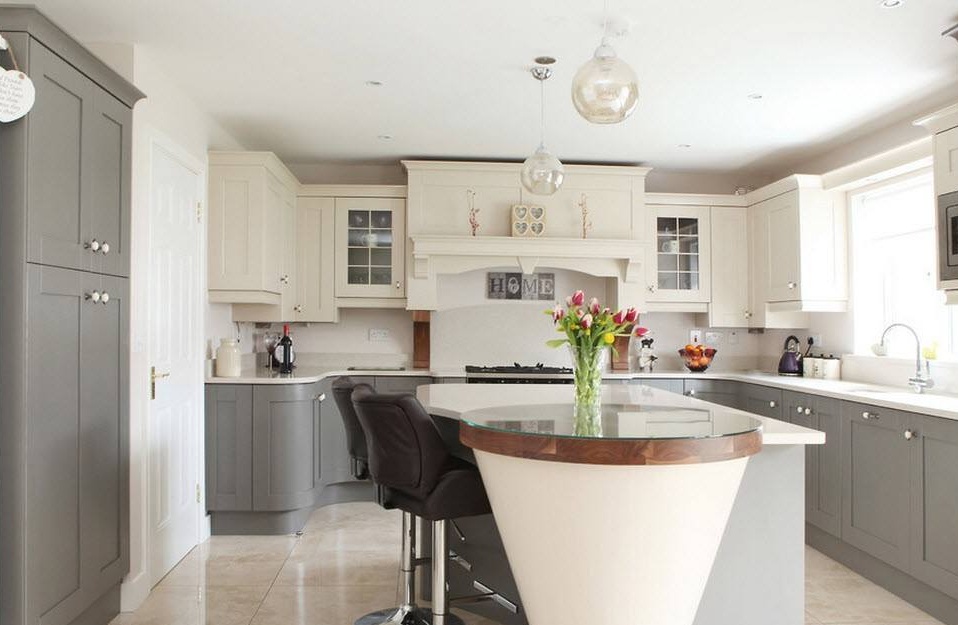
No wonder gray is considered the most neutral option for the design of any room, and the kitchen space was no exception. If you don’t like the white kitchen, and you are not ready for brighter color schemes yet, feel free to use different shades of gray, they combine perfectly with each other, with the brilliance of stainless steel, wooden surfaces and snow-white finish. There will be no surprises in such a room, but there will also be no color spots or contrasts annoying, which is a plus for creating a calm atmosphere in the kitchen space.
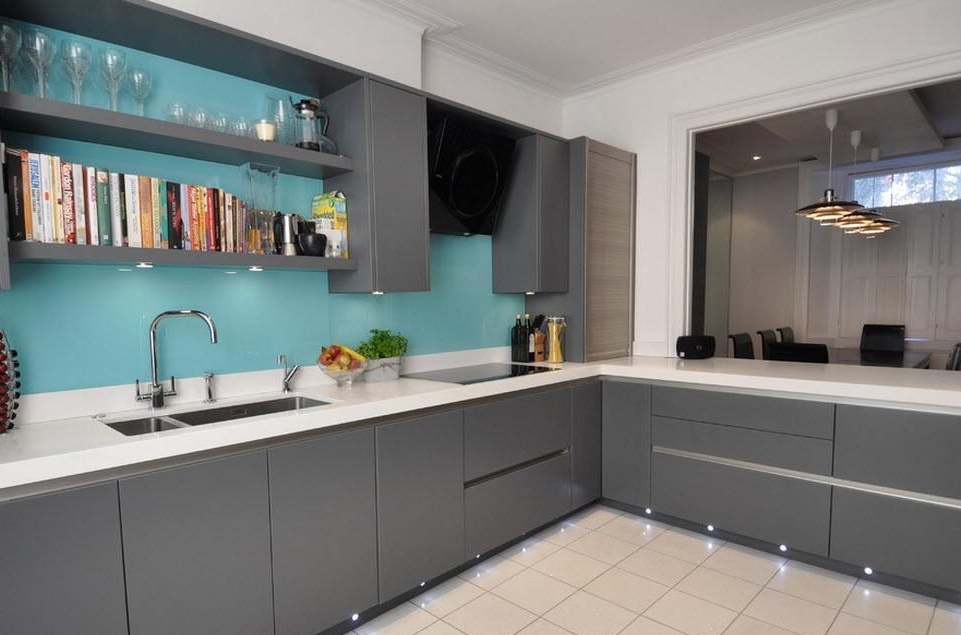
The dark gray color of the kitchen facades will look great with a colorful execution of the kitchen apron. Add to this design the presence of white wall and ceiling finishes, the snow-white design of the countertops, and you will get a harmonious, interesting design, but at the same time restrained so as not to irritate with variegation or brightness.
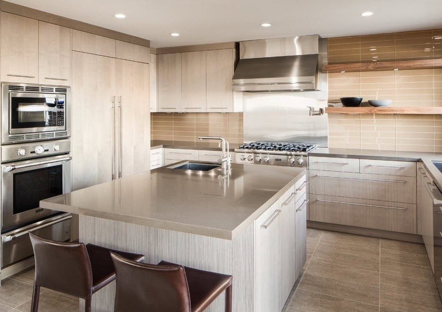
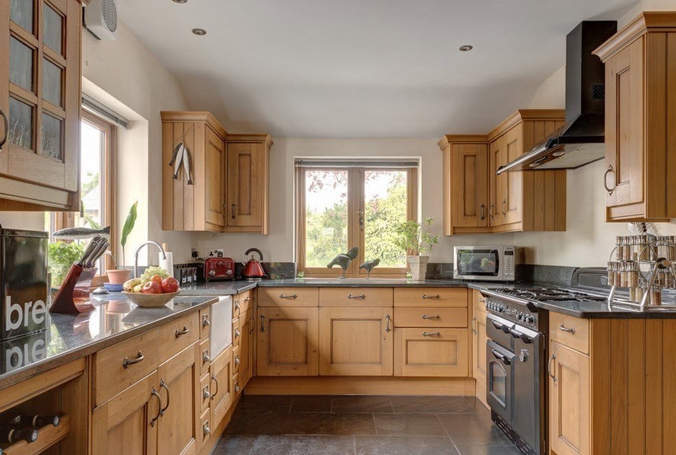
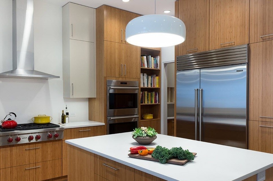
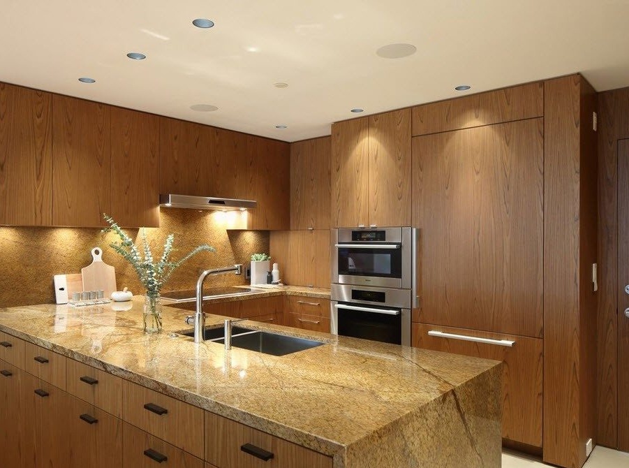
The color of natural wood will always be in trend. This is due to the natural warmth, which wood fills the interior of the room, and the status of the material, its environmental friendliness. The contrast that natural shades of wood create with the sheen of stainless steel, bringing cool notes to the design of the kitchen space, looks especially bright.
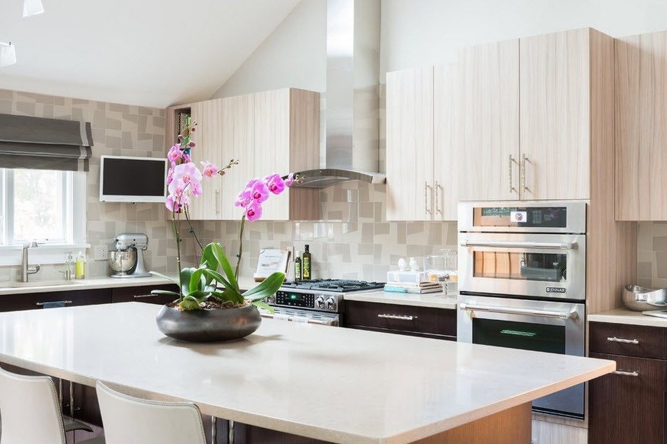
Unpainted wooden facades look great against a snow-white finish, especially with the use of countertops of a similar shade. In a room with enough quadrature, you can achieve the maximum completeness of storage systems and not just confine yourself to the placement of kitchen utensils, but keep at hand, for example, a collection of cookbooks or flaunt beautiful dishes.
The white color of the kitchen facades looks simply luxurious in combination with chocolate shades of wood. To add freshness and coolness to such an interior, you can use light blue, mint or turquoise shades to design a kitchen apron, for example. The resulting design of the kitchen space will be relevant for many years and will delight you and your household with your image.
Color experts say that choosing a darker shade for the lower tier of kitchen cabinets provides a visual extension of the space that will not interfere even with spacious kitchens. The white design of the upper tier of storage systems will visually increase the height of the room.
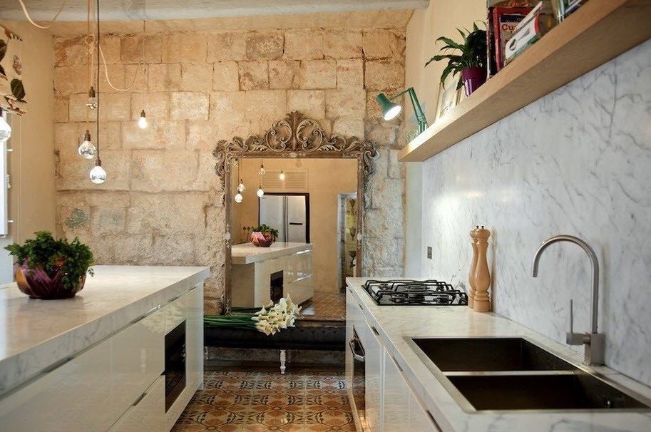
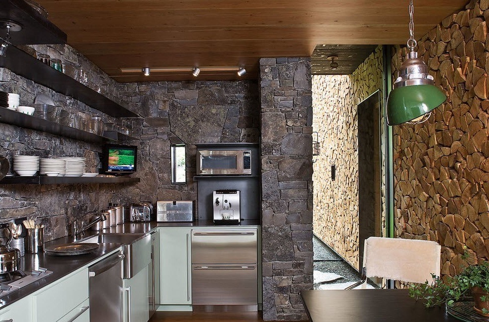
In a small and modest kitchen, it would be difficult to imagine the use of dark shades, and even in combination with masonry. But even in spacious rooms, such decoration needs a contrast-light accompaniment of furniture facades.
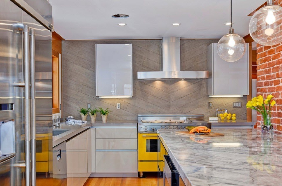
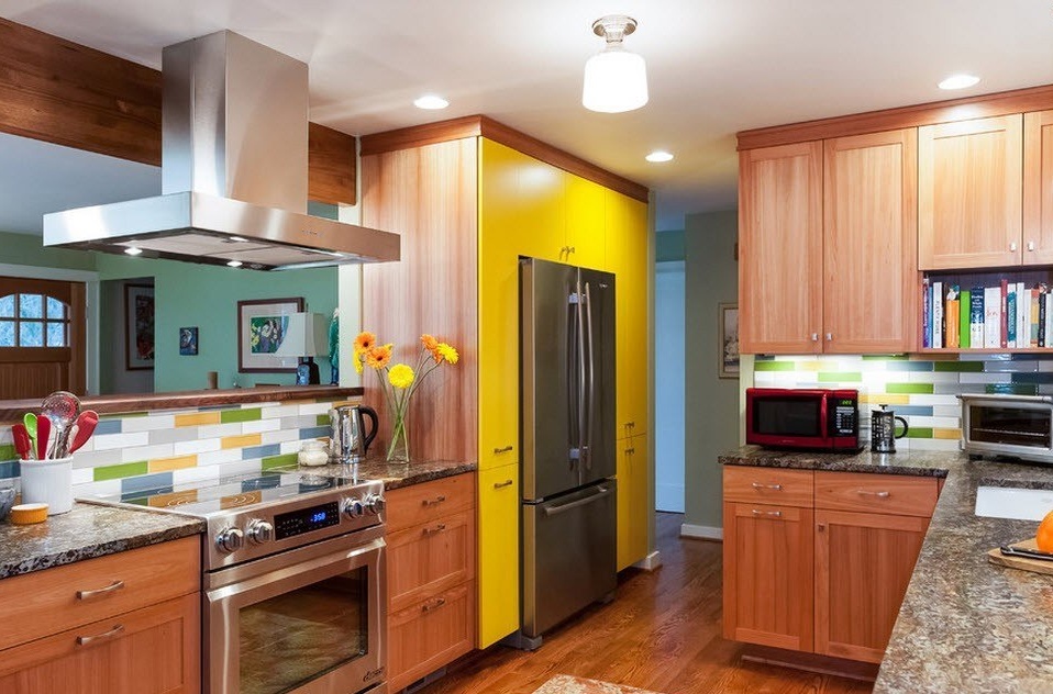
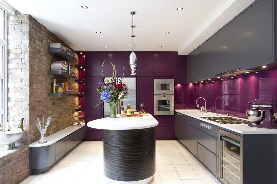
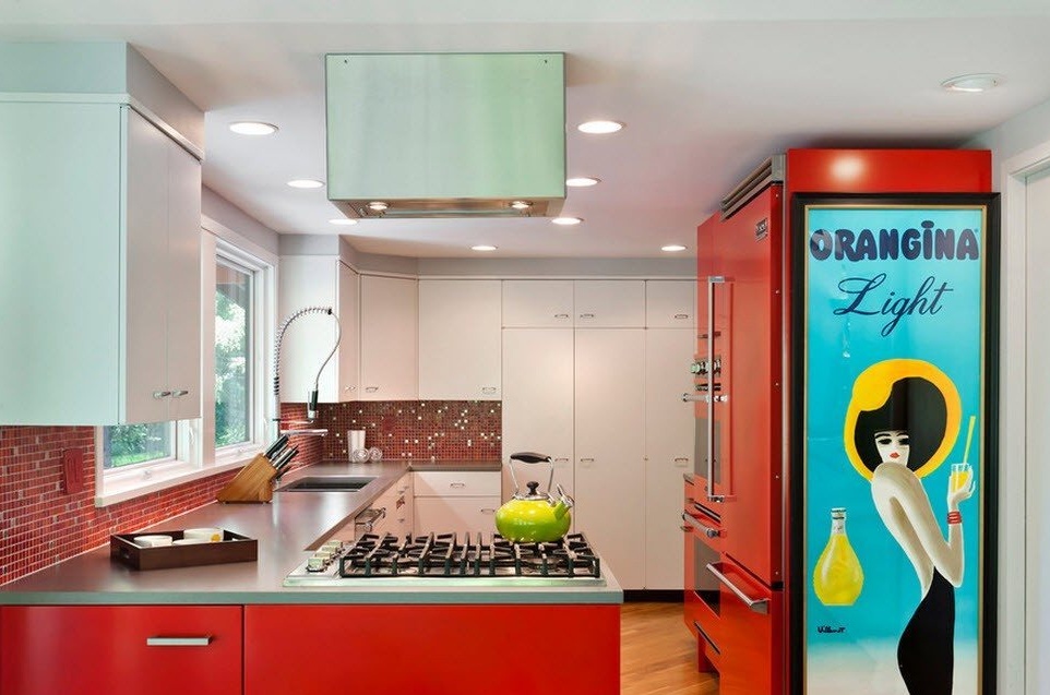
The ability to use bright, saturated colors for the execution of a kitchen set or part thereof is an advantage of spacious kitchens. Currently, there are many models of kitchen appliances in free sale that are made in retro style with very bright colors. They themselves can become a highlight of the interior, but in the appropriate design they will raise the degree of the room to unprecedented heights, create a unique and inimitable design of the room.
Finishing touches in the interior - lighting, decor and textiles
In a small kitchen, we often have to literally restrain ourselves from using decor, large hanging chandeliers or curtains for windows with lambrequins. Obviously, in a small kitchenette even a small part of the decor would have looked out of place. In a medium-sized kitchen space, you can decide on a lot, but not all. Depending on the layout of the kitchen facade, the presence of window openings and the amount of free space, you can use wall decor, living plants, textiles for window decoration.
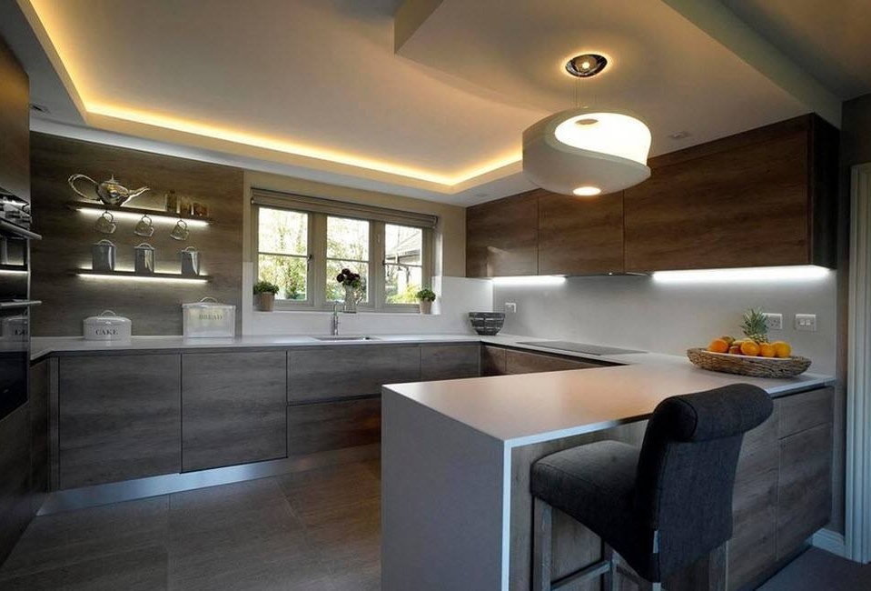
Lighting in the kitchen plays an important role and it is not only the space created by the lighting atmosphere, but also providing local bright illumination of work surfaces. Our safety and quality of workflow performance depends on how the kitchen workstations are illuminated. That is why, in addition to the central lighting device, built-in lighting is used in various surfaces of kitchen cabinets (most often in the lower plane of the upper tier of cabinets), wall sconces or table lamps are less commonly used.
The illumination of work surfaces generally carries only a functional load, while the central chandelier also acts as a decor for the kitchen. A beautiful pendant lamp can become a highlight of the interior, in addition to performing its main functionality.
Agree that it is almost impossible to place a fireplace in the kitchen with a standard for apartment buildings with an area of 6.5 square meters, but it is more than realistic to enter the hearth into the space with 12 sq. M. Here is a unique interior of a kitchen located in a country house, but similar design techniques can be used to decorate the kitchen space of an urban household with a sufficient area.

