Novelties of apartment design - trends of 2019
Fashion penetrates all spheres of our life - in some aspects they are inexorable and strict, while in others it is tolerant and supportive. Fashion trends in the design of residential spaces are not as cruel as the catwalk fashion. The interior, created in accordance with the latest trends, will be relevant for several years - especially if it was created in accordance with the personal preferences of the owners and was focused on maximum individual comfort. When planning repairs in your own apartment, the most difficult thing is to find a “middle ground” between design ideas that are at the peak of popularity and your own idea of the practicality, aesthetics and comfort of the interior. We have selected for your familiarization 100 ideas for home improvement in accordance with new trends in the world of design and we hope that our extensive selection will help you create your own, unique image of an apartment that will be relevant for many years to come.
Actual ideas for the new season
Creating a balance between the financial capabilities of the customer, his criteria for comfort, beauty and functionality with their own design ideas is practically an art for true specialists in their field. But for a novice (the owner of a small-sized apartment or spacious apartments) in the design of their own home, the task is quite feasible - it will only be necessary to make an effort and listen to intuition. Among the current design ideas for the new season (and for the next few years), several main ones can be distinguished.
Natural materials
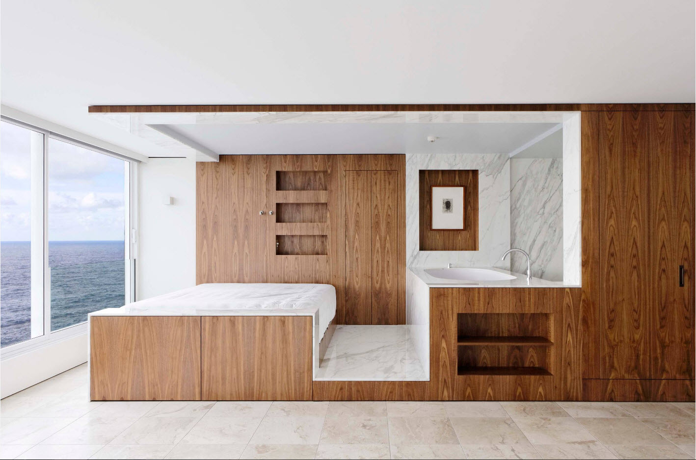
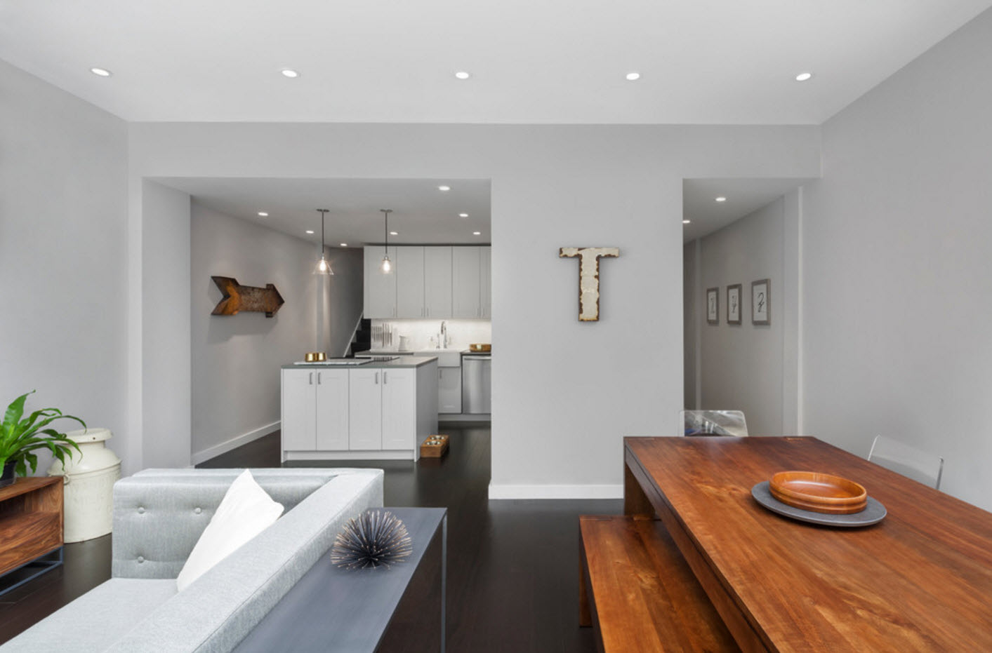
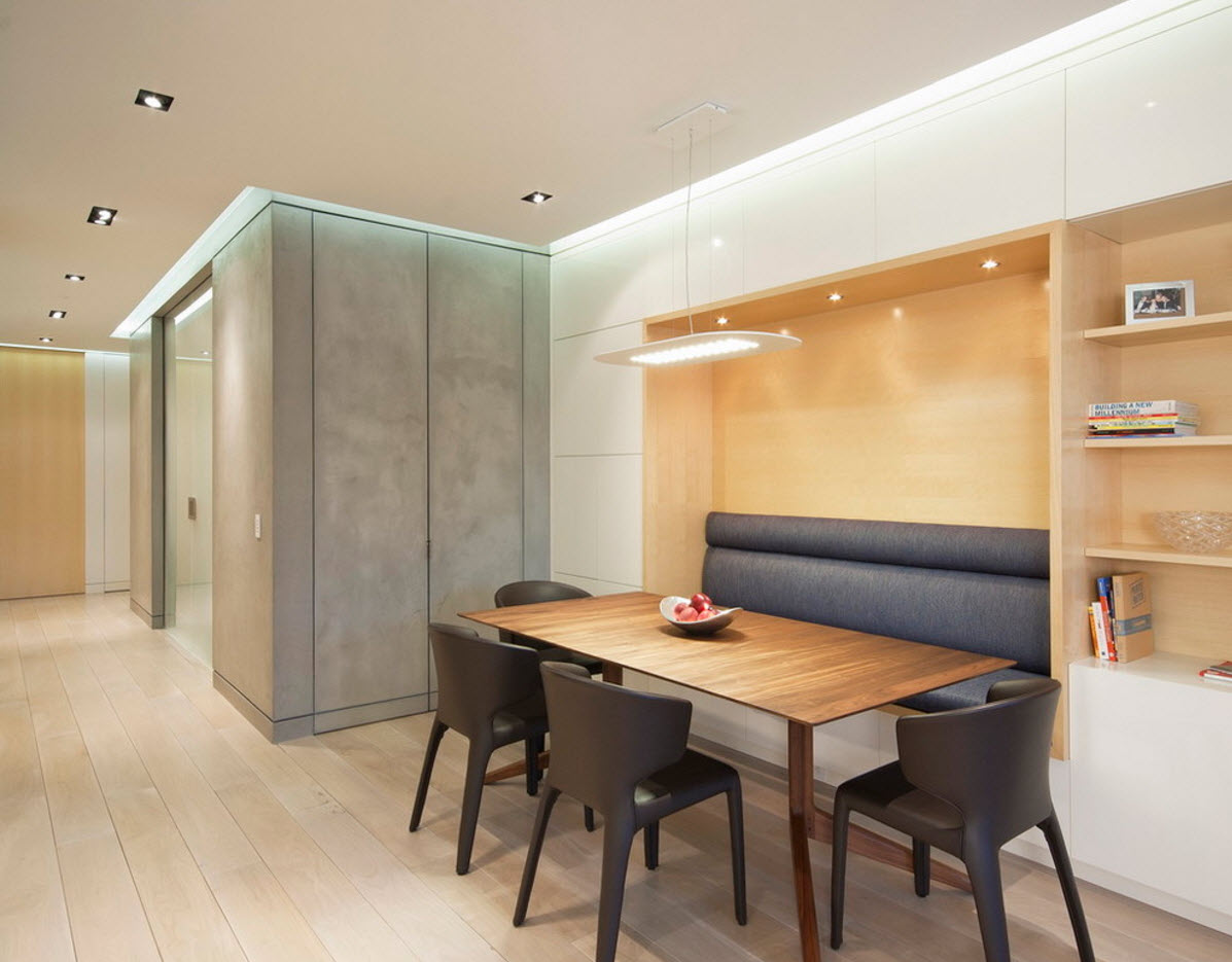
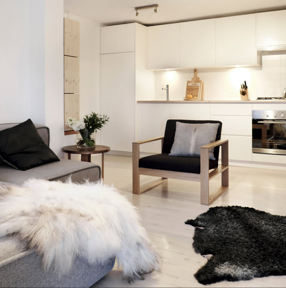
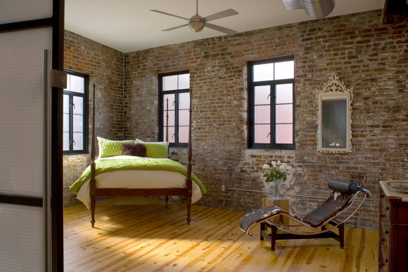
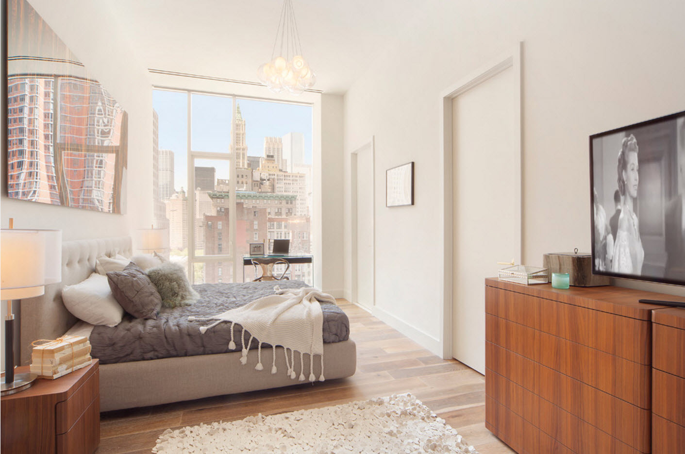
Everything natural is always in trend. This applies to both finishing materials and raw materials for the production of furniture and decor items. Natural materials have reliably consolidated their position in the field of interior design and will be relevant for many years to come. Wood and stone, concrete and plaster, metal and various derivatives of these materials, in the manufacture of which substances harmful to humans and the environment did not participate, simply cannot go out of fashion. Not only proximity to nature, but also their own safety, aesthetics and durability push designers and their customers to use natural materials, although the cost of finishing materials and furniture made from natural raw materials is significantly more expensive than artificial analogues.
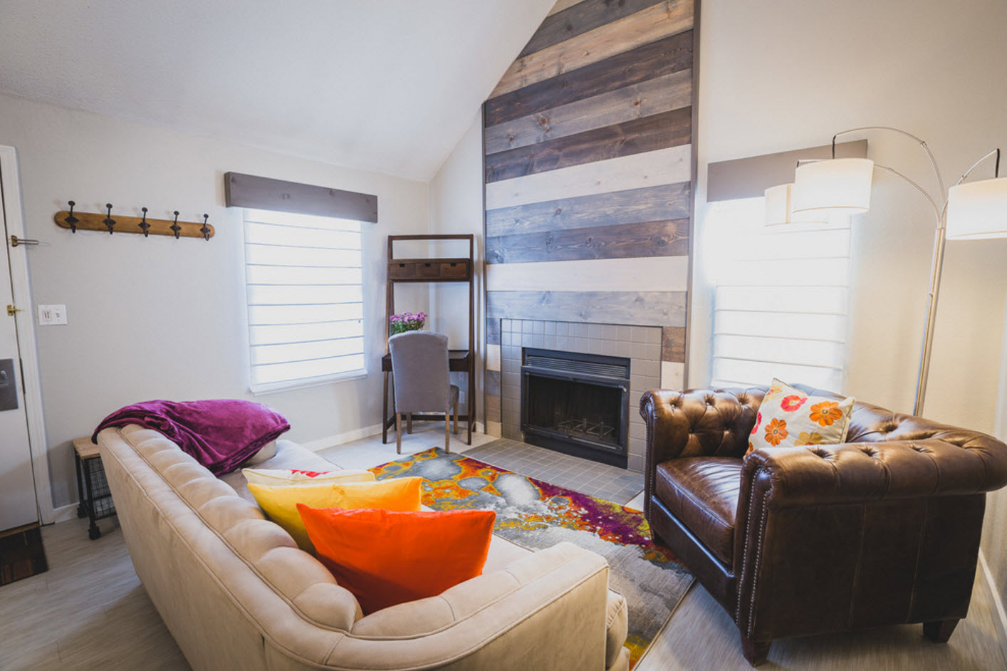
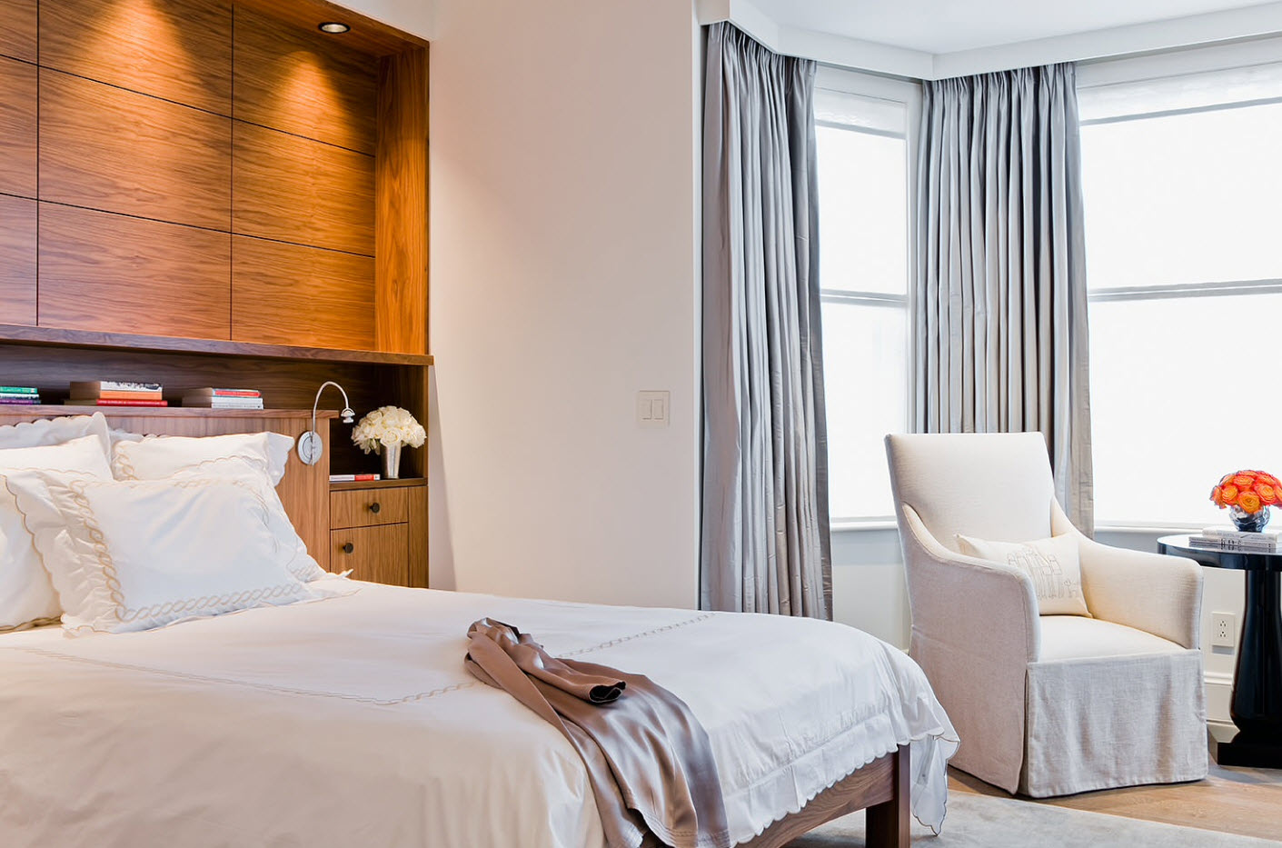
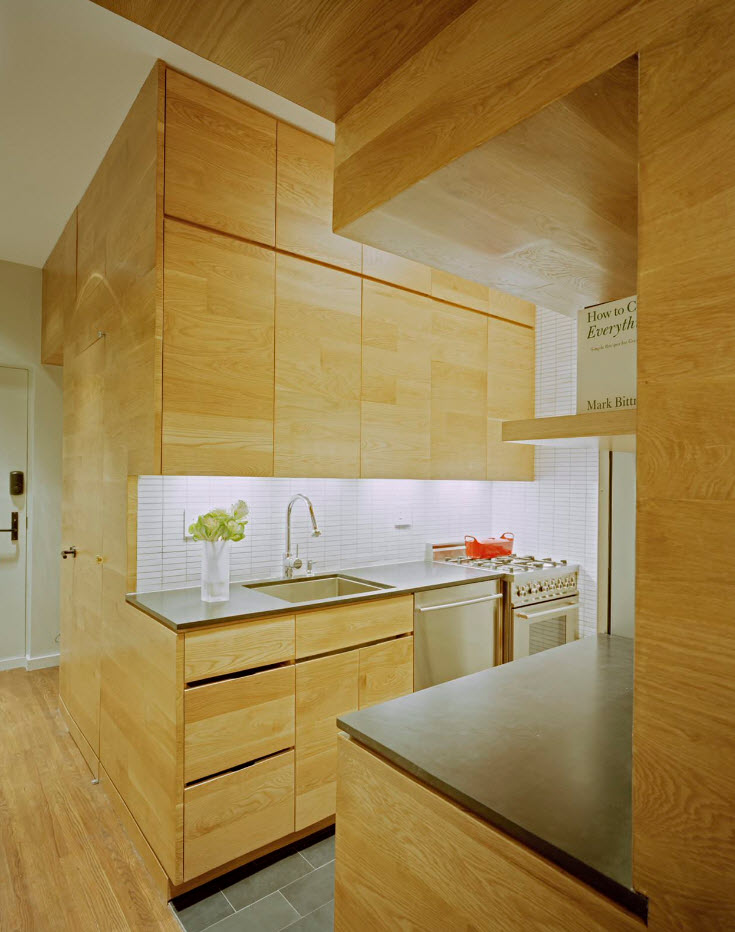
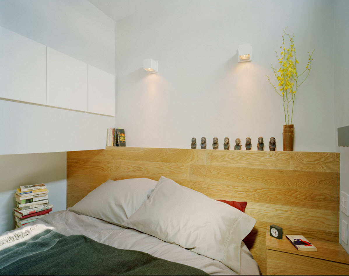
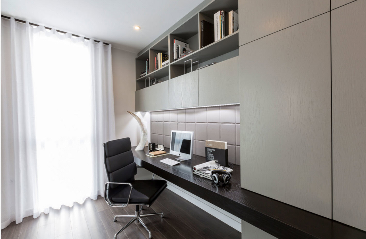
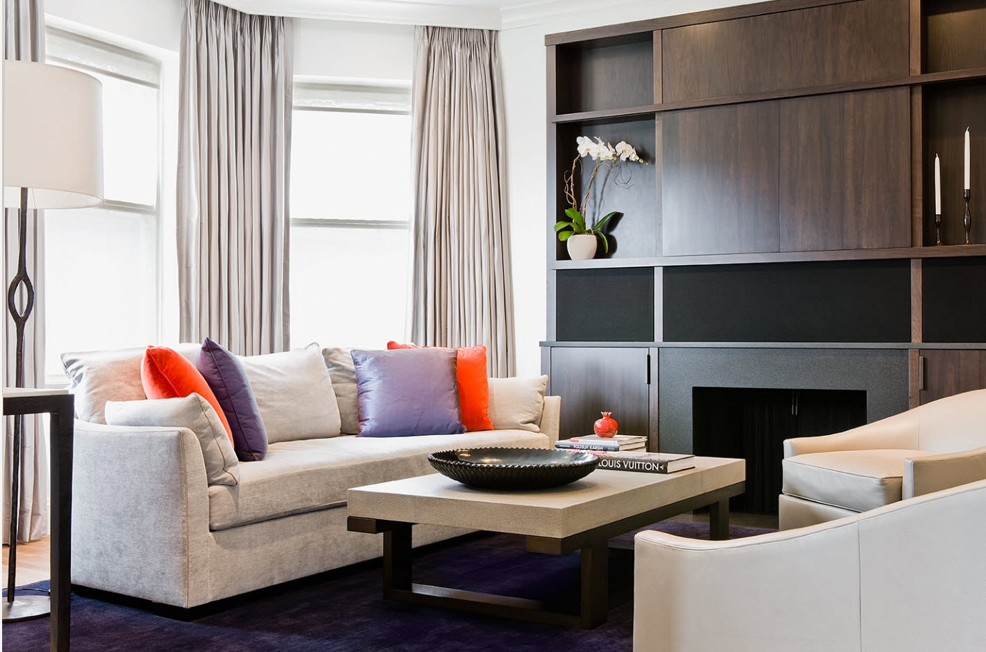
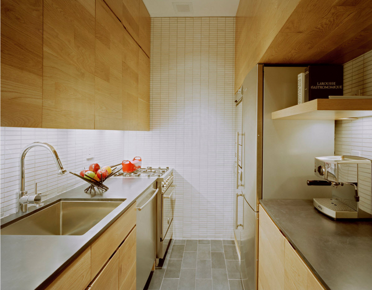
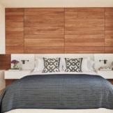
Nothing is able to “warm” the interior so much as the presence of natural wood. The beautiful pattern of the tree and its texture not only bring us closer to nature, but also contribute to the creation of a harmonious image of the room. It is easy to combine wood with surfaces of light and dark tones, choosing the appropriate contrast. For example, maple, aspen, ash will look great in combination with colorful tones chosen to emphasize the beauty of the natural pattern. And all shades of wenge color will look luxurious in combination with a light palette of interior surfaces.
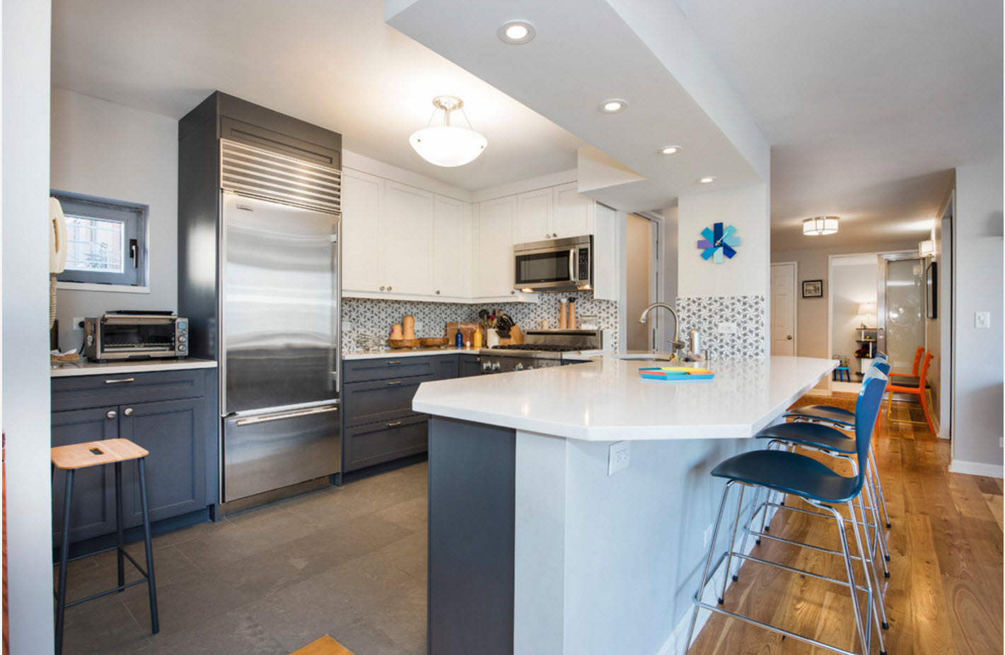
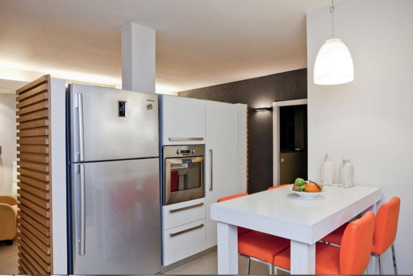
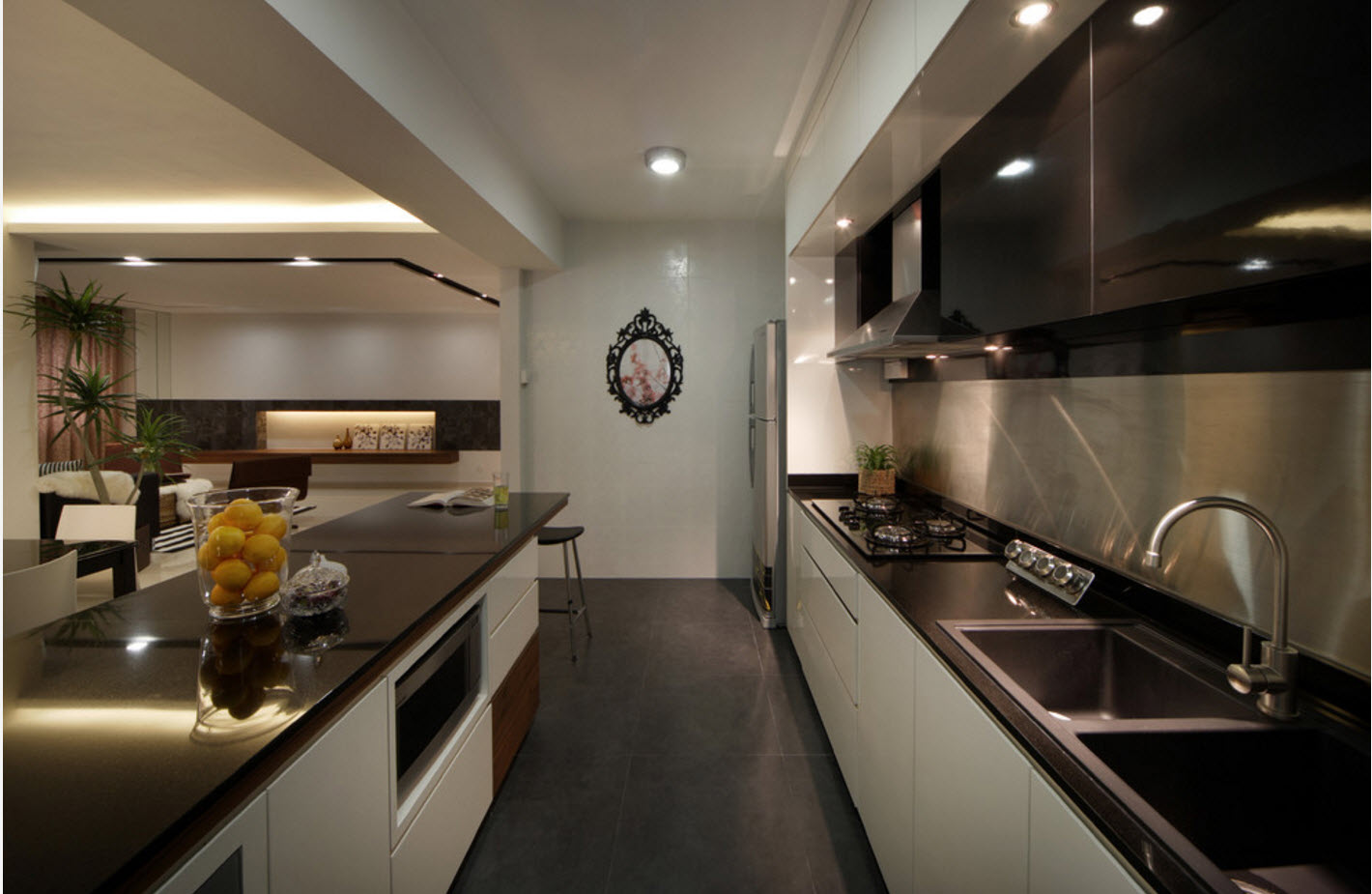
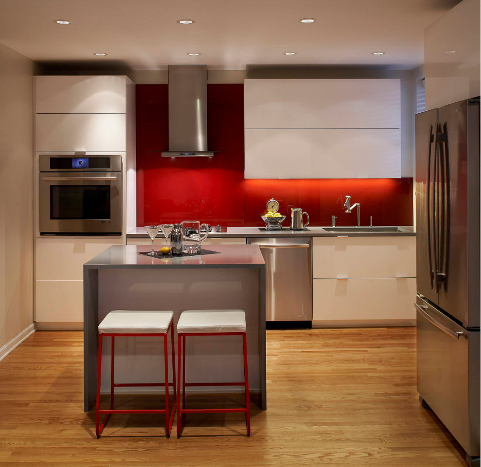
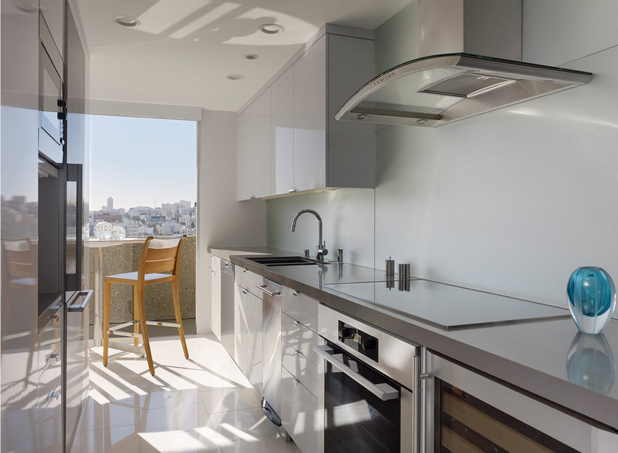
Shine of metal in a modern interior is an integral attribute. Metal elements are present in rooms with a wide variety of purposes. In the kitchen space, stainless steel is used as a material for countertops, finishing a kitchen apron. Chrome elements are part of household appliances, furniture and other structures. Matte surfaces are equally popular. Silver, brass and copper elements can decorate living rooms and even bedrooms - be part of the fittings, frame mirrors and other wall decor.
Bright and spacious rooms
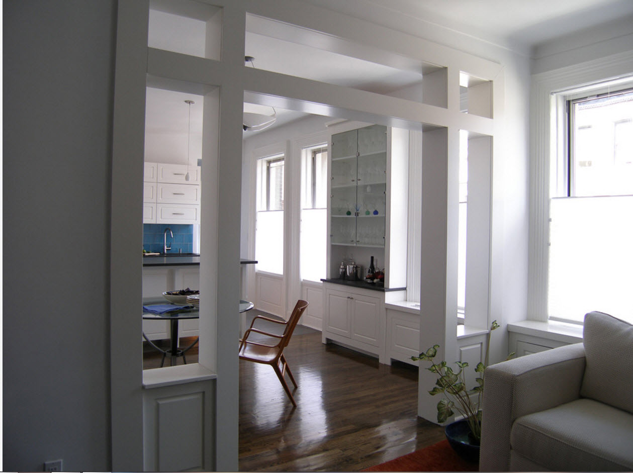
Any style fits harmoniously into a spacious and bright room.It is only a pity that the reality of modern life is such that the value of real estate, especially in large cities, is unbearable for most. Many have to be content with small or standard apartments with a kitchen of 6 square meters and a bathroom with an area of not more than 3.5 "squares". Therefore, the fashion for combining space, for removing partitions and walls, for combining several functional zones within the same room is currently relevant.
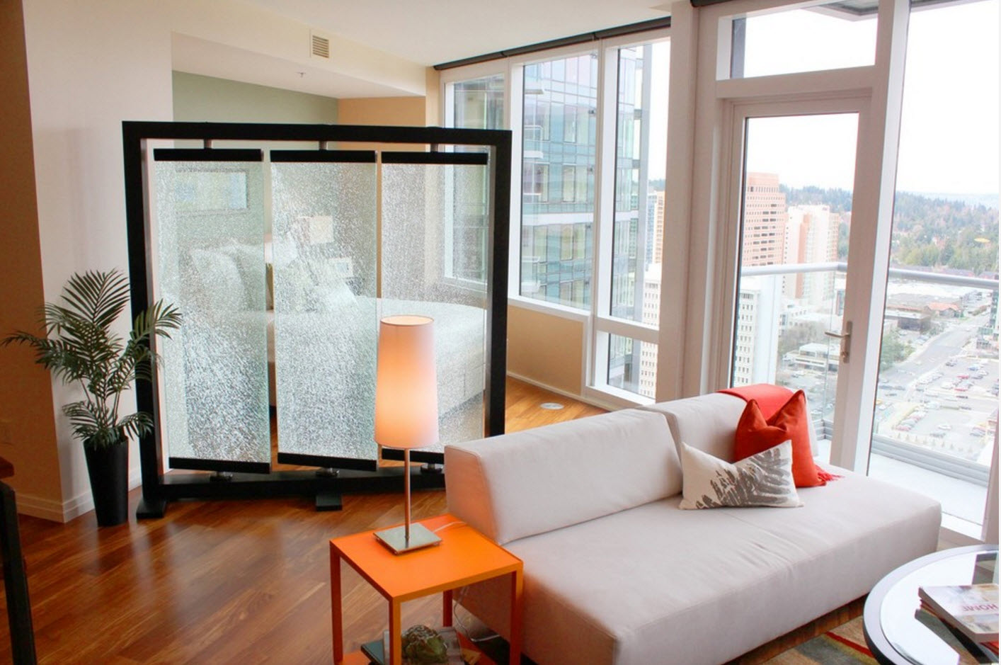
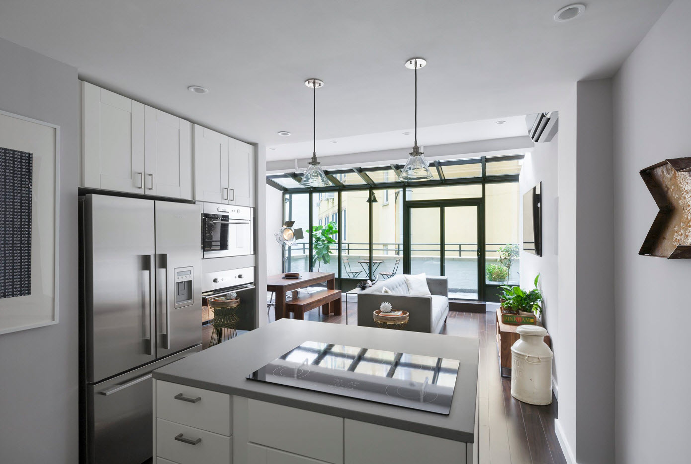
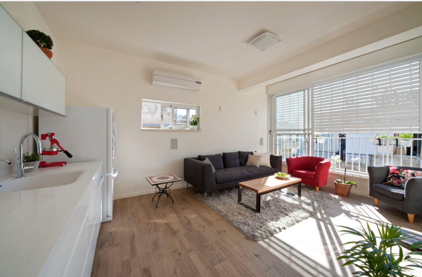
Enlarging window openings and adding as much sunlight as possible to the available space is the mainstream of the current and upcoming season. A bright room seems larger, in its interior you can use rich, deep tones, and not just light shades that contribute to a visual increase in space. A room in which a lot of light harmoniously accepts contrasting color combinations, bright accents, large decorative elements.
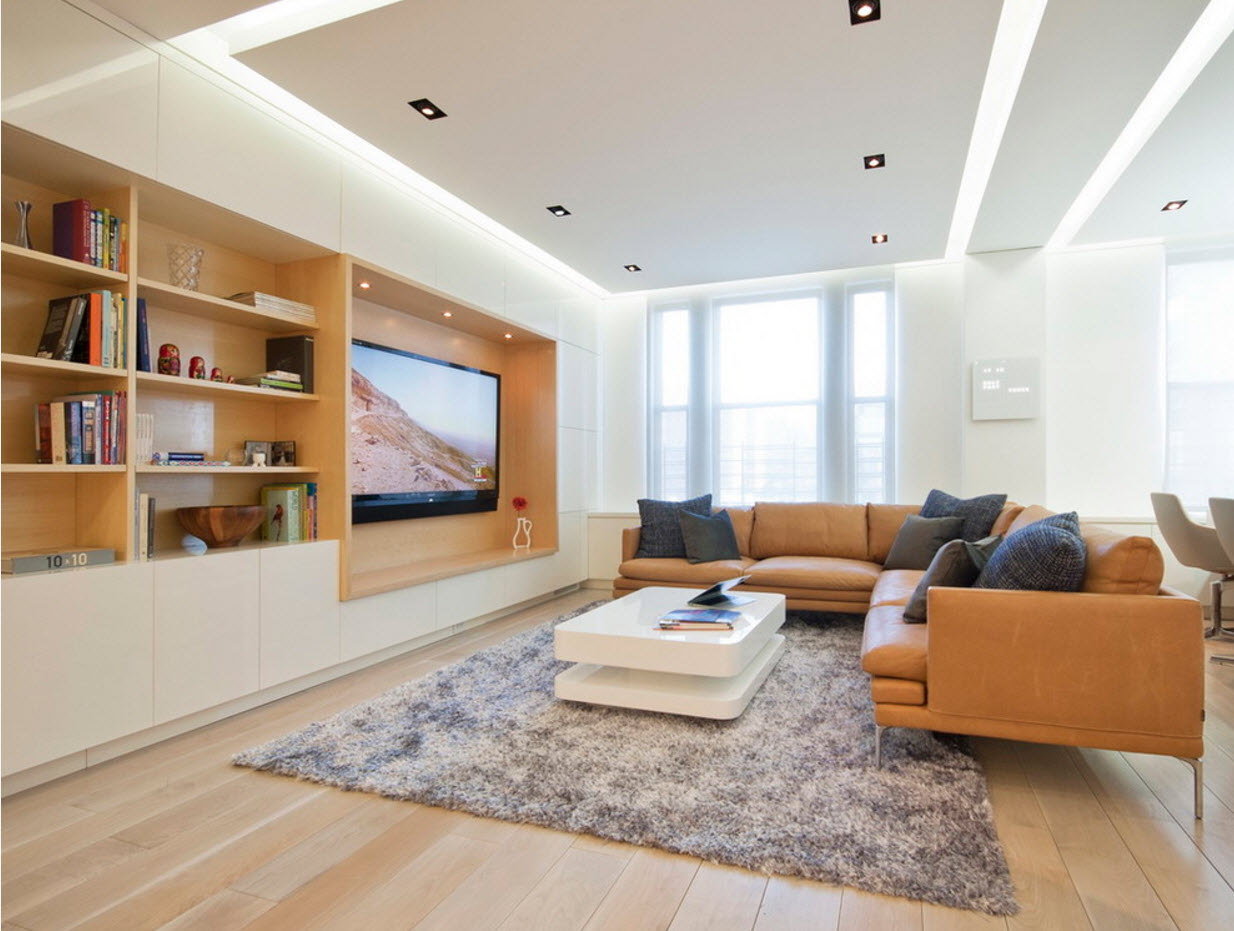
If we talk about artificial light sources, the trend of multi-level lighting does not lose its popularity. Even in rooms with a modest area, it is impossible to get by with a single lighting fixture. And in such multifunctional rooms as the kitchen, almost every surface is working and needs lighting. If we are dealing with a studio apartment, where several functional zones are combined within the same room, then it is necessary to illuminate each segment with local sources or with band lighting.
White tone as the main color scheme
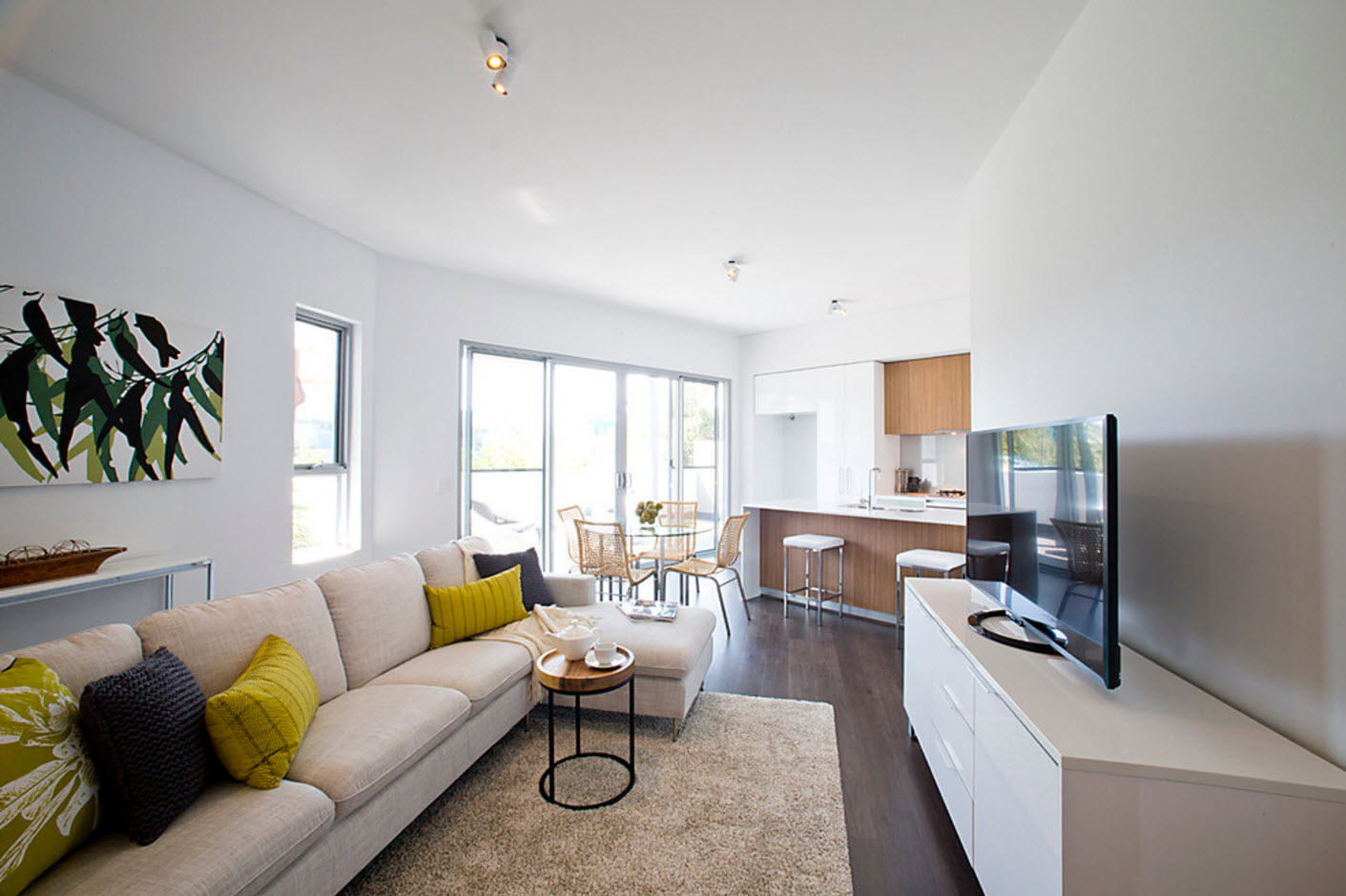
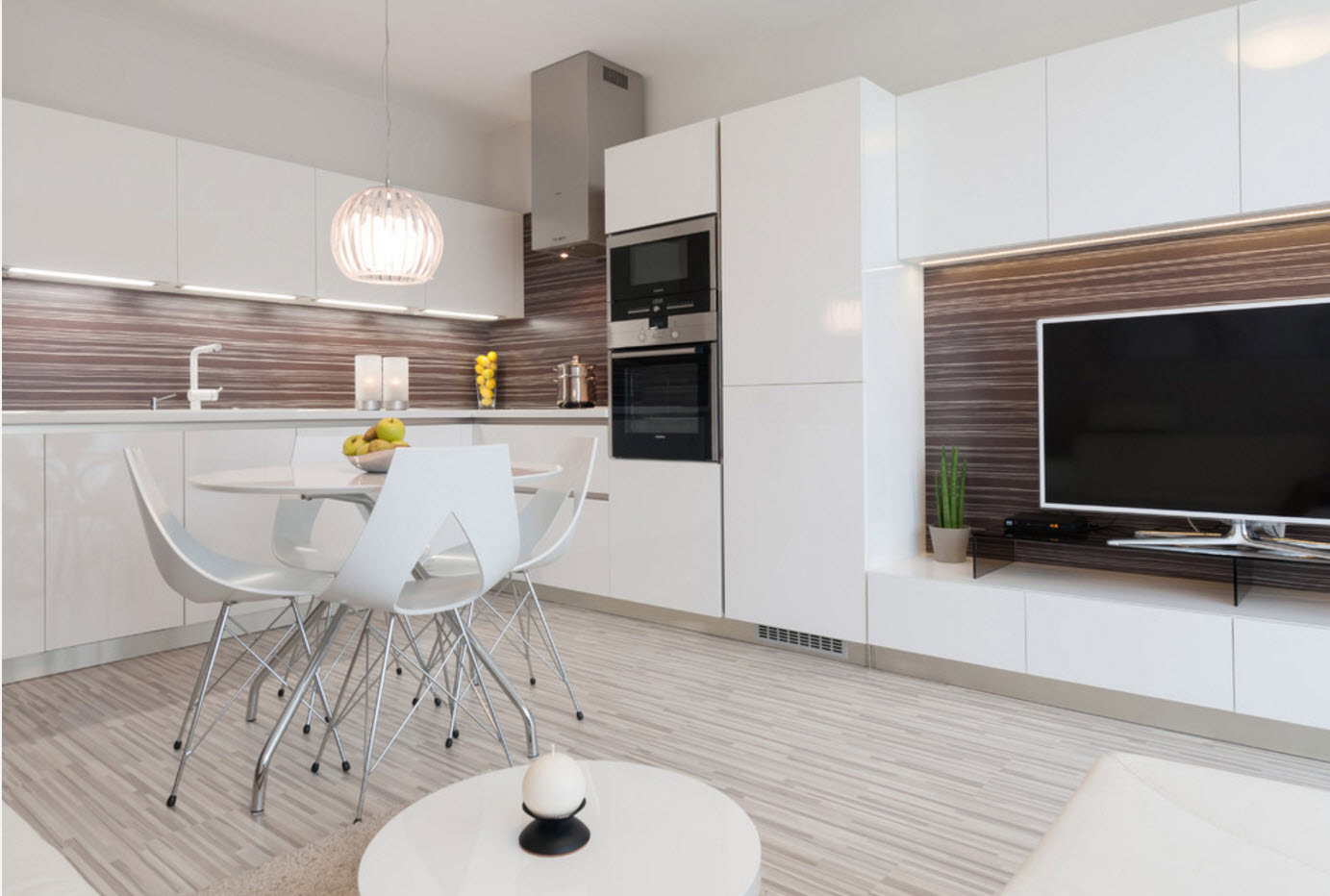
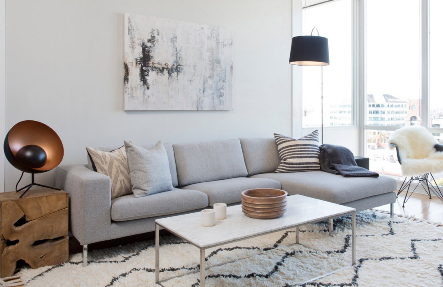
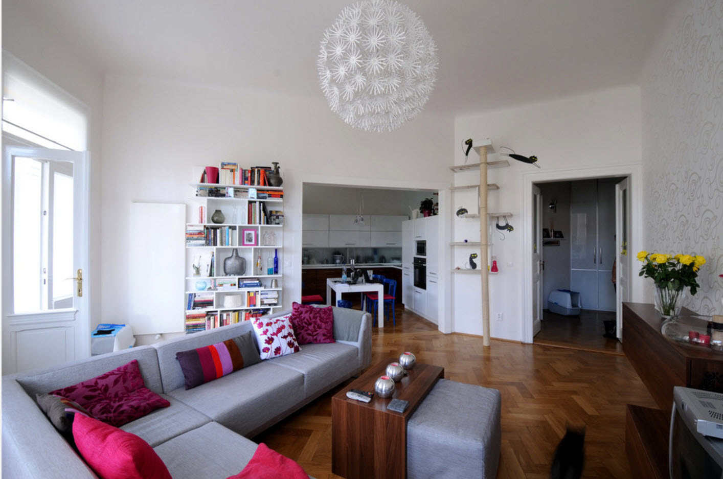
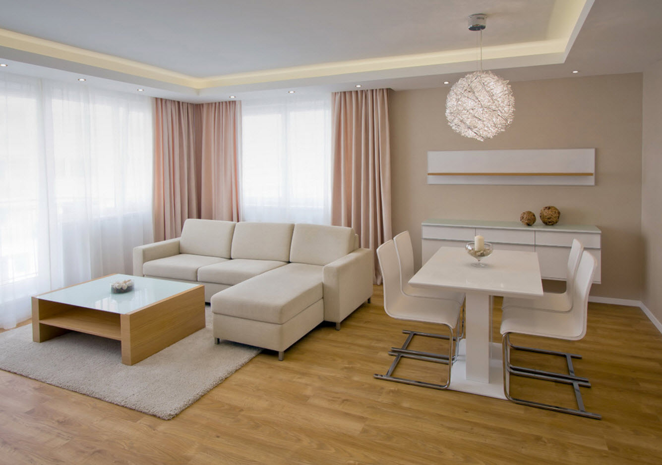
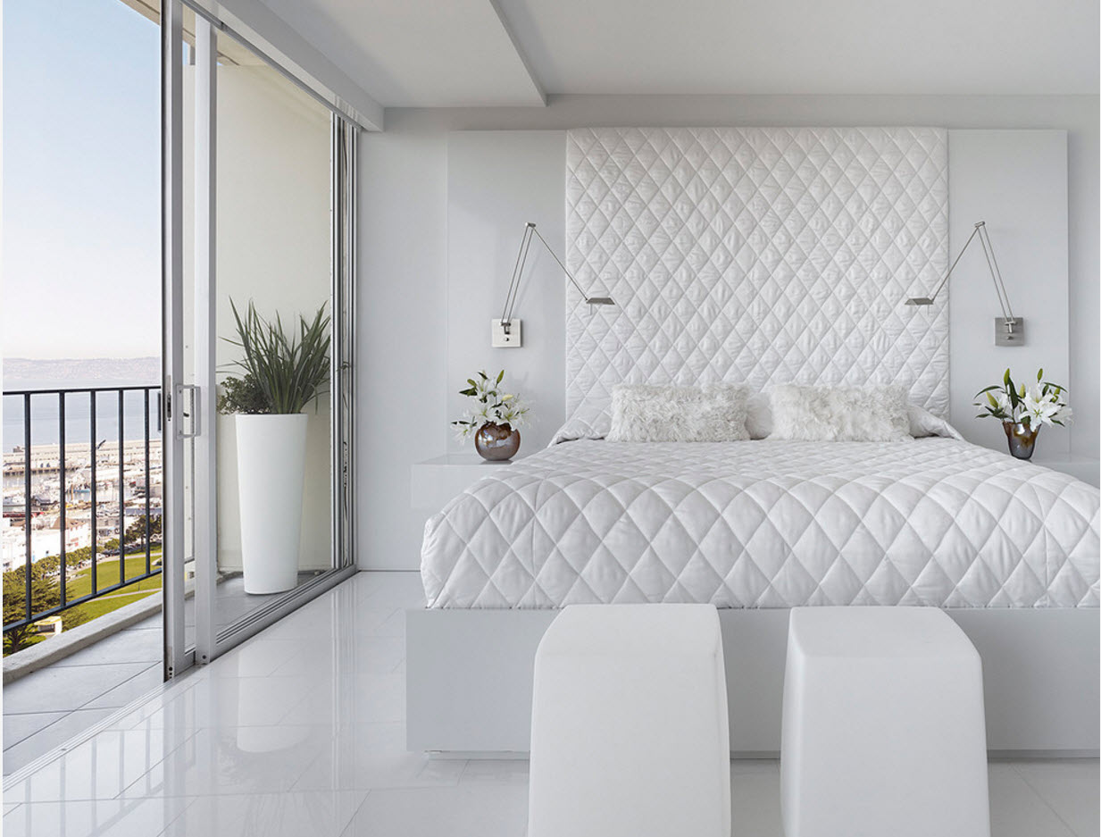
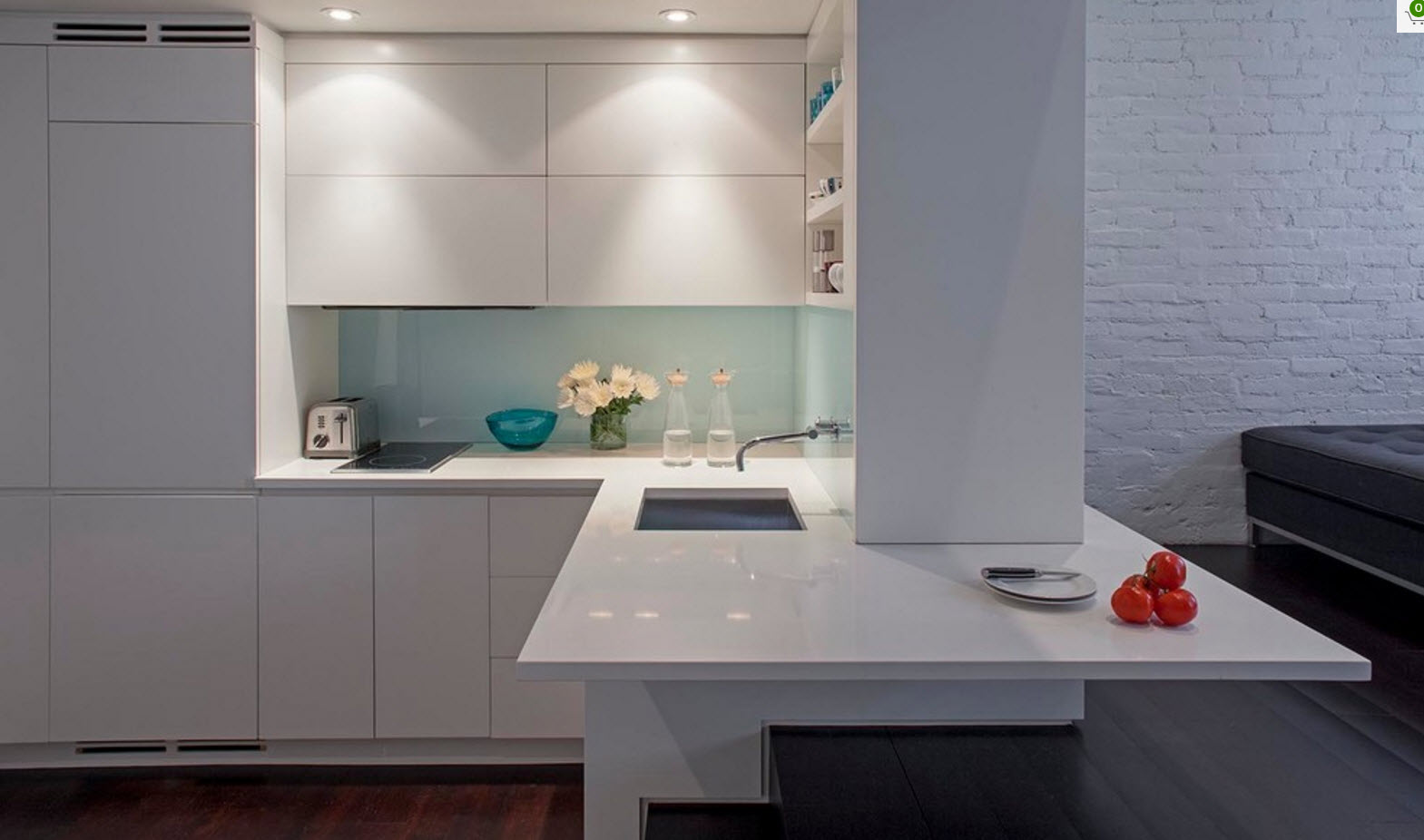
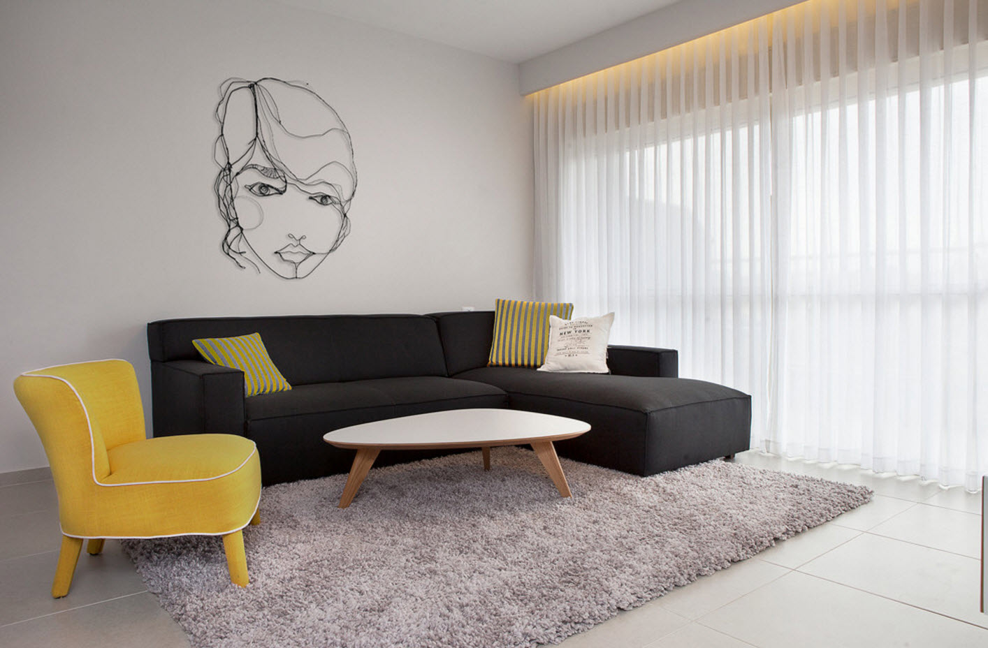
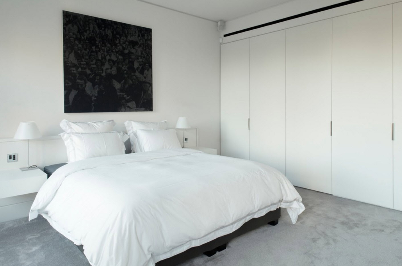
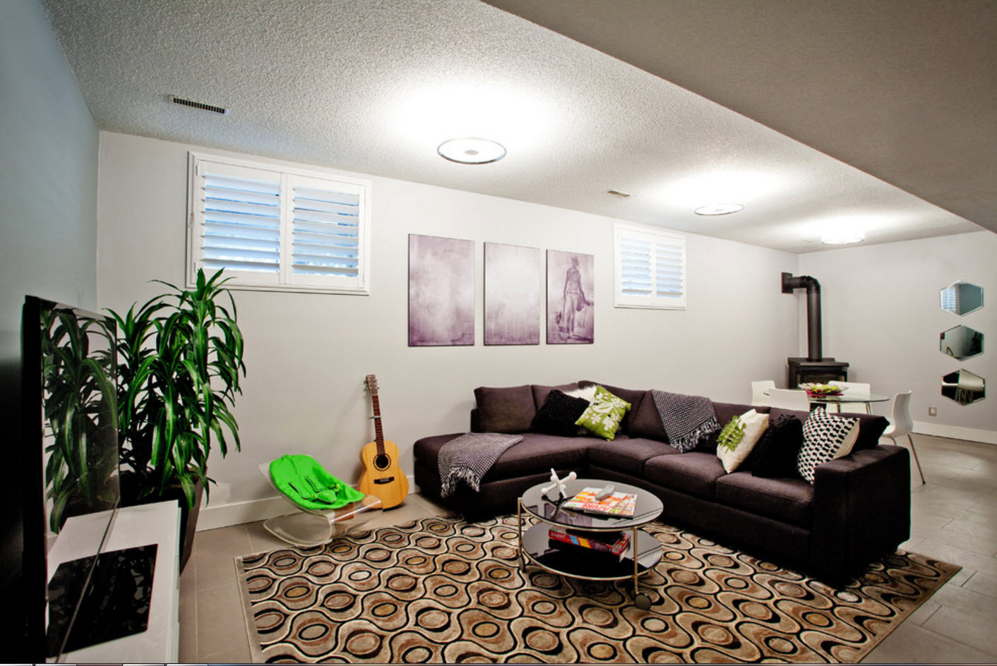
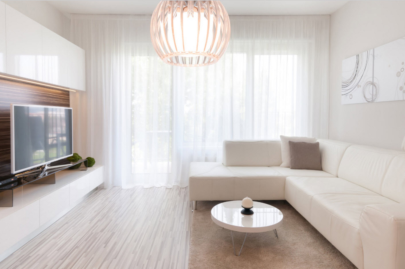
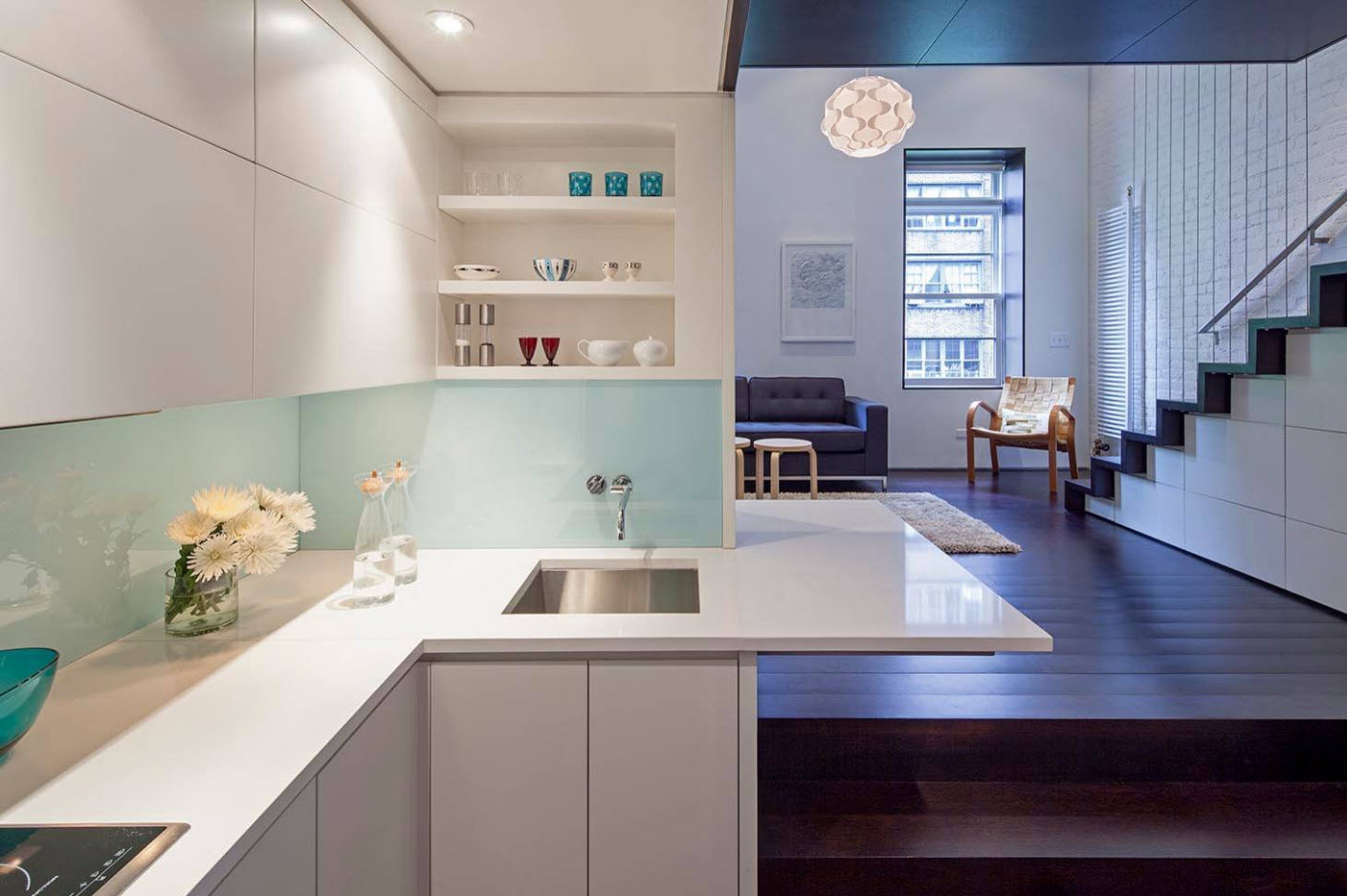
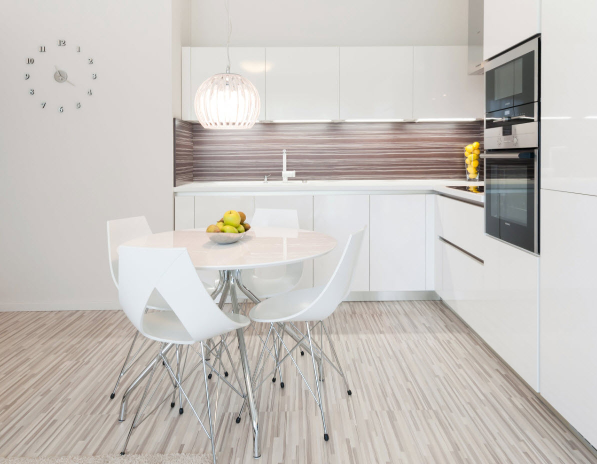
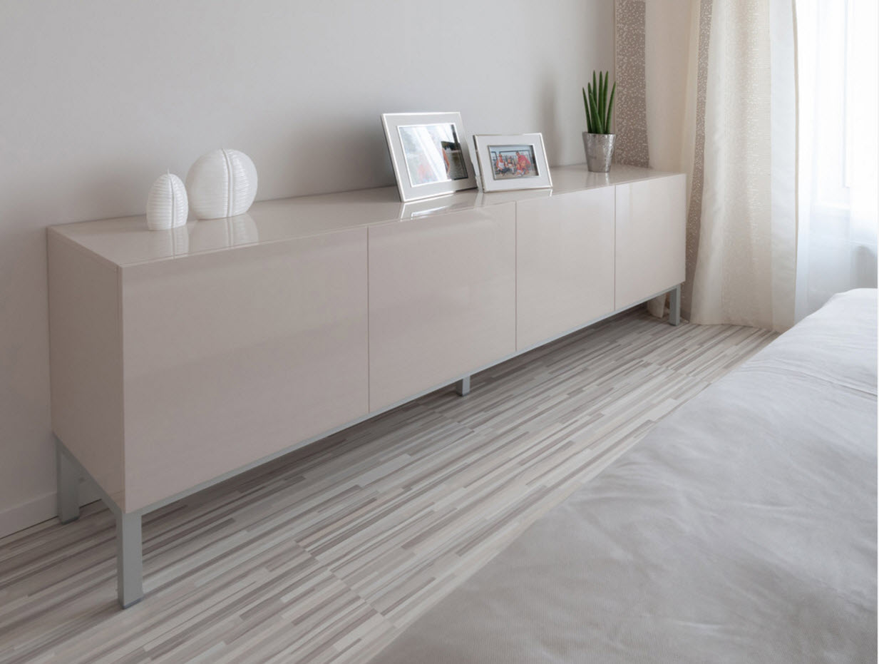
Fashion for all shades of white will never go away. This is due not only to the fact that furniture and decor of any color looks great on a white background, but also to the fact that light colors help visually increase the volume of the room, mitigate architectural imperfections or blemishes. White color is a symbol of freshness and purity. And many owners would like to see their home, first of all, clean and “light”, weightless and fresh. Using white color as the main tone of decoration, it is easy to create a harmonious image of the room. Designers recommend using no more than two additional colors (and their shades) to dilute the snow-white idyll.
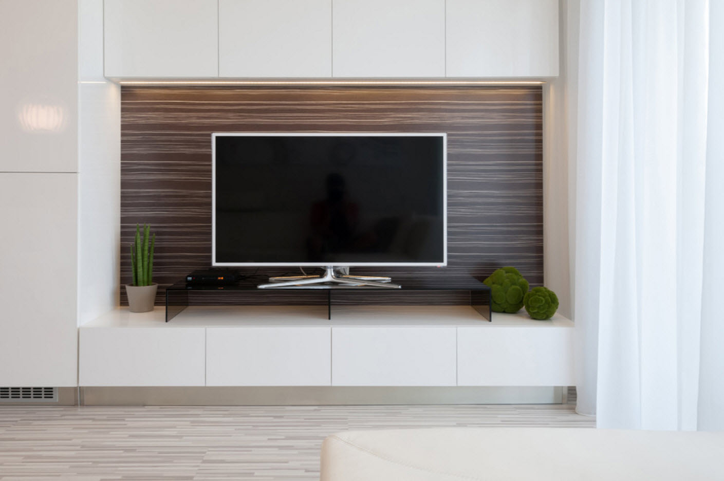
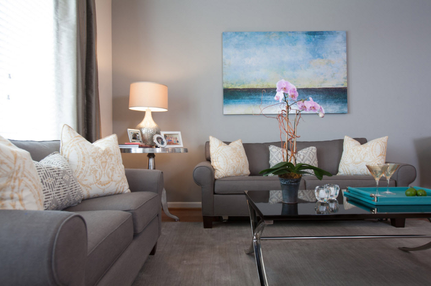
For those who do not want to take risks with the choice of complex color combinations, experts recommend using the “three whales” of the modern palette of shades - the white color is diluted as shades of gray and one of the types of wood as the main color (this can be either a light natural pattern or a contrast dark wenge, for example). The resulting image will be practical and versatile - in such a palette you can decorate the kitchen, living room and bedroom. The room will look fresh, but not flashy, attractive and at the same time peaceful. But it is precisely the calm atmosphere that we expect to see in our own apartment upon returning from work after a difficult working day.
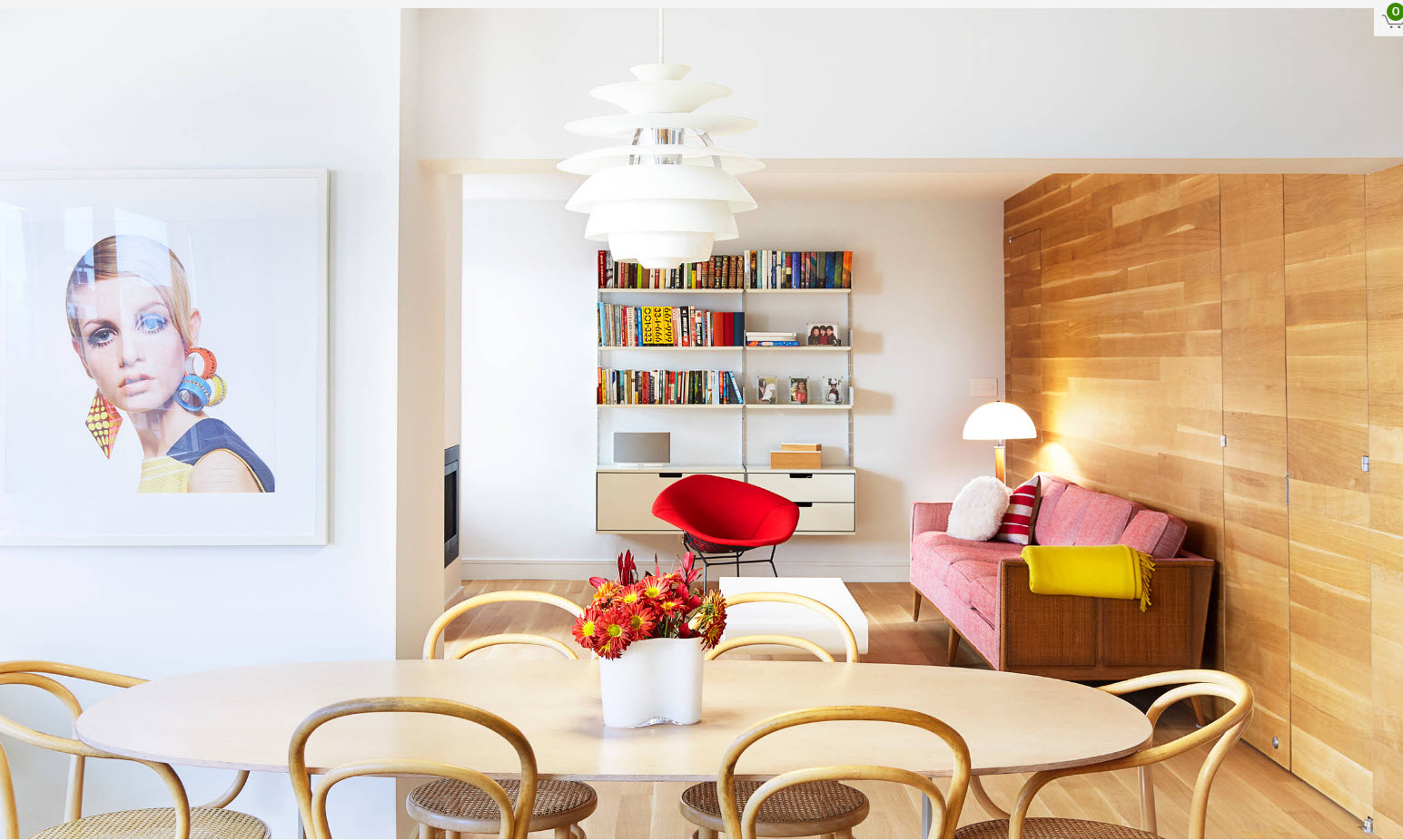
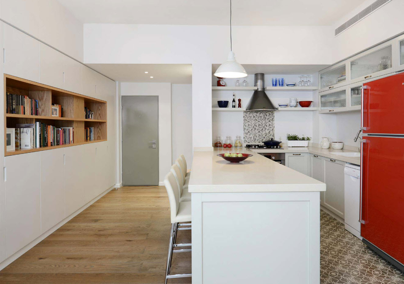
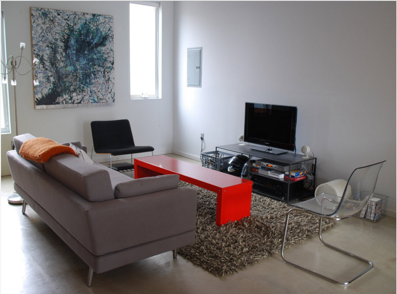
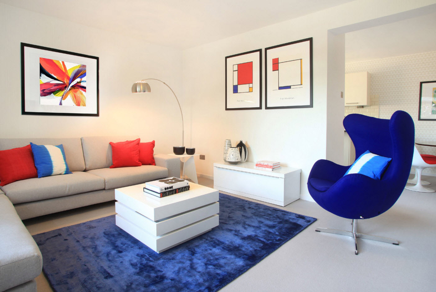
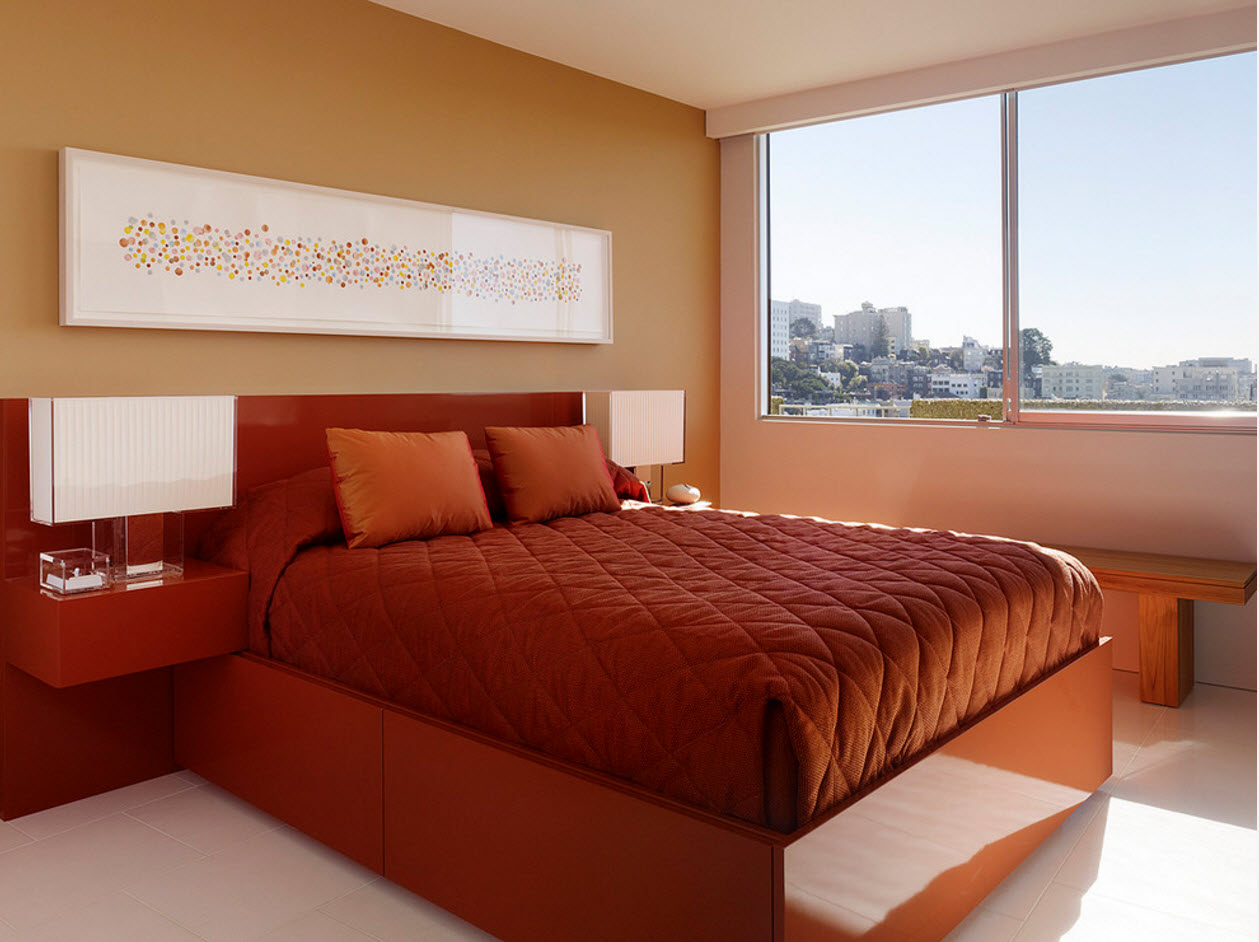
For more daring homeowners of small and medium sizes, we can recommend replacing the gray tone with a bright color, leaving as the main white, diluted with wooden surfaces. But in this case it is necessary to use your bright accent in a very metered way - one surface or a household appliance, a sofa or a chair with colorful upholstery.
For rooms of medium and large sizes, contrasting combinations will be an ideal option for color solutions. The alternation of dark and light surfaces never goes out of style. By means of a contrasting change of light and shadow, it is possible not only to emphasize the geometry of the premises, but also to conditionally zon the space, to highlight especially significant objects.
Use of lightweight furniture and transformers
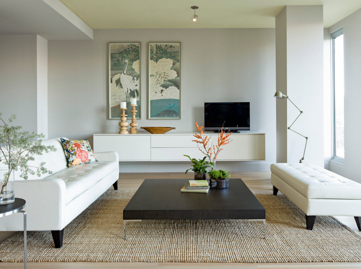
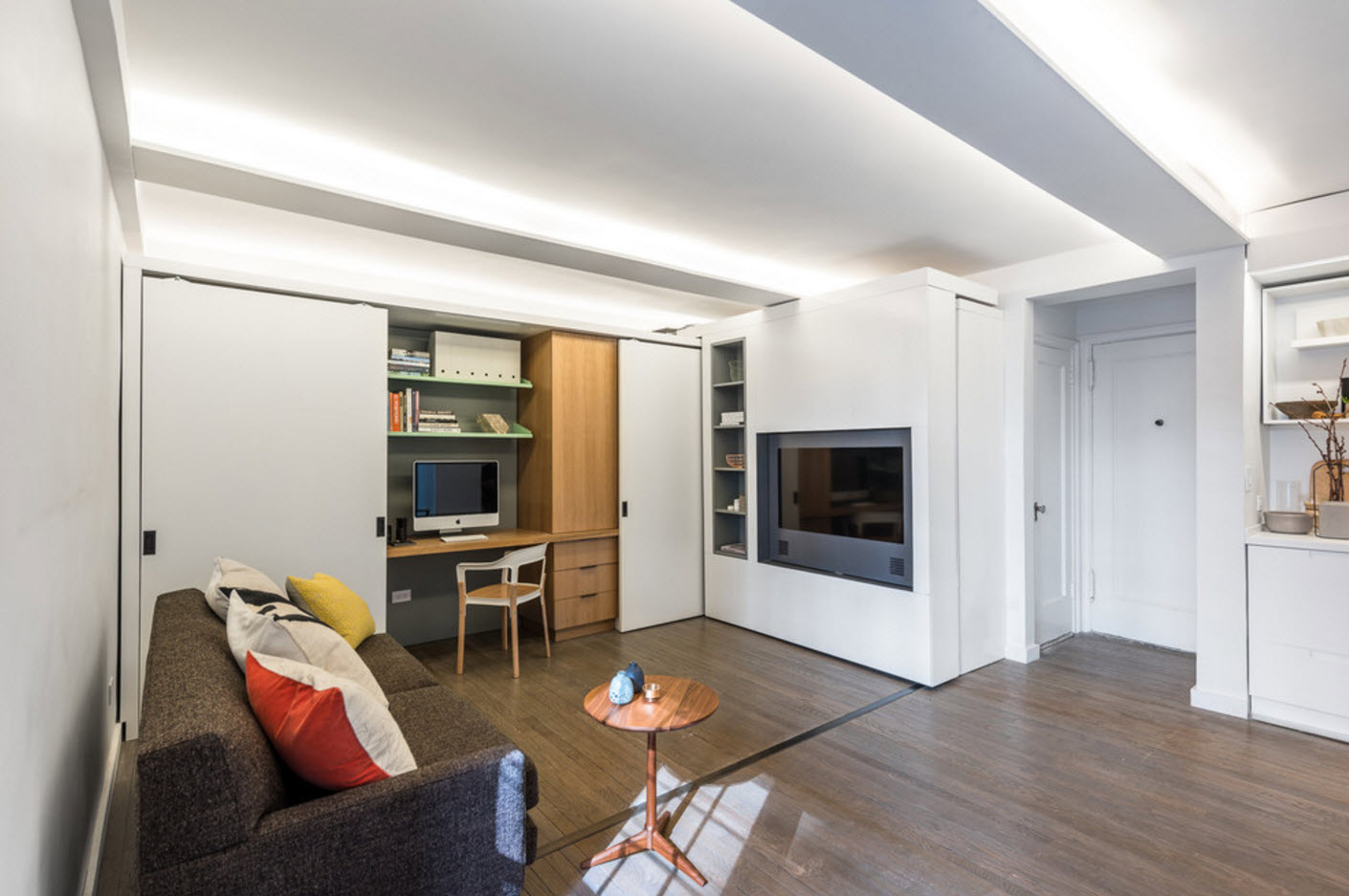
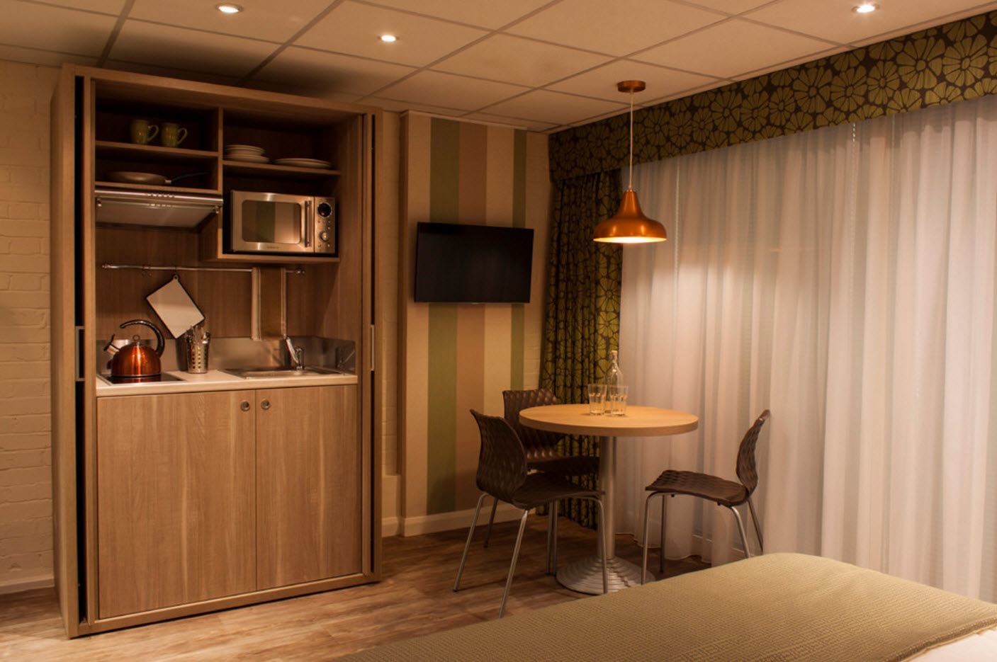
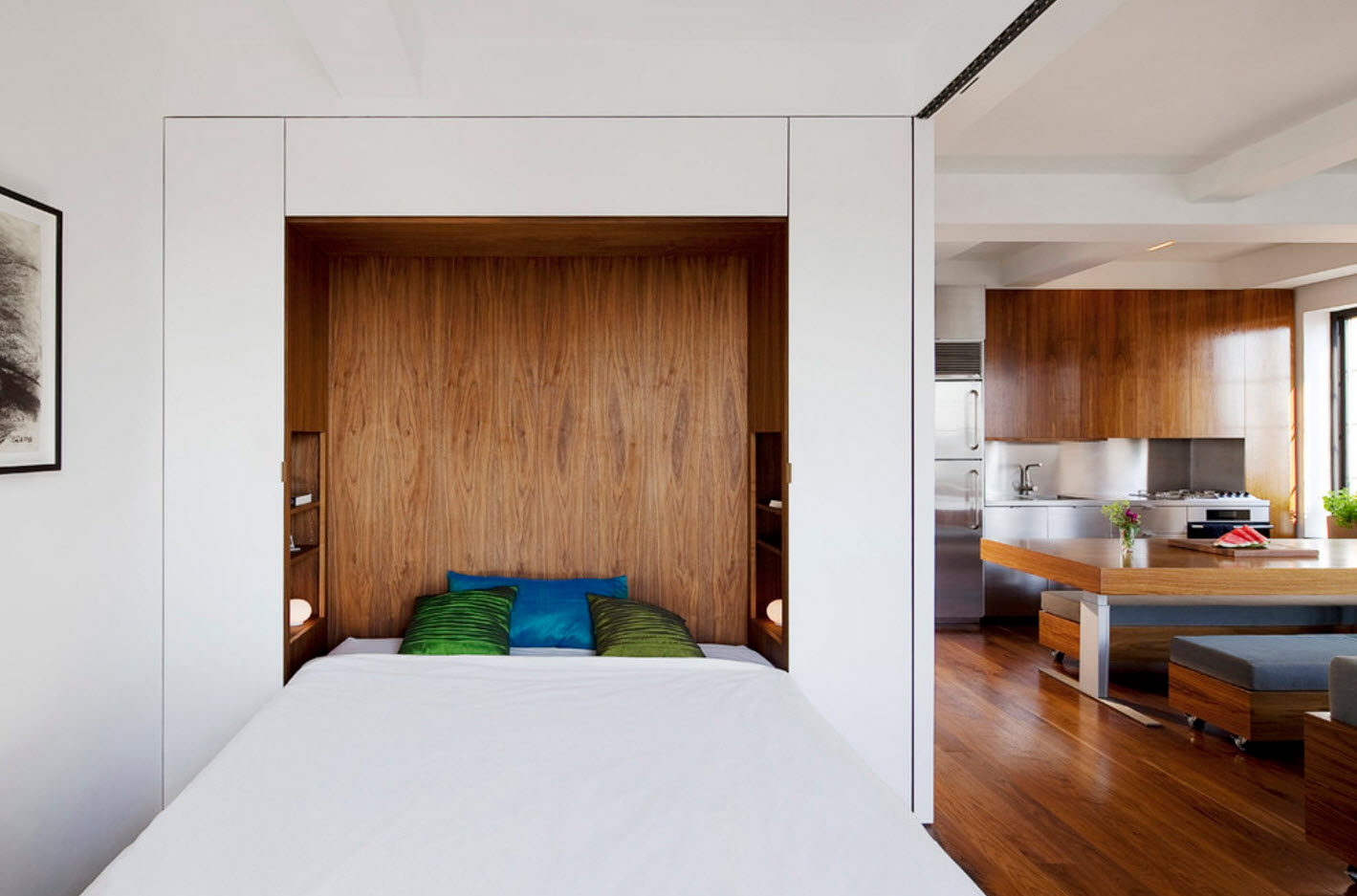
Replacing bulky desks with light consoles, massive wardrobes with open shelves, the use of various folding mechanisms, transforming furniture is a modern trend, due not only to the predominance of dwellings with modest dimensions, but also the desire to surround yourself with a light and concise environment,simple furniture and decorative solutions. Transformable furniture takes up less space and can perform several functions depending on the situation. The increase in transforming models in the furniture lines of modern manufacturers makes it possible for most apartment owners to purchase ready-made solutions, rather than overpaying for individual production.
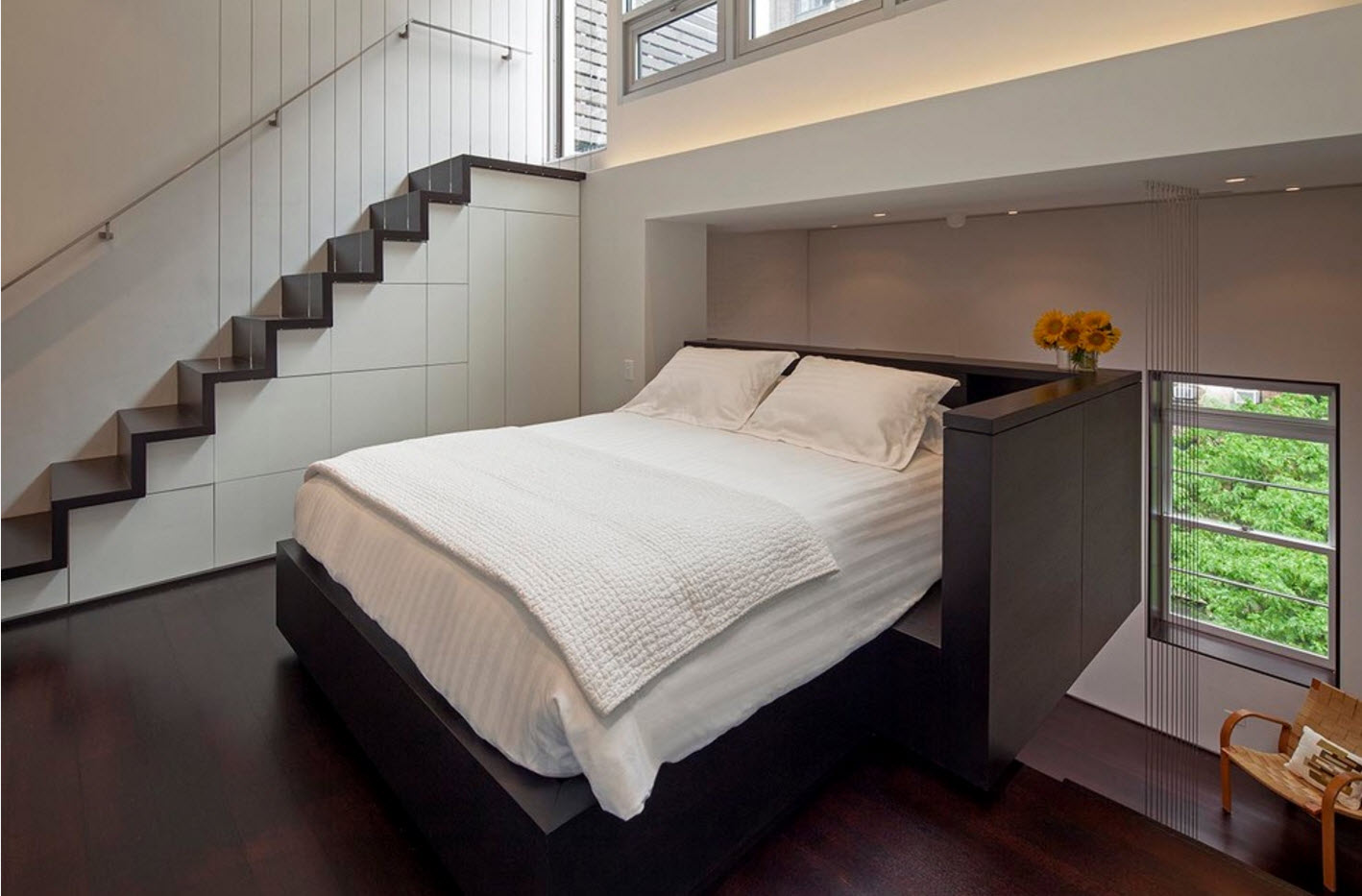
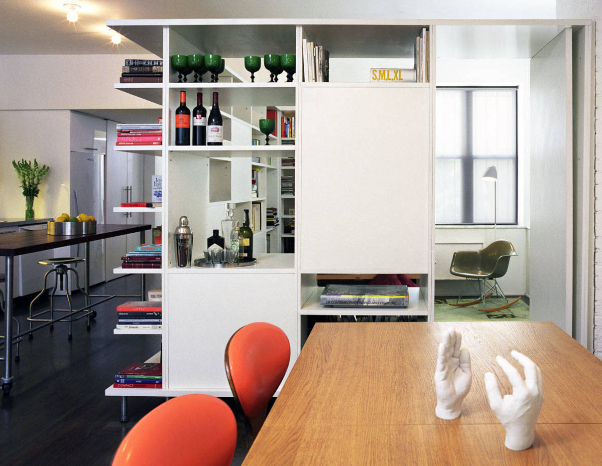
The rational use of the available space pushes the owners of small and standard apartments to use the whole range of design solutions aimed at creating a convenient, functional and at the same time visually spacious interior. Built-in storage systems that make it possible to use effectively every centimeter of the available area are becoming an integral attribute of a modern home.
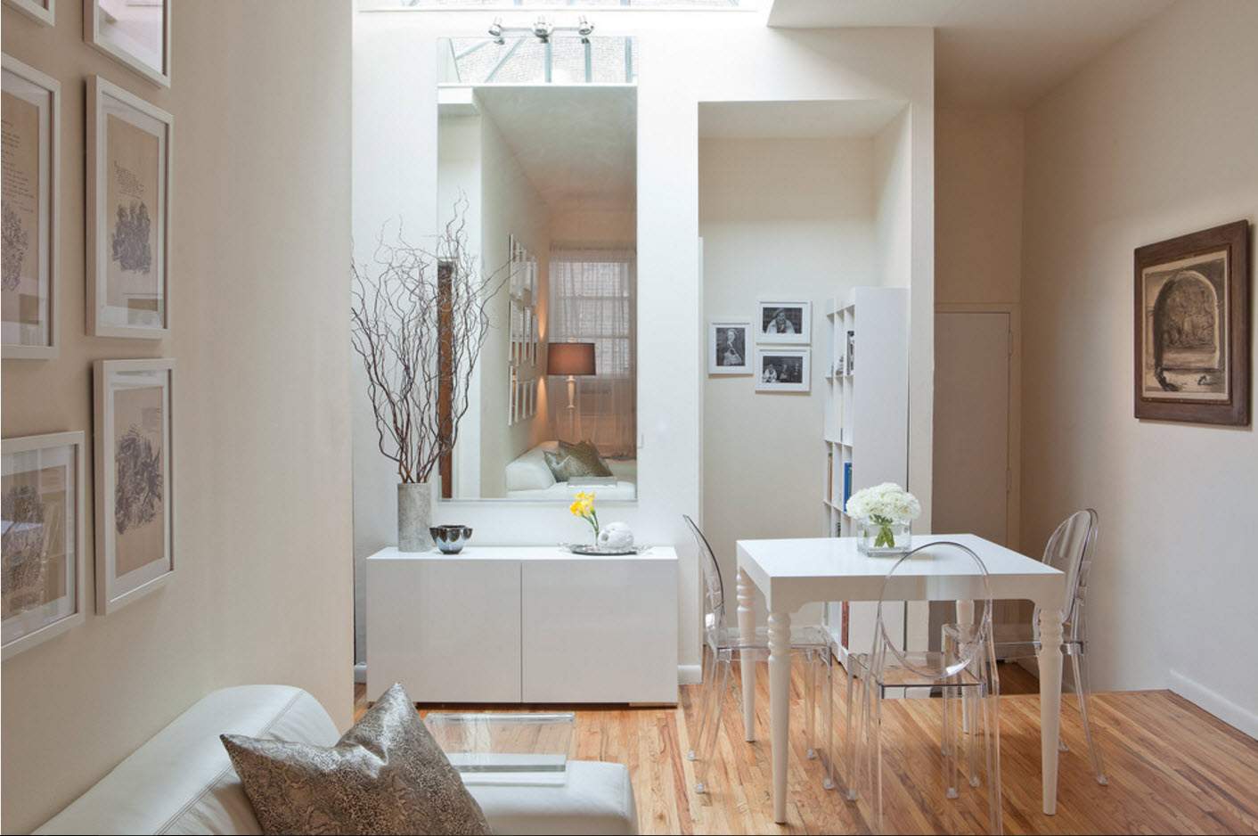
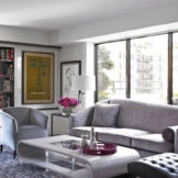
The use of furniture, partially or completely consisting of glass or transparent plastic (acrylic), allows you to bring lightness, airiness to the images of the premises. Translucent and transparent design objects seem to dissolve in space, without weighing down the appearance of the rooms. Tables and chairs, coasters and coffee tables, just consoles and shelves - all these small but important interior items look luxuriously in a “transparent” version and harmoniously fit into the modern design of the dwellings.
Eclecticism of the interior
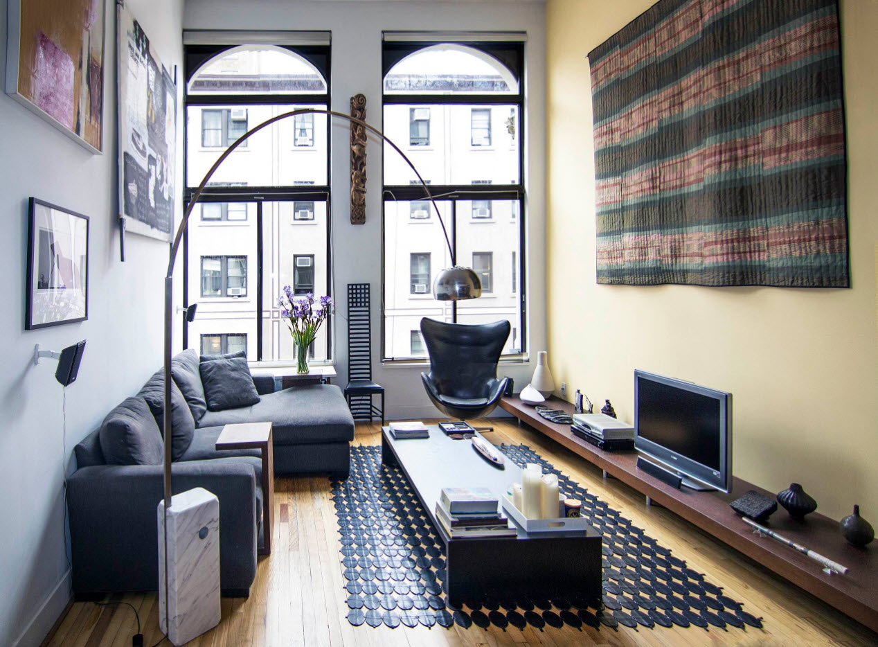
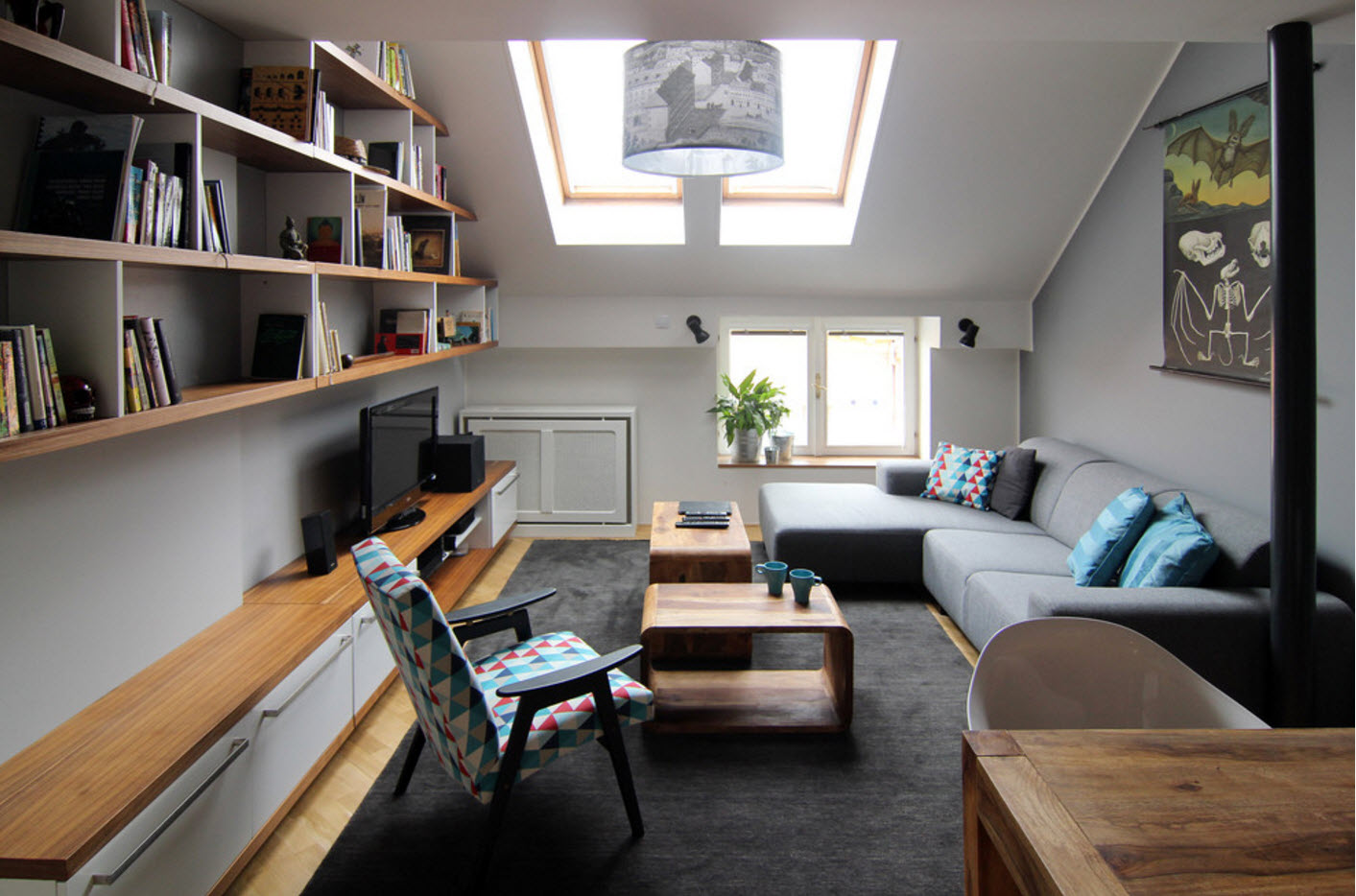
The modern décor style is eclectic in itself. It effectively combines the motives of minimalism, loft, country style (especially Scandinavian stylistics), pop art and even classics. A skillful combination of concepts of different styles leads to the creation of truly unique, original images of the premises, which can reflect not only the style and standard of living of the owners, but also their taste preferences, attitude to comfort and practicality, coziness and aesthetics.
Features of the design of rooms in a modern apartment
Living room
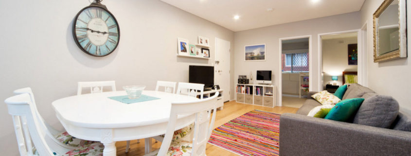
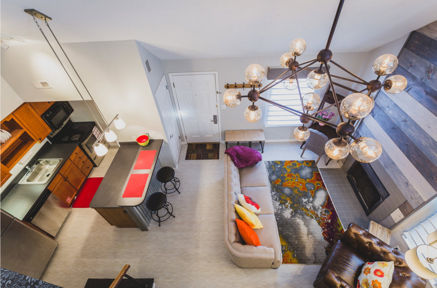
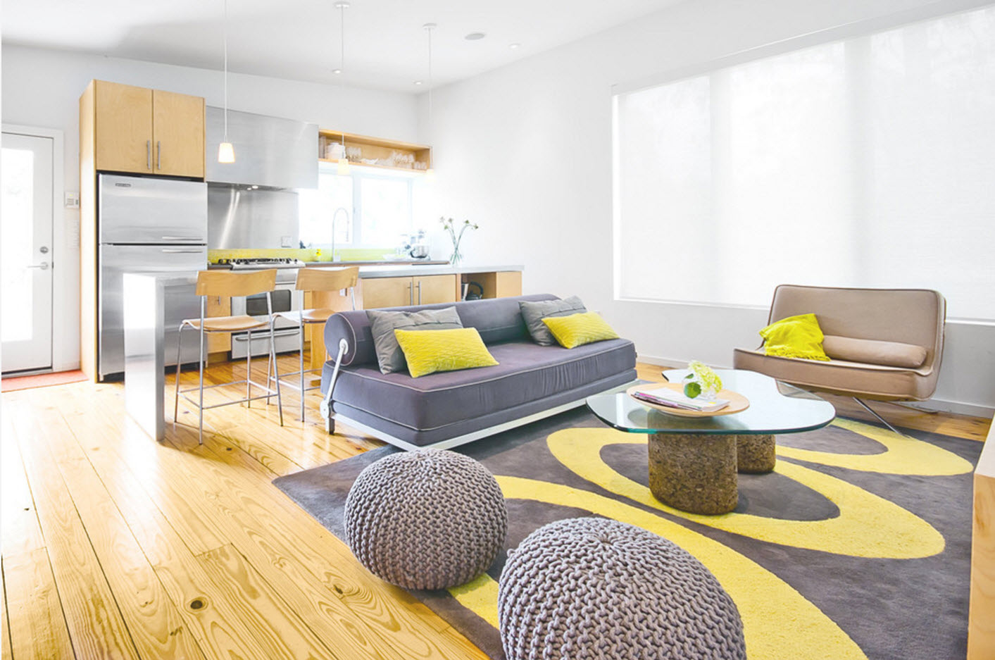
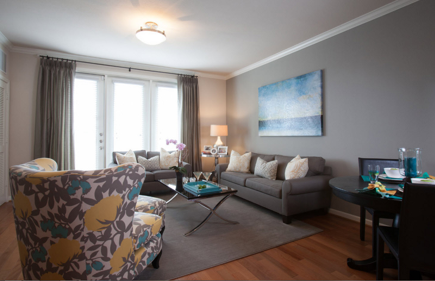
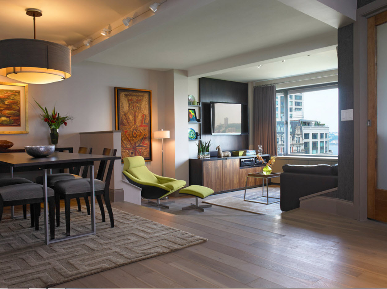
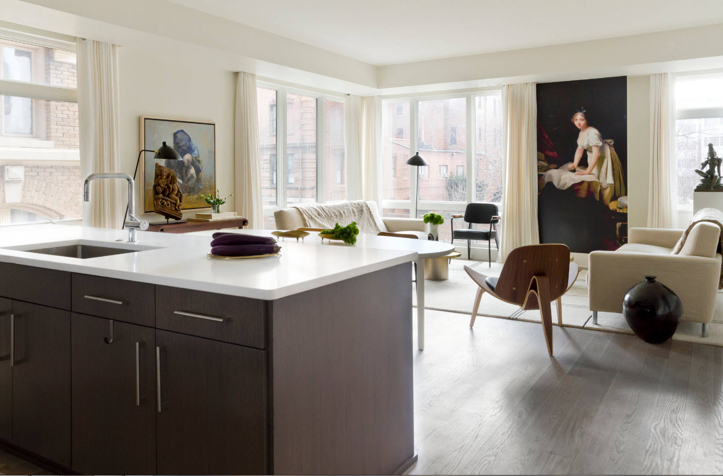
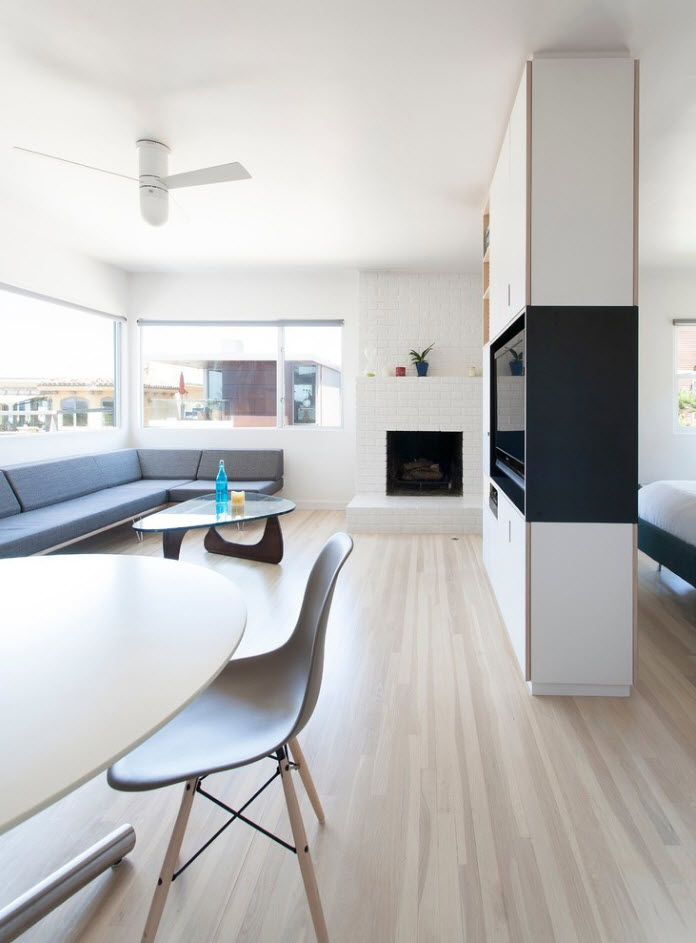
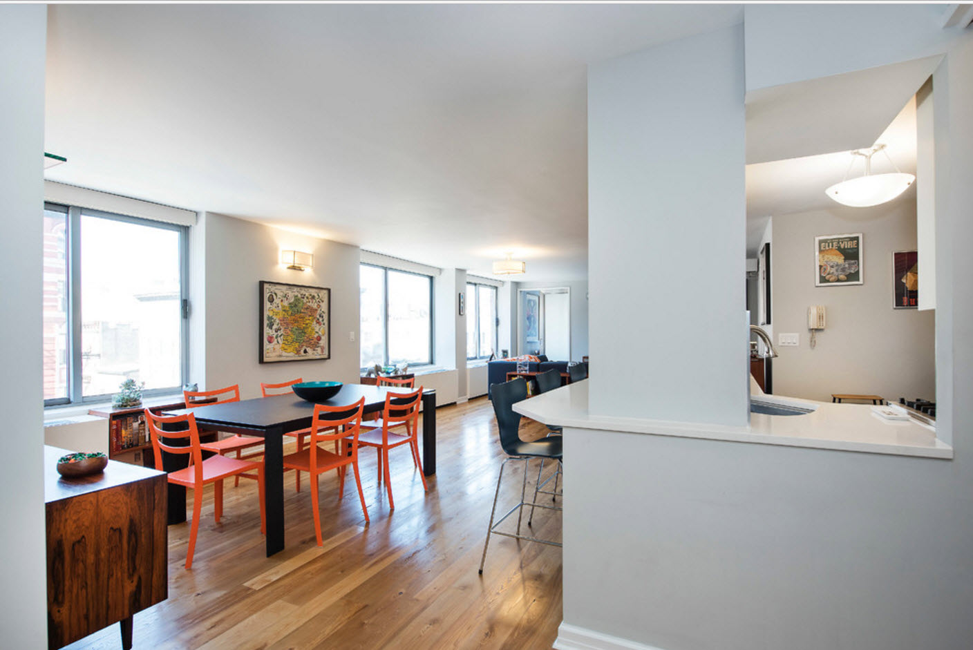
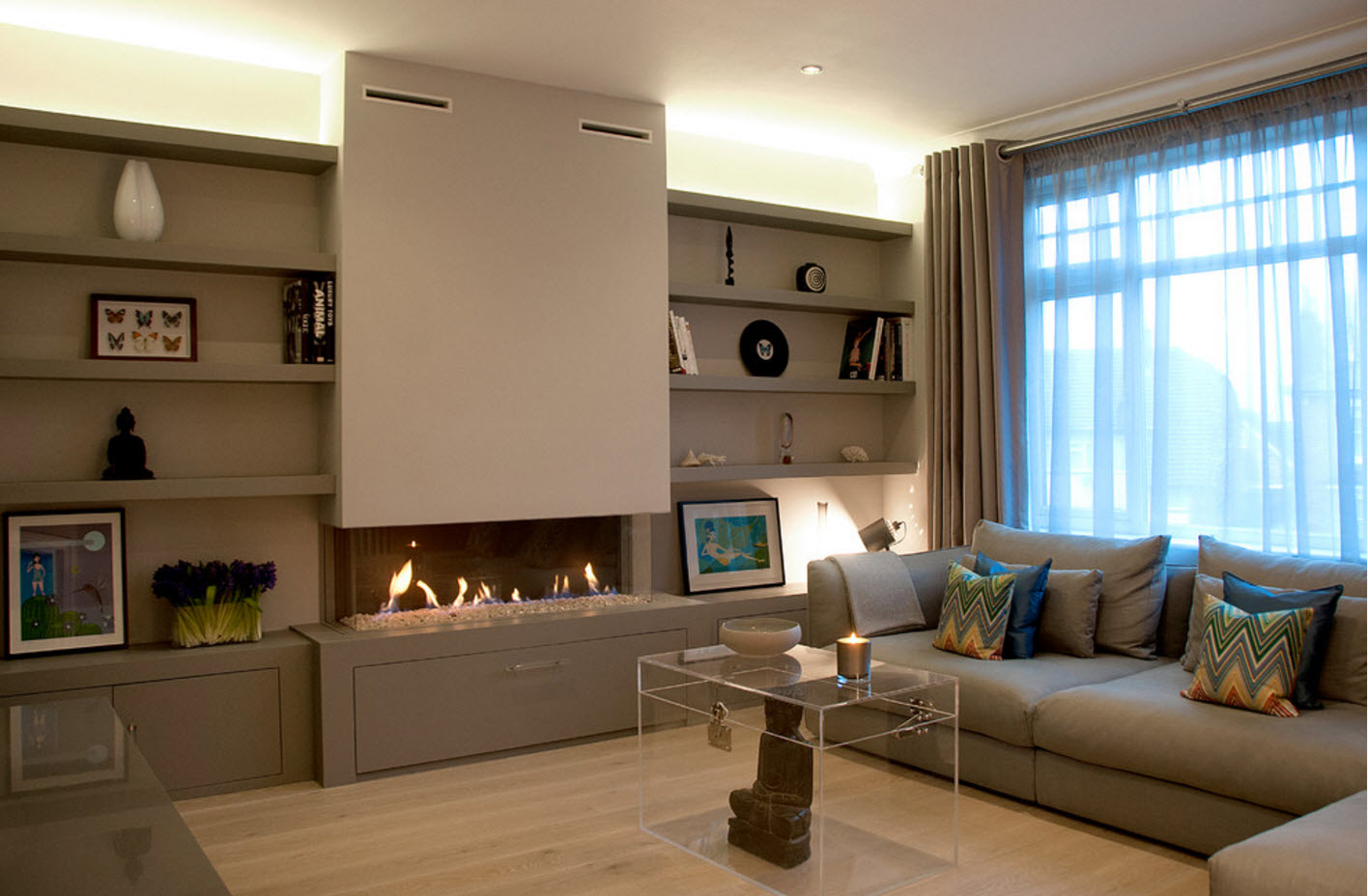
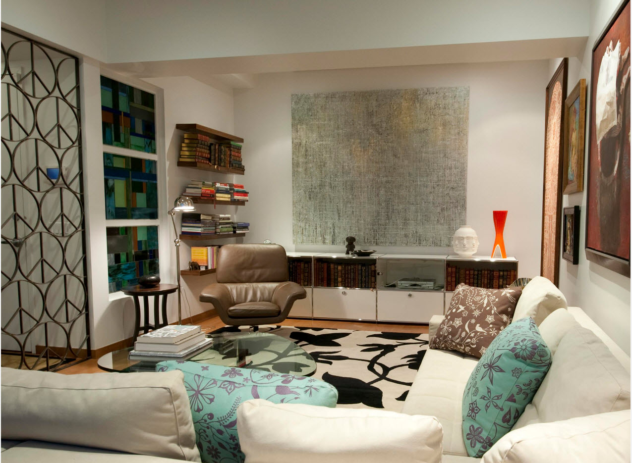
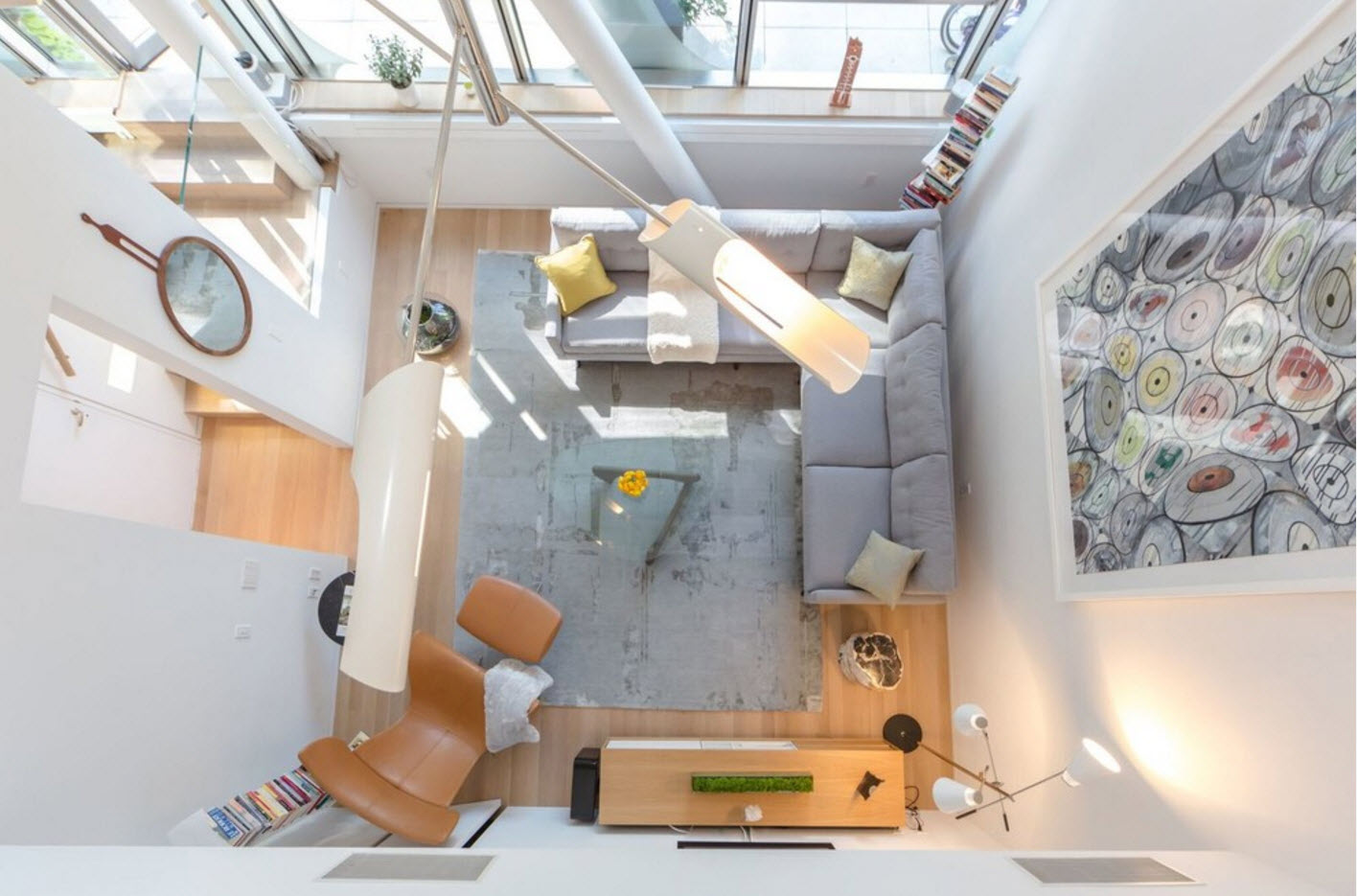
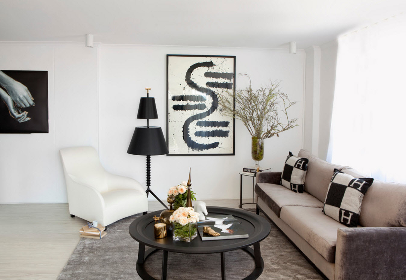
A modern living room can be presented in several variations. The first opportunity is a separate room, acting exclusively as a room for gathering all households and receiving guests. The second option - the living room is connected to the dining room. In apartments where the kitchen space is not able to accept the dining area, it is often taken out to the living room, like a room that performs similar functions: the reception of all family members at certain times of the day. And the last variation on the theme of arranging the living room is the studio, which combines in addition to the family room, a kitchen with a dining room.
Kitchen and dining room
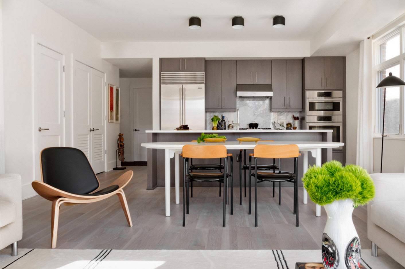
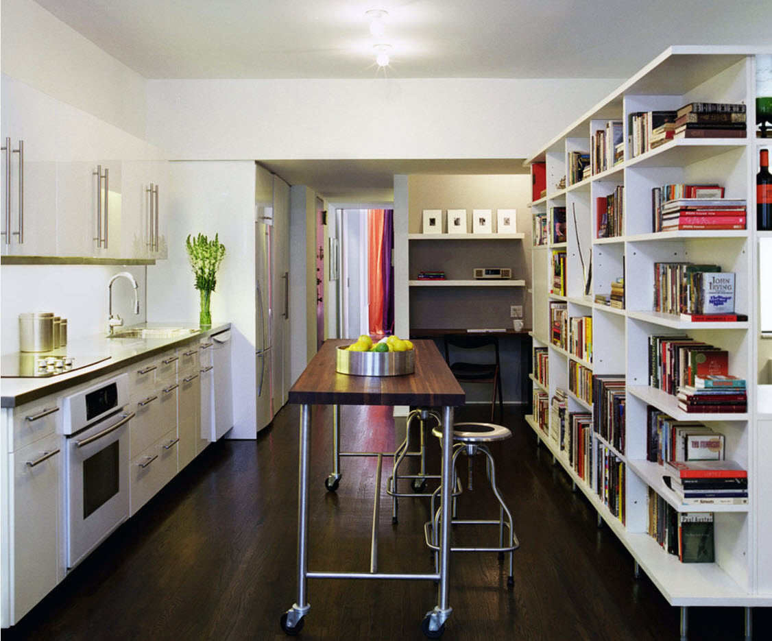
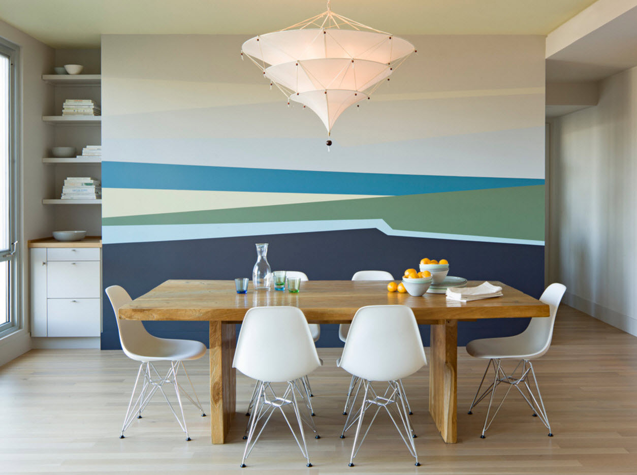
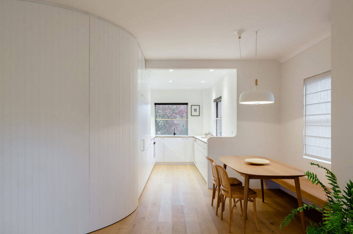
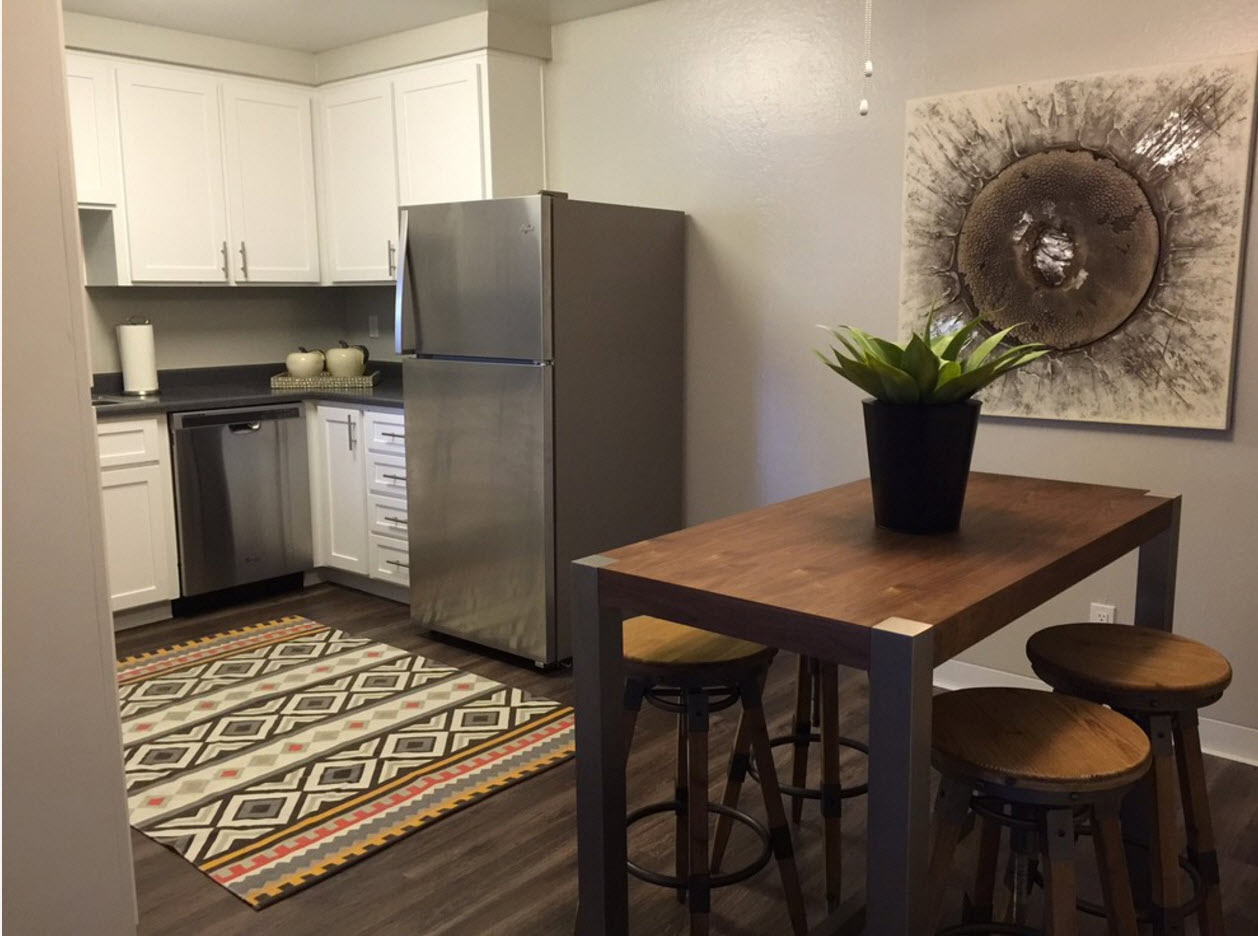
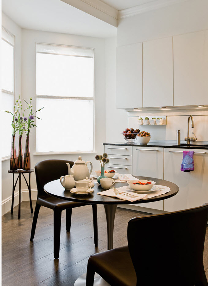
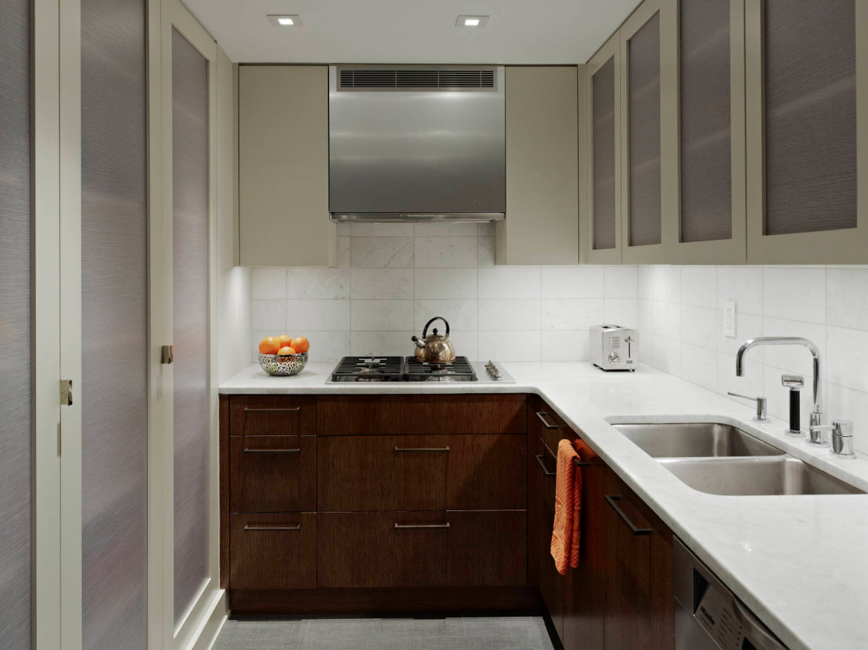
Like the living room, the kitchen can be presented in various variations. A modest-sized room can only contain a working area (the dining group does not fit in a small space). In the second version, the kitchen contains not only a furniture set with household appliances, but also a dining table with chairs. And the last variation - the kitchen is part of a large room, in which there is a living room and a dining room (often this space is also a hallway or a corridor).
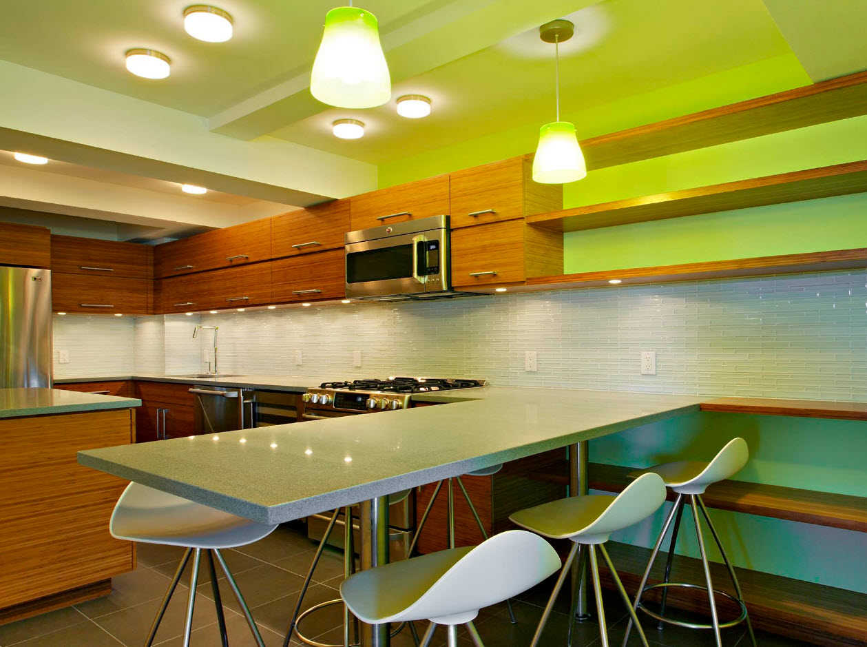
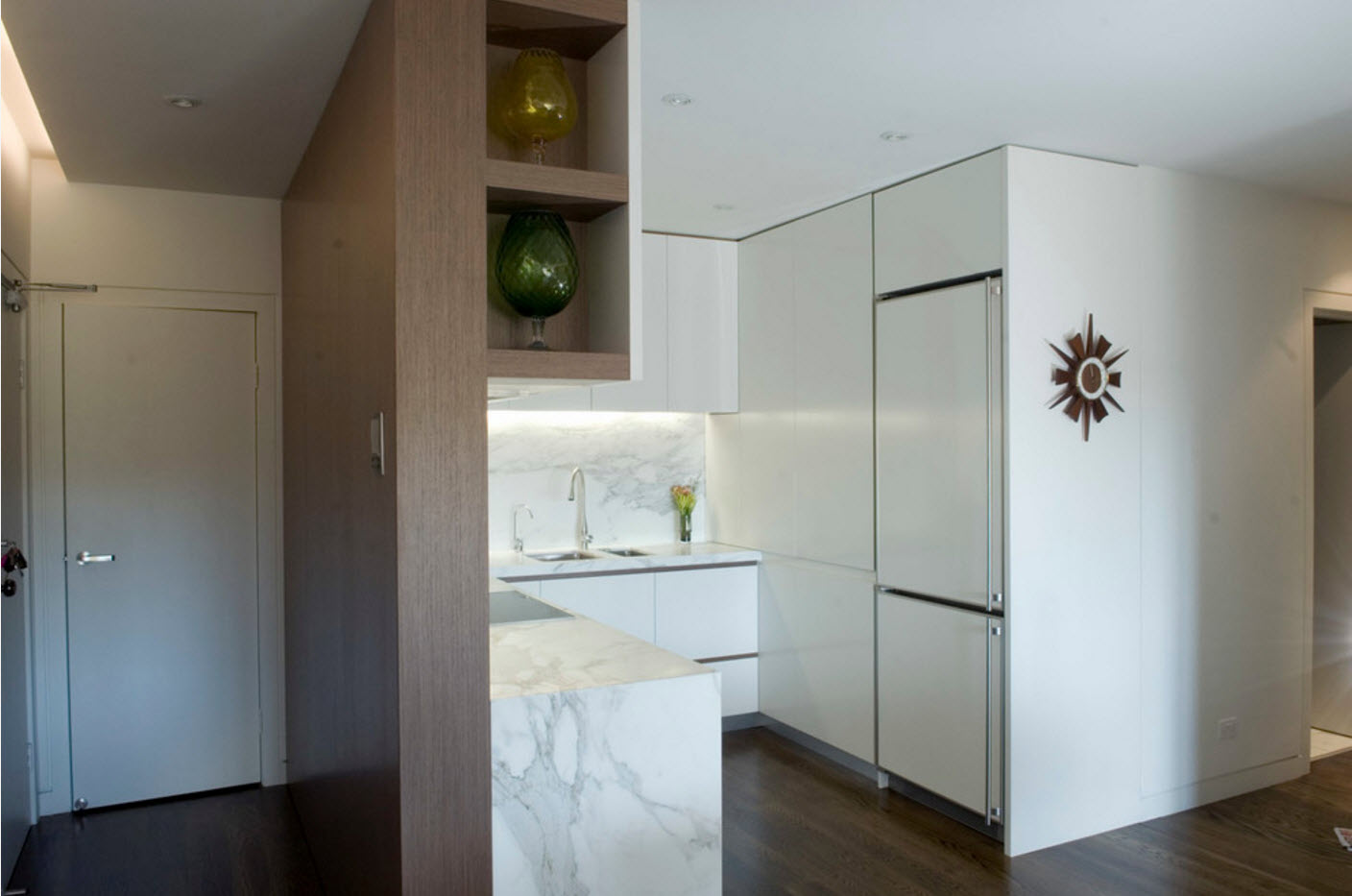
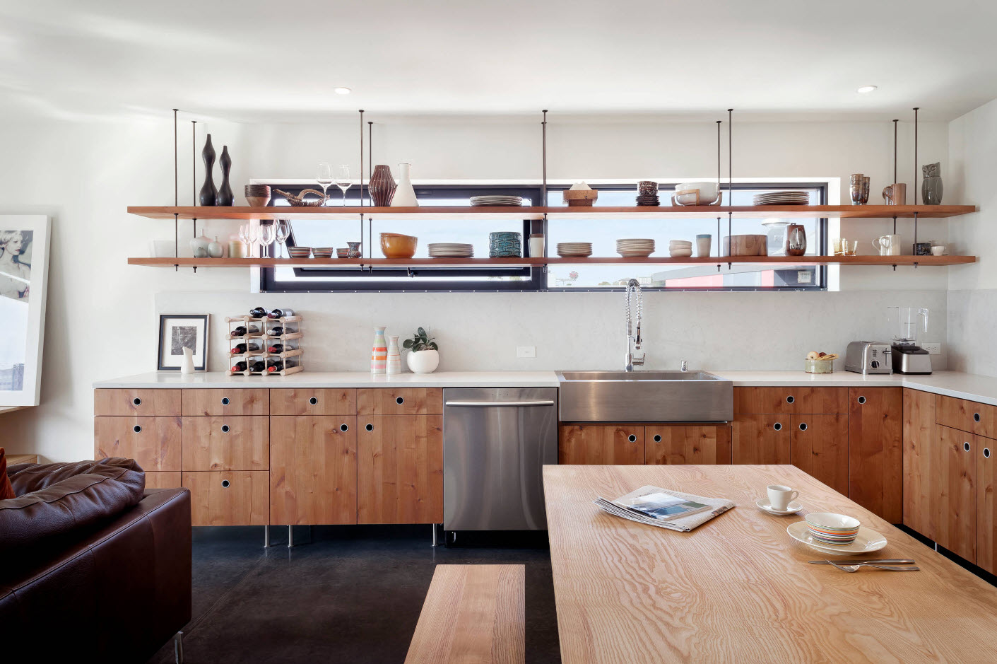
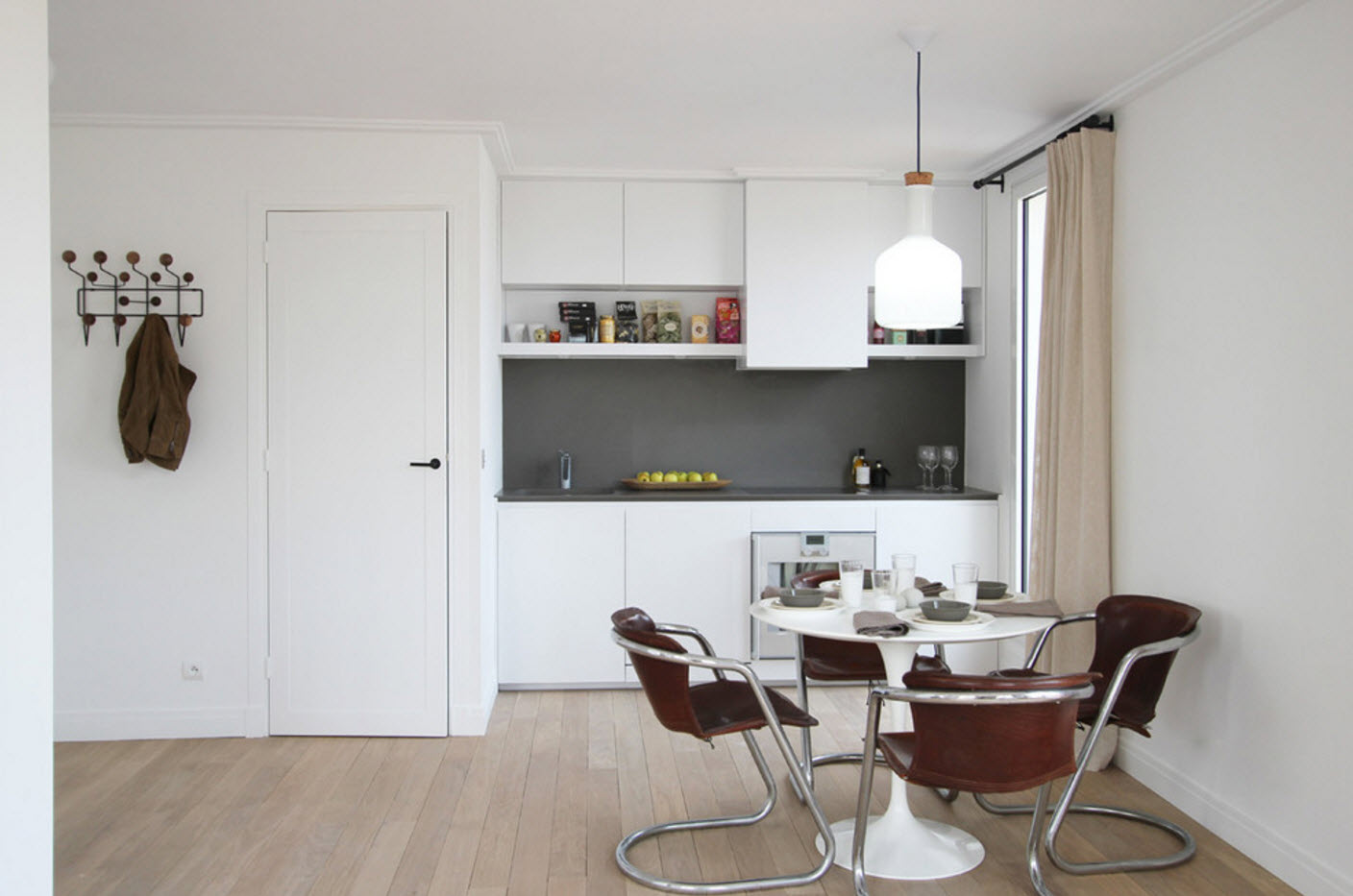
In the new season, the use of open shelves as an alternative to the upper tier of kitchen cabinets will be at the peak of popularity. This design technique allows you to visually "unload" the upper part of the room, to create a lighter image of the interior. Open shelves can be used both as the only option for storage systems for the upper level, or combine them with small hanging cabinets.
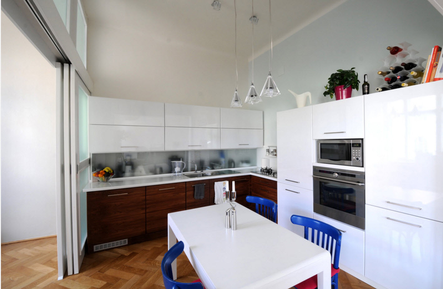
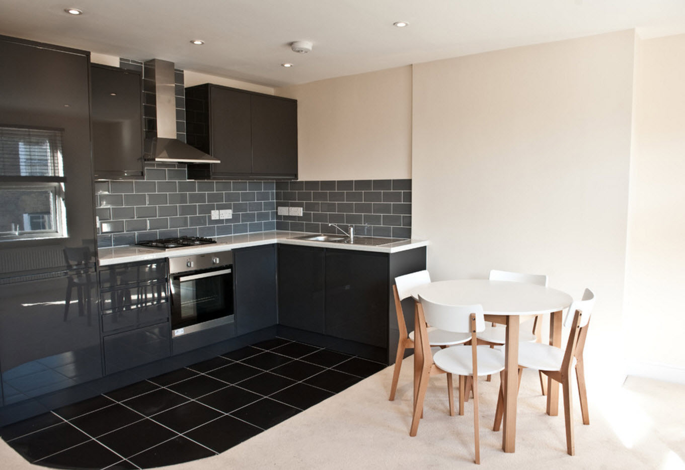
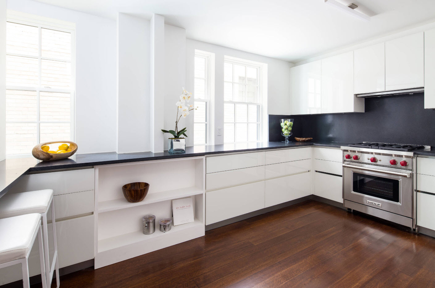
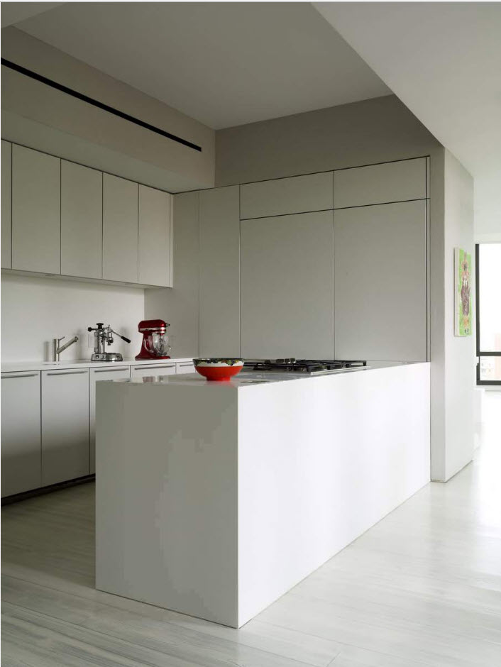
Laconicism in the execution of kitchen sets does not lose its popularity. Absolutely smooth, plain kitchen facades are still popular. Simple furniture solutions look great both in small kitchen spaces and in spacious rooms. Regardless of the chosen layout and associated furniture, a furniture ensemble with smooth facades brings simplicity, geometricity and clarity to the interior, notes of modernity and style.
Bedroom
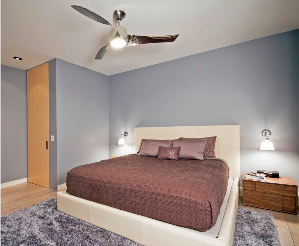
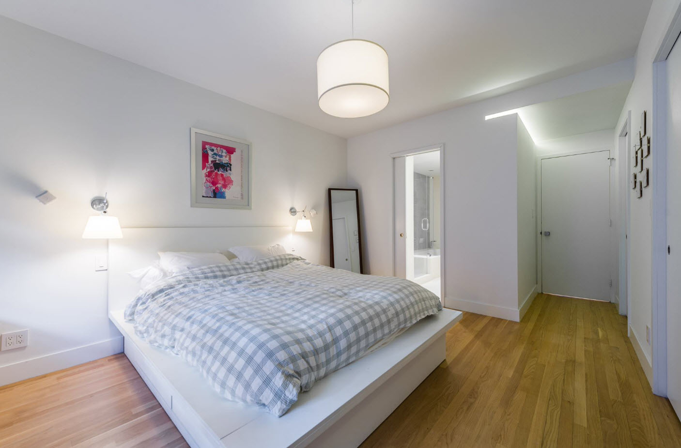
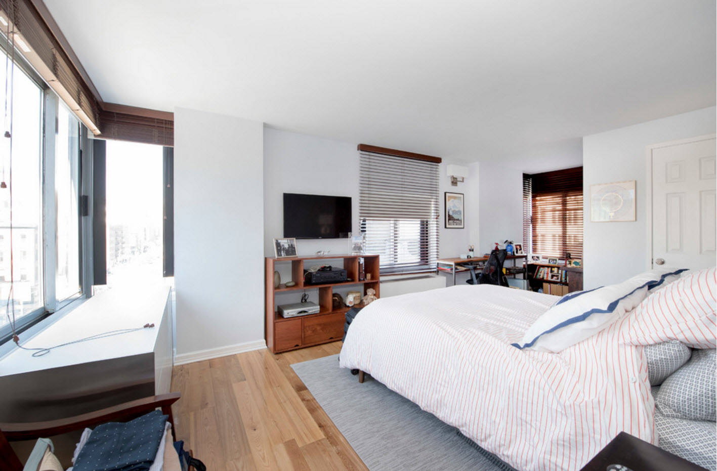
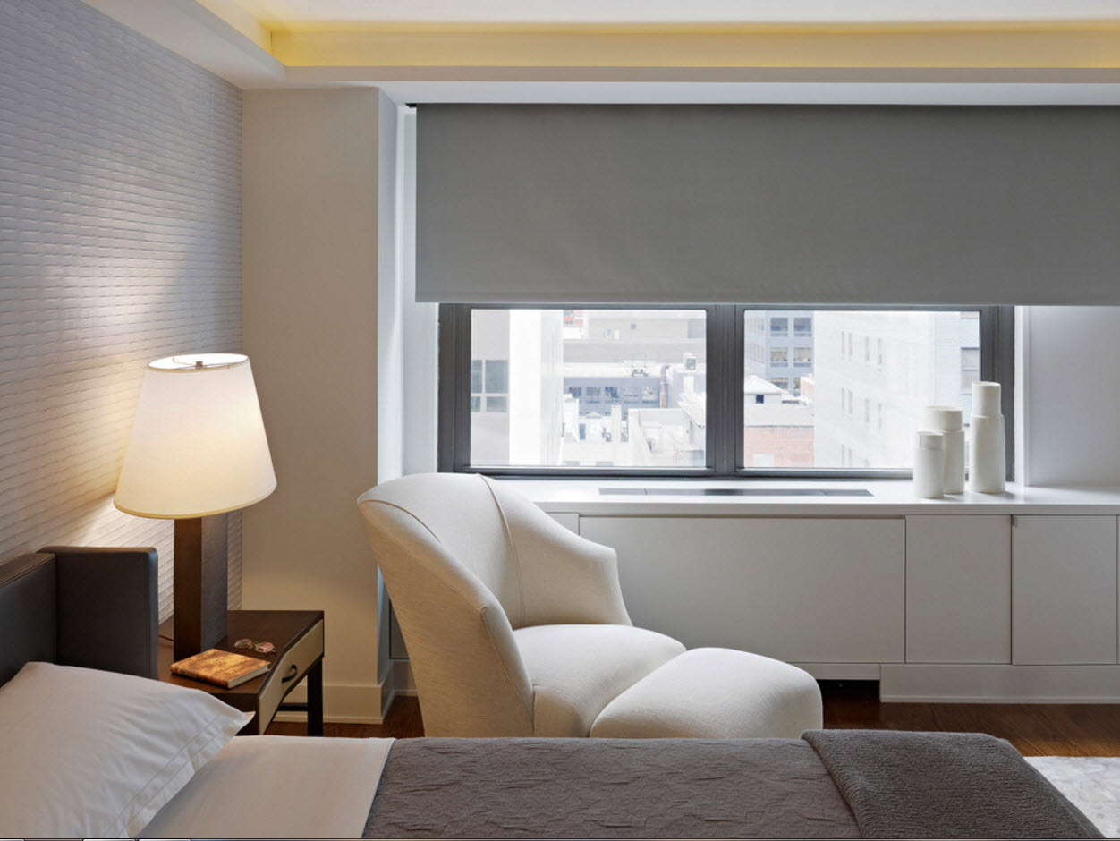
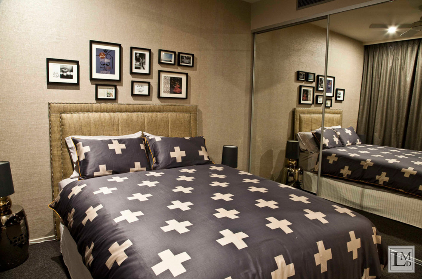
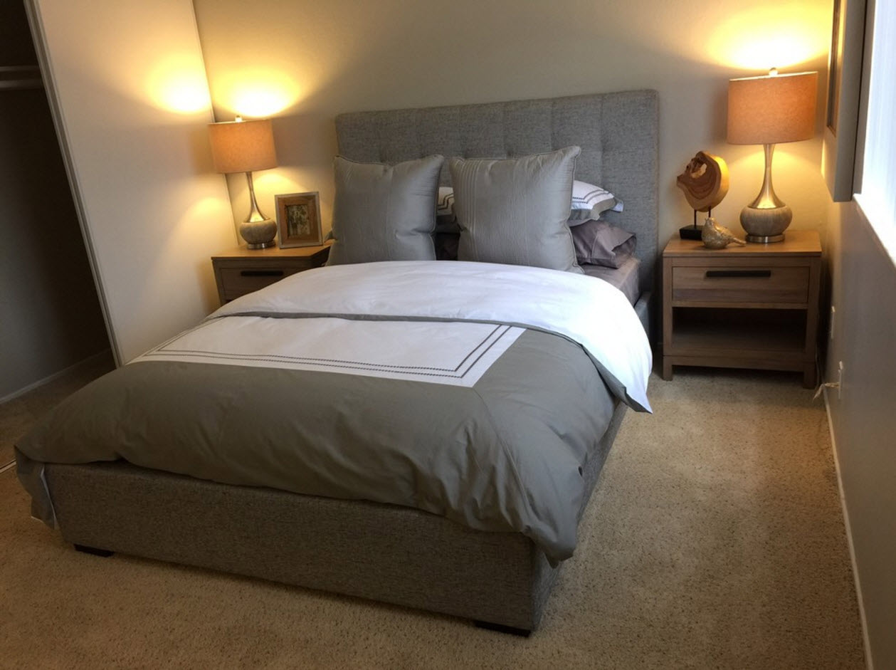
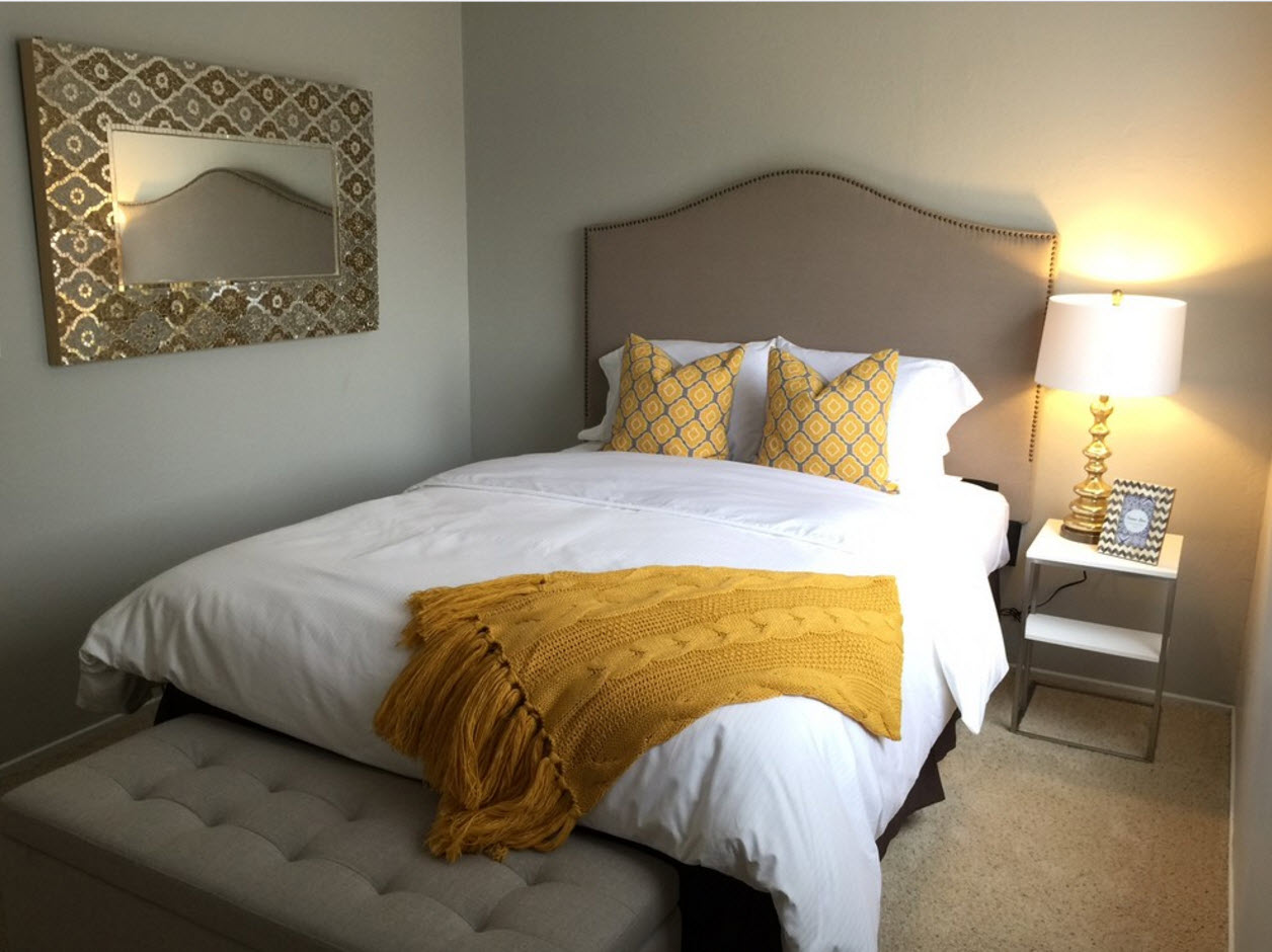
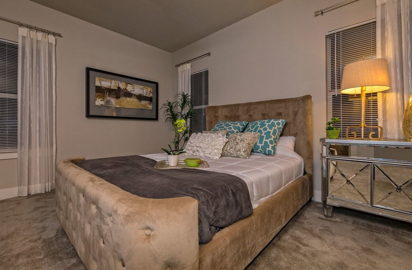
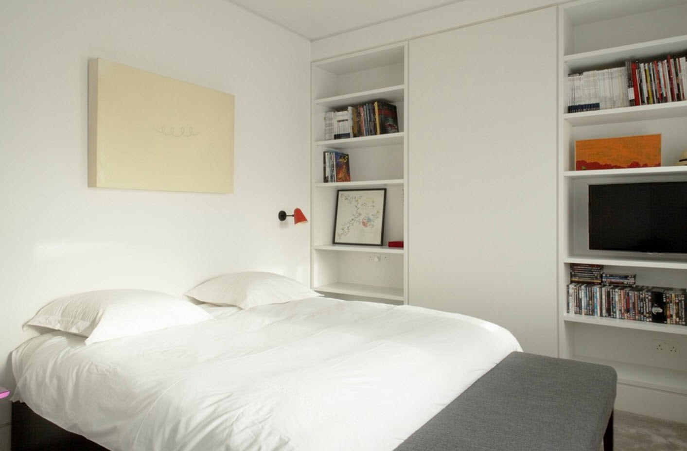
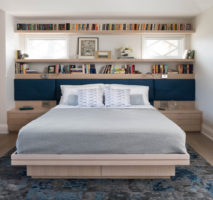
Among modern design projects, there are less and less studios in which the sleeping area is part of one spacious room.Most apartment owners prefer the possibility of privacy for sleeping and relaxing, even if the bedroom ultimately turns out to be the smallest room in the home, in which, apart from the bed, little is placed. But even within a modest room area, you can create a cozy, practical and at the same time modern interior.
If in the bedroom it is necessary to arrange other functional segments in addition to the sleeping place, then they try to execute them in the most neutral colors so as not to distract attention from the main element of the room - the bed with its decoration. If we are talking about the organization of the workplace (which often also plays the role of a dressing table), then experts recommend using a simple and concise solution - a console that attaches to the wall or rests on one support. As an alternative to a massive desk, which takes up a lot of space, this option is preferred for small rooms. If you need to place your home library in the bedroom, then it is better to use bright book racks with open shelves, rather than monolithic cabinets with facades.
Children's room
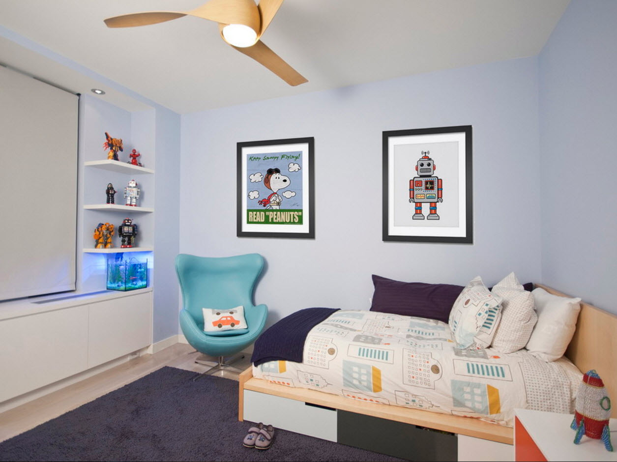
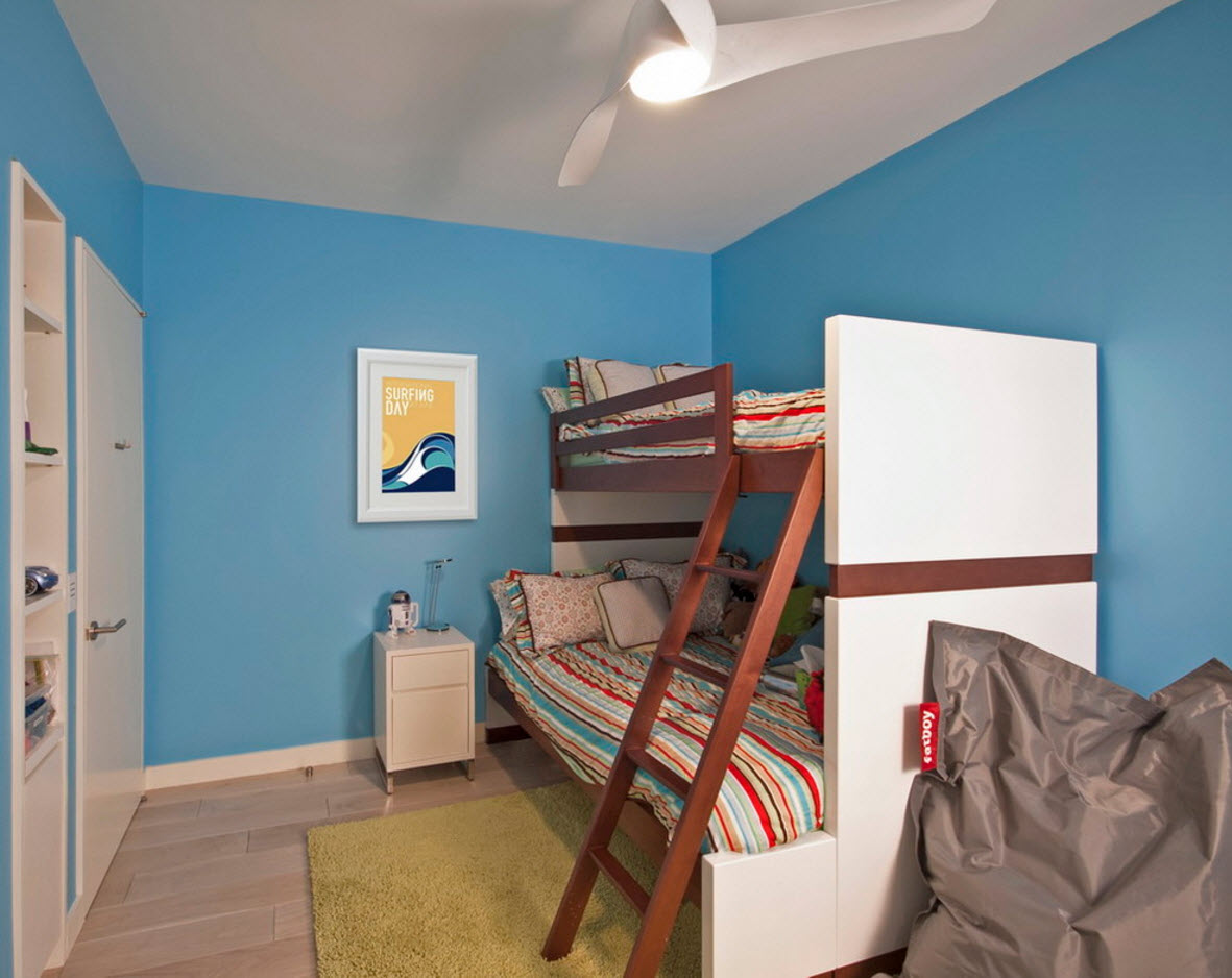
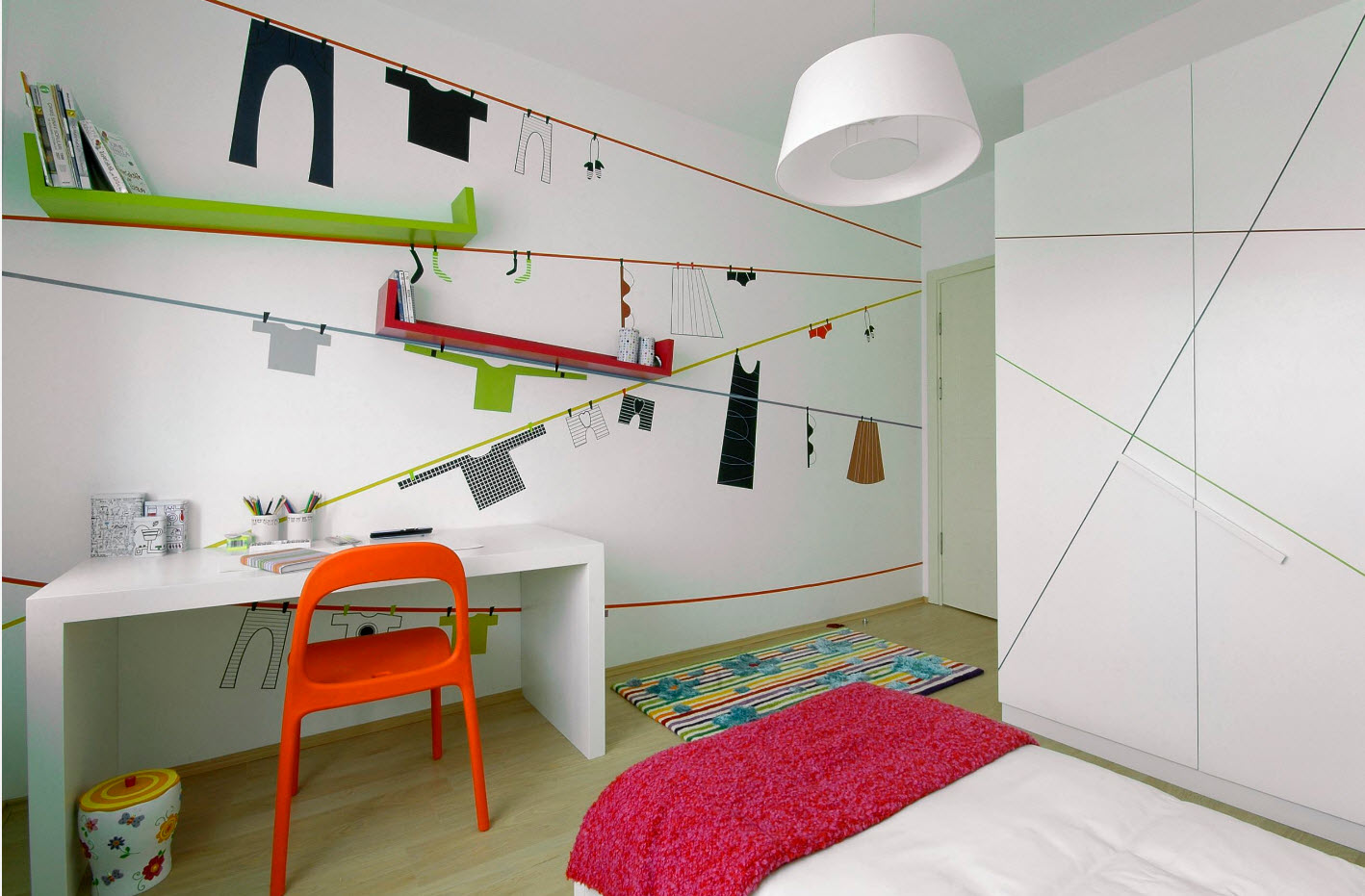
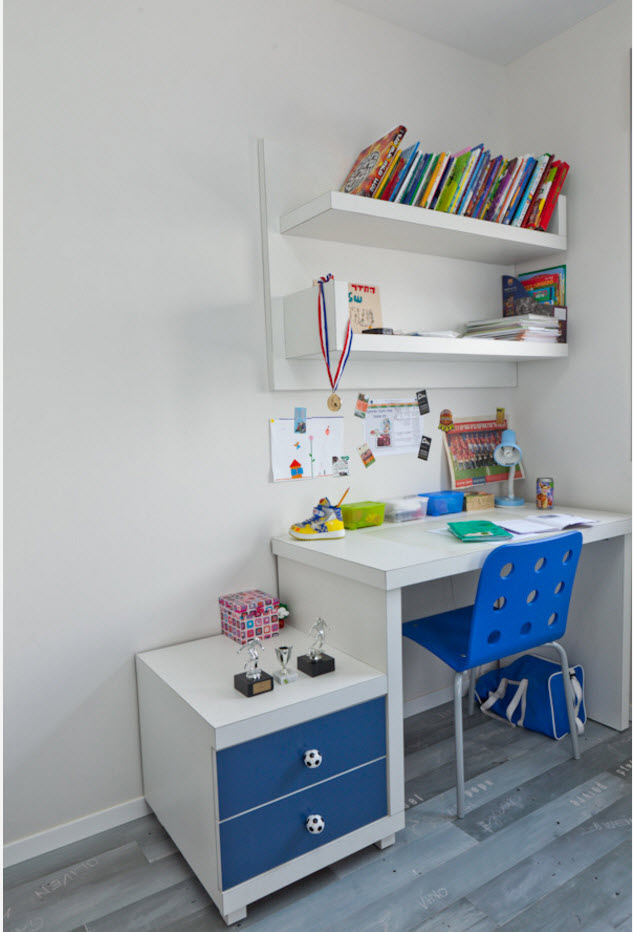
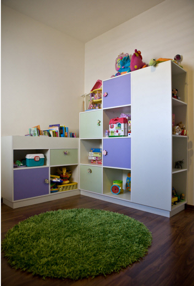
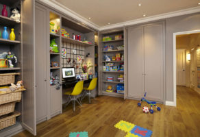
Even in children's rooms, modern style is reflected in simple and concise solutions. Lightweight furnishings, simple shapes and lines, modular storage systems. Comfort, ease of use and ergonomics are at the forefront. Environmental safety is a priority. But you won’t be able to do without decor either, because this is a children's room. Bright accents are necessary - stickers, stickers or paintings, contrasting edging and the use of such a design technique as an accent surface.
Bathroom
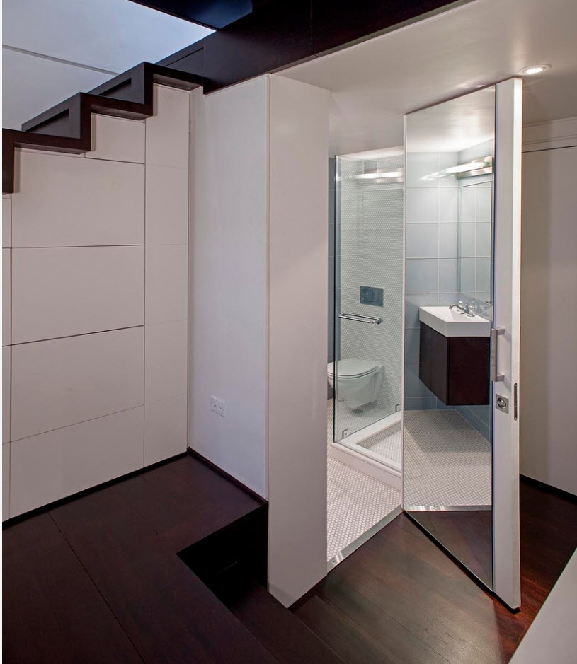
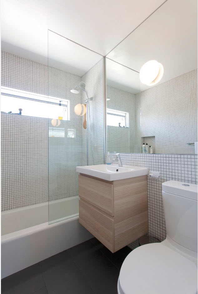
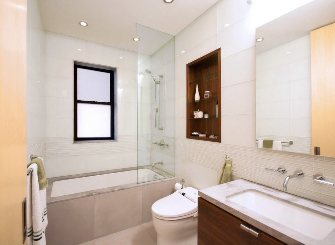
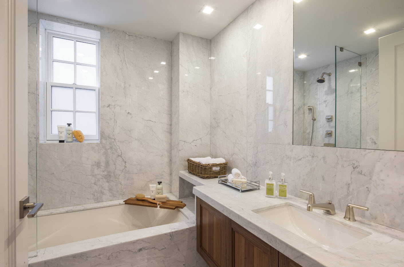
Despite the love of most designers for spacious and roomy bathrooms, the reality of the day is that most Russians still have to place all functional segments for water and sanitary procedures on an area of several square meters (often not more than 3.5-4 square meters. m). A small volume of the room dictates the use of certain techniques for the visual expansion of space. And so they never go out of style. Light shades, glossy, glass and mirror surfaces, the diagonal arrangement of ceramic tiles, the use of edging and a specific print location to visually increase the height of the room - a lot of tricks and tricks are used.

