
Monochrome in the interior: an overview of amazing combinations in photo examples
Creating a fashionable interior in a monochrome color palette is quite simple. The interiors in one shade are charming, as they look very stylish and tasteful. In such rooms everything is thought out to the smallest detail. You just need to get acquainted with the inspiration from this article and properly decorate the room.
The main principle of a monochrome interior is to choose the right base
The choice of the main, that is, the base color will affect not only the appearance of the interior, but also your well-being. Before you do this, you should learn more about the effect of color on mood. Not every color will work in a particular room at home. The key to a stylish composition is the correct combination of shades and the skillful control of the saturation and tone of a given color.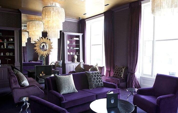
For example, red, although it gives the interior a cozy atmosphere, does not fit into the bedroom, because it has a stimulating effect, which makes it difficult to fall asleep, leading to fatigue. It is better to decorate the living room in this color.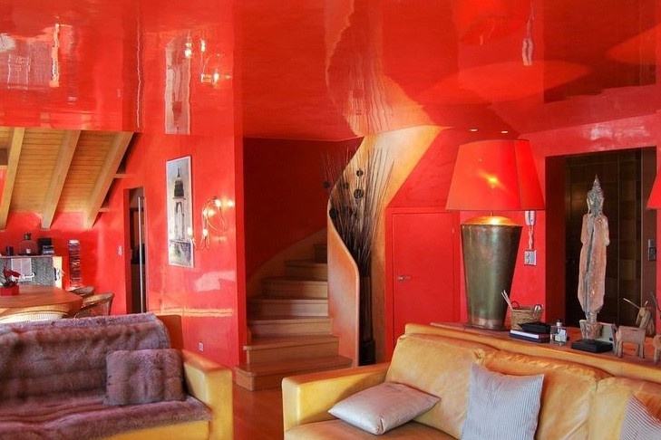
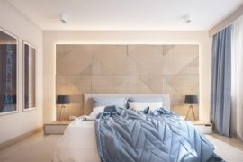
The blue color is perfect for the relaxation room. This cool color helps to calm down and relax. Violet works in a similar way.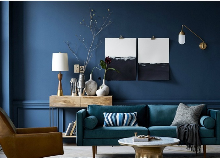
In turn, orange and yellow optimize mood by introducing heat. Orange also increases appetite, so it will be an excellent choice for the kitchen or dining room.
Gentle whitewashed greens, warm gray color - a color palette that contains many subtle offers for people who feel good surrounded by neutral shades.
If you prefer attractive solutions, pay attention to frosted plum or bright greens.
Advice! Keep in mind that saturated colors bother faster than those that are considered neutral.
Monochrome design of rooms: one color has several shades
Selecting one color does not really limit you to using other shades from your preferred gamut. You just have to learn how to highlight color options from the basics. Variable color intensity is enough to make the interior of the room interesting. In addition, you have various decorative details and subtle accents from other carefully selected shades.
Advice! Paint the walls with the lightest shade of the base color. For more intense tinting, choose a sofa or curtains. The interior can be made bright with decorative pillows or other accessories in the darkest version of the selected color.
How to break the monotony correctly?
The monochrome in the interior will not be boring if diluted with various materials and textures. It is worth combining matte and glossy surfaces. The same color will look different on the wall, on a leather armchair or on a fluffy carpet. Don't forget about the possibilities offered by contrasts. To prevent monotony, designers often incorporate various shapes and textures into the stylization of materials such as metal, glass or fabrics. In addition, each of the materials works in a completely different way with light, the decorative possibilities of which are practically unlimited. This is a very important element that determines the appearance of the entire interior, not only in the case of monochrome arrangements.
Monochrome color in the interior: fashionable combinations
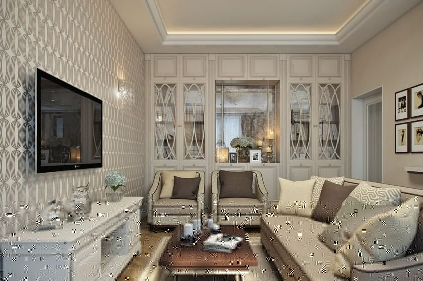
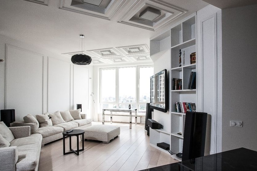
Among monochrome stylizations, those that use neutral colors such as white, gray, or beige are currently very popular. To avoid boredom and a little decorate the interior, they are usually combined with natural and organic materials, such as wood, stone and textiles.
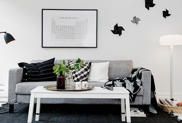
Graphite and white
The combination of white and black has an interesting visualization. If you like this composition, but want to dilute it a little, use intermediate colors from the same palette.Shades of graphite and white will create a clean and expressive composition and at the same time give the room a comfortable atmosphere. Complete the layout with accessories in bright colors to create a pleasant and elegant contrast.
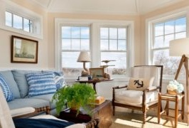
Blue, cyan and gray
Choose blue as an elegant alternative to black. This will add depth to the decor without worrying about the dominance of the entire styling. Blue and white is a classic, proven combination. If you want to use smooth transitions, then replace the white with a light blue or light gray shade. If you are interested in more saturated colors, choose dark blue, which is an elegant alternative to black, while at the same time adding depth styling without an overwhelming effect. Use glossy-colored wooden products so that they stand out against the background of the walls in dark blue.
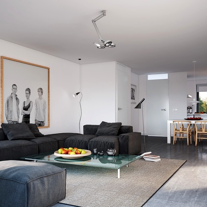
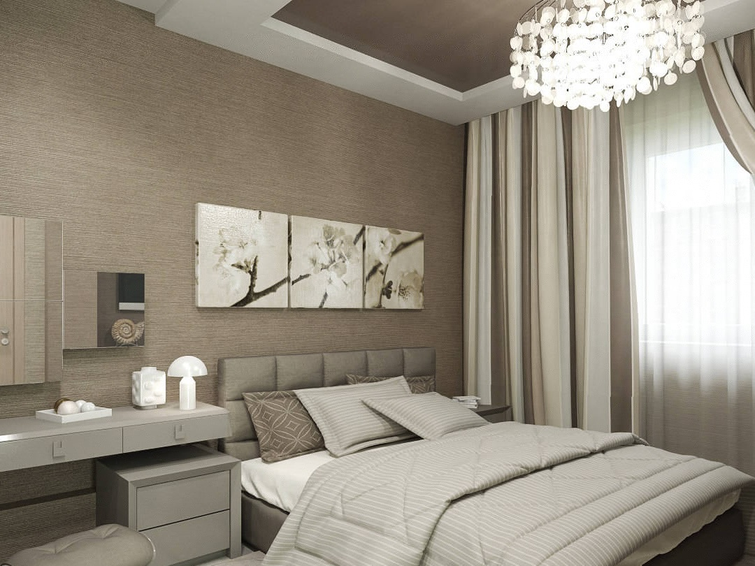
Gray and its shades
A dark shade of gray is a choice for those who appreciate the elegance of style, filling the house with a relaxing atmosphere combined with a lighter tone. Light shade of gray has become extremely popular in recent years as a universal alternative to cream and white. On the other hand, the dark gray color palette is the perfect solution for those who value simplicity and elegance. This combination is great for the role of a neutral interior.
Dark and Pastel Green
Green is usually seen as the personification of the world, so it works best in places that should be an oasis of relaxation, that is, in bedrooms and living rooms. Deep and delicate green color combined with a subtle, pastel shade creates an atmosphere of freshness and is an excellent solution for all nature lovers. It is also the best solution for people in need of concentration, so you should use it in a student room or doctor’s office.
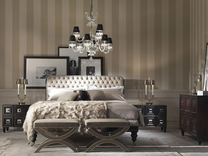
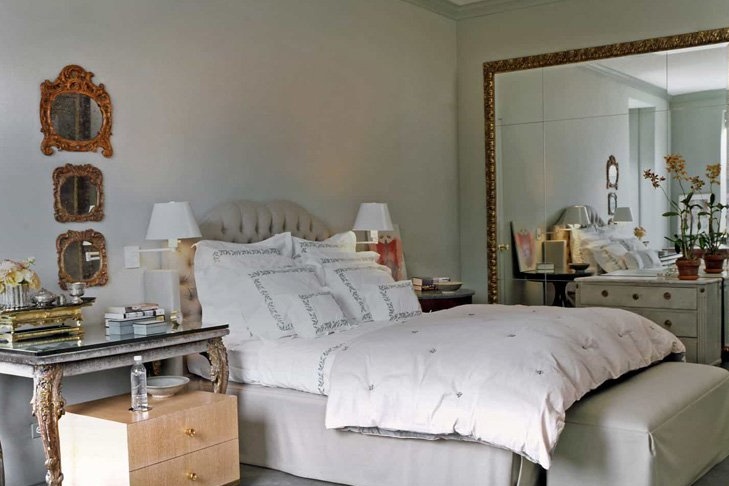
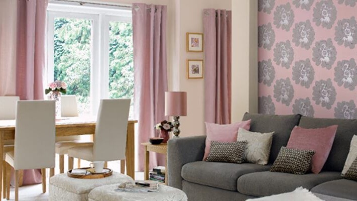
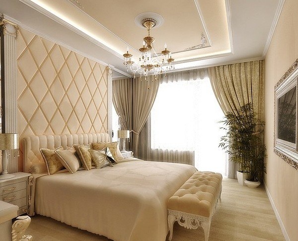
Beige and white
The combination of warm beige and snow-white is a proven way to achieve an elegant style in a modern house. It is also ideal for small rooms. Warm and bright colors allow you to use the optical expansion of the room thanks to natural light, where everyone will feel comfortable. To enrich this combination of colors, complete the entire styling with accessories in neutral colors with soft-touch fabrics.
The monochrome in the interior is a great idea for modern design, where everything is executed sequentially and thoughtfully. Choose the base of your room and complement it with the corresponding gamut of shades.