Kitchen combined with living room - the nuances of decoration 2019
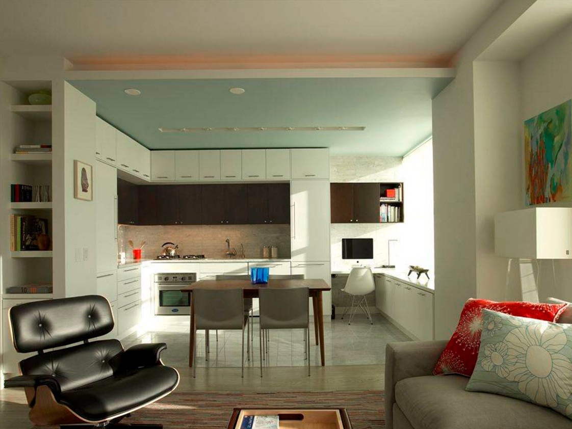
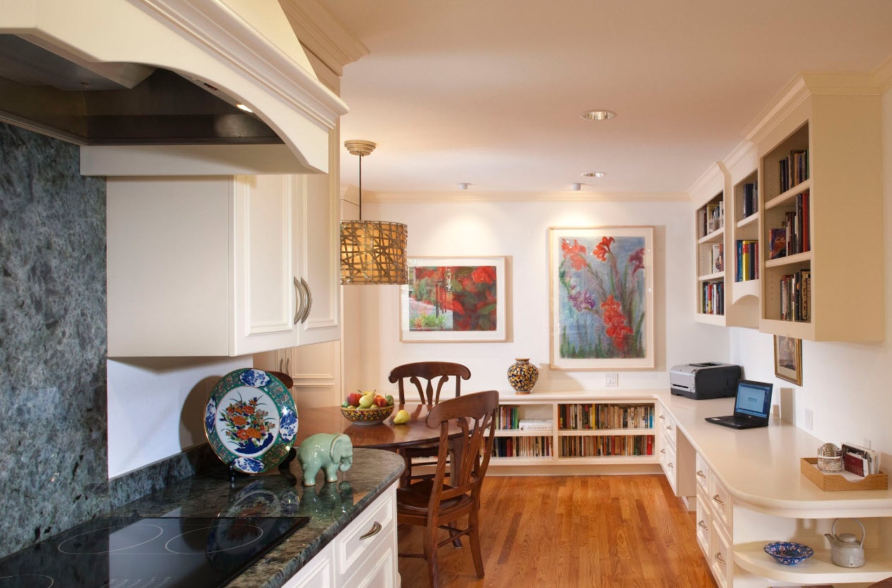
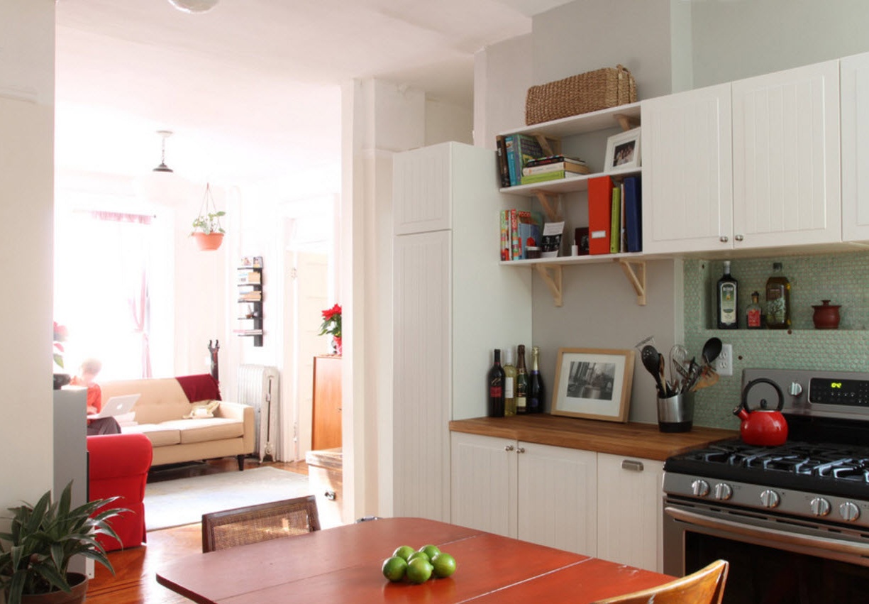
For most Russians, the design technique, as a result of which two or more rooms are combined into one space, is not a novelty. Combining the kitchen with the living room has become the most popular option for combining several functional areas in one room. Most often, such a method of expanding the capabilities of the dwelling is resorted to if the kitchen has a very modest area or the living room does not meet the requirements for comfortable accommodation for households and their guests. Often in the process of combining a kitchen with an adjacent room, a corridor or part of the hallway is also connected. The resulting spacious and bright room can be equipped with a high level of comfort, ergonomics and aesthetics. In the majority of apartments built in the new millennium, the layout initially involves a combined space for the design of the kitchen, with food and living room. But designing a multifunctional room is not an easy task. Not only because it is necessary to correctly distribute all functional segments, choose an ergonomic layout of furniture, but also to preserve the unity of stylistic solutions to obtain a harmonious, stylish and outwardly attractive image of space.
Advantages and disadvantages of connecting the kitchen with the living room
Like any design technique, combining the kitchen with the living room implies the presence of pros and cons. The obvious benefits include:
- obtaining a single spacious and bright room in which several functional areas can be located with a high level of comfort;
- in apartments with a very small kitchen, the connection to the adjacent room allows you to organize a dining area next to the work area, which not only simplifies the process of serving and changing dishes, but also creates an organic image of the entire space;
- traffic in an apartment or house is significantly reduced;
- the hostess can communicate with households in the recreation area while cooking or other kitchen processes (you can monitor children without interrupting their affairs).
The disadvantages of the combined premises include the following facts:
- the smells and sounds of working kitchen processes will invariably penetrate the lounge area. Partial solutions to these problems can be achieved by using a powerful hood and the use of other household appliances with low noise;
- the cleaning of the working area of the kitchen must be carried out more often and more carefully due to the location in the common room.
If you correctly plan the location of the kitchen area, dining room and living room, then you can minimize almost all the shortcomings. But it is obvious that in many respects one will have to spend money on the purchase of silent household appliances, the use of finishing materials that are resistant to humidity and temperature extremes, and the execution of furniture facades in a version that can be cleaned.
Combined room zoning options
Design projects of modern kitchens connected to living rooms on the Internet are most often borrowed from foreign sites. It is necessary to take into account the difference in mentality and life styles of our compatriots and hostesses in Europe or America. If the average European or American uses the kitchen space mainly to warm up ready-made meals or quickly cook something from semi-finished products, then a Russian housewife with a large family can spend half a day in traffic between a stove, a refrigerator and a sink for preparing a full three-course dinner.These nuances must be taken into account not only when buying household appliances, but also when choosing finishing materials, the location of the kitchen set and taking into account all the rules of ergonomics.
For the Russian owner of an apartment or house, the option of combining the kitchen with the living room is more suitable when each functional segment has quite tangible boundaries, when there is no complete merger of two (and together with the dining room and three) zones into a single design solution. In order to effectively and without extra costs zoning the kitchen segment from the lounge area, there are many ways.
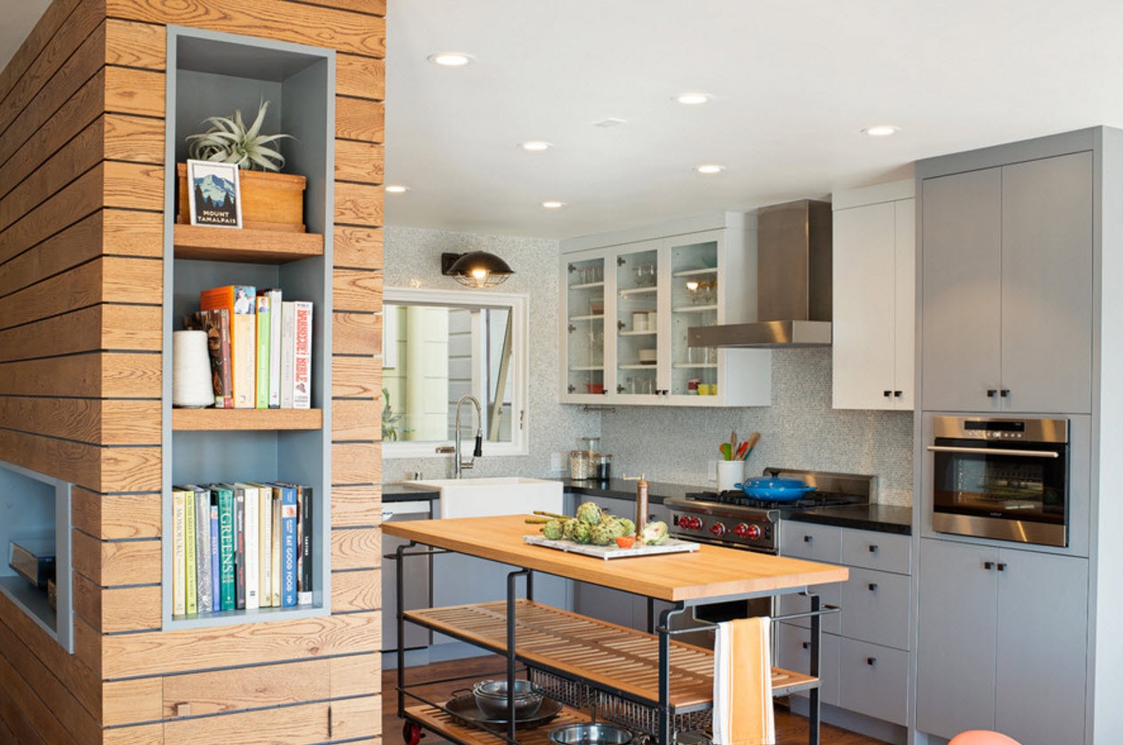
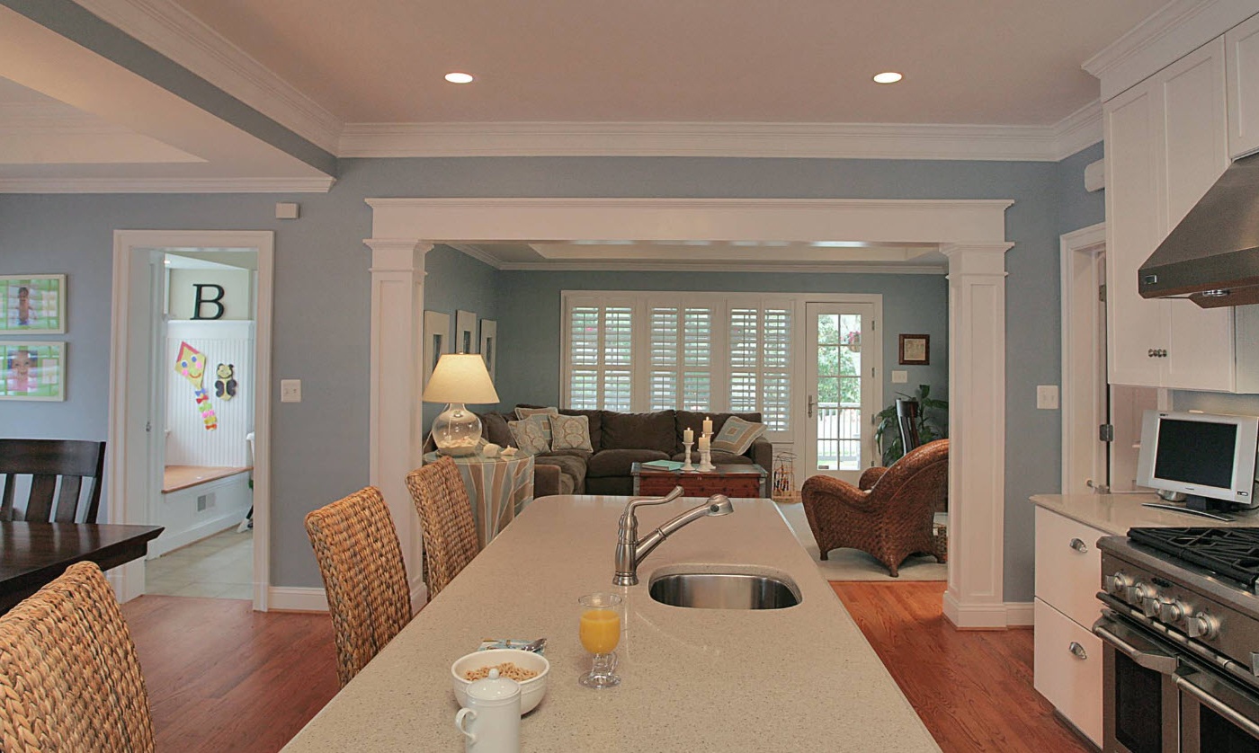
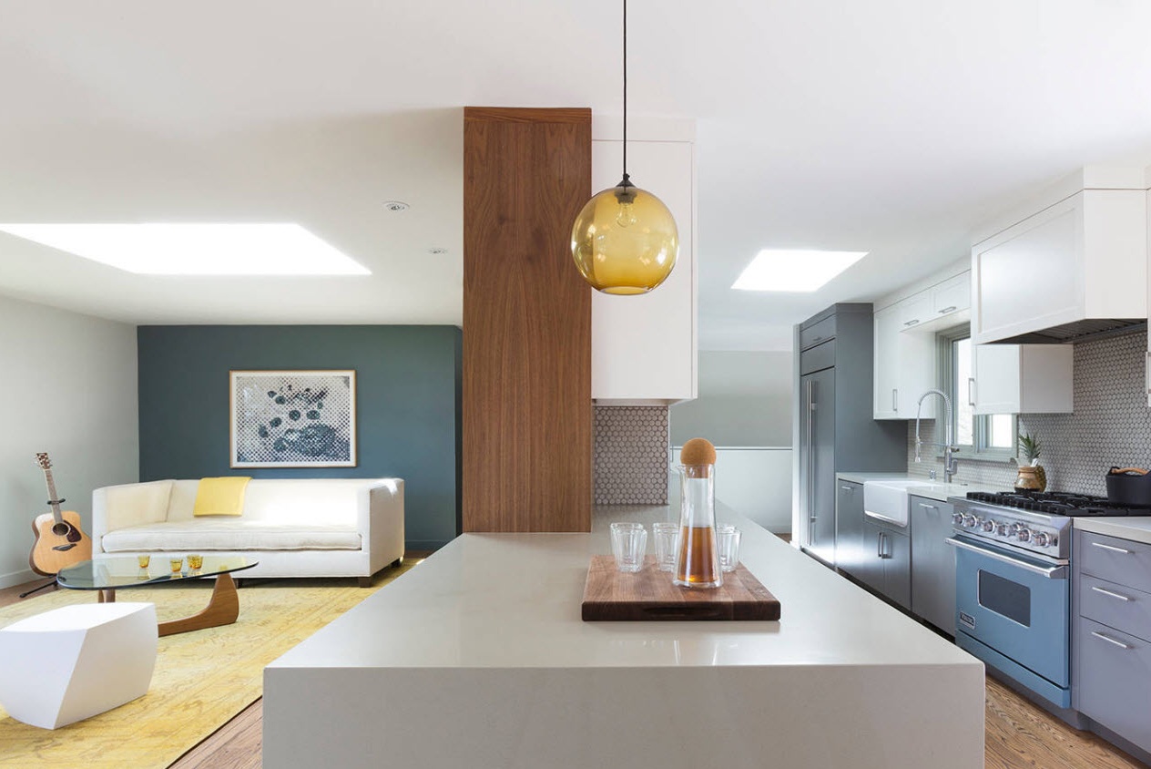
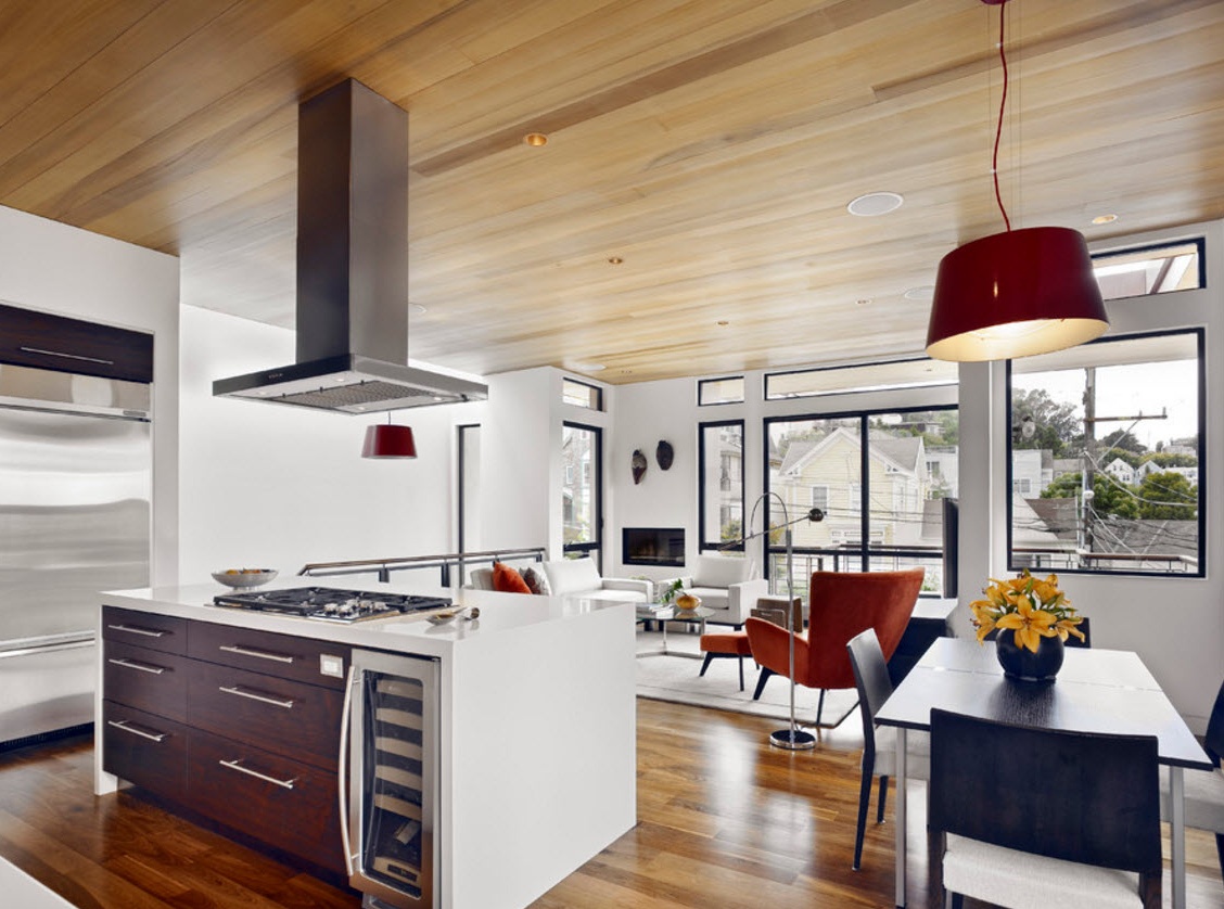
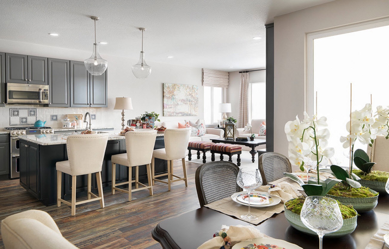
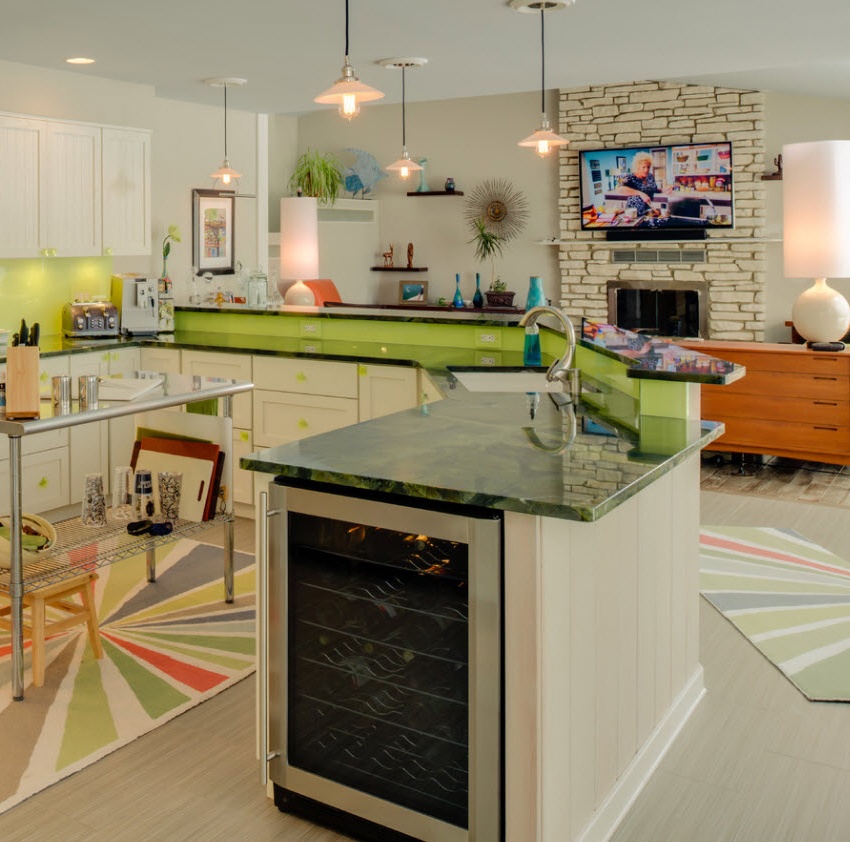
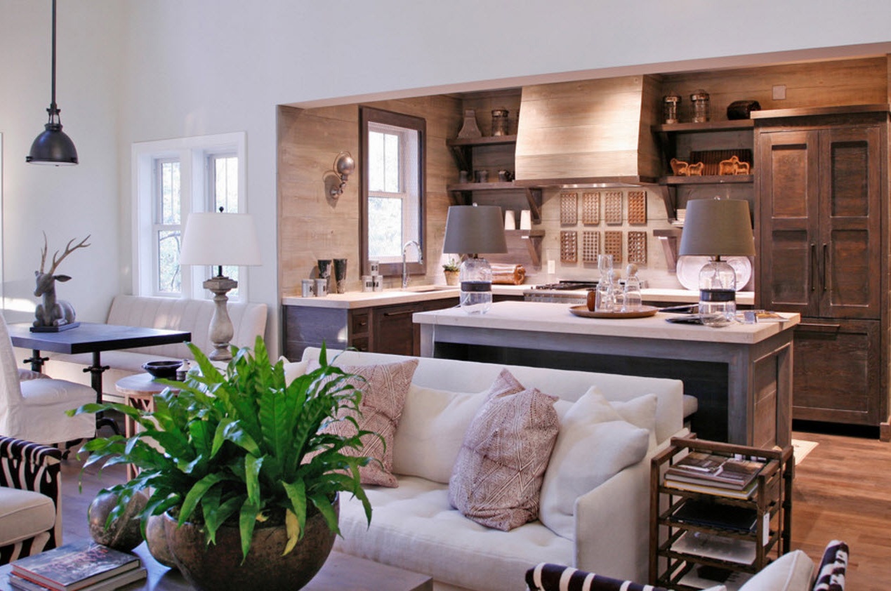
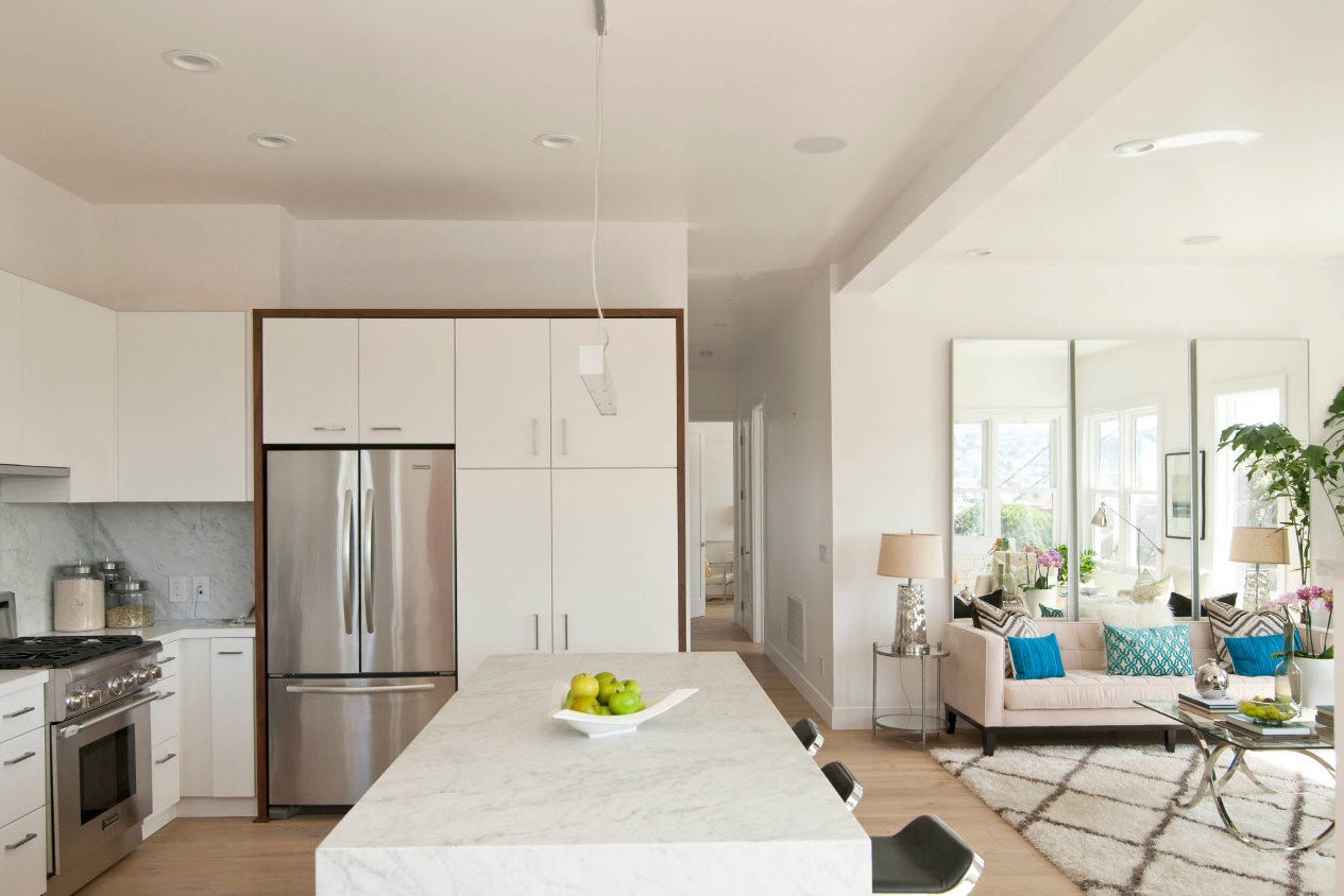
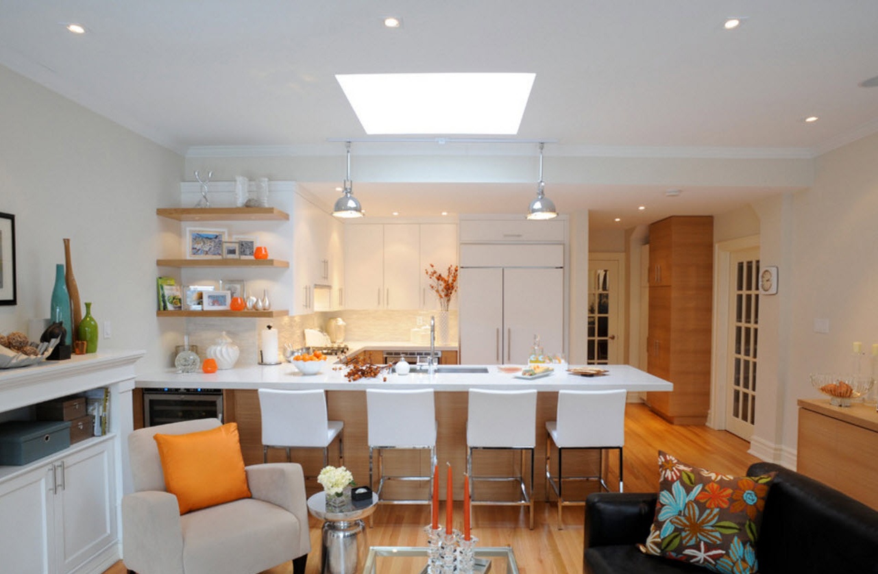
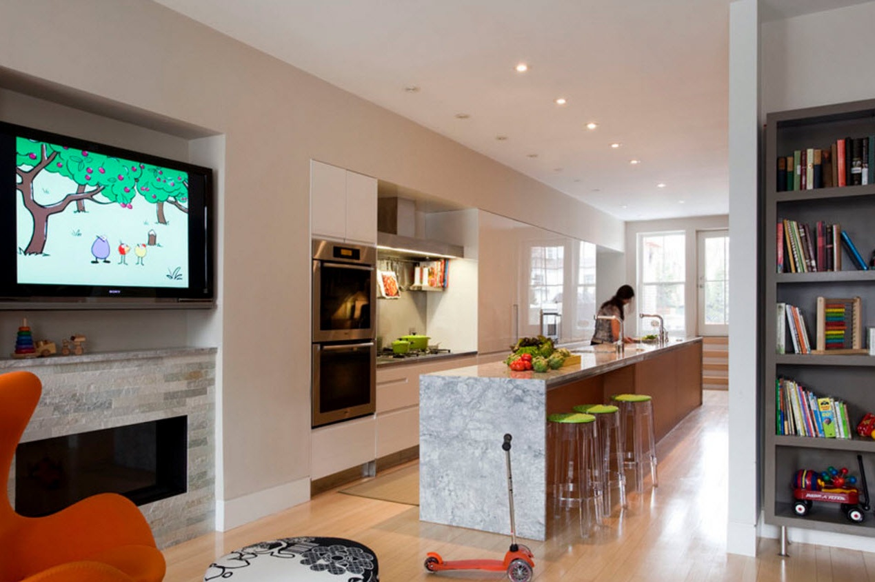
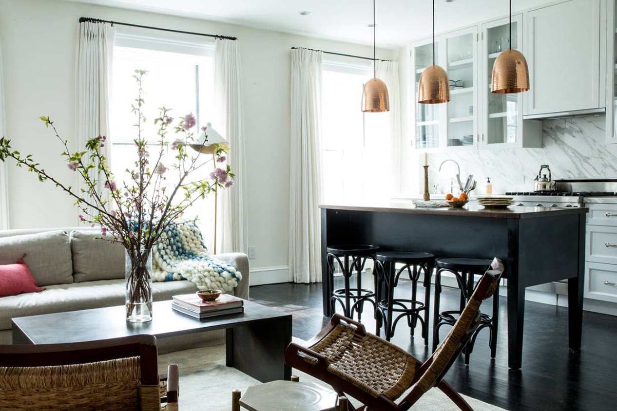
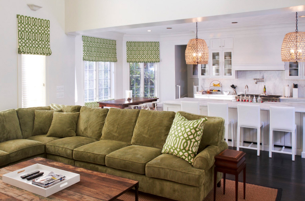
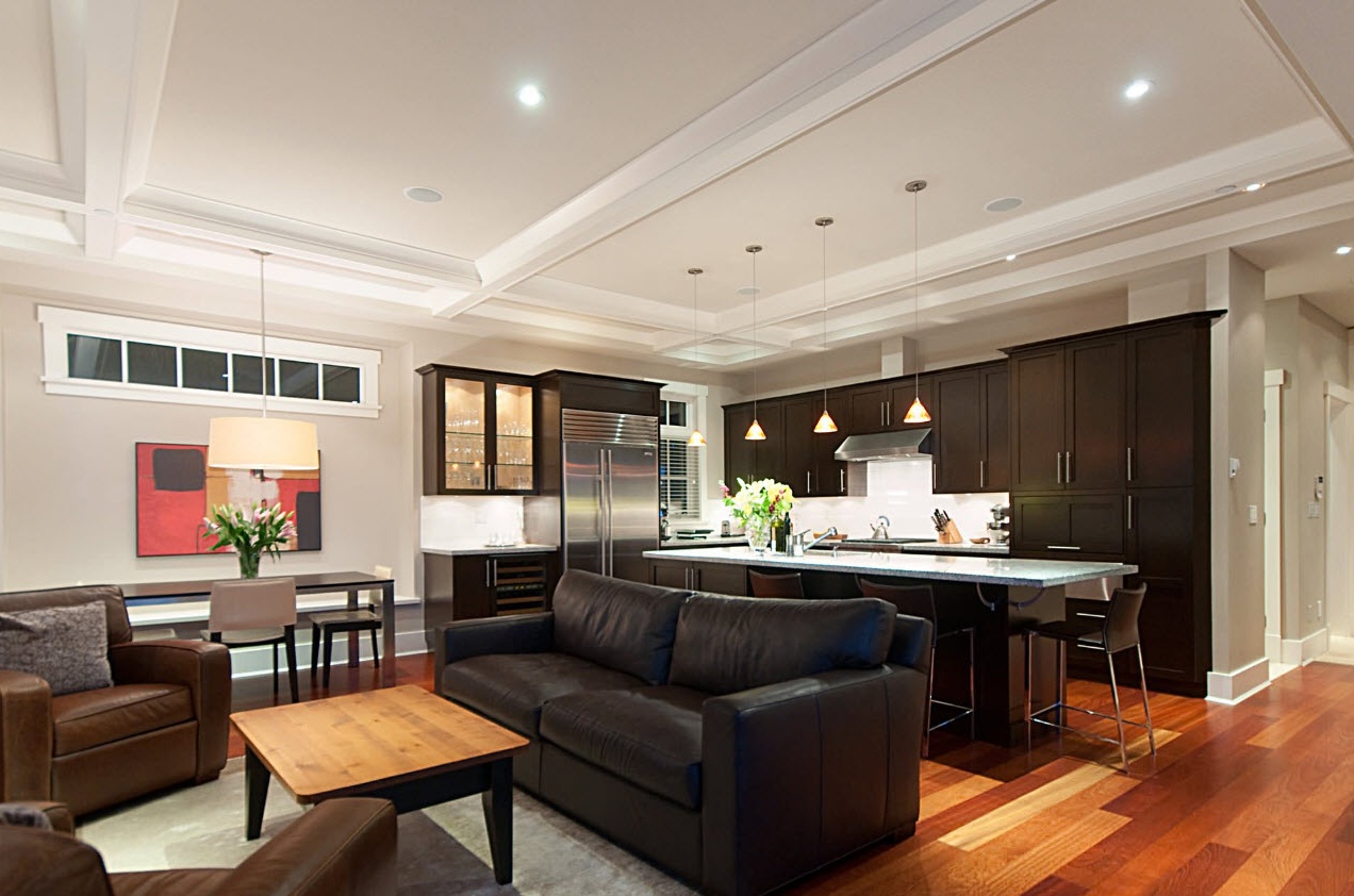
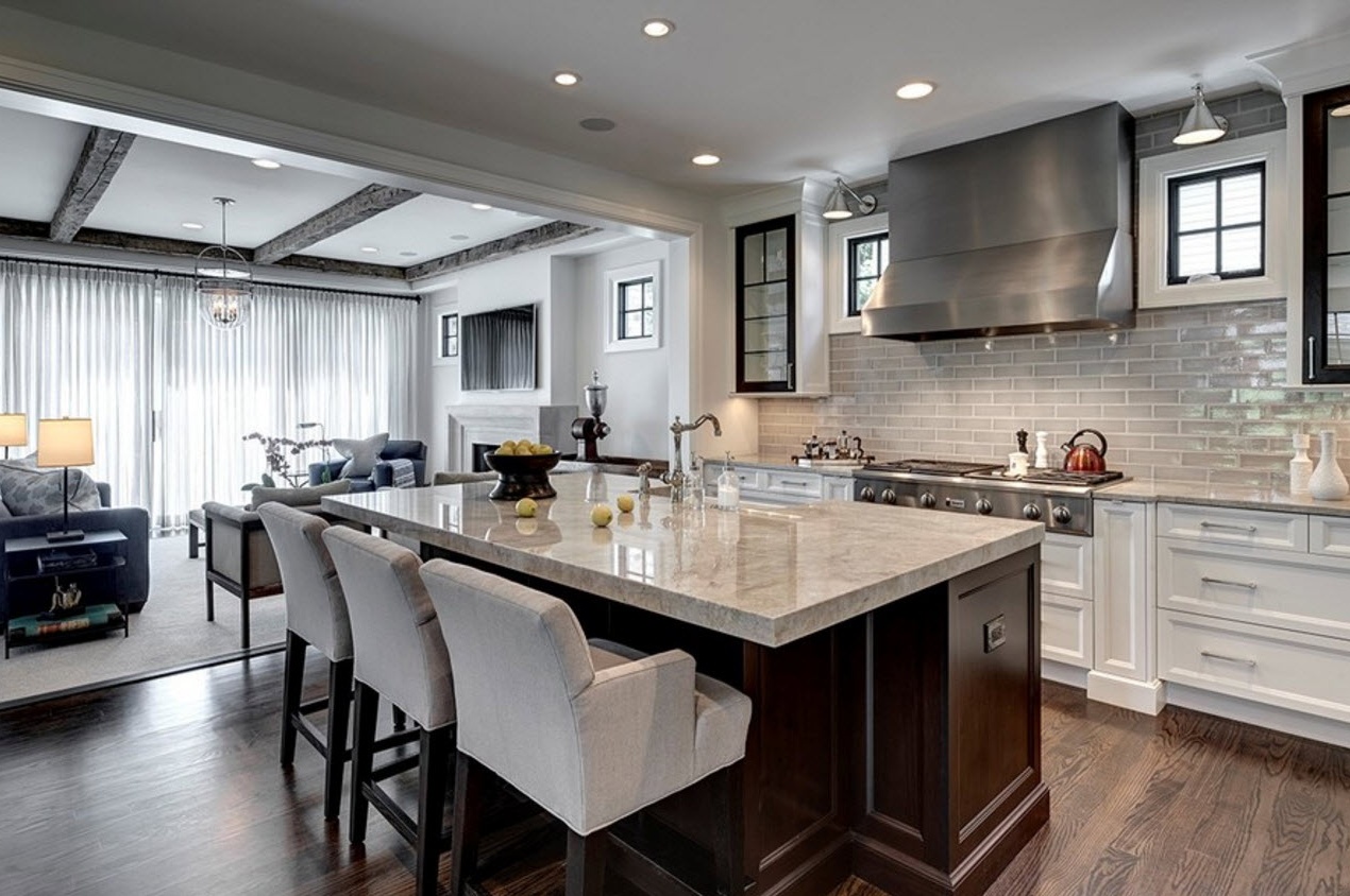
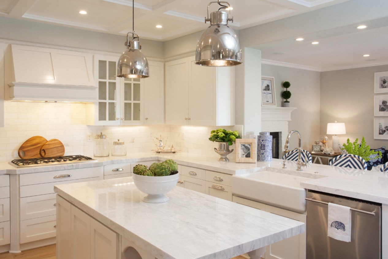
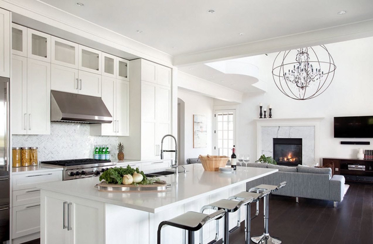
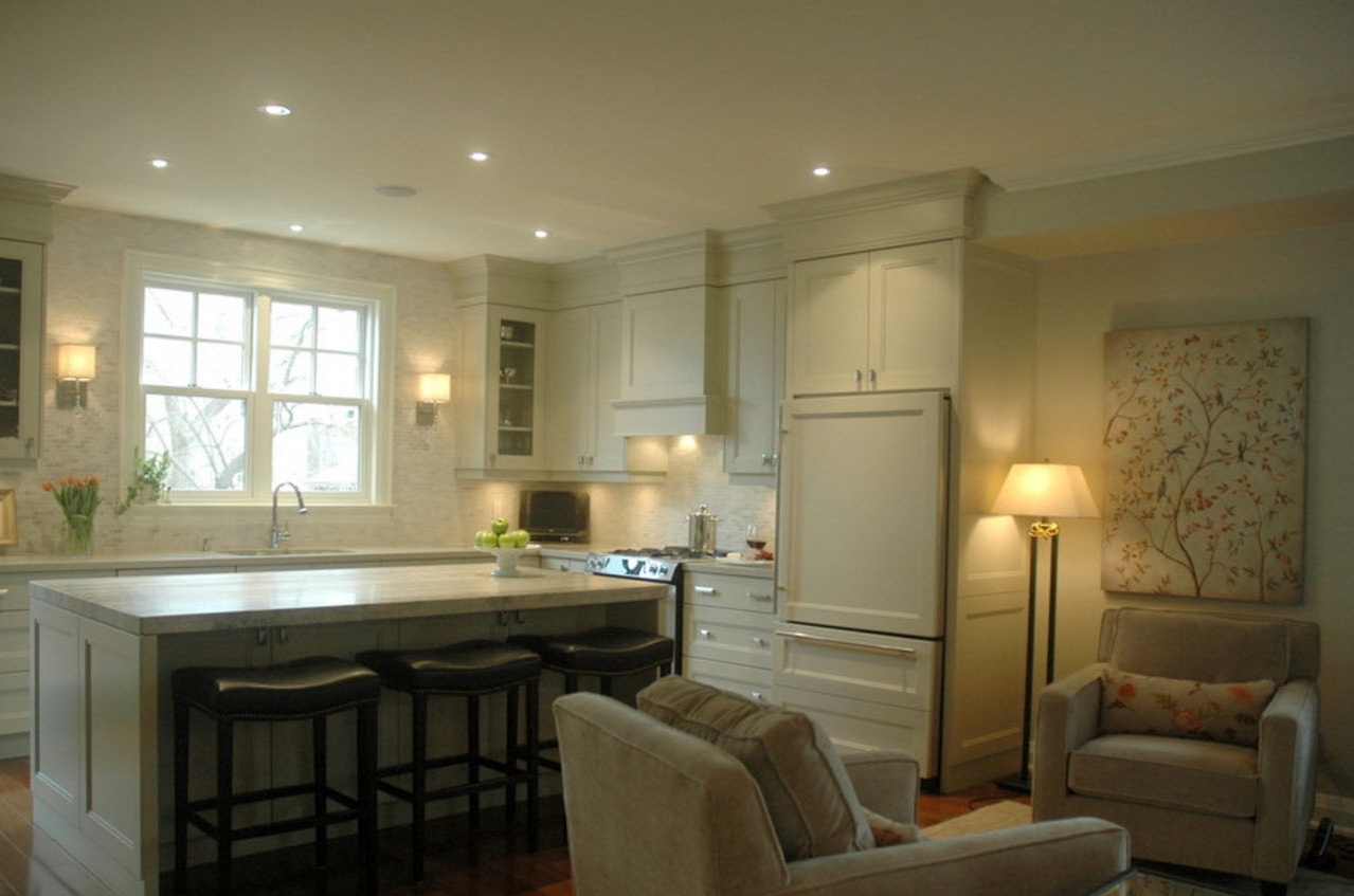
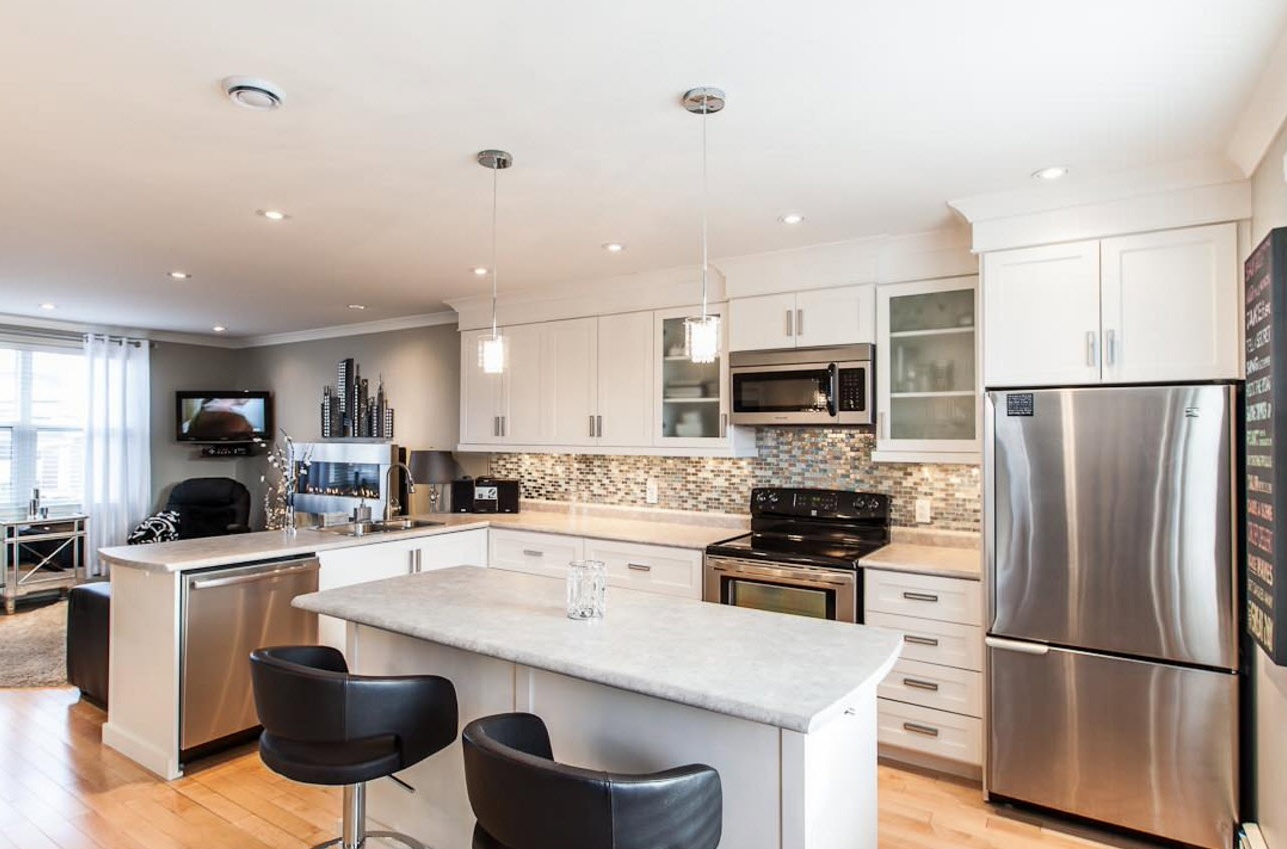
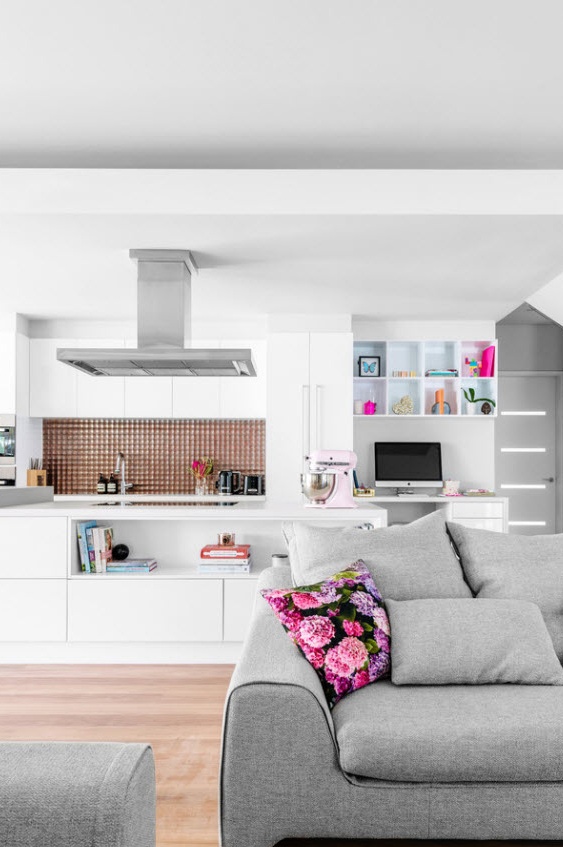
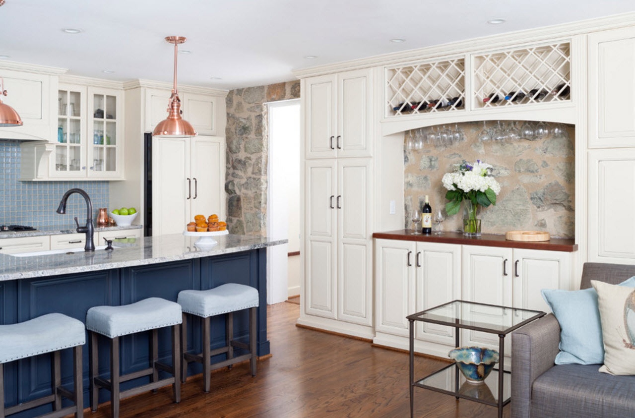
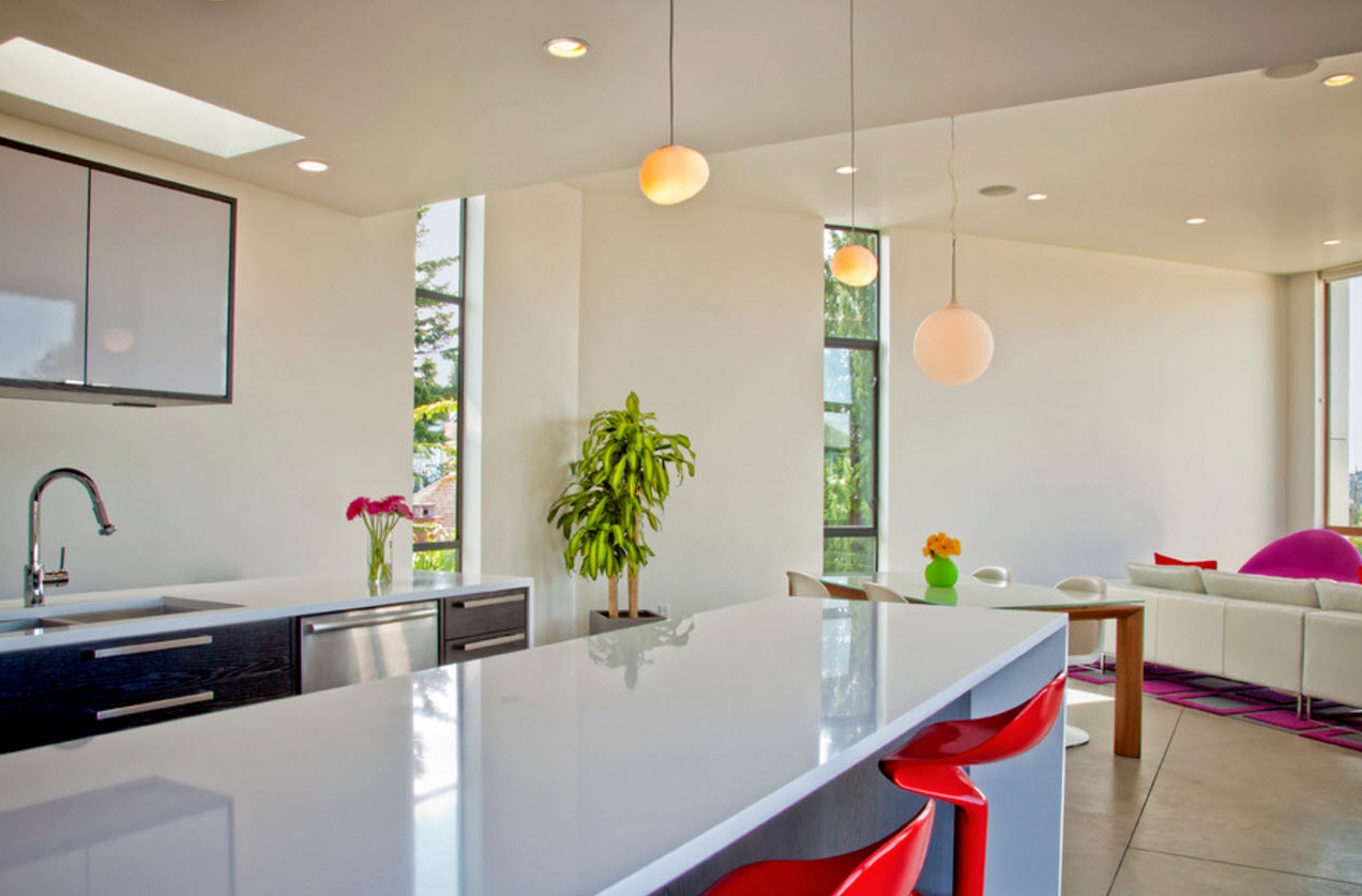
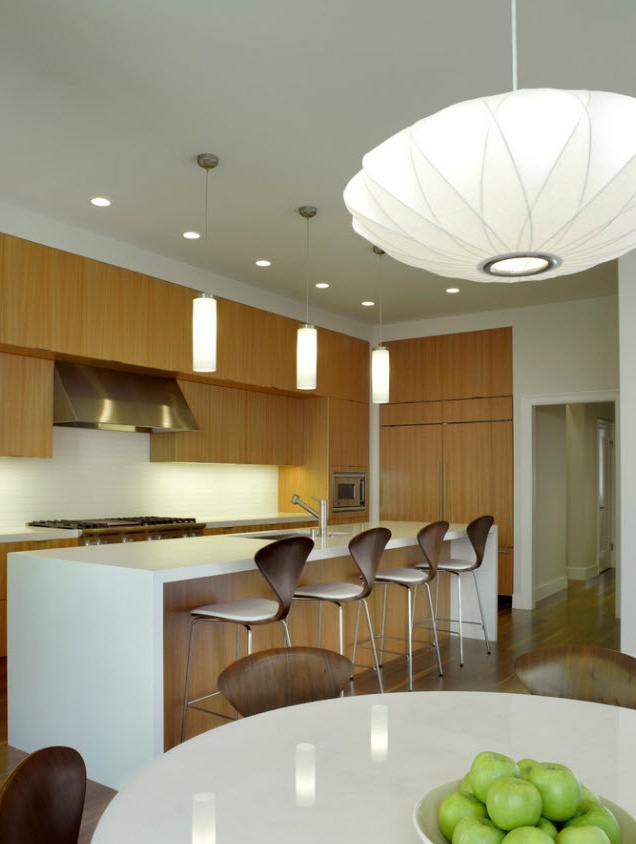
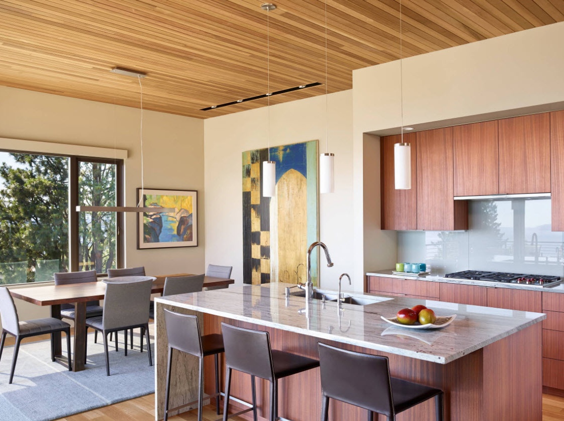
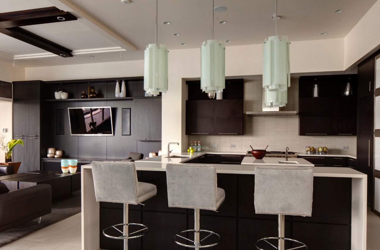
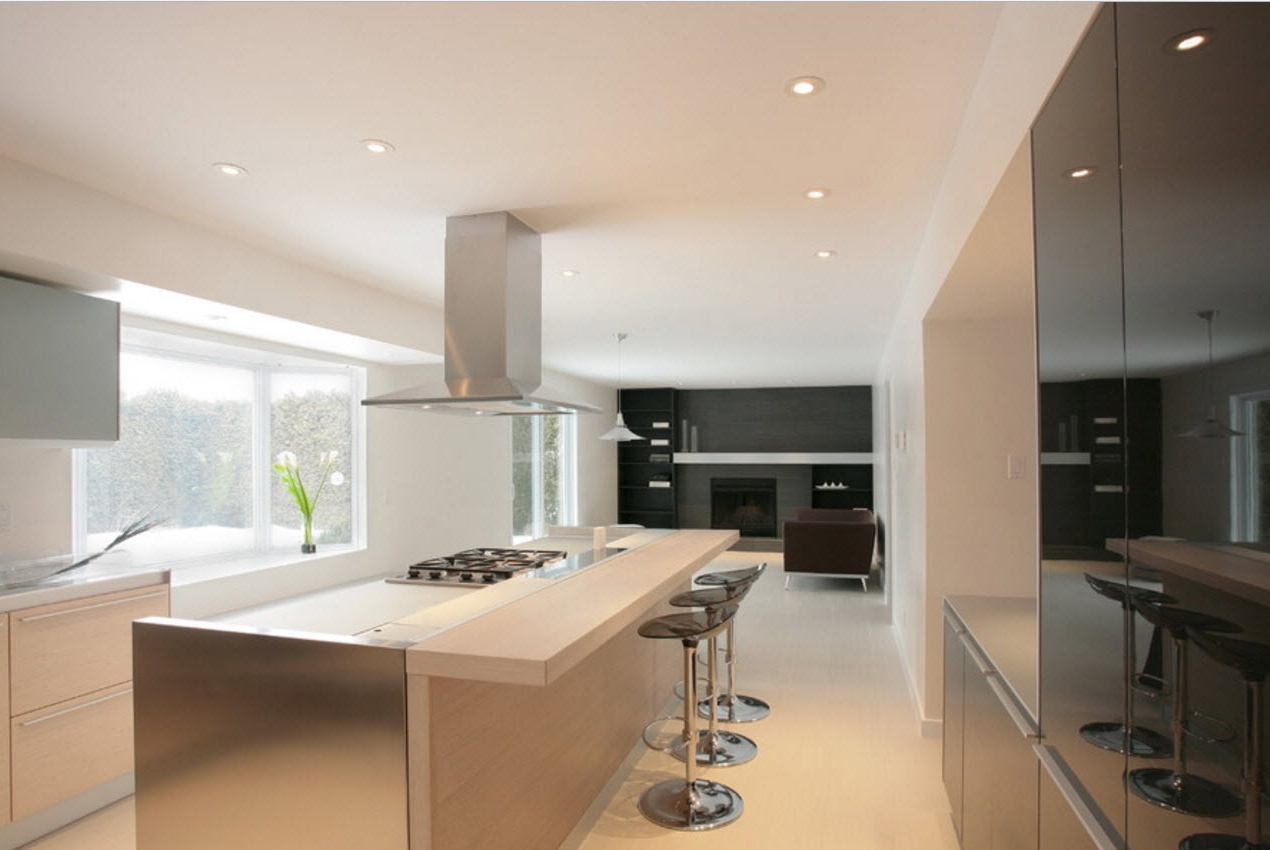
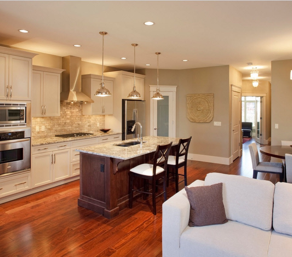
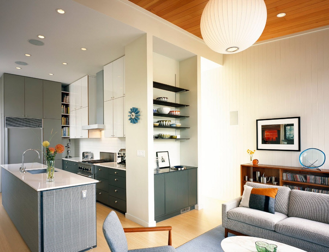
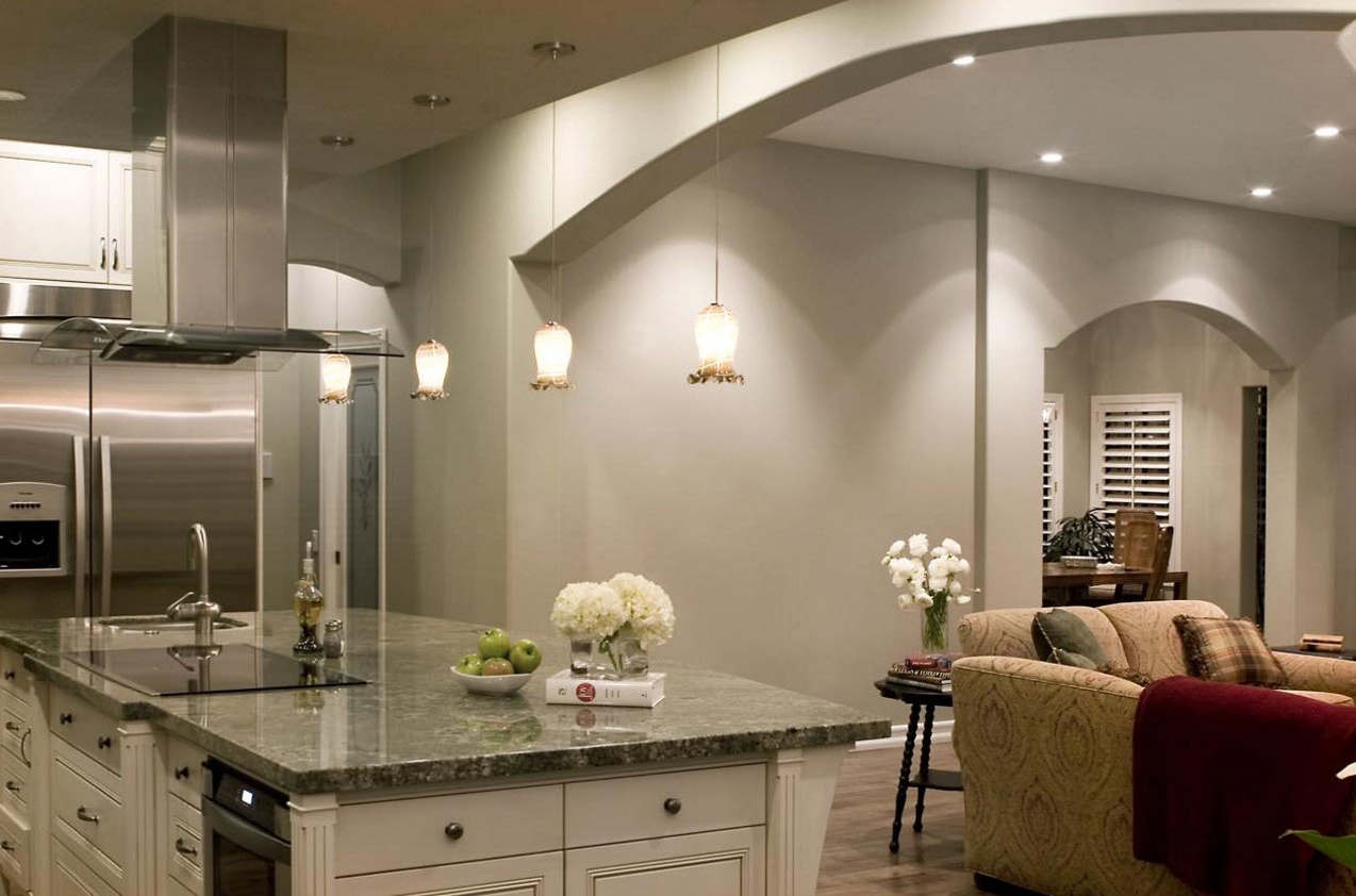
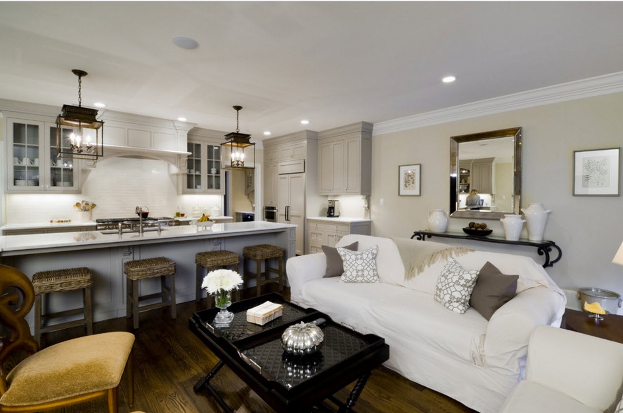
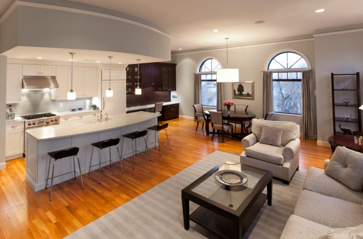
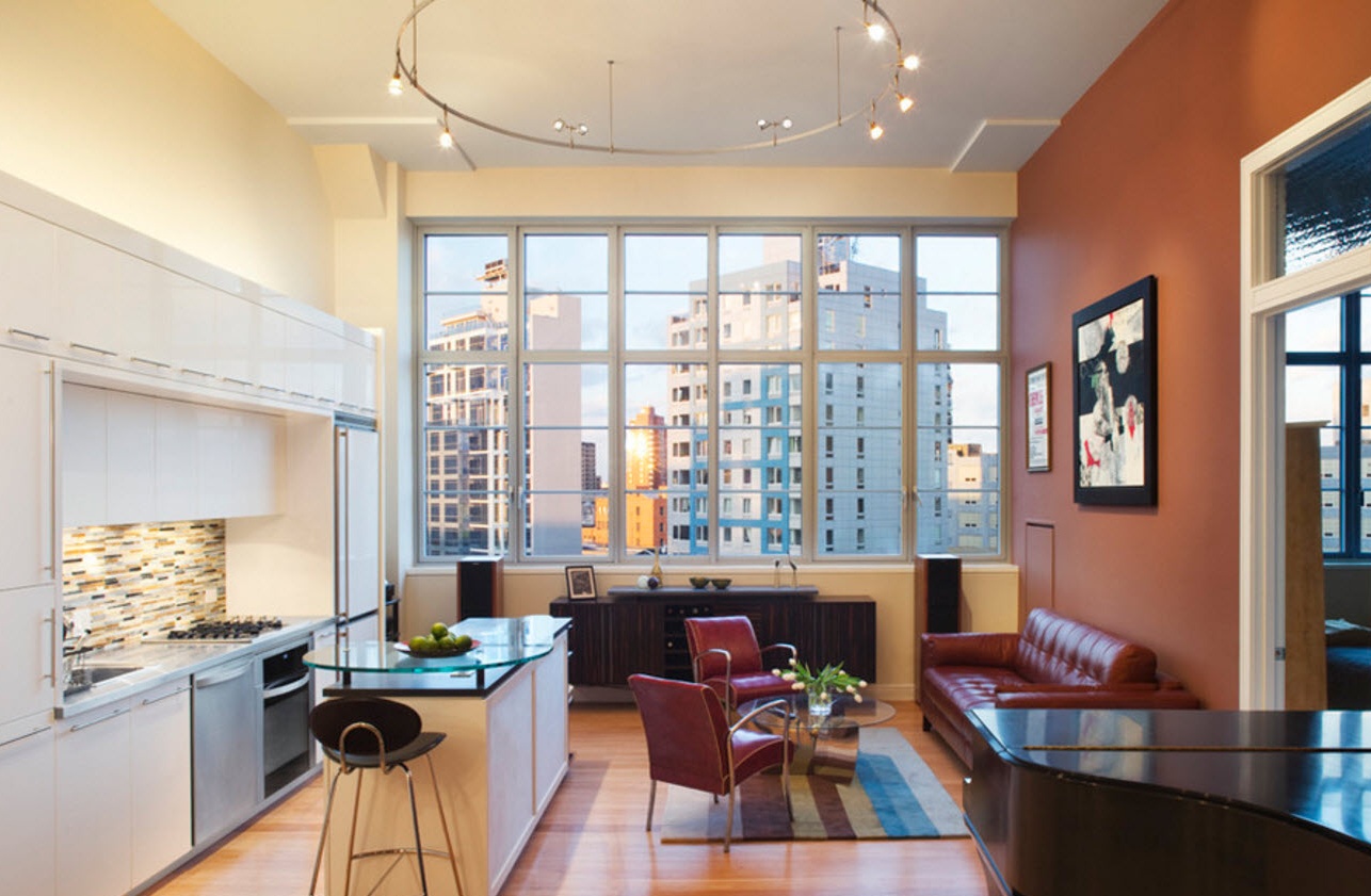
Using the kitchen island to conditionally divide the space into two parts is a popular design technique. The island does not completely cover the space, because the approach to it can be carried out from all sides, but at the same time it clearly zones the space of the combined kitchen. Most often, the module itself is made in the same colors as the kitchen set, but its side facing the living room can be executed in a shade that is more in harmony with the design of the recreation area.
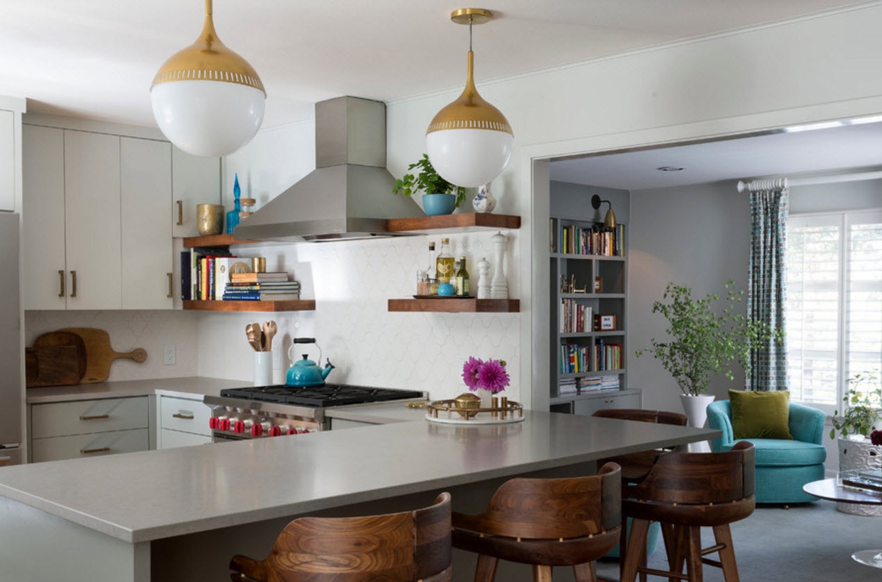
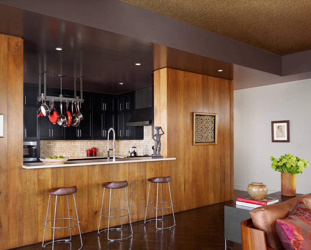
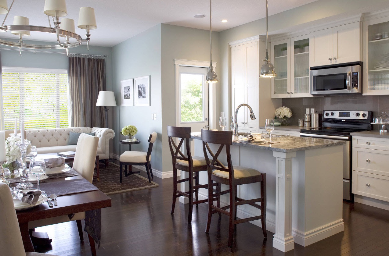
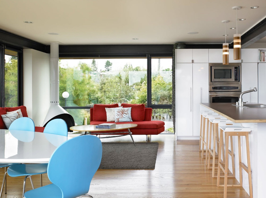
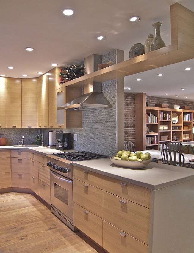
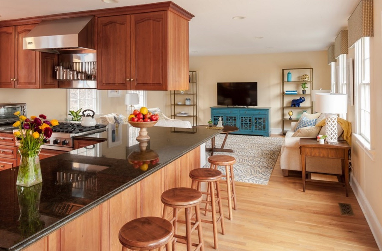
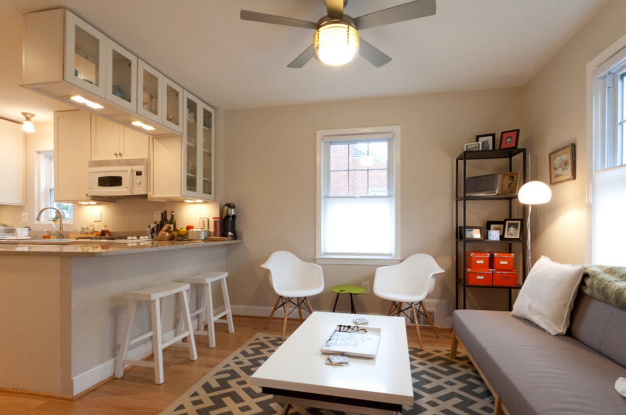
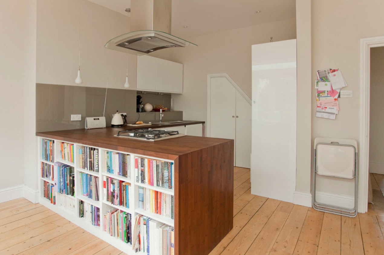
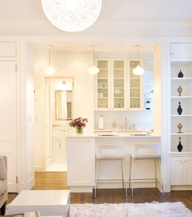
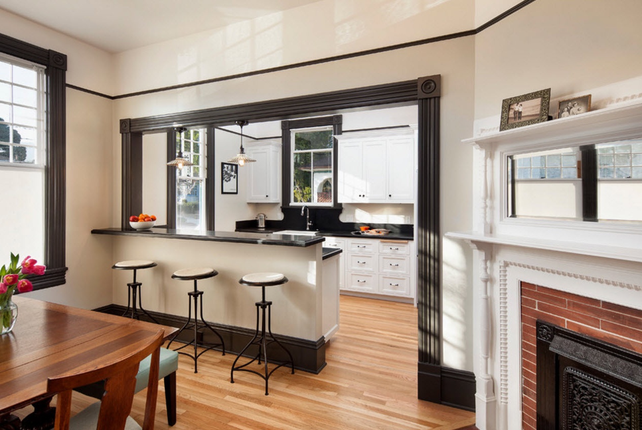
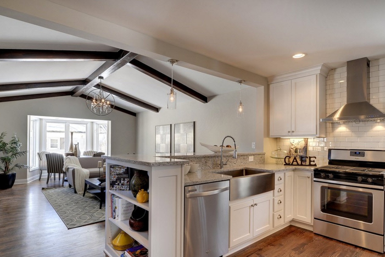
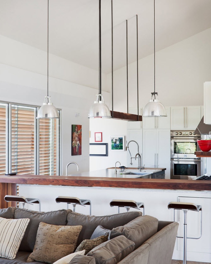
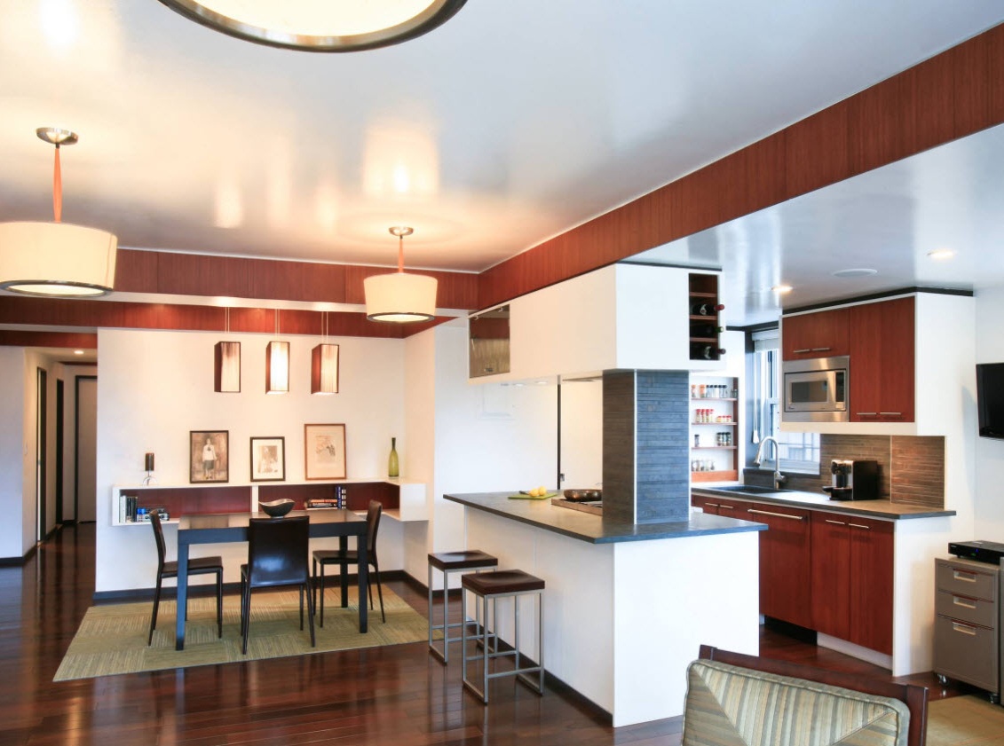
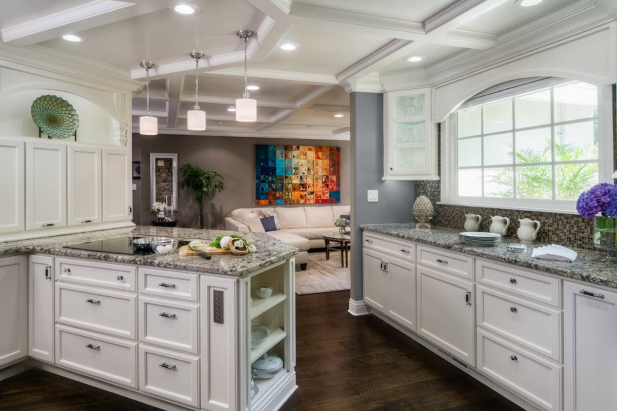
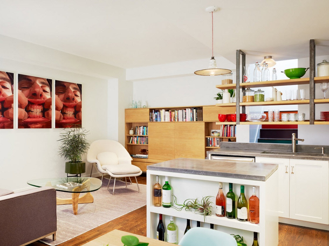
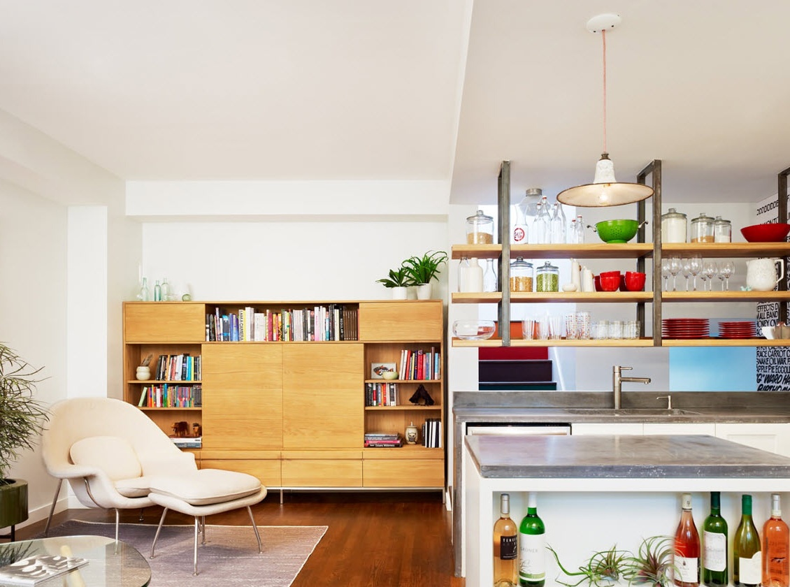
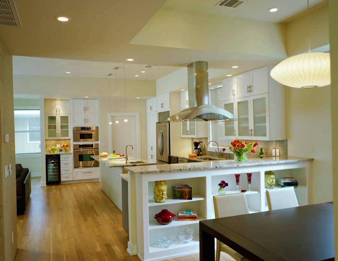
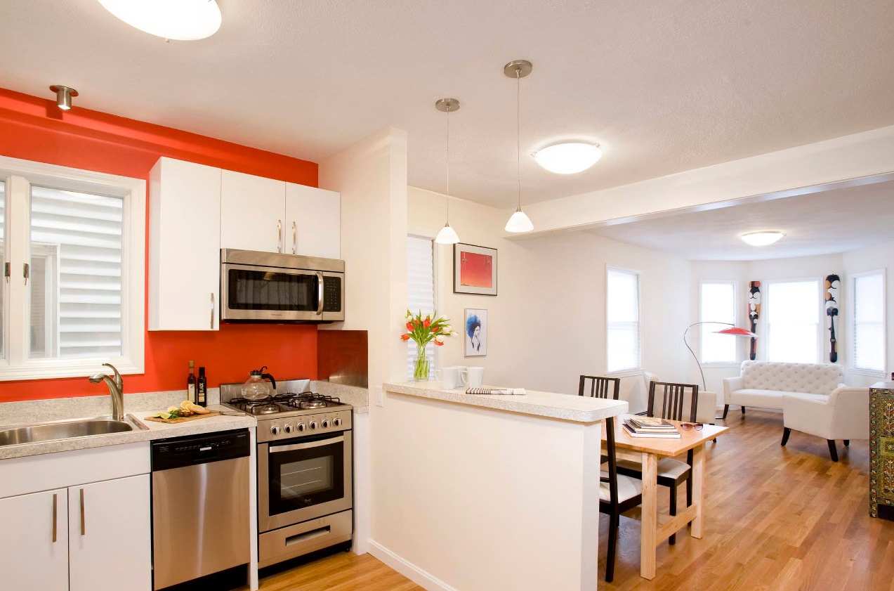
An even greater effect can be achieved by using a peninsula or bar counter as a zoning element. The module, one end attached to the wall, clearly outlines the boundaries of the kitchen area. If it was possible to place hanging cabinets or open shelves (in the form of a small hanging rack) over the peninsula, then the kitchen segment immediately becomes a “corner”. If there is a peninsula or a bar, part of the living room automatically becomes a eating area, because up to four people can sit at the tabletop of these interior elements for a short meal.
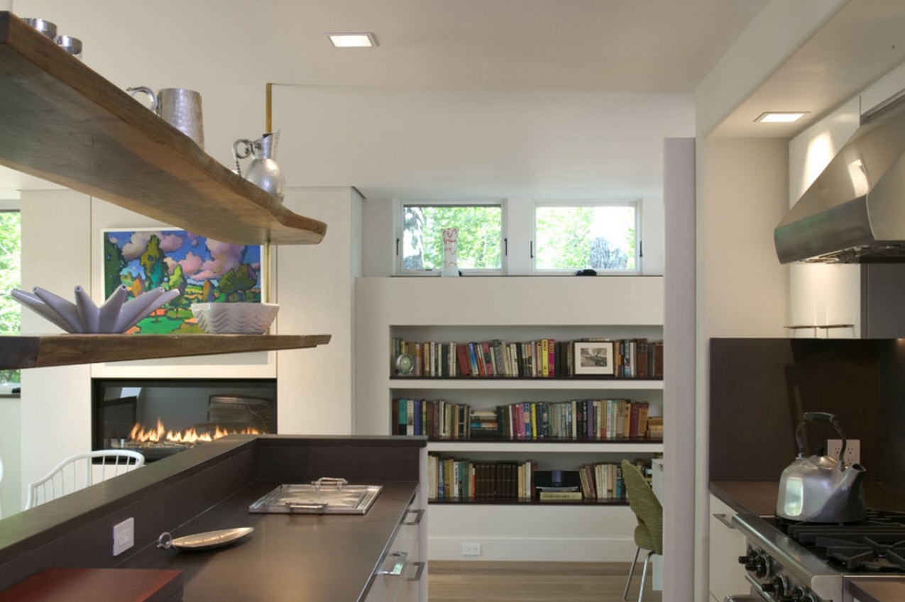
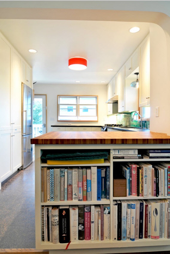
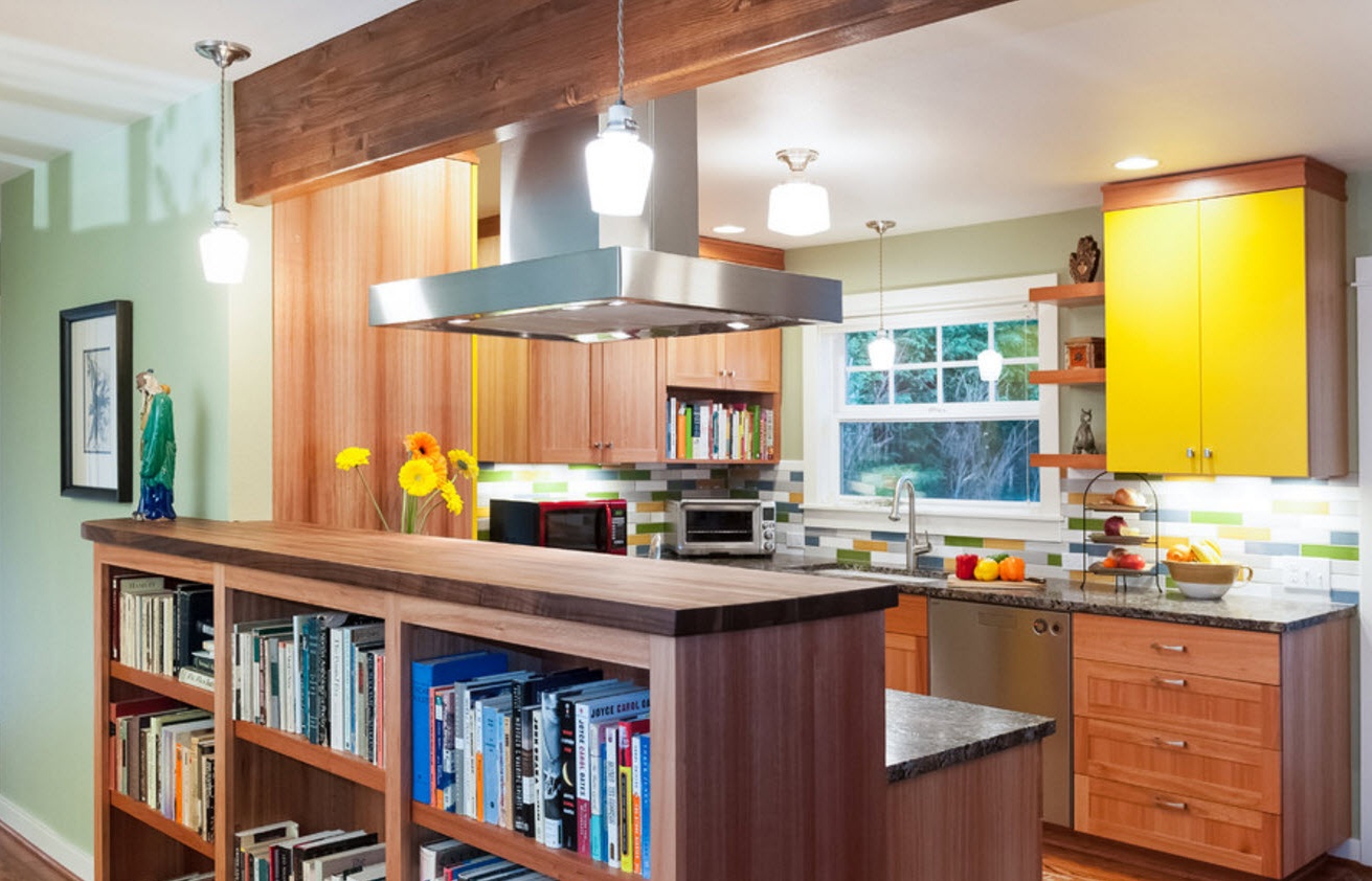
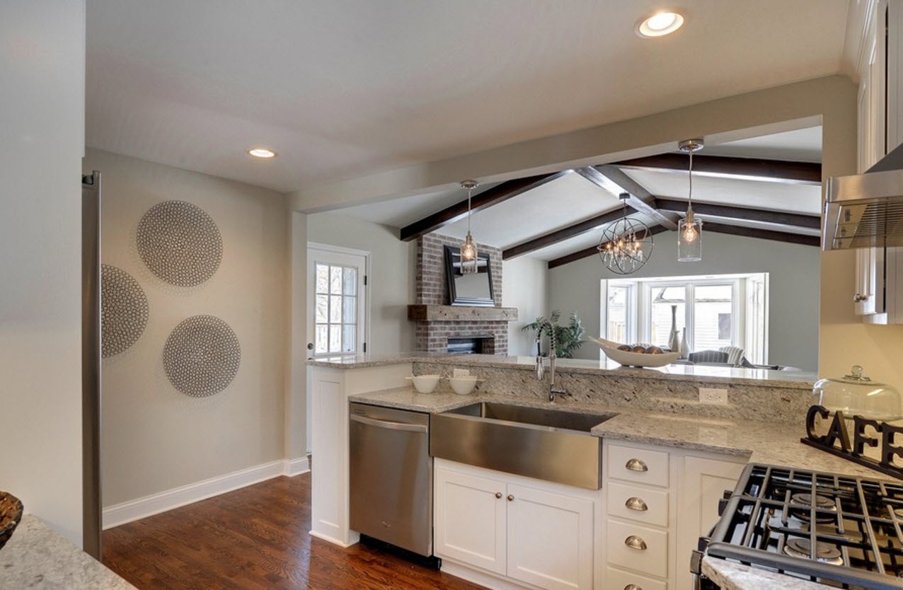
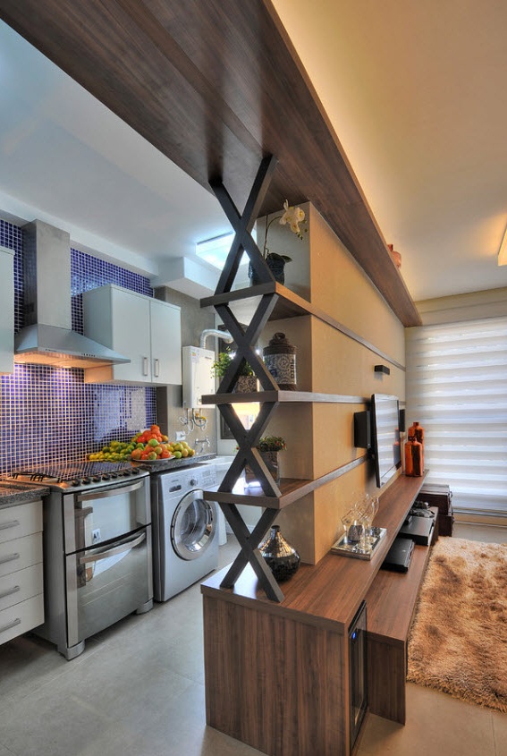
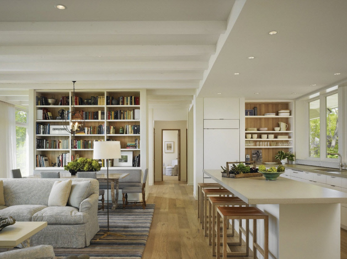
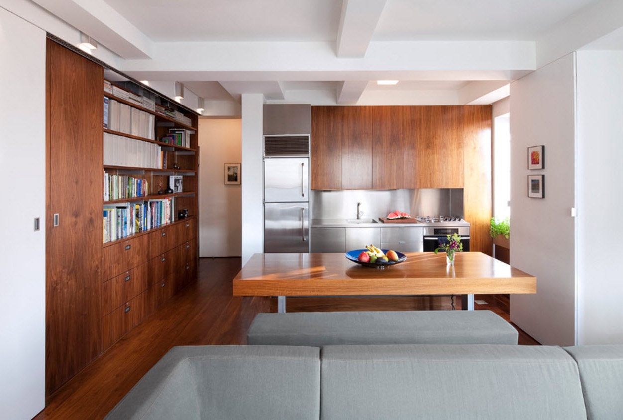
An excellent design technique is the use of the kitchen peninsula as a connecting element between two opposite options zones. From the kitchen side, the peninsula acts as a storage system for dishes or a module for embedding household appliances, a worktop for cutting or a surface for short meals. And from the living room, the peninsula can be equipped with open shelves for storing books. A small home library as part of a compact module is an excellent way to maintain the thesis that “there are never too many storage systems”.
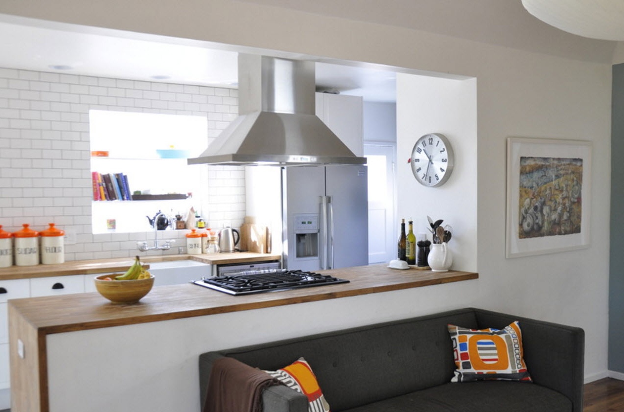
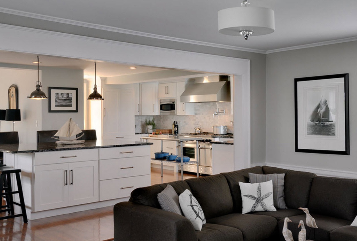
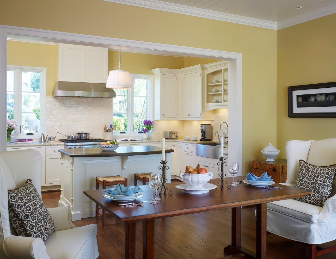
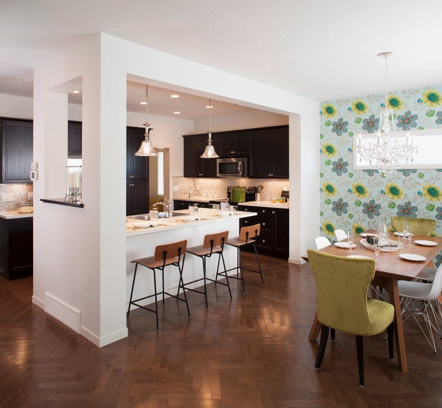
In some apartment buildings equipped with gas stoves, it is not possible to completely remove the wall between the kitchen and the adjoining room. In this case, you can use partial alignment - use part of the wall to decorate the bar and leave something like a wide doorway. On the one hand, both rooms will receive more natural light, on the other hand, functional segments will be partially isolated.
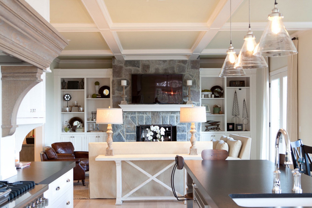
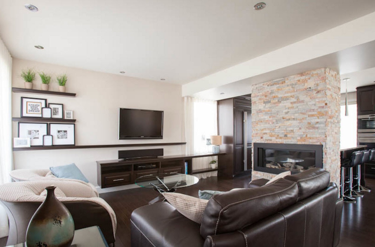
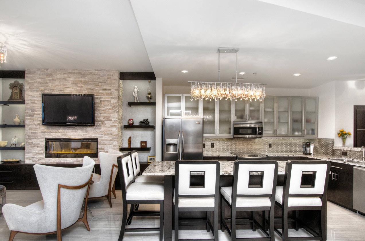
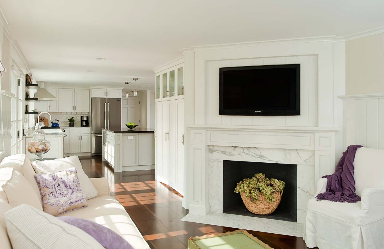
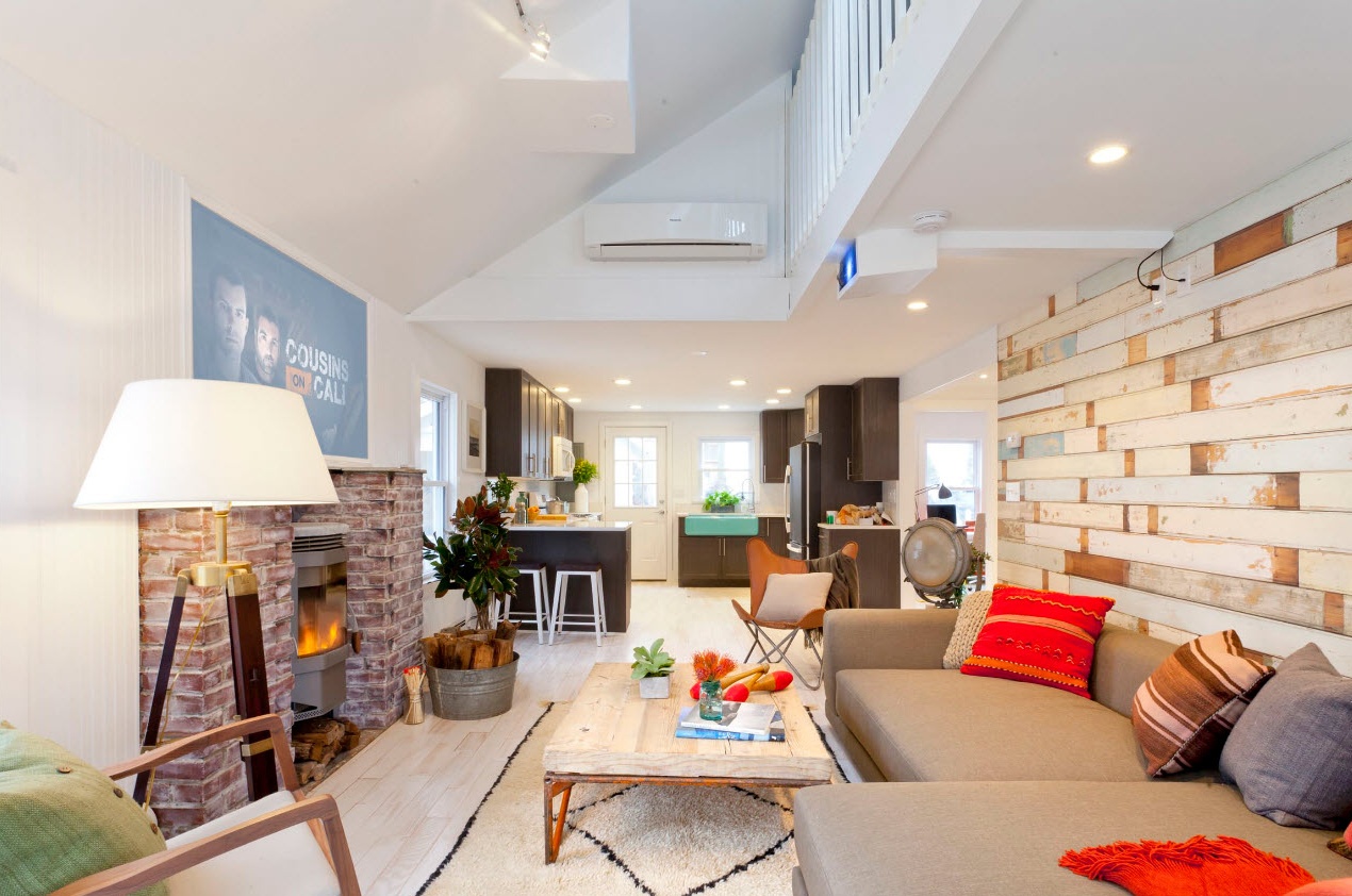
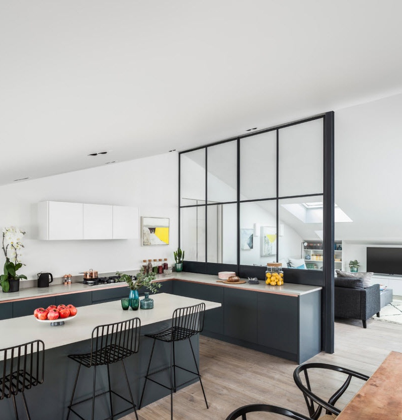
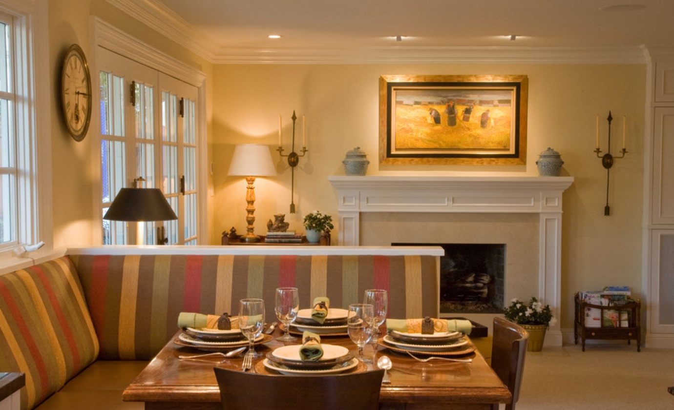
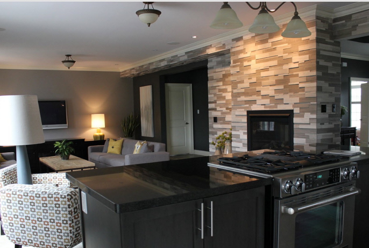
Screens, racks, partitions, partial overlap of two functional zones - a variant of more than obvious zoning. It is effective to use for these purposes a small partition with a built-in fireplace. The hearth can be double-sided or demonstrate the play of fire only from the side of the living room. In any case, it will be not only an excellent zoning element, but also a spectacular part of the modern interior.
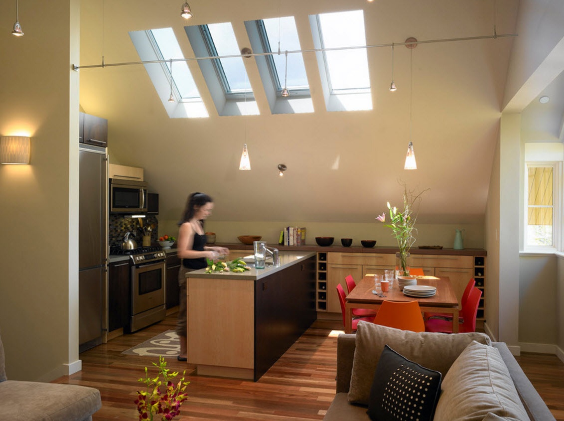
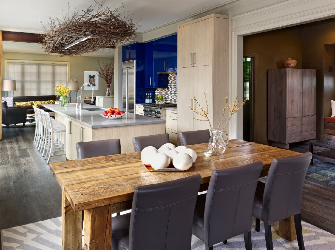
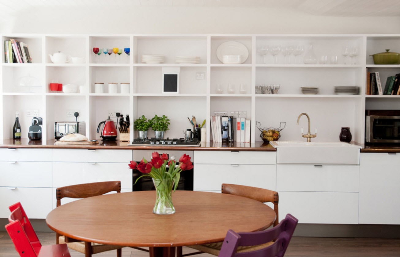
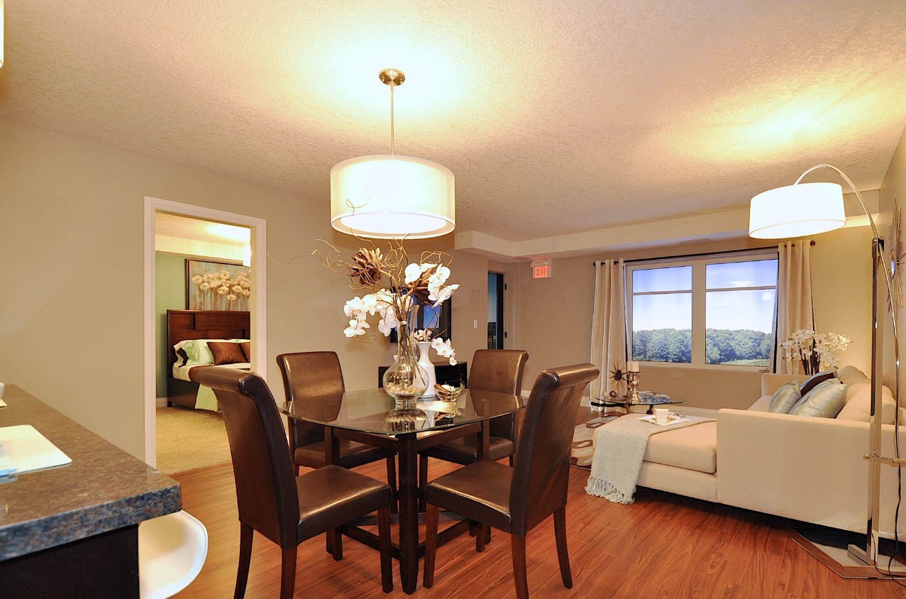
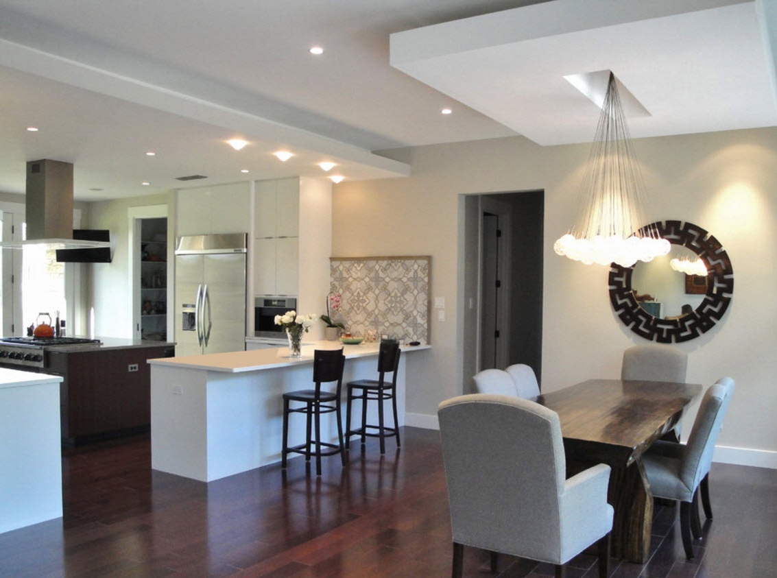
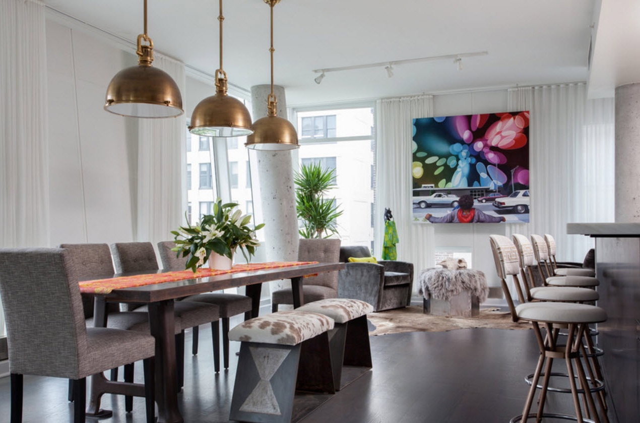
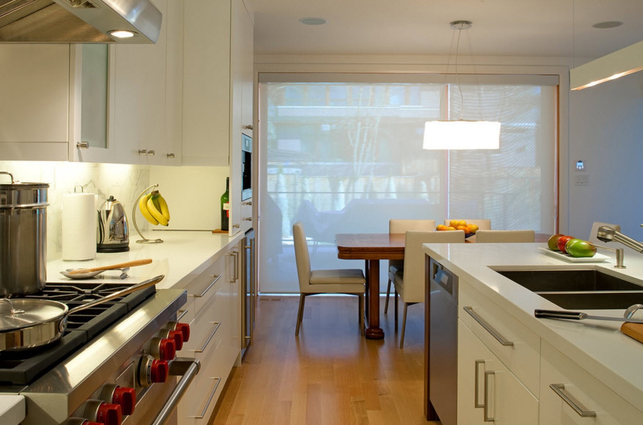
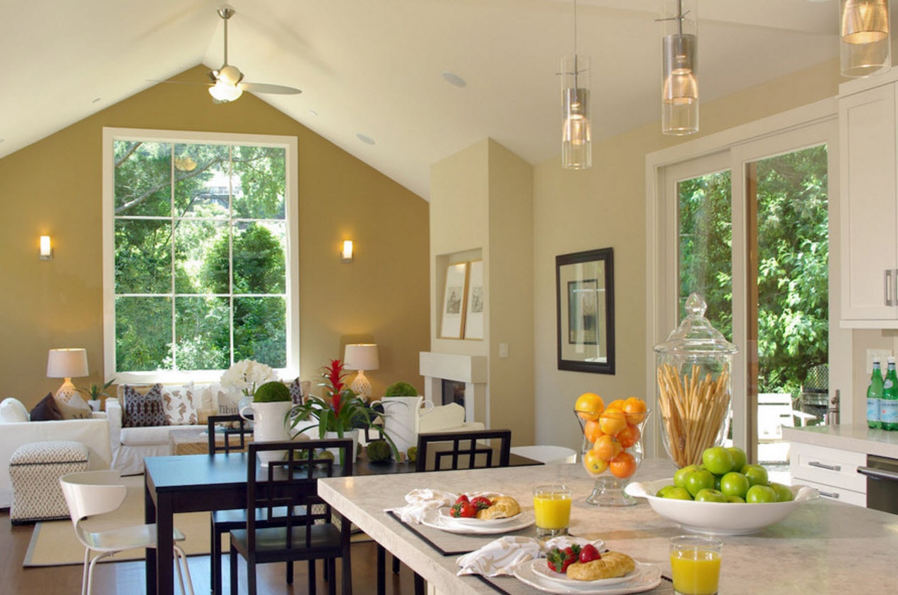
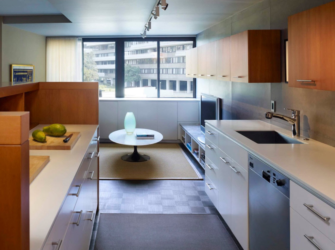
Another functional segment can become a zoning element between the kitchen and the living room - the dining room. The dining table and chairs will not only be located on the border of the two zones, but will also help to plan the location of the kitchen set. Most often with this installation of the dining group, the kitchen furniture ensemble has a linear or angular layout. As a result, you can create the maximum number of storage systems and built-in household appliances on the minimum possible amount of usable space allocated for the kitchen segment.
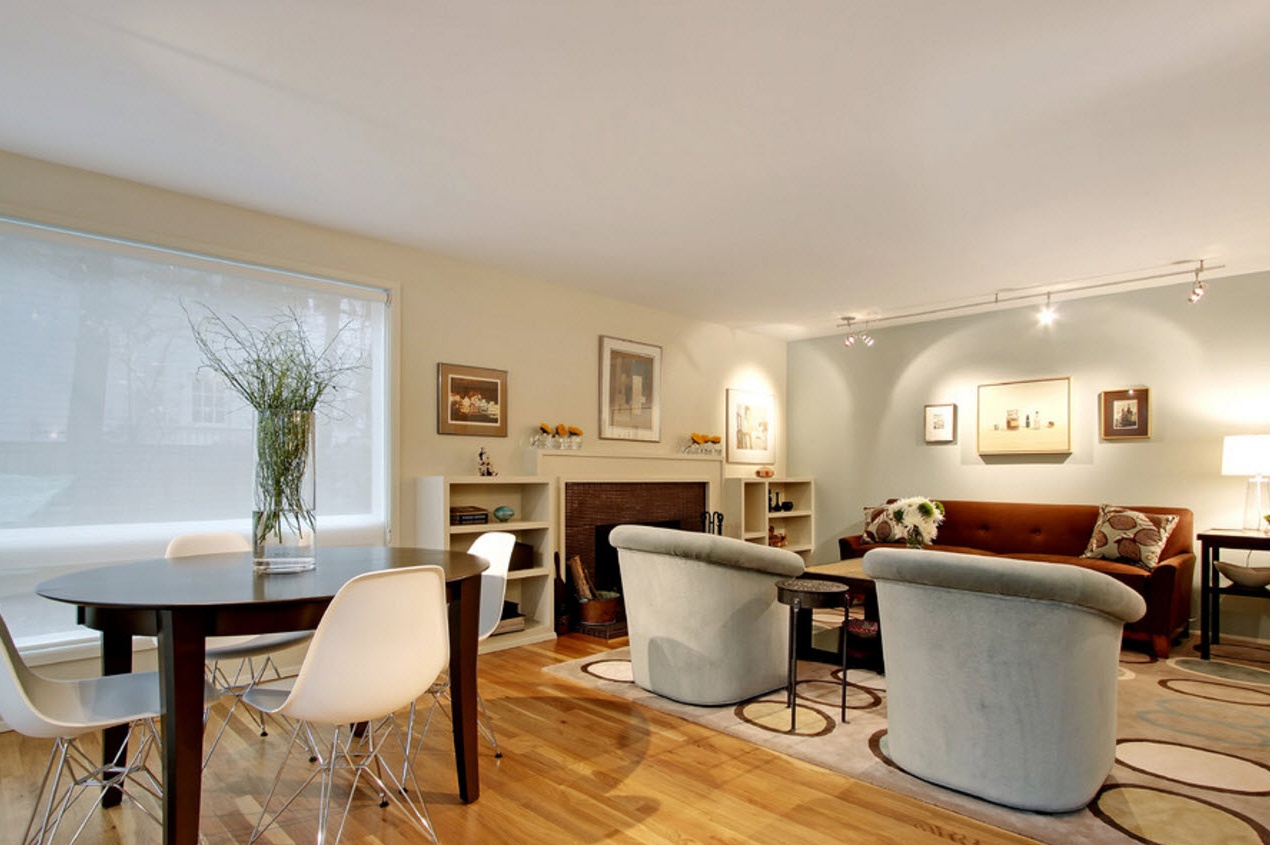
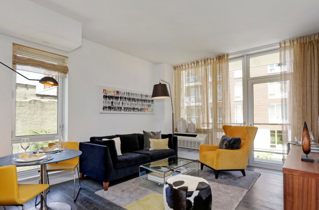
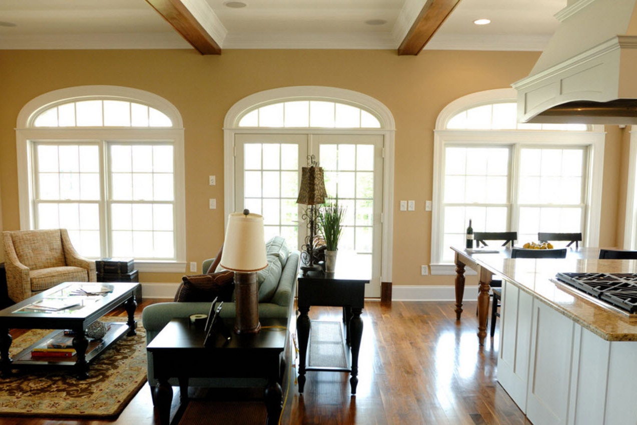
If we talk about zoning from the side of the living room, then most often the upholstered furniture - a linear or corner sofa, a pair of armchairs - becomes a conditionally separating element between the segments.In support of the living room recreation area, carpet can also appear, which is completely inappropriate in the kitchen segment, and more than preferred in the recreation area.
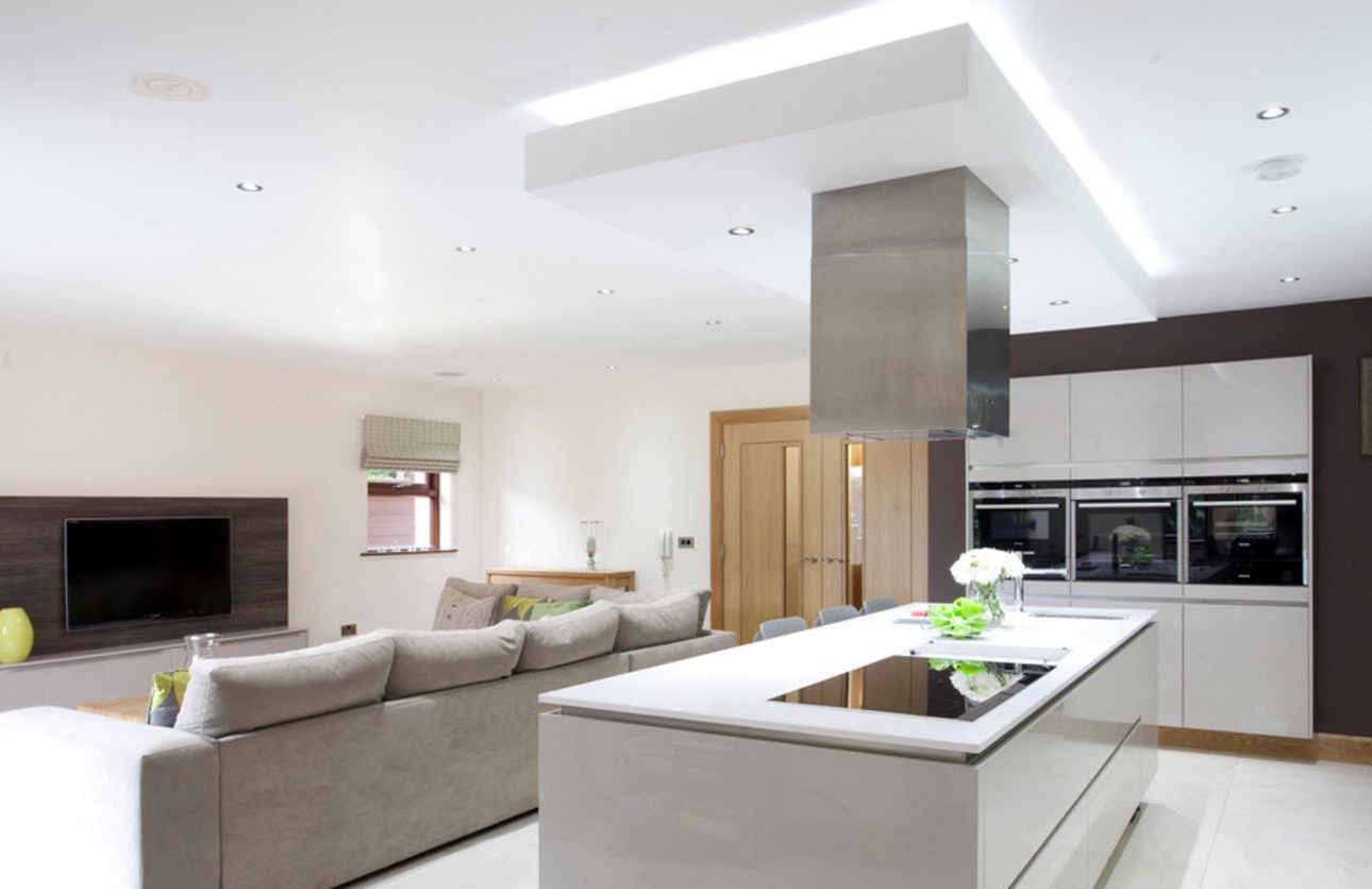
If the combined room has a large area and a high ceiling, then you can resort to zoning by distributing the levels of floor and ceiling coverings. As a rule, the kitchen area is set on a low podium, rising slightly above the living room. The boundaries of functional segments in this case are more than obvious. A similar technique can be used in the design of the ceiling, dividing the zone into different-level elements of suspended ceilings. Obviously, in this case, the built-in backlight system will also create zoning of a large room.
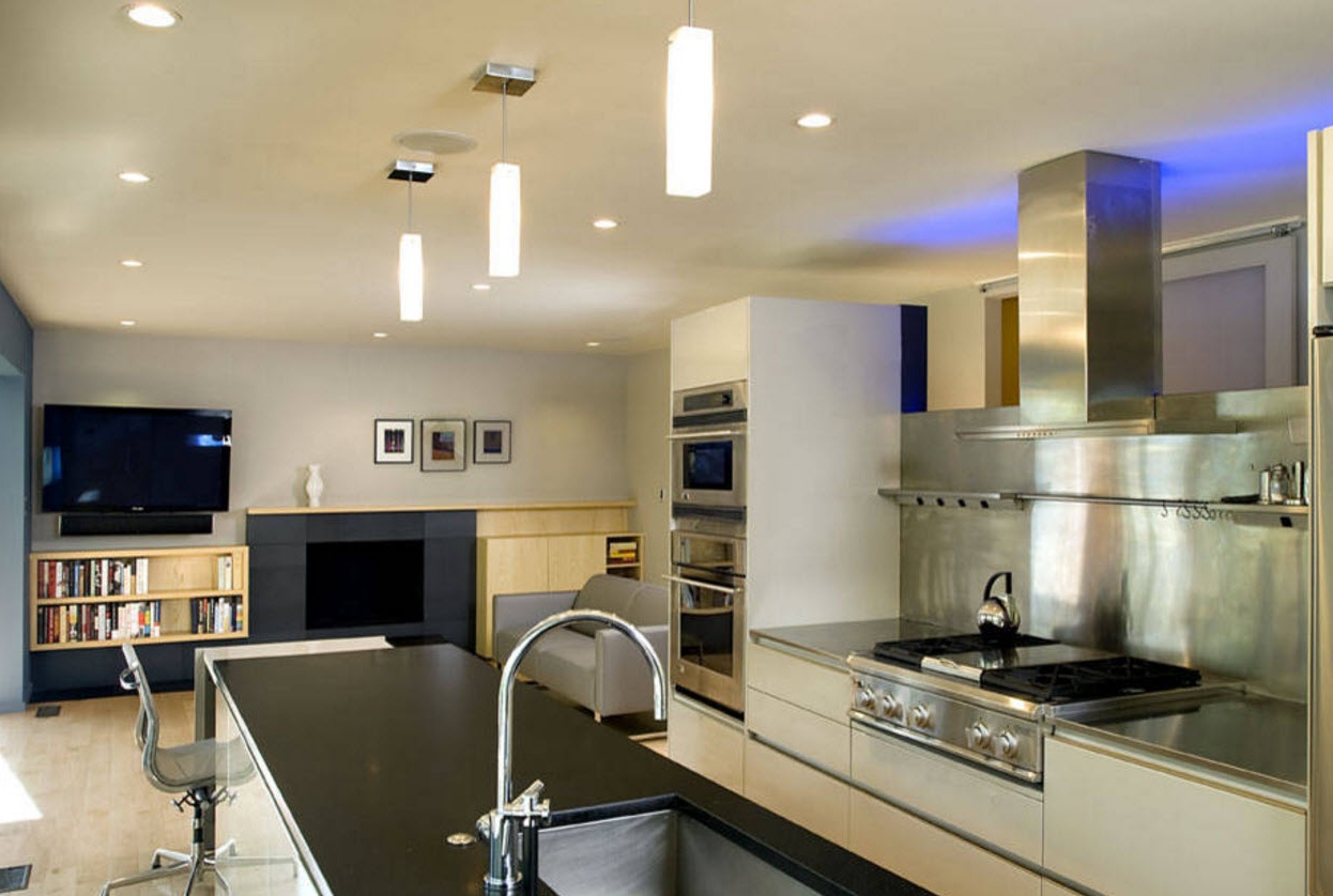
The lighting system can also become a zoning element. Obviously, in a spacious room with several functional segments, all areas should be illuminated. It can be either spotlights or strip lights, a combination of options. In addition to ceiling lighting, which very clearly draws invisible boundaries between the zones, you can use floor lamps and wall lamps to illuminate the relaxation area in the living room. In the kitchen segment, in addition to ceiling lighting fixtures, it is possible to use the illumination of the lower part of the wall cabinets of the kitchen set to illuminate work surfaces.
The color scheme for modern design
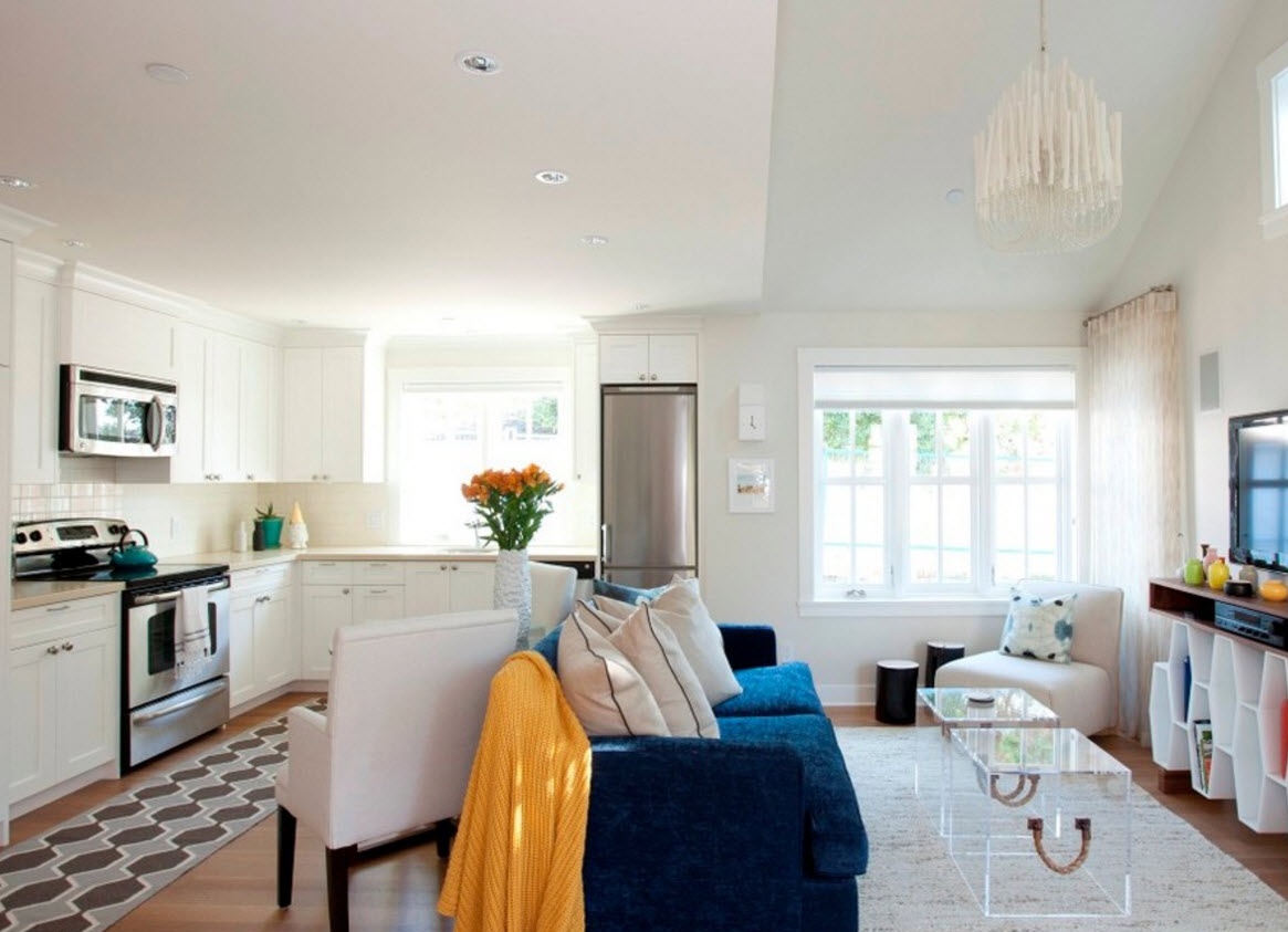
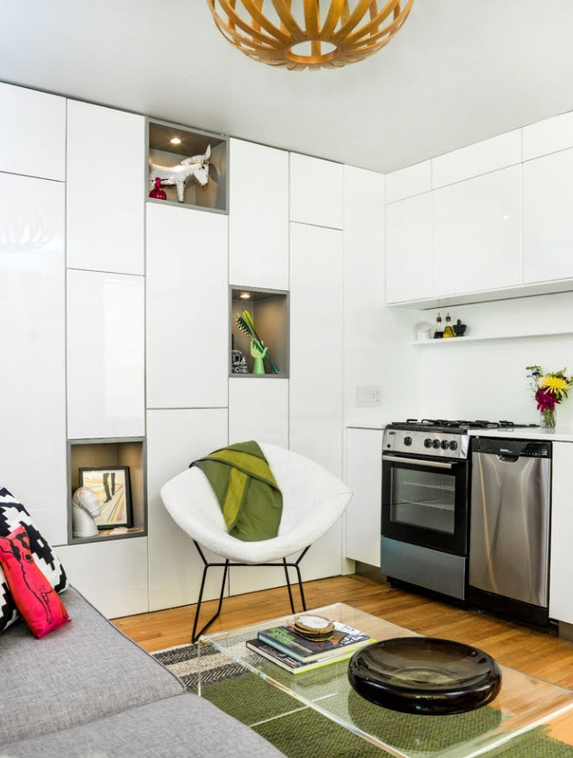
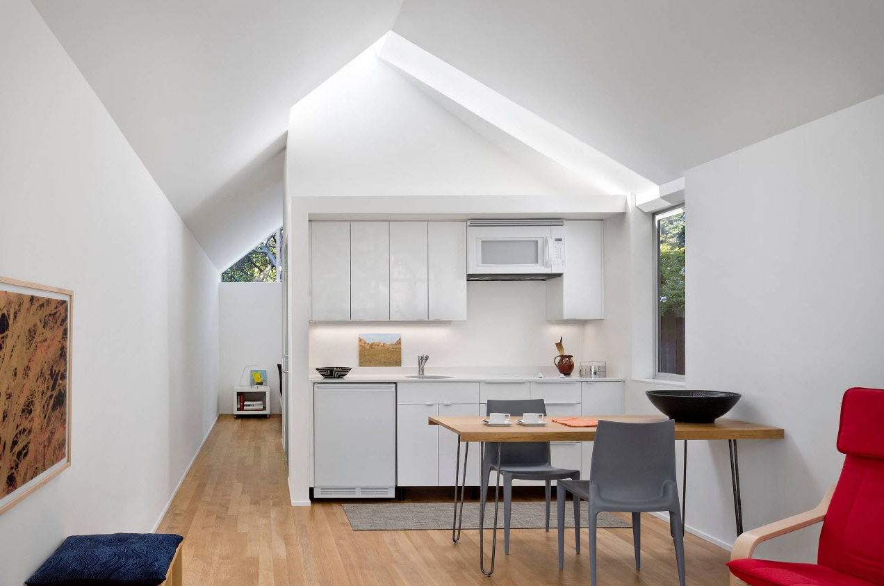
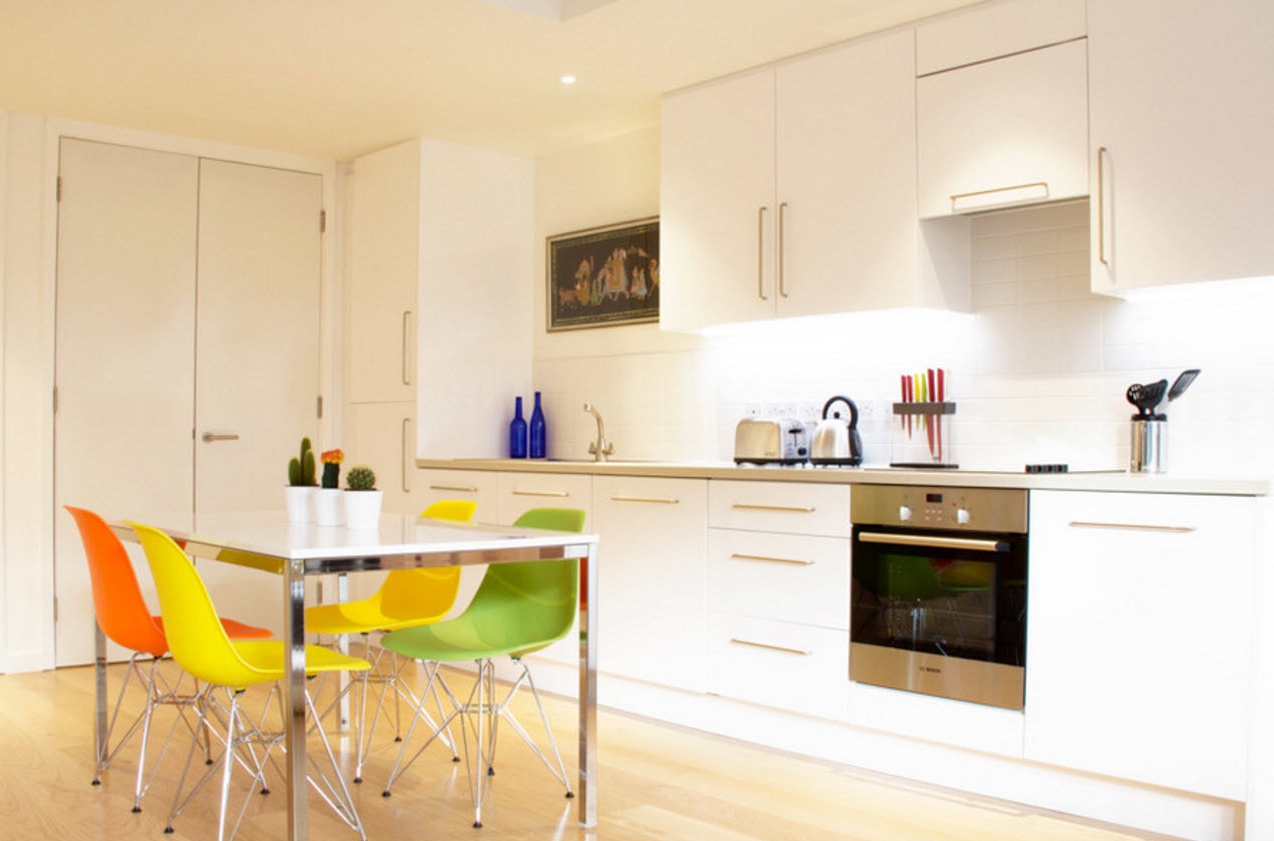
Trends in the design of residential spaces do not appear as often as in the fashion world, for example, but you can still note trends that will be relevant in the next few seasons. There are many universal color solutions, by accepting which you can be sure that your kitchen-living room will be fashionable and stylish in the next few years. For example, light shades are always in trend. Especially if you need to visually enlarge a small space or add light to a room located on the north side of the building. So, a light palette, in which white predominates, can create a light, laid-back image of a room of even very modest sizes, but it is important not to forget about the accents that are simply necessary to focus attention and emphasize the geometry of the room.
Obviously, to create a harmonious interior of the room, in which several functional segments are combined, unifying factors are necessary. As a rule, these factors are finishing materials for various surfaces of the room. Most often, in the kitchen, dining room, living room, the decoration of the ceiling, floor and walls has one style of performance in all areas. The only deviation from this rule is the decoration of the kitchen apron (in some cases it is extended to the ceiling if open shelves are used instead of the upper tier of cabinets). If any shade of white becomes the main color of the decoration, then the room risks losing not only its individuality, but also its borders and form. You can’t do without contrasting accents. When choosing such a light finish, it is necessary to carefully select furniture in each functional area, without disregarding any interior item - from lamps to photo frames on the walls.
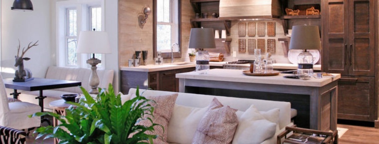
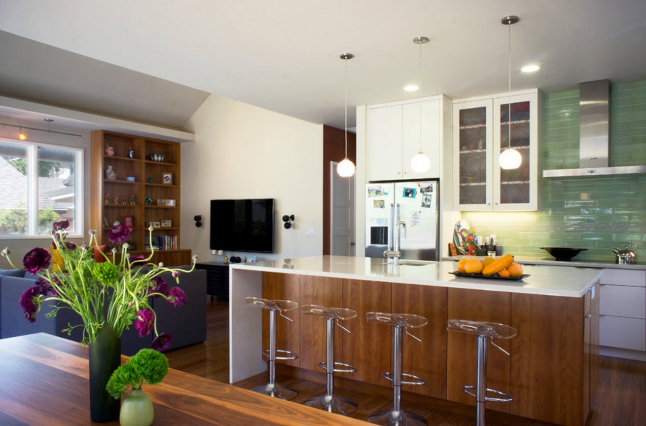
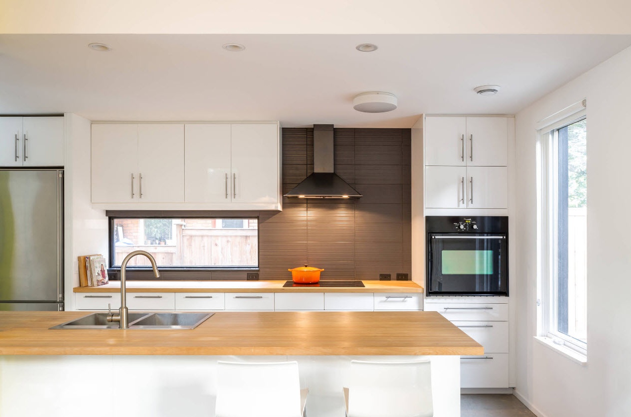
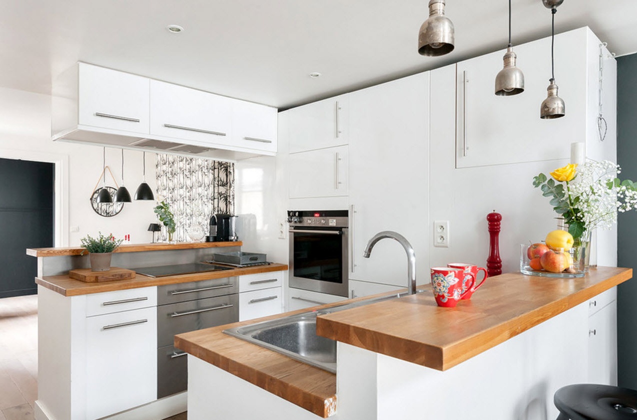
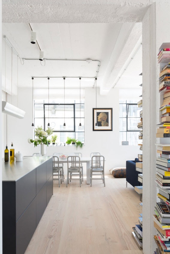
An excellent way to create a bright and at the same time warm mood in the interior is to alternate a snow-white finish with bright wood surfaces. A kitchen, countertops, a bar counter or an island, storage systems in the living room area - all these elements can be made of wood or its spectacular imitation with a beautiful natural pattern. It will be possible to arrange small color accents with the help of lamps, large living plants, carpeting in the leisure segment.
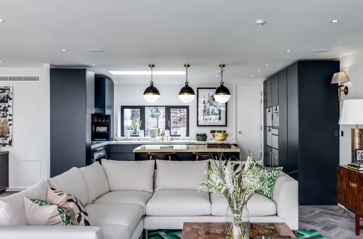
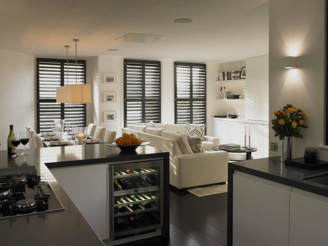
Contrasting combinations are always in trend. Not only because they invariably bring dynamics and tone to the interior, but they also allow you to create original images of rooms even for those who have no experience in the field of home design.It is not difficult to pick up a pair of light tone - shades from graphite gray, the color of dark chocolate to black, can become a spectacular dark accent, emphasizing the features of a particular design of the combined space. Dark shades can also be used to visually expand the space. If the upper part of the kitchen is light, and the lower is dark, then the room will visually appear higher.
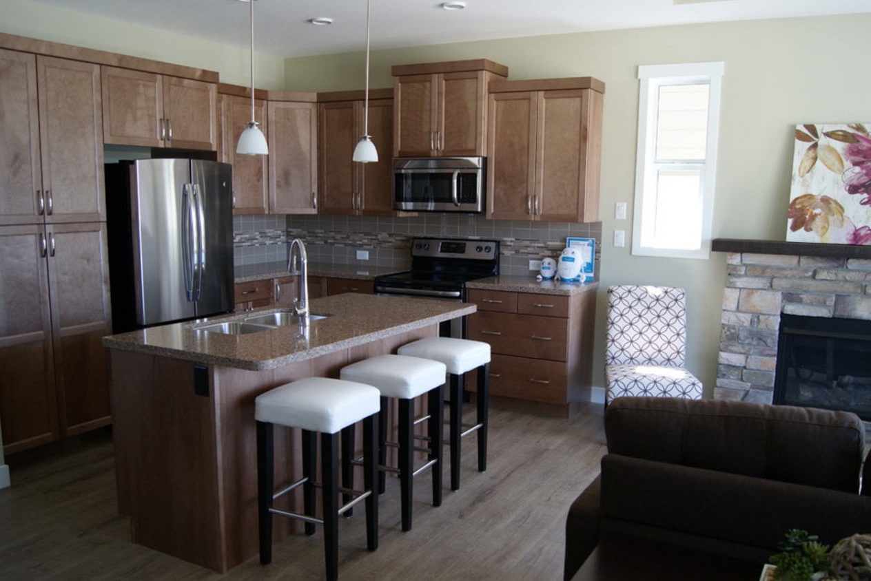
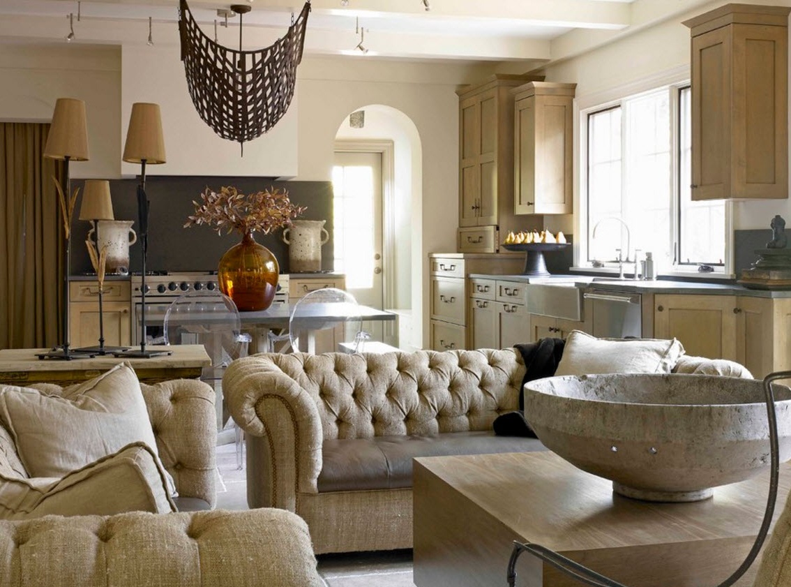
Another universal option for creating a difficult harmonious design of the kitchen combined with the living room, and a truly cozy room with a warm atmosphere is the use of a beige palette. The alternation of light beige, white, sand flowers with light wood creates a light and warm image in which any household or guest will feel comfortable.
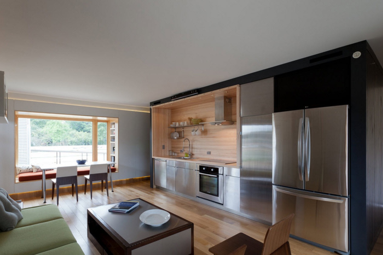
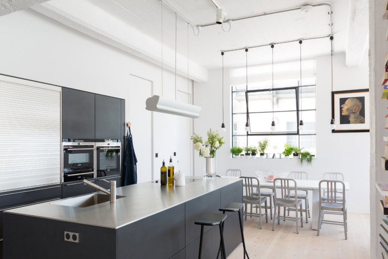
The popularity of gray and its many shades does not fade with the advent of the new design season. The versatility, practicality and simplicity of combinatorics put this neutral color in all respects in the top list of color solutions for rooms of any functional load. The kitchen studio was no exception. In the working area of the kitchen, the brilliance of stainless steel household appliances, and often countertops, a kitchen apron and even crockery, predominates most often. The easiest way to maintain this metallic luster is in white and any of the shades of gray. A noble and at the same time calm, balanced and elegant image of the room is guaranteed. To bring warm notes to the color temperature of the room. Experts recommend integrating surfaces and elements from wood or its imitation.
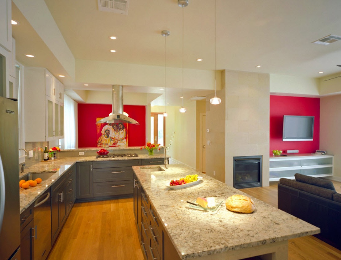
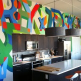
Are accent bright spots acceptable in the decoration of the combined room? Of course, if you feel that the interior needs it. The kitchen-living room, as a rule, after combination becomes a room of impressive size, which is quite capable of accepting the integration of a bright, contrasting finish. Depending on the layout of the room, the location of window and doorways, both the surface of the kitchen segment and the wall in the lounge area can become an accent wall. In any case, a bright, different from other surfaces wall should be unique. It can become the only surface decorated with wallpaper with a pattern, while the remaining planes are executed in a single-color version.

