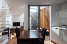
The kitchen is straight in one row - the nuances of a successful linear layout
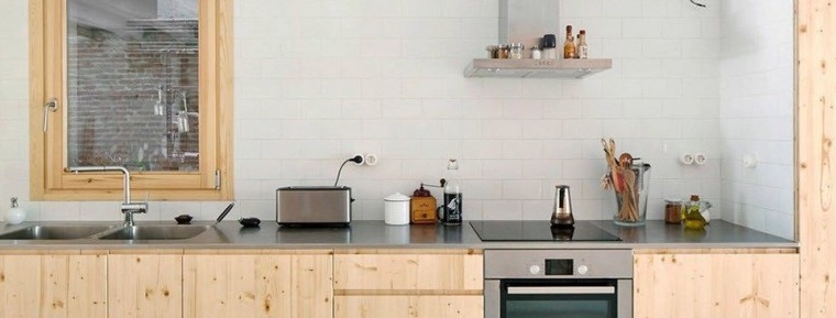
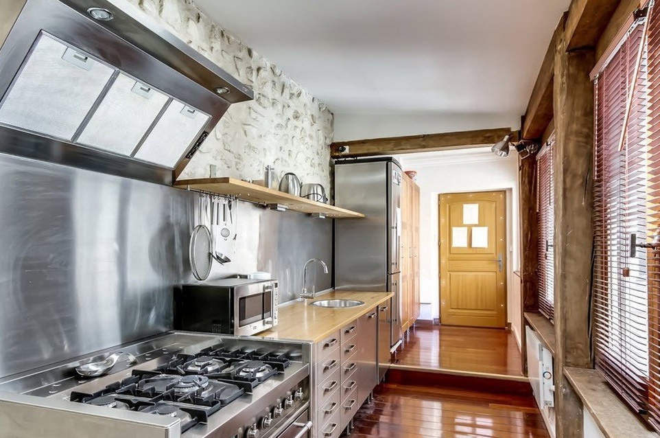
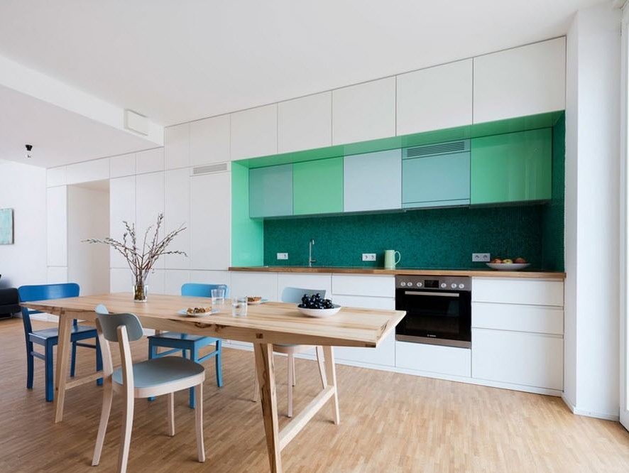
Designers recommend installing kitchen linear in rooms with the shape of an elongated rectangle and in small rooms where there is literally no place for corner modifications and it is necessary to fit storage systems, work surfaces and household appliances in one row. But recently, there has been a tendency to place linear kitchen sets in fairly spacious kitchens. With this layout, when furniture and appliances occupy only one wall of space, there is a lot of free space for a full-fledged dining area with a large table and comfortable chairs, and sometimes mini-chairs.
Linear layout for small rooms
It happens that in a narrow and long room of the kitchen, in addition to arranging all the furniture and appliances in one row, there is simply no other possibility. Sometimes such a layout of storage systems, work surfaces and household appliances is due to the need to place a dining group, because there is no separate dining room in the house or apartment.
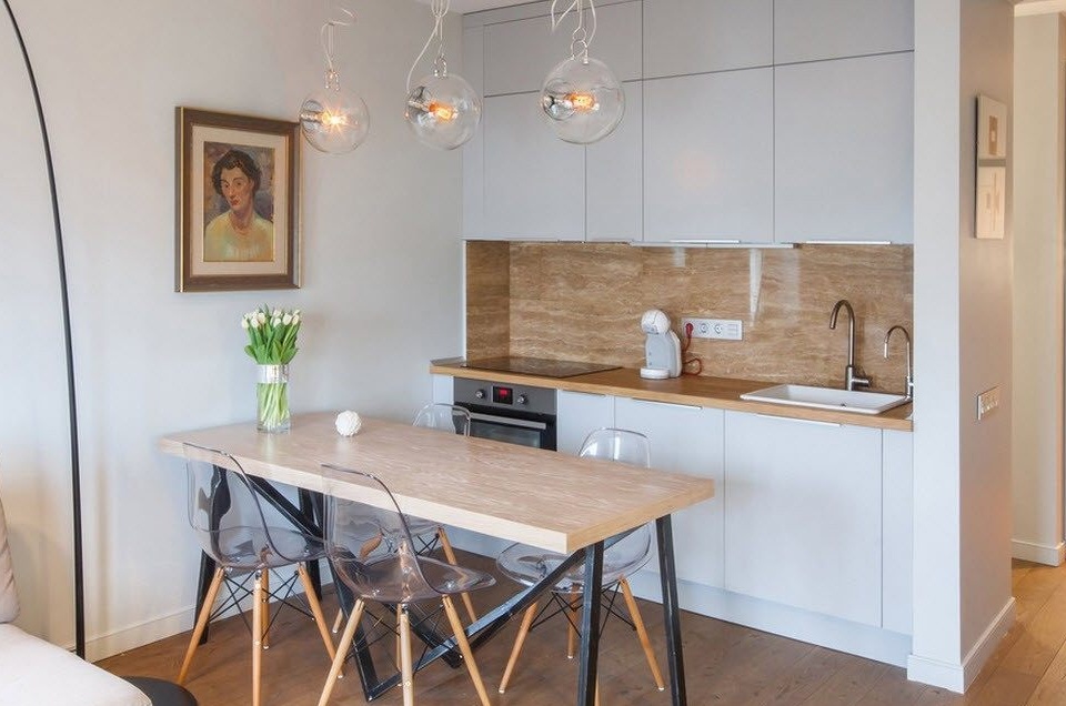
Linear kitchens of short length (no more than 2.5 m), often the only possible and ultimately the best option for small rooms. The convenience of such an arrangement is that the main components of the kitchen - the hob or stove and sink will definitely be close to each other. But it is important that the vertices of the imaginary “working triangle” are not located close to each other, but alternate with the help of kitchen cabinets, the length of which will vary from 40 to 80 cm. There are at least two reasons for this arrangement. Firstly, it’s more convenient to organize work processes - you will put vegetables from the sink and cut them on the surface next to the sink, and put hot pots and pans near the stove on the other side. Secondly, from the point of view of safety, this option is optimal - splashes of water from the sink during washing vegetables and fruits will not fall on the hob or stove, and the oven or built-in stove will not heat the adjacent refrigerator.
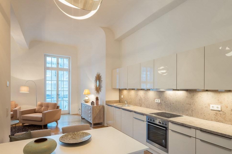
By integrating a linear kitchen set from wall to wall of the living room, you solve several spatial problems at once - the lack of a separate room for the kitchen, the possibility of being located near the dining room and living room. If you are worried about the smells of cooking, which can interfere with households relaxing in the living room, then you can not avoid the acquisition of a powerful modern range hood.
One row layout for spacious rooms
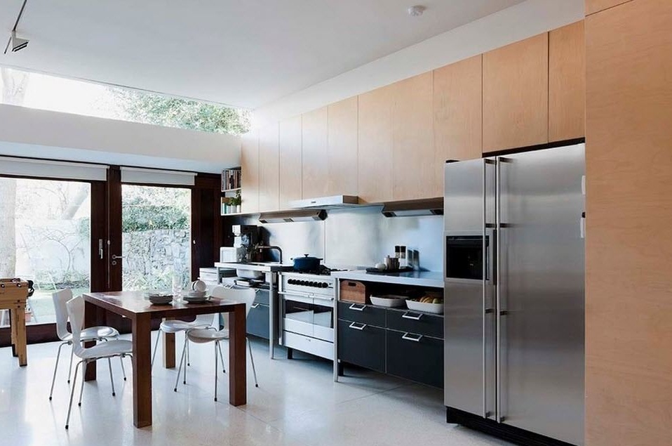
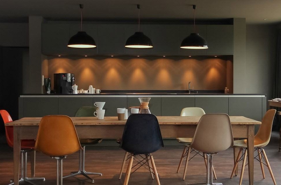
In the kitchens of dining rooms with impressive dimensions, you can often see a linear layout of the kitchen unit. In this case, the dining area with a large dining table, which can accommodate not only family members, but also their guests, is necessarily located nearby.
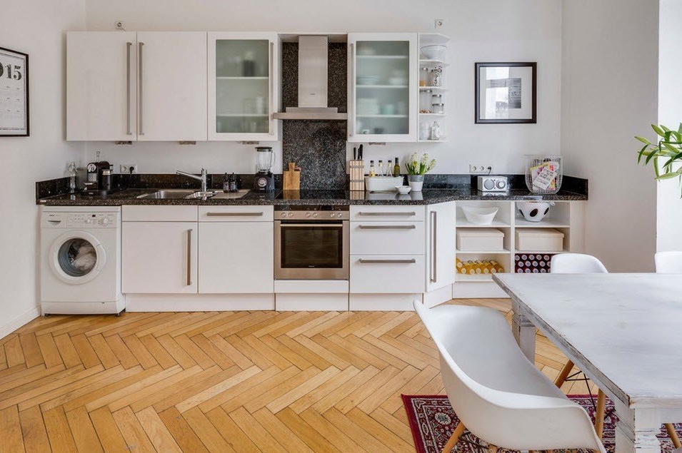
The advantage of arranging a linear kitchen in a spacious room is that in addition to basic household appliances, you can place a lot of additional equipment and storage systems. For example, do not limit yourself to installing only a stove, dishwasher and oven, but add a built-in air grill, hob or wine cooler. It’s important for some homeowners to find the washing machine in the kitchen, because in the bathroom it does not fit into the interior, and I do not have a separate room for arranging the laundry.
In spacious rooms with a linear layout of the kitchen, the same rules apply for the location of the three main kitchen segments: washing, cooking and storing products (washing, stove and refrigerator). According to the canons of ergonomics, these three vertices of an imaginary triangle should be approximately equally spaced from each other (0.9 - 1.5 m).If it is not possible to put one of the objects of the "working triangle" aside (usually a refrigerator), then the main functional segments line up. In this case, you just have to make sure that the sink is located between the stove and the refrigerator. The maximum permissible distance between the extreme objects in the functional line is 3.5 m. Otherwise, the hostess will have to go more than one kilometer through the expanses of the kitchen before dinner is ready for the whole family.
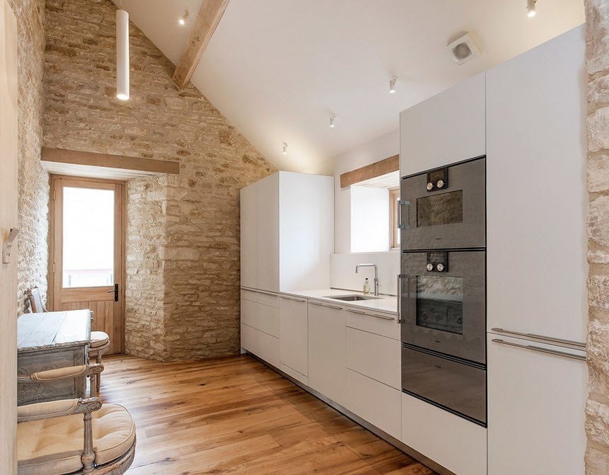
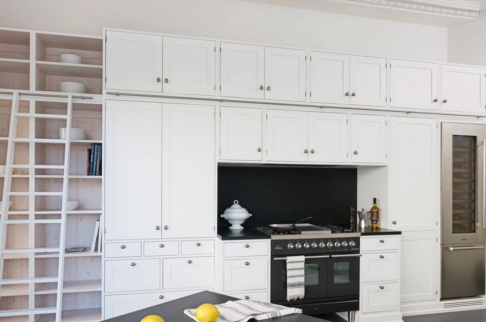
An original and very practical way to place all the necessary kitchen components on one wall of the room is the built-in version of kitchen cabinets, work surfaces and household appliances from floor to ceiling, including around the doorway. With so many storage systems, it’s easy to place all the kitchen utensils. And most importantly, the rules of ergonomics and safety will be observed in terms of the placement of objects of the "working triangle".
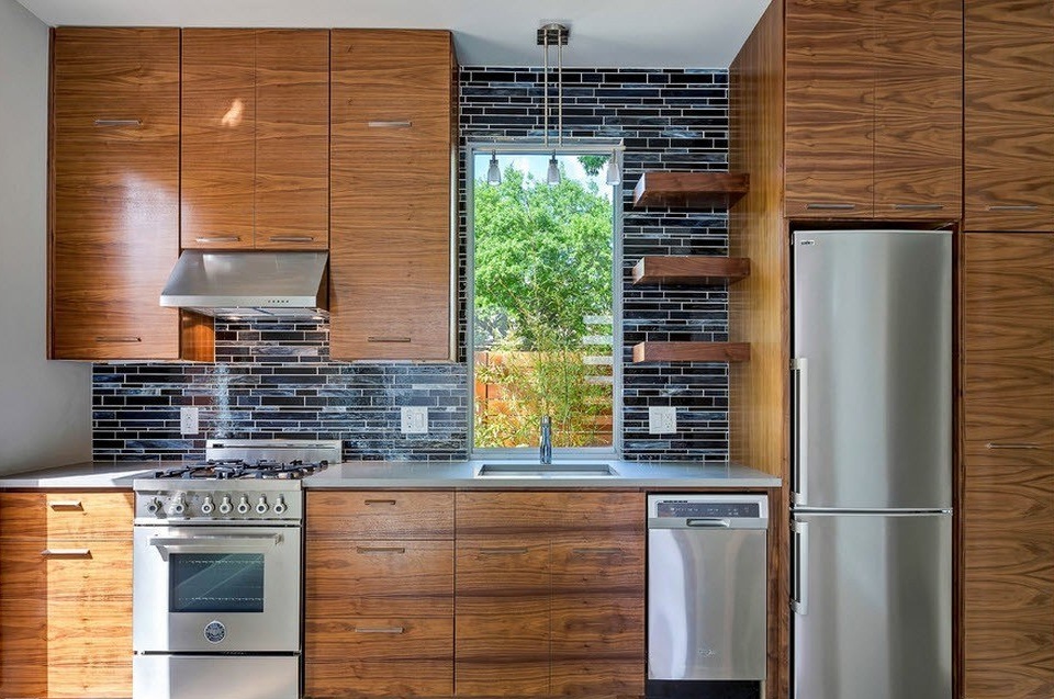
In terms of the location of the individual elements of the kitchen, there are some unspoken rules. For example, the sink can be installed anywhere, only the distance to the nearest electrical appliance was no more than 60 cm. If the sink is part of a “linear triangle”, then it is better to place it in the center, honey with a stove or hob and refrigerator. As a rule, a dishwasher is built into the lower cabinet near the sink so that dirty dishes do not have to be carried over a long distance. From the point of view of installing a stove or hob, there is only one unspoken rule - it is better not to place it in a corner so that splashes of hot oil and fat do not fall on the walls of the room. If with a hob, the issue is solved only by transferring an electrical outlet, then the gas stove will have to be installed in the place where the corresponding communications are present, or the gas service should be invited to transfer the gas pipeline and air duct lines.
An oven is best placed not in the lower tier, but at eye level in a tall column cabinet. So the hostess will not need to bend down each time, as it will be necessary to check the readiness of the dish, load and unload something from the oven. Next to the appliance, consider installing a hot baking sheet.
Stylistic and color solutions for the linear layout of the kitchen
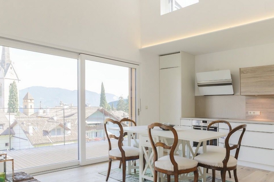
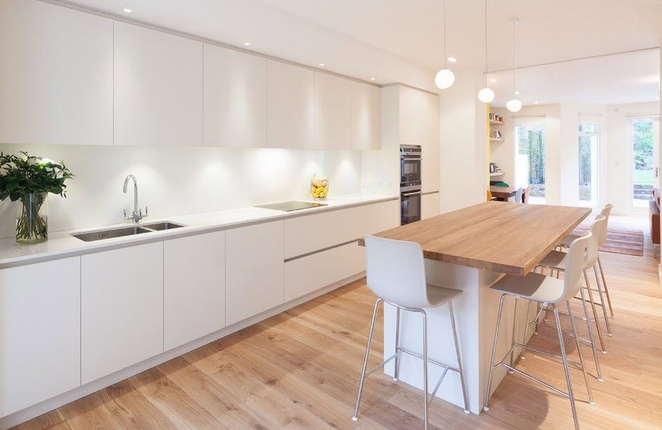
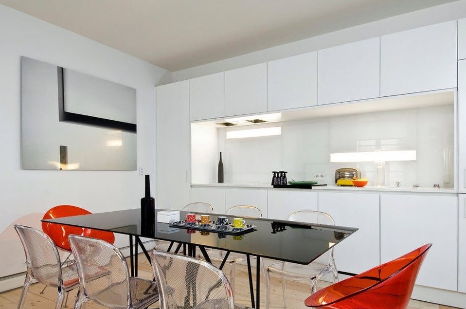
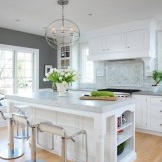
A snow-white kitchen with traditional facades of kitchen cabinets is relevant at all times and with any layout of the headset. The bright surfaces of the storage systems visually increase the space, look fresh and clean, bring ease to the interior of the kitchen even with impressive sizes of furniture and household appliances.
Snow-white glossy surfaces of kitchen facades are recognized as the most practical in terms of daily cleaning cabinet design options. Traces of water droplets or fingerprints are not visible on the light gloss, which cannot be said about the dark or bright shades of the kitchen facades.
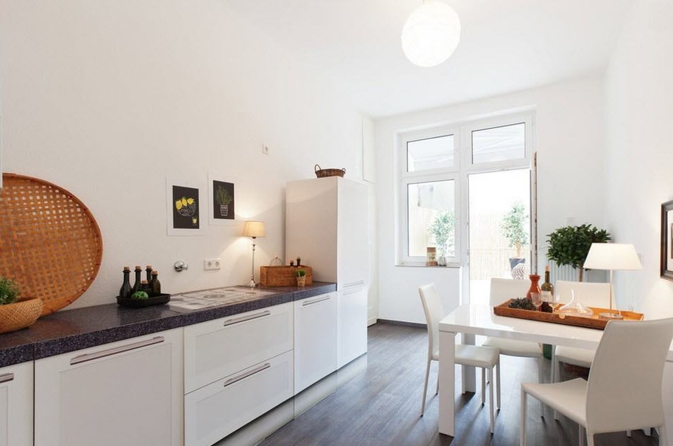
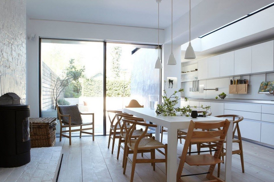
The modern design of white kitchen cabinets strives for the greatest minimalism - the lack of external fittings, smooth facades, rigor and conciseness in everything. To slightly dilute the snow-white idyll of the kitchen set and the same austere white table, you can choose chairs for the dining area from wood or bamboo. Not only the natural shade will dilute the color scheme of the room, but the designs themselves will add a little warmth to the decor of the kitchen space.
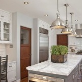
To dilute the total white color of the kitchen set, you can use a dark stone for the execution of countertops, creating contrasting combinations. And the inserts on the facades of the upper tier cabinets made of translucent, frosted glass will add some lightness to the roomy furniture ensemble.
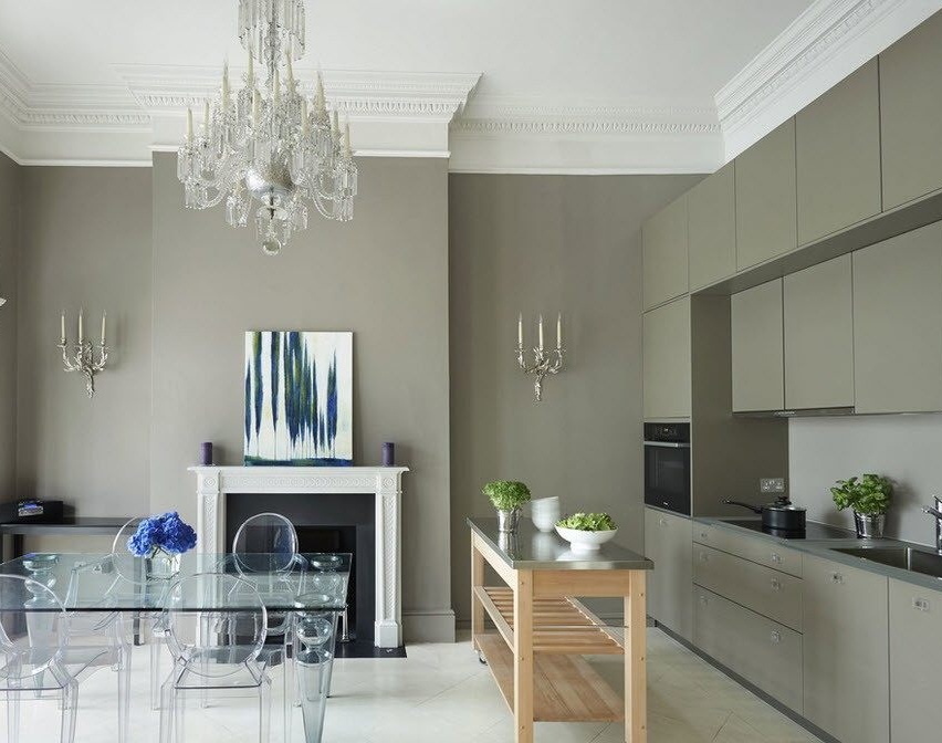
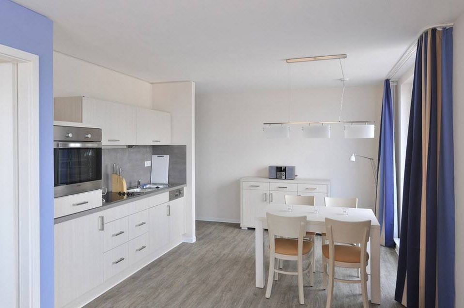
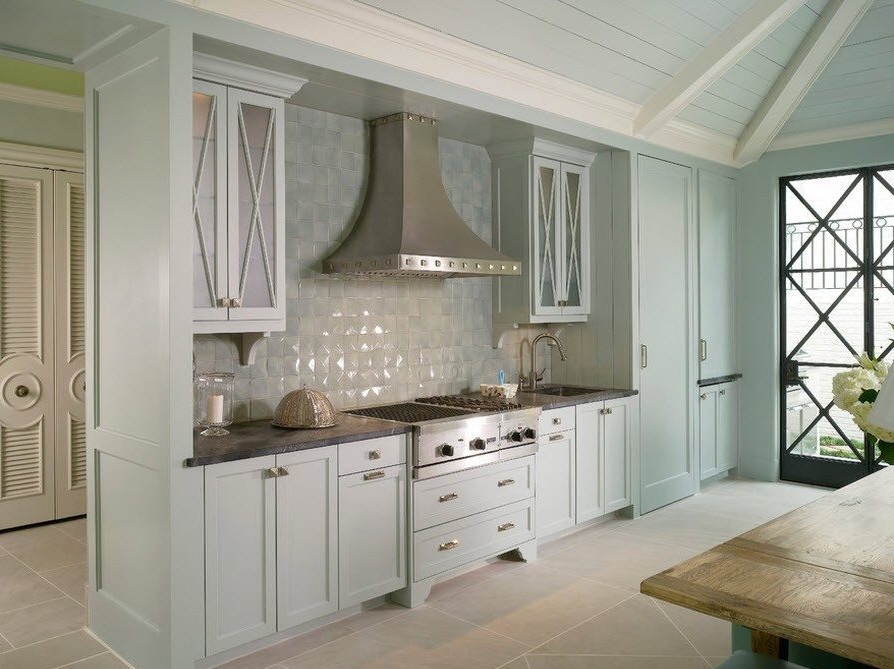
An alternative to a white kitchen can be the use of pastel shades for coloring traditional kitchen facades. The resulting color scheme not only makes a favorable impression on households, but also on their guests, in such a kitchen space it is cozy and comfortable for everyone.
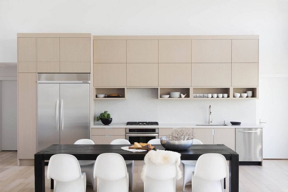
Another option is to use a light, pastel shade to decorate a large kitchen set located linearly. For a passage room with a large dining area, this layout was optimal. For the brightness and contrast in the room, the "dining group" is responsible, executed in a combination of the two most opposite colors - black and white.
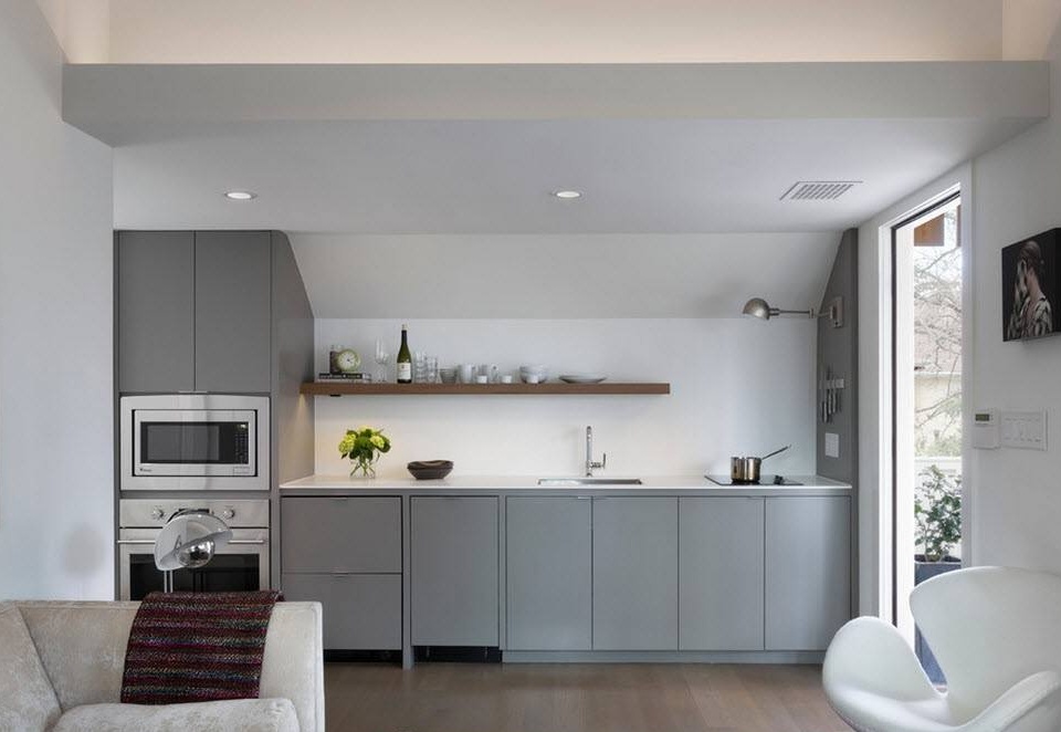
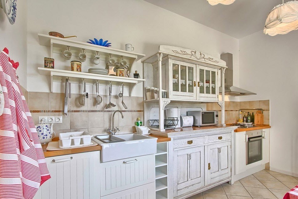
For a country-style kitchen, especially located in a country house, one can often find the use of open shelves for dishes and kitchen accessories to replace the upper tier of cabinets. Dishes placed in front of you leave a certain imprint of rural life on the interior of the kitchen.
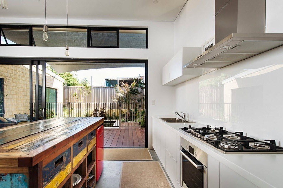
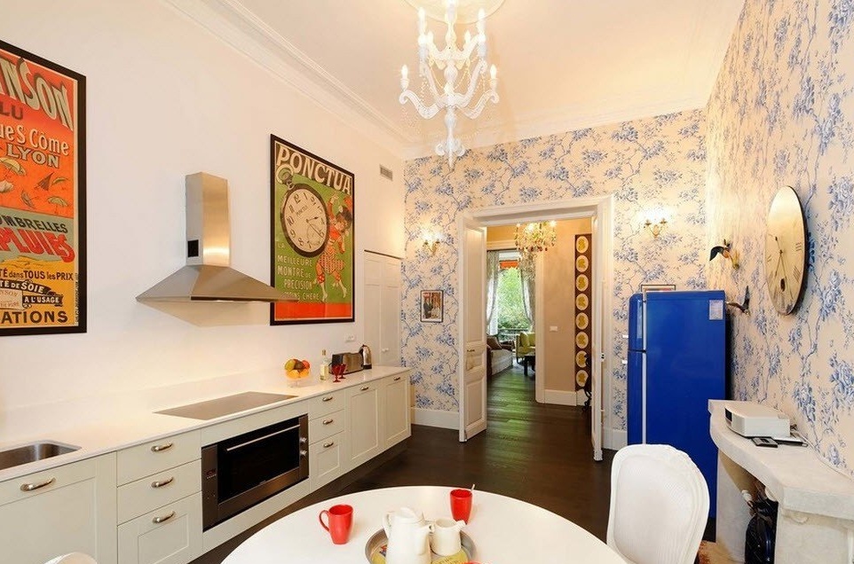
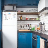
For the execution of the interior of the kitchen in retro style, you can take as a basis the traditional cabinets for the kitchen set, but do not use the upper tier. Bright posters from the past and retro-fridge in bright design will indicate belonging to the style. In addition, with this arrangement of household appliances, you successfully follow the “working triangle” rule and organize a rational and ergonomic workflow in the kitchen.
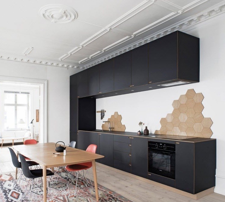
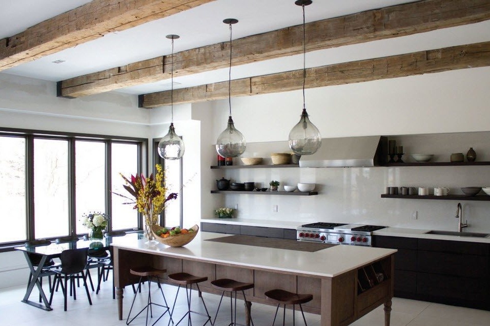
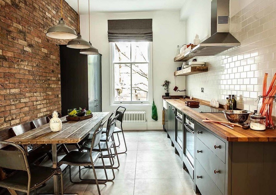
Traditional kitchen facades are also suitable for decorating a room in a loft style. For belonging to a certain style, the decoration of the room may be responsible. For furniture narrow and long space suitable neutral colors of kitchen cabinets and bright wood for the execution of countertops. The rejection of the upper cabinets in favor of wooden open shelves will also contribute to creating a special atmosphere in the original design of the kitchen-dining room.
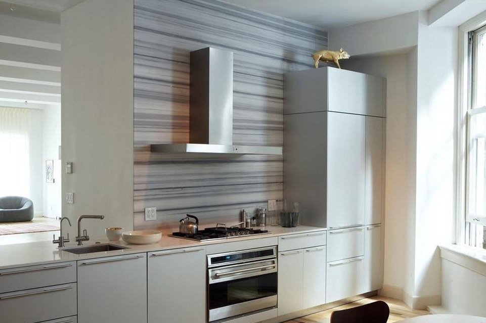
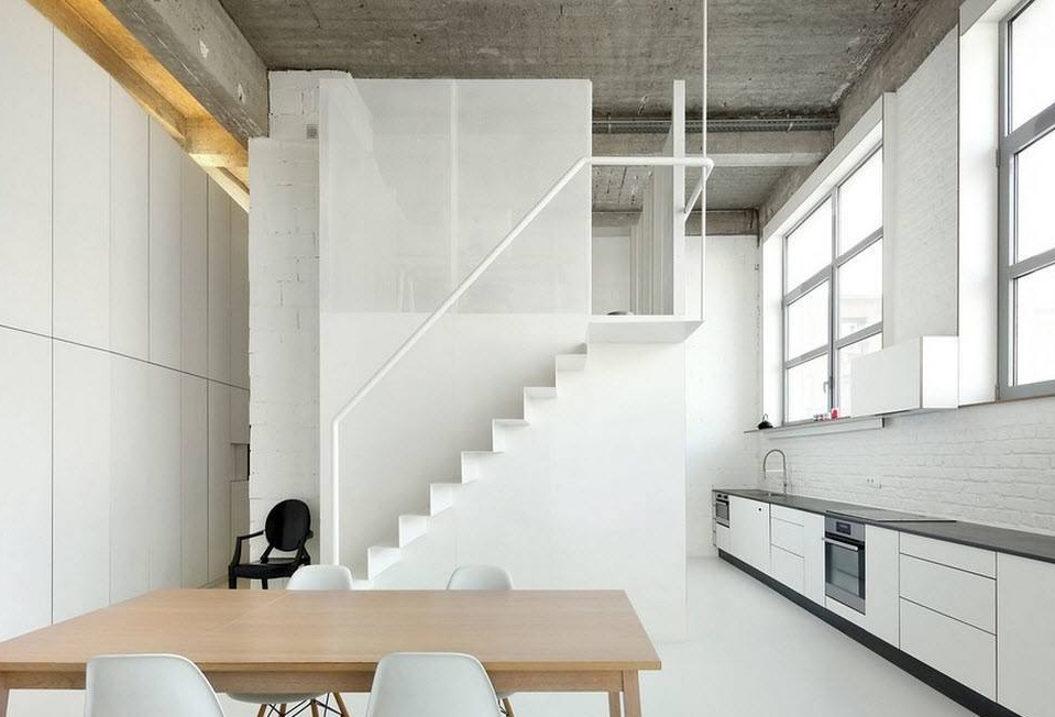
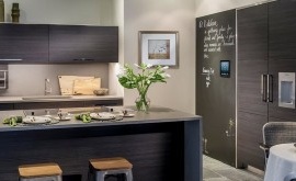
A single-row kitchen set consisting of smooth neutral fronts of cabinets is ideal for a kitchen-dining room in a minimalist style. Strict and laconic execution dilutes only the contrasting color of the countertops and the edging of the entire furniture ensemble. The distance between the main kitchen segments is quite large and the hostess will have to run a lot between the stove, sink and refrigerator. But what can be done in a room with large windows, where hanging the top tier of kitchen cabinets is impossible?
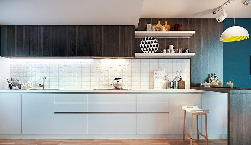
The use of the upper tier of cabinets in a smooth and strict design does not change the minimalist atmosphere of the working area of the kitchen-dining room. In such rooms, only the dining group is able to bring uniqueness or brightness to the room.

