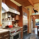
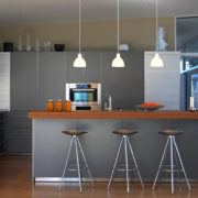
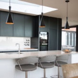
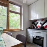
Kitchens from Ikea - design 2018
The company Ikea, engaged in the manufacture of furniture, household and garden products, is popular all over the world due to its high quality products, reasonable cost, wide assortment and environmentally friendly approach to the manufacture of its products. An integrated approach allows Ikea stores, common in most countries, to provide customers with a wide selection of products for any wallet size and taste preferences. In this publication, we will consider the activities of the company in such a popular segment of furniture production as the manufacture of kitchen ensembles for a wide variety of design options for this multifunctional room. The choice of a headset for the kitchen space is as pleasant as the responsible occupation. A wide range of functions and a special microclimate of the kitchen imposes certain criteria on the choice of practical and durable furniture. But it is also important to take into account the aesthetic component, because in many respects the appearance of the kitchen space depends on the style of execution and the color scheme of the facades of the furniture ensemble.
Features of kitchen modules from Ikea
The main feature of manufacturing kitchen solutions for modern customers can be considered the principle of modularity. The company offers a wide range of models of furniture modules with various sizes. Selecting modules for the parameters of your kitchen, its geometric features, you can create a kitchen set without resorting to individual production. If your kitchen has non-standard sizes and shapes, built-in kitchen appliances are not traditional, then you can use the special program (free on the company's website) to calculate the furniture set for your parameters.
The company monitors the environmental friendliness of the entire technological process of furniture production - from the procurement of raw materials to the installation of the smallest fittings. Throughout the process, multi-stage quality control takes place. Thus, the buyer can be sure of the safety of the finished product for humans and the environment.
All products of the furniture sector of the company are produced on the principle of interchangeability. For example, in order to refresh the look of the kitchen or radically change the image of the room, it will be enough to change the facades of kitchen cabinets - their doors. In some cases, it is possible to manage even lower costs, replacing only the fittings of furniture modules. The advantage of this style of manufacturing ready-made solutions is that you can combine modules from various collections, make ensembles with facades of different colors, creating completely unique interiors for a very affordable price.
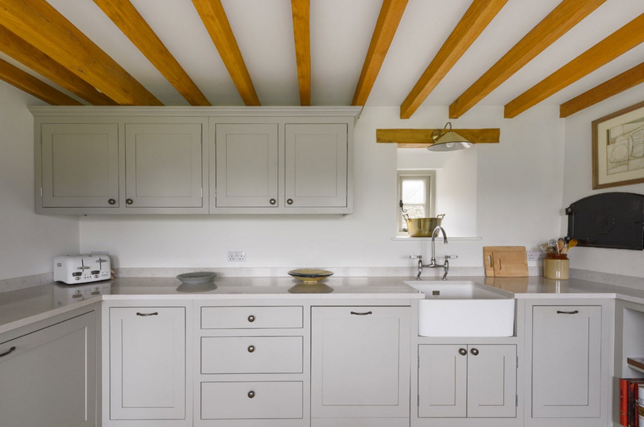
Most models of kitchen facades are presented in a traditional or modern style with a neutral color scheme, which allows them to easily integrate into almost any design concept. Each buyer will be able to find his own version of the style, color and texture of the furniture solution among a wide range of options.
The company is constantly expanding its range, looking for innovative ideas that would help to improve the quality of finished products, their life and technological characteristics. Ready-made kitchen solutions from the Ikea company are suitable for both spacious rooms of private apartments, and for small-sized kitchen spaces of standard apartments. Various ways to save space without losing the functionality and spaciousness of storage systems are constantly being introduced into new collections of the company.
Options for planning furniture solutions for the kitchen
Corner layout
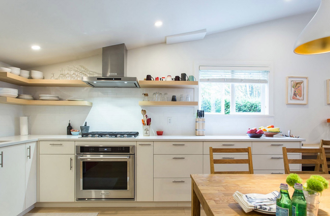
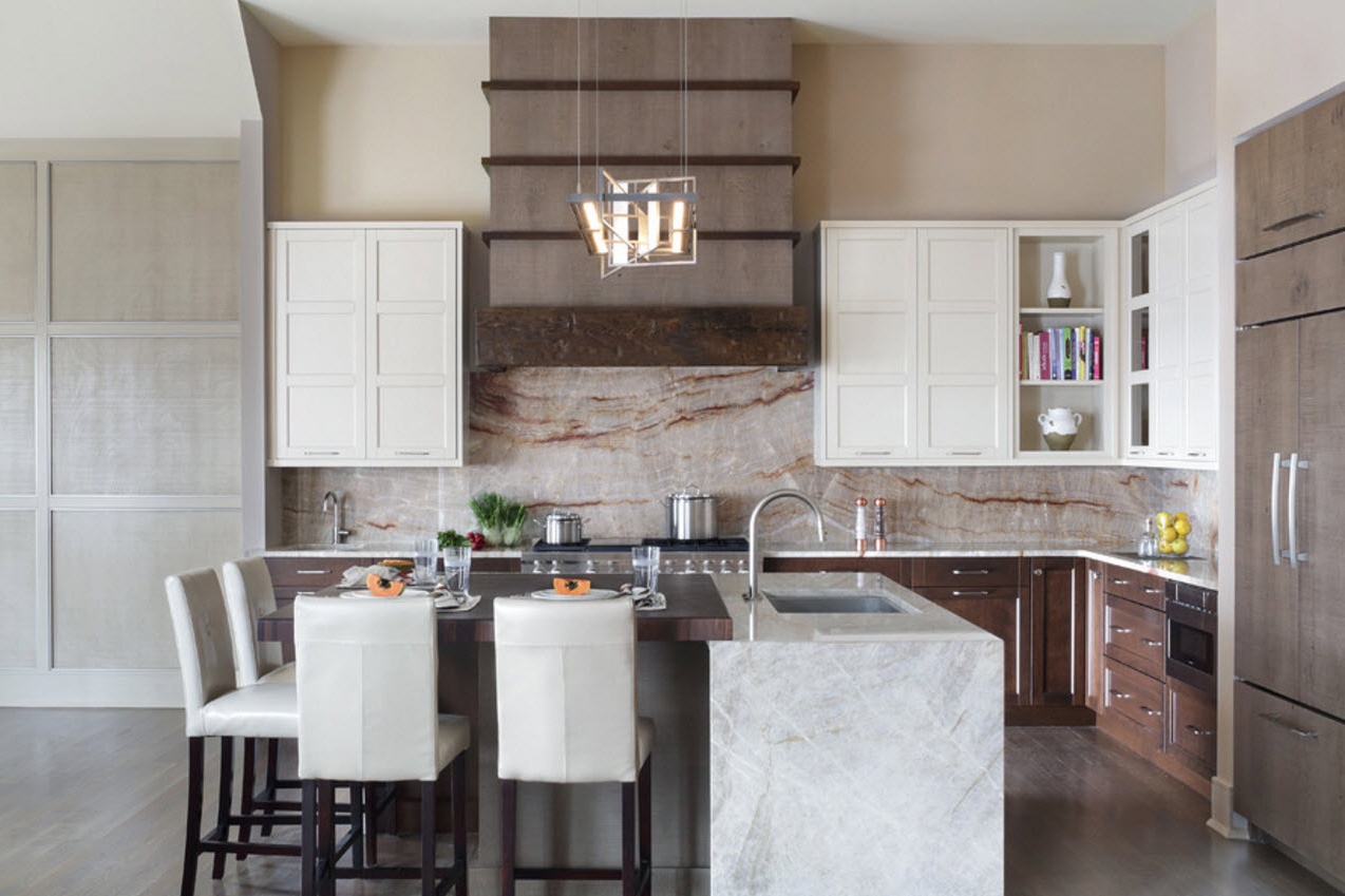
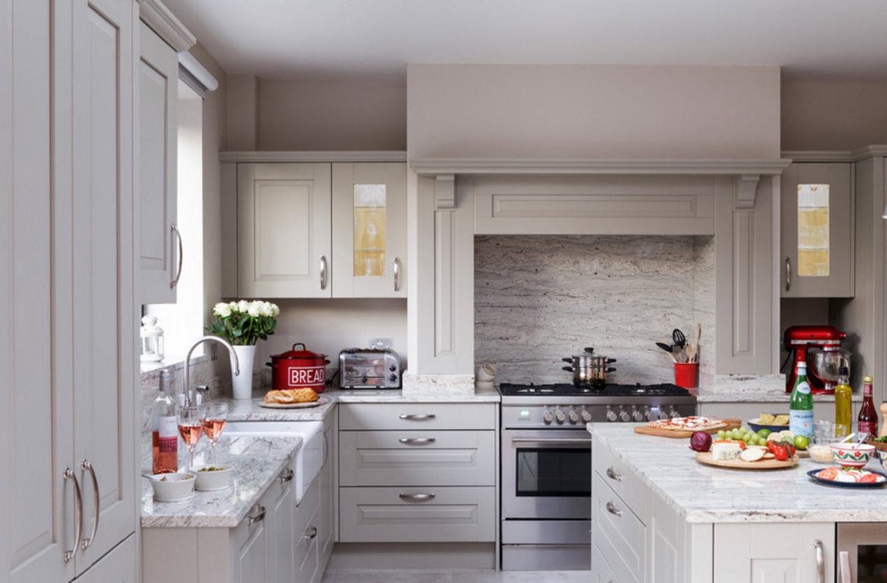
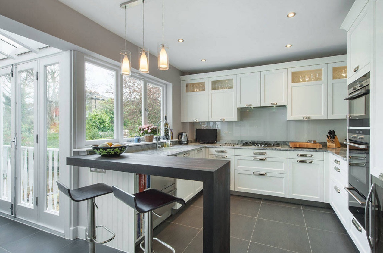
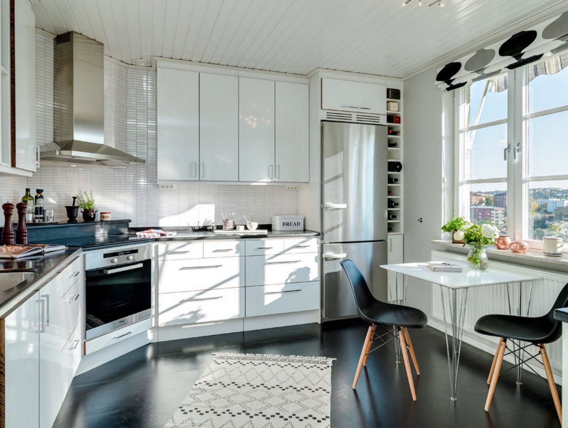
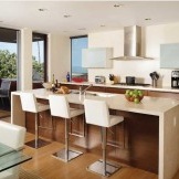
One of the most versatile variations of the layout of the kitchen ensemble.L-shaped layout allows you to arrange a sufficient number of storage systems with integrated household appliances in rooms of various shapes and sizes. In this case, as a rule, there is enough free space for the installation of a dining group, island or peninsula, which can be used as a place for meals. In short, the angular layout allows you to create a full-fledged working and dining area, without prejudice to the capacity of storage systems or the size of household appliances.
In the corner layout, it is easy to melt the “working triangle” by placing the stove or hob on one side of the headset, and the sink on the perpendicular. The refrigerator can be installed separately or integrated in a row with the sink. L-shaped layout has a few drawbacks. It is difficult to use only in walk-through rooms or kitchens with a balcony block or access to the backyard.
with a lunch group:
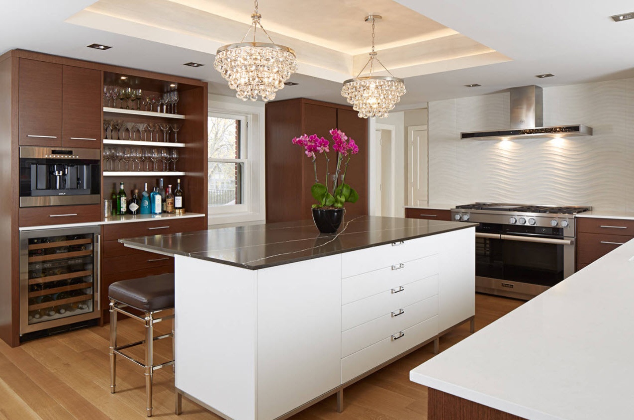
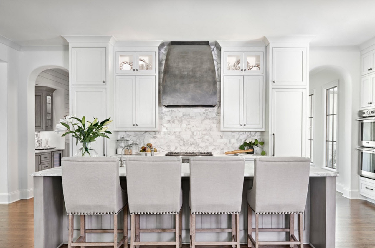
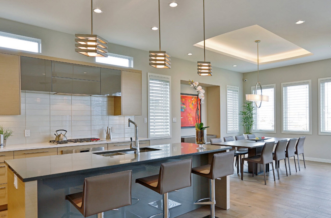
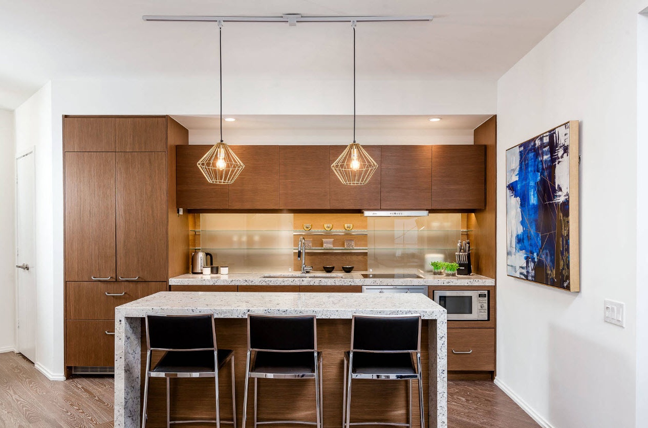
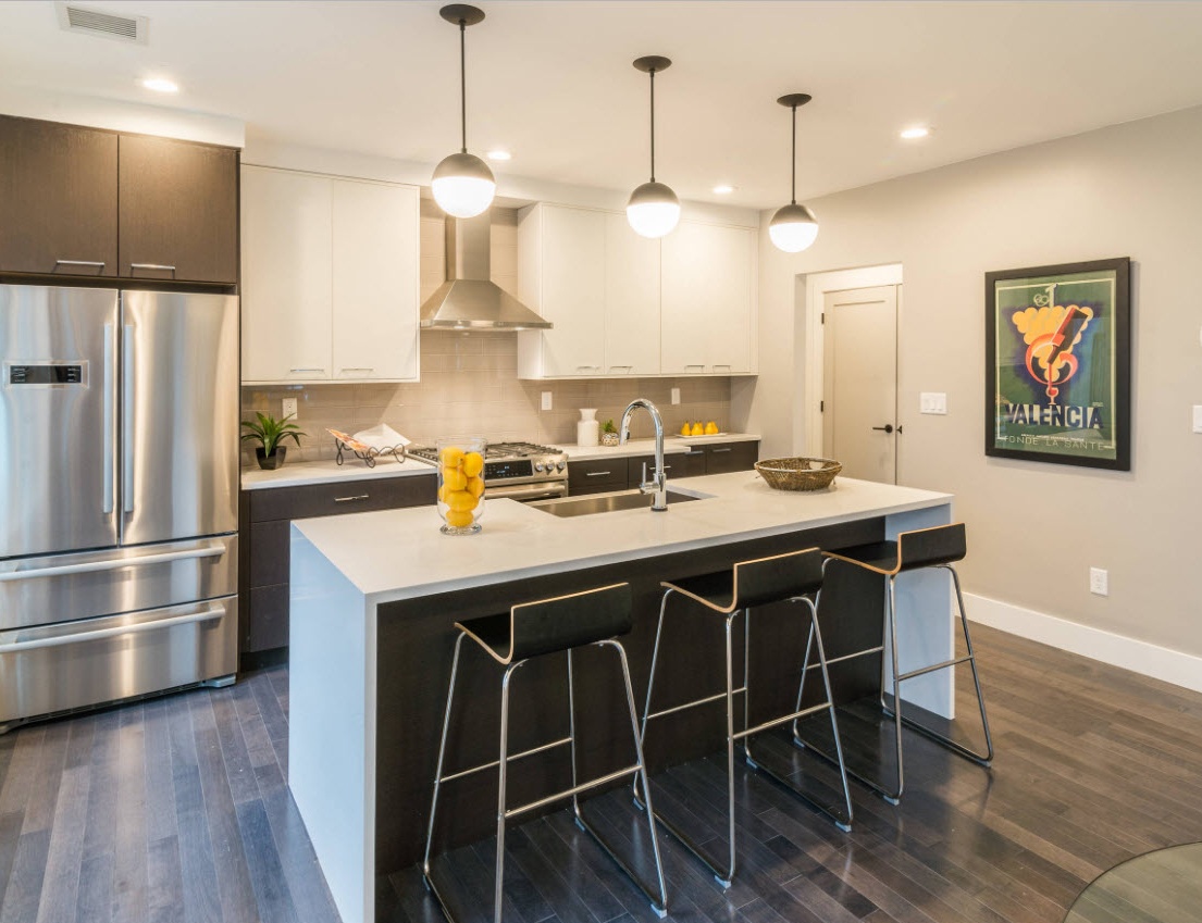
with kitchen island:
with peninsula:
Linear layout
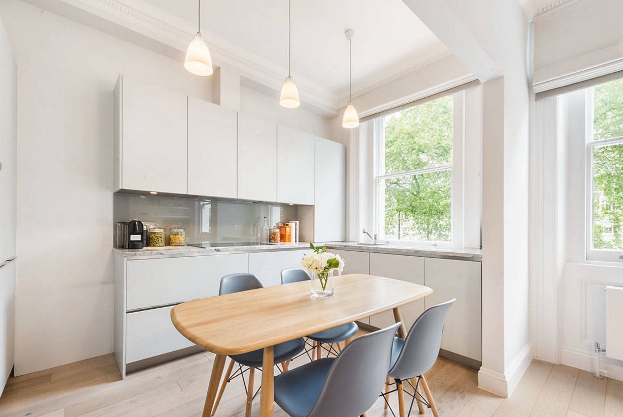
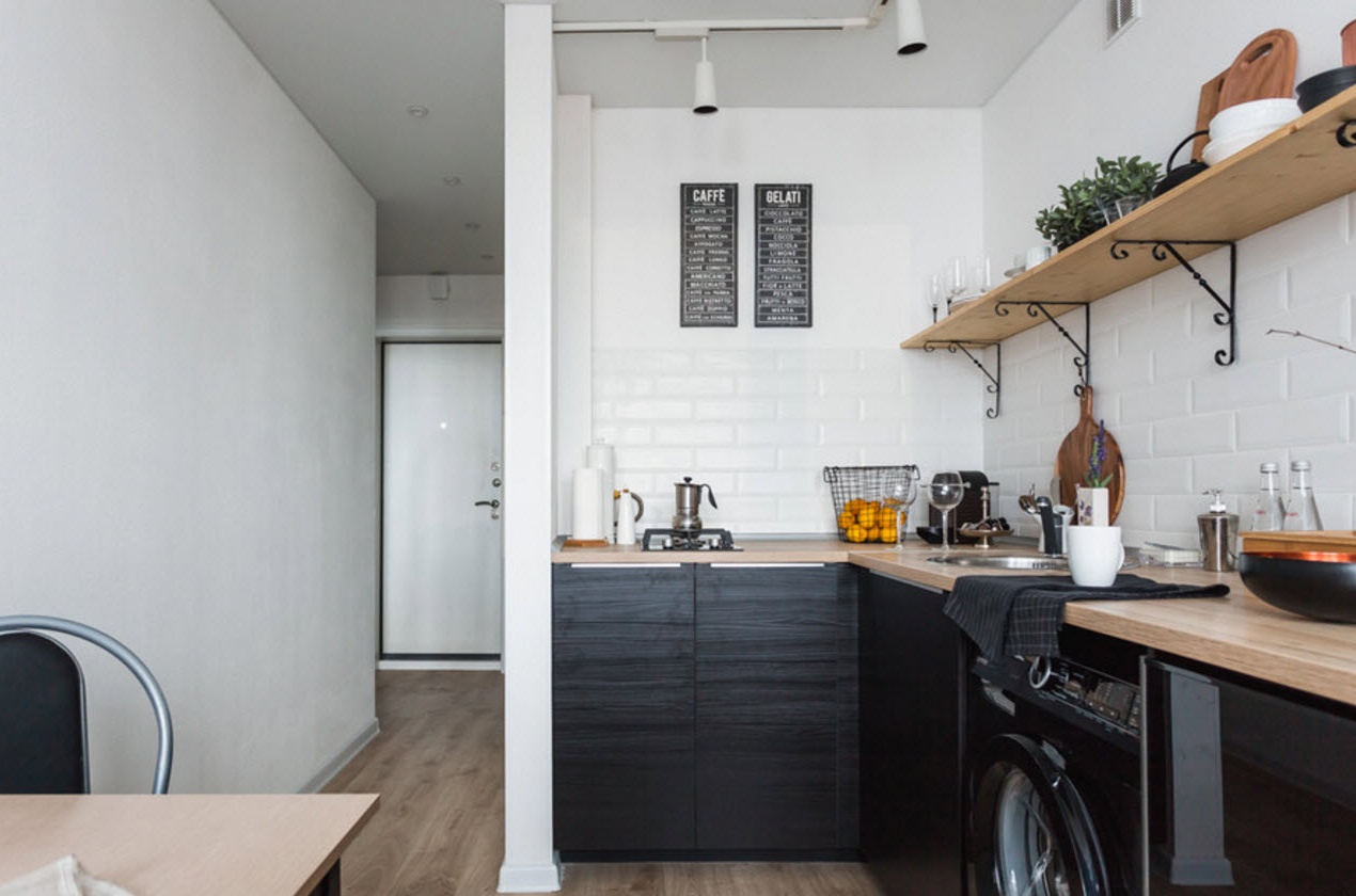
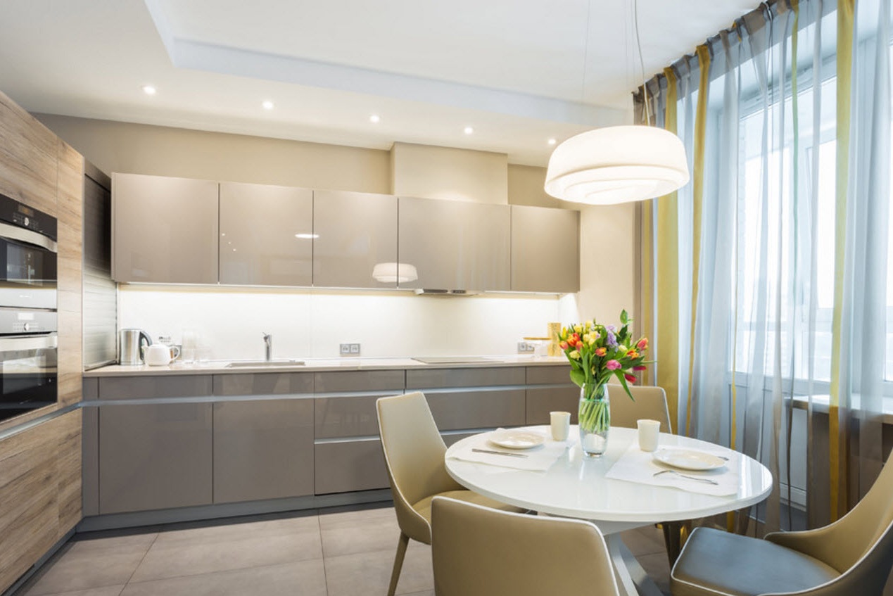
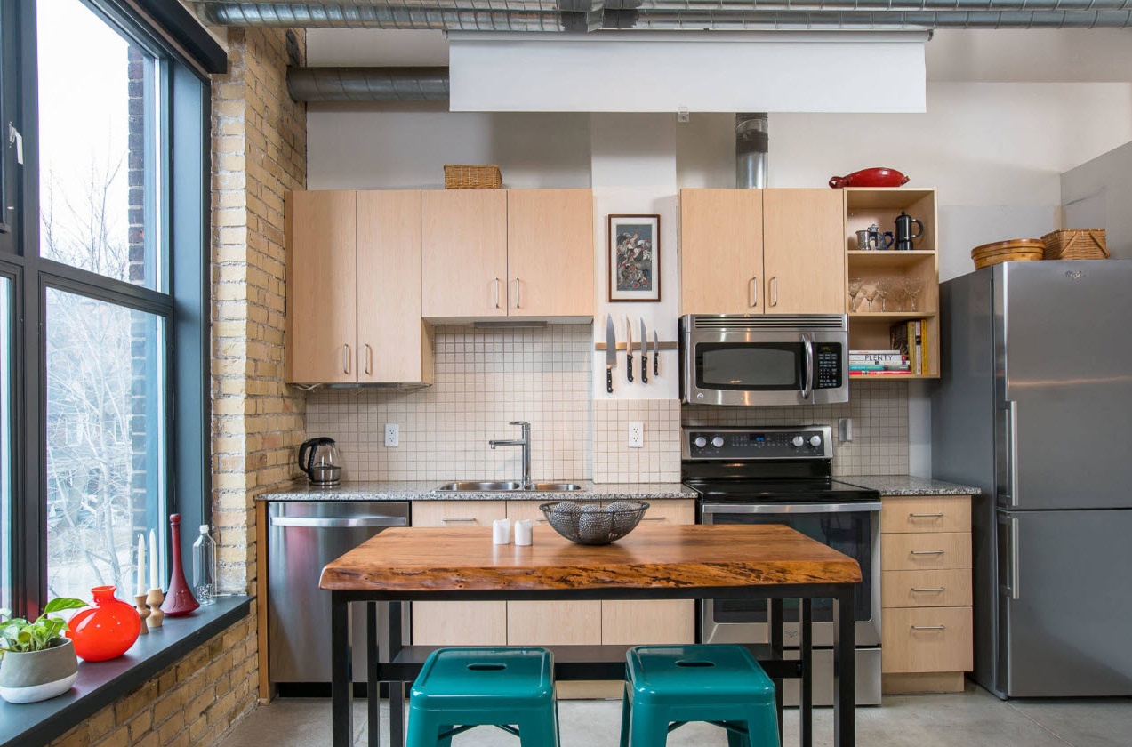
The layout of the kitchen ensemble in one row is convenient for small kitchen spaces or families who do not need to install a large number of storage systems and integrate several household appliances into the furniture set. Also, planning in one row can be an effective solution for families who need to establish a spacious dining group in a small kitchen space.
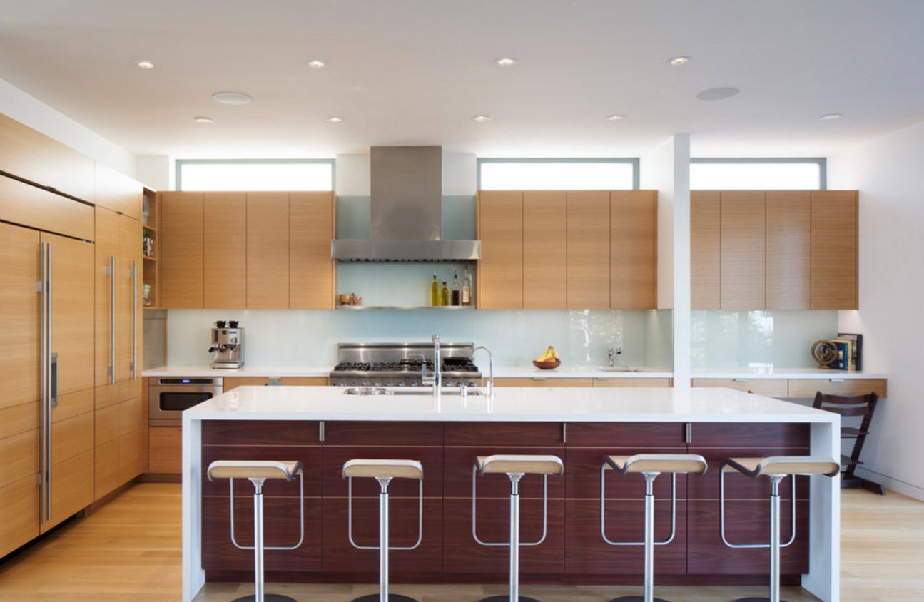
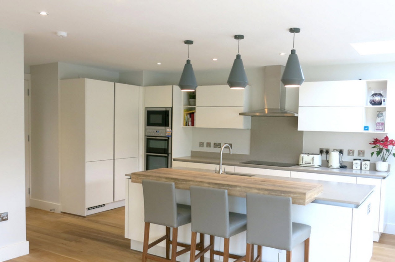
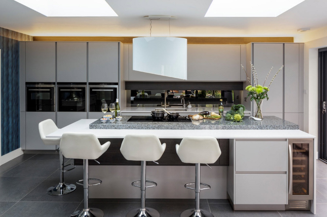
with kitchen island:
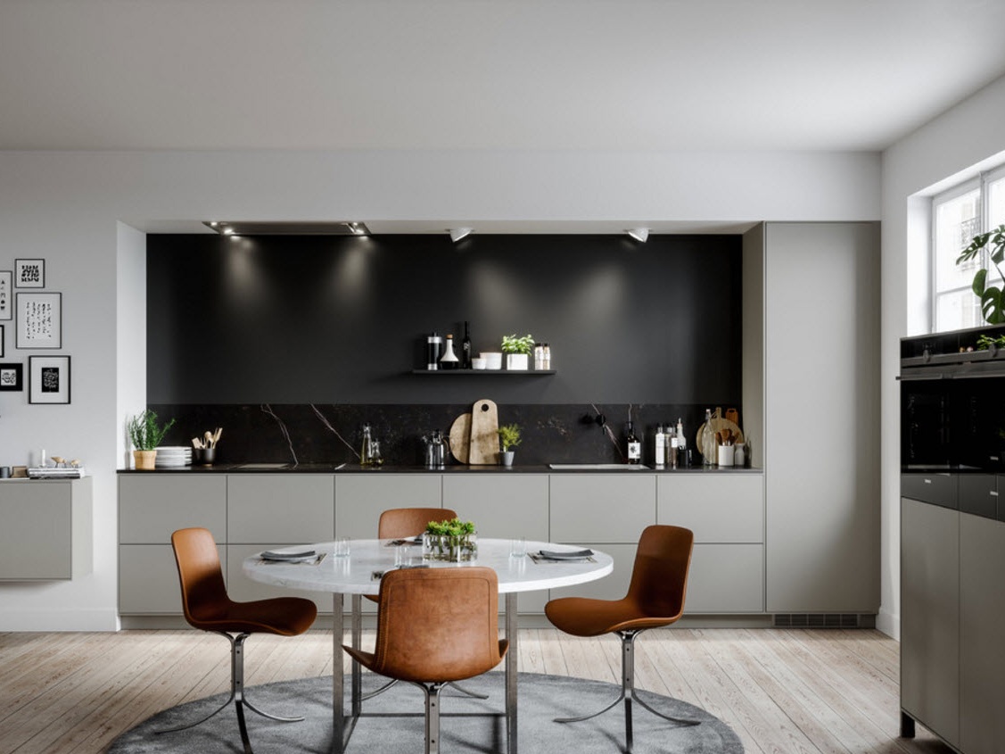
with dining table:
U-shaped arrangement of furniture ensemble
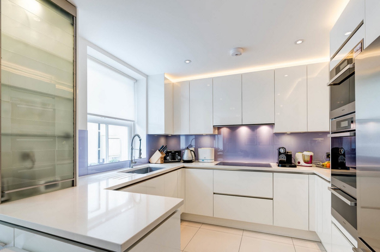
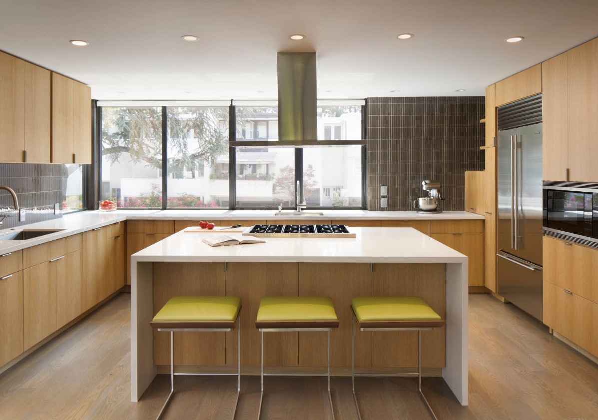
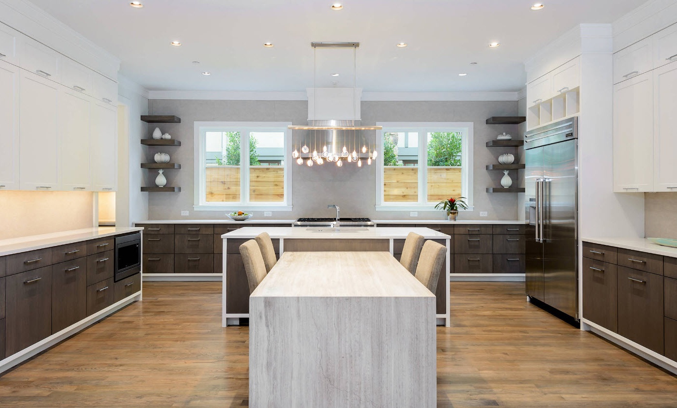
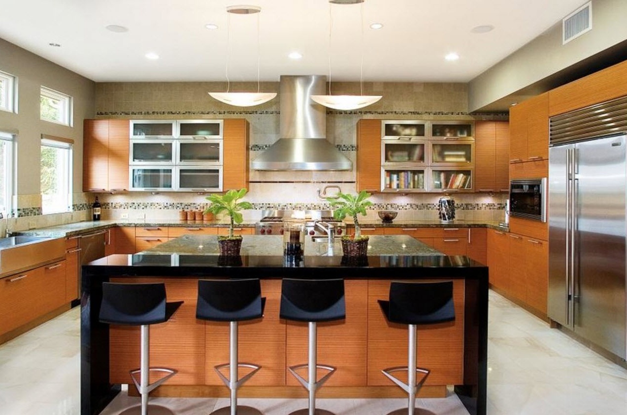
The layout of the kitchen in the form of the letter “P” is advisable if you need to arrange a large number of storage systems with integrated household appliances. At the same time, the upper tier of kitchen cabinets can be partially or completely replaced with open shelves (it all depends on the size of the room and your personal preferences). In the large kitchen, the shape of which is close to the square, there will be enough free space for installing a dining group or kitchen island in the center of the room. If the kitchen space is very elongated, or has a small area, then the dining segment will have to be transferred to the living room or to equip a separate room.
with kitchen island:
Parallel layout
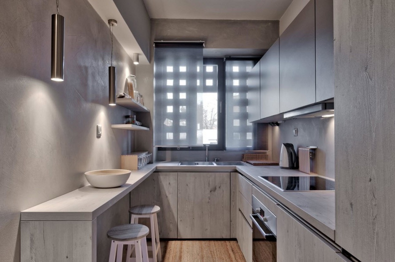
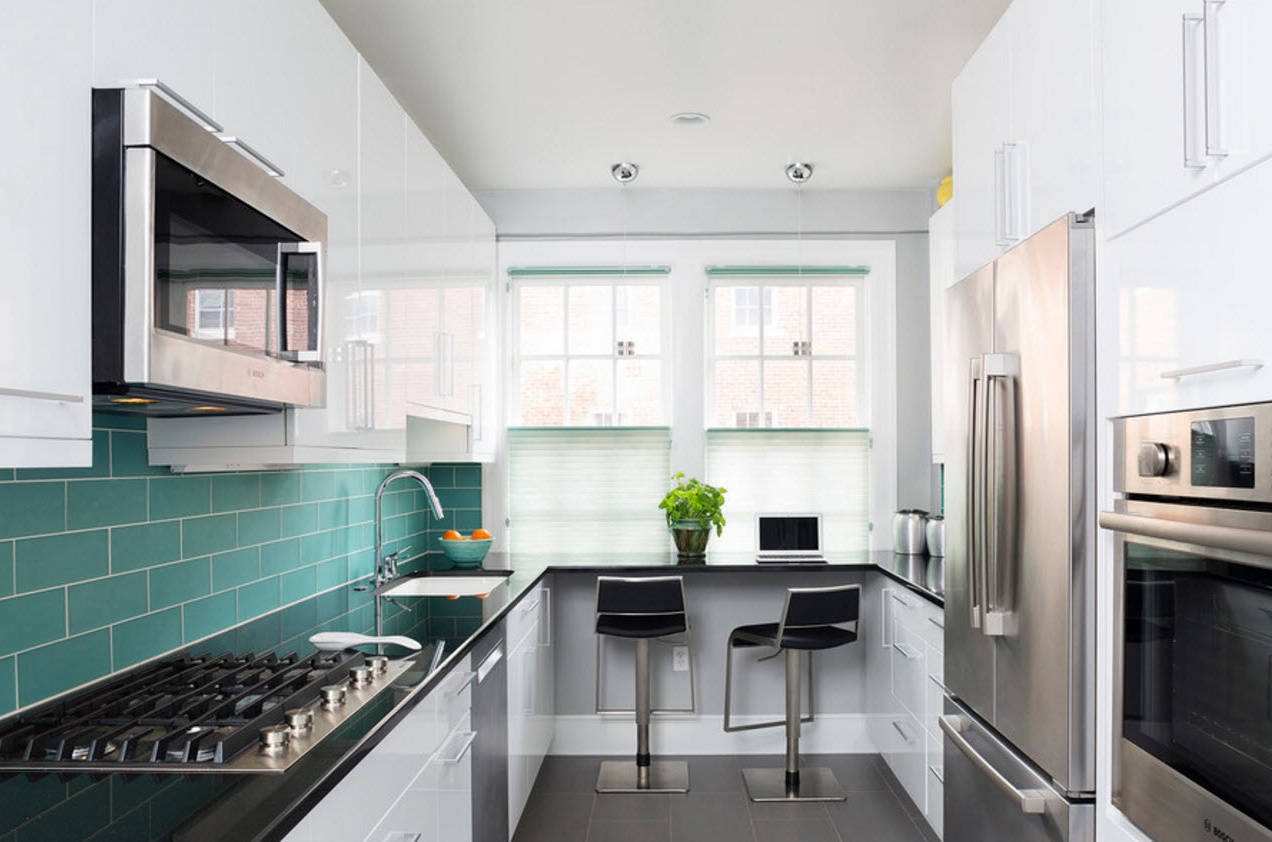
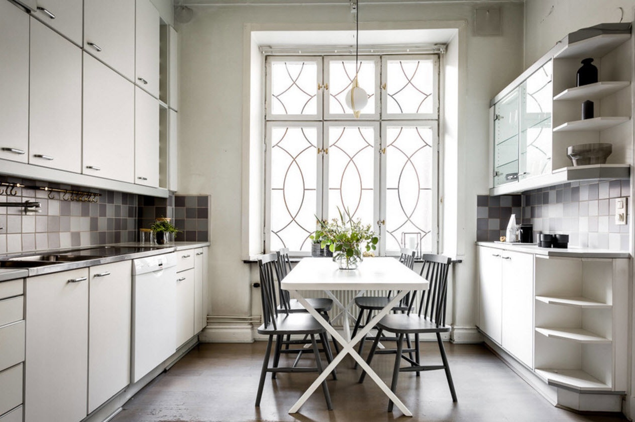
With a parallel layout, the kitchen modules are arranged in two rows opposite each other. This method of organizing the working area is advisable in kitchens that are walk-through rooms or have a large panoramic window, a balcony block or a door (access to the backyard in a private house). If the room is very elongated, then for the installation of a dining group or kitchen island, most likely there will be no free space. If the shape of the room is square or close to this, then a small (preferably round or oval) dining table can be installed without consequences for the ergonomic flow of all work processes. With a parallel layout, it is easy to use the “working triangle” rule, placing its two imaginary vertices “conflicting” with each other, the sink and the plate, on opposite sides.
Kitchen facades - color scheme and style of execution
The current color palette of facades
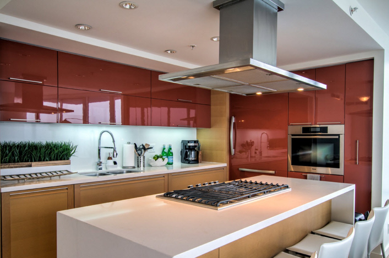
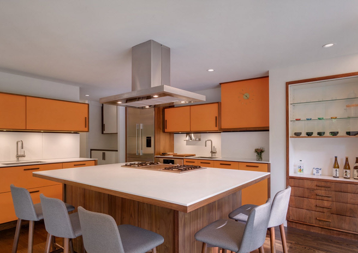
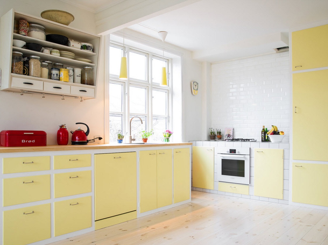
Ikea mainly uses neutral color solutions for the execution of kitchen facades. Such models can organically fit into almost any design of the kitchen space. It is easy to combine light, pastel colors with deep dark shades to emphasize geometry, highlight especially significant interior elements, and create accents. Neutral color solutions will organically look on almost any decoration background, harmoniously combine with any version of the worktops, the design of the kitchen apron.
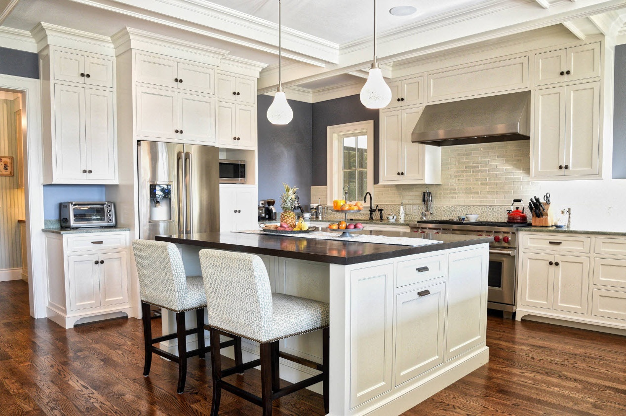
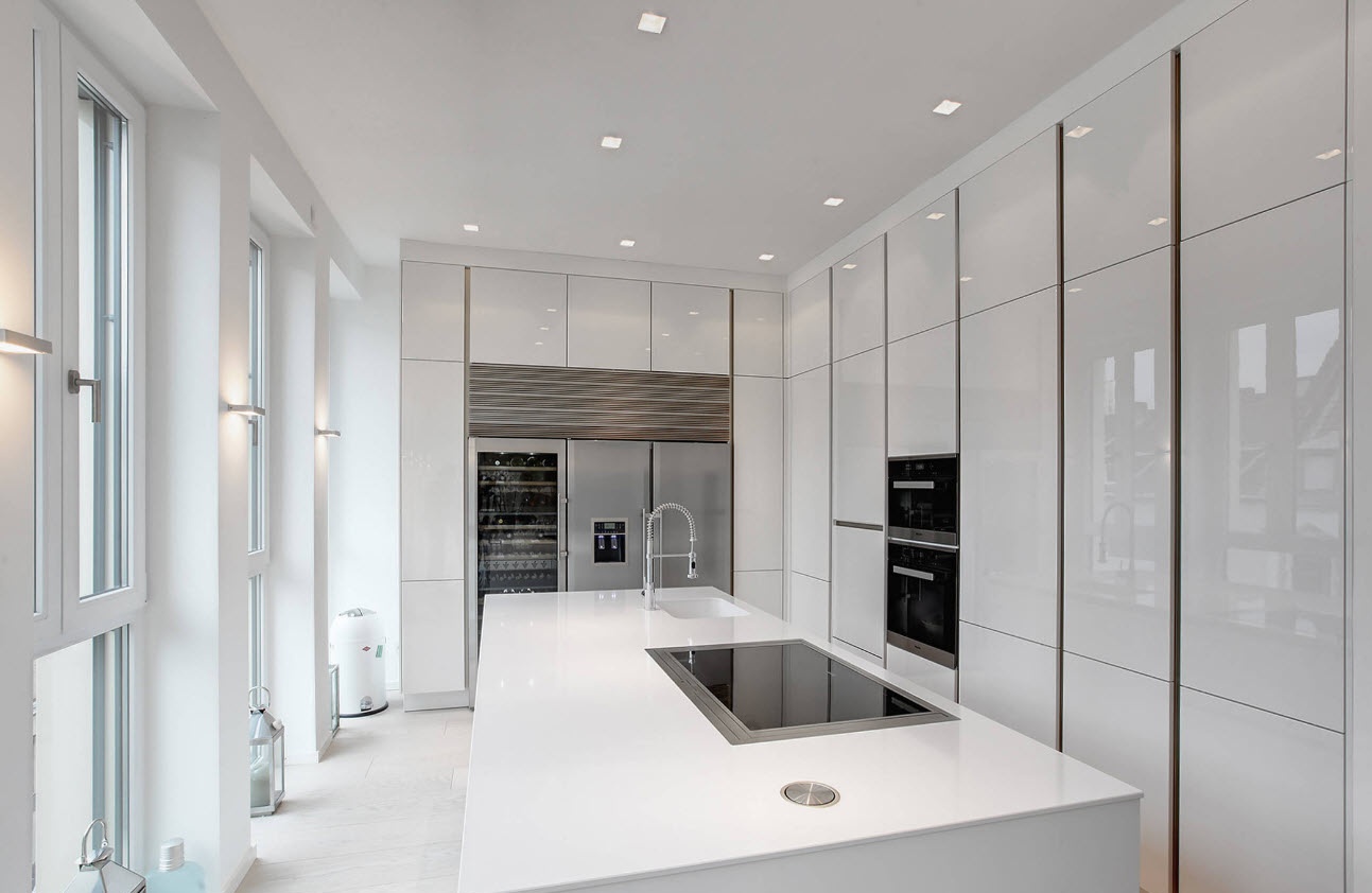
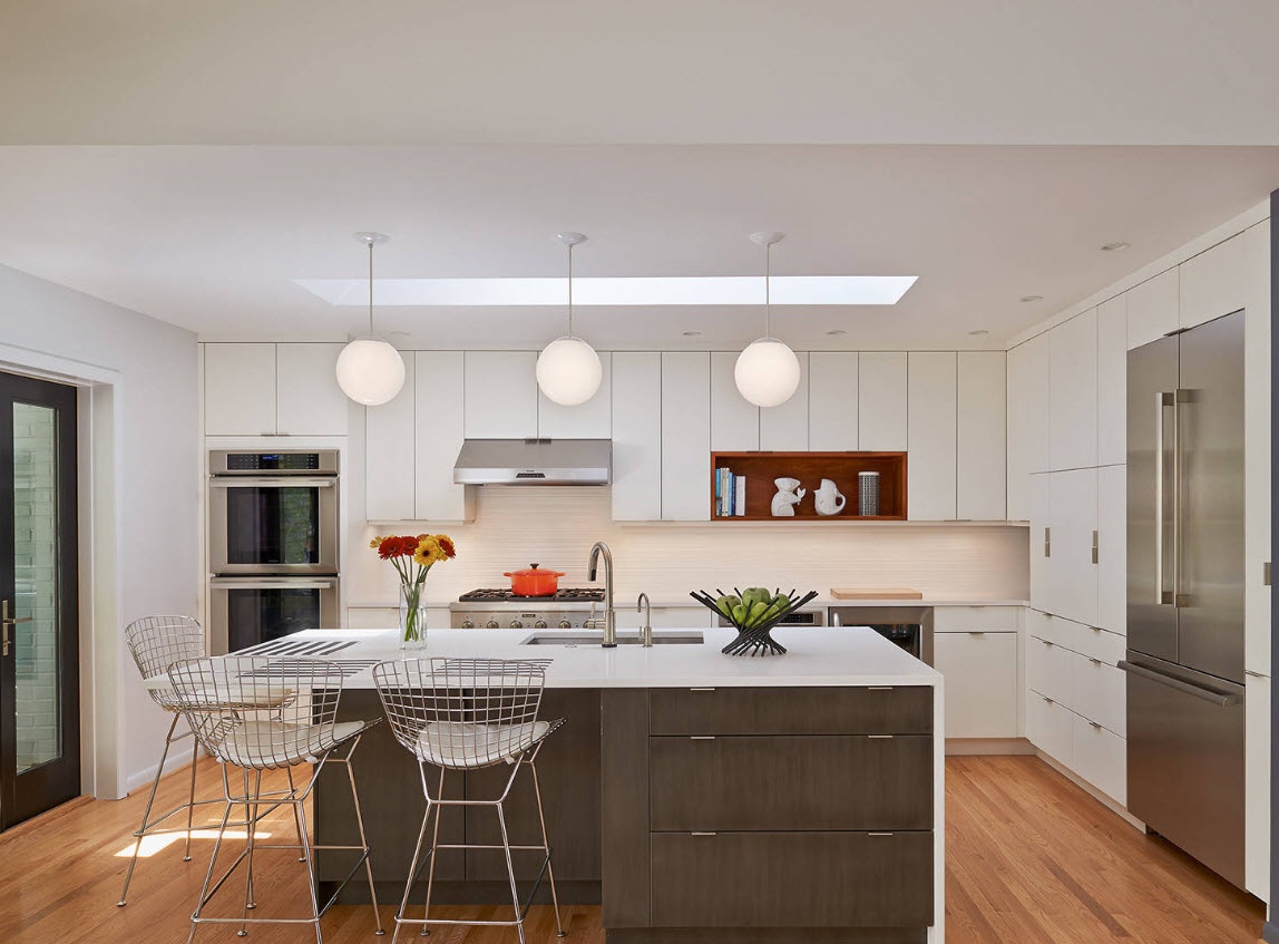
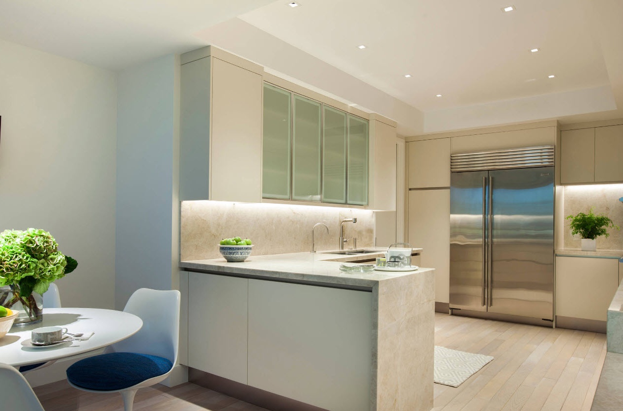
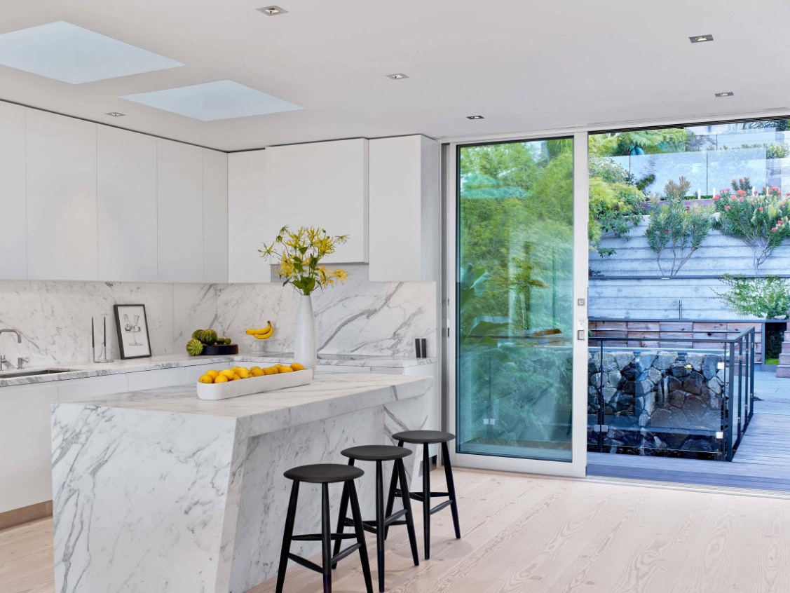
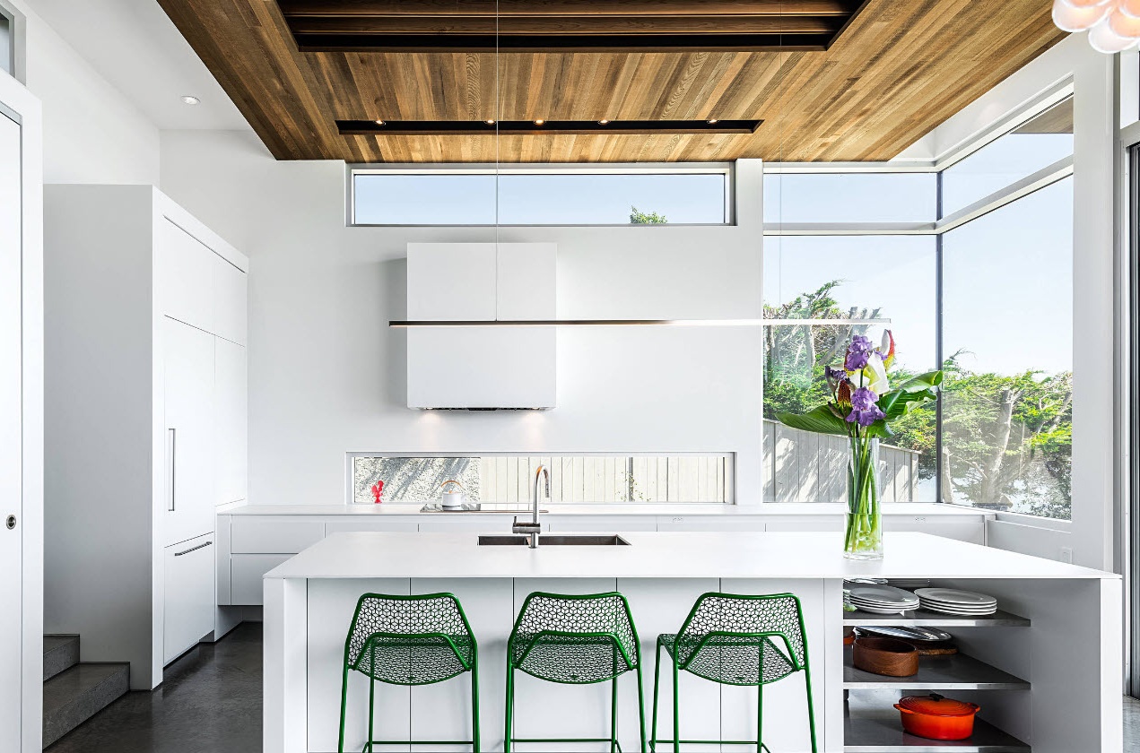
Snow-white cuisine is a “classic of the genre” for any furniture manufacturer around the world. White facades are popular at all times, in any performance.Matte modern or traditional, glossy with fittings or smooth - the snow-white doors of the kitchen set always create a clean, light and even festive image of the whole room. Among other things, a bright kitchen ensemble harmoniously fits into a room of any shape and size, visually creating an extension of the space.
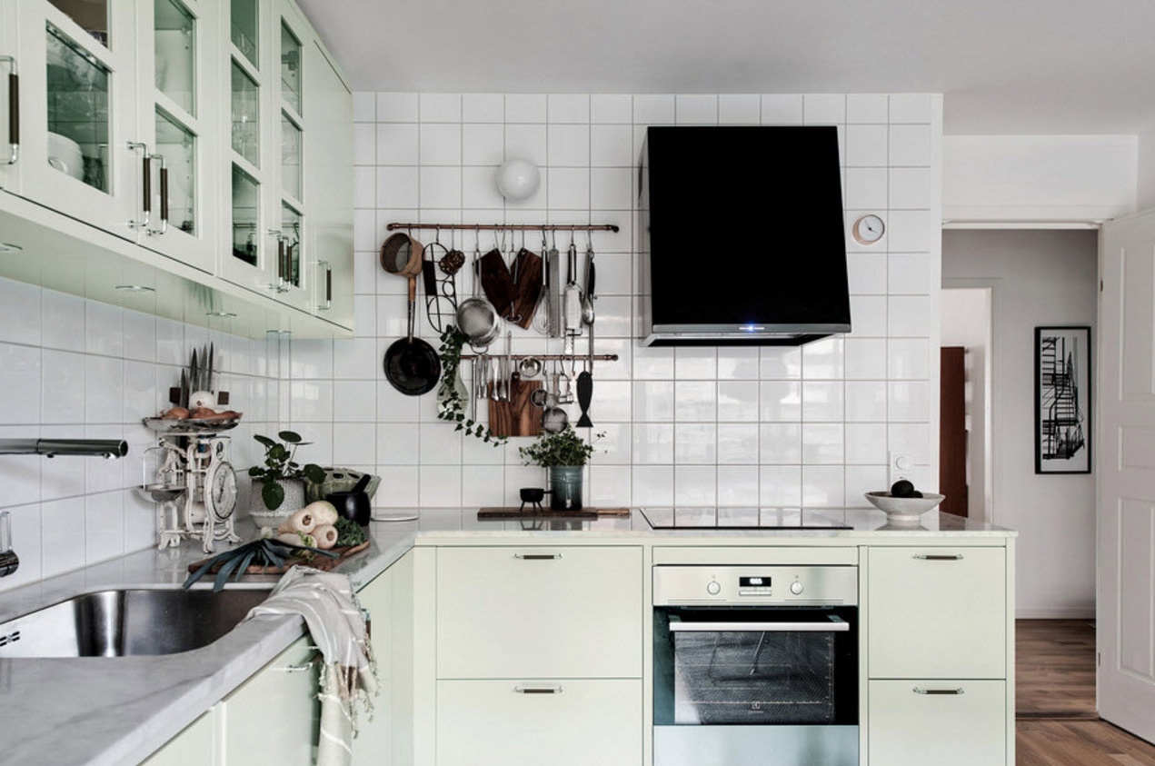
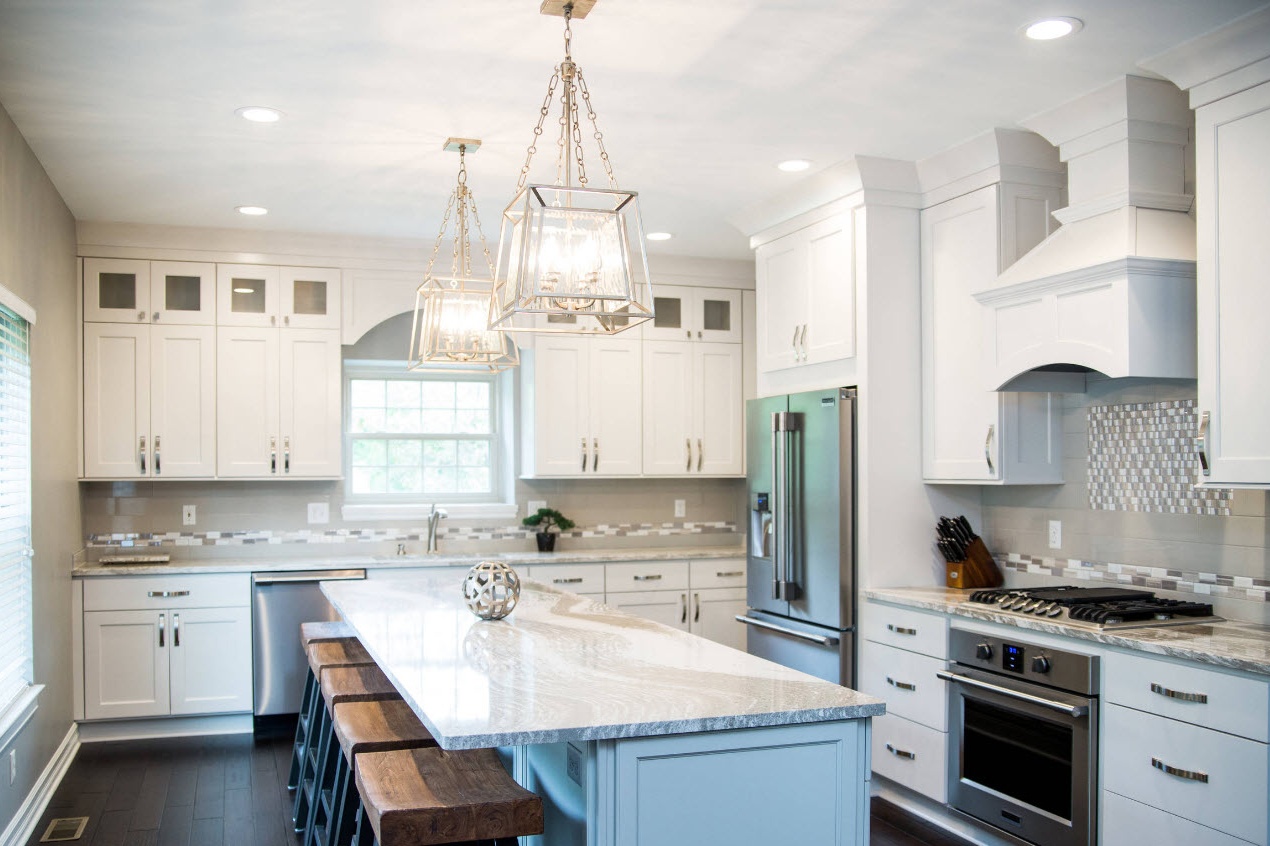
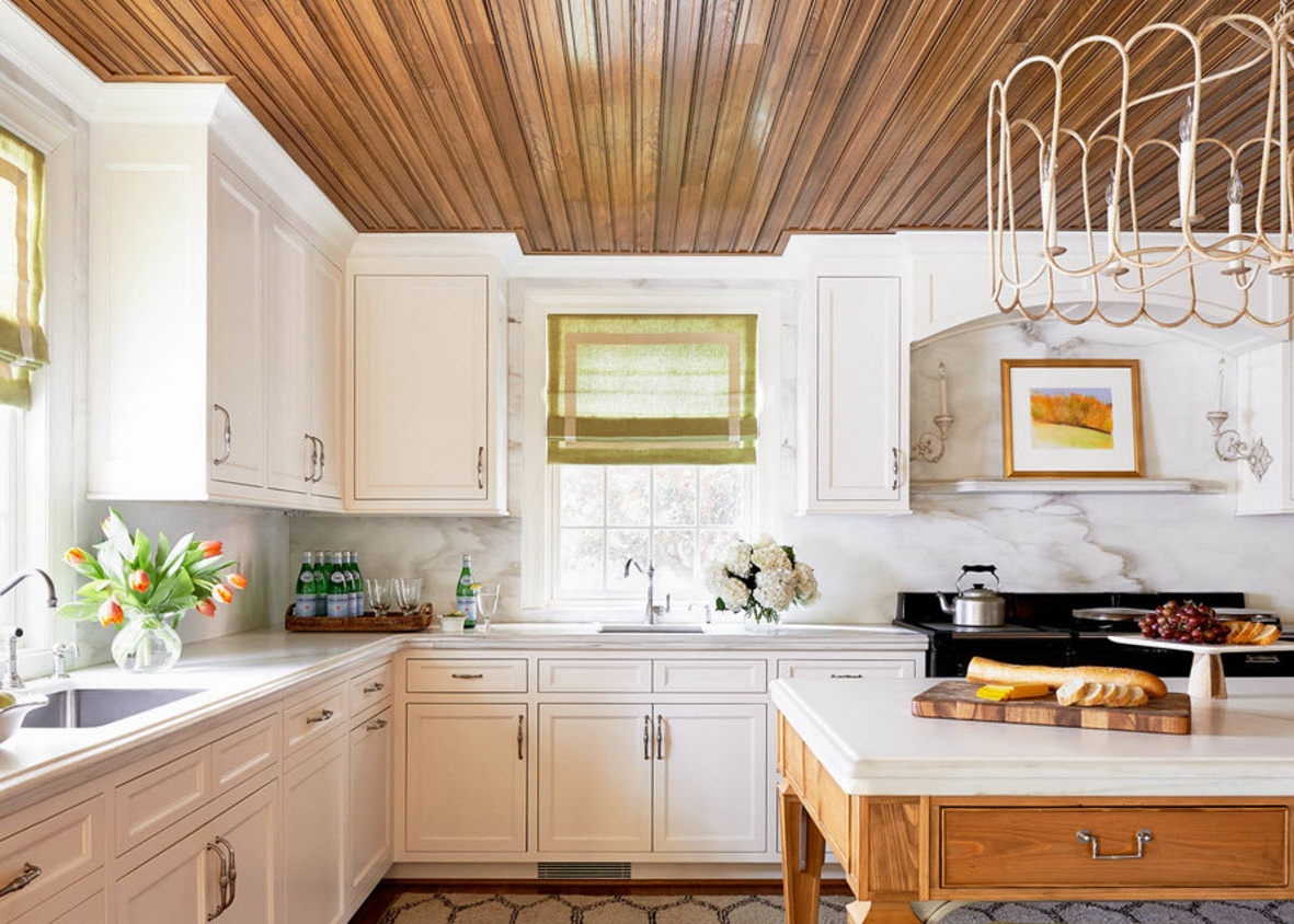
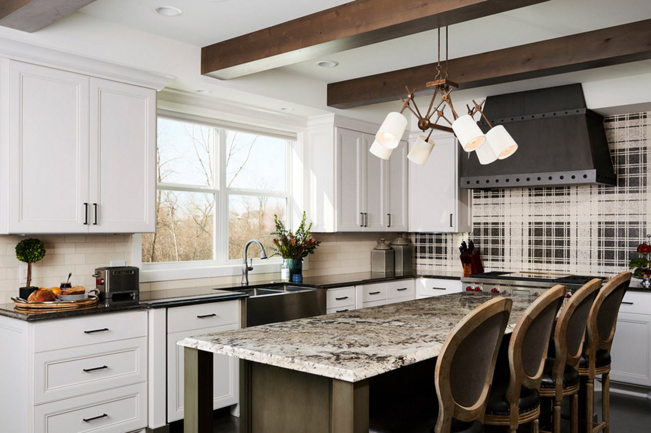
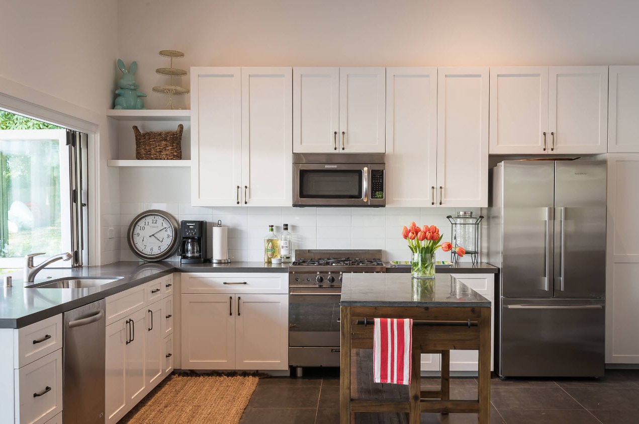
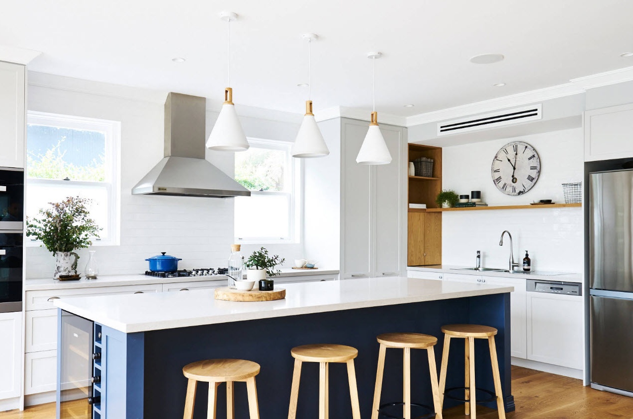
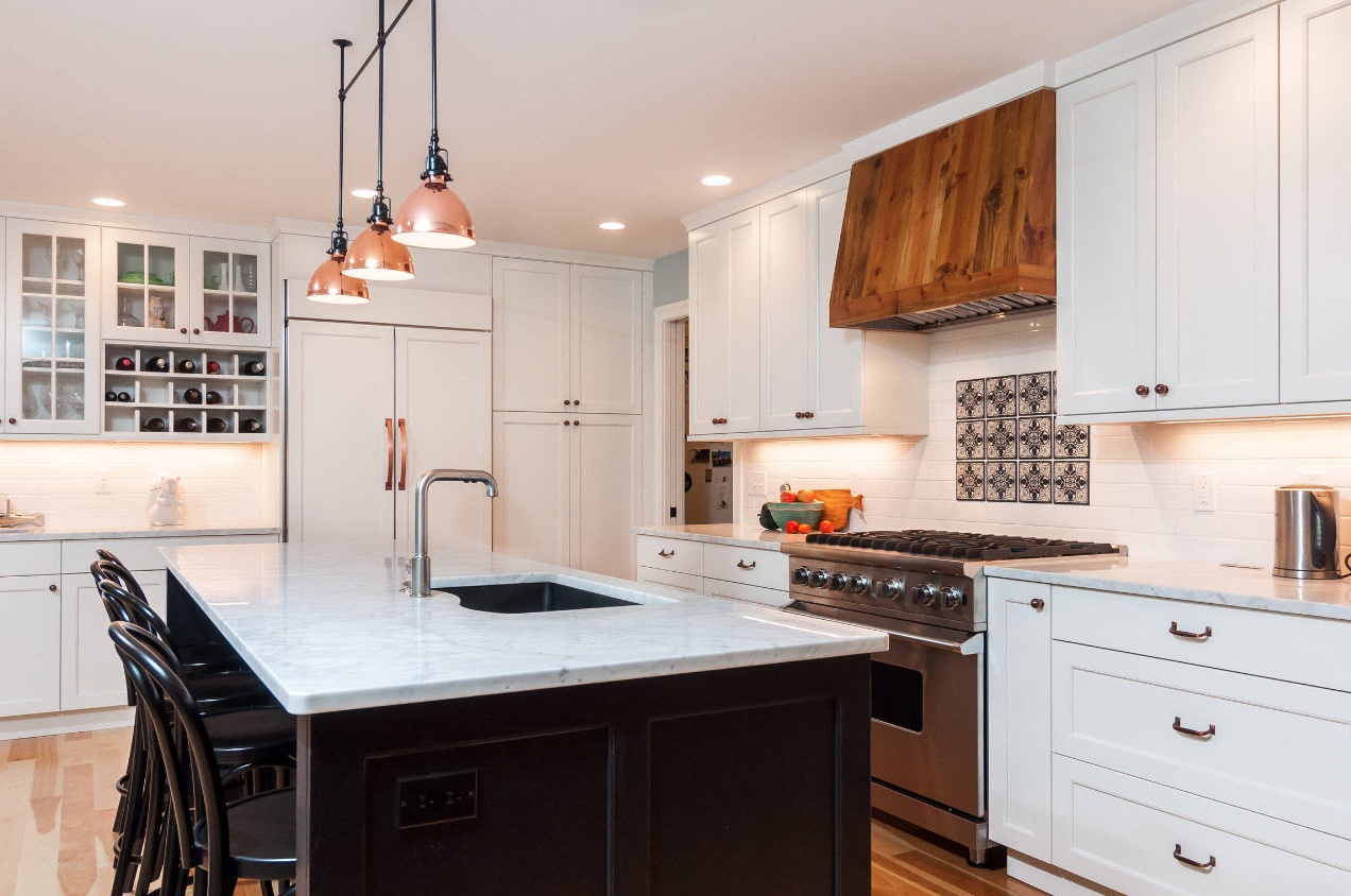
Snow-white facades with fittings are one of the most popular options for the execution of furniture modules in the Ikea company. It is no accident that buyers around the world choose this way of creating a bright and clean image of their kitchen facilities. Snow-white facades are shaded by the brilliance of stainless steel household appliances, accentuated by contrasting dark or bright interior elements, “warmed up” by the integration of wooden surfaces (tabletops, decor elements, dining group).
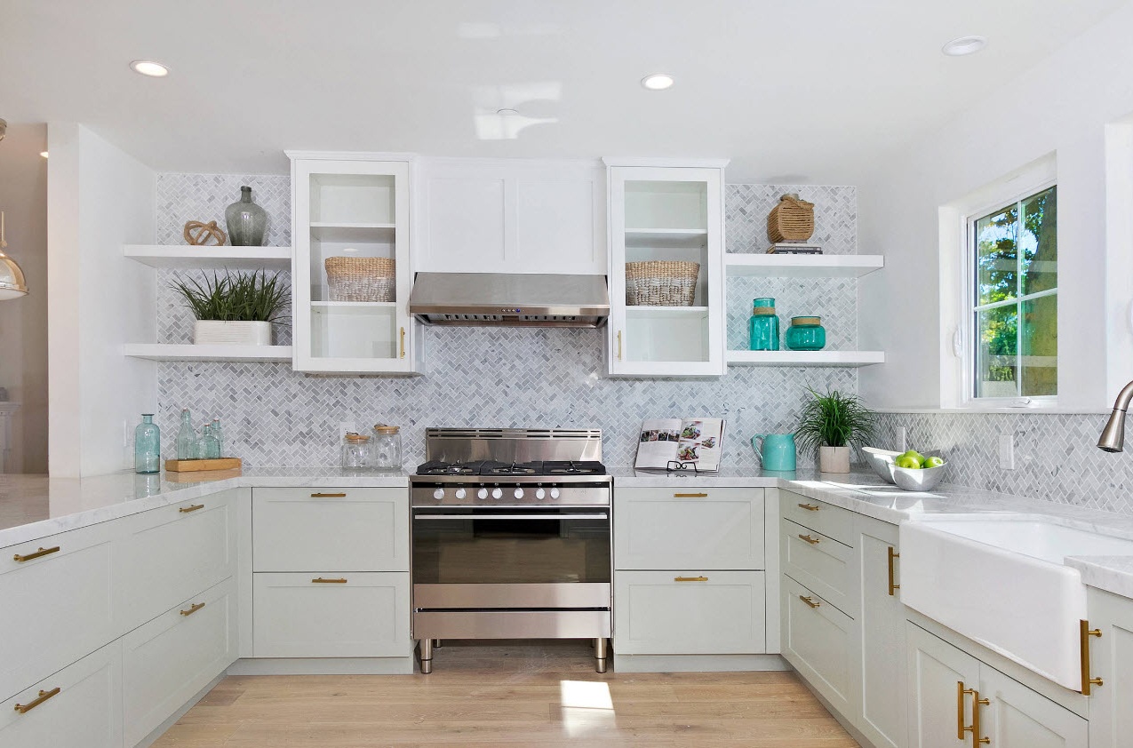
The advantage of light facades is not only that they are easy to combine with any color design of the room decoration, but the kitchen set itself can be changed without much financial loss. For example, bored steel handles on doors can be replaced with contrasting dark, golden or copper products, transforming the entire kitchen interior. The image will be more harmonious if the kitchen accessories (mixers, hooks and towel holders) are made of the same material as the furniture fittings.
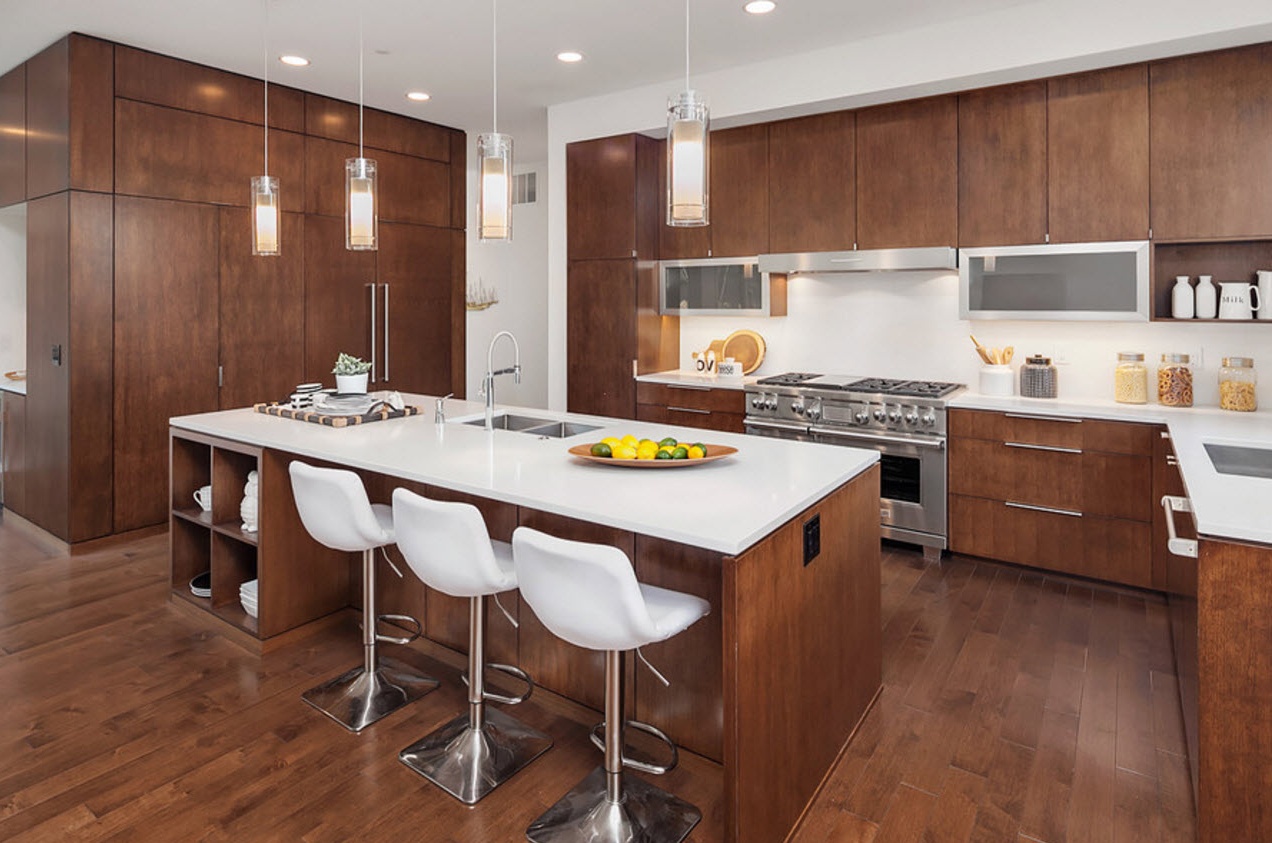
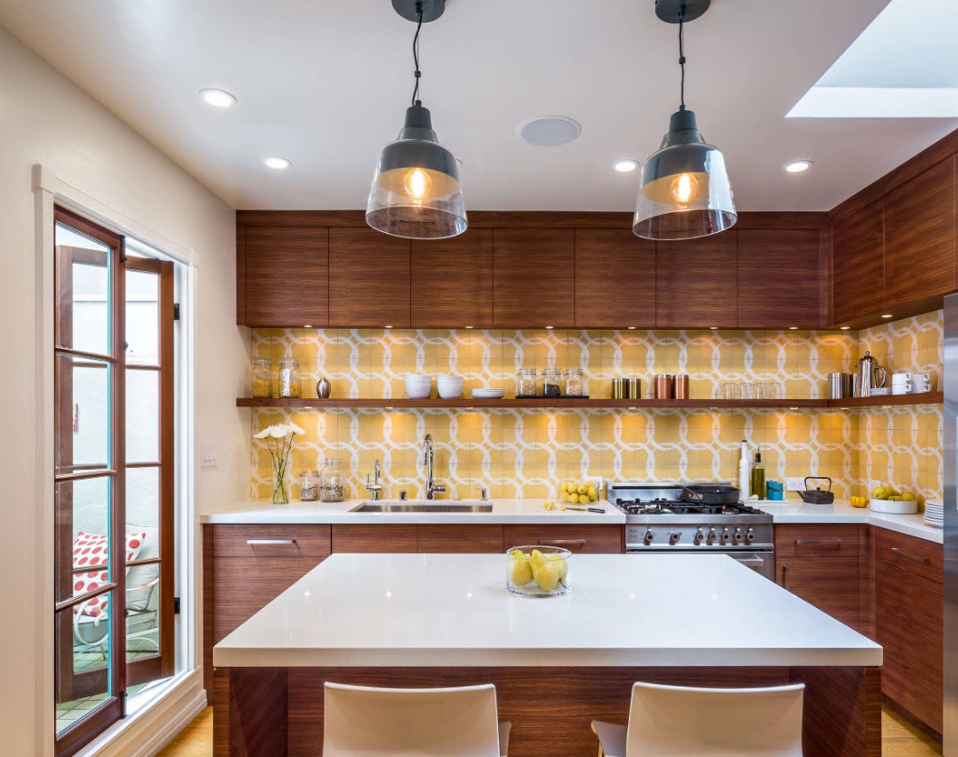
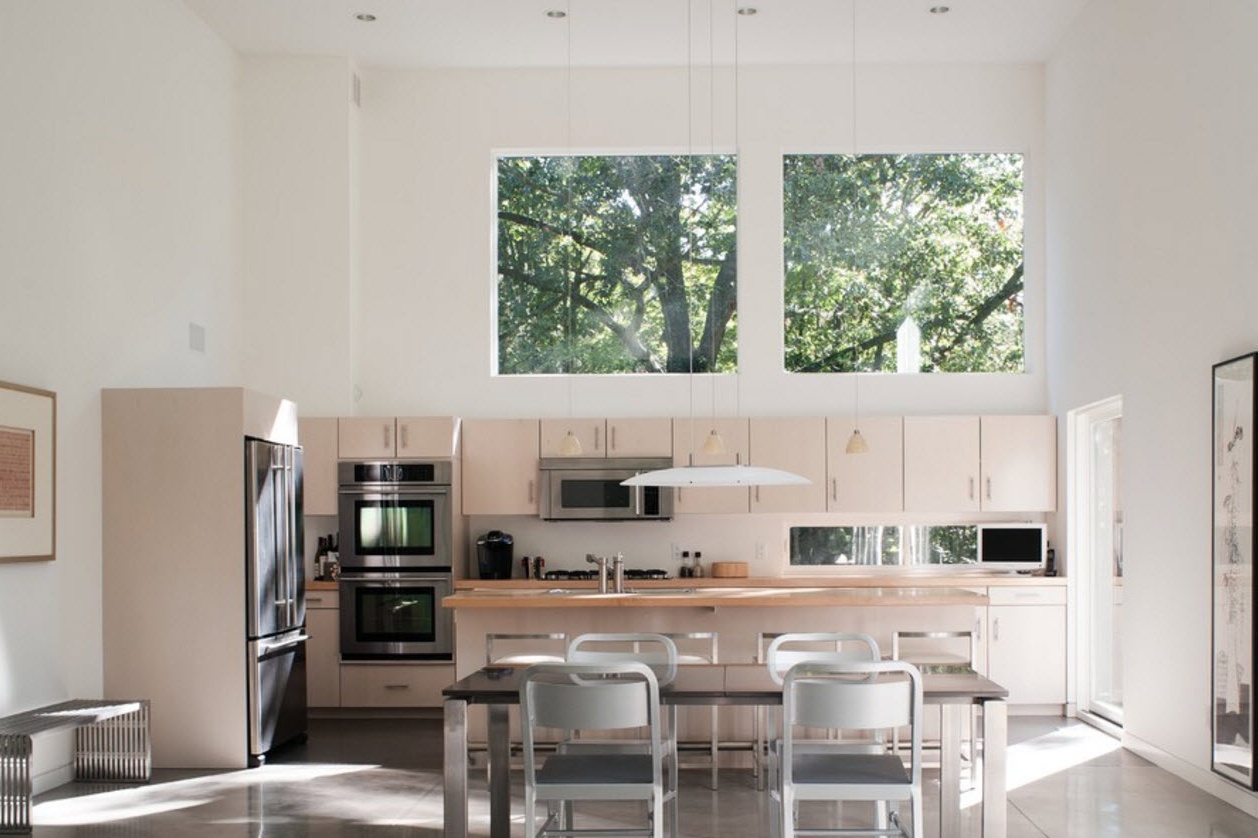
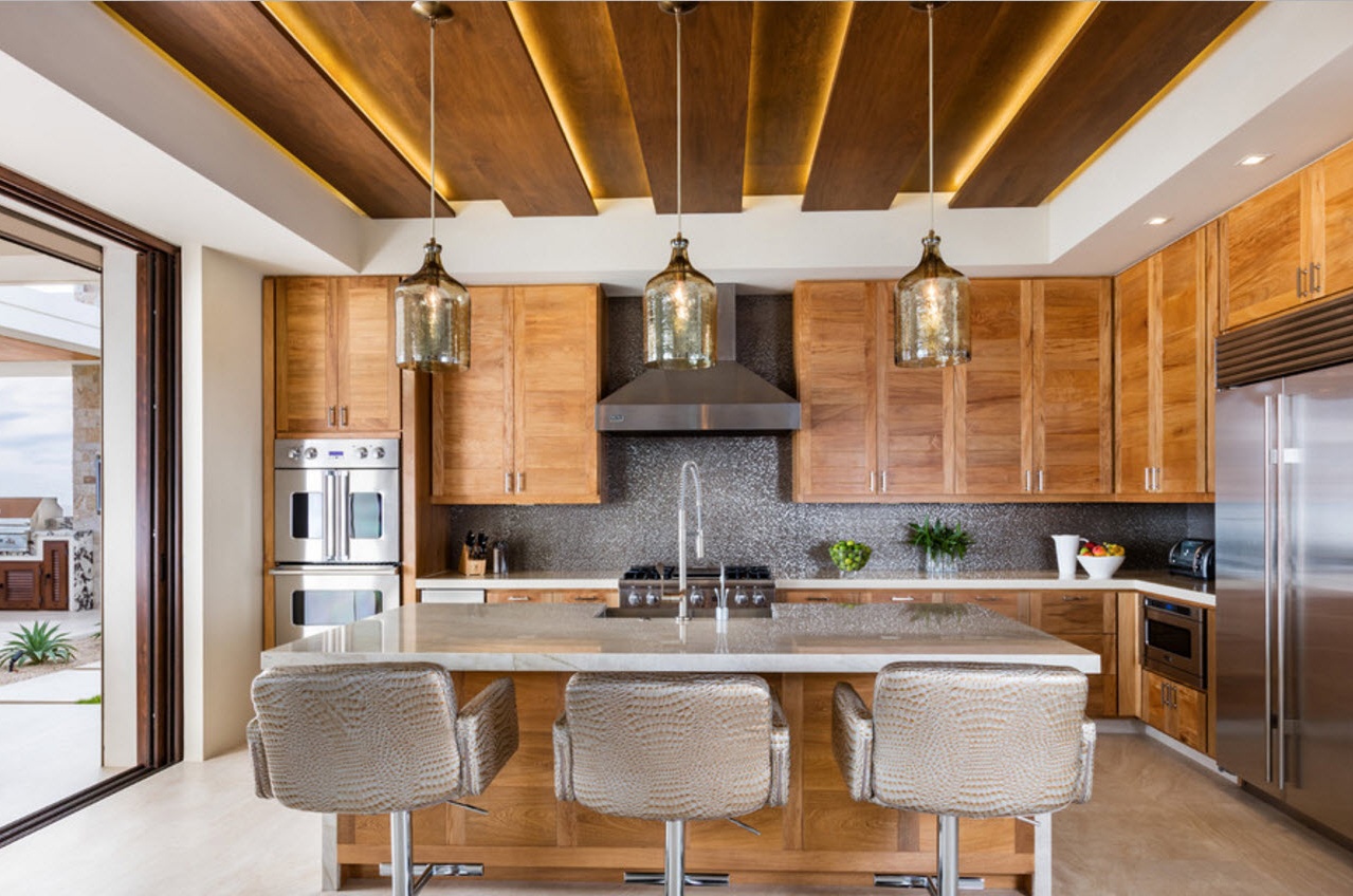
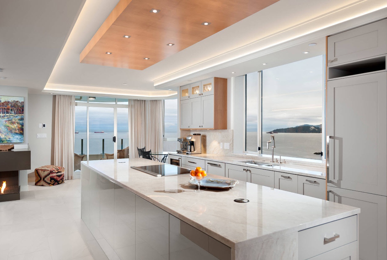
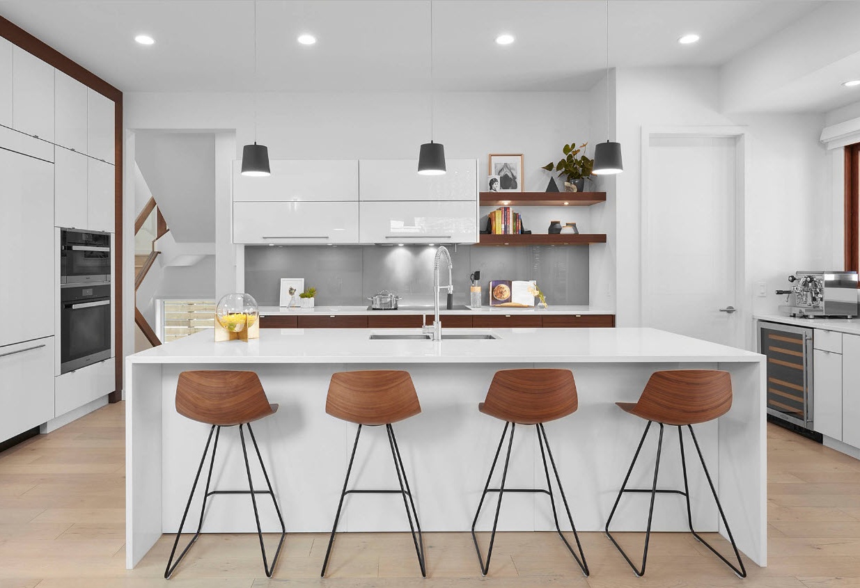
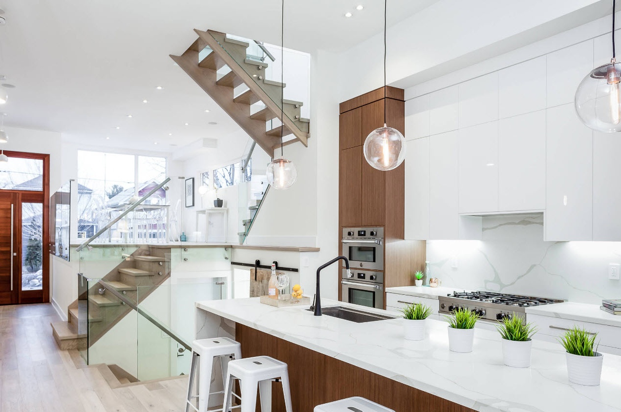
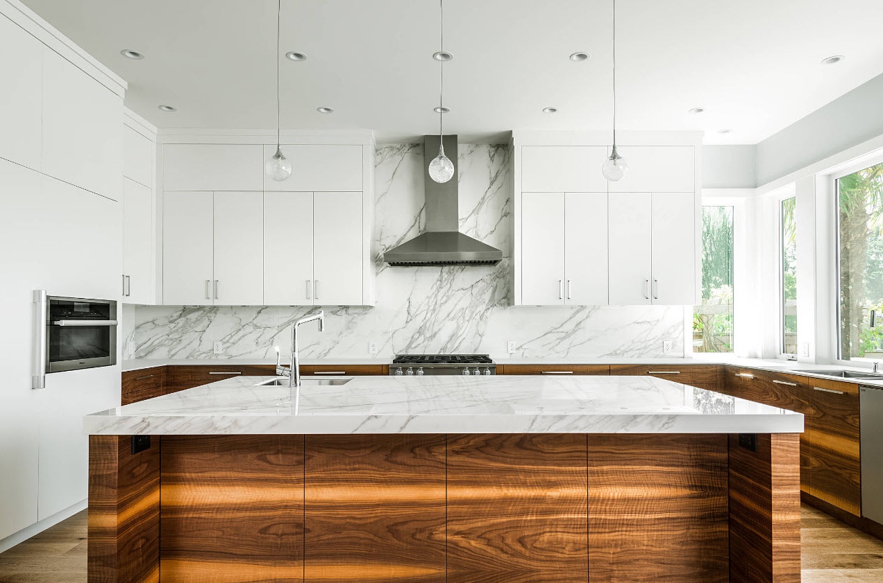
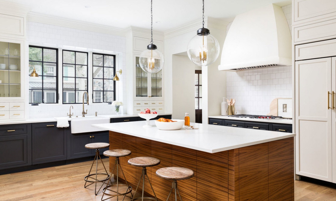
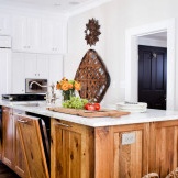
A beautiful, modern and stylish image of a kitchen room can be achieved by using snow-white facades adjacent to wooden (or their spectacular imitations) elements. This may be countertops, facades of the upper or lower tiers of kitchen cabinets, the design of a kitchen island or peninsula, the execution of a bar counter or a dining group.
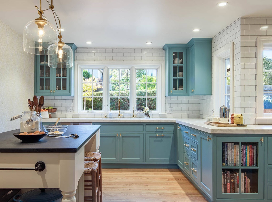
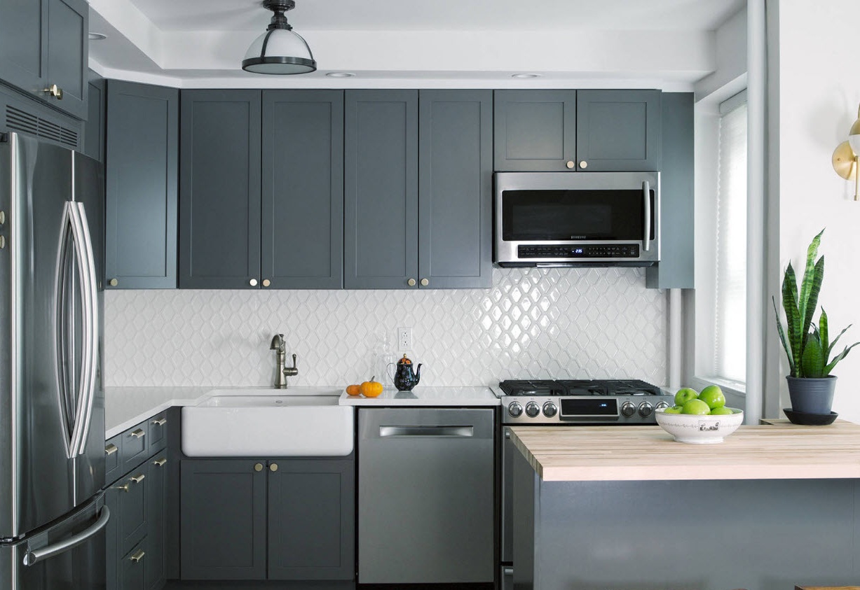
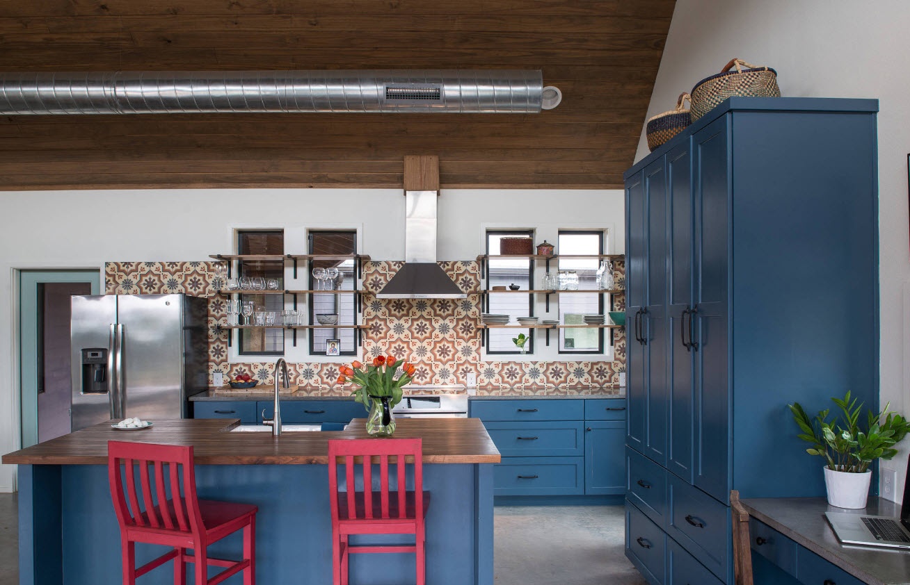
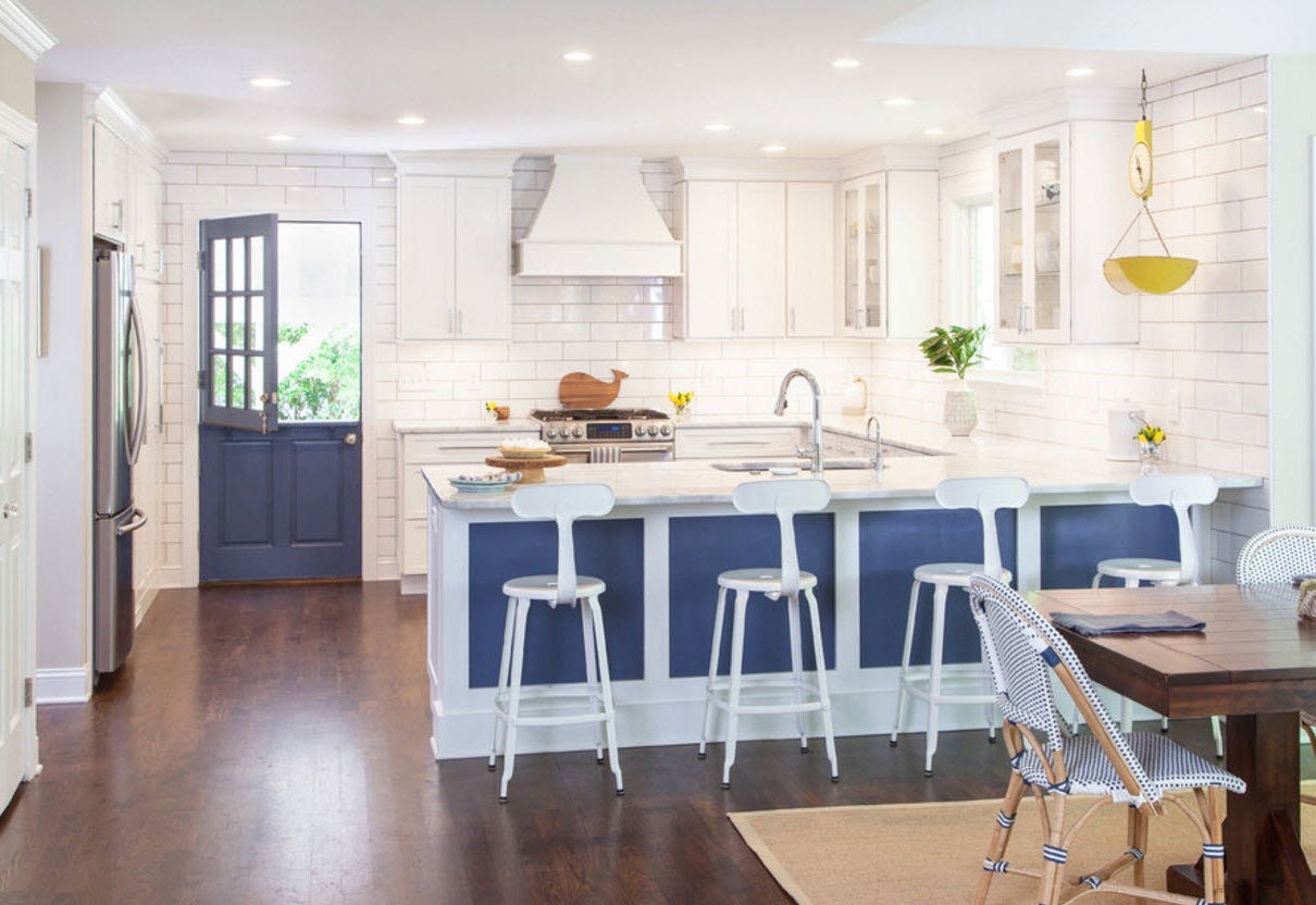
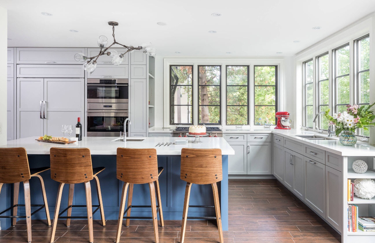
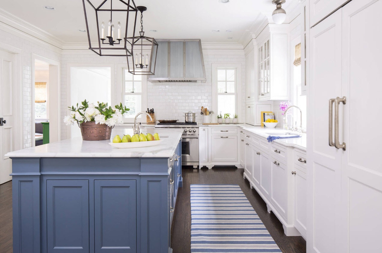
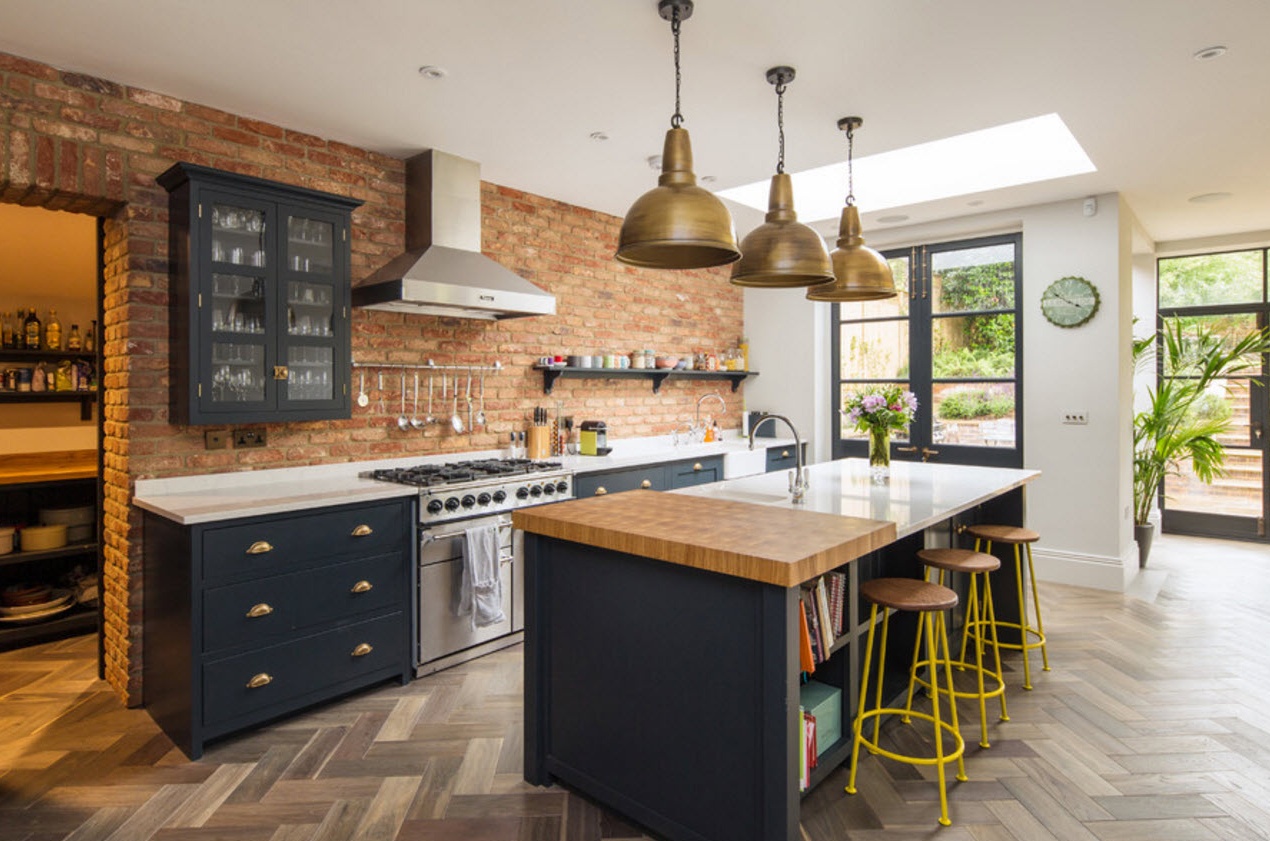
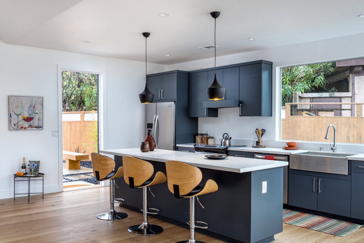
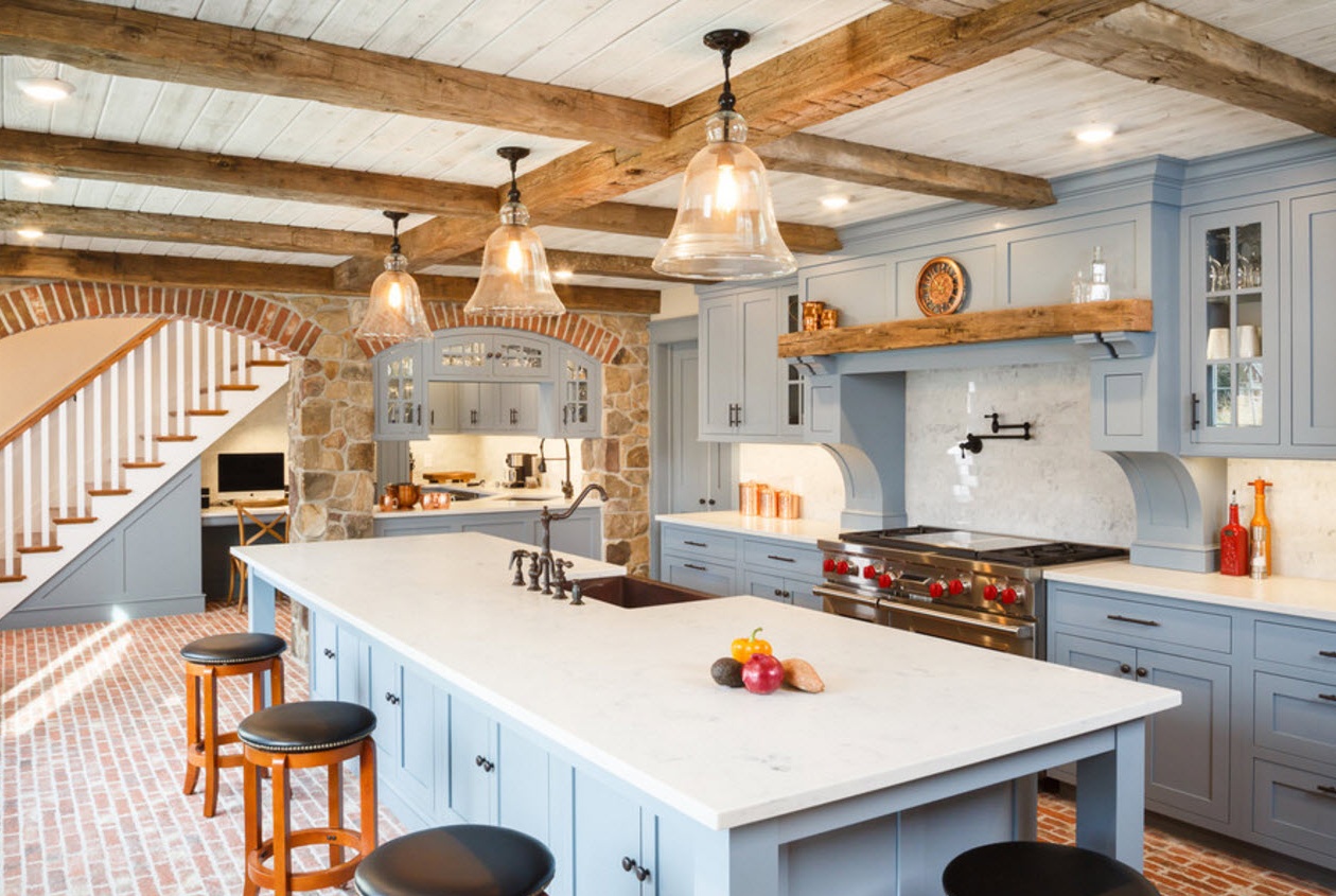
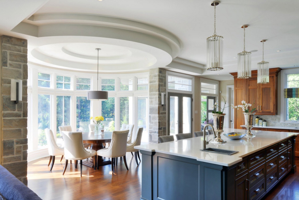
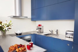
Complex shades of blue - the trend is not the first season. Beautiful. Deep shades can be used both as the main color scheme for the execution of the kitchen ensemble, and for local integration of individual elements. If the kitchen room has a medium and large area, then you can choose a beautiful blue color for all kitchen facades, if you need a visual increase in the ceiling height in the room, then the upper tier of cabinets is best done in bright colors. For small kitchen spaces, you can use a deep shade of blue only for the execution of individual elements - the facade of the kitchen island or dining group.
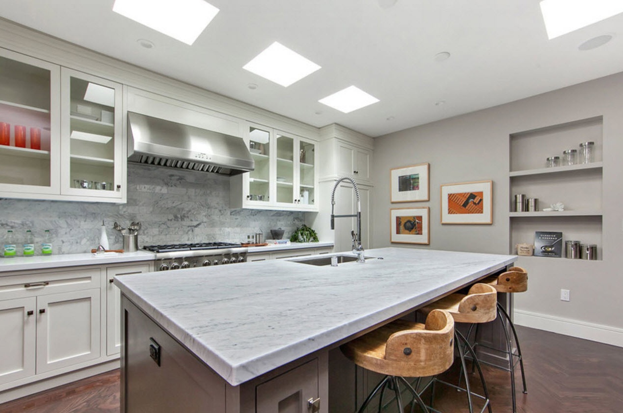
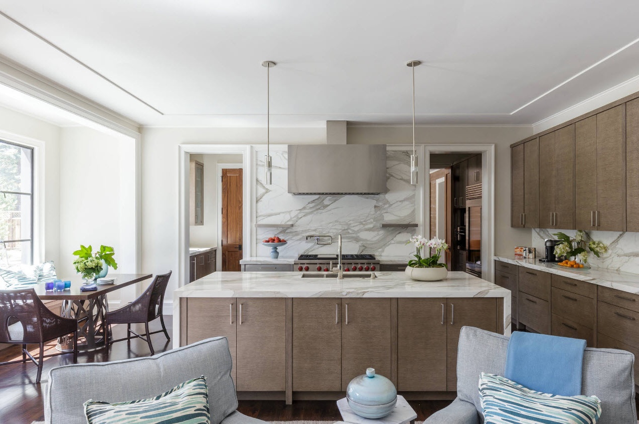
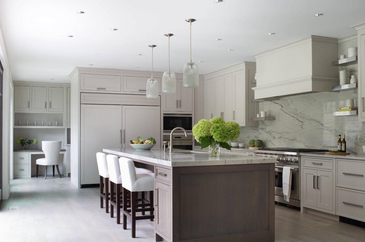
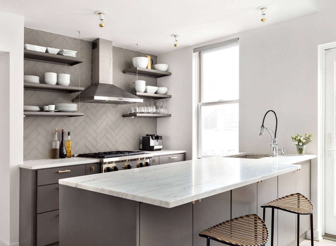
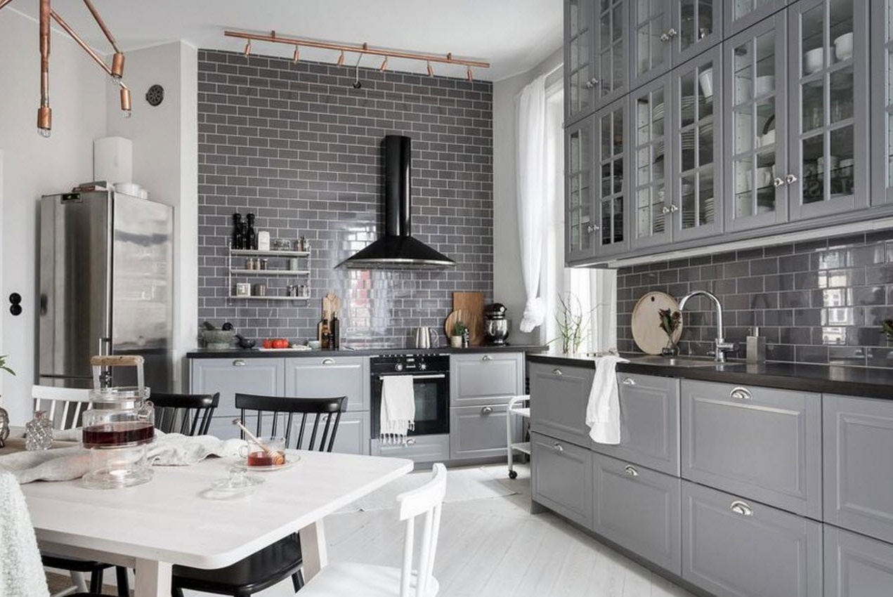
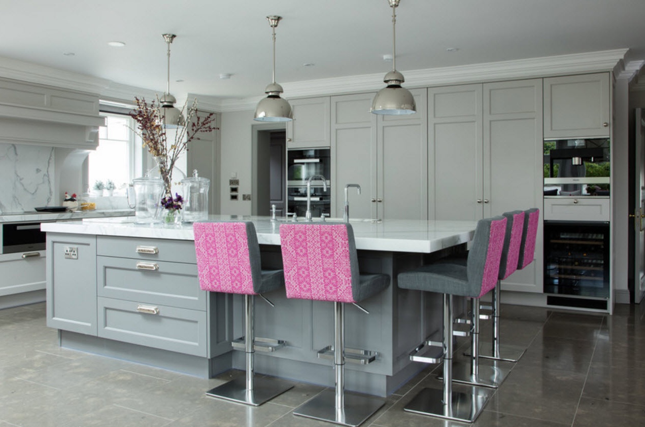
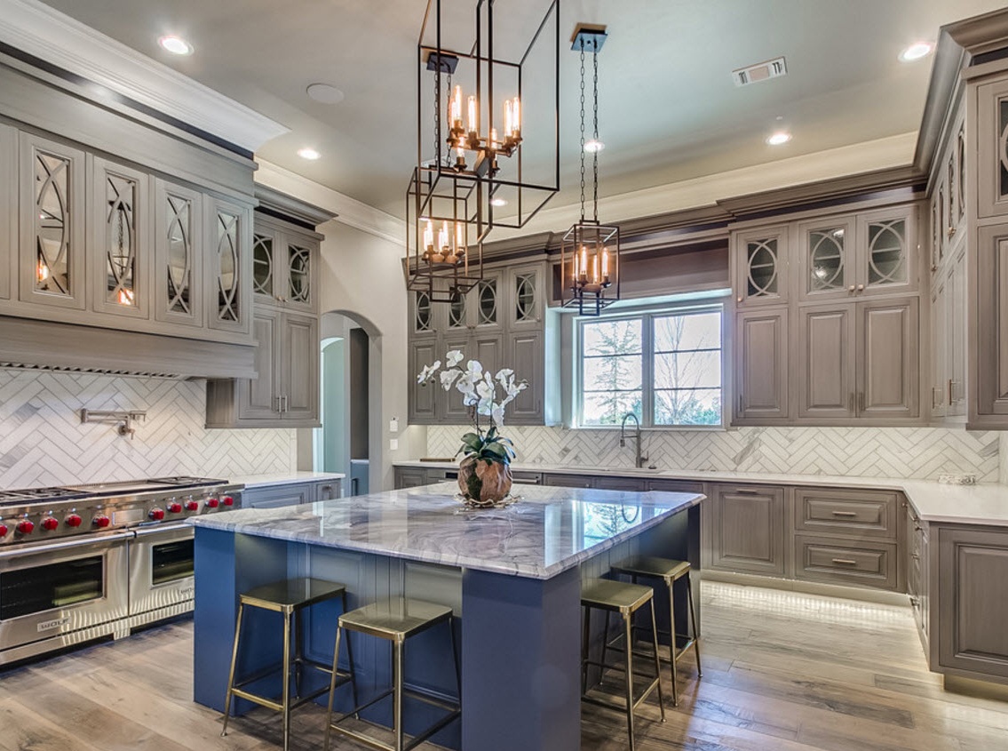
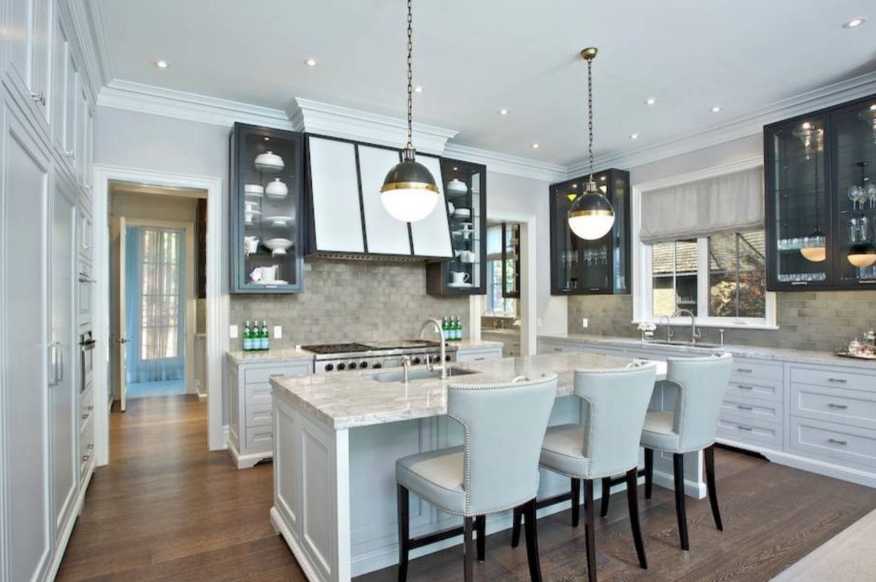
Gray color and a rich palette of its shades are still in fashion. Universal, neutral, noble and unpretentious at first glance color can harmoniously fit into almost any environment of the kitchen space. For small rooms it is better to dwell on light, pastel shades of gray (smoky, the color of the morning utaman), for large-scale kitchens you can use dark, deep tones (anthracite, the color of wet asphalt).
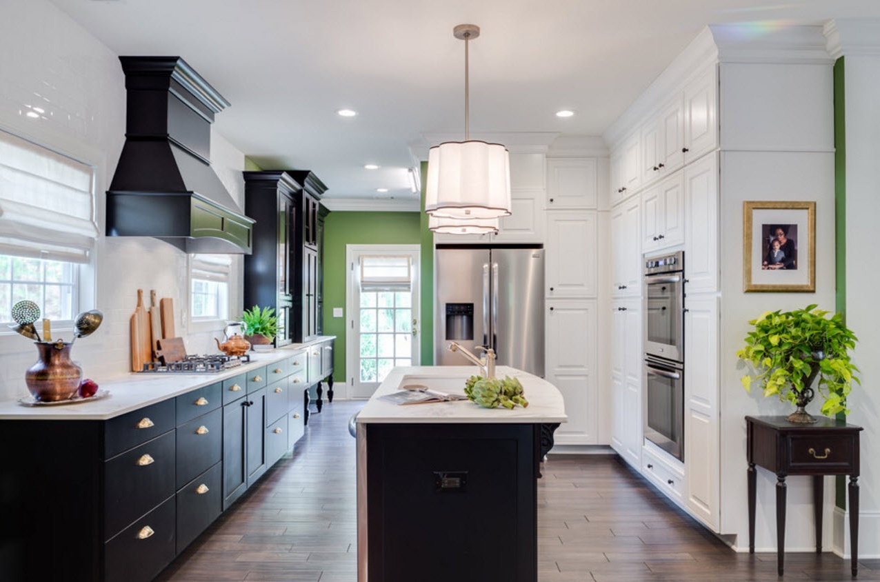
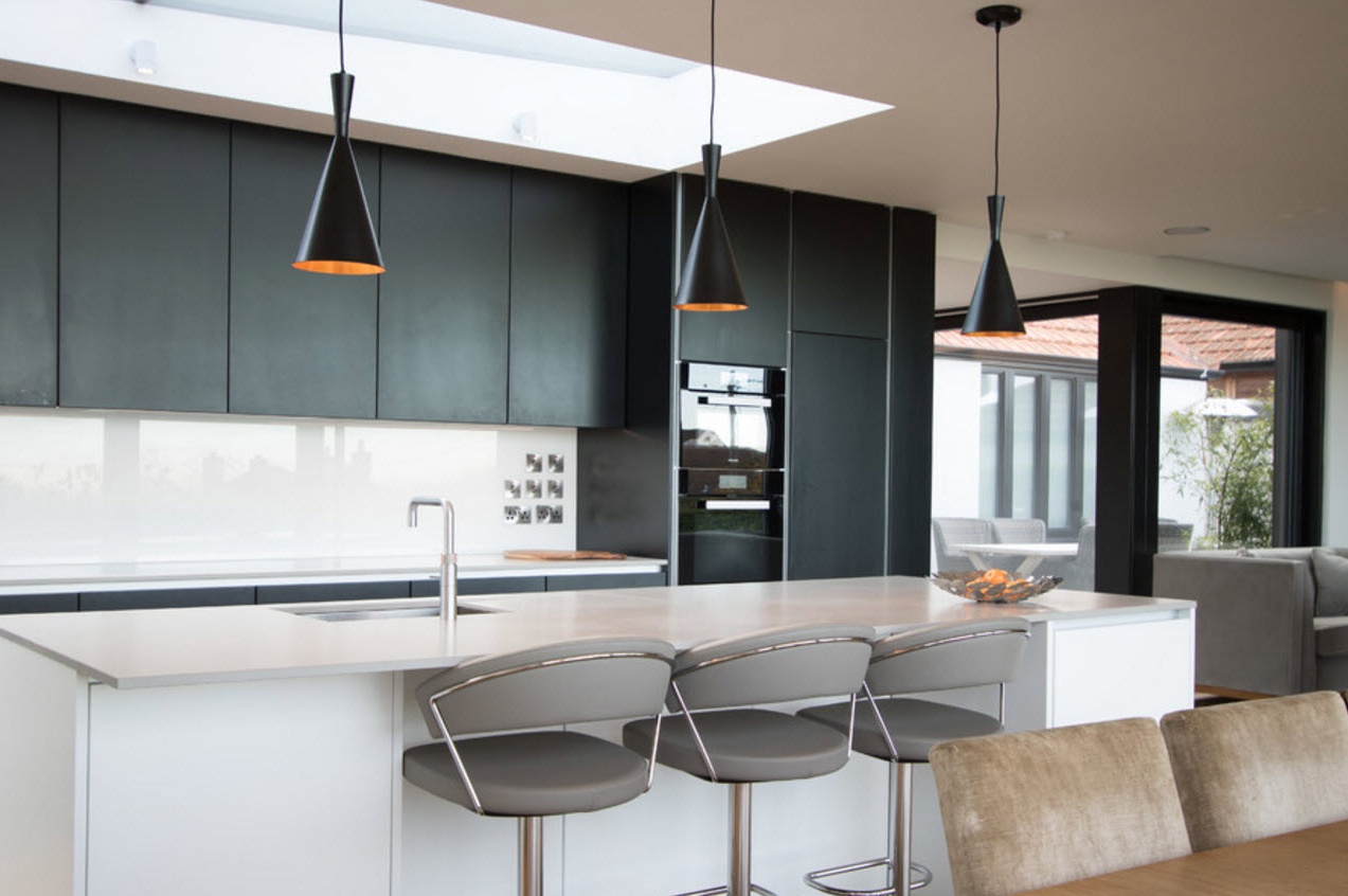
Contrasting color combinations in the execution of kitchen facades are still in trend. You can also use light and dark tones to combine the surfaces of countertops and kitchen cabinets. In any case, the result will create an original, dynamic, relevant design of the kitchen space. Contrast combinations not only help to emphasize the geometry of the room, highlight objects or zones, the dark design of the lower part of the kitchen set together with the light facades of the upper tier, will help visually make the room higher.
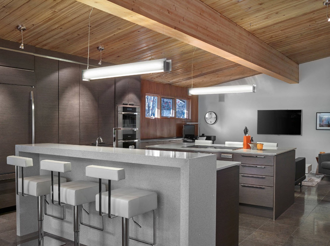
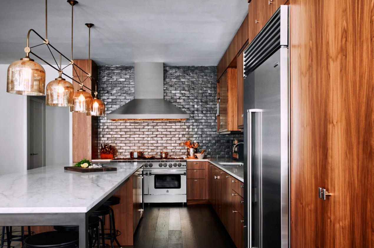
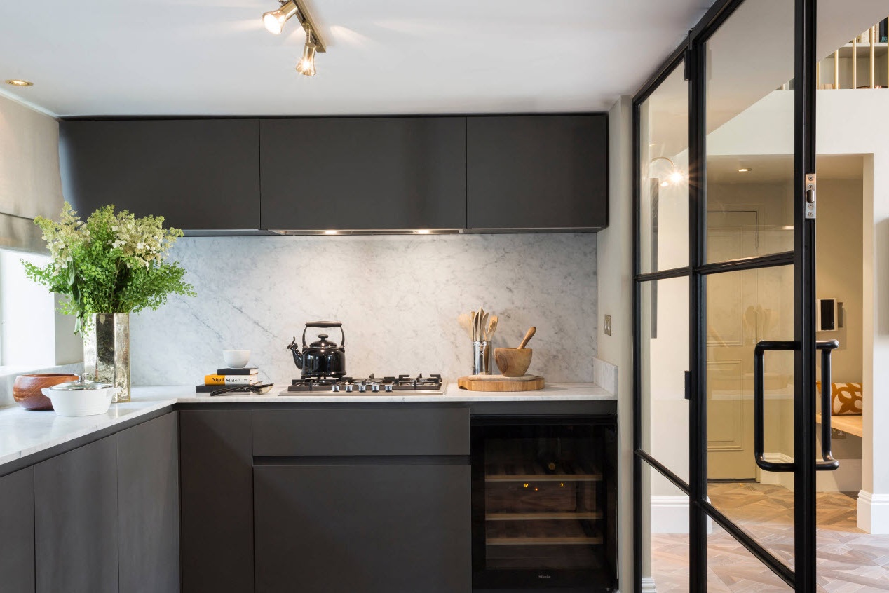
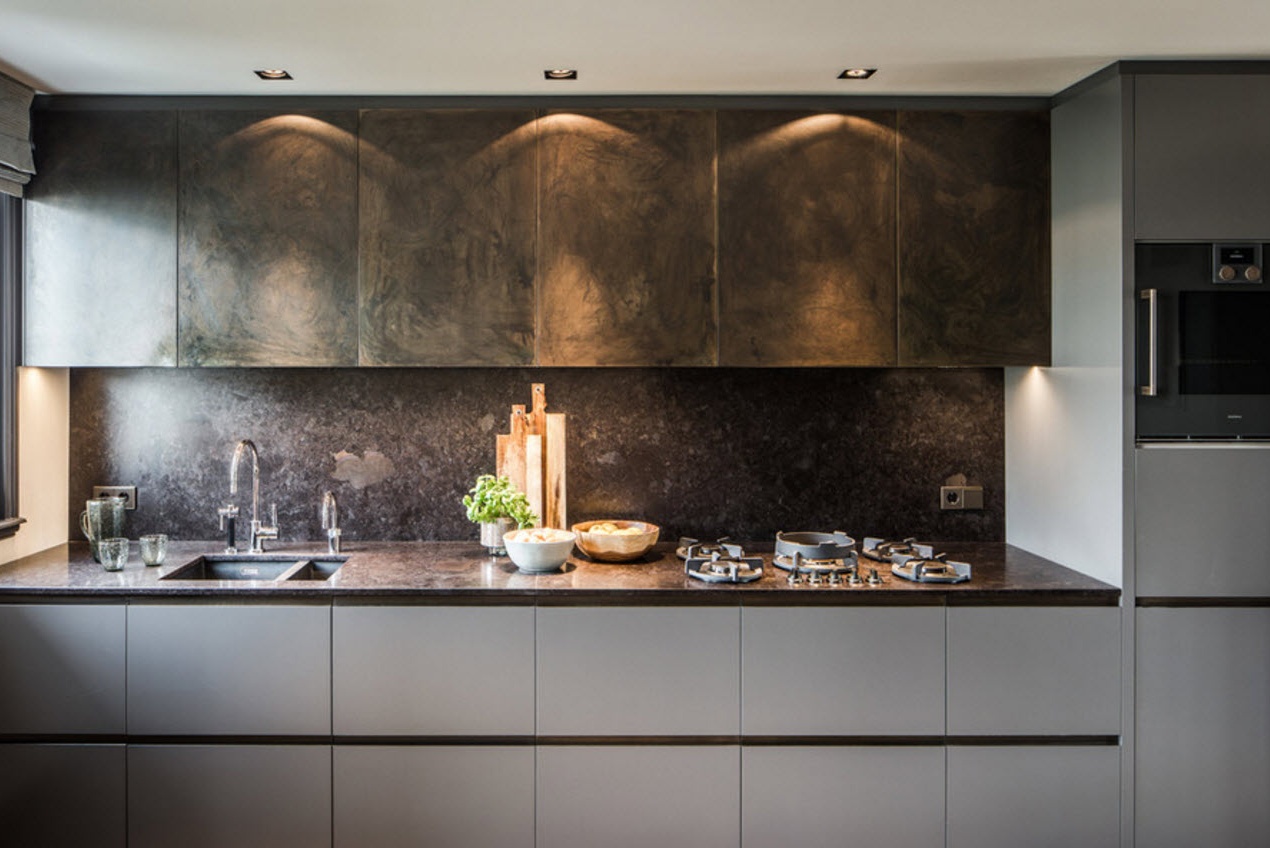
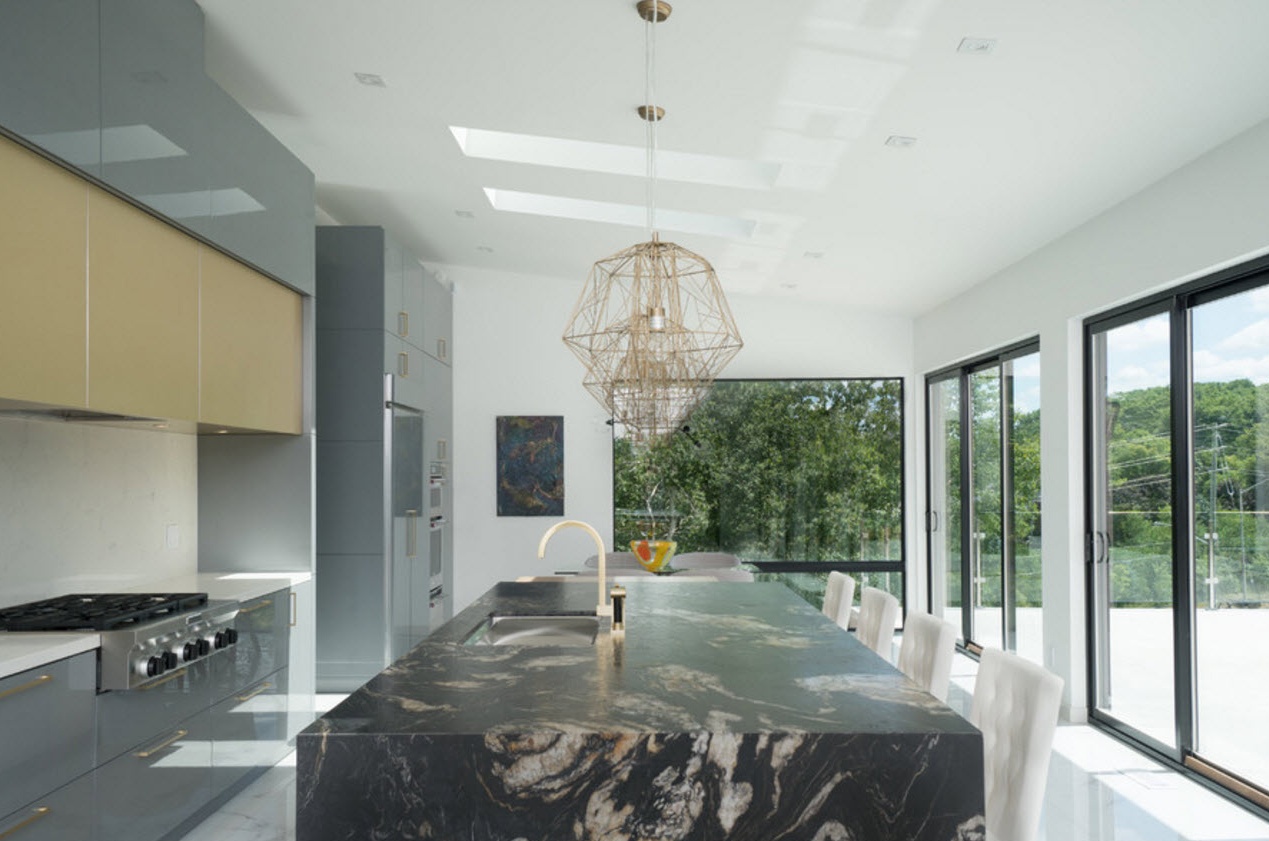
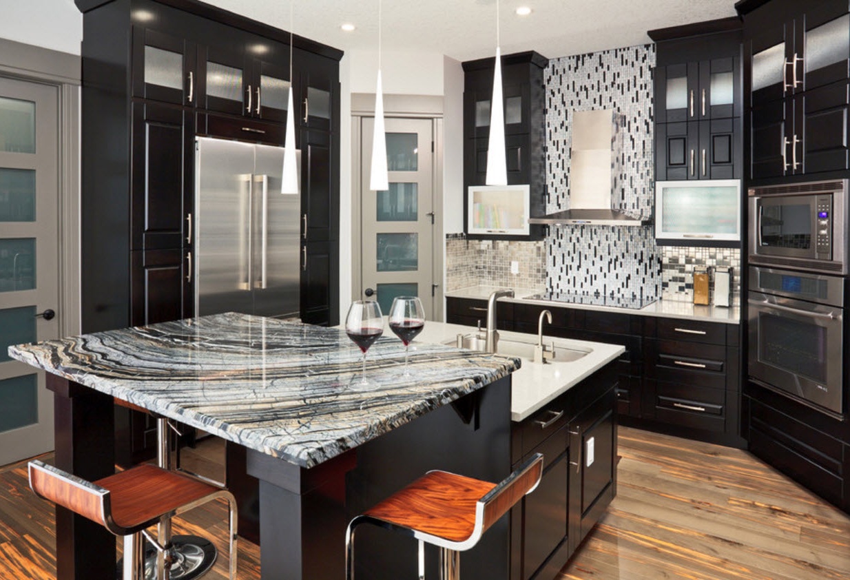
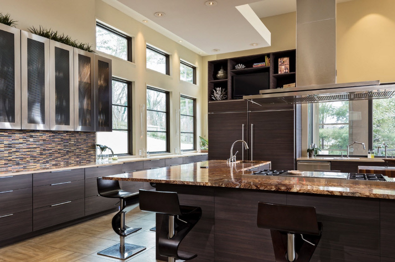
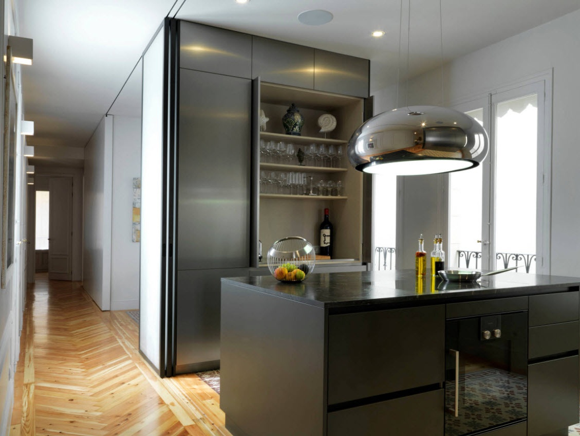
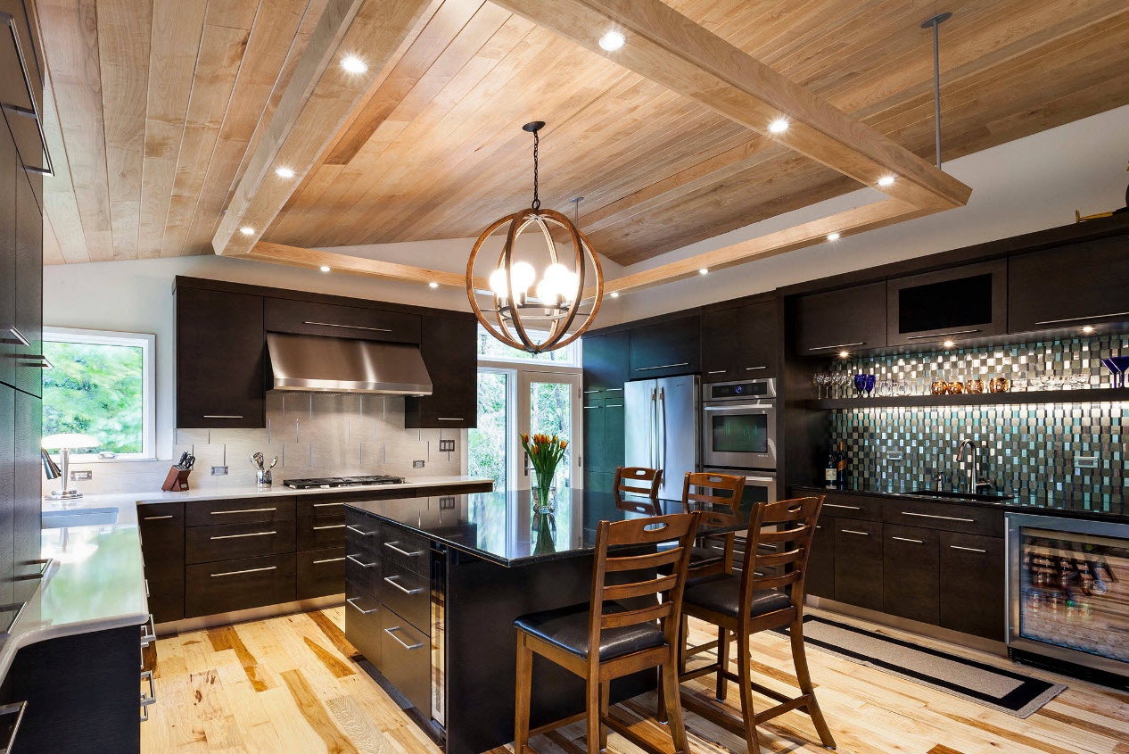
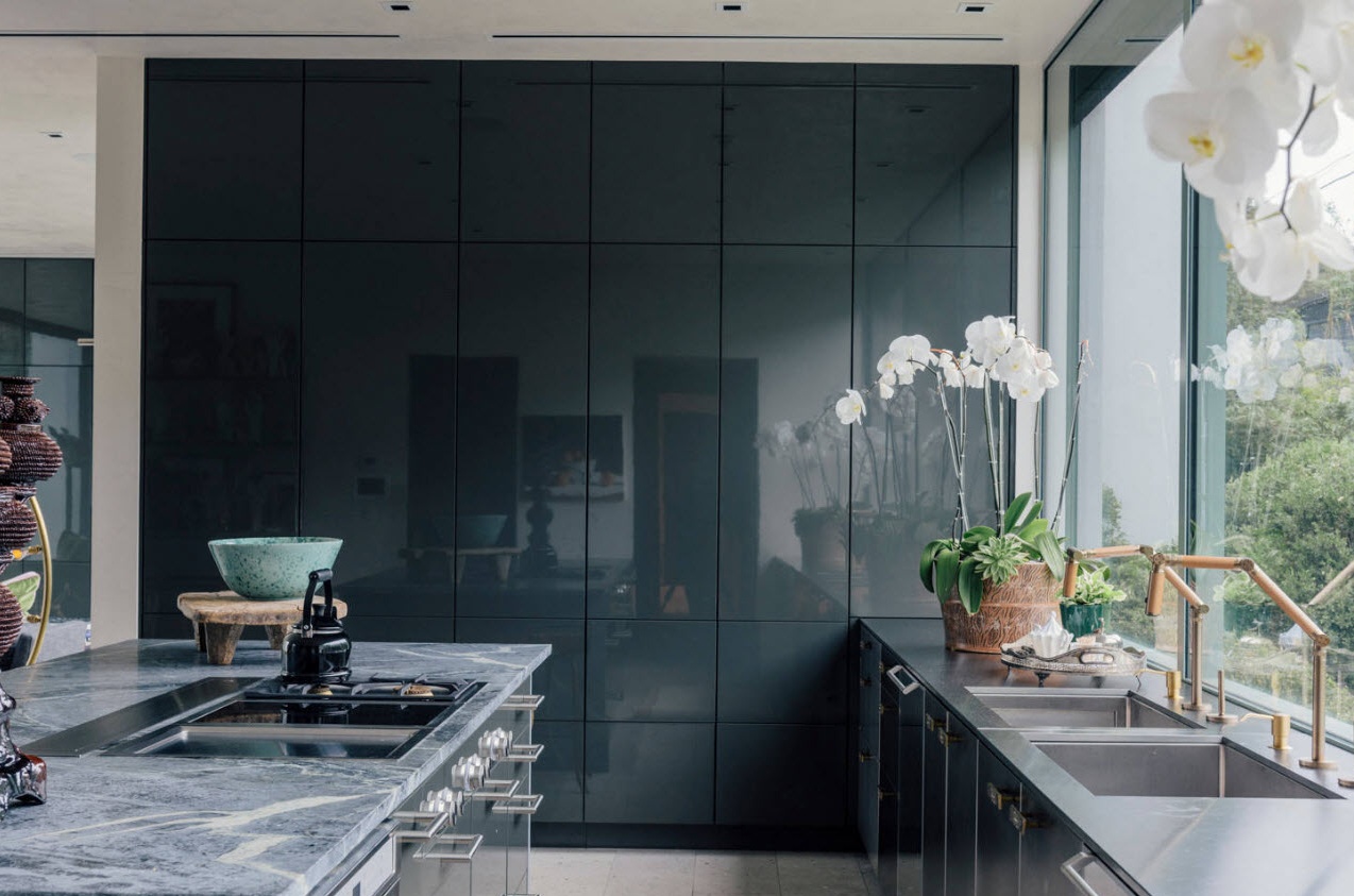
For really spacious kitchens, you can use dark tones to complete the entire furniture ensemble. A dramatic, stylish, luxurious image of the kitchen interior will be provided to you. But it is important to understand that caring for the dark surfaces of kitchen facades will require more time and effort from you than planes in bright colors.
Style of execution of kitchen modules
Conventionally, all the options for the execution of kitchen facades on sale today can be divided into two large groups, each of which has its own subspecies:
- modern;
- traditional.
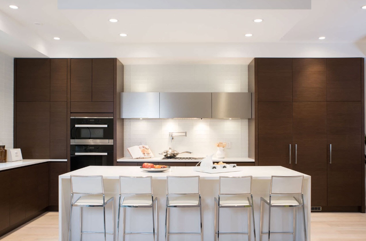
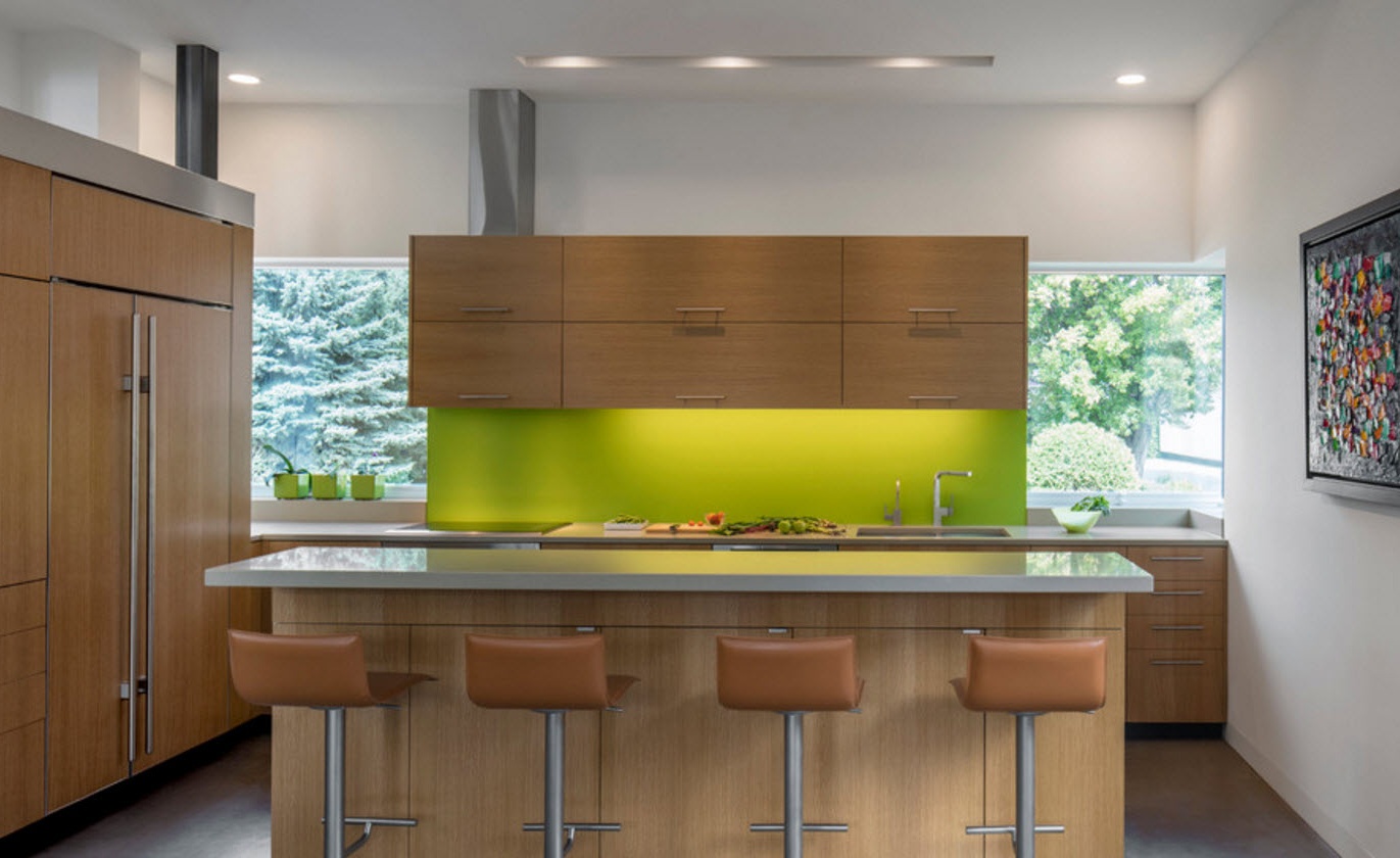
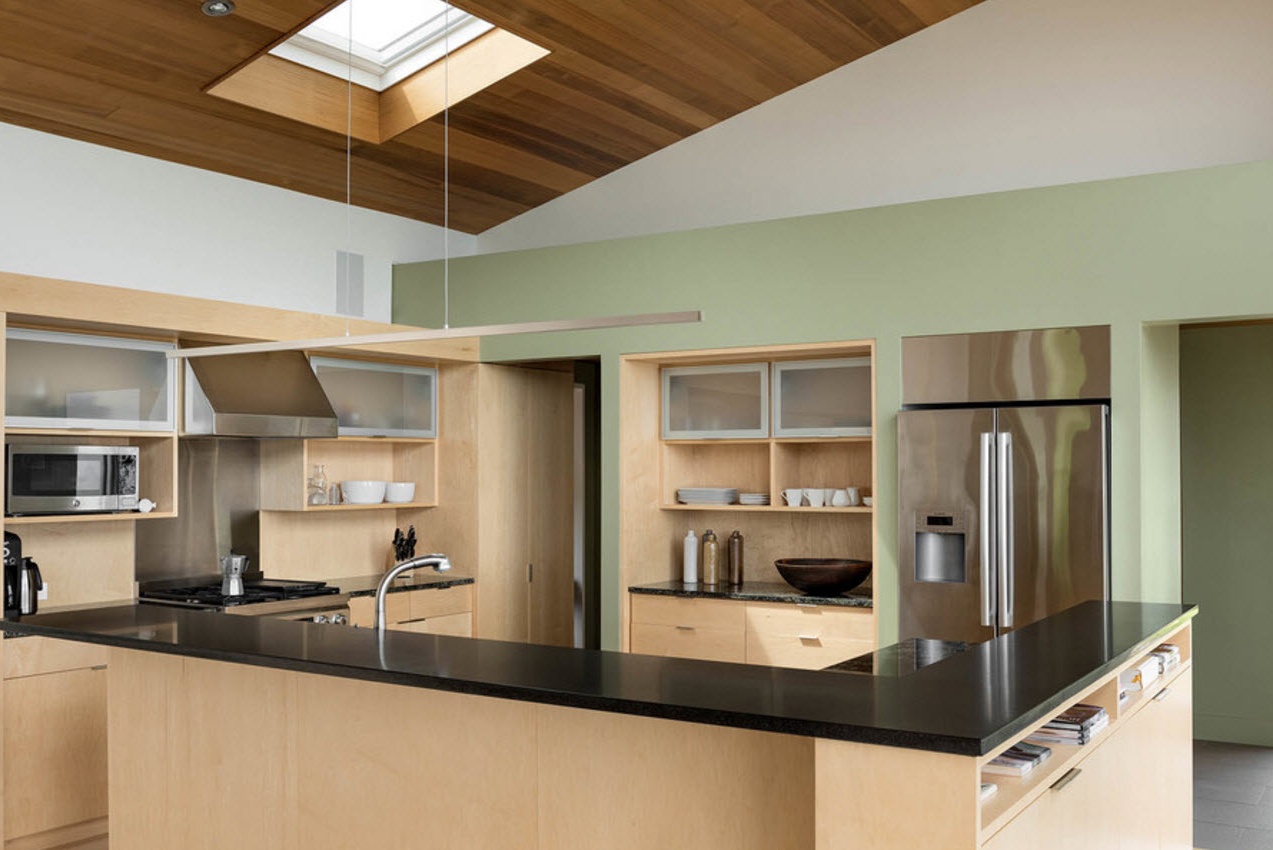
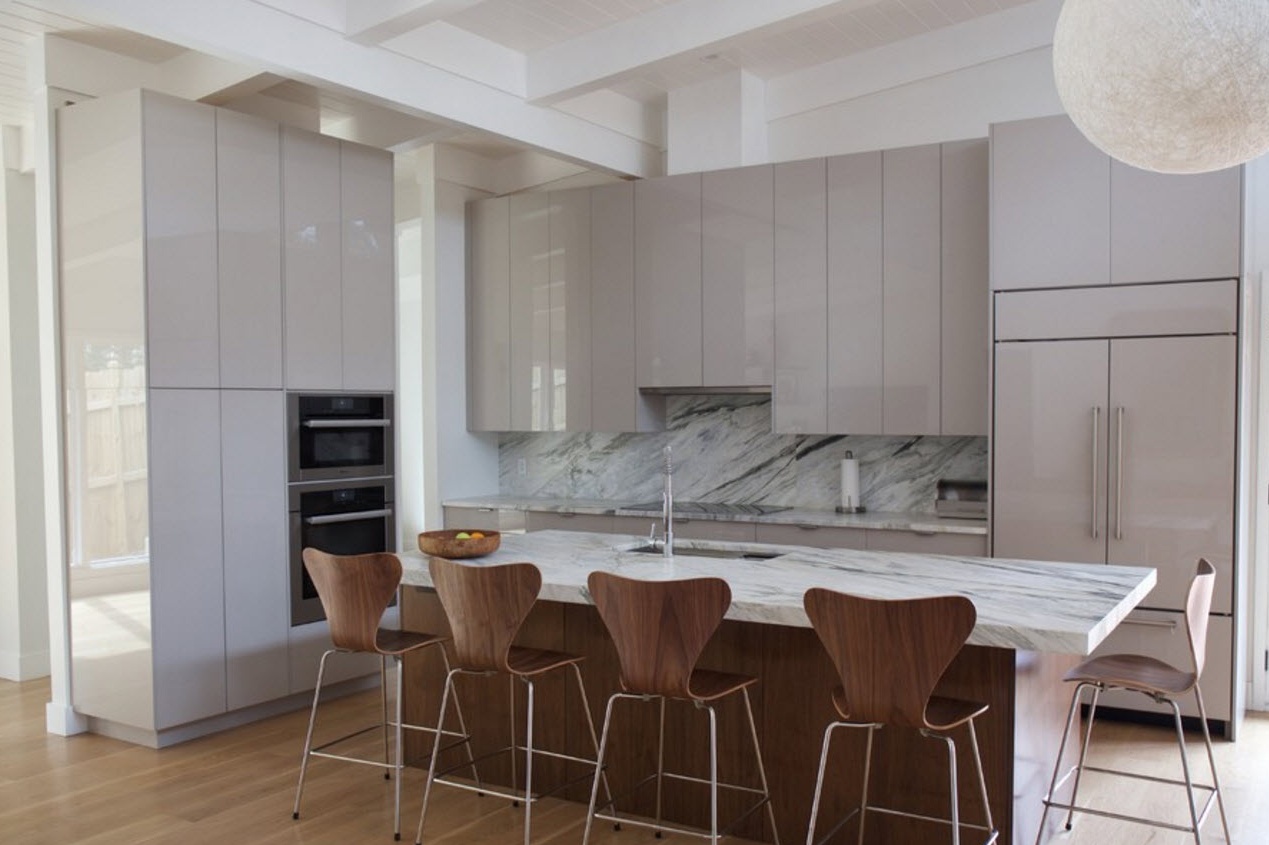
The modern style of execution of the facades is laconic, minimalistic, practical. Most often, modern styling is reflected in completely smooth surfaces in a matte or glossy embodiment. In this case, a combination of options is possible - the upper tier of kitchen cabinets is performed without fittings, and the lower one is equipped with handles on the doors. In this case, both levels are made in the same texture and color.
The minimalist image of kitchen facades is the best suited for kitchen spaces, designed in one of the variations of modern style. Simplicity and conciseness, functionality and practicality are at the forefront. From this, the image of modern cuisine only benefits. Decoration is not excluded, it is simply used in other aspects of the design of the kitchen space.
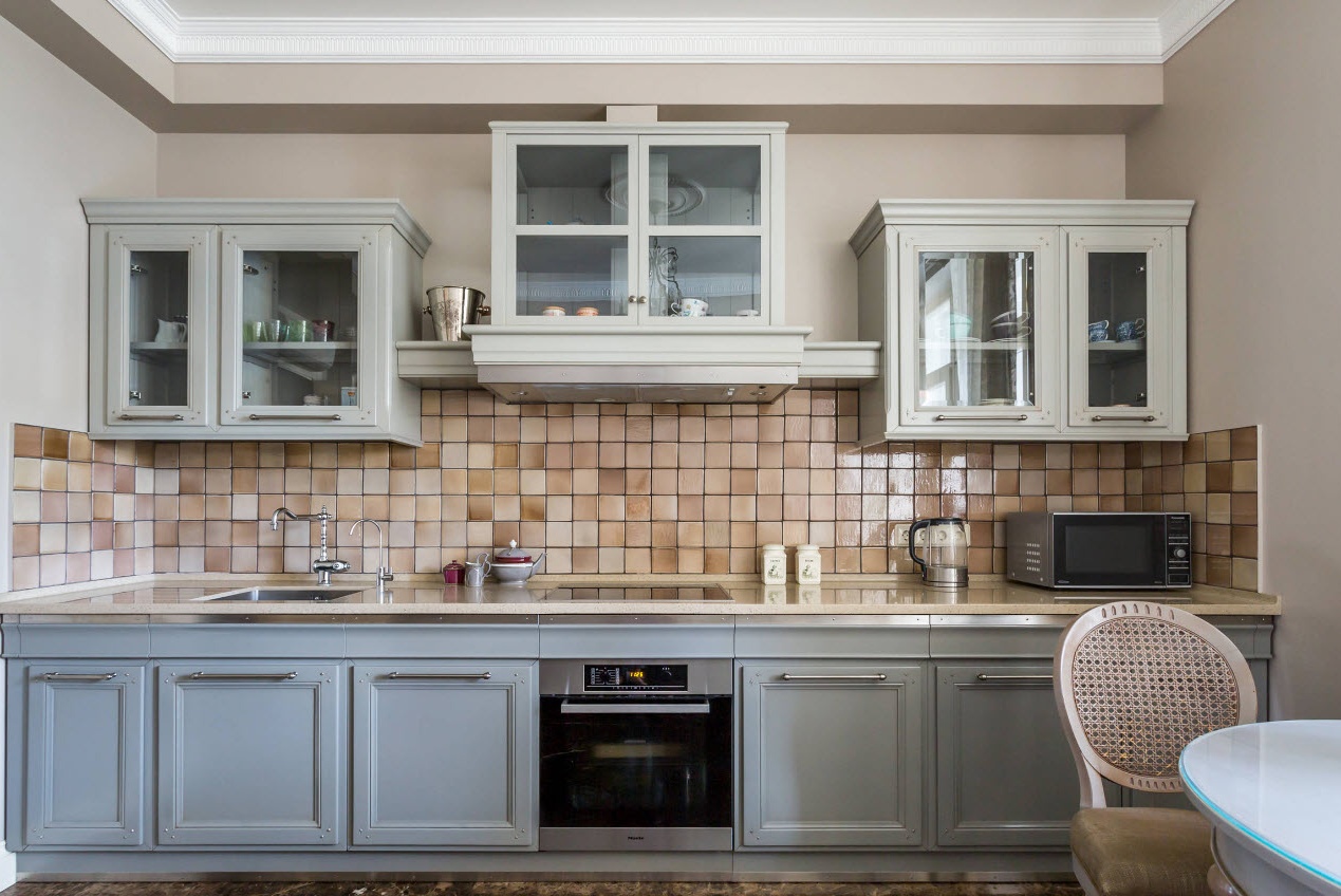
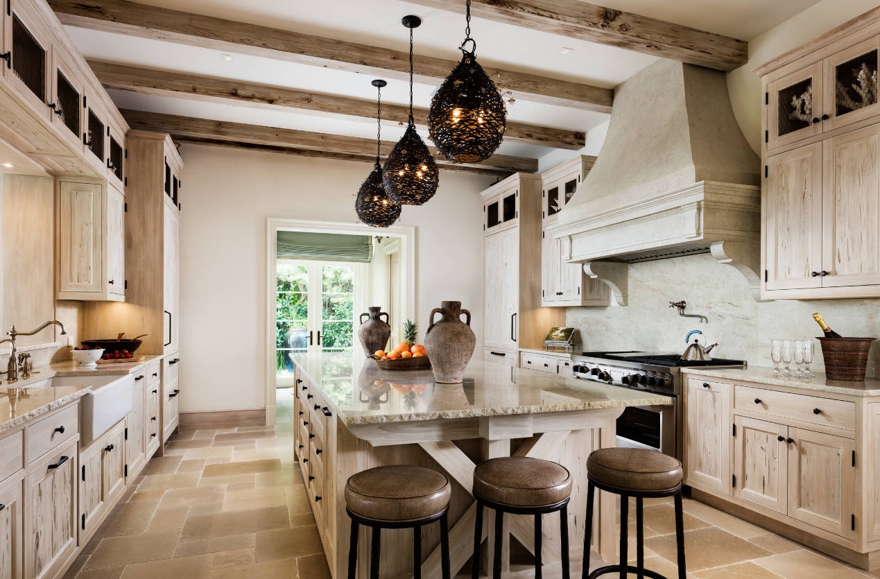
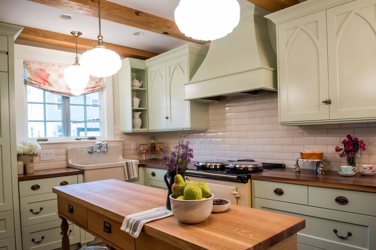
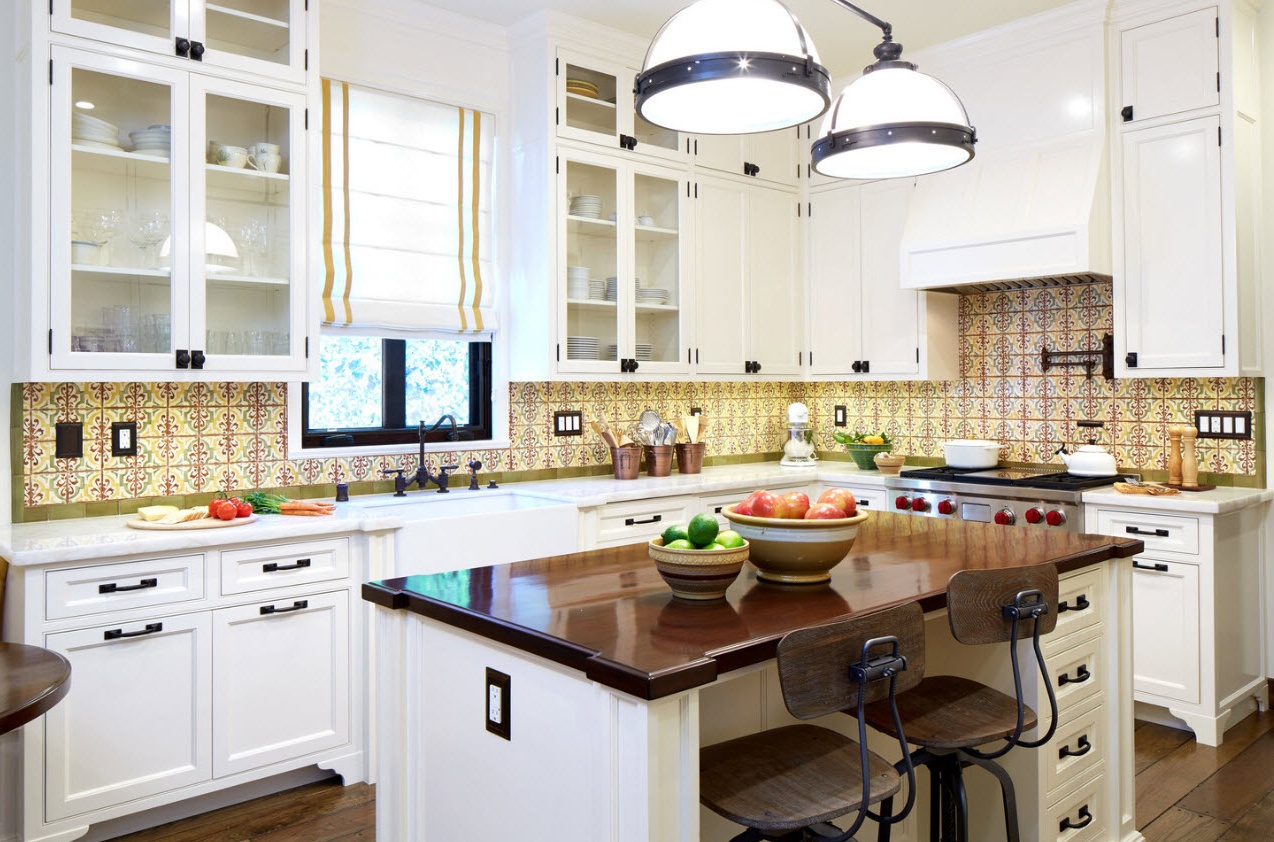
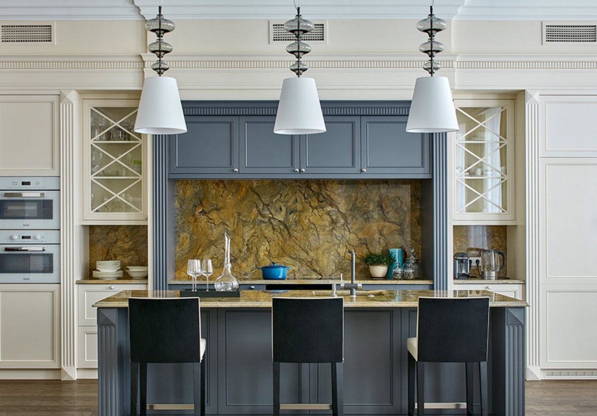
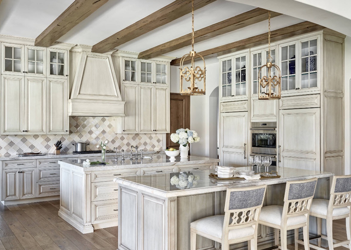
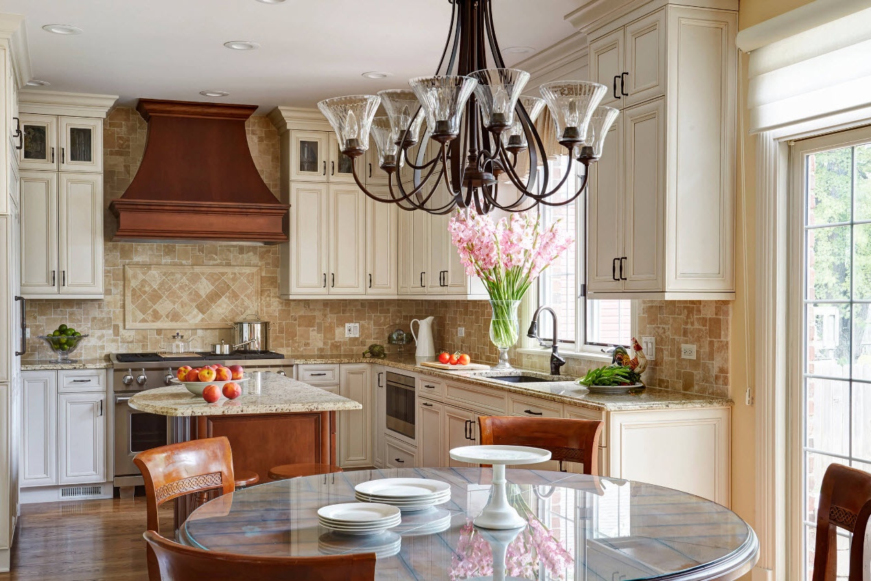
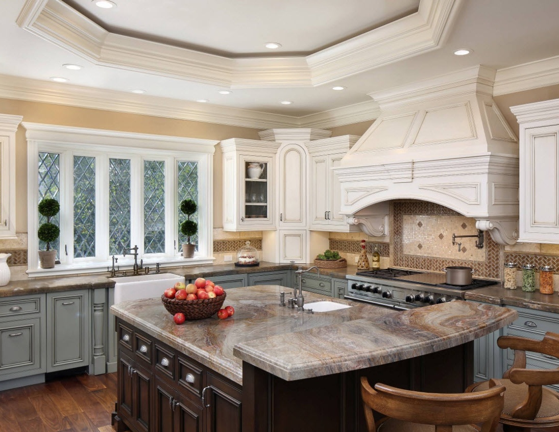
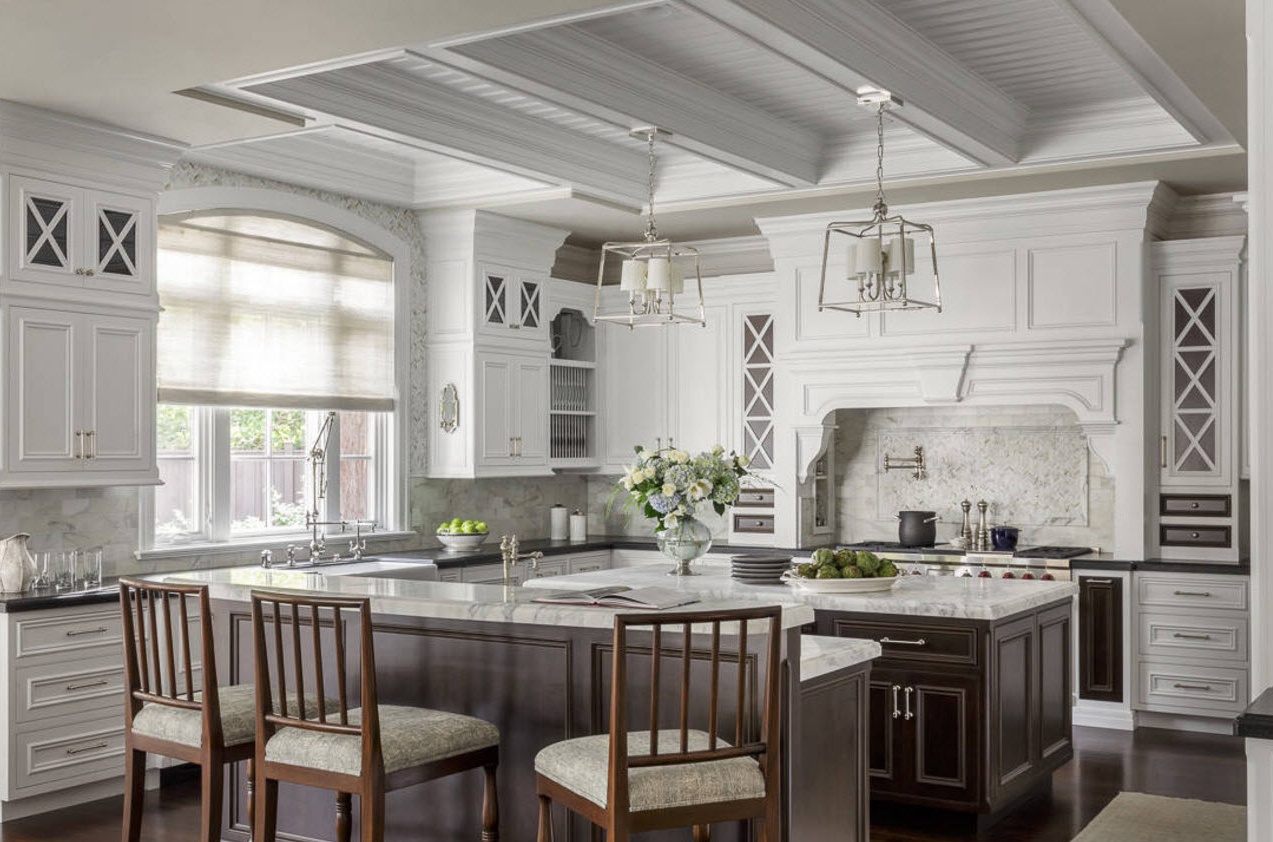
Traditional or classical facades today have also undergone some simplification. Wood carvings, monograms and wrought iron fittings gave way to a laconic decor, a strict version of following traditions. In modern kitchens, you can increasingly find a design option that is associated with the neo-classic style, which involves adapted execution of traditional interiors to the needs of a modern owner who prefers not to hide progressive household appliances behind the facades. Even if the facades are incredibly attractive - they have glass inserts, a combination of materials, moldings and other decorative elements.

