
Red tone of the kitchen: fashion or pretentiousness?
Shades of red in the interior have long been popular. Basically, this color is used for the kitchen, as in a bedroom or a nursery it looks rather aggressive and intrusive.
It’s absolutely not important whether you are the owner of a large and spacious kitchen, or the owner of "Khrushchev". The main thing is to choose the right shade and combine it with the main interior of the apartment. Today, almost all furniture factories make custom-made kitchens, which means that the buyer can purchase a kitchen set in any style and in any performance.


Where to begin?
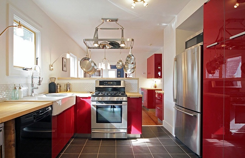
In order for the red color to look organically in the apartment, the surface of the walls, as well as the floor and ceiling, must be made in light shades. The opposite can cause the effect of visual reduction of the room.
Therefore, before proceeding with the design of the room, you need to remember the three most important points:
- Avoid excesses in the use of red;
- Do not create a similar design with a dark surface of the walls and ceiling;
- dilute red shades with other tones that combine the style of the kitchen and other rooms.
Choose shades
Among the shades that are used to create the perfect kitchen interior, use:
- dark peach;
- crimson;
- cherry;
- terracotta.


Designers advise not to go beyond these shades, otherwise the final version will seem either too dull or too aggressive.
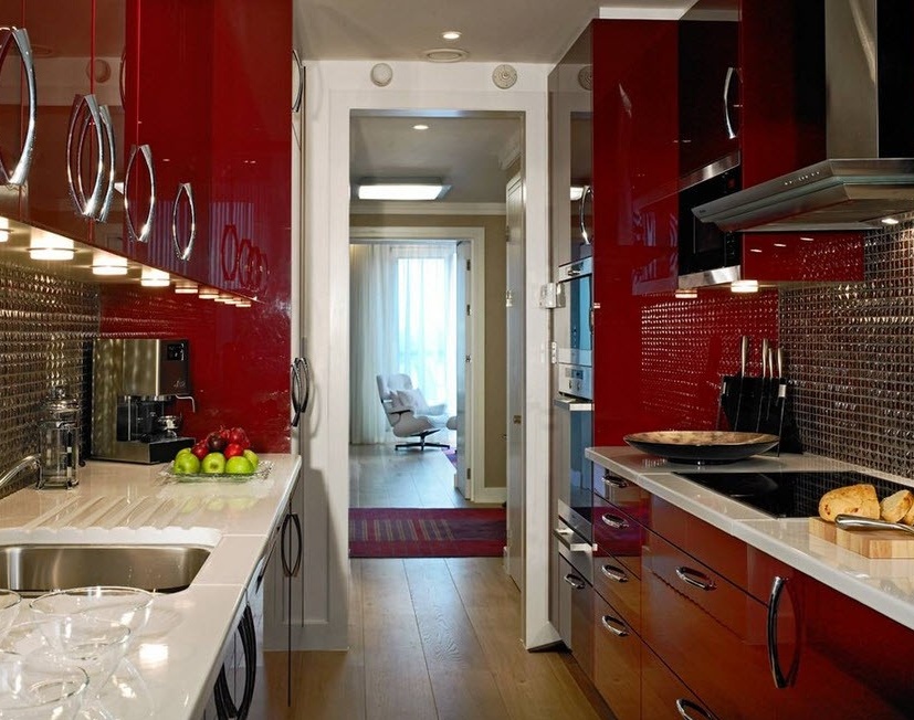
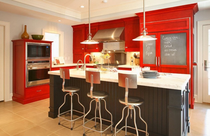
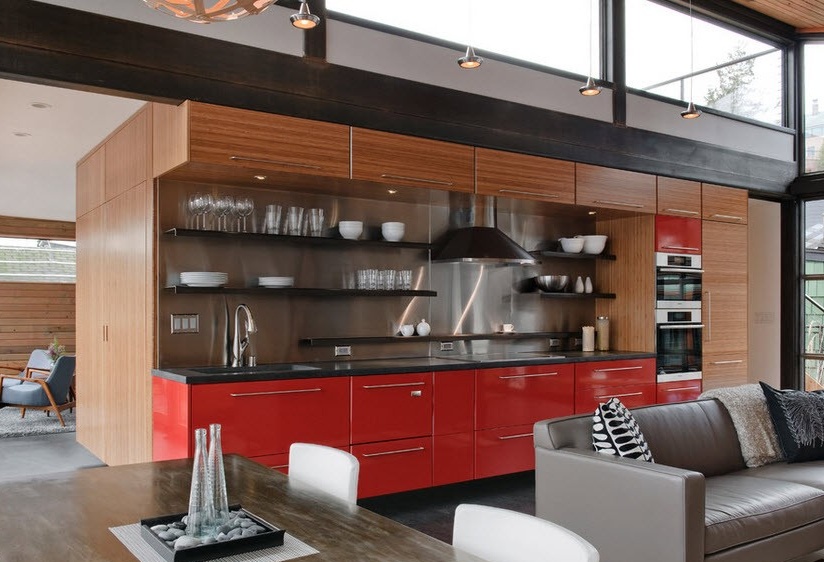
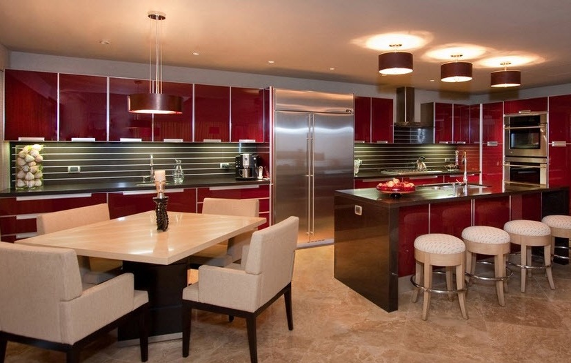
In order for the red color to stand out, while not creating a tense atmosphere, professionals advise painting or decorating the walls and ceiling in soothing colors. It can be:
- for cherry and raspberry - it is best to use white, gray and beige shades
- for dark peach - this color goes well with pale pink shades.
- derracotta color must be combined with cream and milk shades.
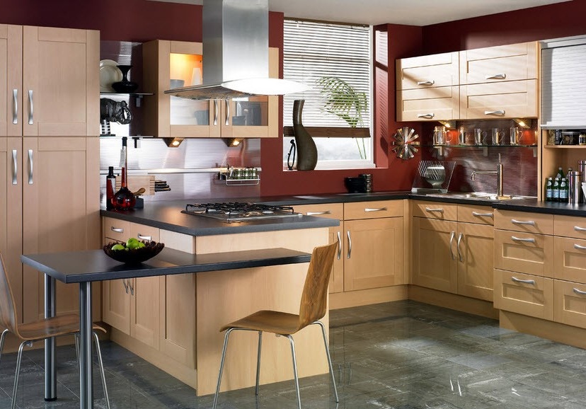
At the same time, the floor should create a stability effect, so the shades should be uniquely dark. All shades of brown and black are suitable here.


Choose a countertop and other interior items
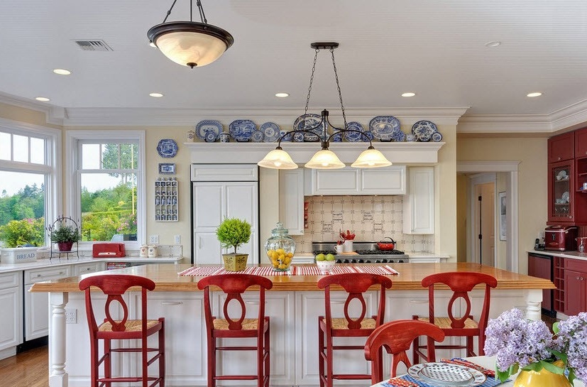
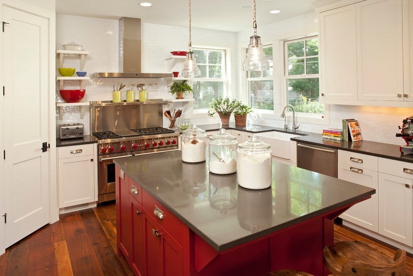
To create the right mood in the kitchen, you need other parts of the interior to be done in soothing colors that muffle all the red shades and create an easy look.
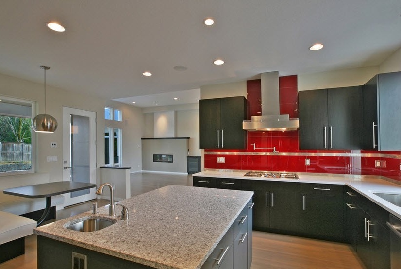
For example, as a basis, designers often resort to beige or gray shades. They look most harmonious with aggressive red, and at the same time go well with walls and other surfaces.
Any other objects that form part of one whole must also be neutral shades. You need to use them wisely: no frills, only clear lines and colors.
Some statistics on the choice of interior
It is noticed that people who often spend time in the kitchen quite often depend on the color scheme used in the interior. Therefore, for people who are often in the kitchen, red will be inappropriate.
Staying in a kitchen with aggressive colors for long periods can cause bitterness and irritation. Therefore, the red style is the style of a busy bachelor who decided to diversify his life by introducing a small peculiarity into his house.


