How to make kitchen areas as comfortable as possible?
The rational use of every centimeter of the kitchen area is extremely important, especially for those who have an old-style apartment. For some reason, the USSR believed that a space of 6-7 square meters would be the best option for the kitchen. Only a small table, a stove and a few stools will fit here. Usually, the interior of Soviet cuisine looked like that.
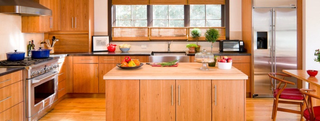
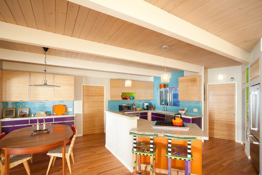
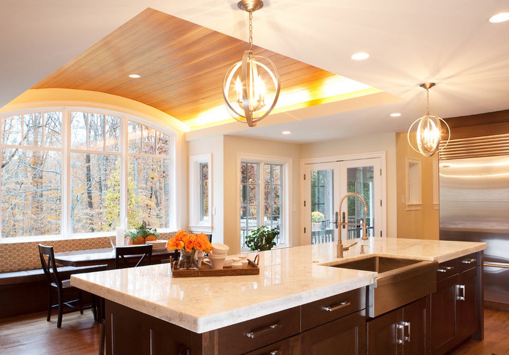
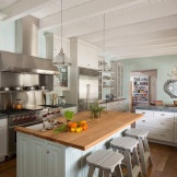
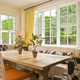
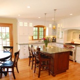
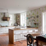
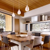
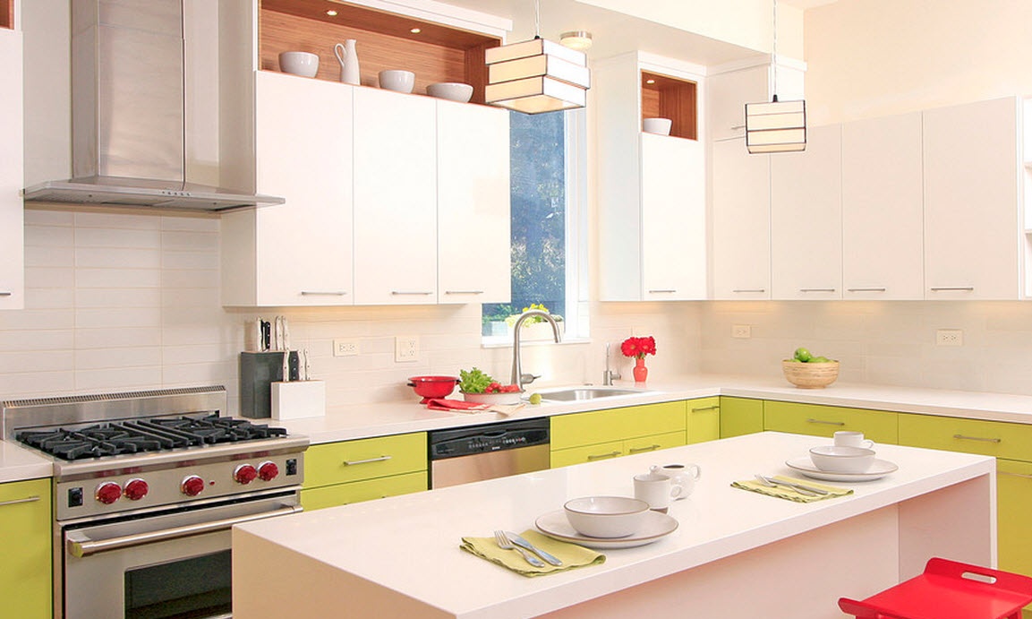
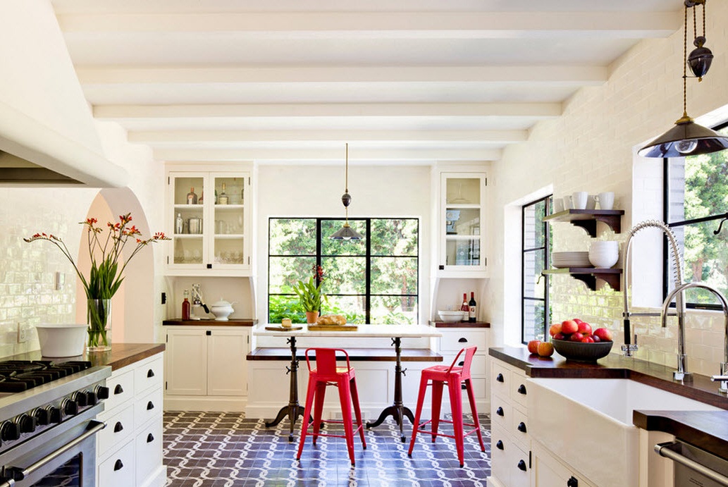
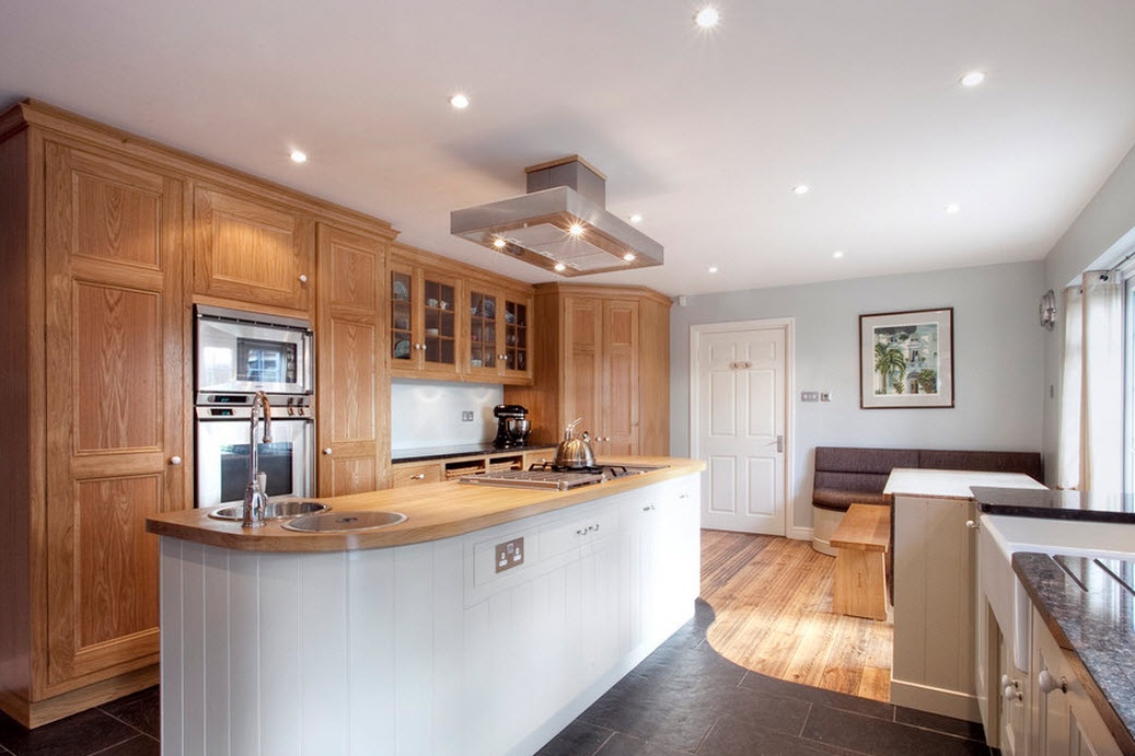
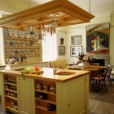
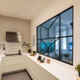
Such conditions can hardly be changed, but to make the space as comfortable and stylish as possible is quite realistic. Of course, the modern interior looks much better than the one that we have known since childhood, and its main advantage is a win-win option for dividing the room into zones. The photograph below shows one of the most optimal techniques for dividing the kitchen space. A clear distinction between the working and dining areas, competent lighting accent, unusual design and natural materials are what you need for your kitchen.
Traditionally, experts divide the kitchen area into the following zones:
- work zone;
- rest zone;
- dining area.
It is from the working area that planning begins, since it is directly tied to the place where the gas and water supply units are installed. When creating a project for the future kitchen, it should be borne in mind that it is in this part of it that the most laborious classes take place. Households spend a lot of time daily cooking. And in order for ordinary food to turn into real culinary masterpieces, you need to take care of aesthetics. It is pleasant to work where beautiful elements of decor inspire and delight the eye.
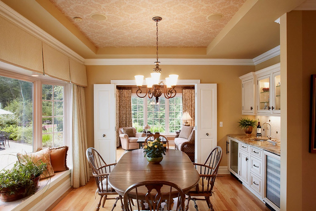
A place for dining should be optimal for a relaxing and sincere pastime. Great attention should be paid to lighting. For example, a dining area is best placed by the window. Natural daylight invigorates, increases physical and mental activity. Evening lighting is usually soft, soothing, but for fans of bright, an exception can be made by installing powerful lamps. It is better to find a compromise here. For example, mount a lampshade on the ceiling that gives bright lighting, and hang decorative small lamps on the wall for a softer, more moderate one.
Sometimes ceiling lights can be with built-in height adjustment for their suspension, thanks to which you can choose the required light intensity. For the same purpose, switches that control the power of lighting are also used.
The functional area should always be as light as possible. The best solution is to incorporate spotlights in the ceiling or panel above the work surface. Ergonomic indicators should guide the design of a kitchen design, even when it comes to lighting.
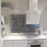
The division of zones occurs by various methods, but the most effective and common is the use of different materials. So, in the work area, fittings are used that are easily hygienic cleanable (for example, plastic panels, ceramic tiles). The dining room is decorated with washable wallpaper, wall paneling, plastic or other panels. There can be a large number of options, and the most unusual combinations can favorably emphasize the beauty of the interior.
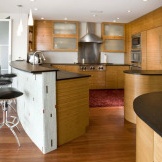
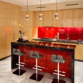
The design of the kitchen should be stylish and organic. Zoning finishing materials can not only walls, but also the floor. The skillful use of a suitable floor covering will correctly delimit space. As you can see in the photo, a completely different texture and color contrast creates the illusion of freedom and space, emphasizes the superior taste and modernity of the owners of the house.
Moreover, with a large area of the kitchen, it is good to use bar counters, all kinds of partitions and so on to distinguish.

