Exclusive in your kitchen
The time of typical interiors has remained in the recent past. Unformatted design and modern modular headsets made by the author's projects in accordance with your desire will help to make the kitchen unique. Sketches, verified with respect to square meters, will significantly increase the functionality of the room, and provide spatial freedom.
To withstand the idea of a concept, for a start it’s good to decide on the priority of style. He will set the direction, and create the surroundings yourself. For examples, dominant designs are suggested: classical, country, modern, Contemporary.
According to time
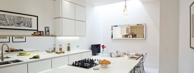
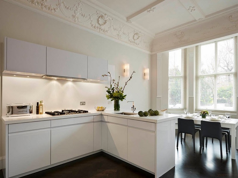
Art Nouveau was synthesized from classics and high tech, and adopted the best trends of the indicated concepts. Recognizable by clear lines, shiny surfaces, steel legs. The furniture facades are made of inexpensive materials, but who prevents the replacement of plastic and enamel with bleached wood or the finish of their natural veneer?
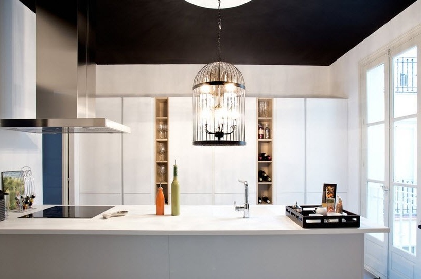
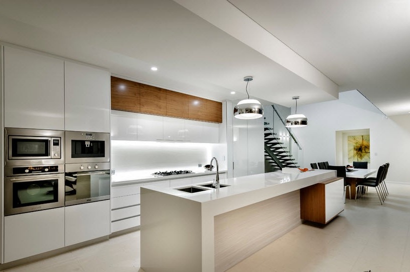
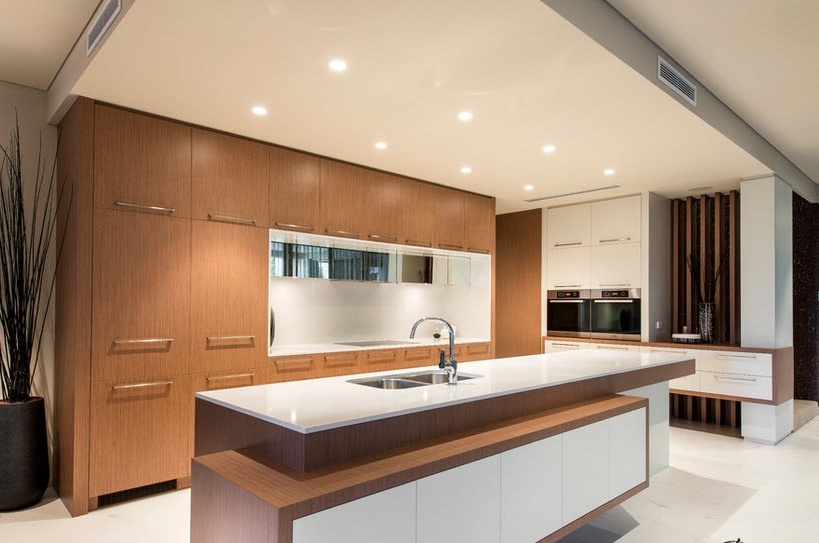
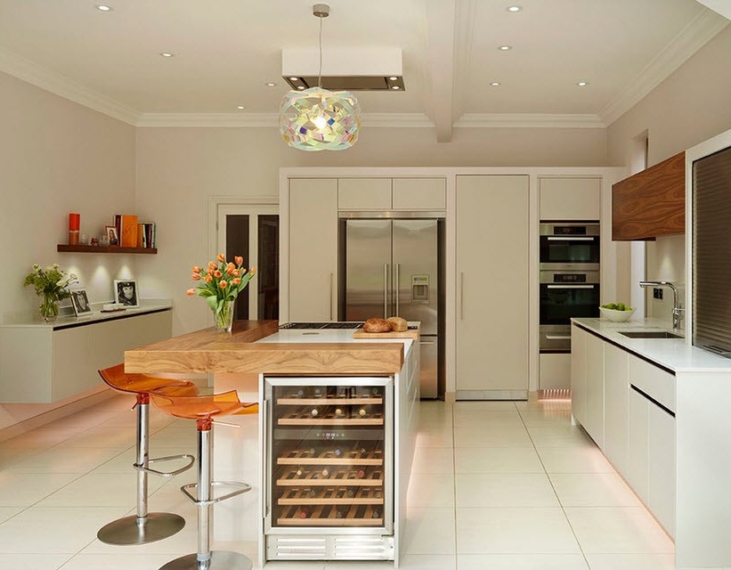
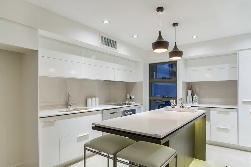
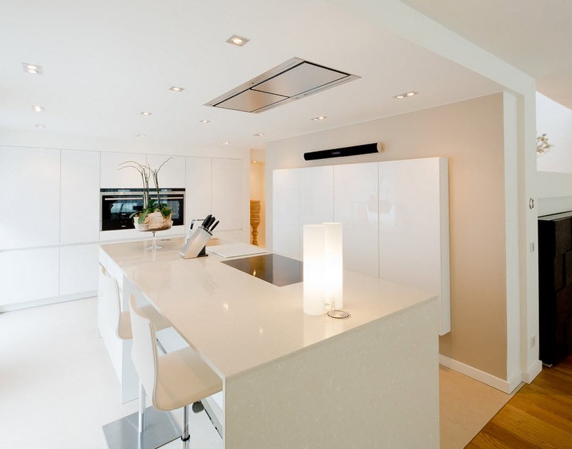
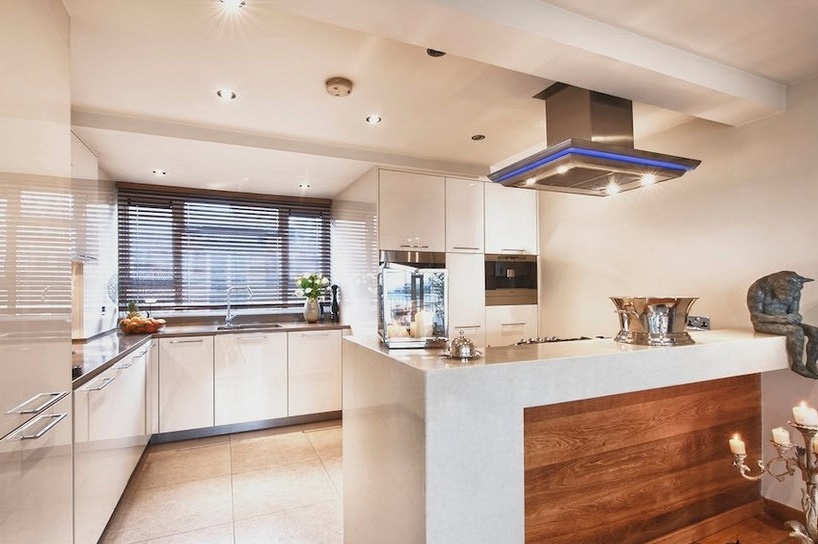
Decorating in this spirit will appeal to neat women, since glossy empty surfaces guarantee the order, rational organization of kitchen utensils hidden behind cabinet doors. Open shelves are excluded in principle. Island or peninsular furniture sets over a large area are combined with a U-shaped arrangement of objects. Restraint in decoration and strict design of the room looks good on the background of stretch ceilings or whitewashed surfaces, with a socket for a chandelier and stucco molding around the perimeter.
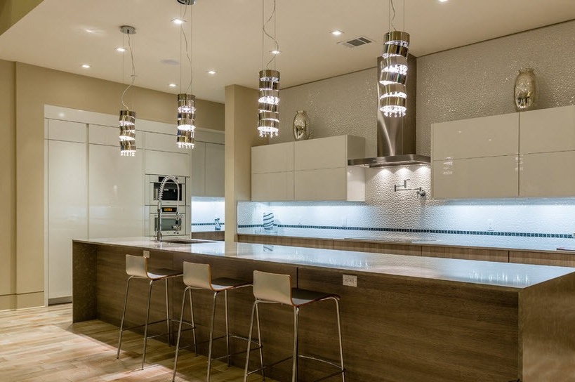
A multilevel play of light will make any interior unique. Lines of luminous dots aimed at lighting every corner will flood the room with light, and the brightness of the chrome highlights will benefit the space. The backlit faucet will also surprise you with its original design.
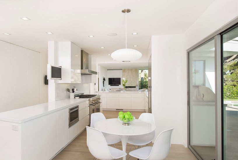
White design or rich color yellow and brown, in a duet of color accents, transferred to accessories, emphasize your taste, and indicate a commitment to style. Kaleidoscopic variety of colors is excluded a priori. A few vases, flower pots with plants and colored backs of chairs are enough for tone harmonization.
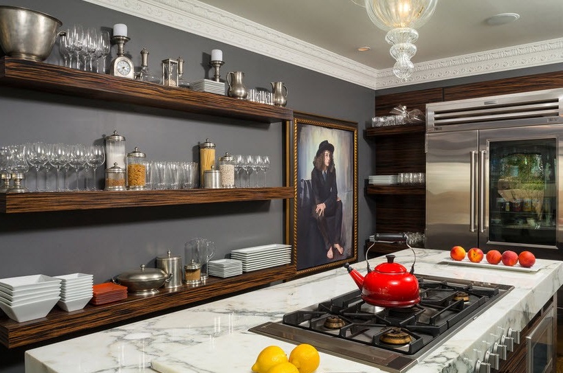
Classic and country - A theme for perfect housewives with 3-course home-cooked dinners. Solid wood furniture “Tell” about stability in life and the value of the family. At the same time, you can talk for a long time and abstruse about the environmental friendliness of the tree, the ceremonial look of the kitchen with his participation, but the beautiful and stylish sections look self-sufficient, and do not need comments. Made in support of a given topic, they are always indicated by authorial touches and excellent performance. Equipping cabinets with decent fittings is of particular value for decorating moments.
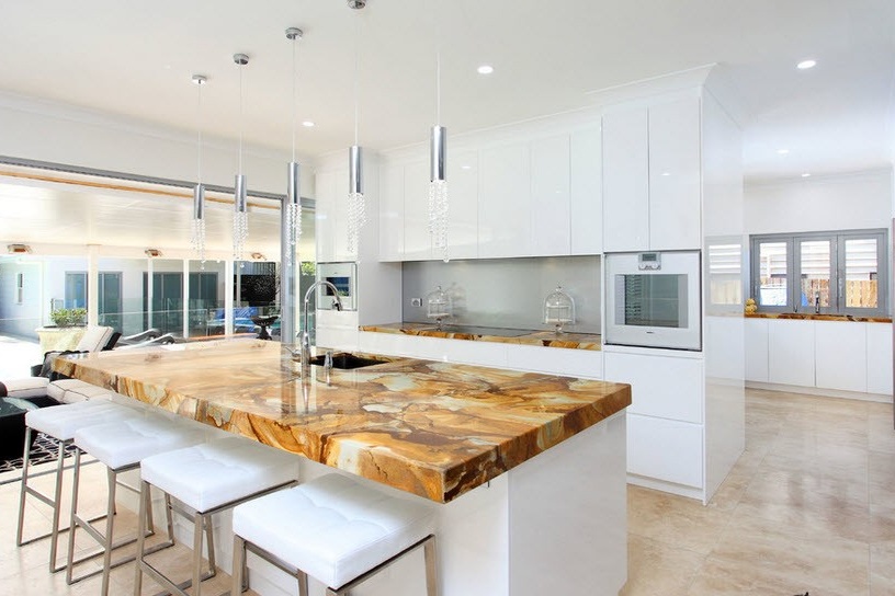
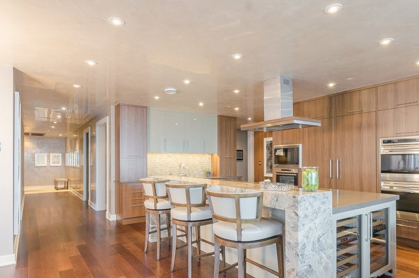
Seamless countertop made of natural stone or its cool imitation, will become the missing link in the design chain, and connect the modules to the headset. Household appliances, despite the modern look, wonderfully fit into both genres, and will not bring dissonance into the classic sound.
Classic in stone
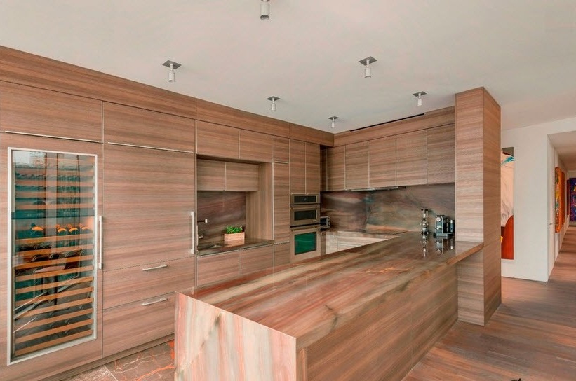
Turn on the fantasy, rely on the texture of the stone, and lock the surface into a ring. The window sill, the monolithic plane of the island, the sink, with the inclusion of fragments in the wall panels, can be performed in a single ensemble. The material is democratic to all styles and loyal to colors.
A good option is considered an acrylic stone based on resins. The finished countertop of any size will look as if it was cut out from a continuous canvas. And all because it adheres well and polishes to a shine.
Products made of quartz - a natural mineral, with the addition of pigment for brightness, are distinguished by the wide range of colors and natural wear resistance. Perfectly restored and provide the beauty of any surface.Brands Plaza and Stone do not hesitate to fully exploit it in their collections.
Cast agglomerate is a composite material, in recent years it is especially in demand in details for the kitchen. Contains marble chips, fragments of granite and quartzite, and with the participation of powder paints, is distinguished by chic colors. The structure and strength have made it universal for use in any quality: both for surfaces and self-sufficient interior decorations. The FOSTER Ekoteko collection is represented by products made of artificial stone.
Looking back to the country
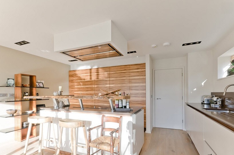
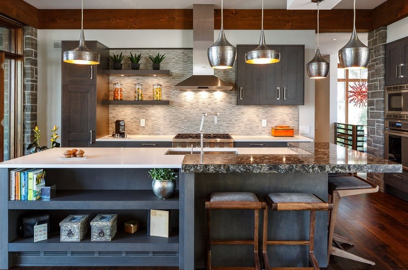
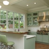
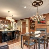
Oak roomy cabinets support country. They do not have to be aged in brown tones, and dark cherry facades will bring energy of peace and coziness. Wooden handles or openwork metal fittings look nontrivial, and resemble vintage retro.
A massive handmade table will make a company of high-quality furniture, and together with chairs of a given theme, they look organically. If the surface is artificially aged, the technique will add charisma. Dark furniture and wooden floors require light colors and some rainbow spots.
Keep on the table a vase of flowers, fruit basket, linen napkins and throw the same towel on the back of the chair. Design requires large windows, and drapery takes on most of the decorative attention. It looks interesting carpet in the dining area to match the curtains.
“Drape” the lemon-yellow wall with a grid of thin wooden laths treated with brown stain. Cell sizes can be very large or small, square or diagonal. In a fixed structure, “plant” several sunflowers. Duplicate the design at the bottom of the window, but just reproduce the copy in a small format, building a 50 cm hedge. The beauty will be supported by a yellow Roman curtain or other versions that leave the glass available for viewing.
Maxim minimum
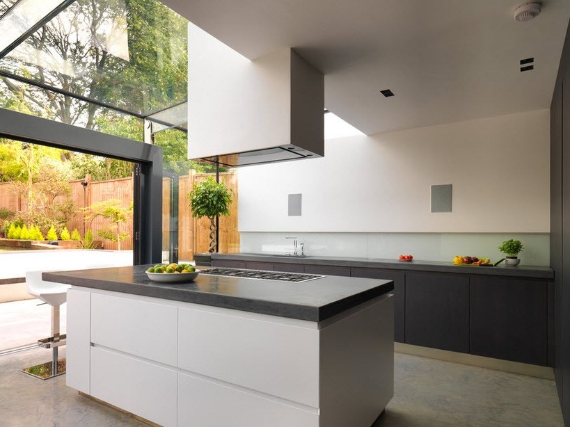
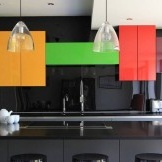
The concept of “contemp” marks fresh ideas and projects that go beyond the conventionality of modern trends. The combination of the best stylistic “squeezes” in decoration and tandem with technological capabilities is based on the economy of space and the individuality of the project. Functionality clearly “quotes” new home appliances with convenient placement for work. Usually these are built-in models. But this does not mean that if you want to indulge in fries once a month, a gadget is bought.
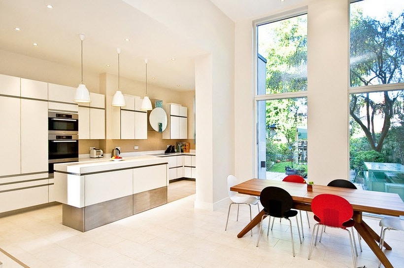
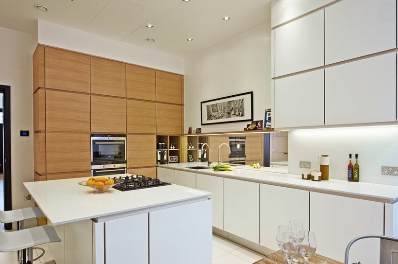
Furniture with simple geometry and basic design is designed to hide household details, and involves the textured expression of surfaces. Cabinets can be made of modern materials and expensive textures according to your capabilities. Judge for yourself how the interior may look, in which glass, colored plastic, wood, metal are involved. Although the priority in flooring is behind tile and laminate, boards and stone are not excluded.
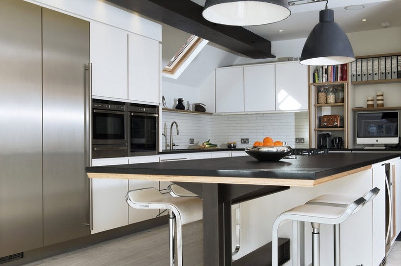
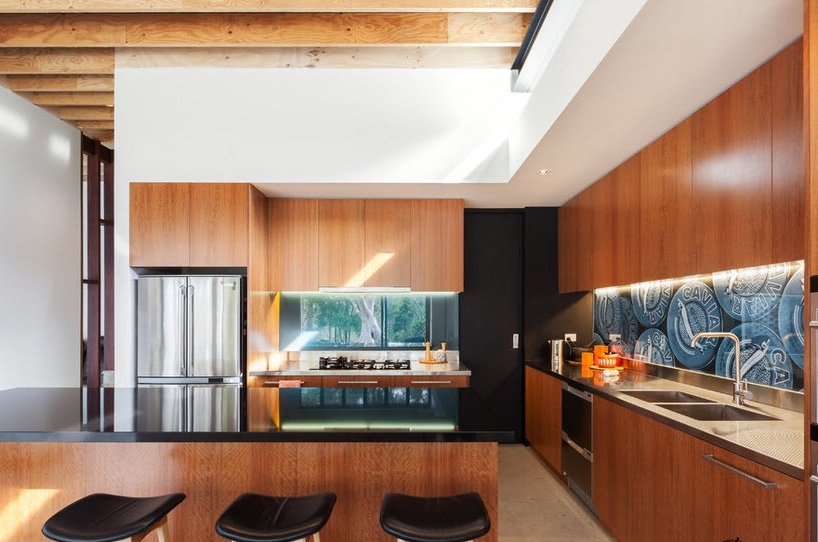
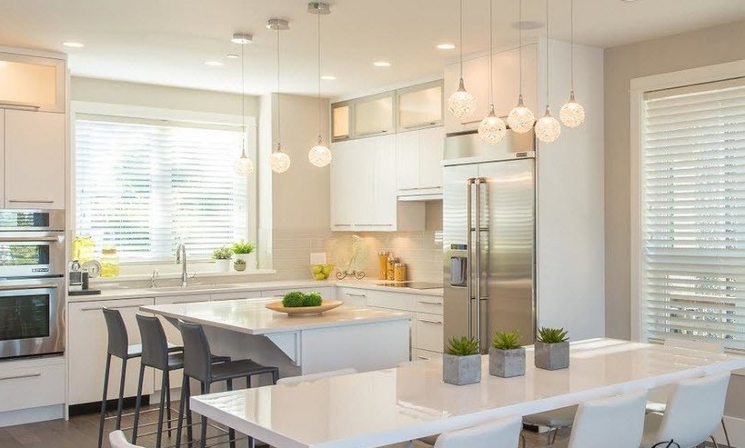
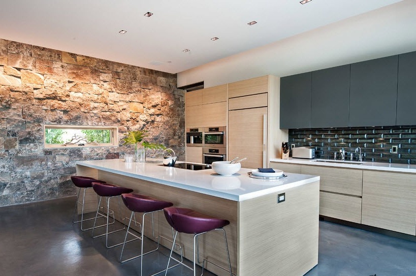
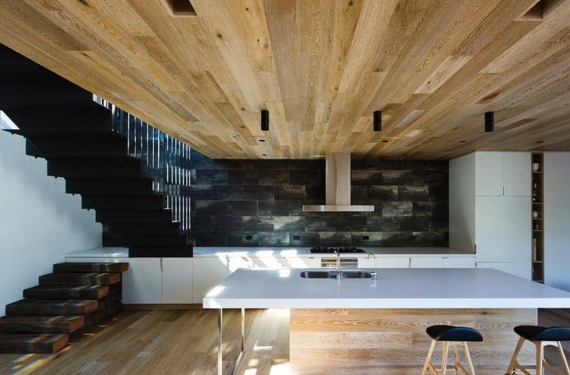
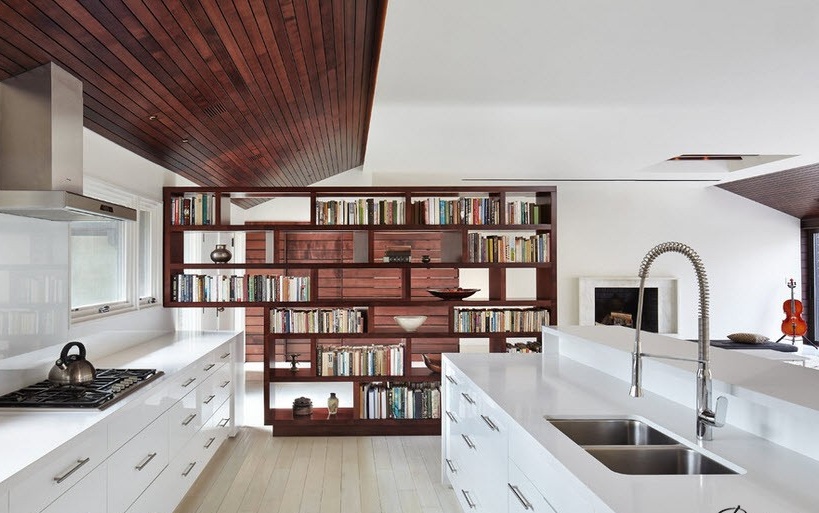
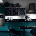
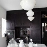
Minimalist kontemp loves black and white colors. Agree, it is difficult to call the plot trivial when light furniture is on the black floor. The notes of a familiar rustic style can be traced in a combination of a dark interior, rough wooden elements of the ceiling and the same floorboards. Unusual bar stools, backs with fragments of plastic, artificial inclusions or texture pattern of stone will dilute the continuous space. Cold whiteness always compensates for the warmth of the wooden floor. The milky color of the kitchen in the company of a stone floor, laid out compositionally, definitely does not require additional decoration. Just a few textile details. Refinement is determined by the simplicity of the configurations and the smoothness of the corners. The glossy black and white facades of the cabinets combined with pendant lights are a delight.
Summary of the above: if you want to get maximum space, and to make the interior always up to date, refer to the contemporary.
Custom ideas for an exclusive cuisine
If you approach the design of the kitchen exclusively from the functional side, and rely on practicality in design, a boring space will psychologically crush over time.
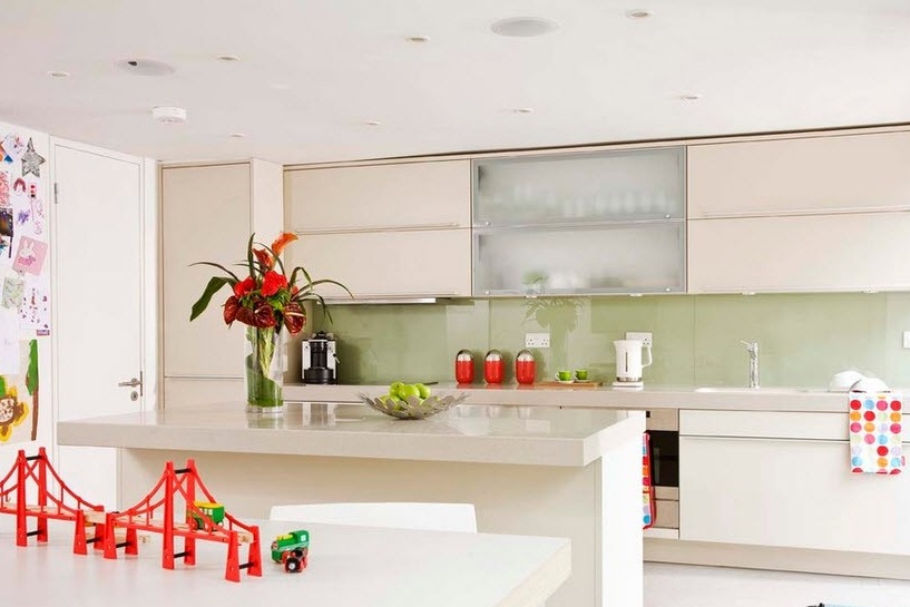
A colorful, catchy apron, can become a chip in the kitchen. This will be taken care of by laminated panels with non-tonal prints made by photo printing. The panel, laid out in horizontal aspiration above the working area, framed by a border, duplicates a beautiful path. Complex ornaments or independent plot fragments united by one idea look interesting.
A composition of triangles (chevrons) is laid out with a 10 x 10 tile in the form of a cardiogram. Zigzags look fun with a combination of dissonant colors. This pattern is also successful on the floor. Select the ceramic squares of two colors, and repeat the curves on the bottom plane. Monochrome space will dilute a bright carpet.
The color is impressive behind the open shelves. The primitiveness of action is striking in its luxurious effect. Paint the interior panels of open cabinets or the back wall behind the hinged structures in a contrasting color.
Fragmented screensavers from photowall-paper have success. Really make an open wall with sheets of culinary recipes or measured proportions. White lines of marking on a gray plane certainly can not be called commonplace.
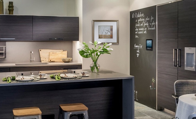
Make a magnetic wall. We’ll leave the habit of hanging souvenirs on the refrigerator in the past decade, but acquiring a “clinging” board will not hurt. On it you can make compositions from the presented little things and leave notes. The design itself is made out with special paint. A chess field is collected not only by tiles. Using a stencil, the floor can be made into a box, and it is not necessary to achieve black and white contrast. Make it violet yellow or beige brown, or paint it in your favorite color.
As you have seen, the design of the kitchen takes past traditions, and transforms them into new ideas. In order to exclude upgrades and updates, design a space for yourself.

