
Blue color: the rules of combination and design
Of course, the sea and the sky are the first things that come to mind when you look at the blue interior. This color belongs to the cold gamut and suits lovers of freedom and lightness, it contributes to the sobriety of the mind, not devoid of romance.

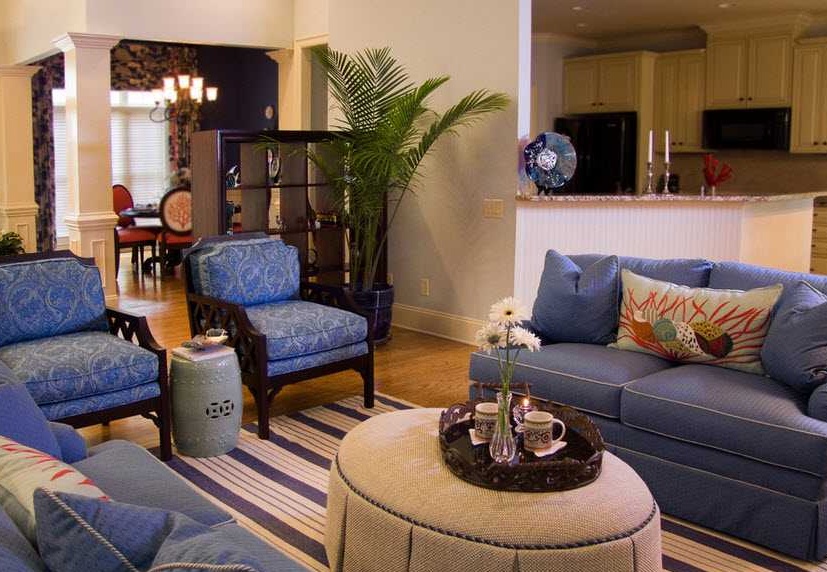
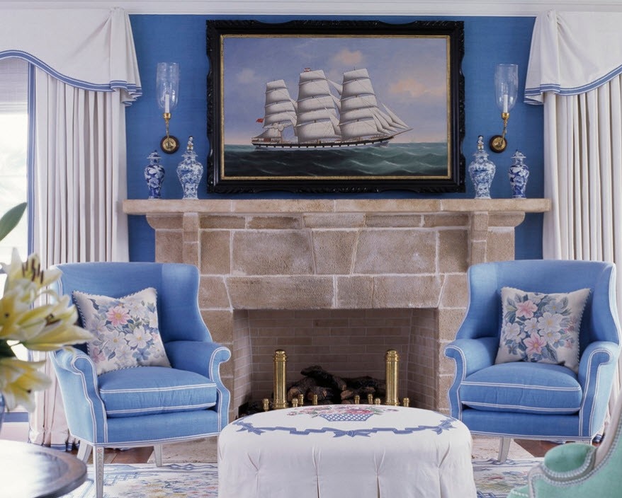
Blue and white
The union of blue and white is most often found in bathrooms, and this is not surprising, because it is blue that represents water, and where, if not in the bathroom, we are most faced with water.


But in fairness it should be noted that in the interiors of other rooms, the combination of white and blue also looks appropriate and even noble. And some rooms are directly recommended to use a tandem of these colors. And that's why. White and blue combination will create an airy atmosphere that contributes to a good and complete rest. This union is considered ideal for rooms that have small windows, so white and blue colors will add light and even fresh air. But so that the effect of this combination of colors is not lost, do not add any bright accents to the interior. The maximum that you can afford is a few soft bedding tones: beige, light caramel, vanilla or pale pink.
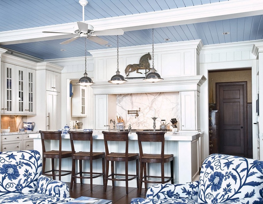
With regard to blue and white interiors, it is worth considering that they are lost not only from the addition of bright colors on the walls or furniture, but also from the saturated tones of the floor. Nothing should distract attention from light blue motifs, otherwise the whole impression of color will disappear, and the desired effect of lightening and expanding the space will not work. The designers expressed their opinion on some floor coverings for blue and white interiors: a laminate of dark shades will create a heavy impression, a ginger tree will make it rude, and a natural greenish oak will upset the balance. So, what kind of flooring will be most suitable in this room? Opinions of professionals agreed on a honey-golden wood coating. It is also good because it looks equally advantageous both in the classic interior and in the modern. Based on the fact that white is a neutral color, and blue is a cold, honey-golden floor, it will add a little heat to the room, without depriving it of freshness.

But if there is no problem, even slightly warming the blue and white interior, you can choose bleached oak for the flooring. It fits perfectly and does not encroach on the cool atmosphere of the room.


Those who want to make their interior not too cold, but, say, moderately cool, will use a bluish-gray background. Gray refers to neutral colors, so this design looks softer. In combination with white elements, it seems that the room is filled with snow flakes. But it will not be cold, on the contrary, in such an interior, conversations will take place easily and naturally.

Many even experienced designers hesitate to work with a combination red and blue, their apparent antagonism, if used incorrectly, can disrupt the entire design design. But, as you know, opposites attract, so ice and flame (blue and red) can create a magnificent interior.
So, the first problem that will need to be addressed is temperature imbalance. But the heat of red and the cold of blue can still be reconciled, using, for example, the method of leader and emphasis. That is, make one of the colors the main one, and just add it to the second. To whom what role to give depends on the temperature preference for the room. That is, if you want to make the room cool, then the main color will be blue, and red may be in the role strips on furniture or wallpaper, but not on all walls, but only in some places. Or let the tablecloth, bedding, chair seats and so on be red. So, we get a soft, relaxing cool from the blue, but due to the red accents, we will warm up a bit. There is even such a technique as one or two pieces of furniture completely made in red - a kind of corner oasis.
By the way, when combining with blue, you should not dwell on only one red color, you can play with its shades, this will help eliminate color disharmony. Whereas for blue it is better to take only red. But if you want to use blue for the background of the room, then shades such as raspberry, terracotta, scarlet, raspberry with cream or coral can be suitable for it.


Green is very close to blue, in the color palette they are relatively close to each other. Therefore, they can often be seen in one interior. For example, such a union is good for children's rooms, bedrooms or spacious living rooms. What is the reason for this popularity of this combination? The fact is that the blue color and green completely embody mother nature, therefore, equipping the interior in these colors, the most successful option would be to use their natural shades. That is, sky blue motifs and fruity greens. If saturated blue, then it is better to supplement it with a deep pistachio. For light blue interiors, kiwi color neutrality is preferable, which, although saturated, will not create either a cold or warm atmosphere.
The versatility of fruit shades of green in combination with blue allows you to use them in absolutely any room. In this case, in this embodiment, you can take both light shades of blue and dark, they are equally harmonious with fruity green tones.


Yellow or orange notes in the blue interior symbolize the awakening of nature from sleep, its delicate spring motifs. The interior is so natural that when you are in it, you feel as if in the bosom of nature.

A cheerful mood and a huge charge of energy, this is what promises you such a combination of colors in the interior. This union is suitable for any room, even for a corridor, pantry or loggias. It all depends on the presentation and proper use of the proportions, as well as correctly placed accents. But the most remarkable thing in this combination is that you can take completely different shades of both blue and yellow (orange) and the overall picture will not suffer from this, on the contrary, it will look fun and interesting. For example, if a room is designed in light blue, possibly with the addition of white, then one or two yellow accents will help to drive boredom out of this room. This will create some dynamism.
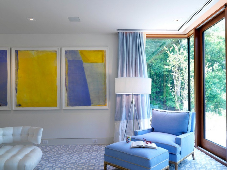
Considering the cold that the blue color brings with it, many prefer to use yellow and orange to soften the atmosphere and fill it with the warmth of the sun, while this combination does not take away from the room the freshness and visual expansion of the space that the blue color gives. By the way, designers are advised to use yellow and orange colors in their bright manifestations.


So, blue goes well with similar colors in the palette, and antagonists (red). If you correctly use emphasis, then the interior with any of these combinations will be cozy and interesting.


