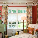
Interior of a small living room: a kaleidoscope of illusions
Modern trends in the design of the living room are formed under the influence of changes in its functional role. We used to watch in the hall TV and dined, hosted large groups of guests, danced, celebrated solemn dates. Now it is more convenient to organize collective festivities outside the home - in a cafe or restaurant. The living room is becoming more closed to prying eyes and casual visitors. Today's living room is a place of individual or family pastime, therefore it becomes more comfortable and corresponds to the true needs and tastes of its inhabitants, and not an “exhibit” exhibit to confirm the status of the owners. In small spaces, with the right approach, the living room, dining room, and even the cornercabinet. Artistic style does not play a big role in the sense that you can choose the one that you have long dreamed of and with which an understanding of the ideal interior is associated. The main thing is to create in the end a clean space that will give a feeling of spaciousness.
A small living room is not a reason for sad thoughts that square meters are not enough to realize interesting decisions and design fantasies. Quite the contrary. There are techniques that can visually expand the room.
7 optical illusions expanding the space of a small living room
As if by magic, you can change the hall without changing its real area. If you have a small living room, try a few visual tricks to make the space seem more voluminous, more lighted, higher, and everything will work out. It seems like magic, but in reality it’s science.
1. Make the space seem bigger than it really is
At the end of the XIX century. German scientist Hermann Ebbinghouse (1850–1909) explained how to achieve a change in perception of the size of an object using Titchener's theory of circles. The essence of the observation is that in the same circle the figure appears larger if surrounded by smaller circles, and smaller when the circles are much larger. Why it happens? We perceive the size depending on the elements that surround us (relative size). Therefore, in order to perceive a small space as large, furnish it with small-format furniture.
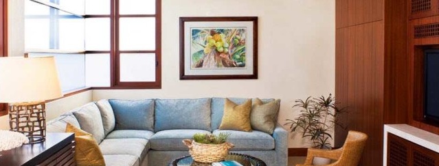
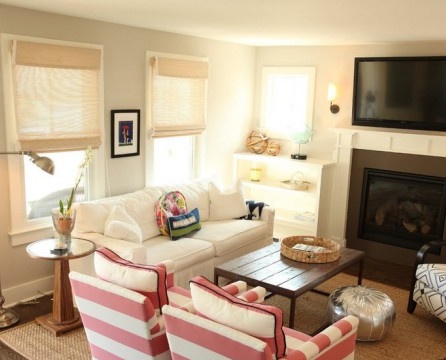
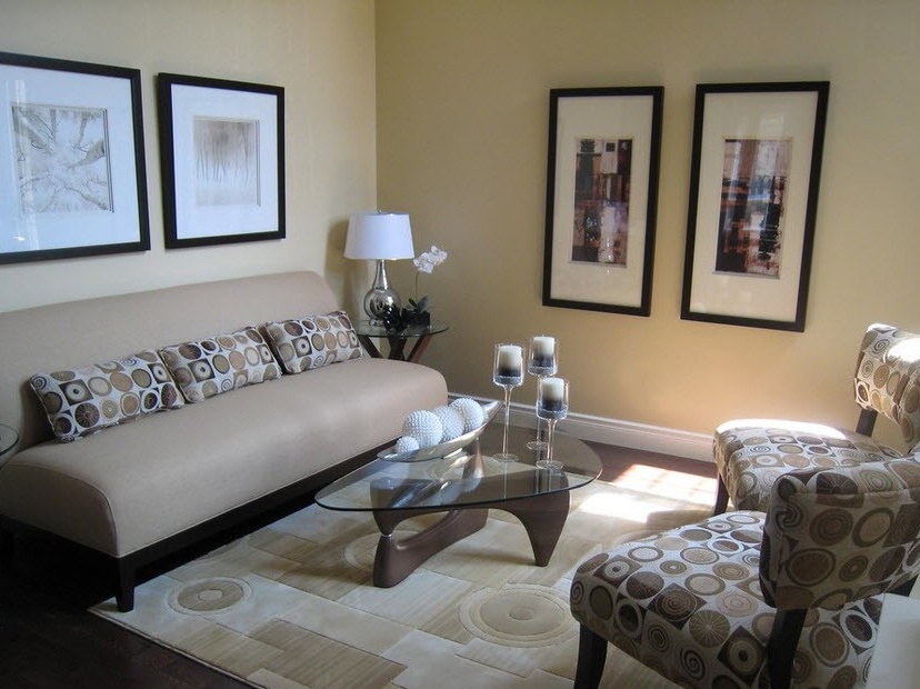
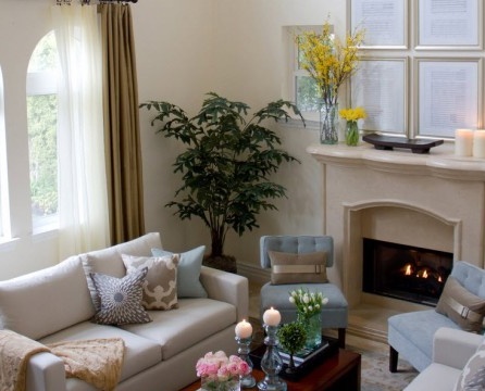
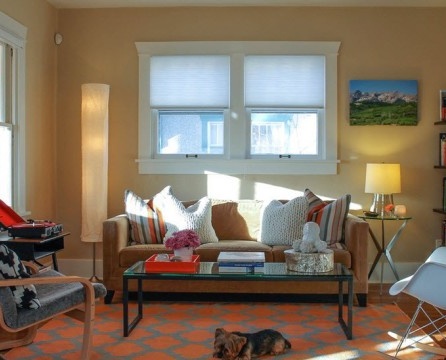
Also, please note that without optical focus, the living room, although equipped with comfortable seats, is poorly balanced. You can turn the sofa into the focal point of the living room by surrounding it with smaller seats. The living room will seem larger and much more pleasant to look at.
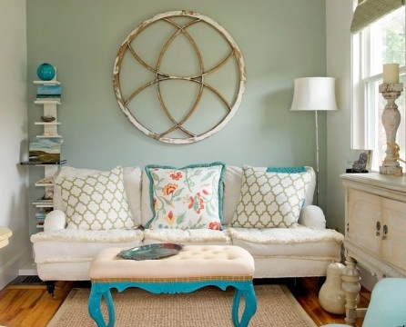
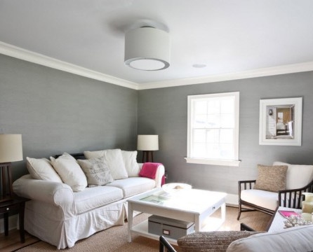
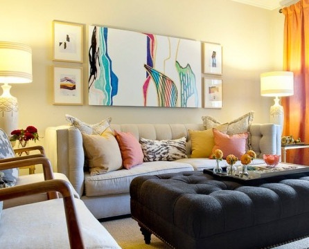
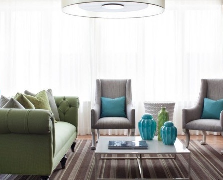
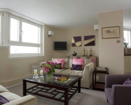
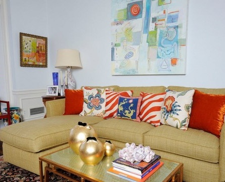
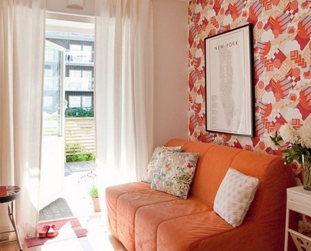
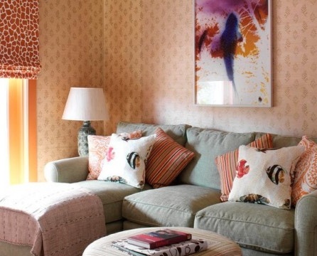
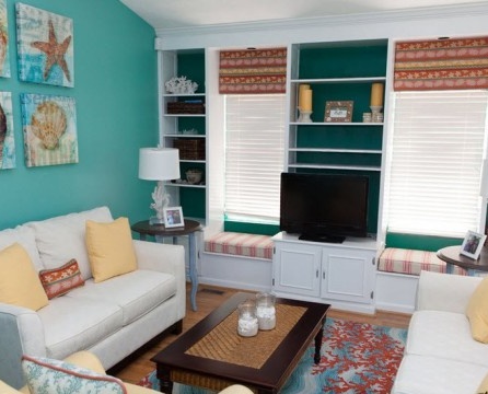
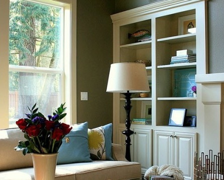
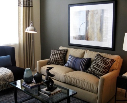
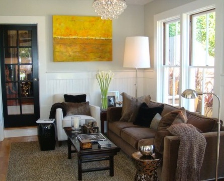
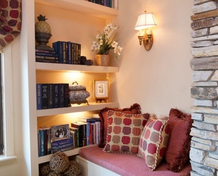
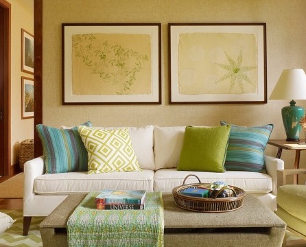
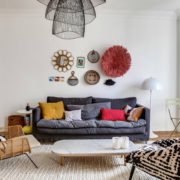
Color is one of the main tools for visual expansion of space and providing light to all corners of the room. The problem of excesses extends to both color and texture, the glut of which negatively affects the perception of a clean and organized space. The dominant in small spaces should be beige, sand and all shades of white. To destroy the monotony, you can resort to bright acidic accents (in small doses) in the form of accessories - sofa cushions, rugs, curtains, linen, cotton, silk or shiny or matte organza covers. A large picture will visually reduce the room, a small one will increase it.
2. Create a sense of perspective
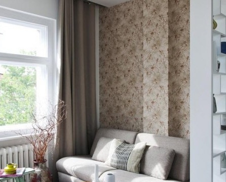
To create depth, use the technique of the illusion of distance. The brain perceives in a peculiar way objects that are further away. They look better (some details disappear or blur). Why not use this illusion to enhance the living room perspective? It’s enough to decorate the wall or furniture that you want to “push” (do next) in smooth and soft colors. And vice versa: to include textures in what you want to bring closer.
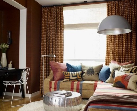
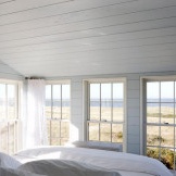
To enhance the perspective, do not leave a single piece of furniture so that it impedes the overall perception of space. For the brain, empty space, like a cloudless sky, is associated with the distance. Therefore, it is also important to increase the visibility of going beyond the boundaries of the room. Leave free space in front of the windows and open the curtains so that your eyes do not meet obstacles and are sent, almost unconsciously, into the external environment.
3. Change the space using horizontal and vertical rays
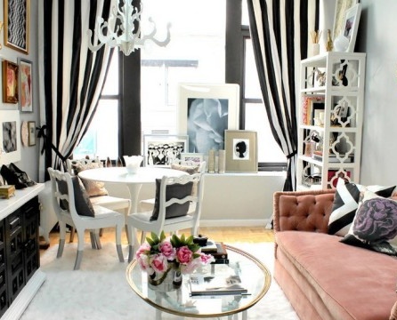
Peter Thompson, an expert in psychology of perception, speaking in 2008 at York University (UK), argued that the difference in perception of the size of the subject can create horizontal and vertical rays that stylize spaces and bodies. In 1860, this effect was already discovered by the German physicist Hermann Helmholtz, who conducted experiments with the perception of squares. He took 2 squares of the same size, in which he drew parallel lines of the same width and dividing stripes inside. A square with horizontal lines was perceived higher and more stylish. As for the second square, it seemed that the vertical lines occupy a larger area.
Therefore, if you want the wall to appear higher, draw horizontal lines, if wider, draw vertical lines. If you read the opposite statement somewhere, then it is a fallacy. This has been proven by numerous experiments.
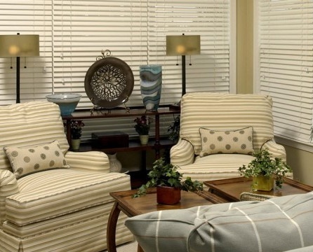
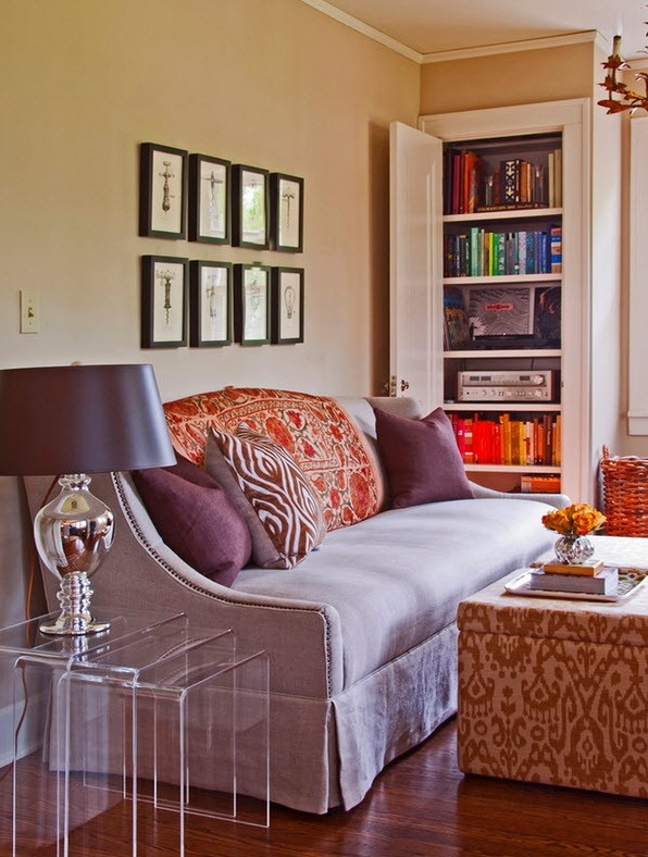
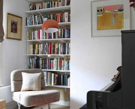
Accessories and decor items (lamps, paintings, mirror frames) with pronounced vertical and horizontal components change the perception of the surrounding space.
4. Choose furniture that takes up less space.
Proceeding with furniture should, of course, be done with general planning and understanding that if the size of the room is small, you should not clutter it up too much - “extra” furniture will take up space and reduce the sense of volume. Each furniture candidate for placement is carefully selected for expediency and necessity.
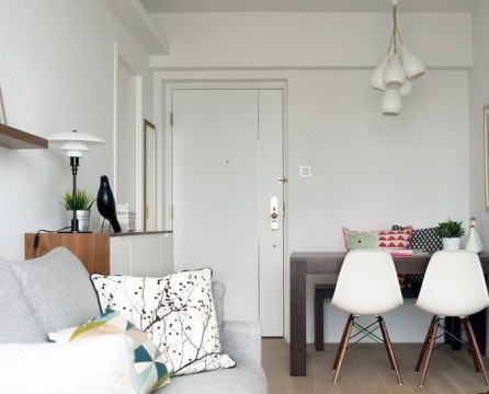
Today's furniture market offers a wide selection of versatile and multifunctional furnishings of small size and excellent design. Modern furniture designers offer many transformer designs that can be used in a variety of ways, easy to clean or position as needed.For example, in a small room, it would be ideal to provide only two objects - a single table that would serve both a writing desk and a dining room, and a sofa turning into a bed, quickly sliding apart and folding.
Furniture is arranged in such a way that there is more free space. Several elegant folding chairs can be placed behind the closed facades of the built-in wardrobes and removed as needed.
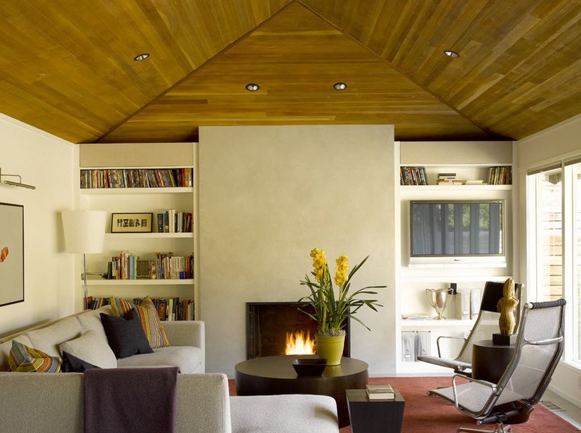
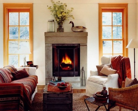
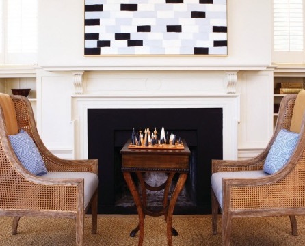
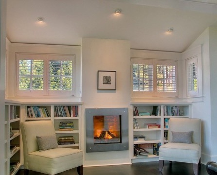
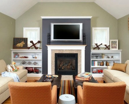
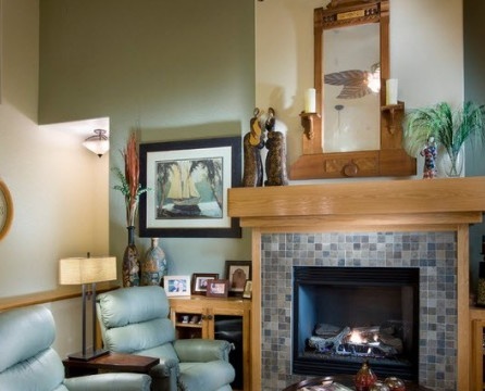
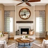
It is impossible to imagine a comfortable living room without comfortable armchairs, set in front of the video system or next to the fireplace. To achieve greater order, experiment with pairs of pieces of furniture located on both sides of an imaginary axis of symmetry.
The vertical line seems a third longer than the horizontal of the same size. What is this illusion based on? On the movement of the eye. According to the German psychologist Wilhelm Maximilian Wundt, horizontal visual passage is easier and faster, and vertically causes effort and therefore is slower. The horizontal rack appears to be shorter (and “occupies” less space) than the vertical one.
5. Achieve increased light
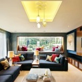
With a lot of light, the room is perceived as more lively and energetic, and at the same time larger.
If you play with contrast and shadow, you can increase the illumination, without adding light. Light will be perceived lighter and brighter, just paint the surrounding areas. This was demonstrated by optics professor Edward Adelson with his theory of contrast clarity. The lesson is simple: the light source produces more light with the addition of a certain amount of shadow.
To apply this effect to a room, you can paint the window wood details in white and the slopes in dark. Thus, the light passing through the window is amplified and intensified by the shadow frame.
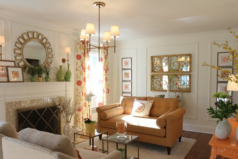
One of the simplest and at the same time magical tricks to decorate a small room and make it visually large and bright - use in interior mirrors. To make the small room more spacious, you can put mirrors on opposite walls. They, reflecting natural and artificial light, visually enlarge the room. Mirror walls come in a huge number of styles and are an element of decor. Ideal for decorating bare walls.
6. Separate the space without dividers
In order for space to be perceived as organized and spacious, the illusion of the Kaniss triangle can be used. An Italian psychologist at the beginning of the twentieth century discovered that if, using an imaginary triangle (or square, rectangle) in the room, furniture was placed at each vertex of the corner, the brain would unknowingly close the geometric figure, and you could separate the living room area from the study corner or dining room without real dividers (which always reduce space).
7. Show a sense of proportion in the decoration
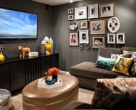
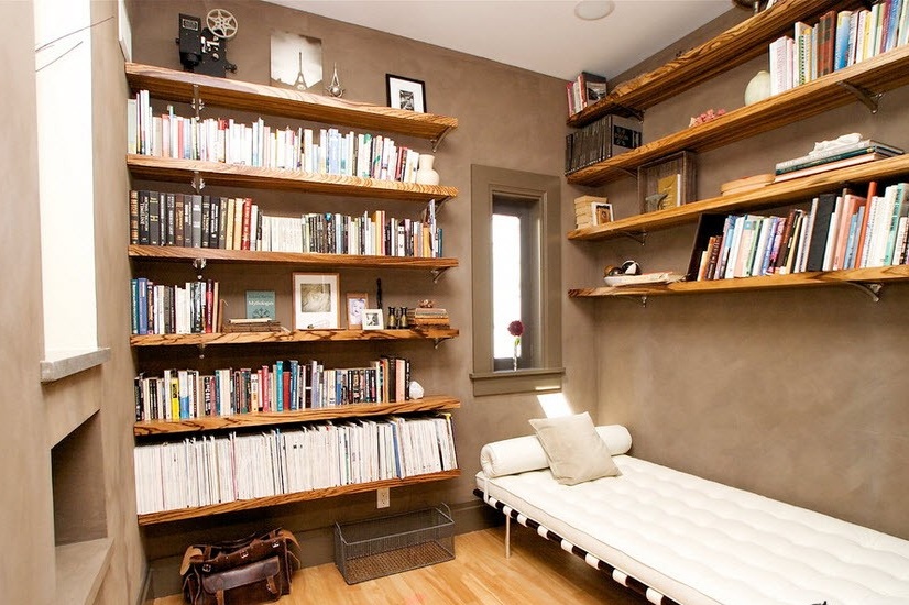
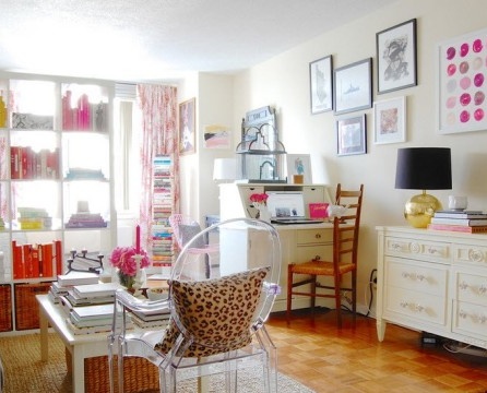
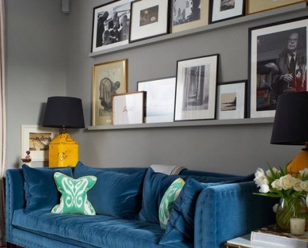
Some mishmash of wall decorations can create a mess in the room. You should review the collections on display and showcase your favorites instead of completely covering the walls and filling the shelves with works of art. Eyes cannot concentrate on anything, and the impression of disorder and disorganization is created. In living room decoration, less is really more.
Finally, we got to an optimistic conclusion - the main thing for the room is not size. Create your own unique style with tips from the best interior designers, and your living room will be transformed.

