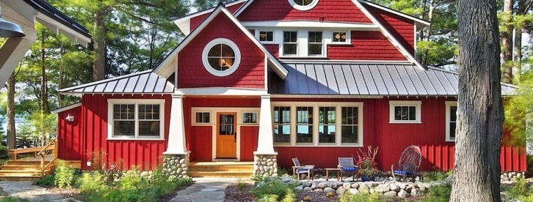
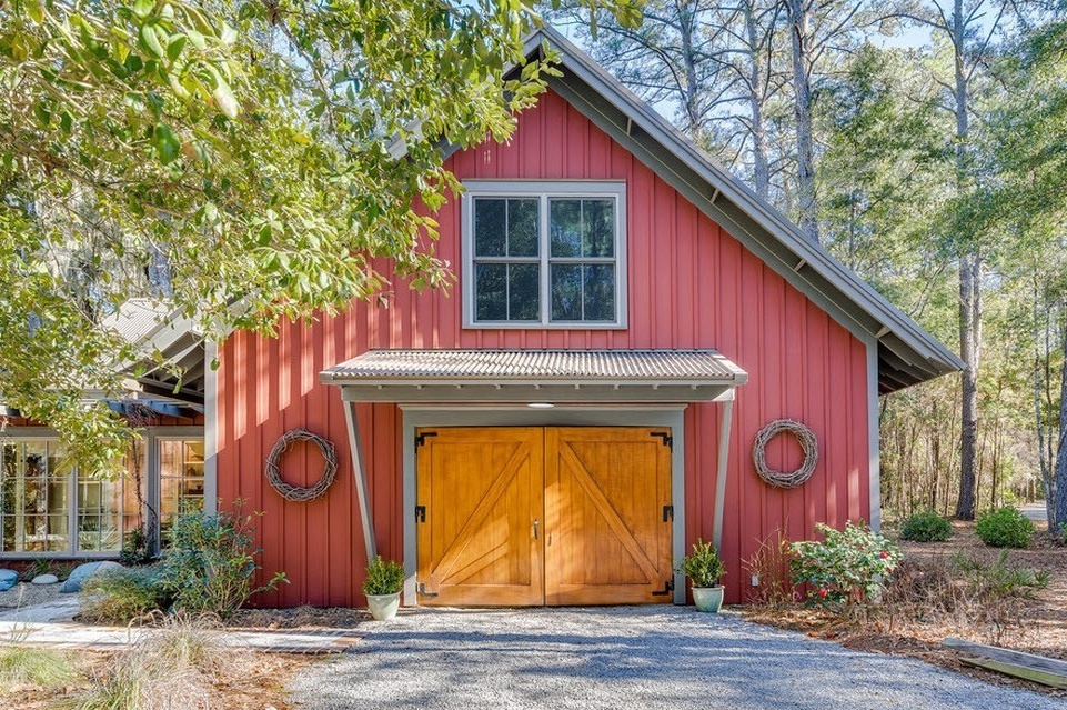
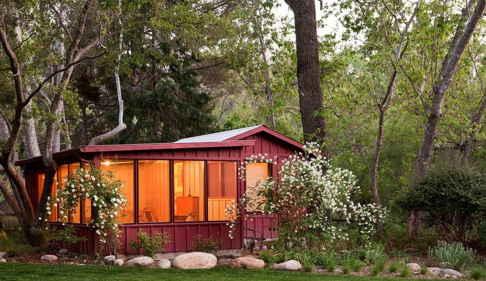
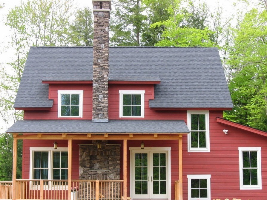
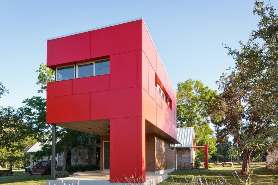
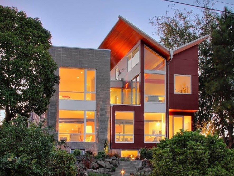
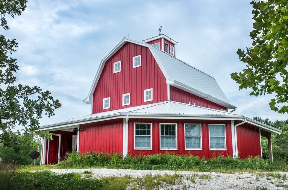
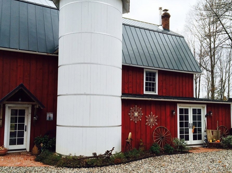
The red facade is a bold solution for a colorful image of a private house
The perception of flowers is a very subjective process. And at the same time, there are certain trends that summarize the impact of certain shades on our mood, physical and psychological state, emotions and even thoughts. We all notice that some colors contribute to our performance, tone up and energize, while others are able to calm emotions and calm, set to rest and relaxation. Colorists can tell a lot about the potential effects of color on our psyche and health. When designing our homes, we first of all think about choosing a color palette, but the outer part of our houses needs no less attention in terms of decoration. Not only the first impression of the home depends on how the exterior of the home ownership looks, which will either be confirmed after getting inside the house, or will be refuted. How your house will look against the background of the surrounding nature, other buildings and the street as a whole depends on the choice of color schemes when decorating the facade (we were talking about a city private house).
But how to choose the color of the building, which will not only beneficially affect our body, the human psyche. But will it allow the building to stand out among neighboring buildings or vice versa to harmoniously fit into the existing architectural ensemble? The answer to this question can be found with the help of a specialist who can take into account all the nuances and features of the location of the house, climatic conditions, the shape of the building, or you can try to figure it out yourself. This publication will be devoted to the facades of private houses made in various shades of red - one of the most striking, positive and energetically charged colors.
The choice of colors - the beginning of beginnings
Choosing a color for the facade of the building, we can’t think flat, stopping our choice only on the shades of the walls, it is important to consider the combination of the color scheme of all structural elements, parts of the building, its decor. That is why you need to choose not one color, but a small spectrum - the color scheme. The following types of scales are available:
- contrasting;
- achromatic;
- monochromatic;
- disharmonious;
- nuance.
The selection of colors is a difficult and structural process, to which it is best to involve a specialist if possible. Depending on the style of your building (classic, modern, country or modern), a color palette is selected. To obtain a harmonious image of a building, it is better to use no more than three shades - one main and two (maximum three) additional. Features of the architecture of the building dictate to us the choice of colors and their shades, because incorrectly selected tones can cross out the sophistication of the style of your home, the uniqueness or originality of the building.
Choosing a color palette, it is necessary to consider the following parameters:
- the purpose of the building (in our case, it is a private home);
- architecture of neighboring buildings (in this case, everything will depend on whether you want to stand out from the rest of the houses or go unnoticed, the latter, when decorating the facade in red, is possible only if the rest of the households are executed in the corresponding palette);
- climatic conditions (hot or frosty climate, temperature differences, the intensity of sunlight and their abundance);
- features of psychological perception;
- cultural traditions (for example, in a historical place the choice of a color palette can be very unambiguous and dictated at the level of local authorities);
- modern tendencies.
When choosing a primary color, it is important to determine its main characteristics:
- durability;
- visual properties (human exposure);
- dependence on form (in our case, on the shape of the building);
- heat absorption level.
Dark shades attract sunlight and are often used to decorate buildings in cold regions. Light colors can visually increase the size of the building. Bright colors in the sun burn out much faster than pastel ones, for example. But red has so many shades, so many options for the intensity of the tone, that choosing a color scheme that is right for your building is a very real task.
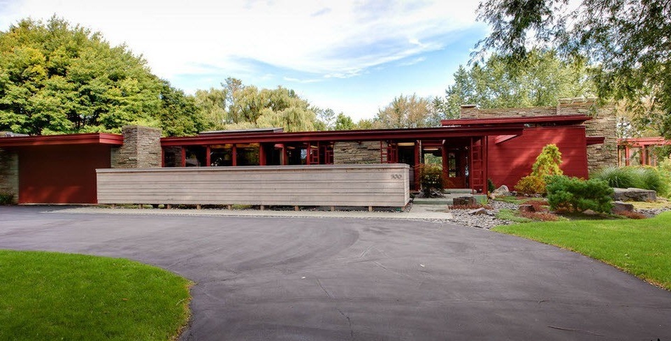
In bright colors, intricate designs with multiple decor look good. In turn, bright colors are suitable for buildings with simple shapes and clear borders. Dark tones of red are able to emphasize the shape of the structure and reduce the emphasis on the building, and bright red on the contrary will highlight home ownership not only against the background of the surrounding nature, but also among other buildings.
Features of red color and options for combining with other tones
Among the main influences on a person from the side of red (scarlet) color, the following can be distinguished:
- ability to increase tone;
- the ability to get a charge of vigor, activity;
- red color allows you to move off the ground, receive a promise to action;
- gives strength to fight, confrontation;
- fills the person with ambition.
In addition, we can talk about the effect of red on our body - it stimulates blood circulation, increases metabolism, has a beneficial effect on immunity. Red color is able to warm a person only by force of influence. The positive influence of red on a person is noted by historians - in many medieval coats of arms and flags, red was used as a symbol of military power, the desire for conquests, victories. But the red color is associated not only with victory, but also with danger, activity, passion.
Choose winning combinations of facade color and other building elements
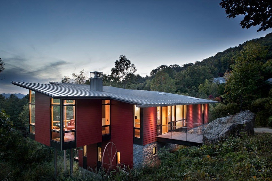
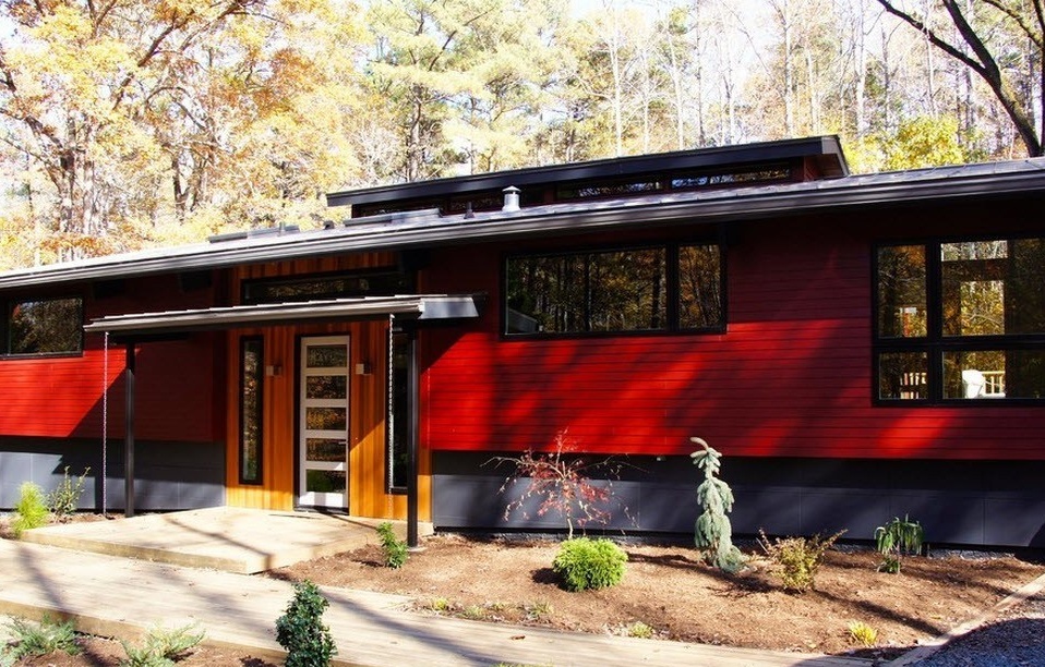
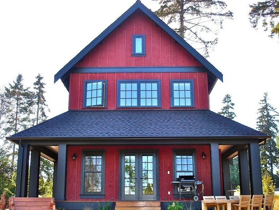
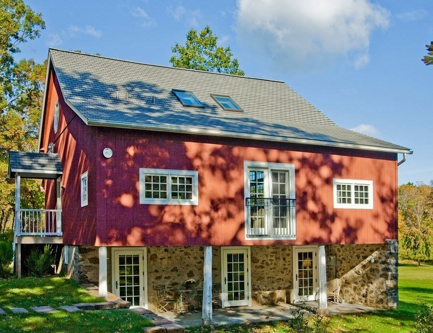
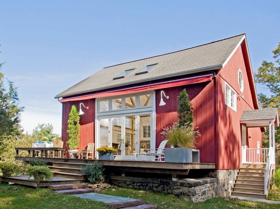
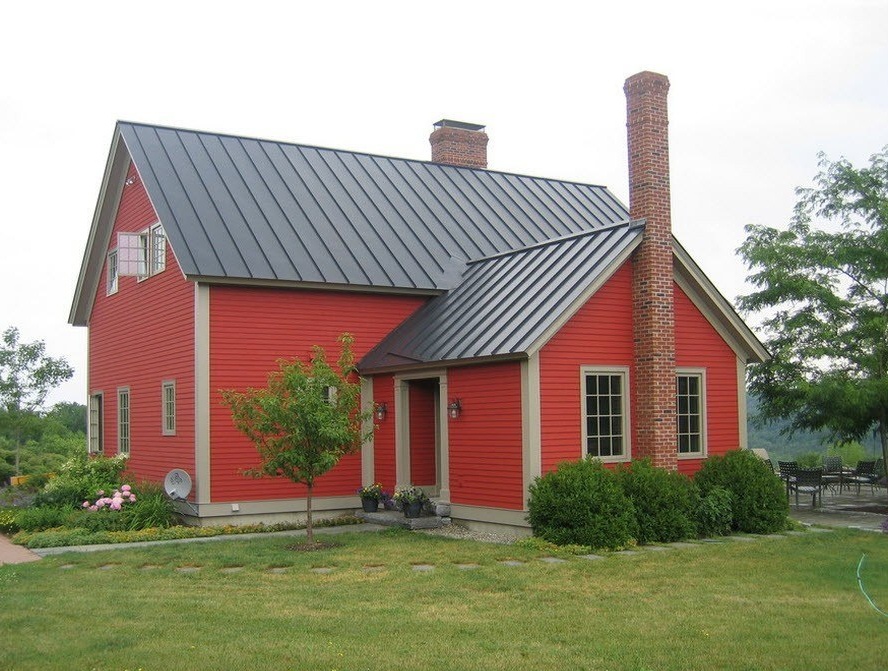
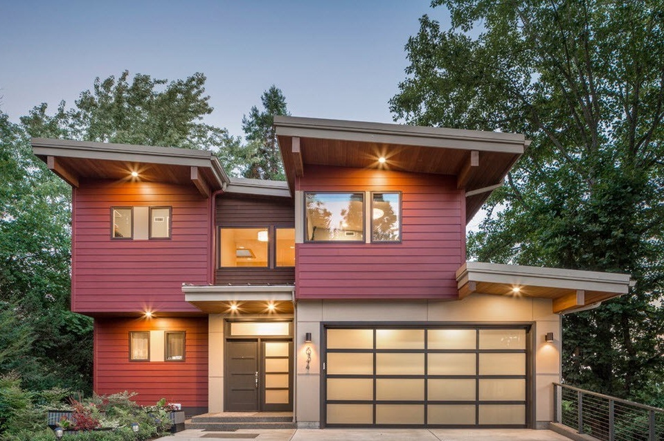
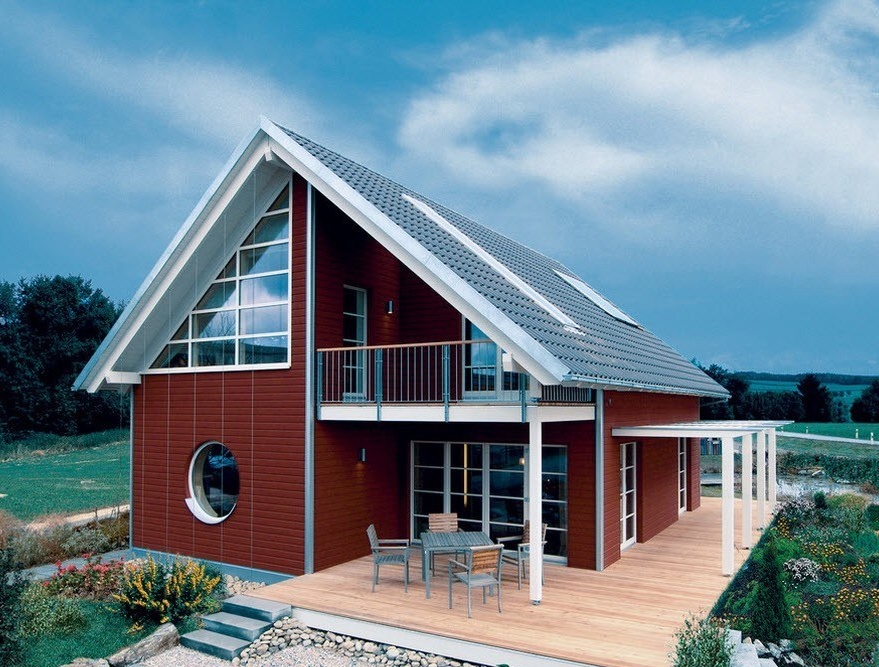
A bright red color needs a neutral, “calming” opponent, and it is difficult to find a more neutral color than gray. If the facade of your home is decorated with a fairly rich red color, then the execution of the roof, window and doorways, such additions as cornices and drains in gray, will successfully complement the image of the original home.
Gray is generally the most popular travel companion for saturated colors such as red. The light gray tile looks great against the background of any of the shades of red. If in your house the basement is faced with natural stone (or its successful imitation) in a grayish palette, then the image can be considered successfully completed.
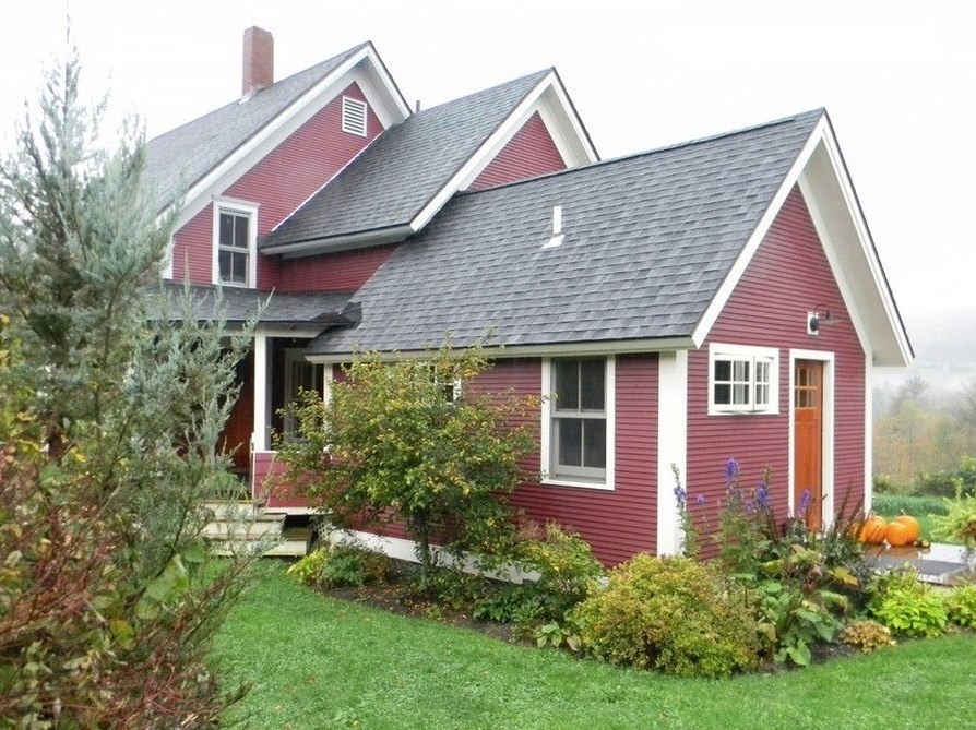
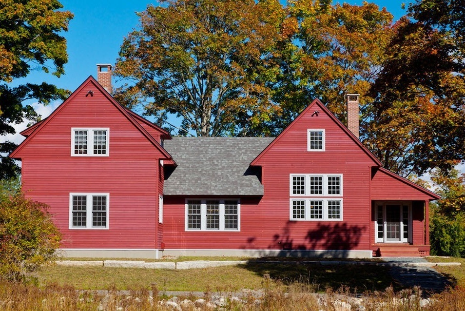
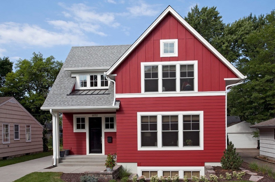
Almost all variations of the brightness intensity of the terracotta hue of the facade will look great with snow-white edging of window and door openings, cornices, drains and even the design of the basement. Light gray tiles and a similar tone for the design of the steps of the porch, successfully complete the attractive image, filled with a positive attitude.
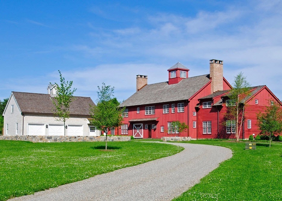
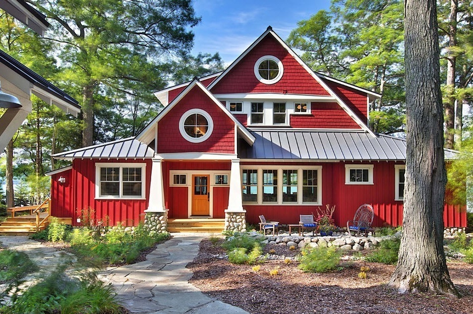
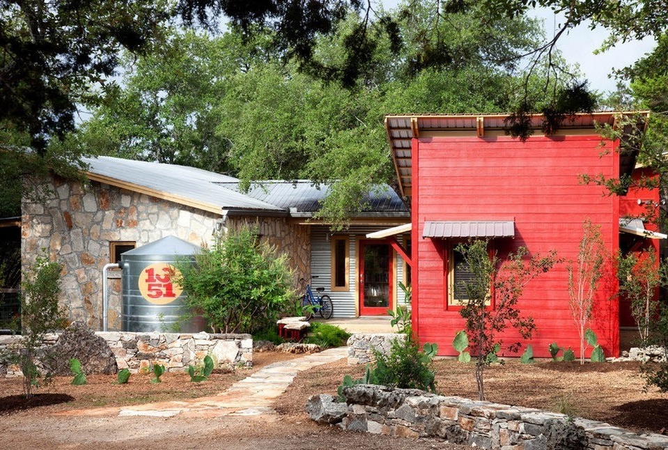
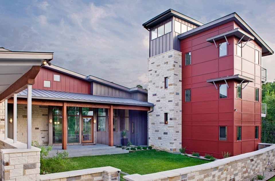
If the total use of the red hue to decorate the entire facade of the building seems to you a too bold operation, then you can always resort to one of the options for combining this bold tone with more relaxed finishing materials. For example, masonry with a sandy gray palette will be an excellent background for a colorful "neighbor". For a more harmonious look. It would be great to use the red color of the facade in the part of the house with masonry, for example, as the basis for window frames or the front door.
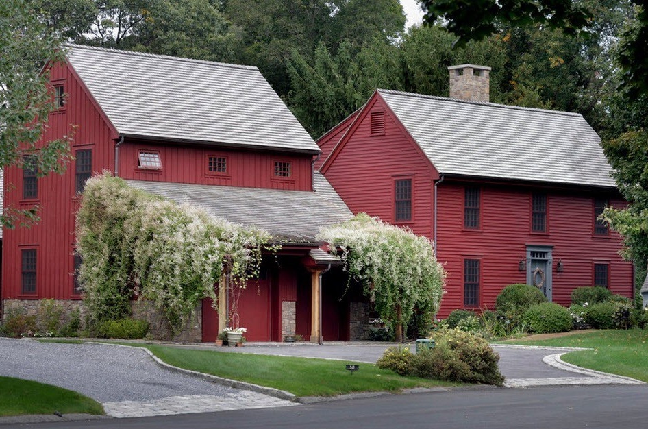
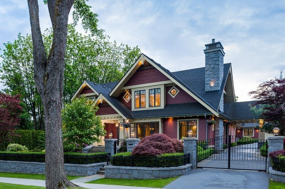
Red has many variations. For example, a burgundy-lilac color or a shade of Marsala looks great as the basis of the facade. In combination with a snow-white edging of windows and roof eaves, dark window frames and tiling of the same shade, the whole image looks noble, attractive and, of course, will stand out among neighboring buildings.
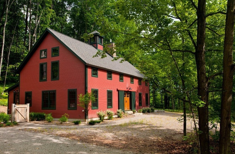
In coloring, there is an unwritten rule - "red does not combine with green." But there are exceptions to any rule, especially since both colors have a lot of variations, shades.The brick and terracotta color of the facade and the dark emerald shade of decorative elements (casters of windows, doors and gable roofs) and doors can create a harmonious, non-trivial and outwardly attractive alliance.
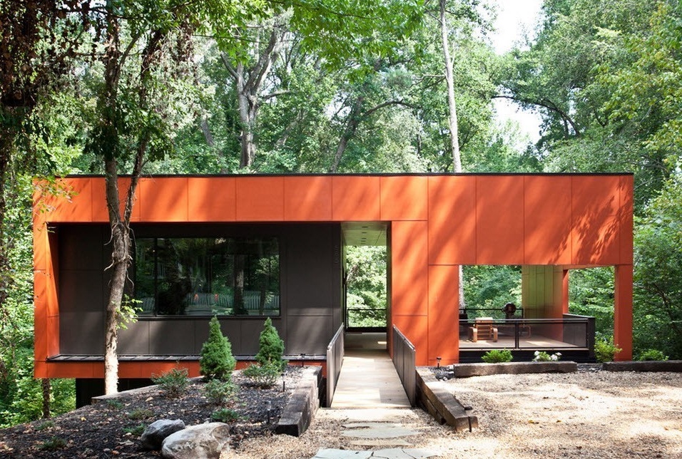
The red-orange hue of the porcelain tiles used to decorate the exterior walls of buildings is great for buildings in a modern style. If earlier this facing material could be met mainly as decoration of public buildings, at present the popularity of using ceramic granite for decorating private dwellings is only growing. In combination with the dark gray tone of the tile and the same color of fences, railings and other structural elements, the house looks modern, interesting and bright.
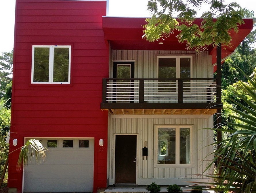
The easiest and quickest way to get the facade of a private red house is to clad it with siding. Recently, vinyl siding for decorating the exterior of residential buildings has gained the most popularity. This is a fairly durable, moisture-resistant material, the color palette of which is truly wide. Anyone can find their own shade of red. This is a fairly budget option for facing a private house.
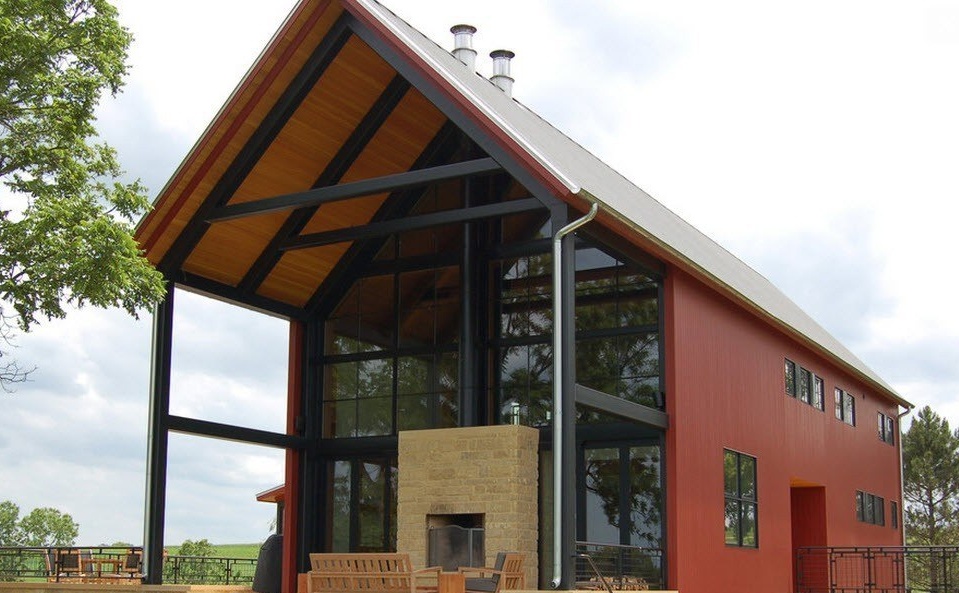
The color of the bardo as the main tone of the facade and the light gray and black shades as optional - look great together. Even simple geometric shapes become interesting and attractive if additional colors are dosed in sufficient quantities.
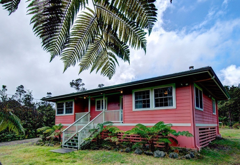
For those who do not dare to use very bright shades of red to decorate the facade, you can compromise and apply a bleached bardo tone. This is a dull, almost pastel shade, along with a grayish-beige palette of coloring of additional structural elements will look noble and original, but it does not look elaborate or too bright.
Brown is a derivative shade that is obtained by mixing red with black. The facade of a private house of bright brown color, together with the snow-white finish of window and door openings, light gray tiles on the roof will look colorful, noticeable and unique.

