Aprons for the kitchen 2019
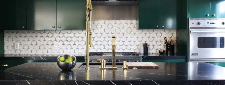
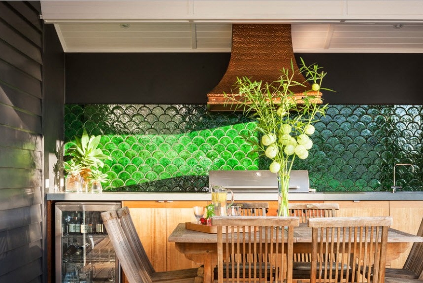
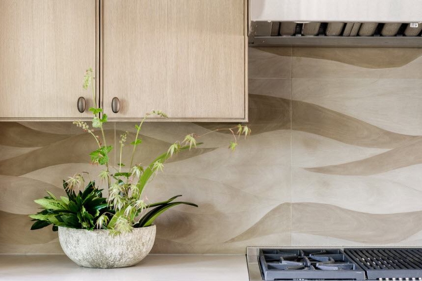
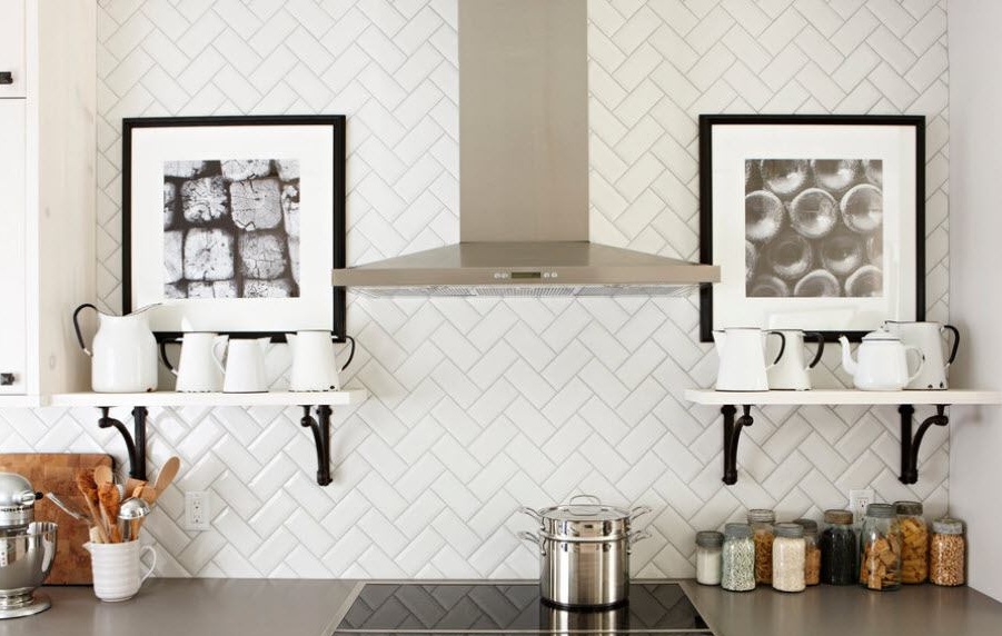
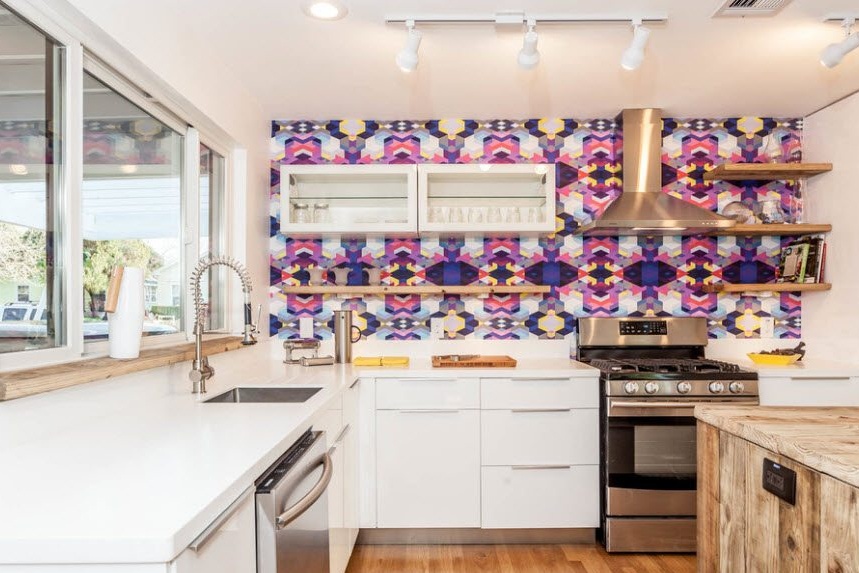
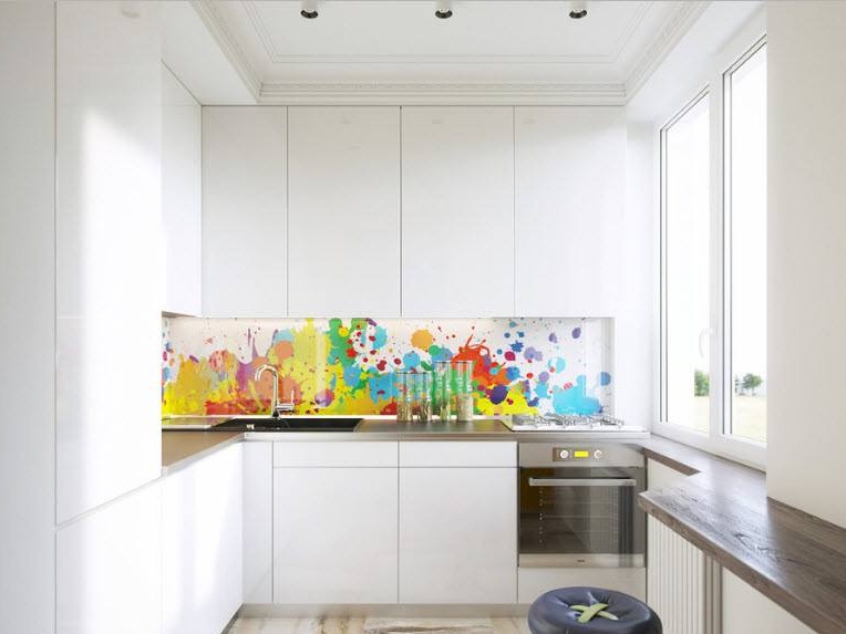
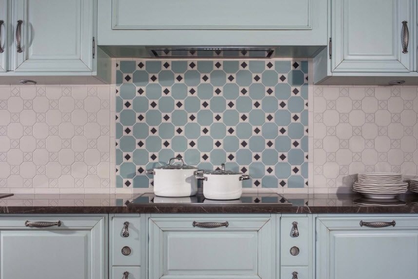
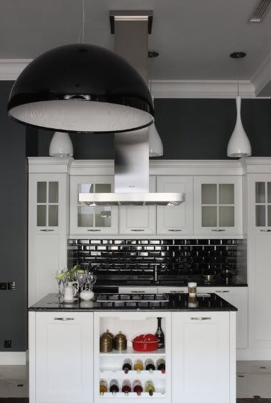
Well-chosen material for a kitchen apron can save the most ordinary interior. In fact, a kitchen apron in interior design is the same subtle nuance as textiles. And so as not to make a mistake with him, collect all the materials that are in your kitchen - samples of facades, countertops, wallpaper, painting walls, flooring - and already guided by these stocks, proceed to choose the apron itself. The furniture also plays a large role - a dining table with chairs, lamps, decor elements. And only when you have a complete picture of the kitchen interior, can you safely proceed to the concept of an apron. But first answer yourself a series of questions. What effect do you want to achieve: make the apron an accent or leave it invisible? If you still have an accent, then how exactly: with the help of material or color?
Focus on invoice
We combine correctly
To the tone of the walls
Perception integrity
Spectacular transition
Apron and countertop: exactly
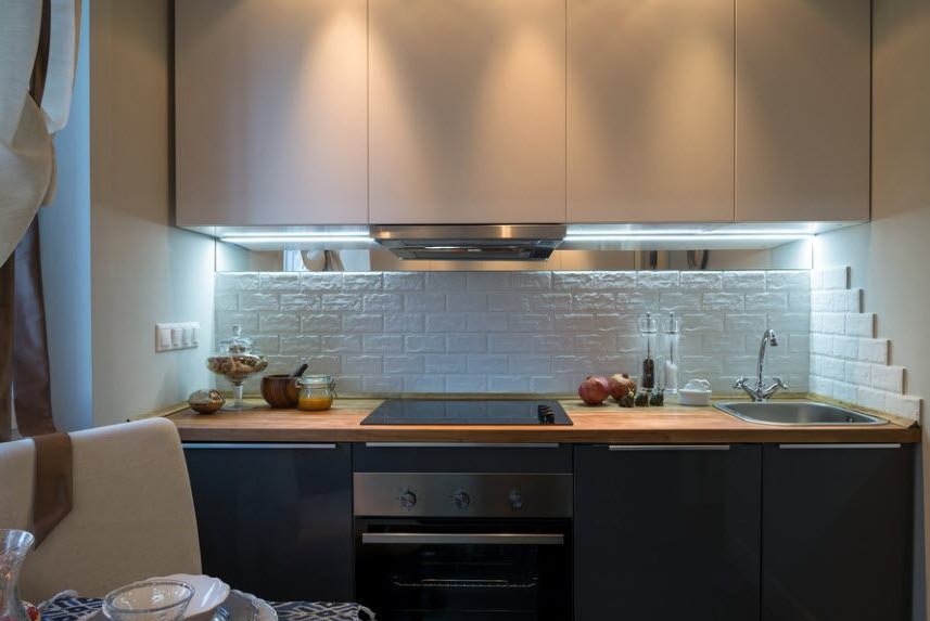
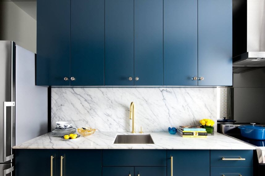
The kitchen apron looks very organic in accompaniment with any other piece of furniture, for example, a countertop. In this case, the color, material and texture must match. An apron can completely fill the space to the hanging cabinets, or maybe just a side of a certain height, which looks very stylish and extraordinary. The advantage of this solution is that you do not need to select a complementary element to the kitchen apron, because it already has an ideal partner - a countertop.
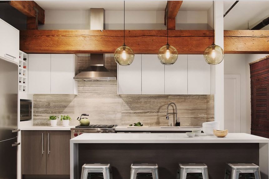
The perfect complement to white
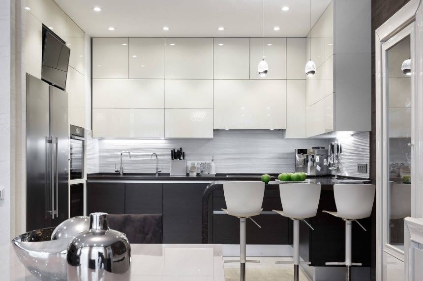
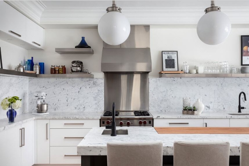
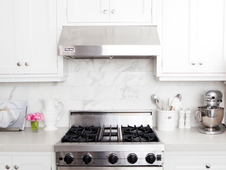
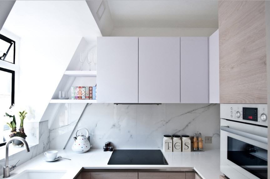
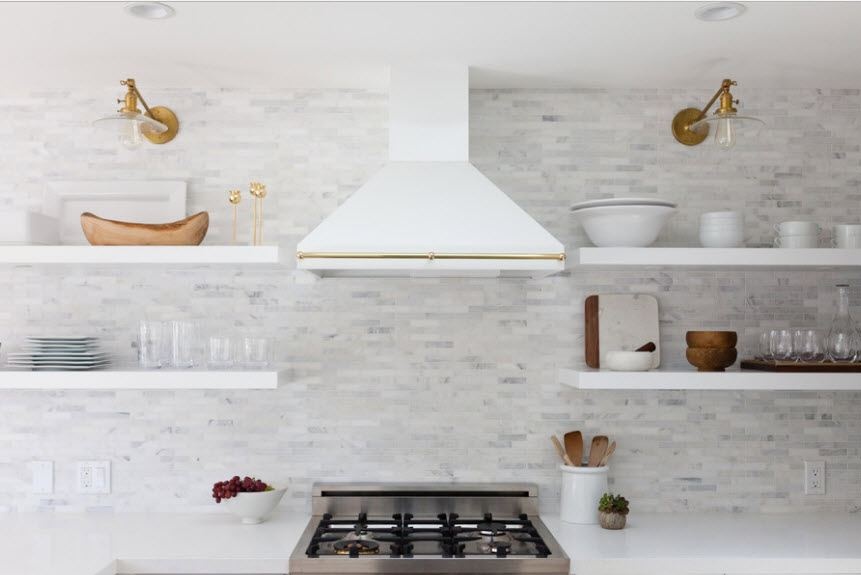
You can shade a white kitchen with stainless steel appliances and household appliances. A kitchen apron made of large tiles with marble stains here will be an ideal bonding component.
Brutal design
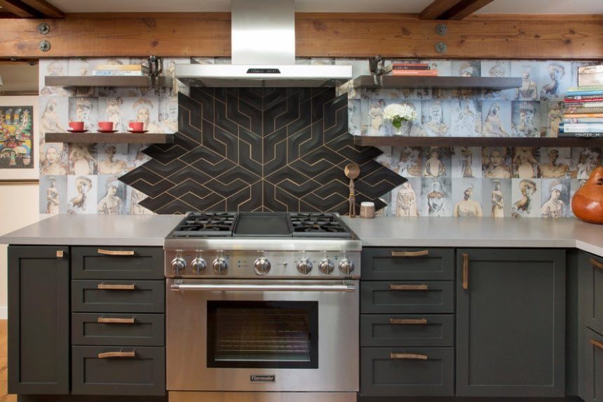
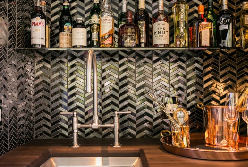
The following photo shows a real bar with a stylish design solution. The secret of success is a countertop made of natural wood, a steel mixer and a spectacular sink. But the main highlight of the brutal design is a glass apron in a zigzag design in the form of chevrons.
Everything ingenious is simple
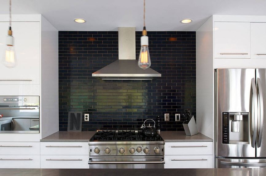
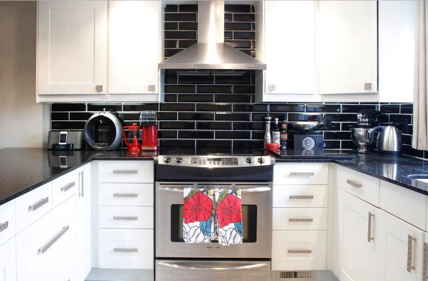
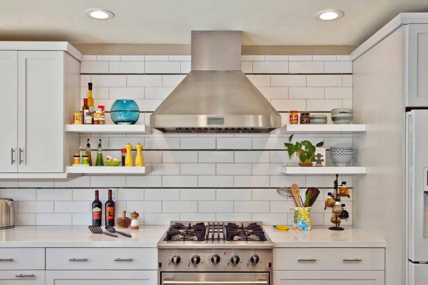
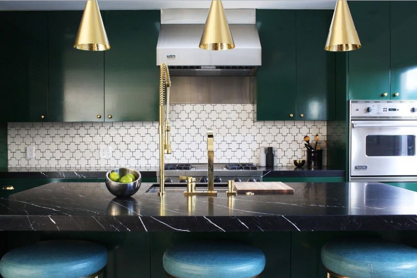
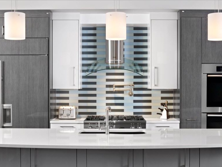
The following photo is another confirmation of the popular quote “everything ingenious is simple.” Horizontal black stripes turn the simplest at first glance apron into something unique. Such a solution is indeed an ideal option for those who strive for an impeccable style, modernity, exquisite simplicity and conciseness.
In the background
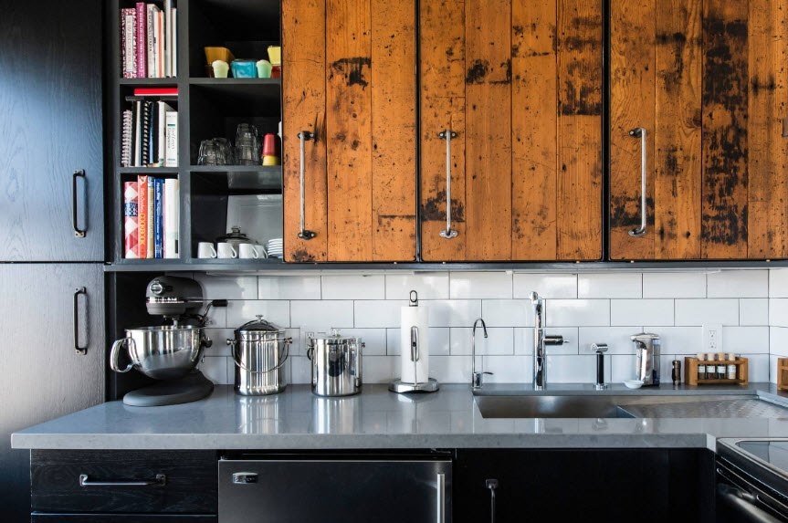
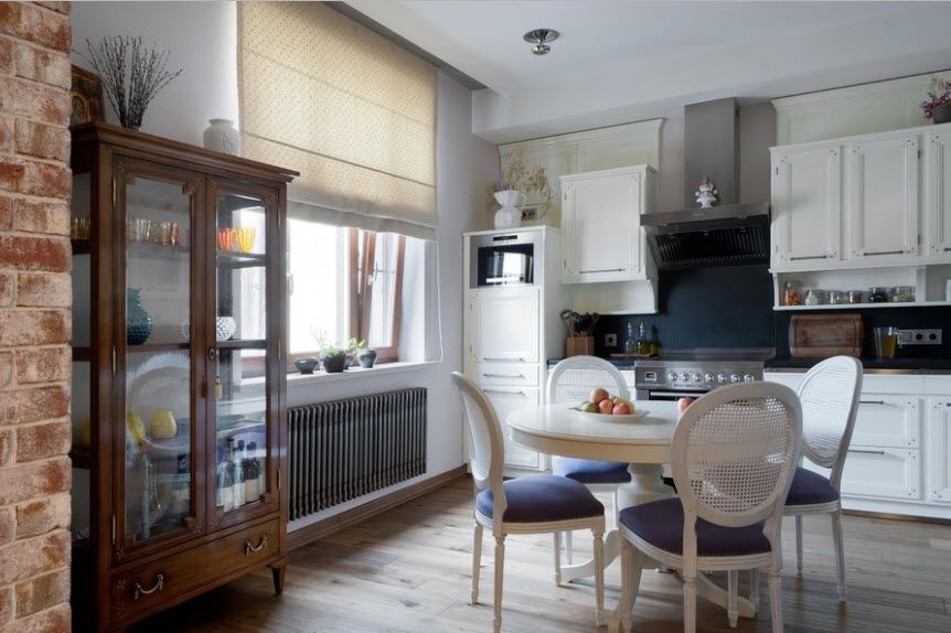
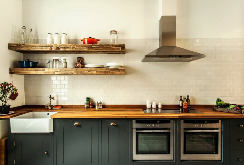
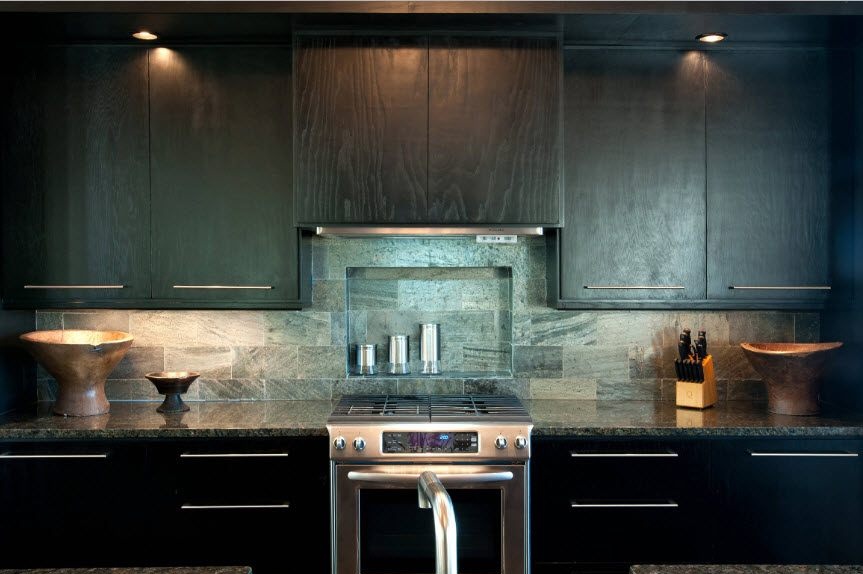
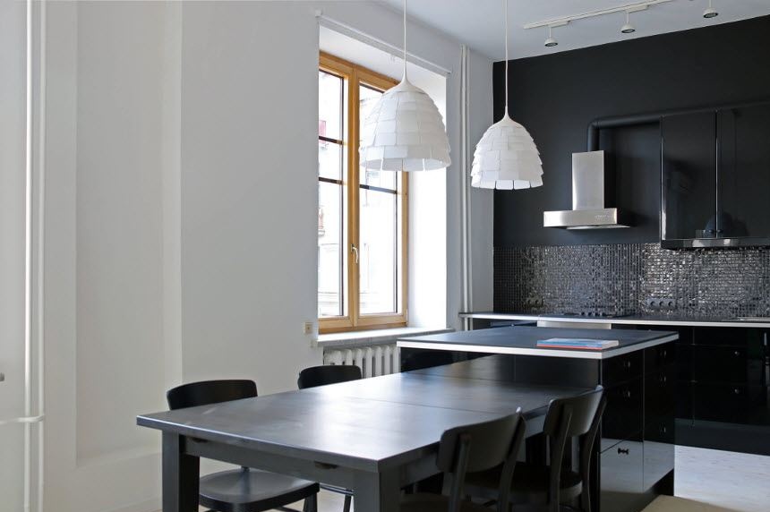
The apron does not have to be accented. For example, in this example, the designer’s idea is to make it a background, which slightly shades the depth of a beautiful dark facade and a rough wooden texture of countertops and shelves.
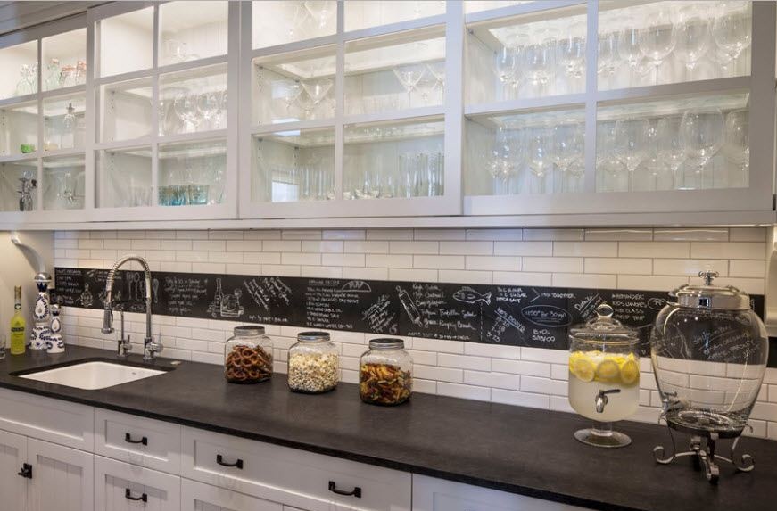
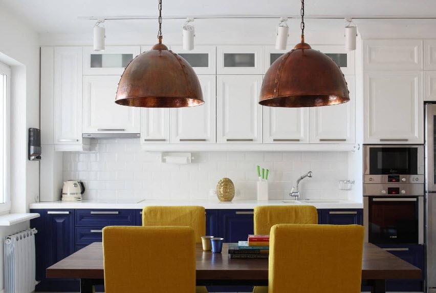
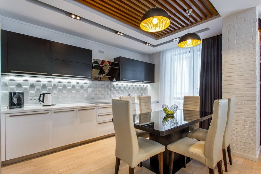
And here a white glossy apron in the form of brickwork organically merges with the upper set, highlighting the bright yellow chairs and blue facades at the bottom. The highlight of the interior is expressive loft-style lamps above the dining area.
Modern ideas for a kitchen apron in the photo

