The design of the one-room "Khrushchev" - a modern upgrade
Perhaps the strangest, most impractical and often not logical planning was carried out during the Khrushchev program for the construction of affordable housing, the main task of which was to minimize the cost of construction and provide as many families as possible with separate housing. As a result of total savings and errors in the layout of buildings, many of our compatriots are still "enjoying" the fruits of the construction thought of those times. If in a three-room “Khrushchevka” or two-room version you can still allocate personal space for each family member, then in a one-room “work of architecture and construction” you can’t do without redevelopment.
Yes, one-room "Khrushchev" is not a gift. But, on the other hand, if your small apartment is located in the center of the metropolis, and even not far from the place of work, then the complex building from the point of view of planning becomes much more attractive. Well, with the help of competent design and skillful repair, you can even make such a modest space space cozy, comfortable, convenient and attractive in appearance. In any case, even a relic of the past with a small quadrature, but comfortable and practical interior is a much more attractive option for our compatriots than a rented, albeit standard, one-room apartment.
One-room "Khrushchev", as a rule, has a total area of 27 sq.m. of which 17 sq. m per room, the kitchen can be from 4 to 6.5 sq m in size, the entrance hall is often absent altogether, and in most cases the bathroom is combined. But often in Khrushchev’s apartments there is a protruding pantry, asymmetric corridors or a trapezoidal or narrow and long room that violates not only all the rules of ergonomics, but also contradicts common sense. Add to this the irrational arrangement of communications, the often impractical location of the entrance to the apartment and you will realize that repairing a small apartment will cost a lot.
You can focus on the shortcomings of the layout of the "Khrushchev" for a long time. But there is little sense in this; it is important to determine the possibilities of using the provided number of square meters with maximum benefit, practicality and rationality. Indeed, in one existing room it is necessary to arrange sleep, rest and work zones, not to forget about the organization from the tol zone, because in small kitchens, as a rule, there is no place for a dining group.
But there are also advantages - the compact dimensions of your “odnushka” will allow the use of expensive finishing materials of high-quality production while maintaining the framework of an affordable and affordable budget. And, therefore, it will be possible to get an aesthetically attractive, stylish and practical design of the "Khrushchev", without ruining the family budget.
Ways to create a competent layout in a one-room "Khrushchev"
There are several options for expanding (at least visually) the Odnushka space. Some of them require only competent arrangement of modular furniture and the appropriate size of the room decoration, the right choice of color schemes. For the implementation of others, it will be necessary to break the partitions, and move the doorways. Which of the options will be most suitable for your "Khrushchev" depends on the geometric parameters of the living room, the size of utilitarian premises and your budget for redevelopment and repair.
We use the space of the balcony
Yes, the area of the balcony is small (usually 4 sq m). But in such modest rooms as one-room Khrushchev’s apartments, every centimeter counts, not to mention square meters.Therefore, if there is a balcony, it can be glazed, insulated and demolished a partition with a balcony door. Only at first glance it seems that the resulting space with a width of not more than 1.5 m (and in most cases even 1, 2 m) does not give the owners any odds. On the suffered area, you can arrange a mini-office with a workplace, a small console and a modest size of an office chair are enough for this. You can install a narrow sofa, sofa or a pair of narrow armchairs with a small table-stand on the former balcony and get an additional relaxation area. In the end, you can use the balcony space to organize storage systems - symmetrically on both sides of the former balcony and under the window. It can be either closed cabinets with hinged doors and drawers or open racks. It all depends on what exactly you will store and how ready you are to provide access to the contents of your cabinets.
If you organize a place to relax and read on the former balcony, then be sure to take care of an additional (in addition to the central ceiling lighting) light source. This moment should be considered at the planning stage of the location of all communications; most likely, a new outlet (possibly not one) or built-in lighting will be needed in the new area. If you will not break the partition between the balcony and the room, but just get rid of the window and the balcony door, then on the remaining part of the wall you can place indoor plants or basic necessities that should always be at hand. It all depends on what zone will be located on the former balcony, if there is a reading and working corner, it will be logical to place books and stationery on the partition so that the place is not empty, but the natural light from the window does not block.
We install modular and folding furniture
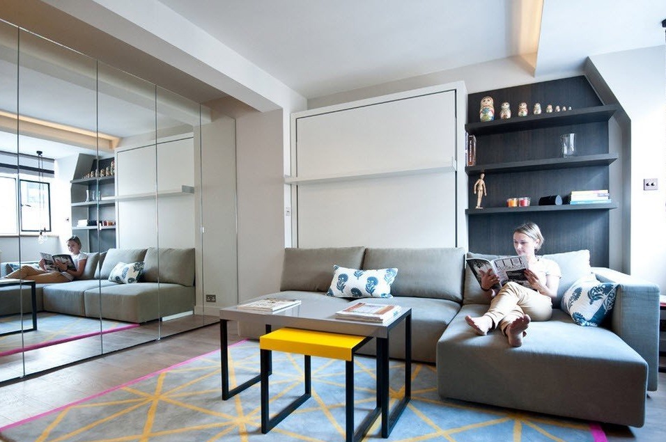
If breaking walls and partitions is not your topic (it is also necessary to legitimize this process in the BTI), then you can try using the well-known design technique for saving space - wherever possible, use modular furniture and embed folding mechanisms. For example, a folding sofa during the day is a key piece of furniture in the living room and organizes a sitting area, and at night it turns into a sleeping place. For guests who decide to stay overnight, in this case it is better to have an air mattress in the pantry or, what is called "on the mezzanine". He won’t take up much space, but as an option for sleeping for one night, it’s quite suitable.
Use corner sofas, which provide an extensive seating area (and some models can fold out and become a roomy place to sleep and relax) while not taking up much space.
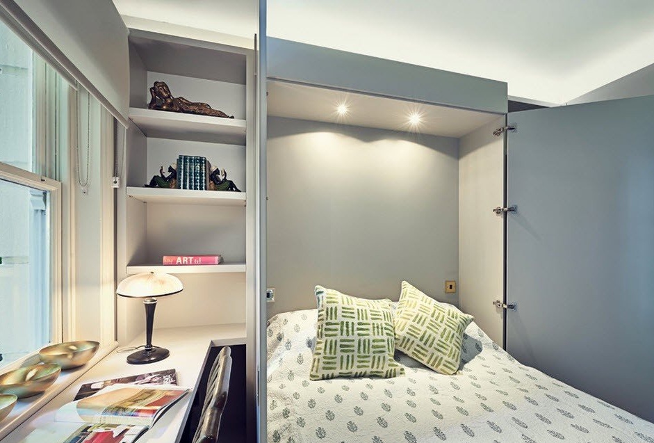
But few will agree to sleep on the couch all the time. Nevertheless, it is better not to come up with beds for sleeping furniture. There is an option to integrate a mechanism with a folding bed into the cabinet. During the day, your room appears in the image of a living room, and at night the shutters of the “closet” open and the room becomes a bedroom. Of course, such mechanisms have their drawbacks - there are restrictions on weight. Jumping on such beds is not recommended and the mechanism itself is important to use strictly in accordance with the instructions, so that it will serve you as long as possible.
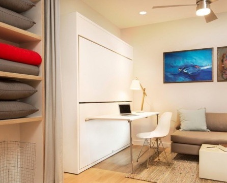
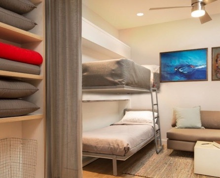
There are even two-tier models of folding and sliding mechanisms with single beds. This is a very convenient way to organize sleeping places for two people in terms of space saving. The practicality of these mechanisms lies in the ease of use. You don’t even need to move furniture to make your living room and workspace a bedroom.
We use the "destructive" method of planning
The redevelopment method with the destruction of walls and partitions is suitable for couples without children or single homeowners. In this case, you can equip a convenient and practical studio apartment, which will contain the entire set of vital segments and at the same time retain some space and lightness.In addition, the studio apartment is progressive, stylish and modern.
Of course, not so much space will be added to the fault of the walls (usually the walls, if they are not bearing, are not very wide). But it is necessary to take into account the transfer of doorways, the addition of windows (if possible). As a result, the room in any case will visually seem much more spacious, and it will be much easier to place all the necessary furniture in it.
Several ways to visually expand the space of small rooms
- The first thing that comes to the mind of a homeowner who wants to visually expand the boundaries of his modest living space is light neutral shades for surface finishing. To make the room seem larger, the color of the walls should be lighter than the floors (significantly), but slightly darker than the tone of the ceiling. If the ceilings and walls in the rooms are finished in the same tone, then this technique will also work for you, but less obvious. White has many shades and you can use any of them as a base shade for surface finishes. Depending on what atmosphere you would like to create - warm and cozy, pacifying or positively invigorating, tonic, stimulating to action.
- When decorating small rooms, it is best not to use more than three basic colors. This rule is as old as the world, but verified by many real design projects. If in a small room filled functionally and with the help of furniture, there will be several basic colors (more than three), then it will be a fragmented space, and not a harmonious, single interior. It is better not to use wallpaper or any other finishing material with a large print, at least not on all vertical surfaces, leave catchy ornaments or patterns for accents.
- For rooms with a modest quadrature, it is better to choose only wall decor, precious meters are useful for furniture, and free space is necessary to feel some freedom and lightness - small rooms are very cluttered up very quickly.
- Use mirrored surfaces for interior bedroom or living areas. But be careful with quantity and size. To roughly determine the size of the mirror, which will really have a beneficial effect on the appearance of the room (in addition to its main function), see that the figure of a person is reflected in it by two-thirds. Experts advise placing the mirror in the studio room so that it reflects the living area, and not the working one.
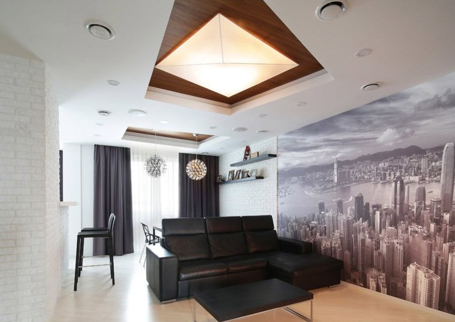
- An excellent method of “expanding” the space from a visual point of view is the design of an accent wall using wallpaper with photo printing. If 3D wallpapers are made using long-range technology, then at some points it will seem that your room does not end, but simply merges with the external environment.
- Use not hinged interior doors, but the option of a compartment or “accordion”. The fact is that for the comfortable use of swing doors you need at least 1 sq m of free space, and in the "Khrushchev" every centimeter counts.
- For zoning the premises, you can use false panels or screens, partitions. They, as a rule, do not occupy the entire space from wall to wall; they are placed either in the center or from one of the edges of the room. Such screens serve not only to create some boundaries of certain zones, but also act as a support or plane for placing a TV, split system or decor.
The kitchen in the one-room "Khrushchev" is a special topic
More often than not, a few homeowners leave the kitchen as a separate room. At 5 square meters, it is not easy to organize the necessary work surfaces, build in household appliances, storage systems, install a sink and a refrigerator. Obviously, there is no room left for the dining group. Therefore, the logical design course of most owners of the "Khrushchev" is the union of the living room area (it is the dining room) with the kitchen space.
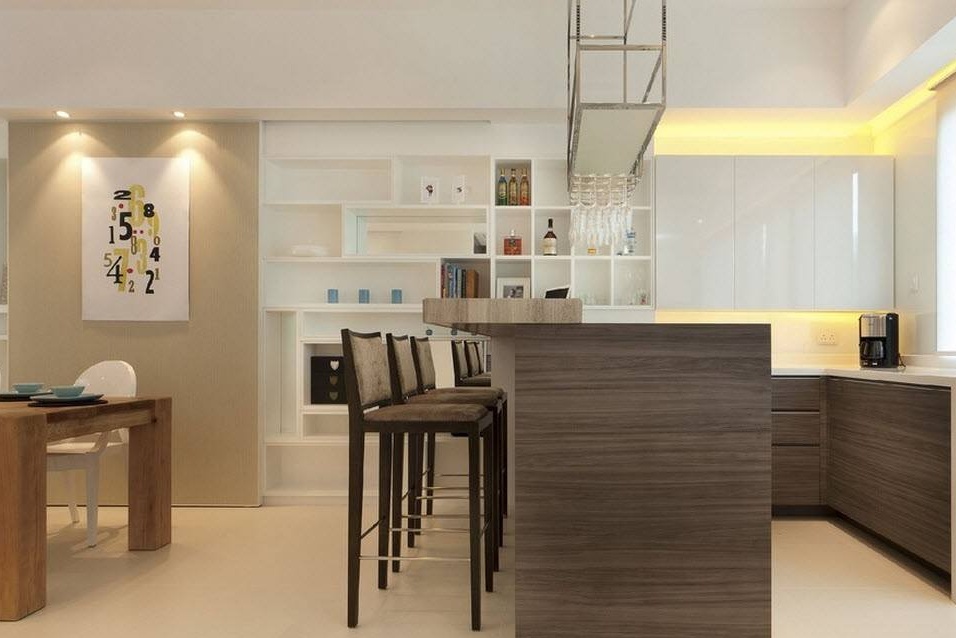
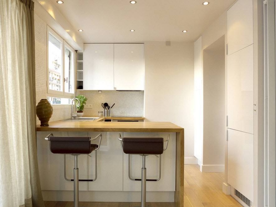
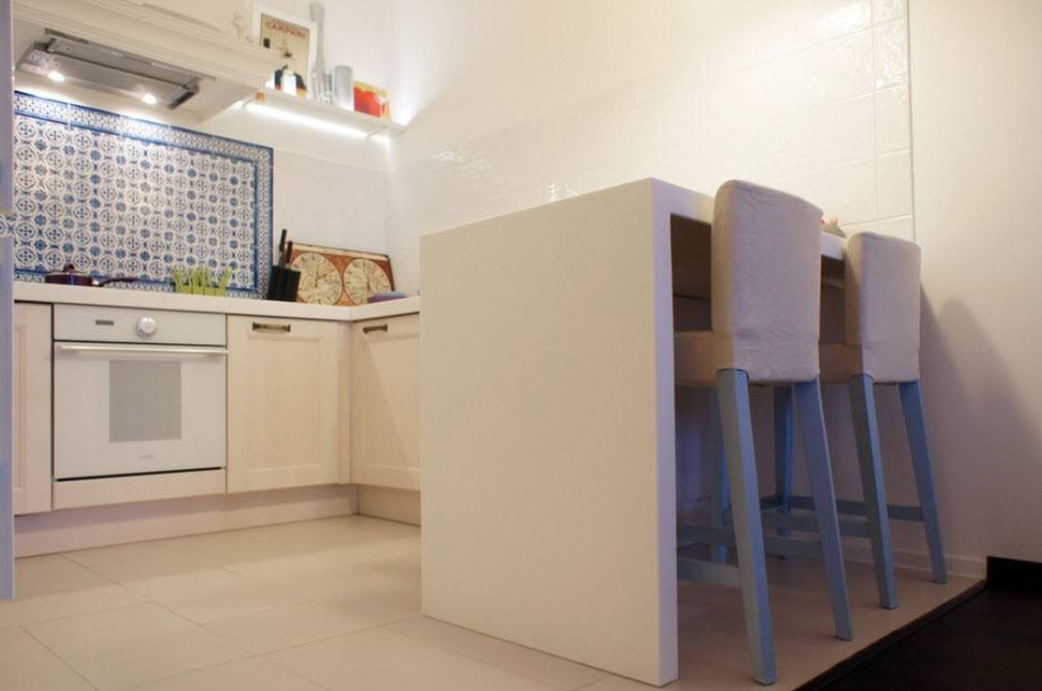
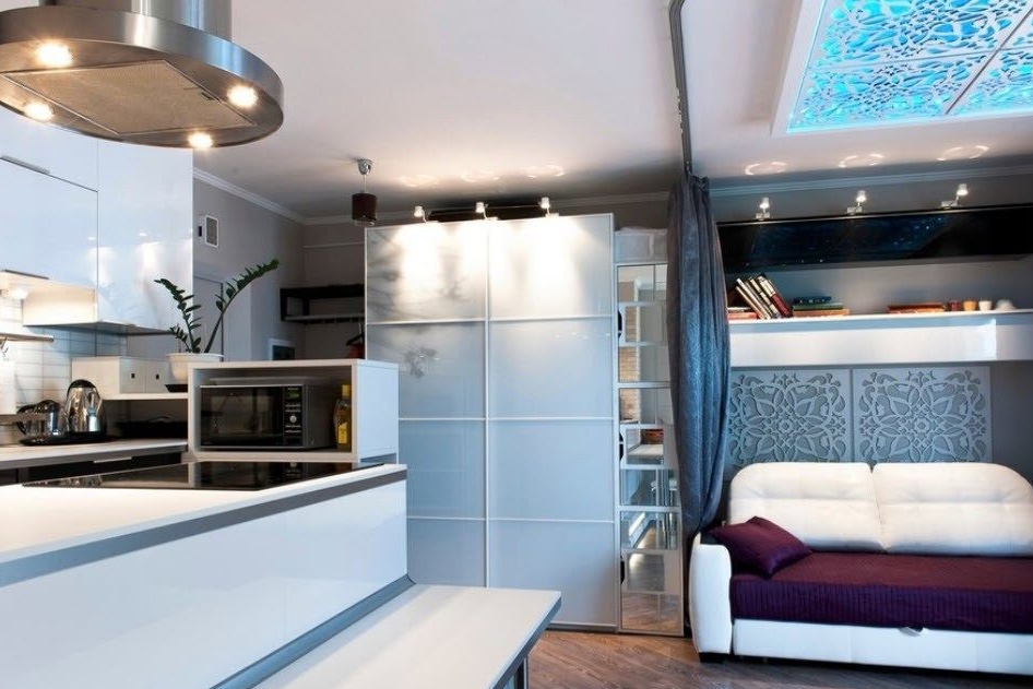
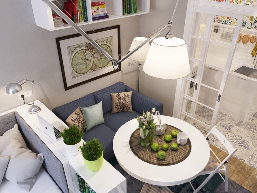
Very often, there is still not enough space for a full dining area in the space obtained after the redevelopment. In this case, you can use the bar or part of the working surfaces of the kitchen, which act as an island. If two people live in the apartment, then such a place for meals will be quite sufficient.
The conditional boundaries of your dining area can be not only the location of the kitchen island or bar, but also differences in surface finishes. It would be logical to use a tile floor in the cooking area, and a laminate or parquet in the living room segment. The walls of the kitchen can be tiled with ceramic tiles or mosaics in the segment of the kitchen apron, while the main finish coincides with the method of designing vertical surfaces in the room.
When combining the kitchen space with a common room, do not forget to take care of several levels of lighting. It is logical that one ceiling chandelier, even a very powerful one, is not able to cope with all the space provided for lighting. In the kitchen area, you can integrate the illumination above the work surfaces by placing LEDs or fluorescent lamps in the lower bases of the upper tier of the kitchen cabinets. In the "Khrushchev" low ceilings, so the option with a backlight built into the suspended ceiling, as a rule, disappears immediately. But you can use two chandeliers for one room. Or place wall sconces in the living area (in extreme cases, a floor lamp, but it takes up a lot of space).
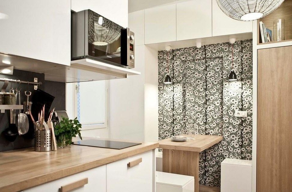
To save the space of the kitchen area, you can use not a full dining table, but its miniature analogue. This is a small console with sliding legs, which is attached to the wall and can be folded, freeing up space, if in the apartment, for example, receiving guests. Light chairs that easily become one into the other and are tucked away into a corner or pantry will also help mobility and transform your home, depending on the situation.
It is rarely possible to use ready-made kitchen solutions in Khrushchev’s apartments. But thanks to firms that make kitchen furniture to order for any size and design features of the architecture of the room, you can get a rational arrangement of work surfaces, storage systems and household appliances even in complex asymmetric nooks and crannies of space.
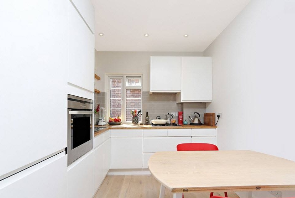
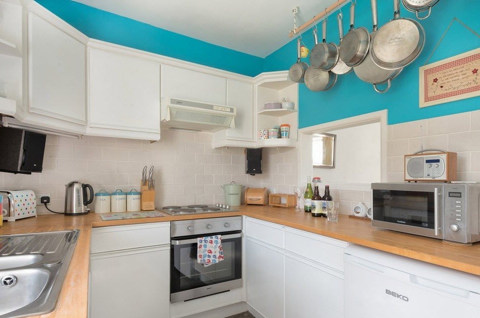
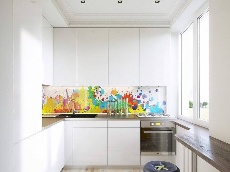
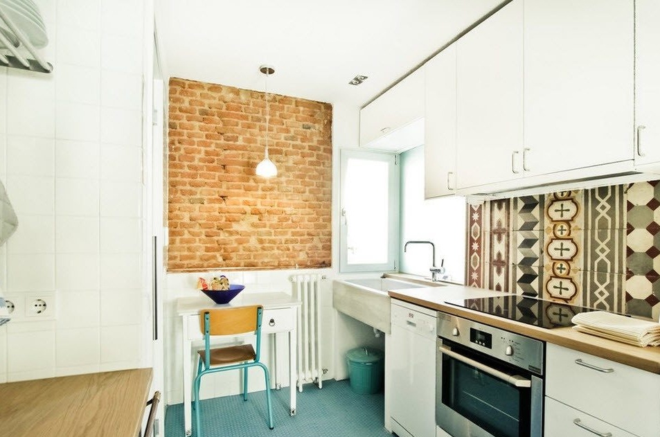
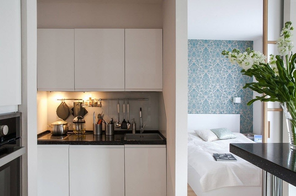
If the kitchen for some structural reasons or due to the architectural features of the apartment has remained a separate small space, then the owners have the difficult task of organizing all the necessary functional segments of the kitchen space, placing on a few square meters what is usually placed in kitchens with an area of 8-9 sq m and more. In this case, the white glossy surfaces of the built-in kitchen cabinets will help you. To avoid the feeling of being in a sterile ward, use bright accent stains in textiles (window opening) or the decor of a kitchen apron.
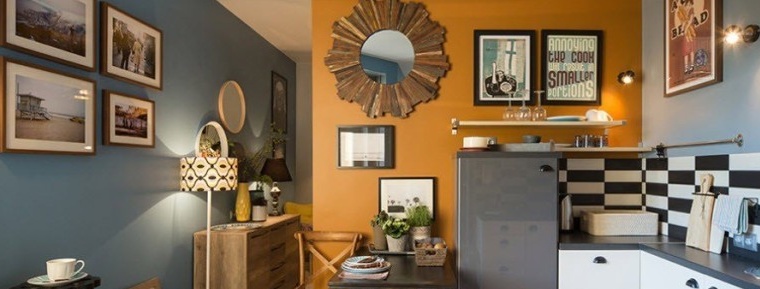
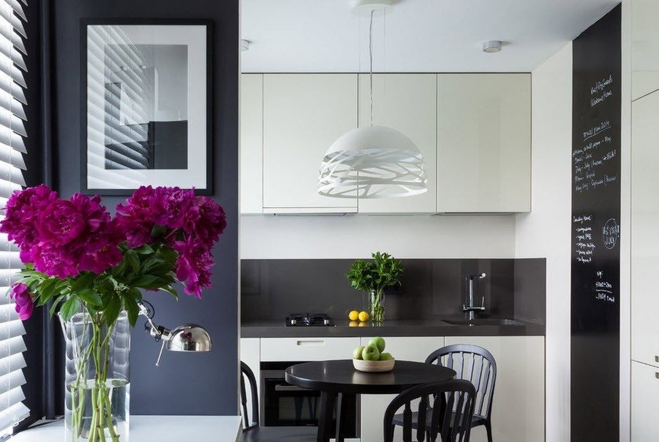
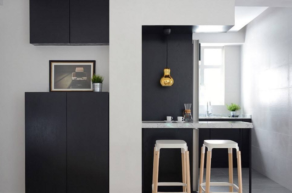
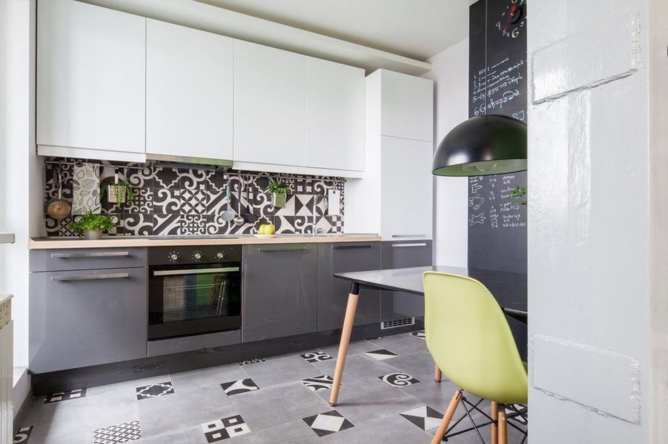
The contrasting use of two opposite colors will also help to create a harmonious interior within a modest area. A competent dosage of white and black tones in the interior of the kitchen room and not only will allow you to create a really interesting, practical and dynamic design.
Many owners of small apartments are afraid of combining the kitchen with other areas of the apartment because of the smell of cooking food, which will be present in any corner of the home. Modern hoods are very powerful, but at the same time, most often, energy-saving and equipped with a backlight in the lower working part. It is better to invest in good household appliances so that you can then fry fish and not be afraid that households in the living area will cough from burning. A good range hood can become the focal point of your kitchen area, so modern models are aesthetically attractive.
Bedroom in odnushka - sofa or bed?
As mentioned earlier, not all homeowners will agree to constantly sleep on a sofa bed. In addition, doctors and specialists in organizing a place for a sound and deep sleep, recommend the purchase of a bed in any case. An exception may be the situation when the homeowner simply does not have the ability to install it. A comfortable bed with an orthopedic mattress will allow you to get enough sleep after a hard day's work and gain strength for new achievements. Buy a bed of the maximum possible size for your sleeping area, but do not forget about the rules of ergonomics - the distance from the edges of the bed to the walls or large pieces of furniture should not be less than 70 cm, it is better not to have a sleeping place in the corner, leaving only one side part for approaching and the foot of the central piece of furniture for the bedroom.
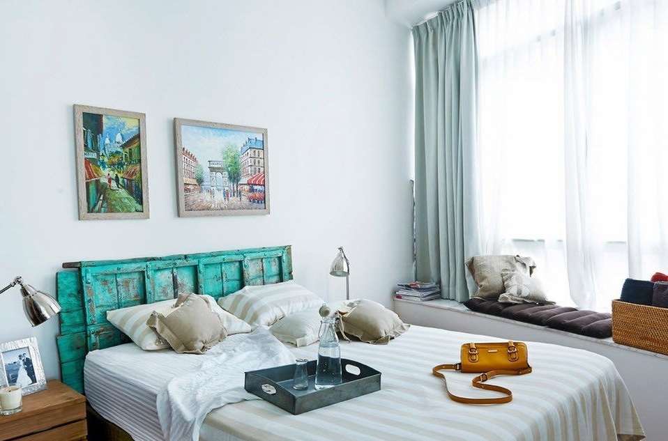
It is logical that your sleeping area will be department in bright colors, but do not forget about the accents. Create an original accent wall design with a medium-sized wallpaper. The use of plant ornaments soothes emotions at bedtime no worse than light, neutral tones.
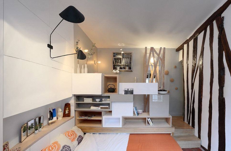
Often the sleeping area in Khrushchev's “odnushka” is not fenced at all, which for many homeowners is not a convenient and comfortable state of affairs. Many people want to create at least the illusion of zoning, a more intimate atmosphere. As a screen, you can use racks, book or combined, which include as open shelves. And closed small lockers. Storage systems are never many, and even more so in such modest premises as “Khrushchevs”.
Some inspiring examples of the real design of one-room "Khrushchev"
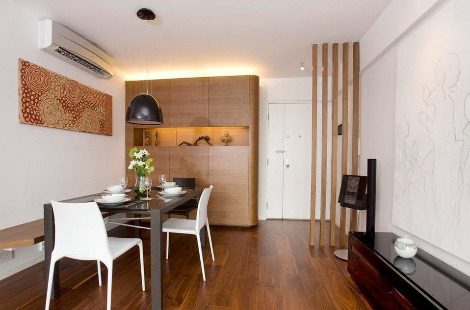
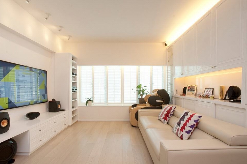
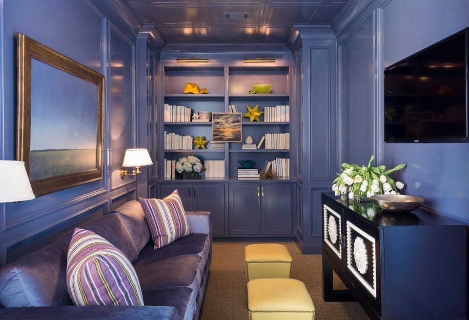
We bring to your attention a small selection of interiors of existing apartments with a small area. We hope that interesting, practical and attractive outwardly designs of these modest in size, but not in the functionality of the premises, will inspire you to remake your own "Khrushchev" or just a small room in your standard apartment.
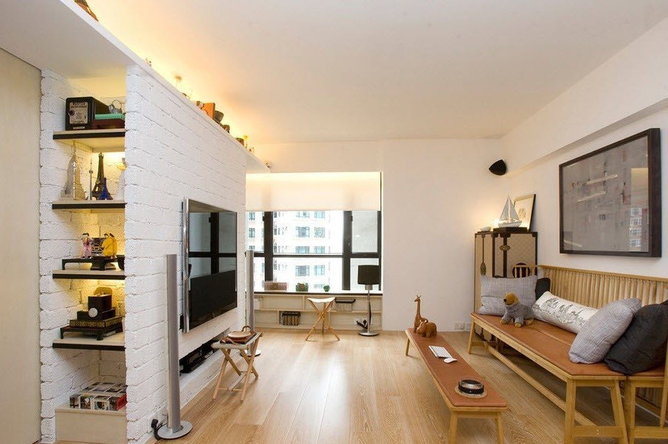
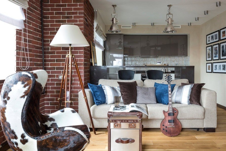
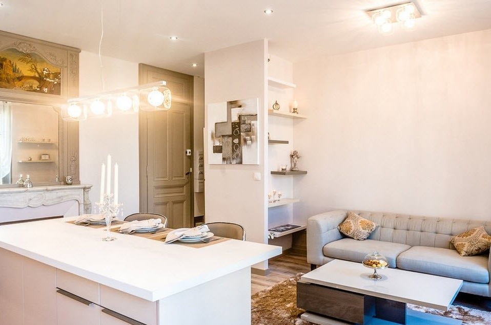
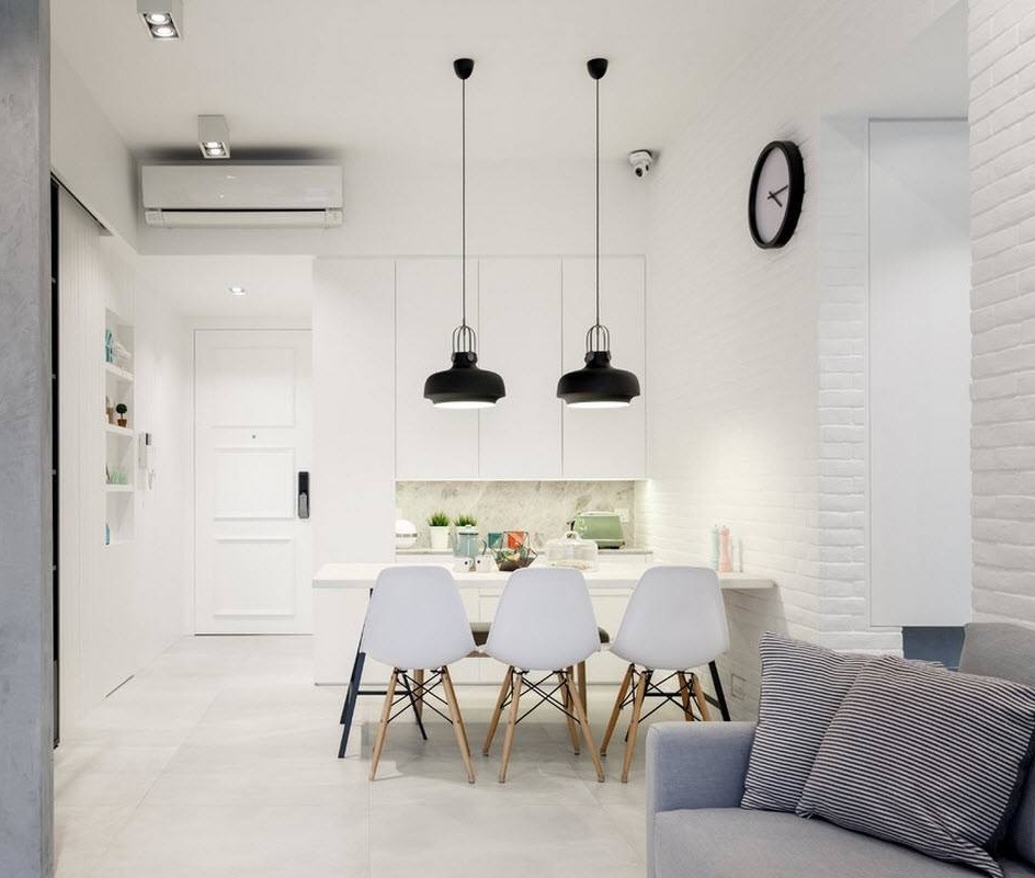
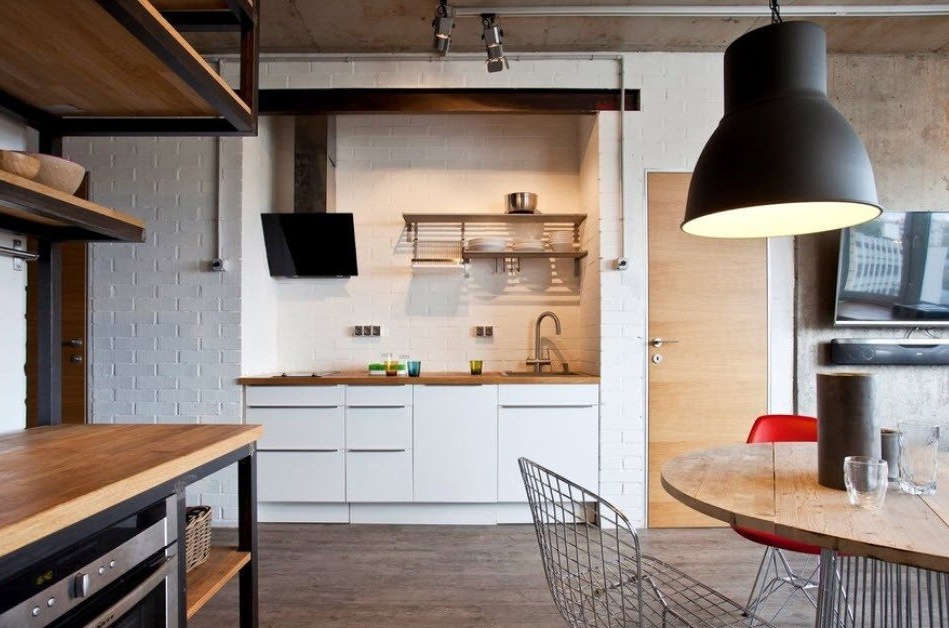
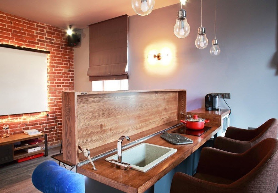
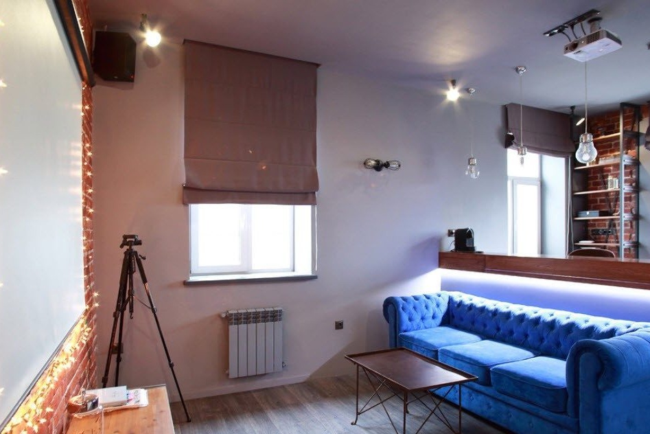
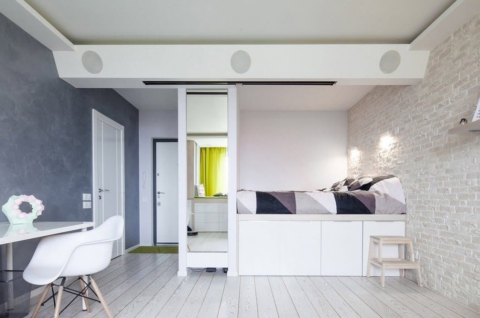
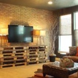
When combining the living room space with the kitchen area, it is very convenient to use the back of the kitchen island as a support for the sofa, which creates a soft segment of the common room. For such rooms, the most advantageous option for wall decoration will be the use of light colors for the main vertical surfaces and the creation of an accent plane. In this design project, brickwork was used to create not only a color, but also a textured accent, an element of personality, and even some brutality.
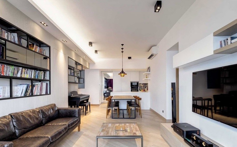
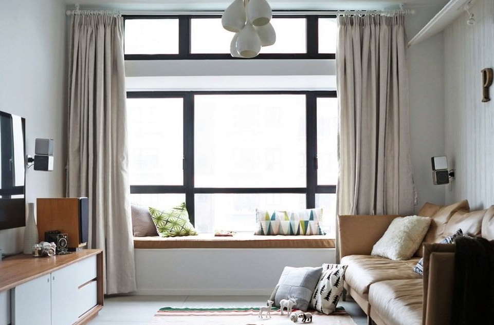
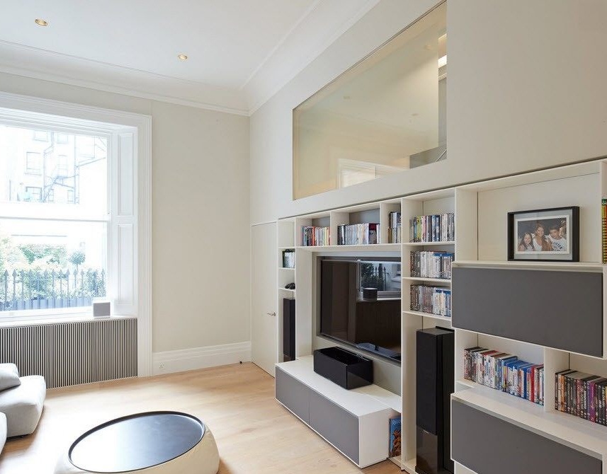
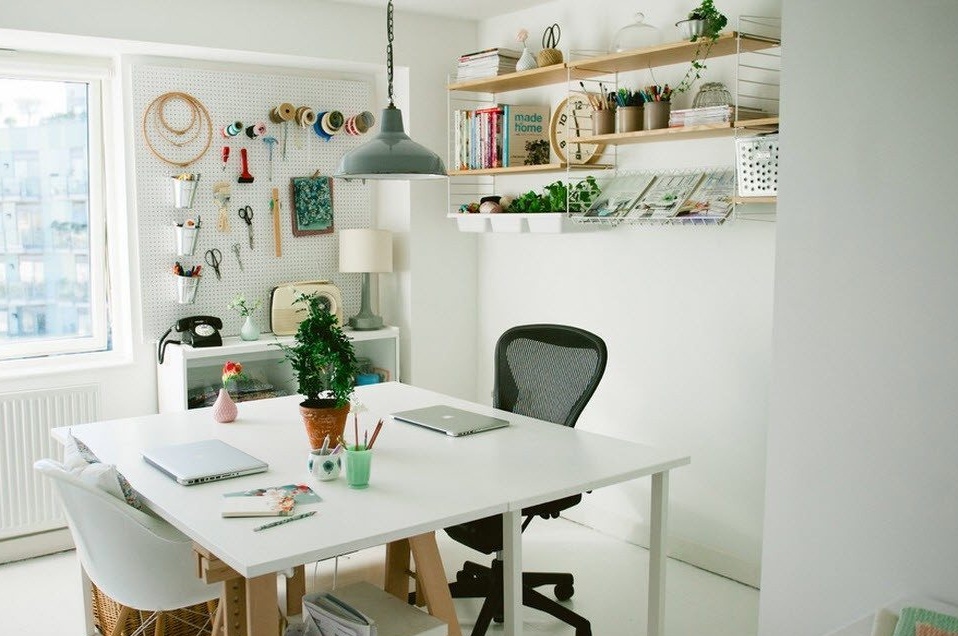
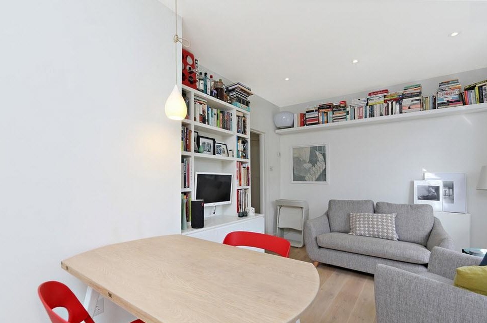
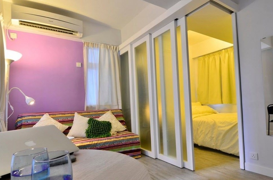
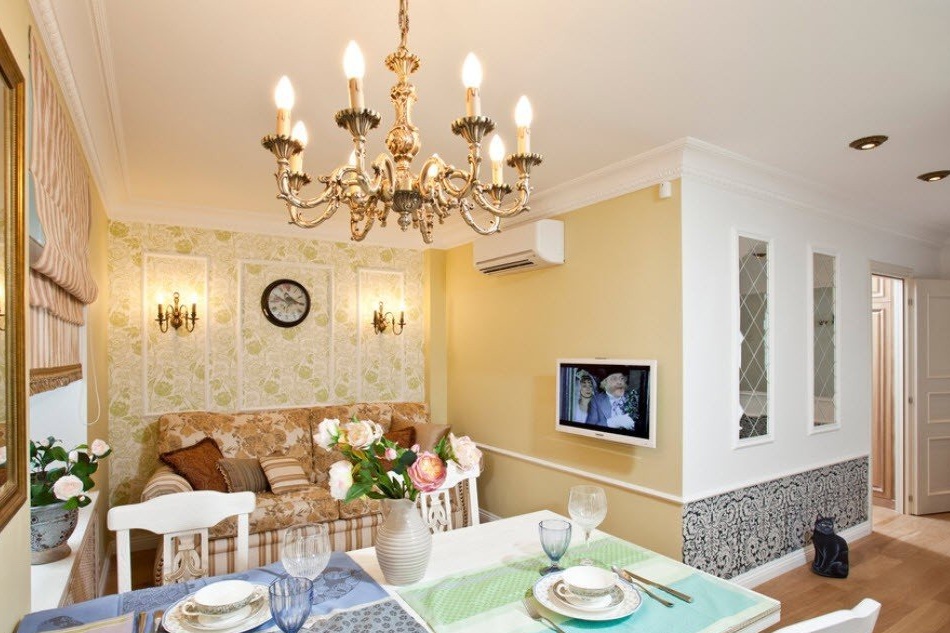
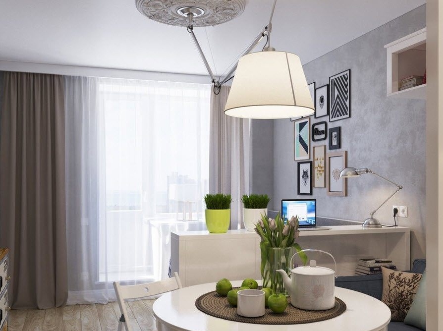
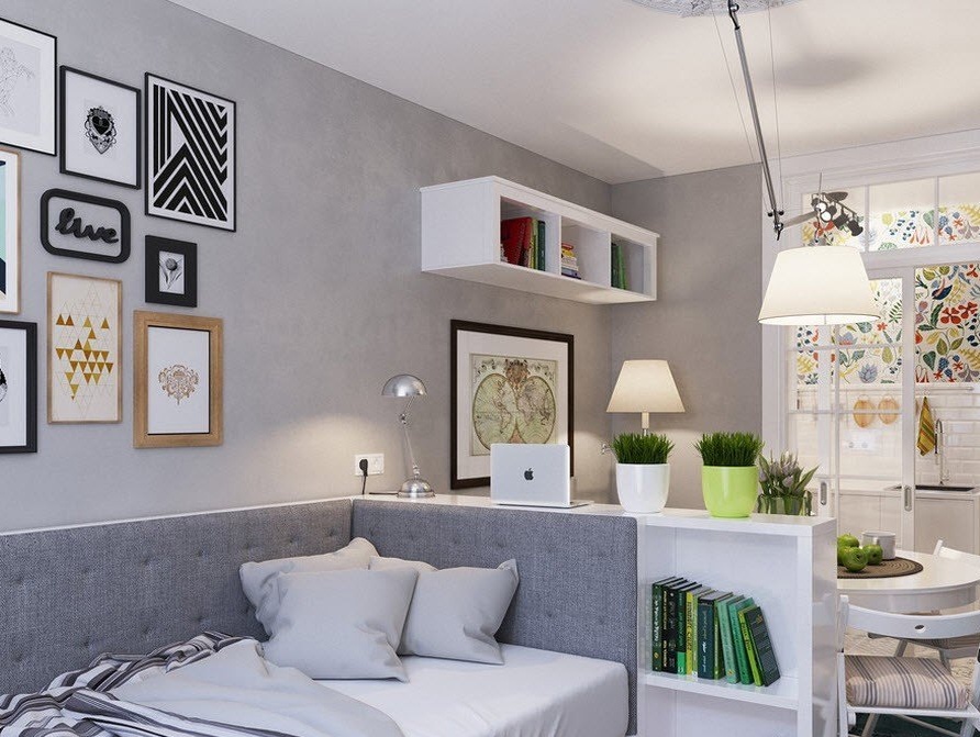
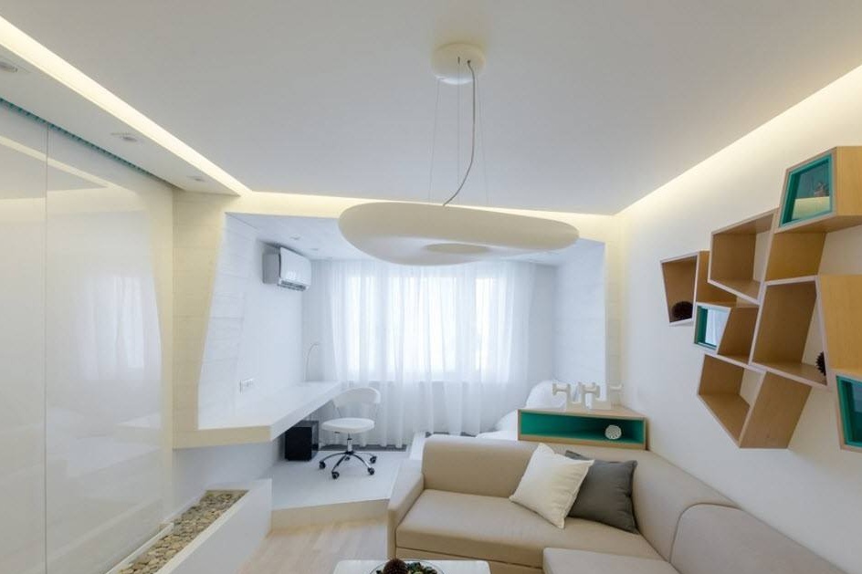
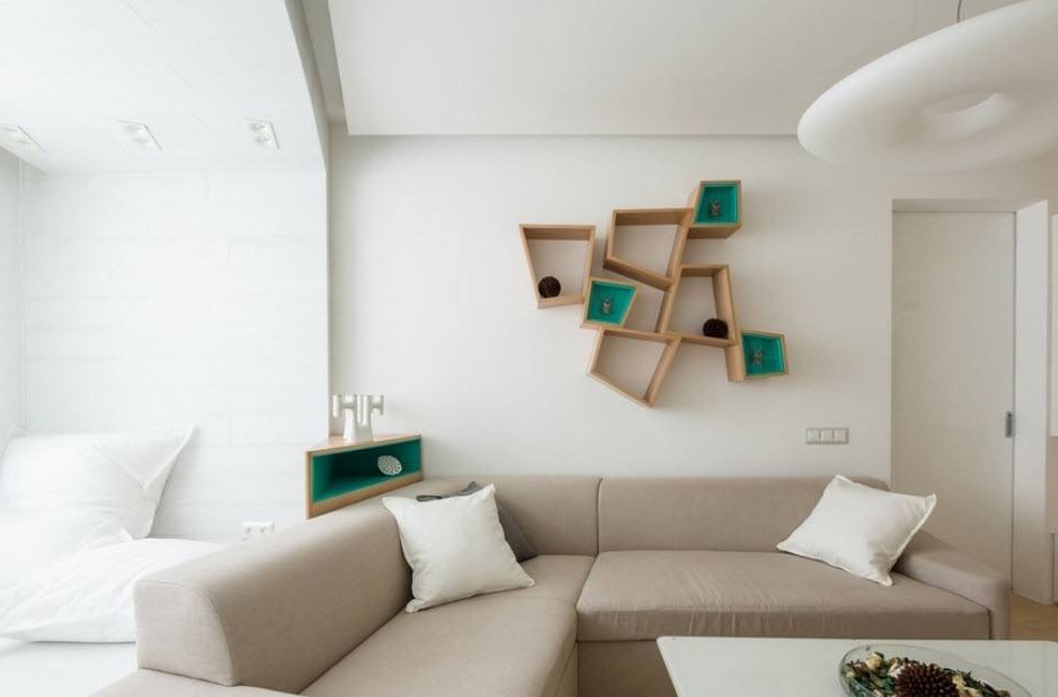
Snow-white wall decoration and pastel shades for furnishing are the best way not only to visually expand the space, but also to hide the room layout errors, especially design inaccuracies. But in an absolutely bright room it is difficult to feel comfortable, because the common room is designed not only for sleep and relaxation, but also for work, creativity, hosting guests. Unusual trapezoidal open shelves arranged in asymmetric order were used to create bright accents. The warmth of the snow-white cool atmosphere of the room was given by a light wood flooring and yellowish shades of ceiling lights.
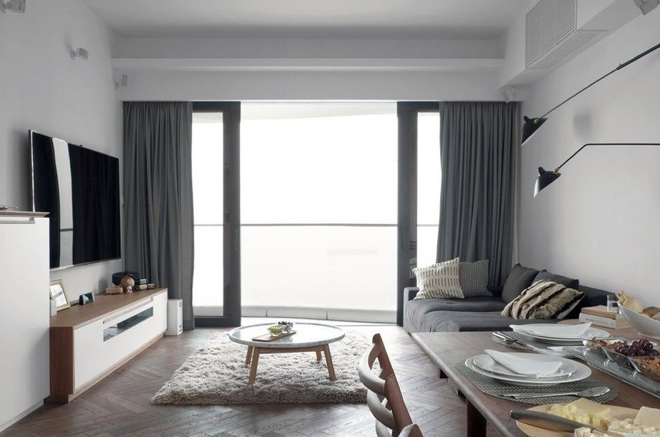
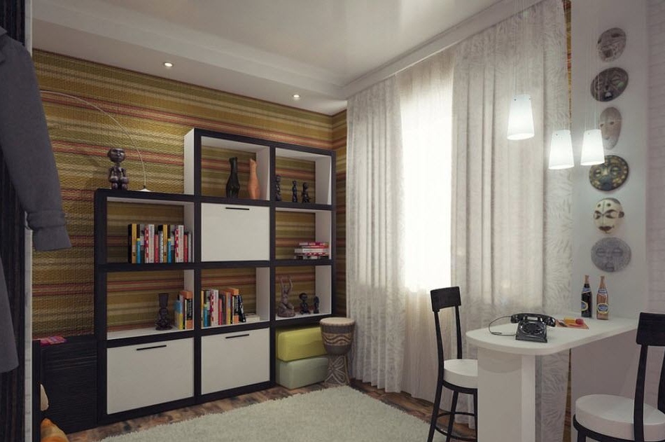
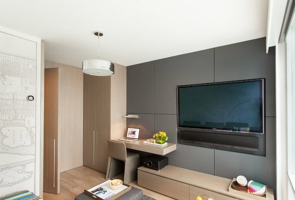
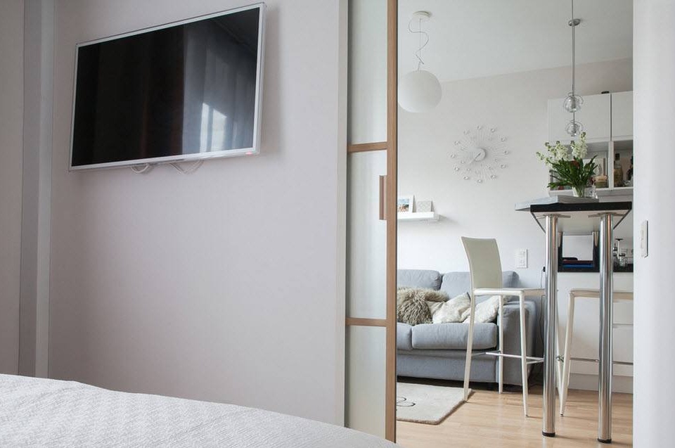
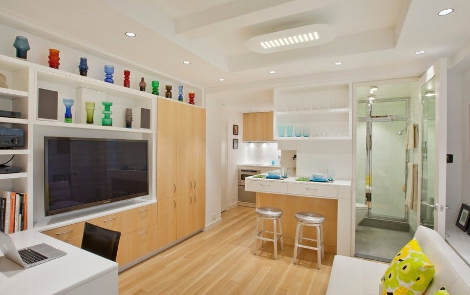
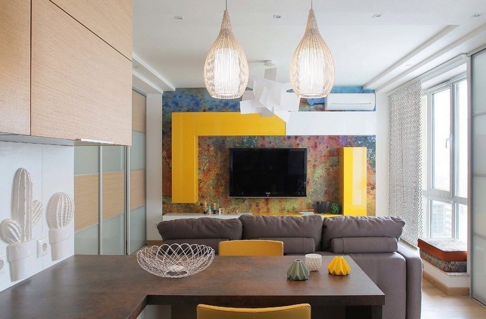
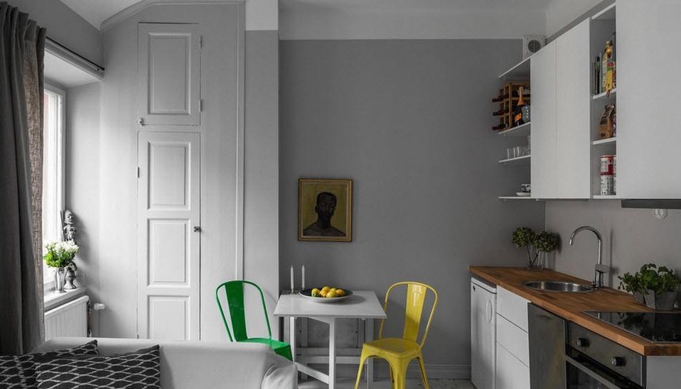
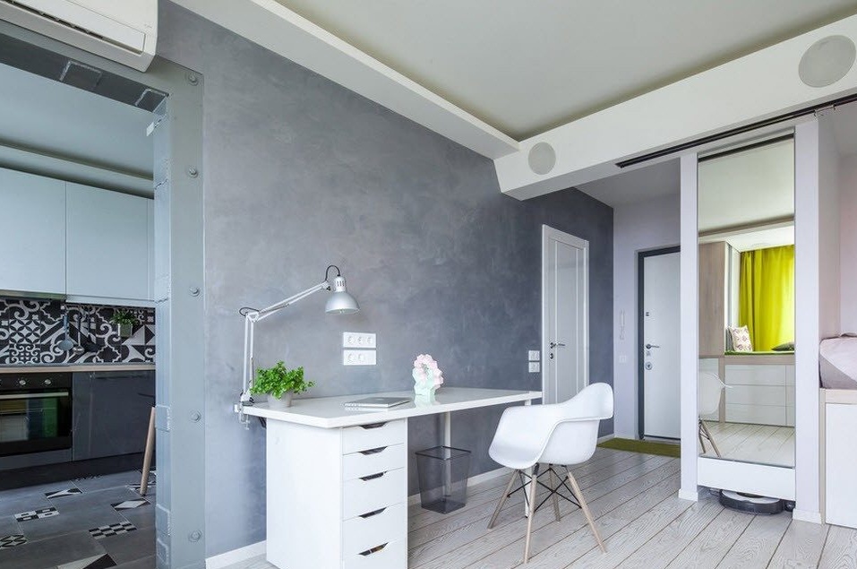
Modern style, striving for practical minimalism, but accepting bright pieces of furniture and decor with a functional background is the best suited for creating a harmonious and rational interior of small studio apartments, former "Khrushchevs". The use of contrasting combinations in decoration and furnishing, among which light shades prevail, allows you to achieve a light and fresh atmosphere. At the same time, the entire functional content of the apartment is at the highest level and the owners can not infringe on themselves in anything, living on three dozen square meters.
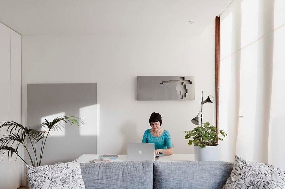
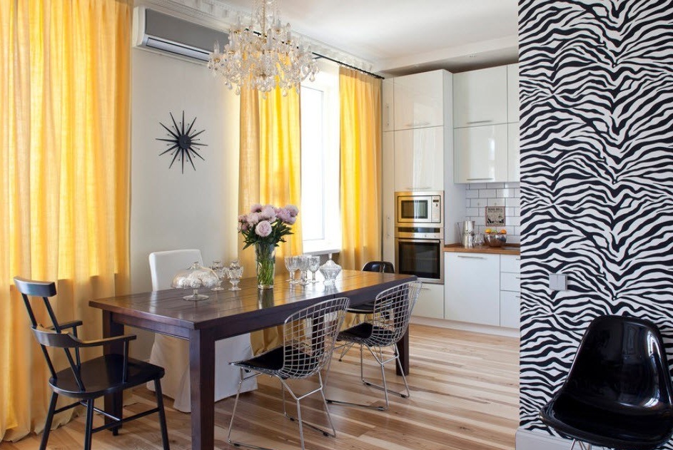
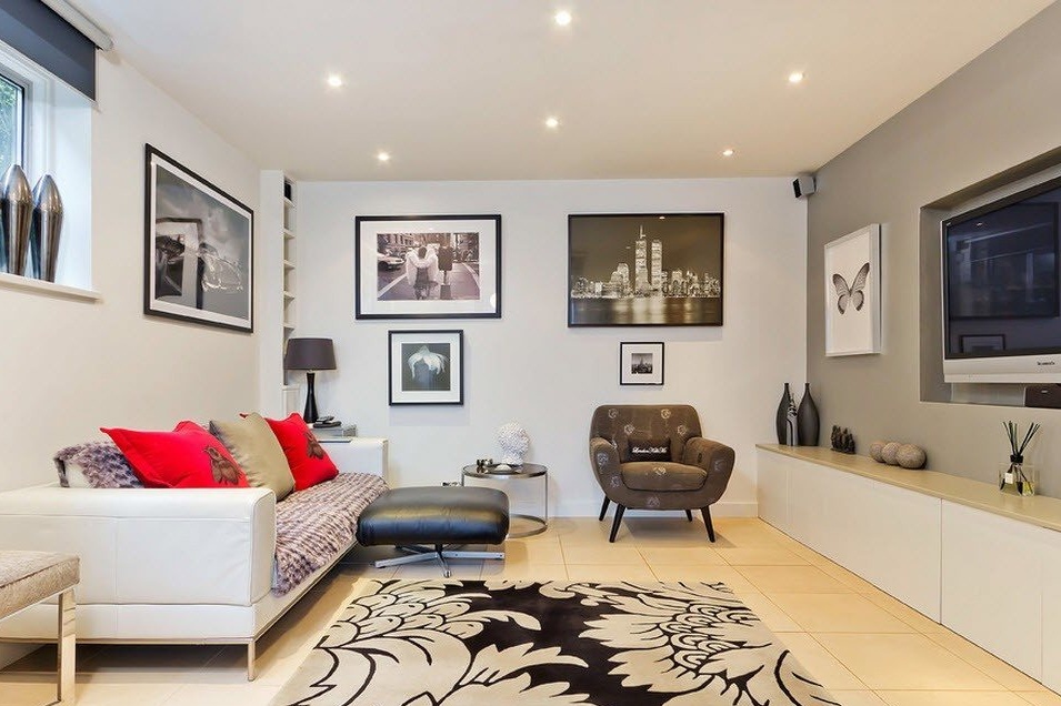
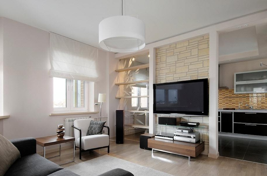
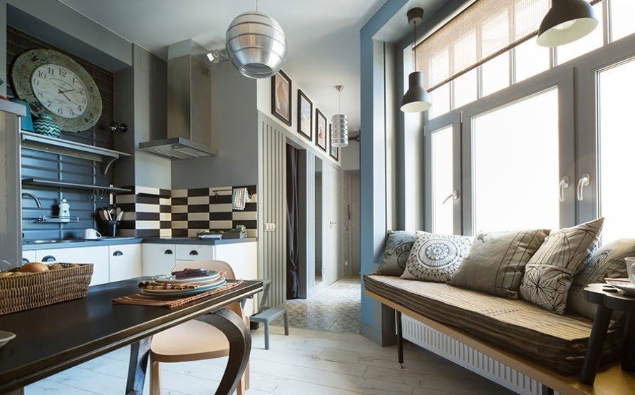
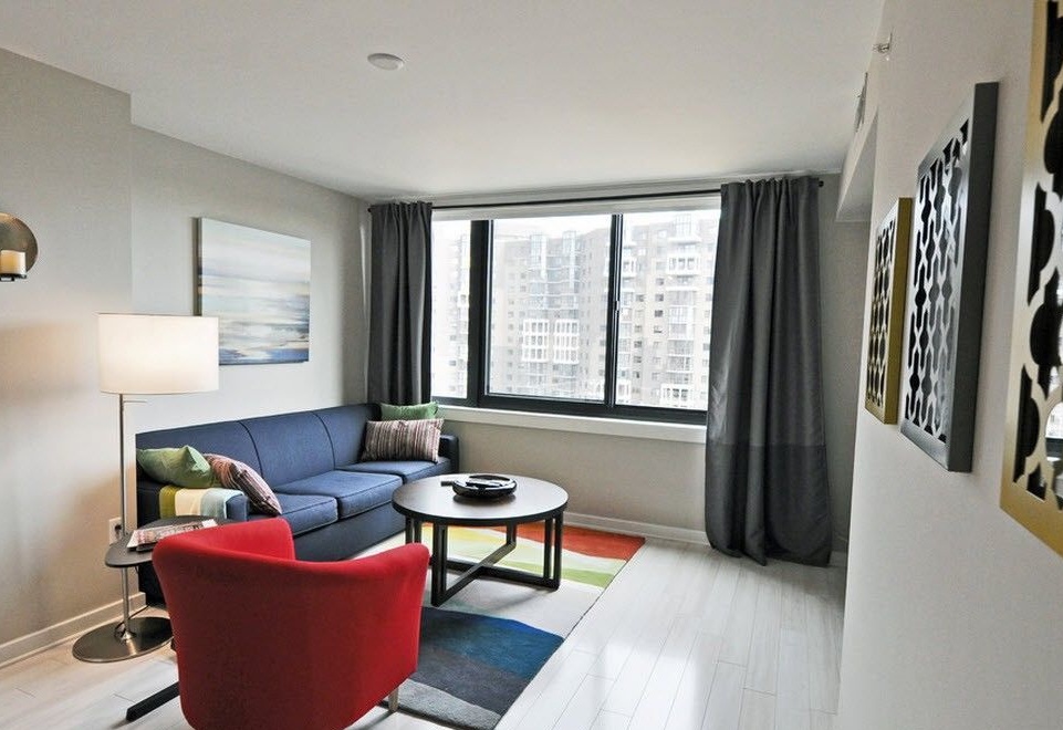
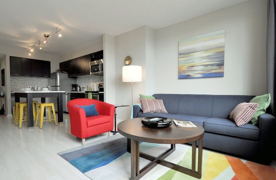
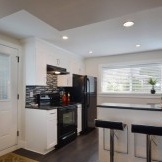
The play of contrasts and the use of bright upholstery of upholstered furniture made it possible to create an interesting, original atmosphere in this rather minimalist living room combined with the kitchen.The same technique was used in the kitchen space - the use of black and white combinations in decoration and furnishings, together with bright accents of the dining area chairs. As a result, the whole room not only looks harmonious, but can also serve the owners for many years without the need to refresh the interior - such a design will be popular for many more years.

