Kitchen design 10 square meters. m - create a practical, beautiful and functional environment
It is not in vain that a kitchen with an area of 10 square meters is considered the “golden mean” - this is a sufficient amount of space for arranging a convenient, ergonomic and outwardly attractive area for cooking, eating and even relaxing for the whole family. With the correct layout, a 10-meter room can be equipped in such a way that there is enough space not only for the necessary set of storage systems and household appliances, but also for placing a convenient dining area. If for a foreign owner of an apartment or house a kitchen with an area of 10 square meters. m - it’s rather an average option that makes you think about the lack of space, then for our compatriots such a basis for cooking and absorbing food is just a godsend. Most of us are accustomed to the small kitchen spaces of apartments built last century with an area of 6-6.5 square meters. m, where literally every centimeter had to be cut out. But do not rush into euphoria from the presence of a sufficient number of square meters - and a medium-sized room can be cluttered with prohibitively large furniture or the wrong choice of layout. Let's take a closer look at the options for the arrangement of kitchen furniture in spaces of different shapes and configurations.
The choice of layout of the furniture ensemble
There are not so many options for organizing a kitchen set in a 10-meter space. Nevertheless, it is necessary to correctly prioritize, find out the needs of your family and have a clear idea of the possibilities of the kitchen. The following factors will influence the choice of layout of furniture and household appliances:
- room shape (square, rectangular, asymmetric, strongly elongated, etc.);
- the location of the room in relation to other rooms of the dwelling (whether the room is walk-through, adjacent to another space);
- location and number of window and door openings (in apartments the situation is almost standard, but in private houses options are possible);
- location of engineering systems and the possibility of their transfer if necessary (water supply, sewage, gas pipeline);
- family size (the arrangement of furniture for a bachelor and a family with young children or older people can be dramatically different);
- the amount of household appliances that you would like to integrate into the furniture ensemble (for some people, besides a stove, a refrigerator and an oven, a dishwasher is needed, while others have nowhere else to build a washing machine).
Corner (L-shaped) layout of the kitchen ensemble
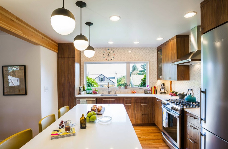
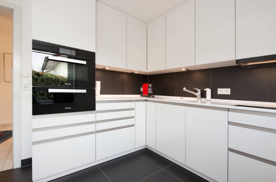
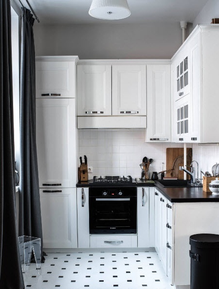
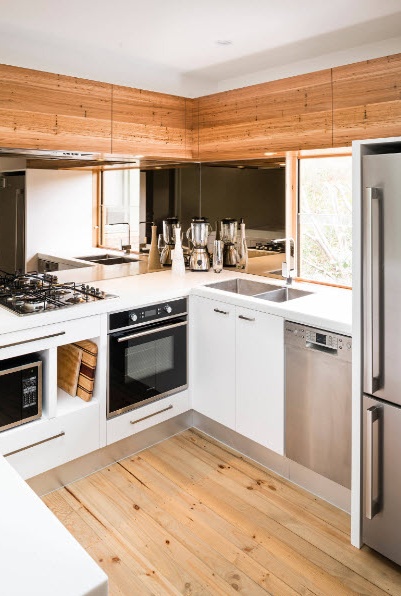
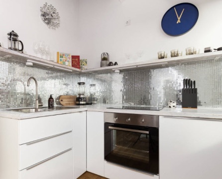
The corner layout of the kitchen is a universal way of arranging furniture and household appliances, which is suitable for almost all forms of rooms, except for a very elongated passage space. L-shaped layout allows you to place a sufficient number of storage systems, household appliances and work surfaces at the lowest cost of useful space of the kitchen. With this arrangement, the easiest way to fulfill the rule of the working triangle is by placing its imaginary vertices (refrigerator, hob and sink) on opposite sides, but within walking distance.
Compliance with the ergonomics of the working triangle allows you to not only create a convenient and safe environment for performing various work processes, but also spend a minimum amount of time and effort on them. In any case, it is necessary to adhere to the rule of location of the hob or cast in relation to the sink at a distance of at least 50 cm (it is best that they are separated by a countertop of at least such dimensions).
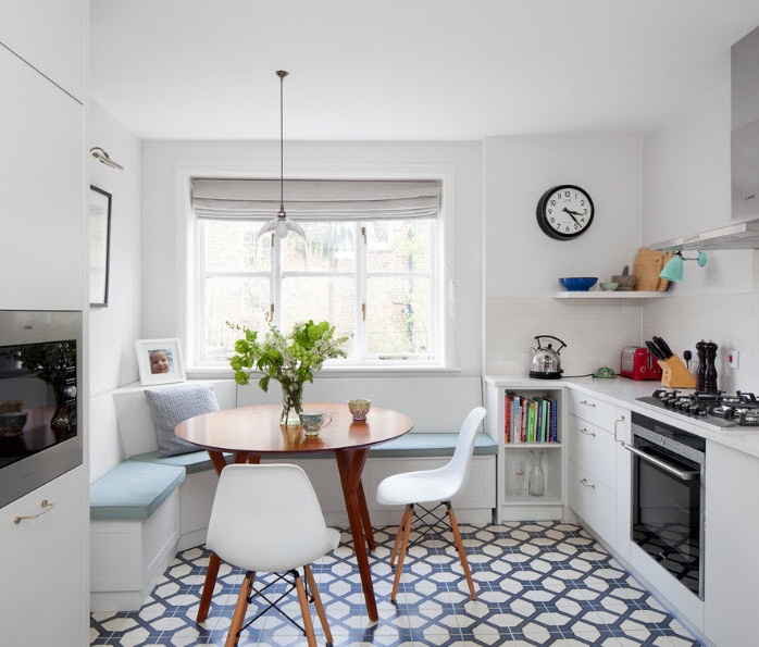
Another advantage of the corner layout is the ability to install a full-fledged dining group in a space free from the furniture set.At the same time, your family will not be prejudiced in the number of storage systems and household appliances. Corner cabinets located above and below the sink (if this particular functional segment is located in the corner of the room) are incredibly spacious, as a rule, they are equipped with a retractable or rotary storage system.
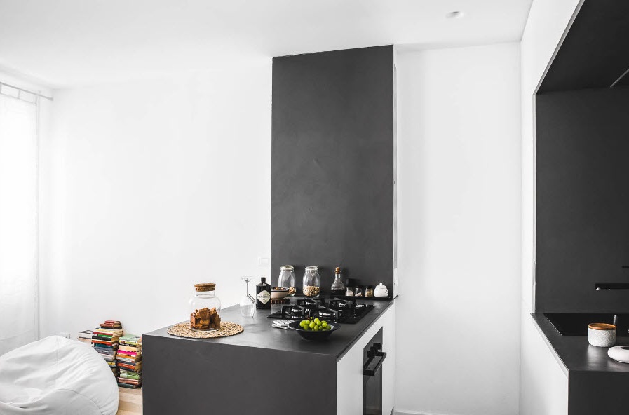
Corner peninsula headset
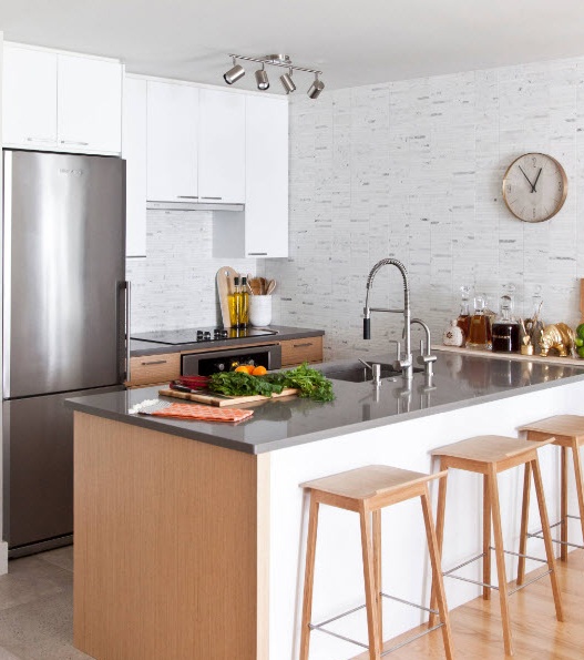
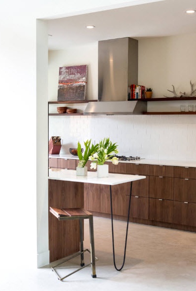
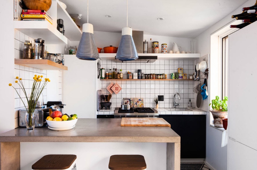
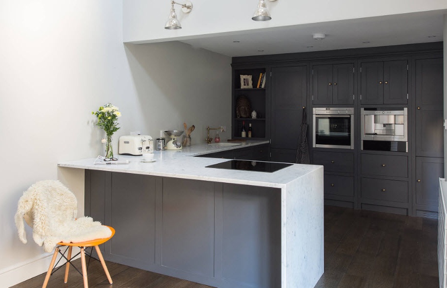
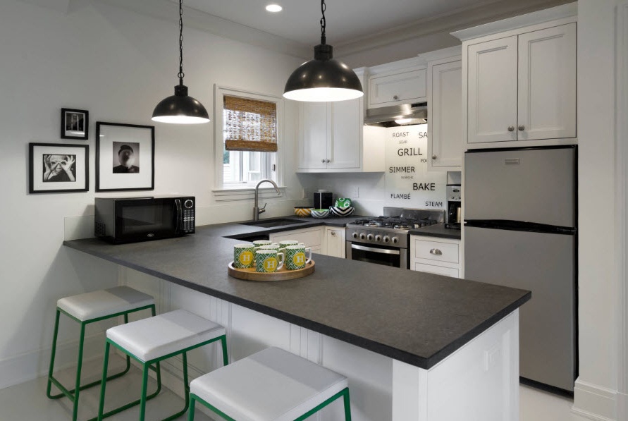
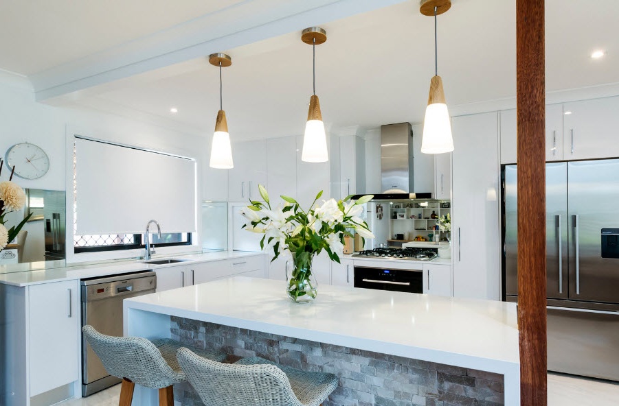
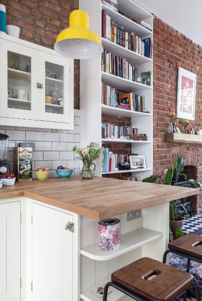
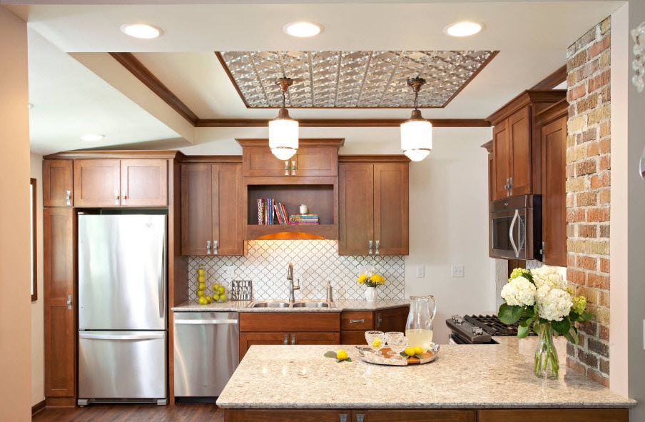
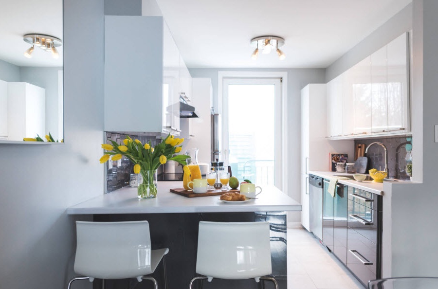
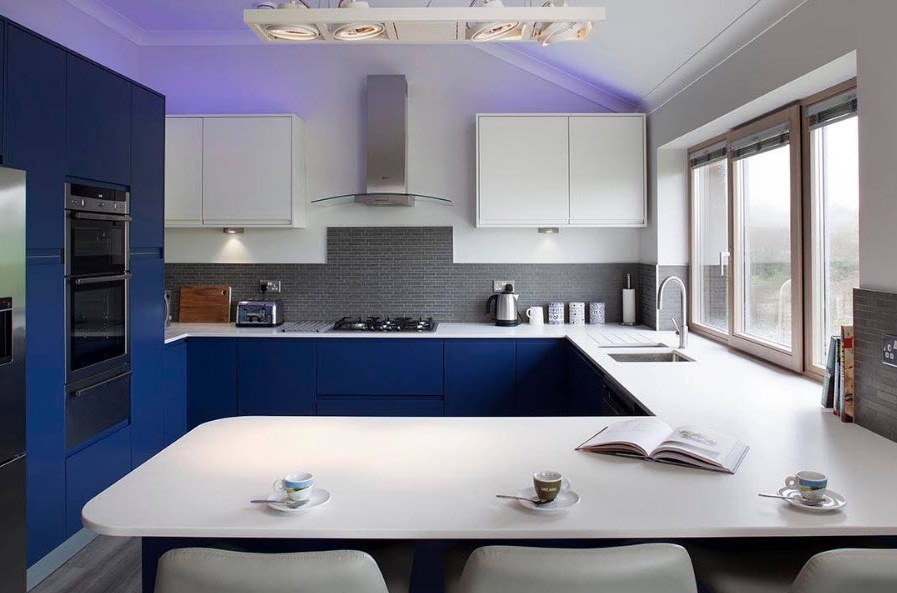
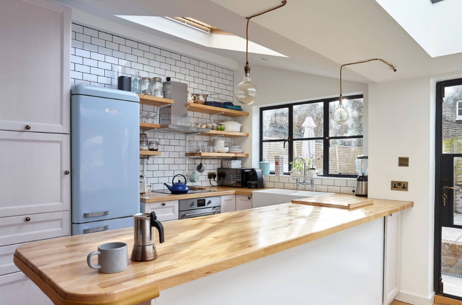
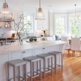
The advantages of the angular layout are enhanced by adding a peninsula to the headset - a module, one side of which is attached to the wall. In addition to the fact that the peninsula is an additional space for embedding household appliances (sometimes even sinks) and storage systems, its countertops are often extended to provide space for short meals. A small family (for example, a couple of young people) can use such a rack and as the main sector of food intake.
U-shaped furniture layout
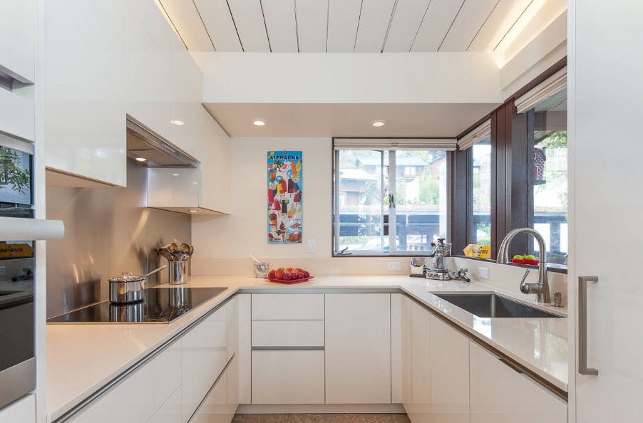
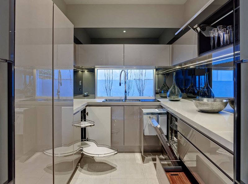
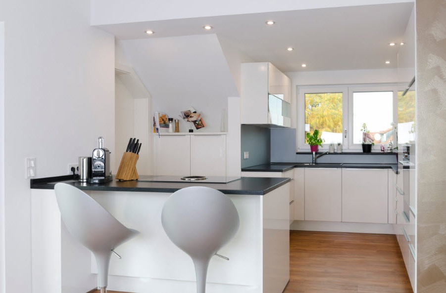
The layout of the furniture ensemble with the letter P allows you to arrange the maximum possible number of storage systems and household appliances in a medium-sized kitchen. If you have a large family and to organize order in the kitchen space you need a large number of cabinets and various appliances, then the U-shaped layout is your option. In a square room, such an arrangement of the furniture will even allow you to set a small dining area in the center (a compact round table and light chairs). In a rectangular, elongated room, this will not be possible, and for the organization of the eating area it will be necessary to allocate space in the living room or equip a separate room.
With a U-shaped layout, it is also simple to fulfill the conditions of the working triangle by placing the refrigerator, sink and stove in opposite sides of the furniture set. At the same time, the hostess (owner) will not spend much time moving between strategically important elements of the kitchen space.
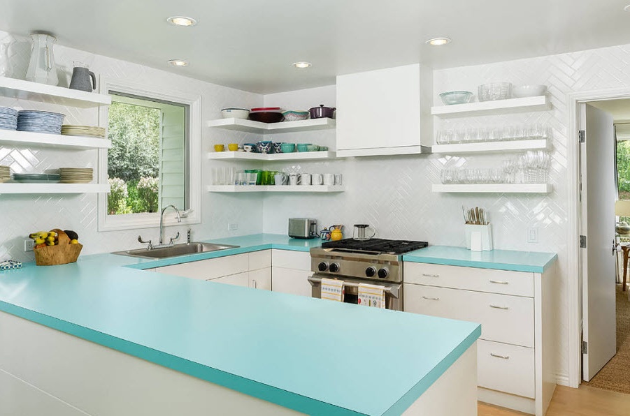
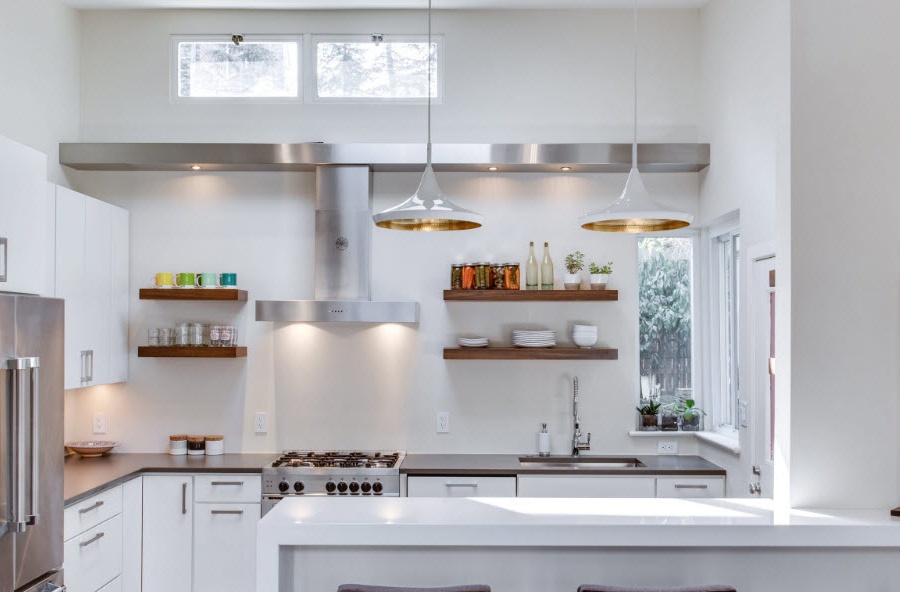
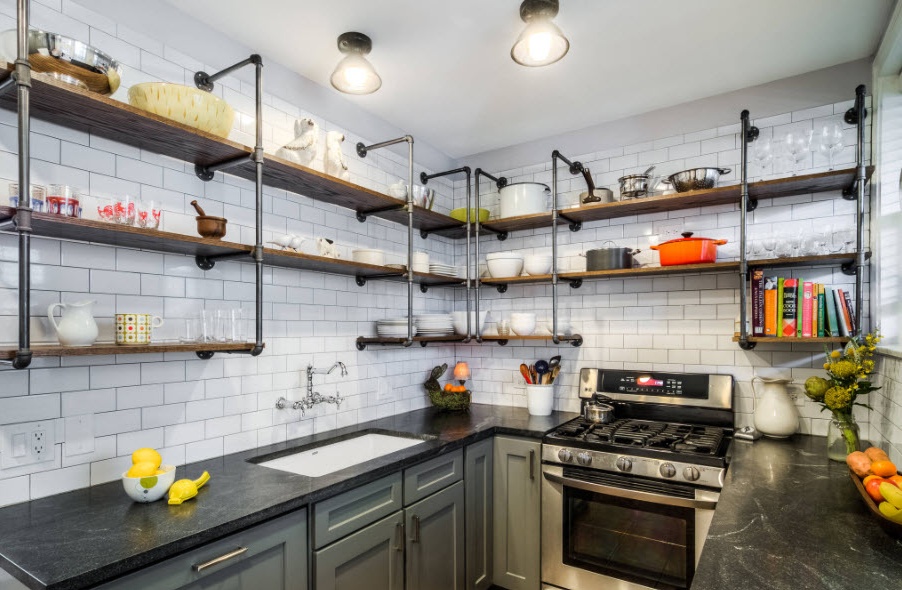
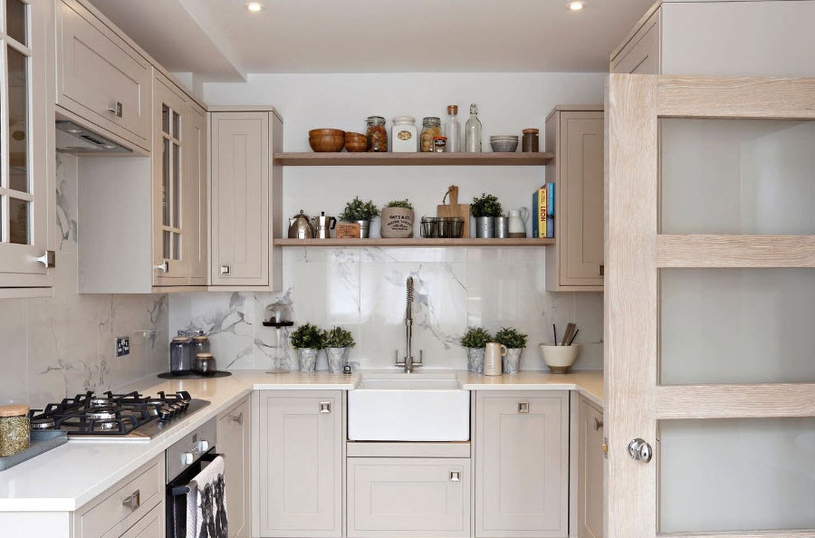
U-shaped layout in a small room can look quite heavy, especially if the upper tier of kitchen cabinets is located from the ceiling. Designers recommend replacing the upper level of closed cabinets with open shelves or shelves, and storage systems can also be combined to create an interesting and more favorable image of the kitchen space for visual perception. No less effect can be achieved when using facades with glass inserts for the upper level of cabinets.
Parallel Layout Headset
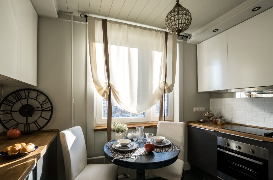
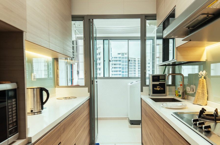
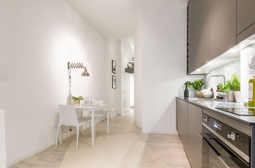
For walk-through rooms, a parallel layout is an ideal option for arranging furniture and appliances. If the space is very elongated, then placing storage systems and household appliances along its sides, there is only room for passage and movement between important working areas - there will be no zone for installing a dining table. But if in an almost square room with door and window openings on opposite sides, two parts of the kitchen ensemble are located in the same way, then in the center of the room you can place a small (preferably round) table for meals of a small family.
Single-row (linear) layout of furniture and appliances
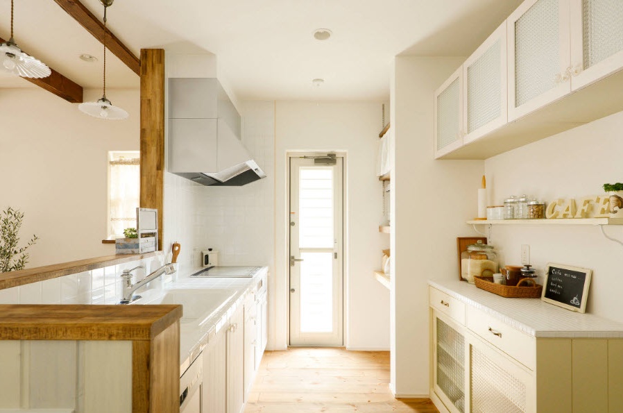
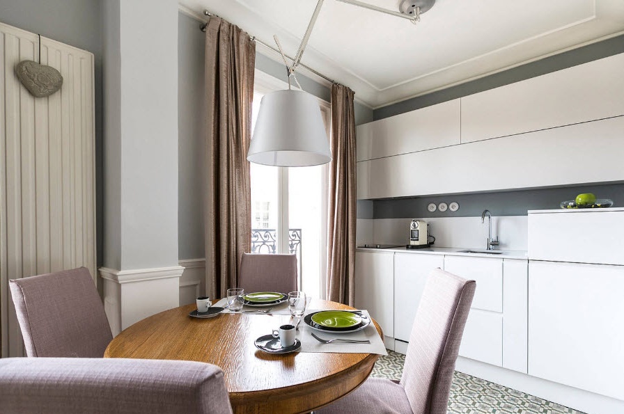
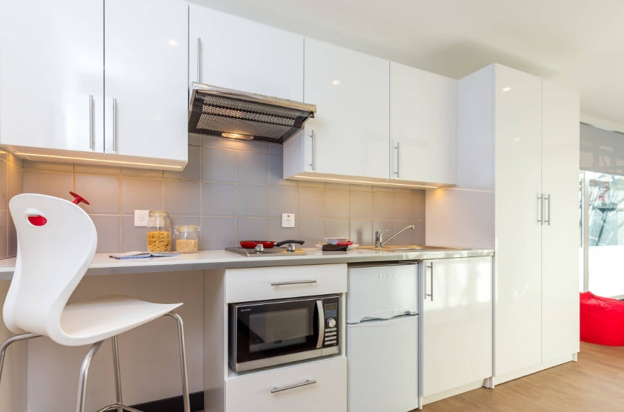
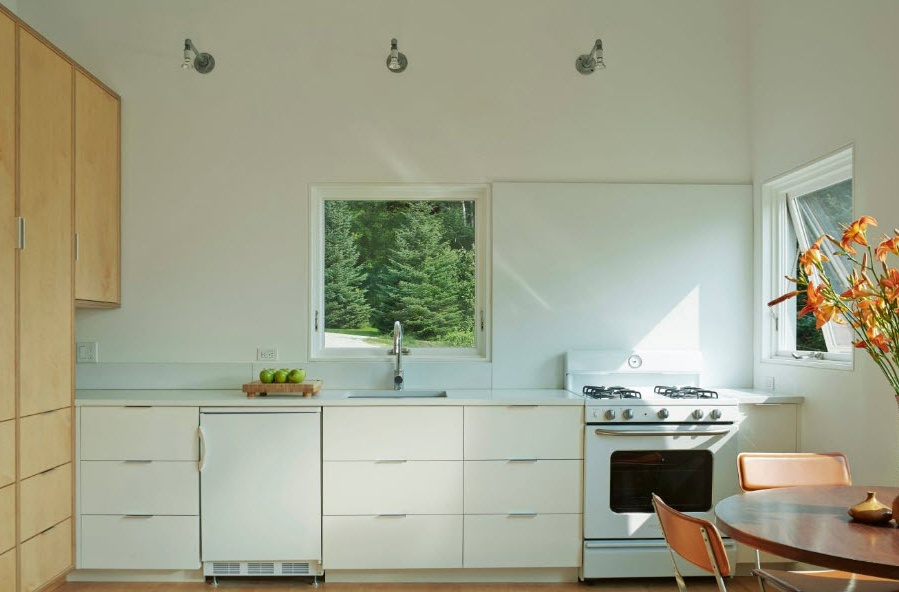
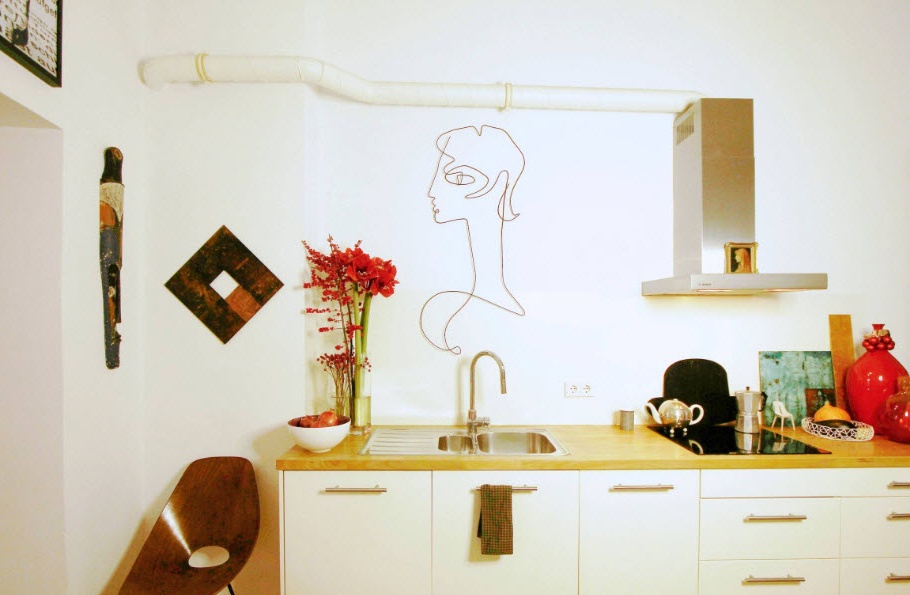
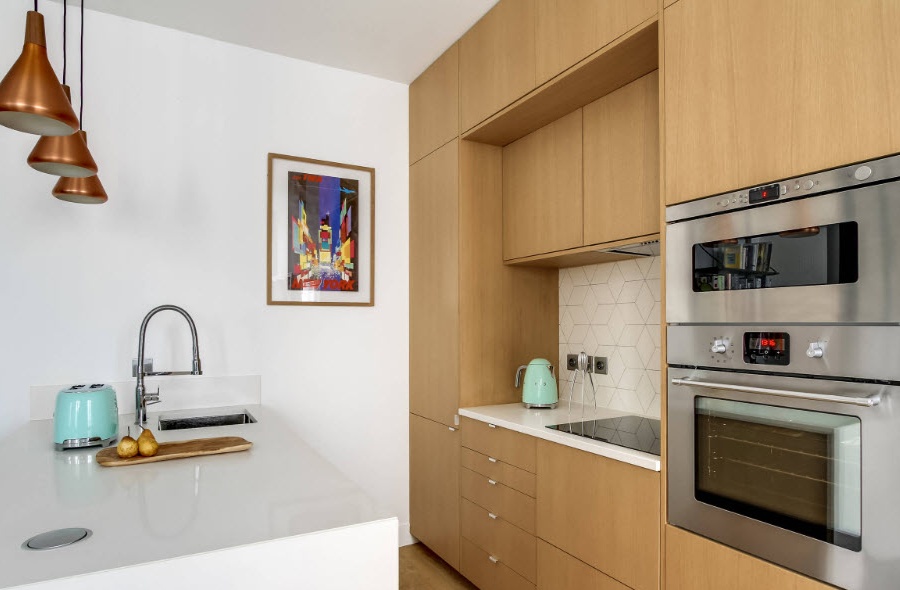
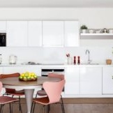
Layout in one row is usually used if there is no possibility of arranging a corner headset (a door or window is interfering) or a small family and a small number of storage systems and household appliances will be enough. As a rule, a single-row furniture ensemble is placed along the long side of the room (for a rectangular shape). With this arrangement in a 10-meter space there is enough space for the dining area with a spacious table or kitchenette with a comfortable soft sofa.
If for you a kitchen is not only a place for cooking and gathering the whole family once a day for a joint meal, but also a room for gatherings with friends, organizing dinner parties and even a place for parties, then a compact single-row layout will be the best option.
Color solutions for a medium-sized kitchen
Designers recommend using predominantly light shades for small kitchen spaces, diluted with bright or contrasting dark accents. We all perfectly understand that all shades of white are able to visually expand the space of the kitchen, create a light, almost airy image of the room. But at the same time, the total use of light colors for the decoration and furnishing of the kitchen area can lead to the creation of an uncomfortable interior, similar in sterility to the operating room. In order to avoid unpleasant associations, it is only necessary to add colors and contrast to a bright room in a dosed manner.
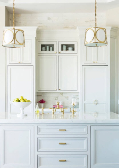
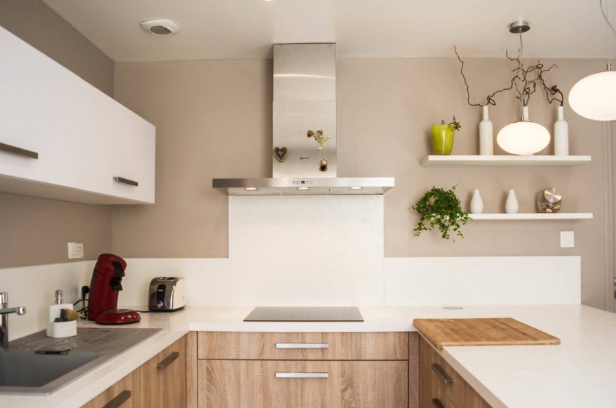
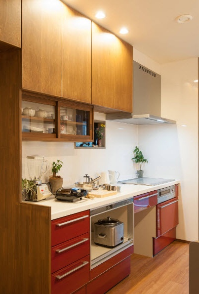
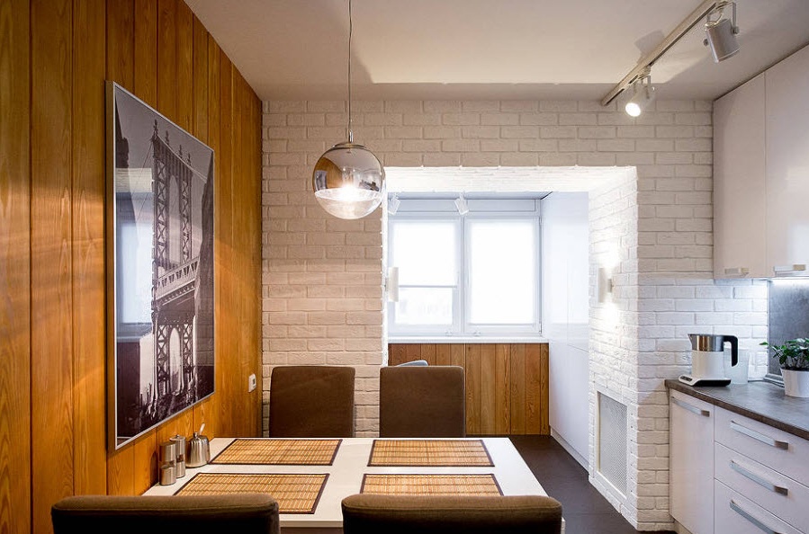
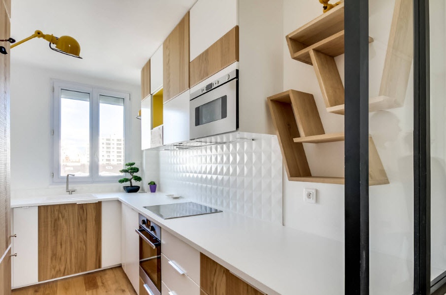
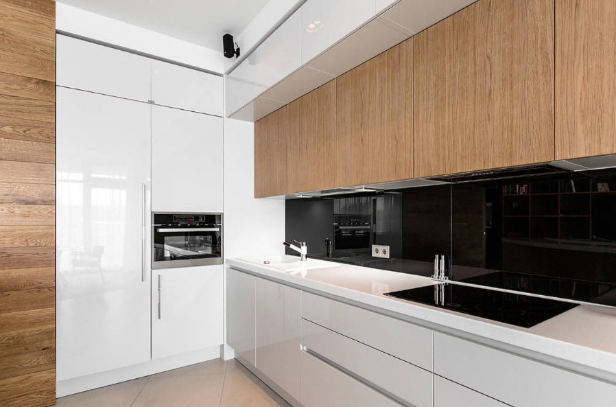
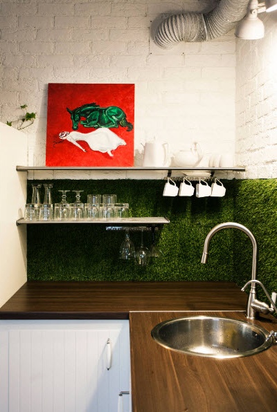
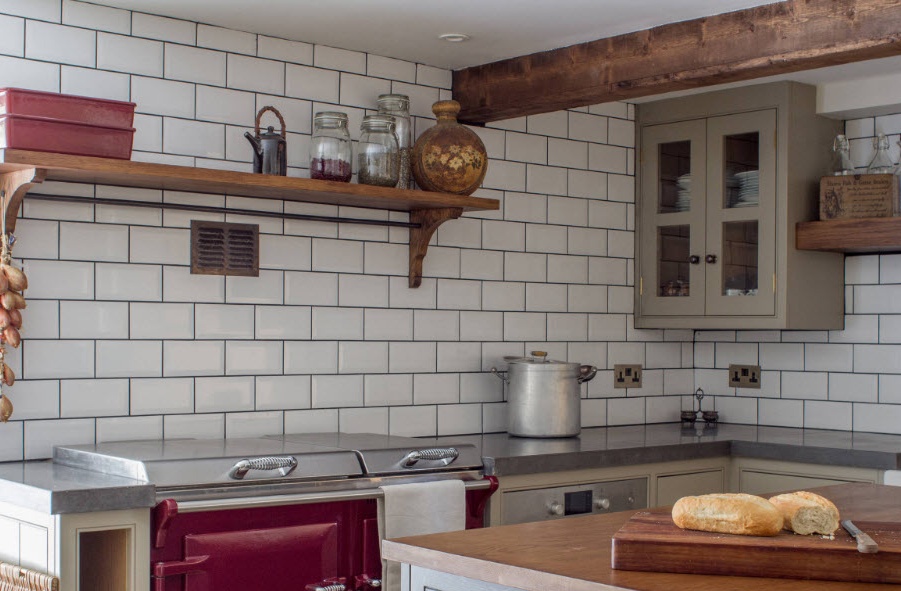
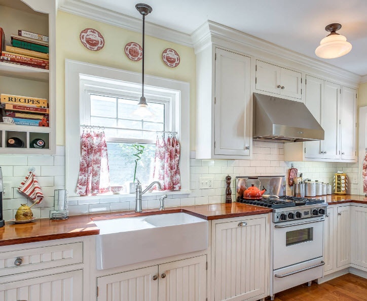
One of the easiest ways is not easy to dilute the snow-white surfaces of the kitchen, but also to add warm color to the design of the room is the integration of wooden elements (or their spectacular artificial counterparts). In combination with a white tone, a beautiful natural pattern looks especially advantageous, positive and even festive.
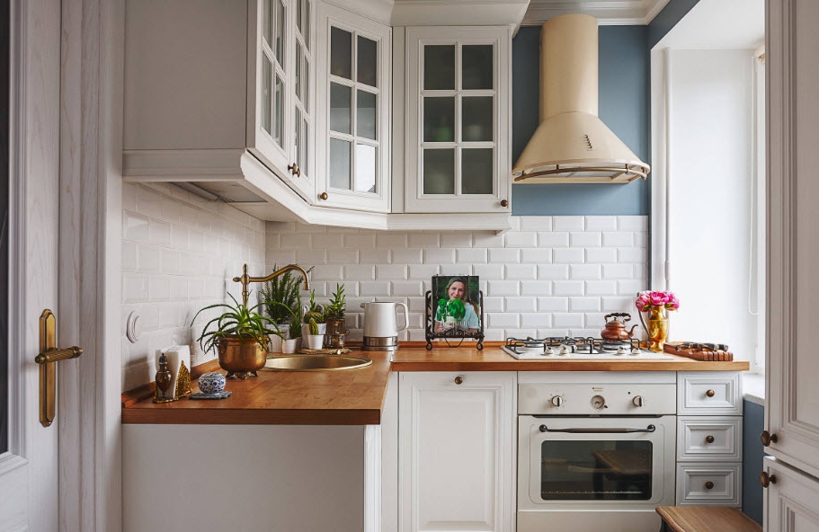
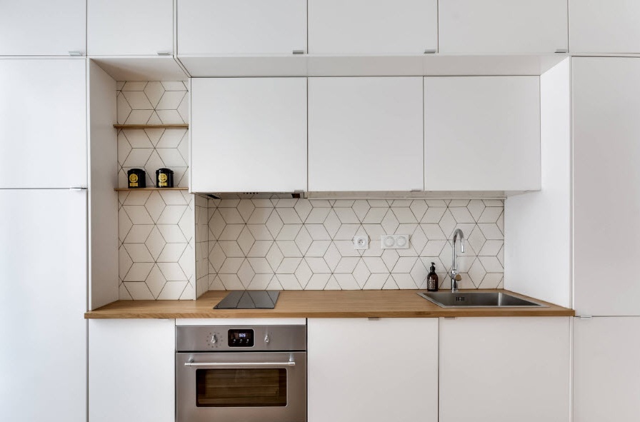
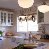
Wooden kitchen facades on a white background finish - "classic of the genre" for the kitchen. No matter how the fashion for design changes, lovers of such a traditional combination will always be found. And there are many reasons for this - the time-tested scheme works very well to create an outwardly attractive, cozy, but at the same time practical image of the room, in which it is convenient to cook food, and it's nice to sit with the whole family.
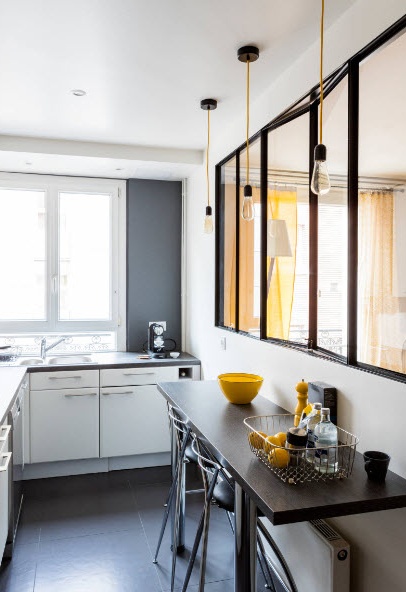
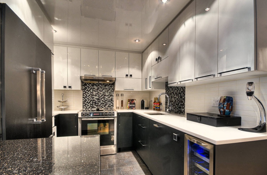
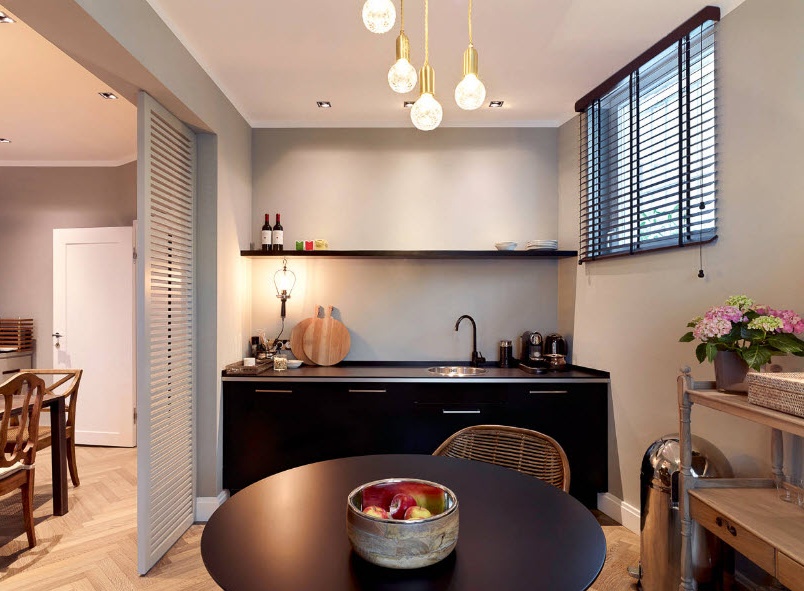
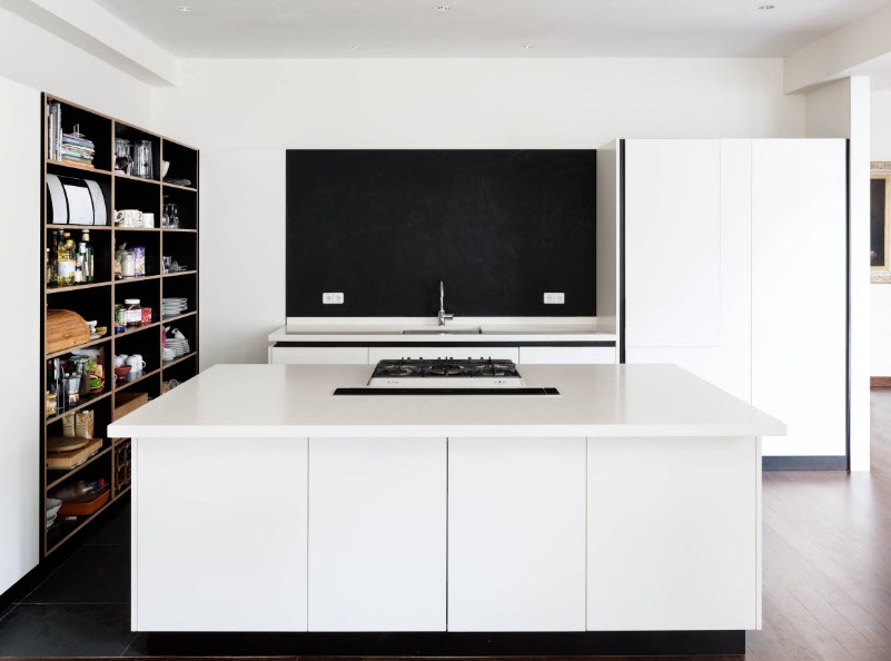
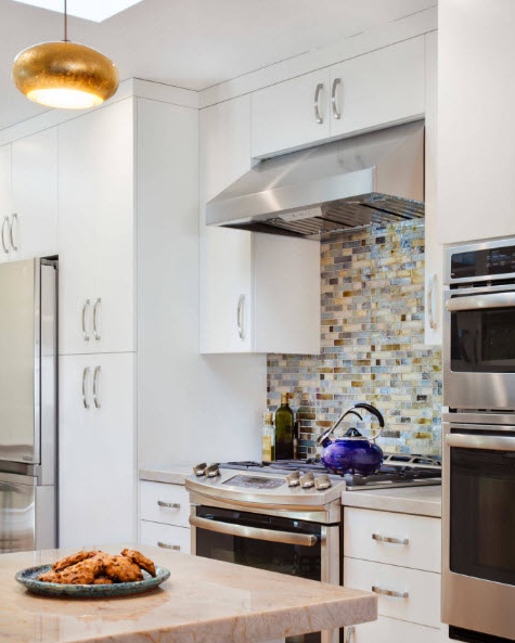
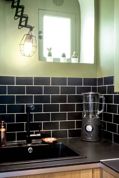
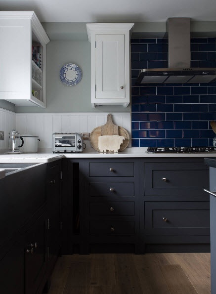
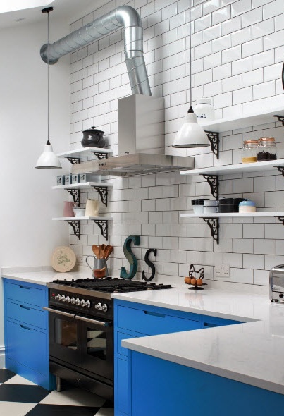
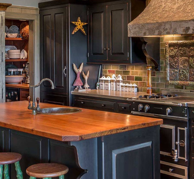
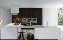
Another spectacular white companion in creating modern kitchen spaces is black. The metered use of a dark tone in a snow-white idyll allows not only to create the centers of attention necessary for the gaze, but also to make the design more structured, clear, and sometimes dramatic. Black color can be used for the execution of countertops, the bottom row of kitchen cabinets, flooring or a picture on the kitchen apron, decor elements, lighting. But it is important to understand that dark surfaces in the kitchen space will require more effort from you in terms of cleaning than light interior elements.
White, wood and black - three options for the execution of surfaces, "juggling" with which designers around the world create an incredible number of projects. Skillfully combining only three of these types of surfaces, you can create interesting, fresh, practical and at the same time externally attractive images for modern kitchen spaces. If, in addition to an interesting image, you are also interested in the visual expansion of the 10-meter space of the kitchen, then use darker shades in the lower part of the room, place colorful natural tones in the center, and exclusively white color closer to the ceiling.
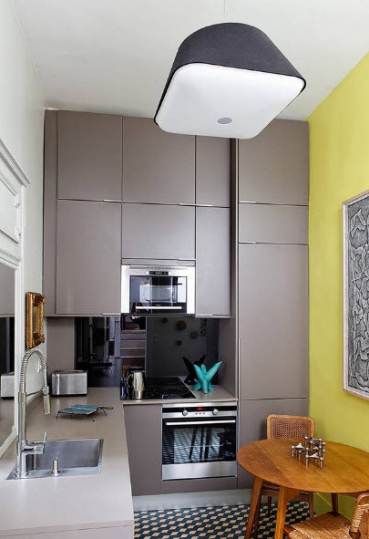
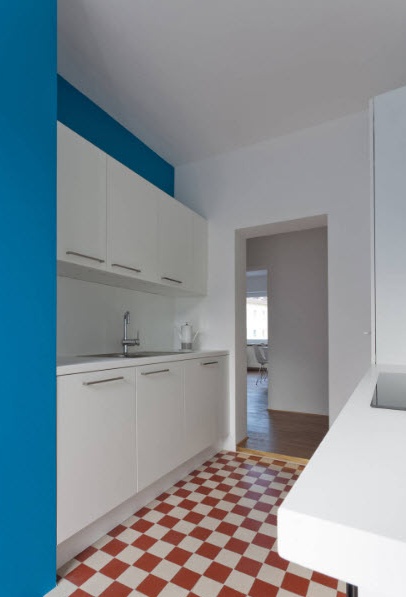
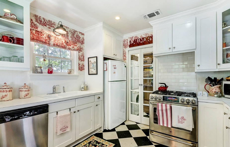
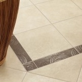
If it’s important for you to use white color for the decoration of the ceiling and walls of the kitchen premises, as well as the facades of the furniture set, apply the color in the flooring. The dark, contrasting floor covering will not only add variety to the color palette of the room, but also help visually create clear boundaries of the space. Floor tiles with a colorful pattern or laid out on the principle of a checkerboard will be the highlight of the light interior and help to give the trivial image of the kitchen originality.
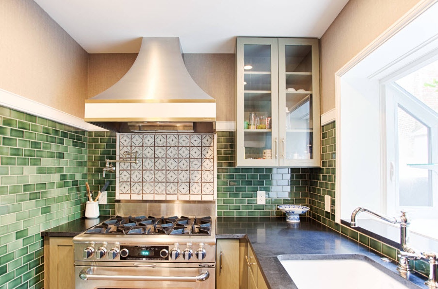
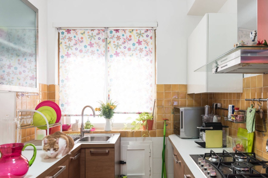
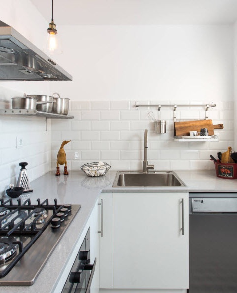
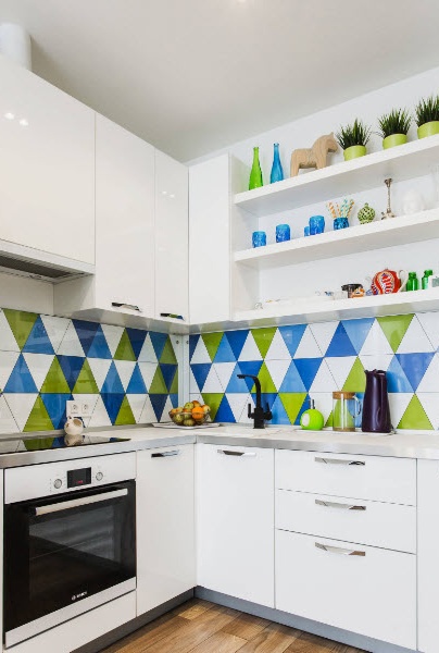
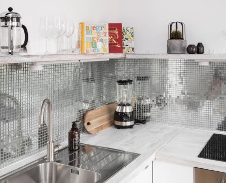
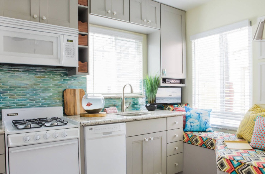
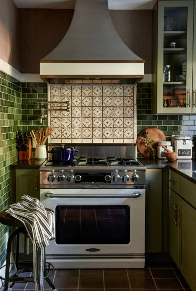
A bright kitchen apron is a simple and incredibly winning way to create an accent in a snow-white kitchen. It can be either motley ceramic tiles or mosaics, or a pattern on glass wall plates or PVC sheets.
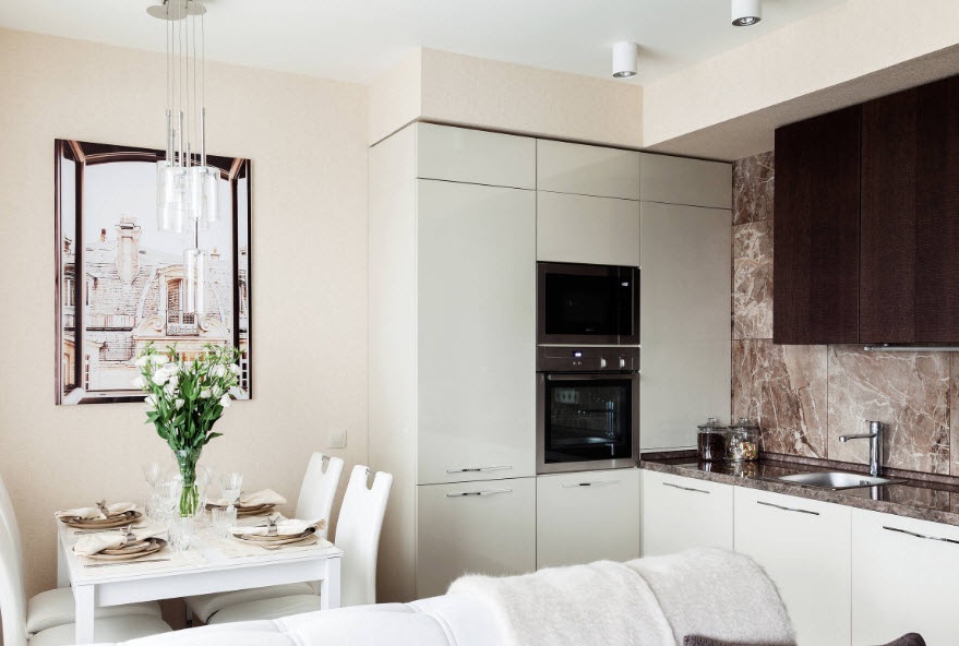
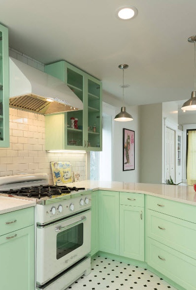
Almost all pastel colors can become the basis for creating an image of an attractive and comfortable kitchen in a 10-meter space. Even the use of light shades of mint, vanilla, coffee with milk and beige. On a white background, the finish of the kitchen will look advantageous. Such kitchen facades will give originality to the kitchen area, without prejudice to the freshness and lightness of the image of a bright room.
The combination of white tone with any colorful color in the execution of the kitchen set leads to the creation of an interesting image of the kitchen space. Use the white facades in the upper tier of the cabinets, and the colored ones in the lower tier and you can, among other things, achieve a visual increase in the area of the room. But it is important to consider the effect of a particular color on the psychological state of a person. For people who are constantly on diets, the use of red and bright orange in the interior of the kitchen is not recommended - they contribute to an increase in appetite. But all shades of blue reduce appetite, but the atmosphere in the kitchen is cool. The beige and gray gamma of the design of the kitchen space has a neutral effect. Calming and relaxing most shades of green, in addition, a similar palette gives freshness and spring mood to the interior.
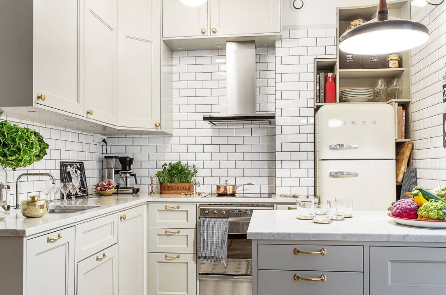
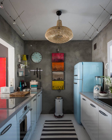
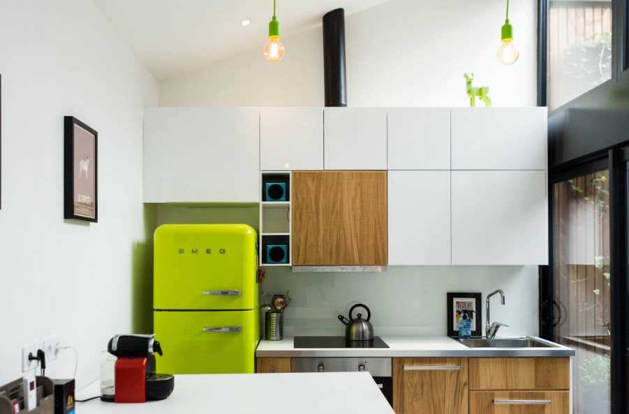
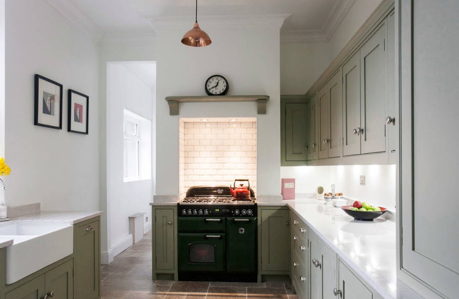
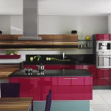
In recent years, the use of retro-style models of household appliances in the interior of a modern kitchen is gaining popularity. In addition to the original design, such devices are most often performed in a colorful, bright color and become difficult accent spots of a neutral image of the kitchen, and its highlight. Just one interior item (for which, however, you will have to pay much more than for the standard model), and what a splash of color and design thought, a variety in the interior and an increase in the uniqueness of the whole image of the room.
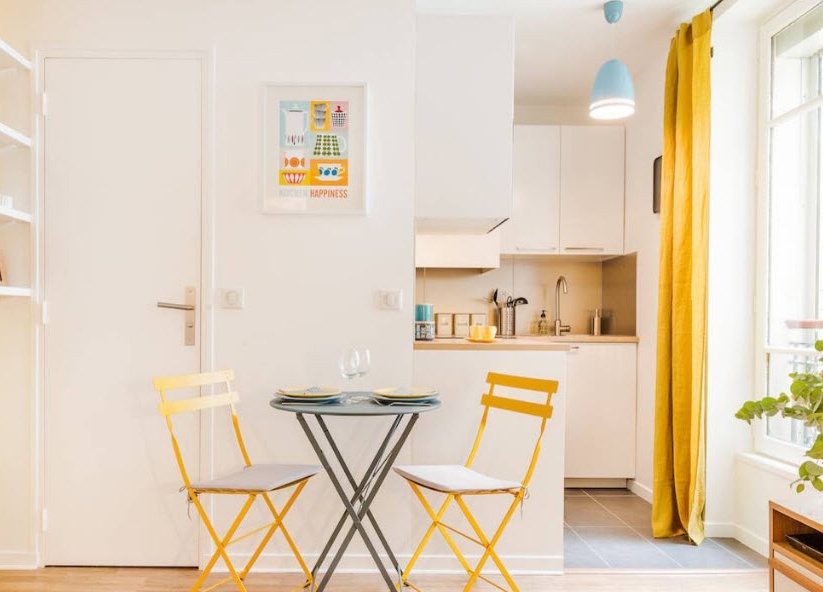
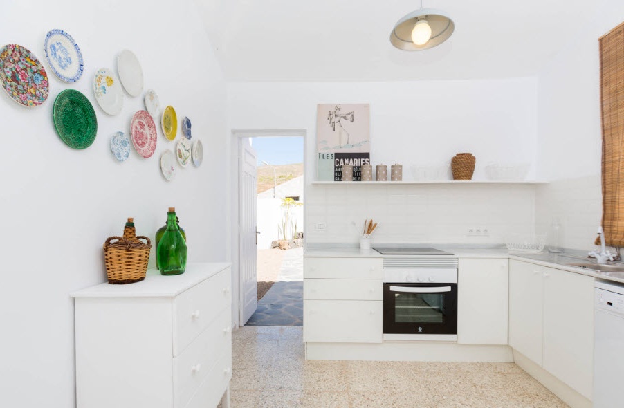
Decor will help bring brightness to the image of the kitchen space that is neutral in color. The easiest way is to use wall decor in the form of bright plates or panels (which will be easy to wash), assembled from multi-colored glass or ceramic elements. Another simple way to diversify the color palette of a light kitchen is to use colorful textiles. The bright upholstery of the kitchen corner, the curtains on the windows or simply the kitchen towels thrown over the handrails and the handle of the oven can change the image of the room. But it is important to understand that in a space of small sizes it is necessary to apply such design techniques in a dosed manner.
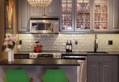
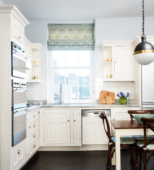
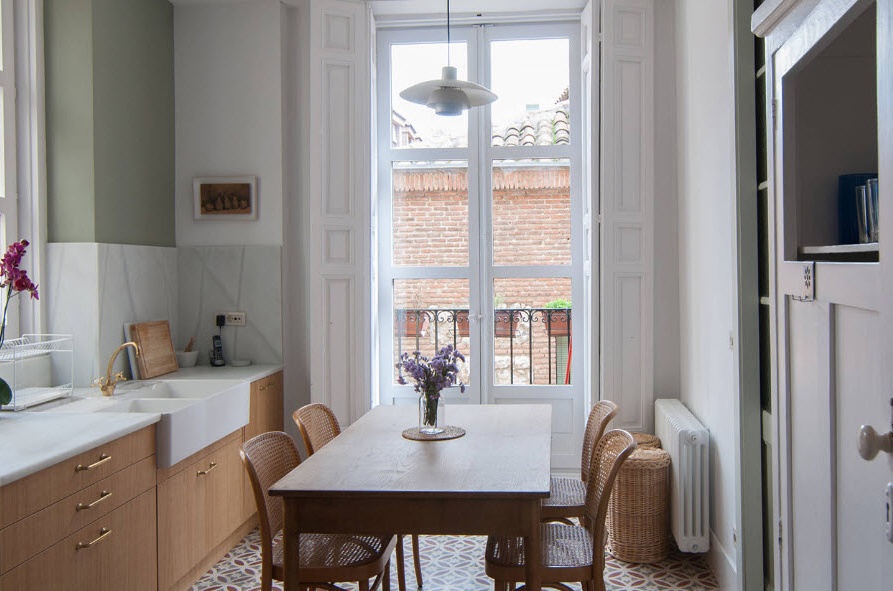
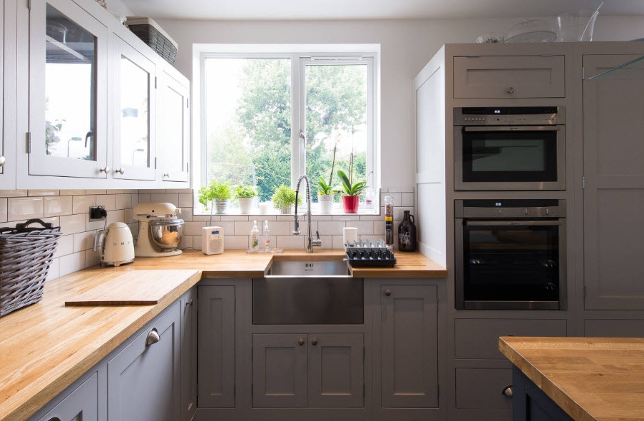
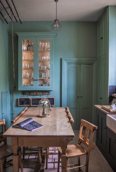
In the English country style there is such a technique for arranging the kitchen space - painting the walls and facades of the cabinets in one (or similar in shades) color. Most often, shades of blue, green or gray are selected. The colored kitchen looks very original, but at the same time in such a space it is comfortable for everyone - both households and guests of the apartments. In our country, there are also adherents of using such techniques in arranging a kitchen - you can find both ready-made furniture solutions in salons and order an individual project for pre-selected room decoration.

